The Blue Lagoon is an artificial hot spring located in Iceland, created by the geothermal power plant Svartsnegi. It uses underground lava flows to run turbines to generate electricity, while excess seawater is released into low-lying areas to form lagoons. This is how the dreamy blue lagoon was formed.
The water is rich in silica, algae and skin-friendly minerals, giving visitors a soothing feeling both physically and mentally. Because silica reflects light (some colors of light are absorbed by objects), the lagoon is famous for its distinctive aqua blue color.
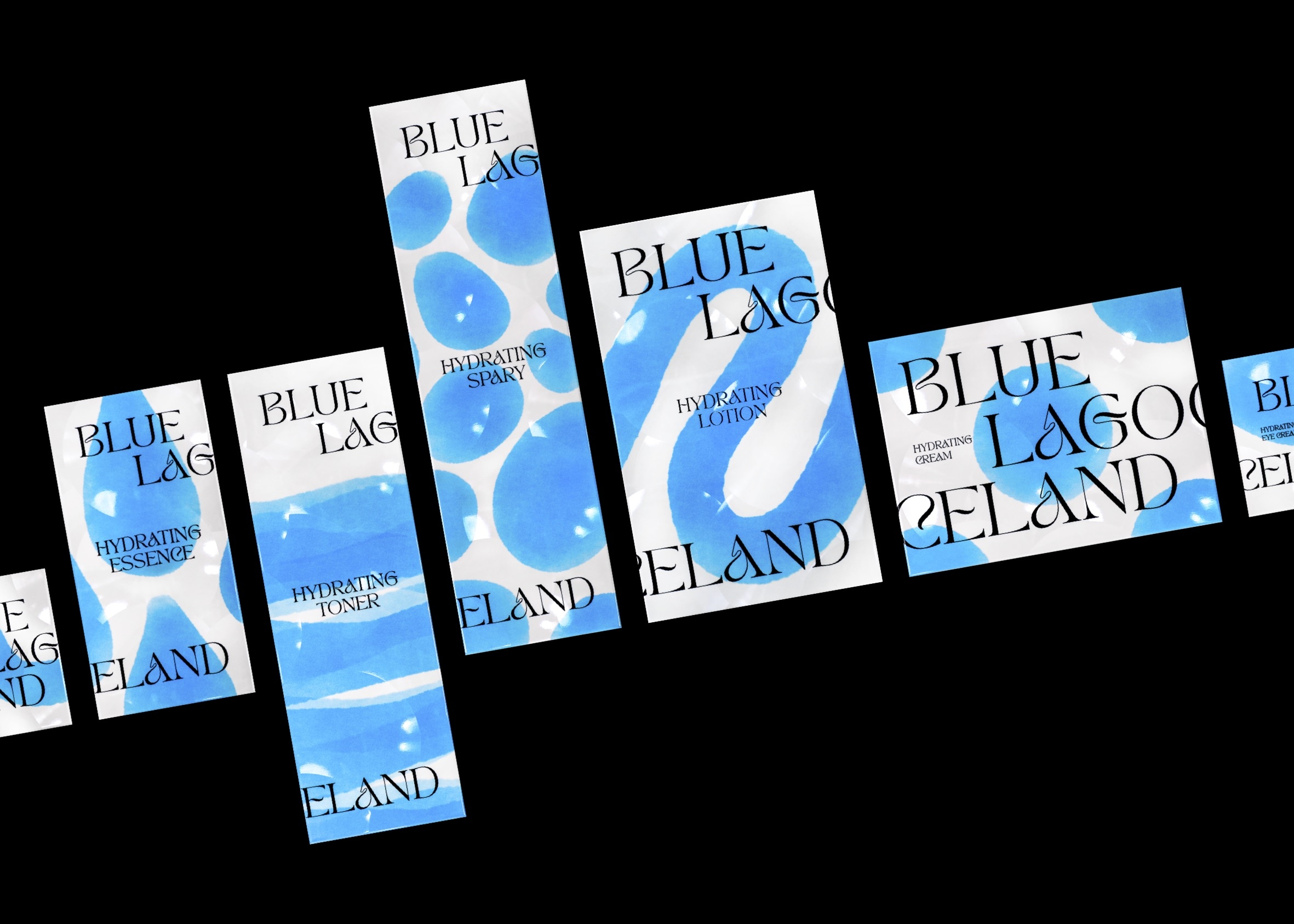
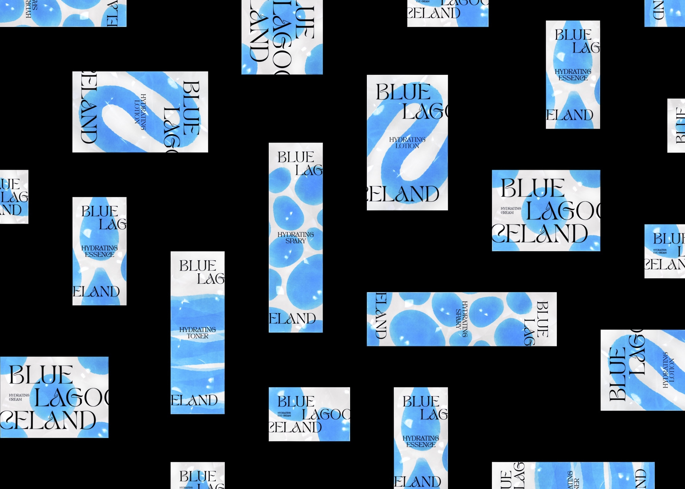
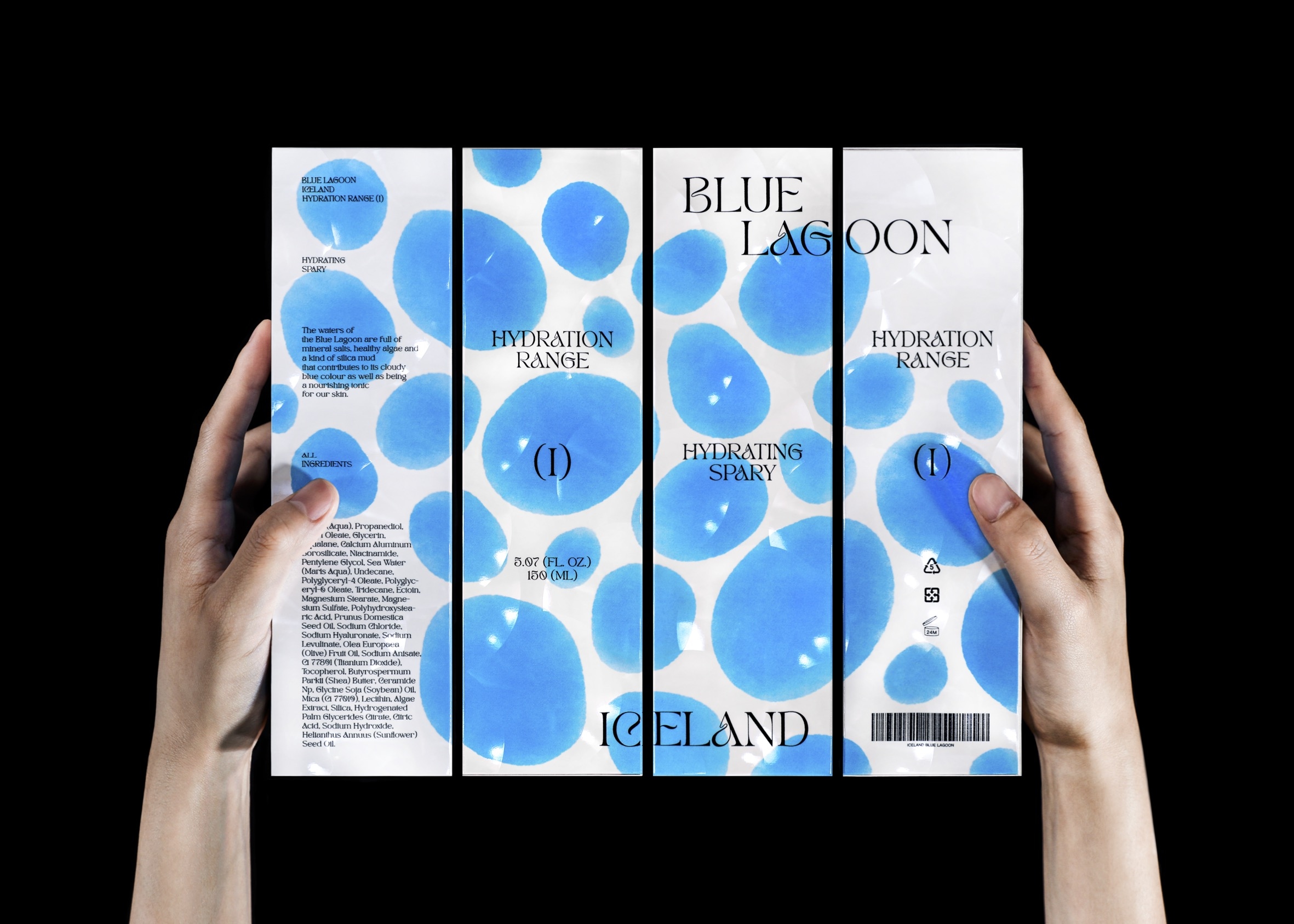
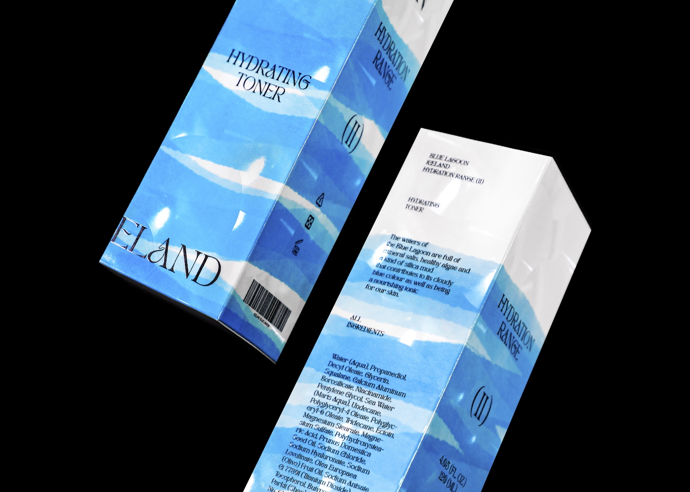
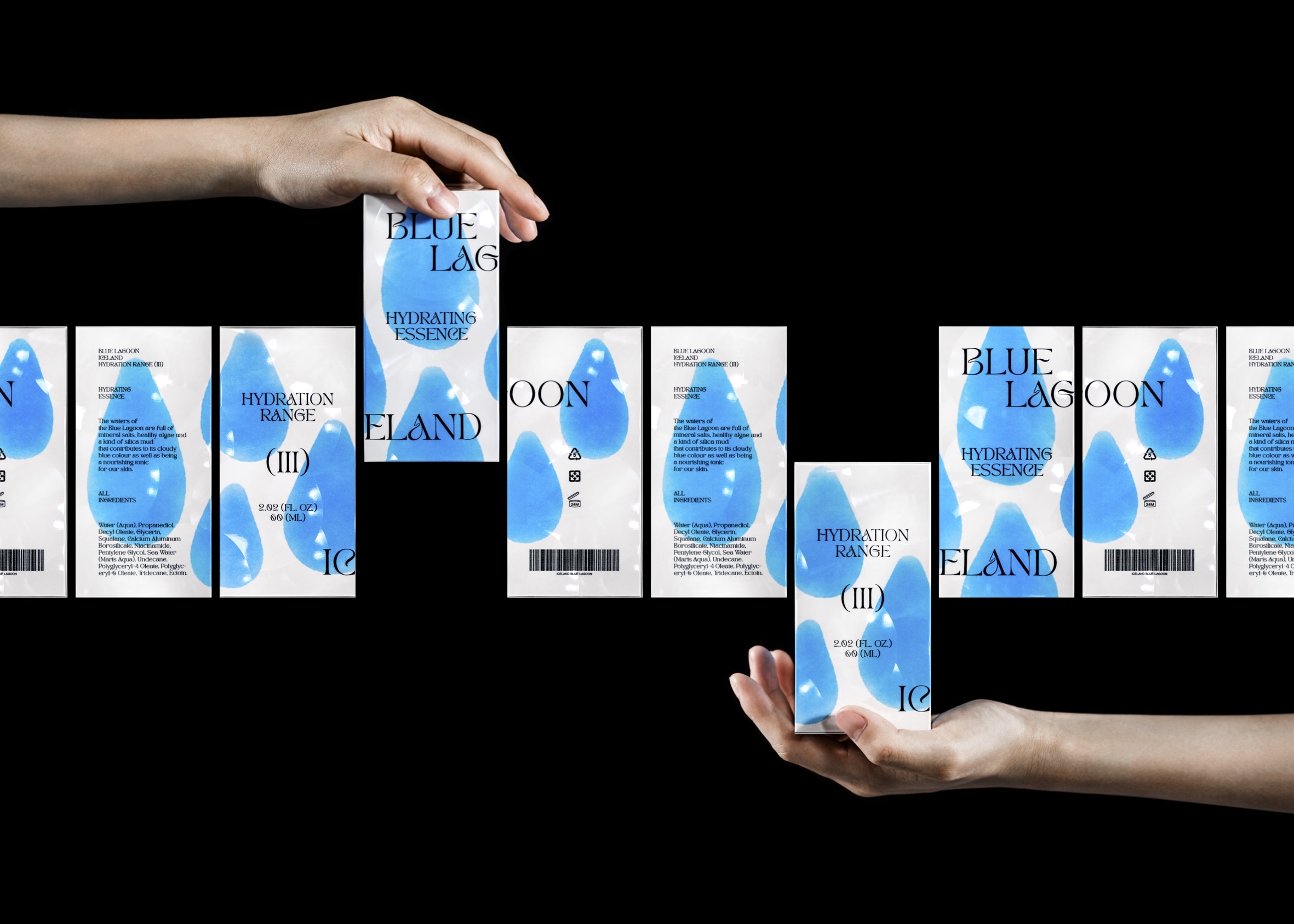
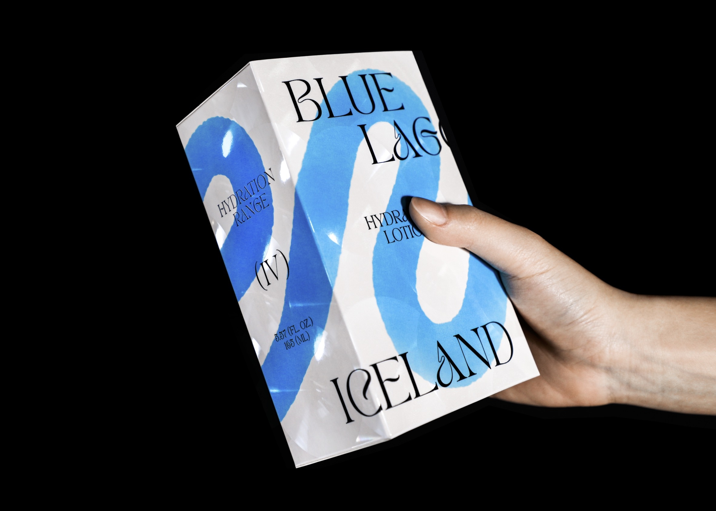
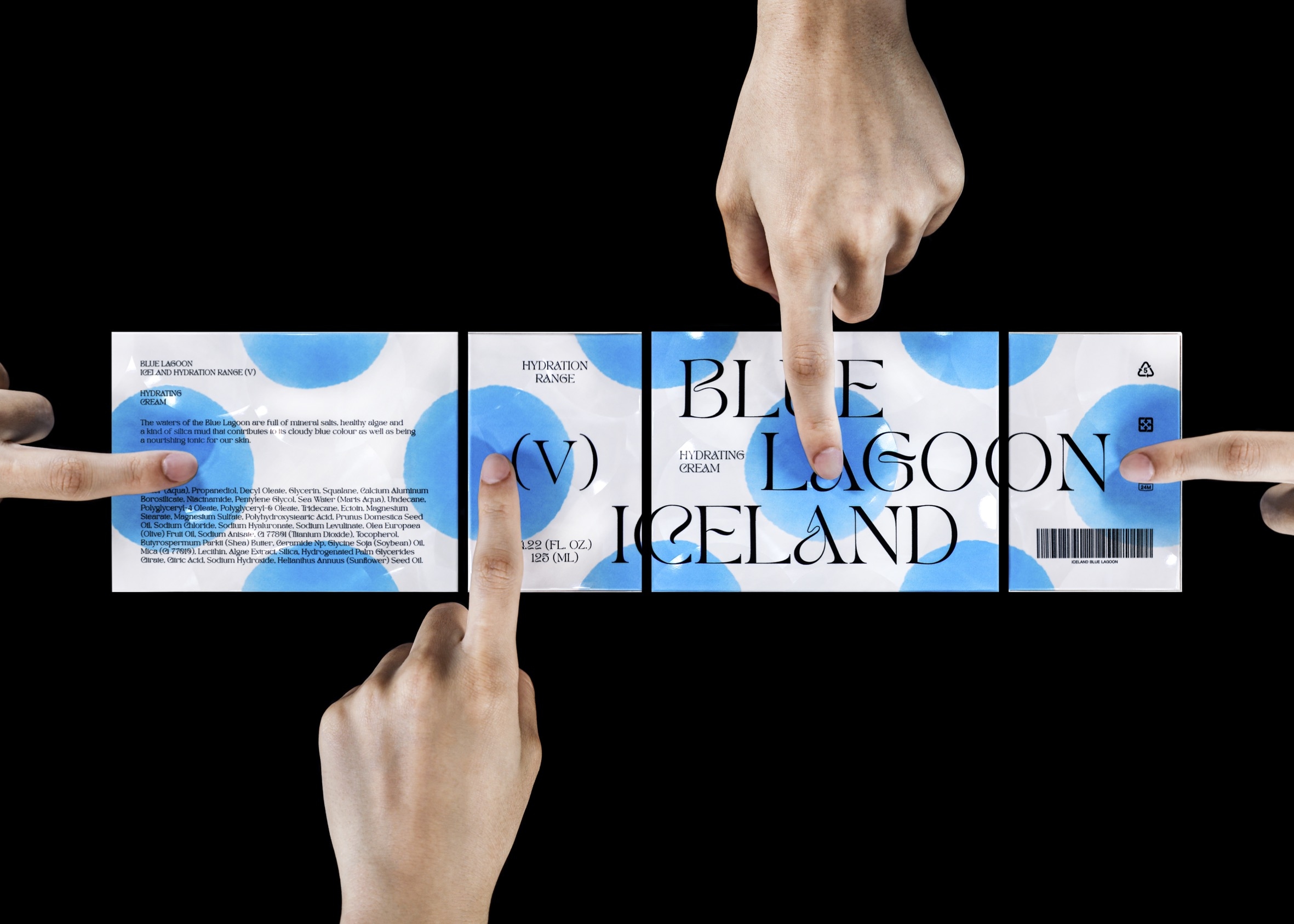
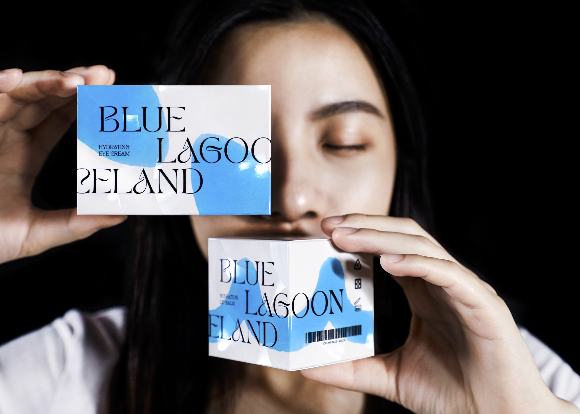
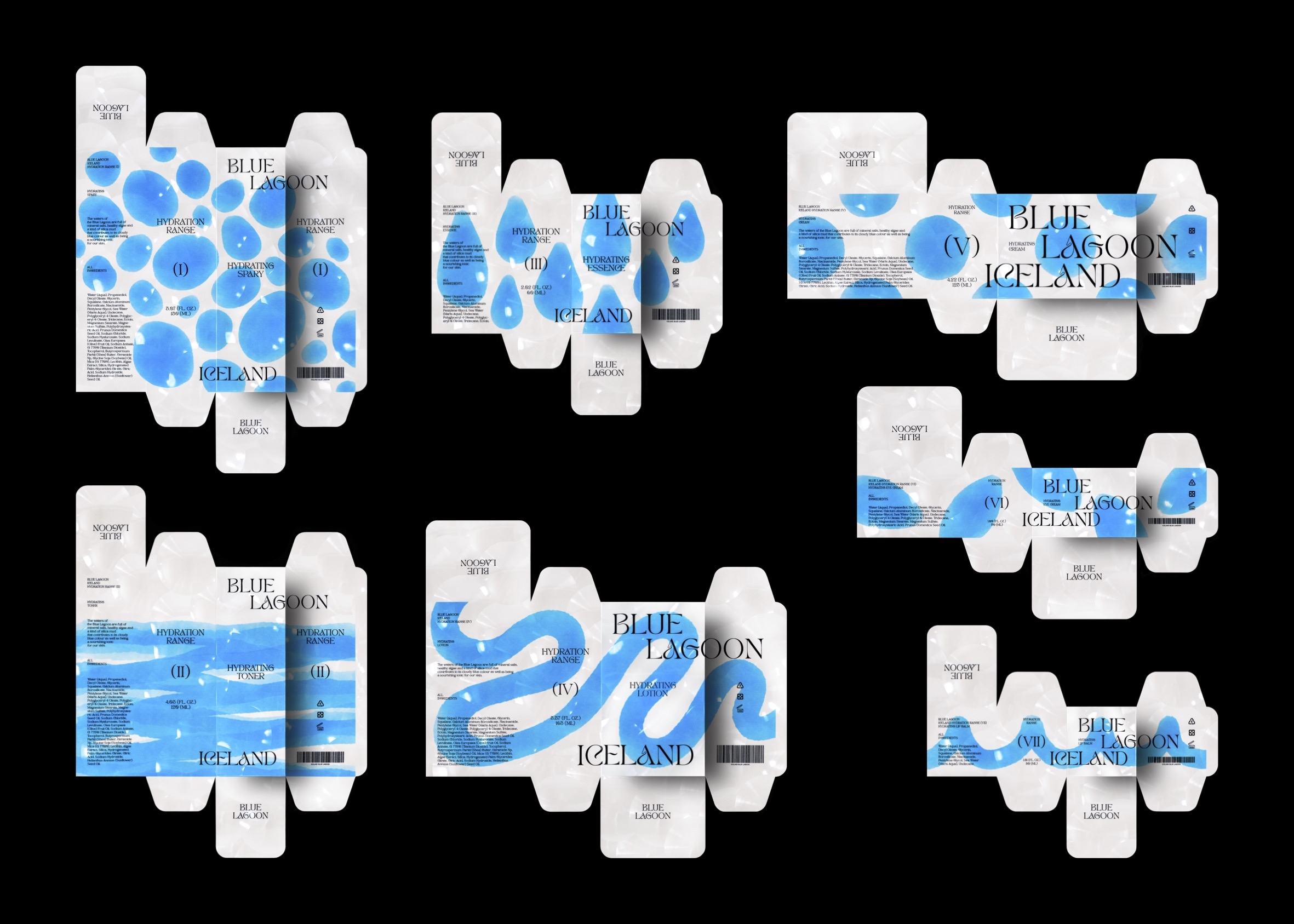
In order to echo the unique color of the lake, the packaging of “Blue Lagoon” aims to present the visual effect of skin care products in the form of watercolor. To make the theme more visible, the design process focused primarily on the audience’s perspective when establishing connections between brand, product, ingredients and visuals.
There are seven types of moisturizing products, including spray, toner, essence, lotion, cream, etc. In addition, the facial features are designed to identify areas of the body where the product can be applied. For example, the eye cream’s packaging is inspired by the eyes and cheeks, while the lip mask’s packaging is heavily inspired by the upper lip.
CREDIT
- Agency/Creative: K LASER Design Lab.
- Article Title: Capturing Tranquility: Blue Lagoon Hydration Skincare Range Packaging Design by K LASER Design Lab.
- Organisation/Entity: Agency
- Project Type: Packaging
- Project Status: Published
- Agency/Creative Country: Taiwan
- Agency/Creative City: Hsinchu
- Market Region: Global
- Project Deliverables: Brand Creation, Brand Design, Graphic Design, Illustration, Packaging Design
- Format: Box
- Industry: Beauty/Cosmetics
- Keywords: WBDS Agency Design Awards 2023/23
-
Credits:
Creative: Curtis Ju
Designer: ZuHao Zhang
Photographer: ZuHao Zhang
Material: K LASER


