After surviving breast cancer, Krystal James was inspired to launch Soapy Faith, a family-owned clean beauty & bodycare brand specially formulated for sensitive skin. Natural products don’t have to be boring, so we partnered to create a visual identity designed to bring the fun to bodycare while inspiring consumers to reevaluate what they absorb physically and mentally.
Collaborating with the founders, we dove head-first into strategy and oriented Soapy Faith around three central pillars: fun, vegan, and faith-based. Christian brands are often misunderstood to be cloying or stale, so we playfully positioned the brand as being Godsent, embracing puns, wordplay, and double entendres to break the mold and captivate consumers of all backgrounds. We also allowed the brand’s origin story of the Soapy Sisters’ trial to triumph shine, empowering the verbal identity with optimism and encouragement. From there, the products helped us do the talking. We showcased their simple and clean (but never boring) formula, introduced the HappySkin guarantee, and championed glycerin as the hero vegan ingredient.
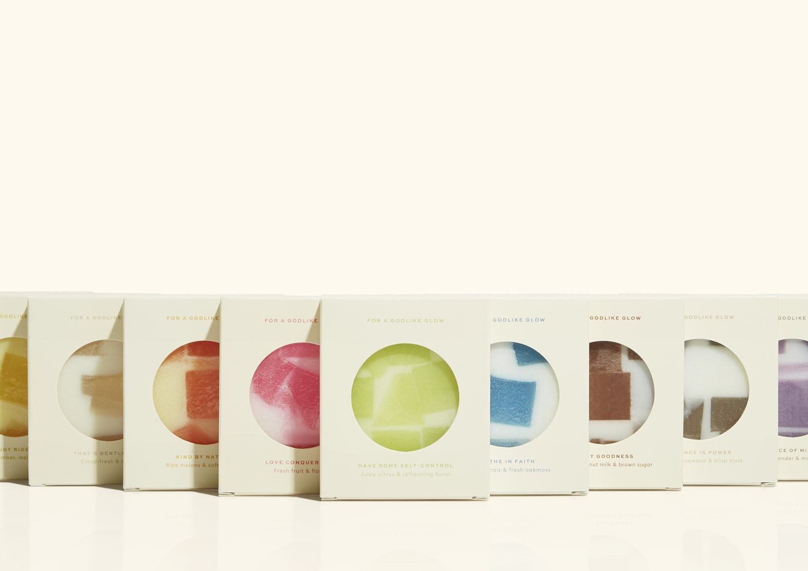
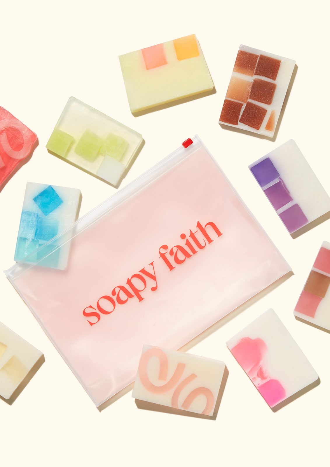
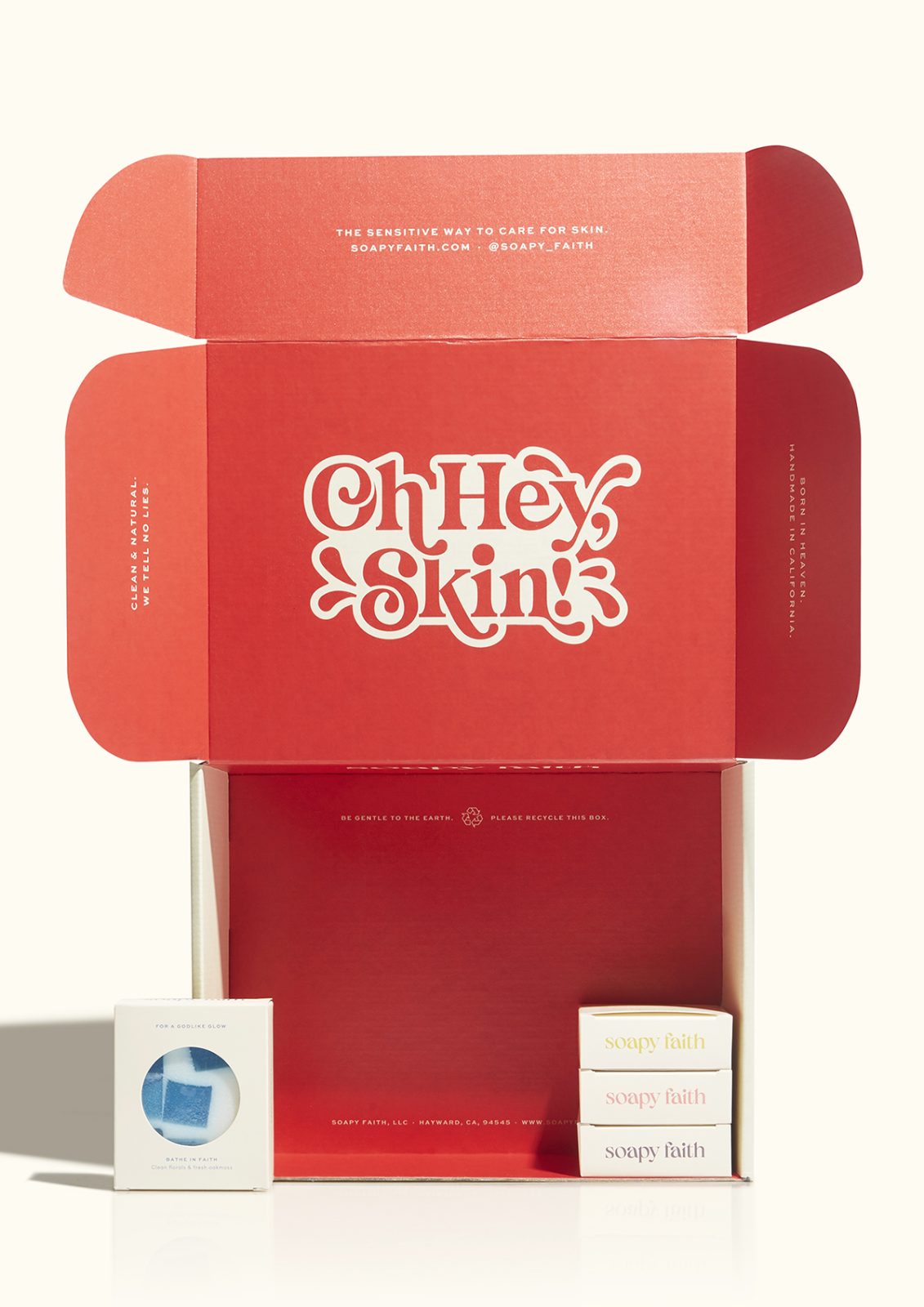
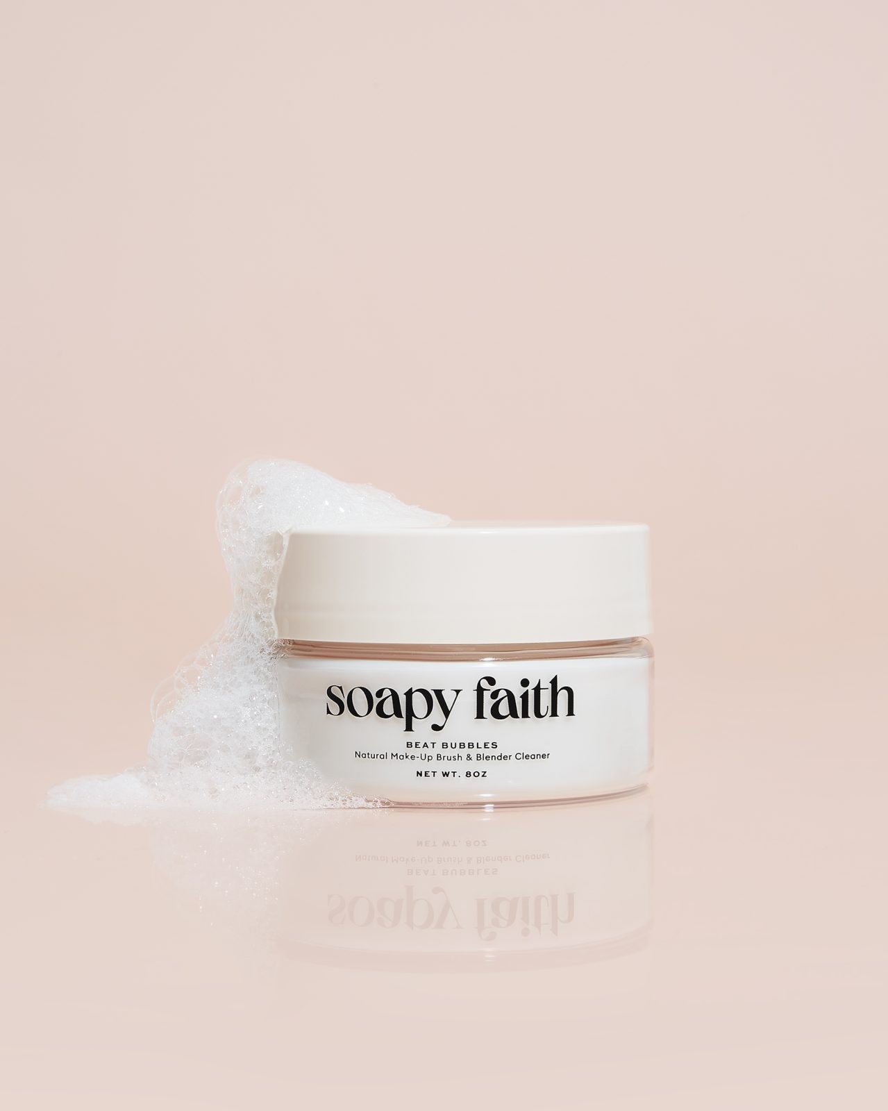
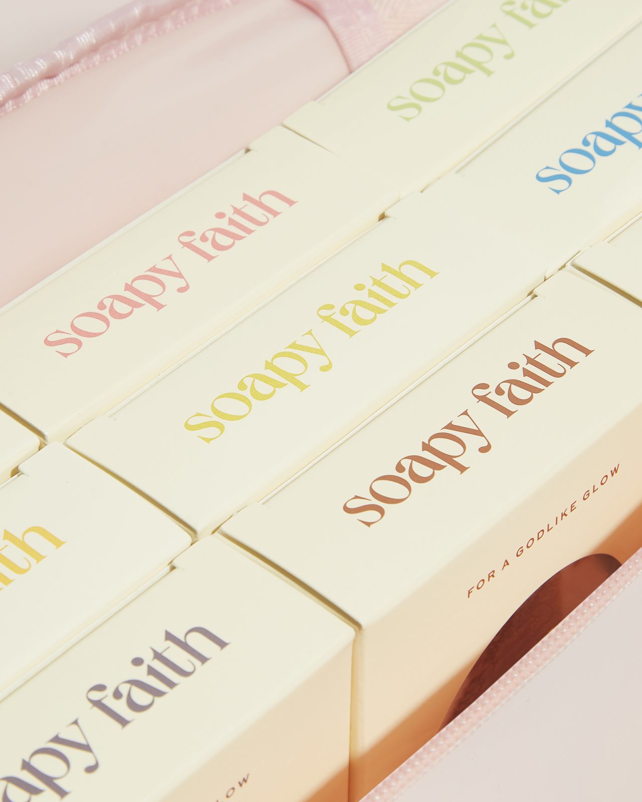
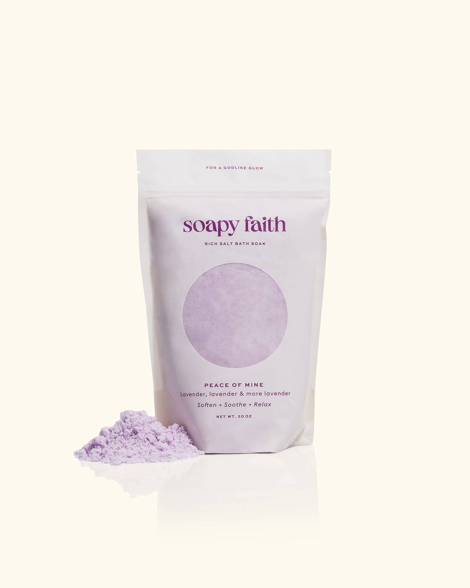
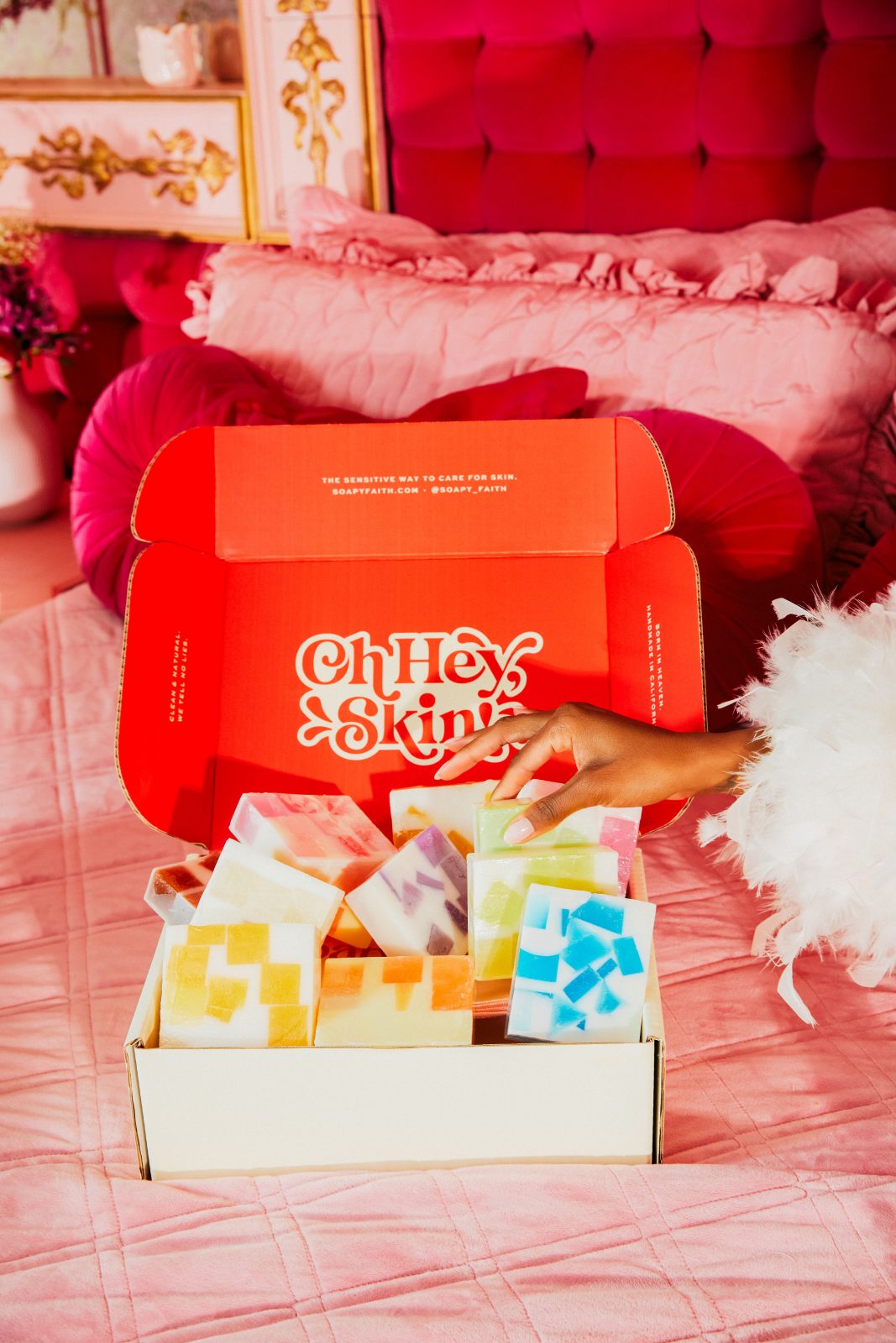
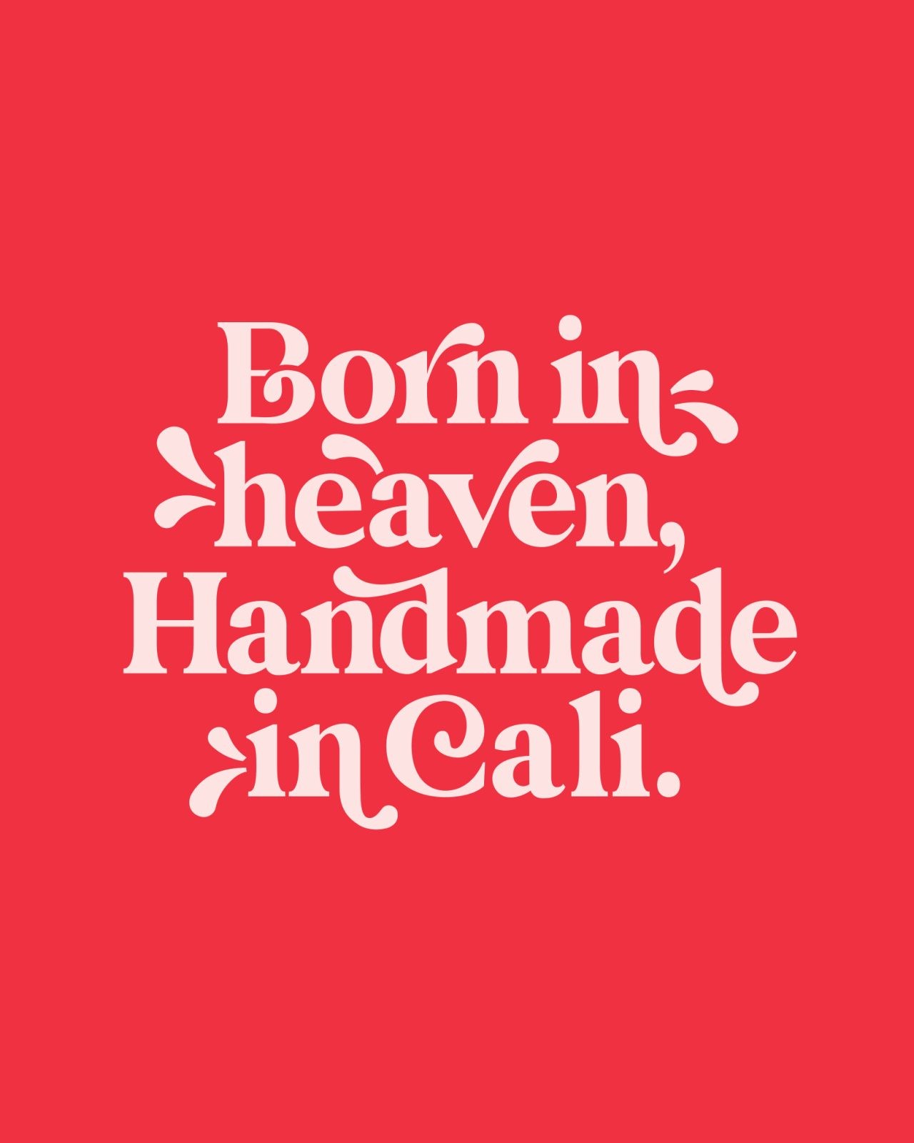
The visual identity needed to elevate Soapy Faith’s color palette and capture their sunny, uplifting brand story. We embraced a soft, swirly, 70s aesthetic as an ode to retro California, bucking the minimalist and neutral design trend in favor of bold and powerful colors that helped categorize the scents and special products such as their Breast Cancer Awareness line in the packaging phase. The relaxing design system was inspired by the brand’s original logo and its playful use of soap bubbles. We added water droplets and brought in typeface Queens to evoke that squeaky clean feeling and give the brand the final regal touch they needed to reign supreme in the bodycare space.
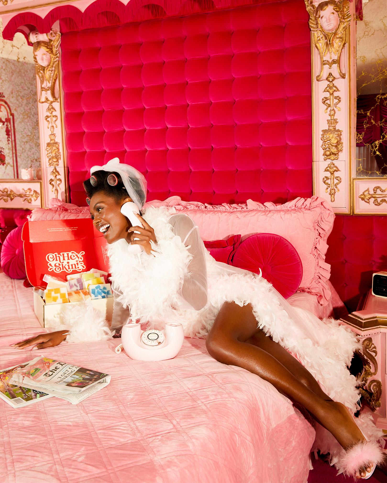
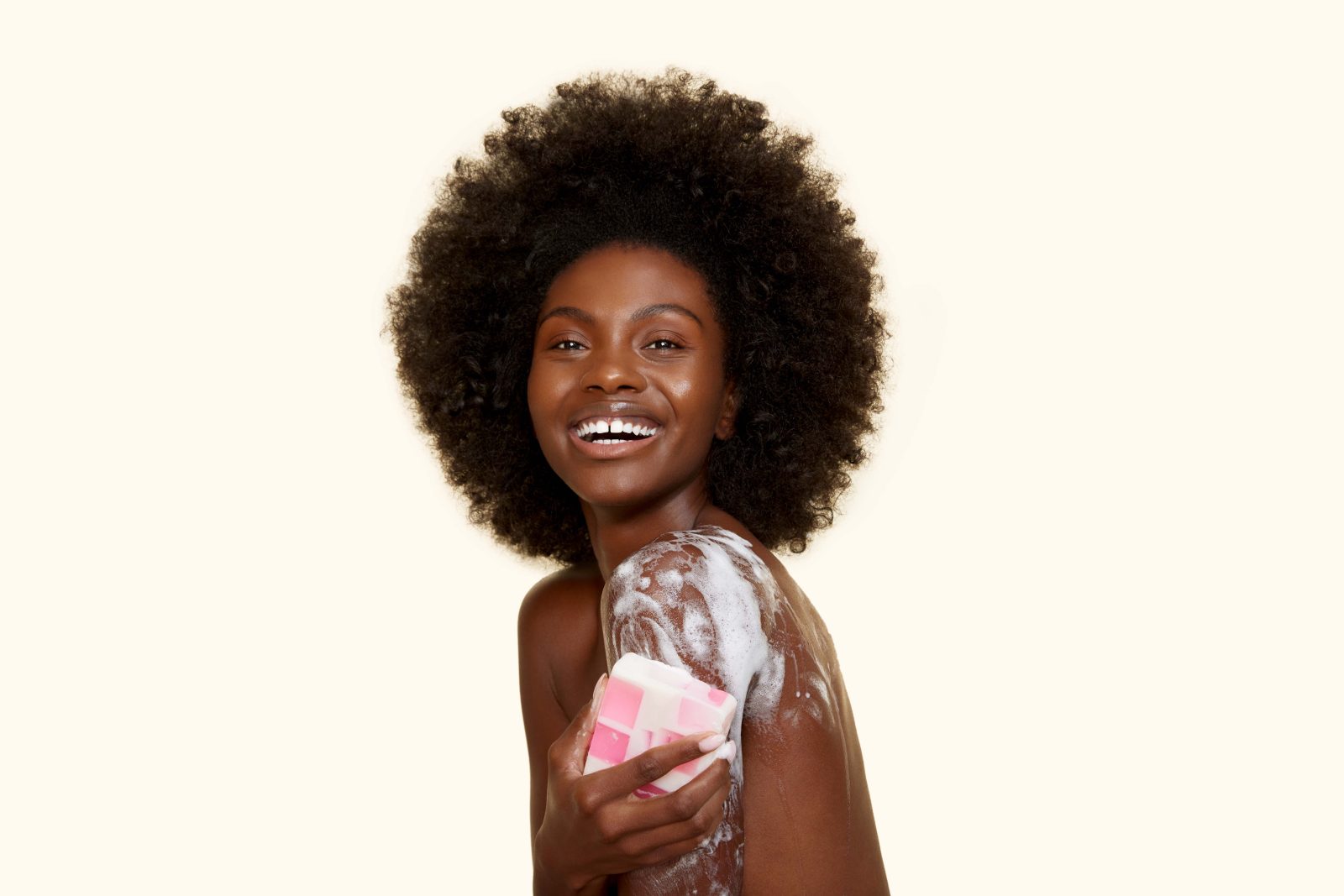
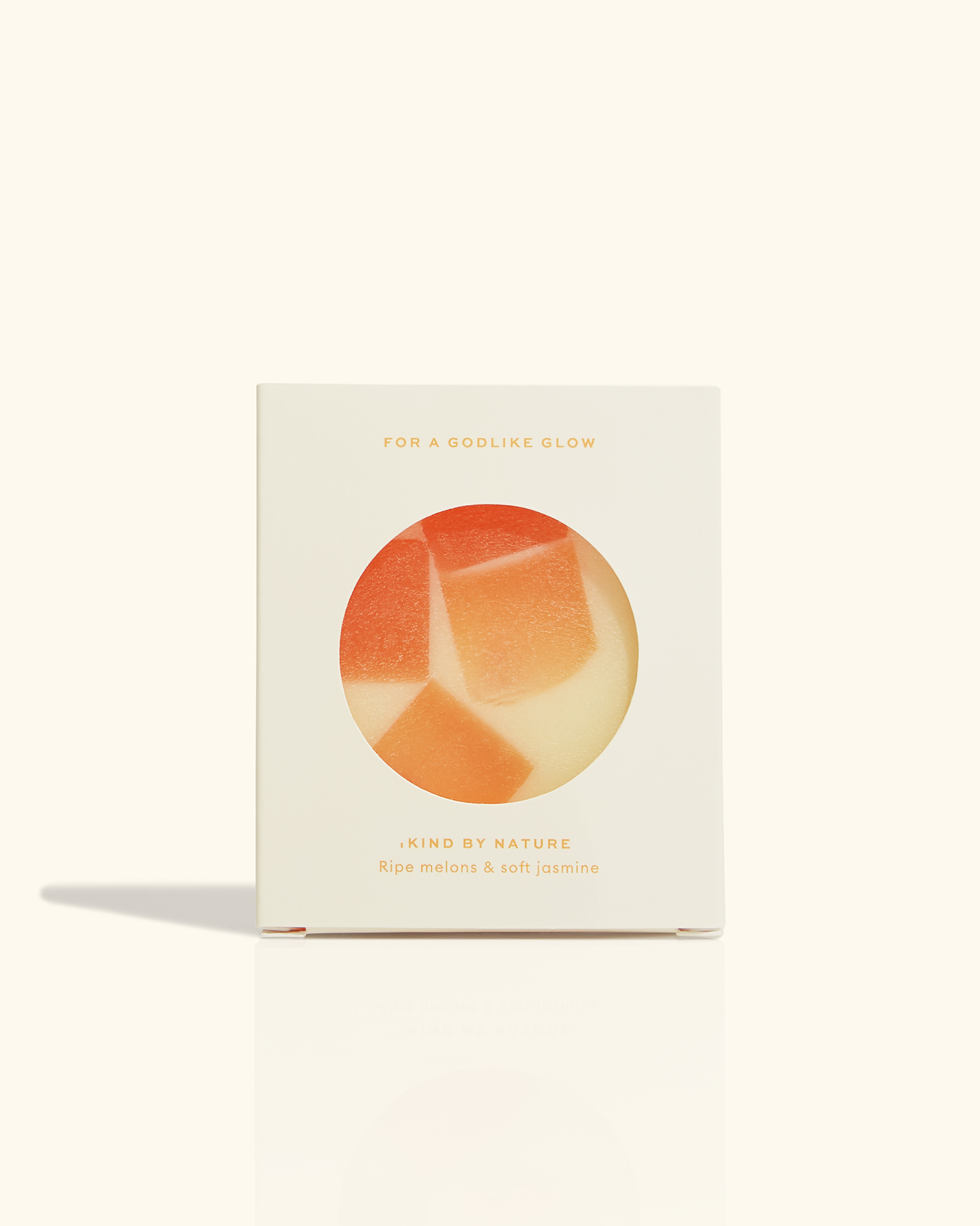
We zigged where others zag by creating a color palette free of green and brown, setting us apart in the vegan and organic product space. Instead, our warm, friendly, and bold colors encompassed joy and allowed the natural skin tones and packaging to elicit the clean nature of the brand. No detail was forgotten; we tackled every brand identity touch point, from the box tape to the 200 quote cards. We then began planning for the photoshoot. Casting was vital to our success as Soapy Faith was determined to break the glass ceiling of representation in the beauty industry, so we partnered with two gorgeous Black models to be the faces of the campaign. We were determined to give our leading lady an afro because hair that grows upward shouldn’t be a political statement! After scouting our location, we decided to blend both studio and on-location photography, with photographer Emilynn Rose shooting lifestyle and Halves shooting products. In-studio, we focused on capturing elegant and natural imagery of skin and bodies. Inspired by the summer sun, we harnessed our warm 70s aesthetic and shot on-location in a vintage California mansion in the heart of the desert!
CREDIT
- Agency/Creative: Saleah
- Article Title: Captivating Clean Beauty & Bodycare with Soapy Faith Branding and Packaging Design
- Organisation/Entity: Agency
- Project Type: Identity
- Project Status: Published
- Agency/Creative Country: United States
- Agency/Creative City: NYC
- Market Region: North America
- Project Deliverables: Advertising Photography, Beauty Photography, Brand Design, Brand Guidelines, Brand Identity, Brand Redesign, Brand Strategy, Brand Tone of Voice, Branding, Copywriting, Design, Graphic Design, Icon Design, Identity System, Logo Design, Packaging Design, Product Design, Product Photography, Set Design, Tone of Voice
- Industry: Beauty/Cosmetics
- Keywords: skincare, bodycare, body care, vegan, body care branding, beauty rebrand, skincare rebrand, black-owned cosmetics rebrand, woman-owned beauty branding, black-owned beauty branding, black-owned beauty rebrand, woman-owned beauty rebrand
-
Credits:
Creative Director: Shar Biggers
Designer: Jens Nilsson
Designer: Shar Biggers
Copywriting: Shar Biggers
Photographer: Emilynn Rose
Photographers: James Lyle
Brand Strategy: Shar Biggers


