


BACKGROUND & BRIEF
Capsicana brings authentic Latin American flavours to the UK. Founded on a market stall and inspired by travels around South America, today it’s a success story, owned by AB World Foods and listed across all major UK supermarkets.
The 2025 packaging refresh represents the latest chapter in the brand’s evolution, although it started to take shape back in 2021 when we first worked with the team. Our brief: to sharpen positioning and create a brand world that captures the spirit of Latin America. Packaging and logo were not in scope at that time – as a challenger, Capsicana didn’t have budget to roll-out a new identity.
The resulting work established the core idea and distinctive look that continues to drive the brand today. It also became the foundation for the latest brand and packaging refresh brief.
With ambitions to quadruple growth by 2028, our new task was to evolve the packaging. We needed to bring the vibrancy and emotion of the brand world into a design system that could build equity, drive standout, improve navigation and create cohesion across an expanding range.
OUR SOLUTION
When we first began working with Capsicana, the brand had strong foundations but lacked a creative, consumer-facing hook that could inspire storytelling and design. We helped identify a core audience of ‘On-Trend Chefs’ – creative, instinctive cooks who love bold flavours but don’t necessarily have the time or confidence to make Latin food from scratch. With noticeably fresher, brighter and more flavoursome products versus competitors, we opted to shift the brand from a geography lesson into a more emotive space – celebrating the sociable informality and fresh flavours of Latin American cooking.
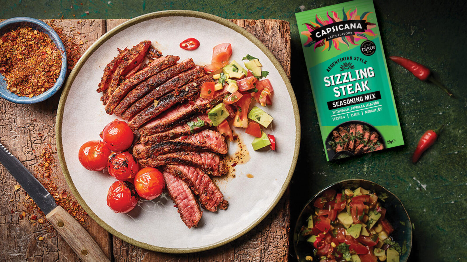
Our big idea – Create a Fresh Latin Vibe – inspired a vibrant brand world and the creation of a dynamic logo lock-up of flames and sparks – a visual metaphor for the heat, flavour and passion of Latin America. We also introduced a zingy fresh citrus-green brand colour, bold type and a more confident, inspiring brand voice.
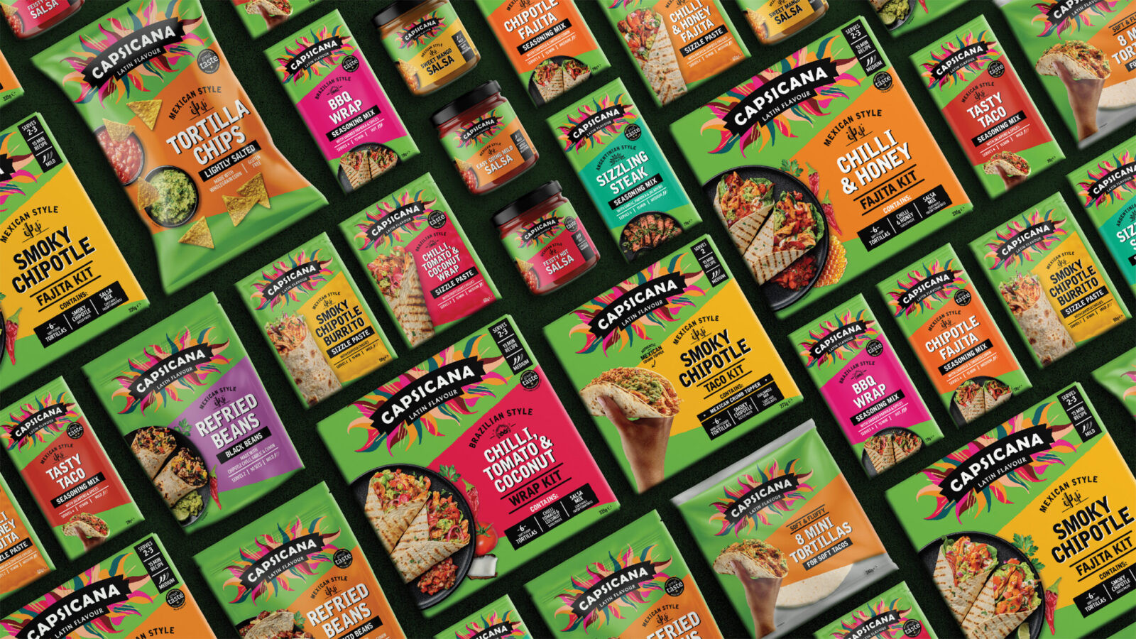
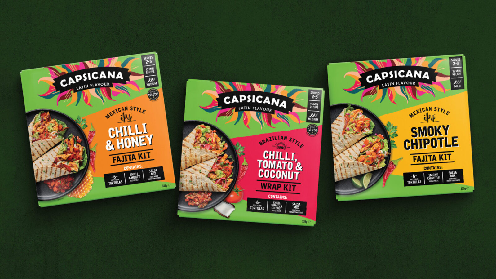
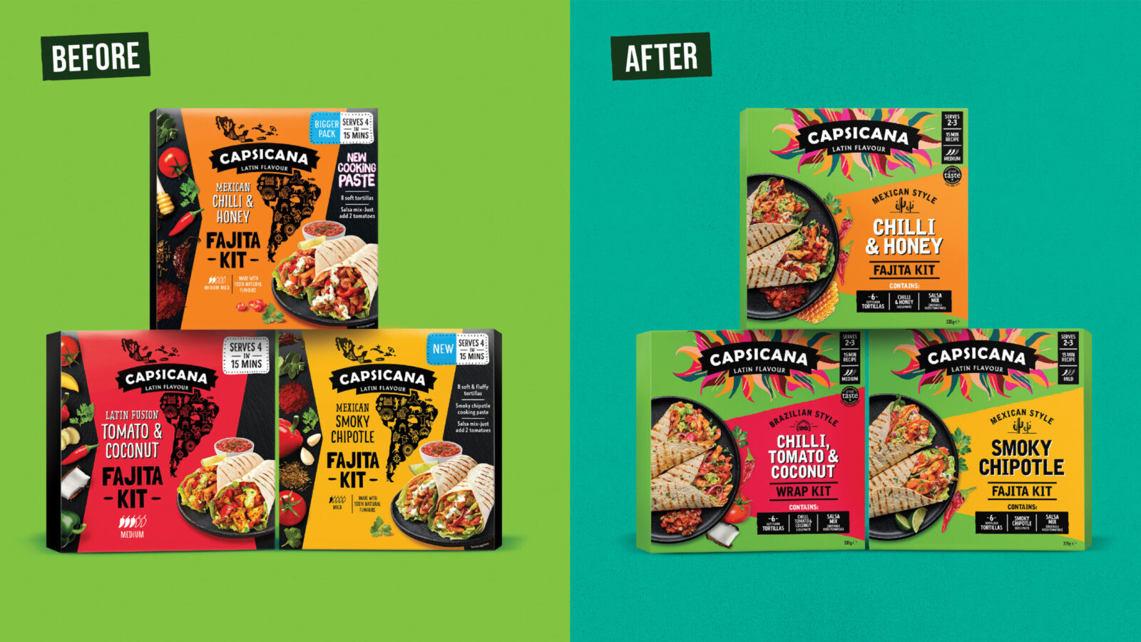
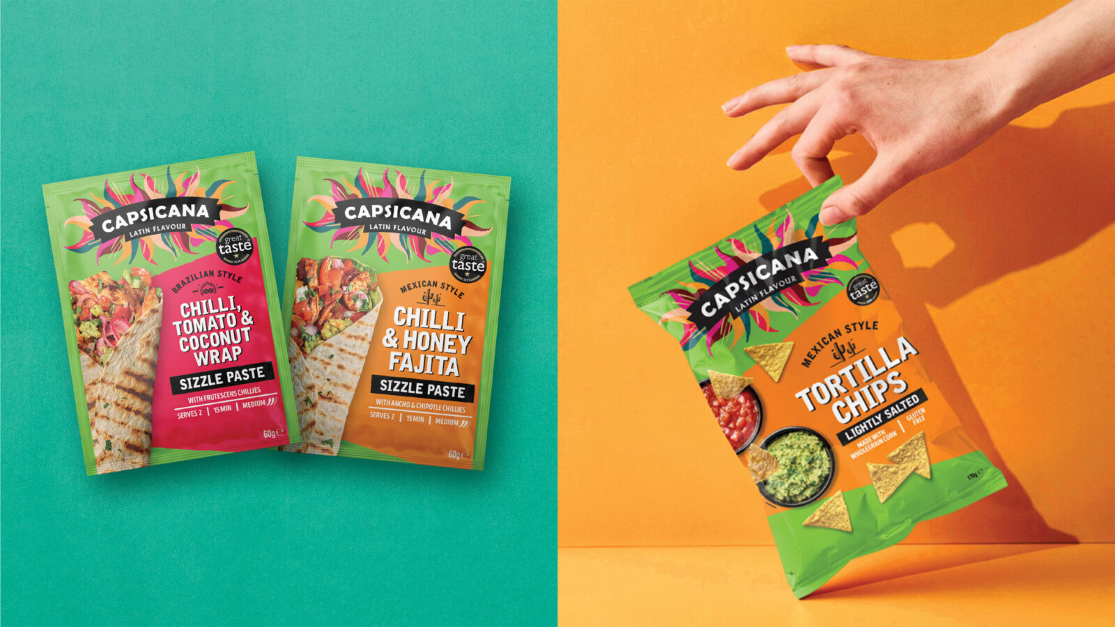
Visually, the packaging refresh retains the essence of our original brand world work but takes it to the next level. We intensified the signature zingy green to deliver brand blocking and stand-out. It’s accompanied by vibrant shards of colour which create a joyful fiesta-feel at fixture and differentiate flavours.
We refined the messaging hierarchy and emboldened type to shift focus from the product type to Capsicana’s superpower – flavour! Product photography is fresher, more delicious and more inspiring, whilst illustrative icons celebrate provenance and aid navigation.
RESULTS
The impact of the original strategy and brand world project has been transformative. It contributed to the brand achieving major milestones, including securing listings in all leading UK supermarkets and its acquisition by AB World Foods.
The 2025 refresh and new packaging amplify this further, bringing every part of the brand together – strategically, visually and emotionally. It transforms Capsicana’s shelf presence, reinforces its flavour-first positioning and celebrates the creativity at the heart of the brand.

CREDIT
- Agency/Creative: The Collaborators
- Article Title: Capsicana: Awakening Mealtimes with a Fresh Latin Vibe by The Collaborators
- Organisation/Entity: Agency
- Project Status: Published
- Agency/Creative Country: United Kingdom
- Agency/Creative City: Bristol
- Market Region: United Kingdom and Australia
- Project Deliverables: 2D Design, Art Direction, Brand Architecture, Brand Design, Brand Guidelines, Brand Identity, Brand Mark, Brand Redesign, Brand Strategy, Brand Tone of Voice, Brand World, Branding, Copywriting, Design, Insight, Logo Design, Packaging Design, Packaging Guidelines, Photography, Rebranding, Tone of Voice
- Industry: Food/Beverage
- Keywords: WBDS Agency Design Awards 2025/26 , World Food, Packaging Redesign, Branding, Brand Design, Meal Kits, Mexican Food, Strategic Branding, Brand World
-
Credits:
Creative Director: Mary Lewis
Design Director: Ben Shrubsole
Strategy & Copywriting: Jayne Noblet
Client Director: Sally Batty
Artwork: Christopher Ellis


