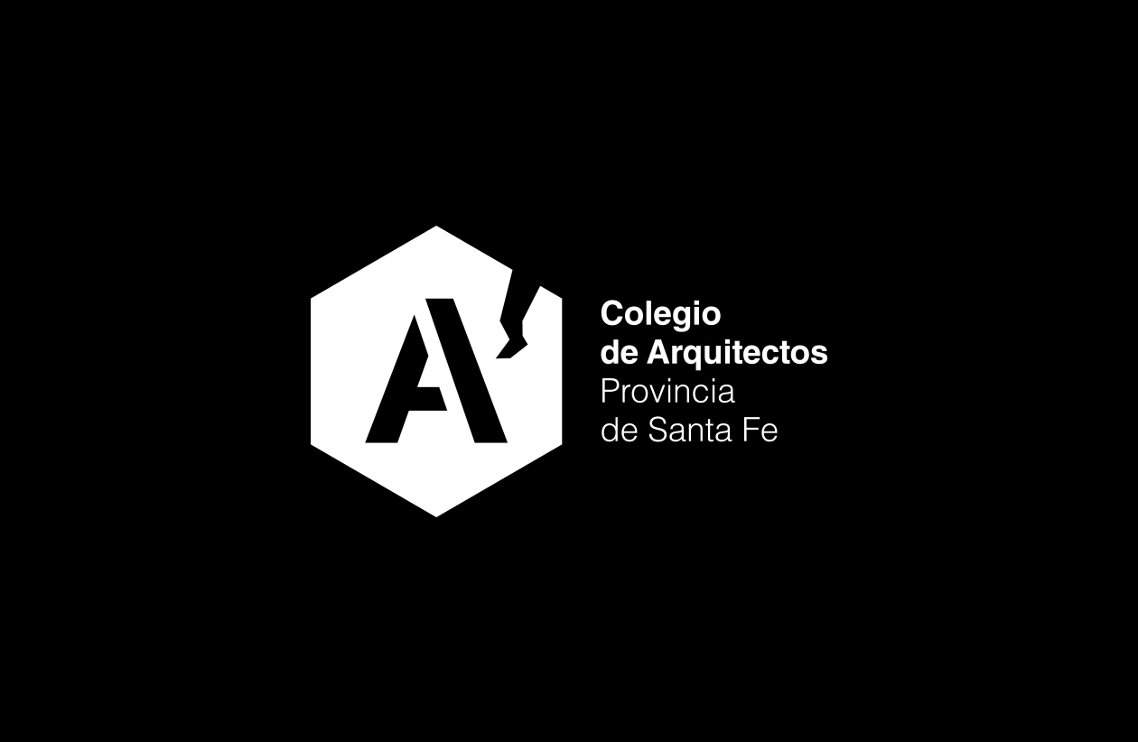
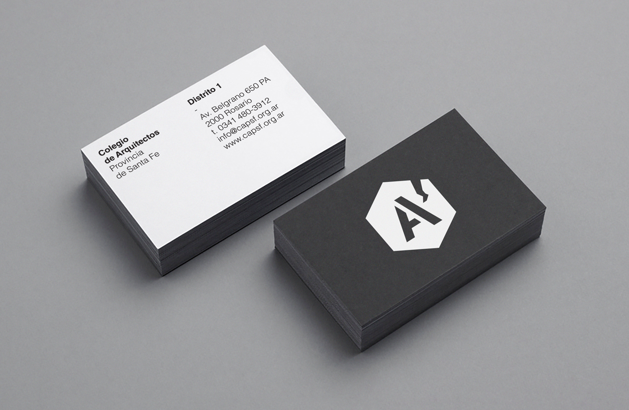
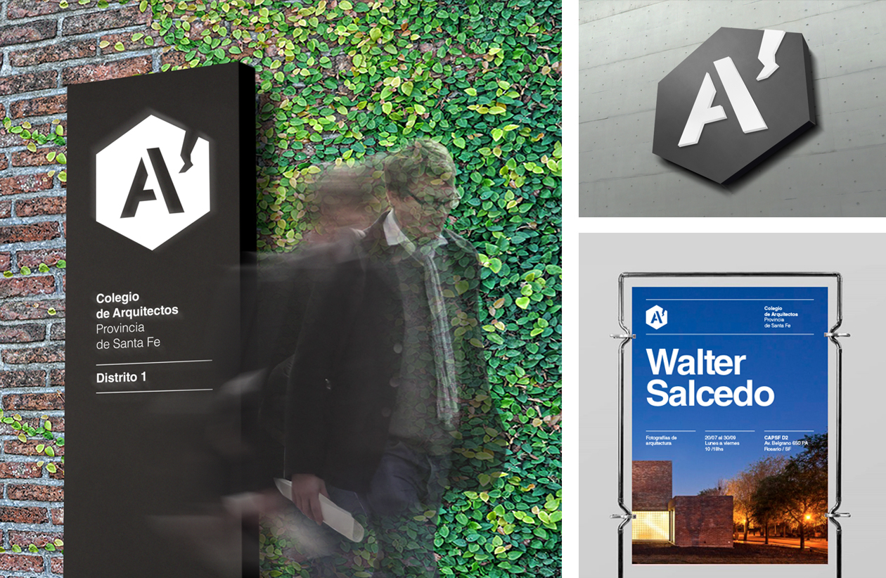
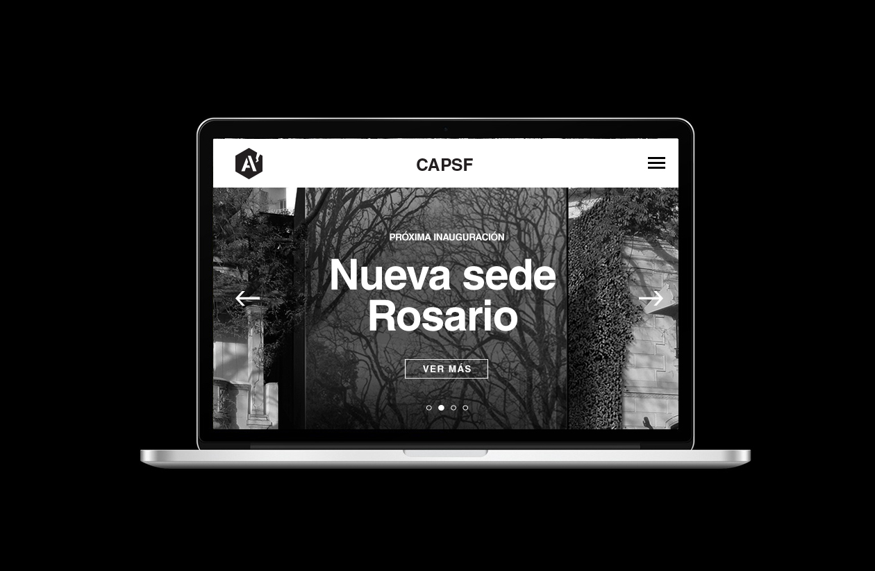
The College of Architects of the province of Santa Fe called a contest for the creation of the new visual identity. We bet on giving prominence to the symbol, where the A of architects stands out as the main element. It is accompanied by a synthesis of the map of the Province of Santa Fe, which with its characteristic form quickly identifies it by making the brand unique. To enhance the icon, we work with the geometric figure of the hexagon as an enveloping shape, whose 6 sides / vertices represent the 6 districts that make up the CAPSF. 2019.

CREDIT
- Agency/Creative: Bardelli Studio
- Article Title: CAPSF Visual Identity Competition
- Organisation/Entity: Freelance, Published Commercial Design
- Project Type: Identity
- Agency/Creative Country: Spain
- Market Region: South America
- Project Deliverables: Brand Architecture, Brand Creation, Brand Identity, Branding, Graphic Design, Identity System, Product Architecture
- Industry: Construction
- Keywords: Competition. Visual Identity. CAPSF.
FEEDBACK
Relevance: Solution/idea in relation to brand, product or service
Implementation: Attention, detailing and finishing of final solution
Presentation: Text, visualisation and quality of the presentation


