


Denomination crafts a striking brand identity grounded in geological drama and artisan purity. In a category long dominated by Scotch conventions – paper labels, serif typography, heritage cues – a new force rises from Tasmania’s wild coastline to redefine luxury whisky.
Introducing Cape Hauy, a brand that breaks free from category codes with brave creativity and a profound sense of place. Unlike anything else on the market, Cape Hauy embodies the raw beauty and geological richness of its origin. Tasmania is home to the world’s largest surface exposure of dolerite –
an ancient, dramatic rock that sculpts the island’s vertical sea cliffs. Nowhere is this more breathtaking than at Cape Hauy, whose towering dolerite columns inspired every element of the brand’s visual language.
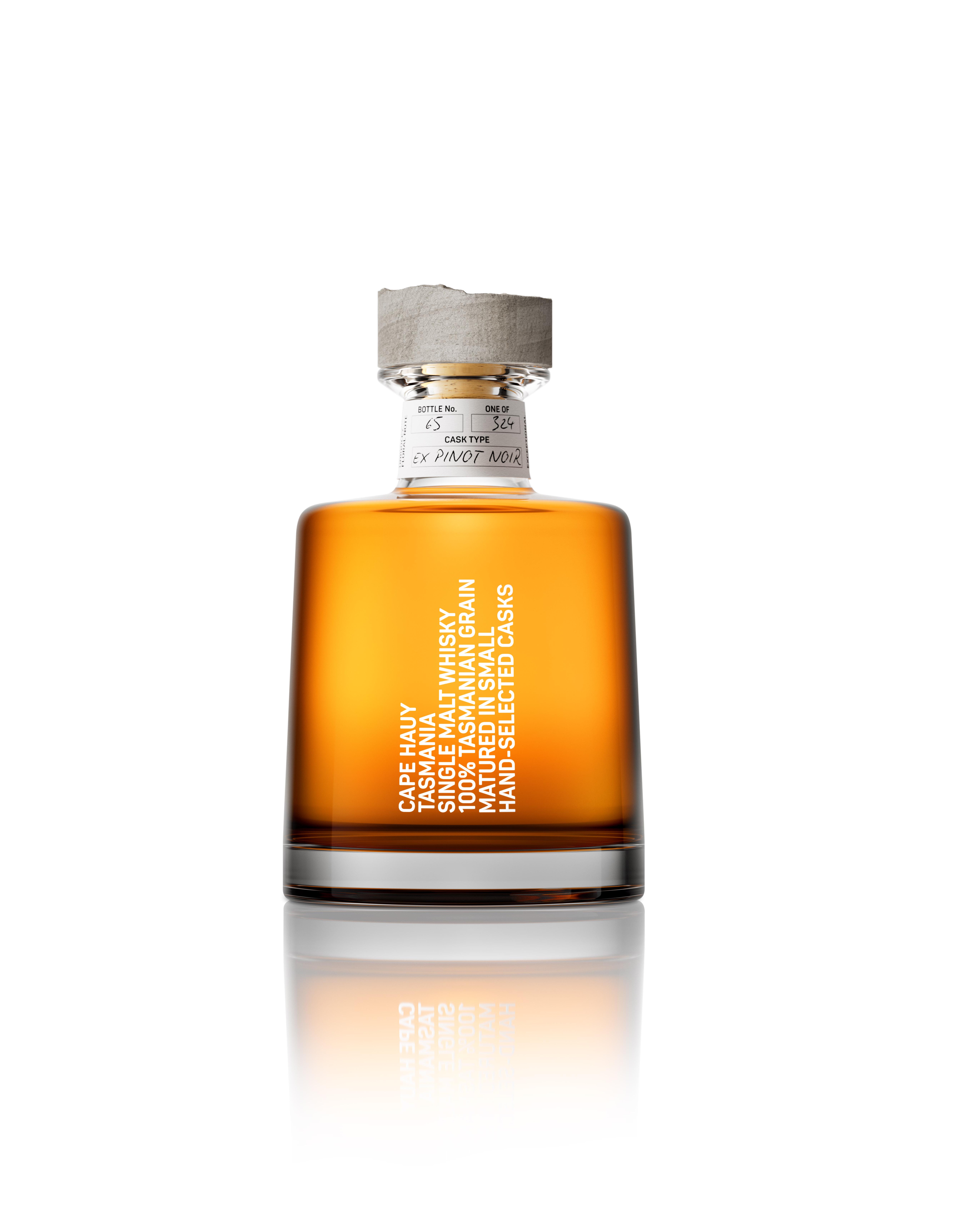
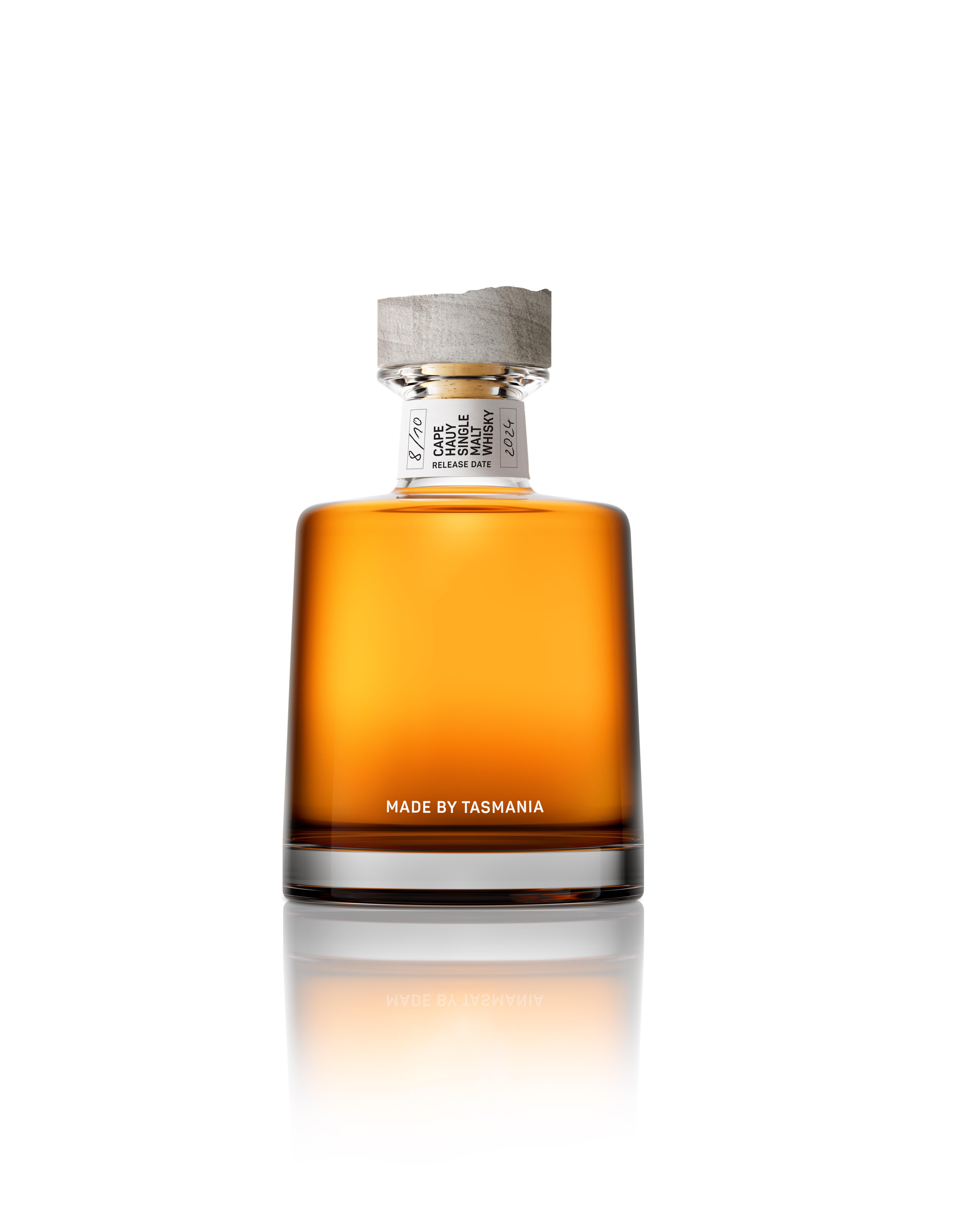
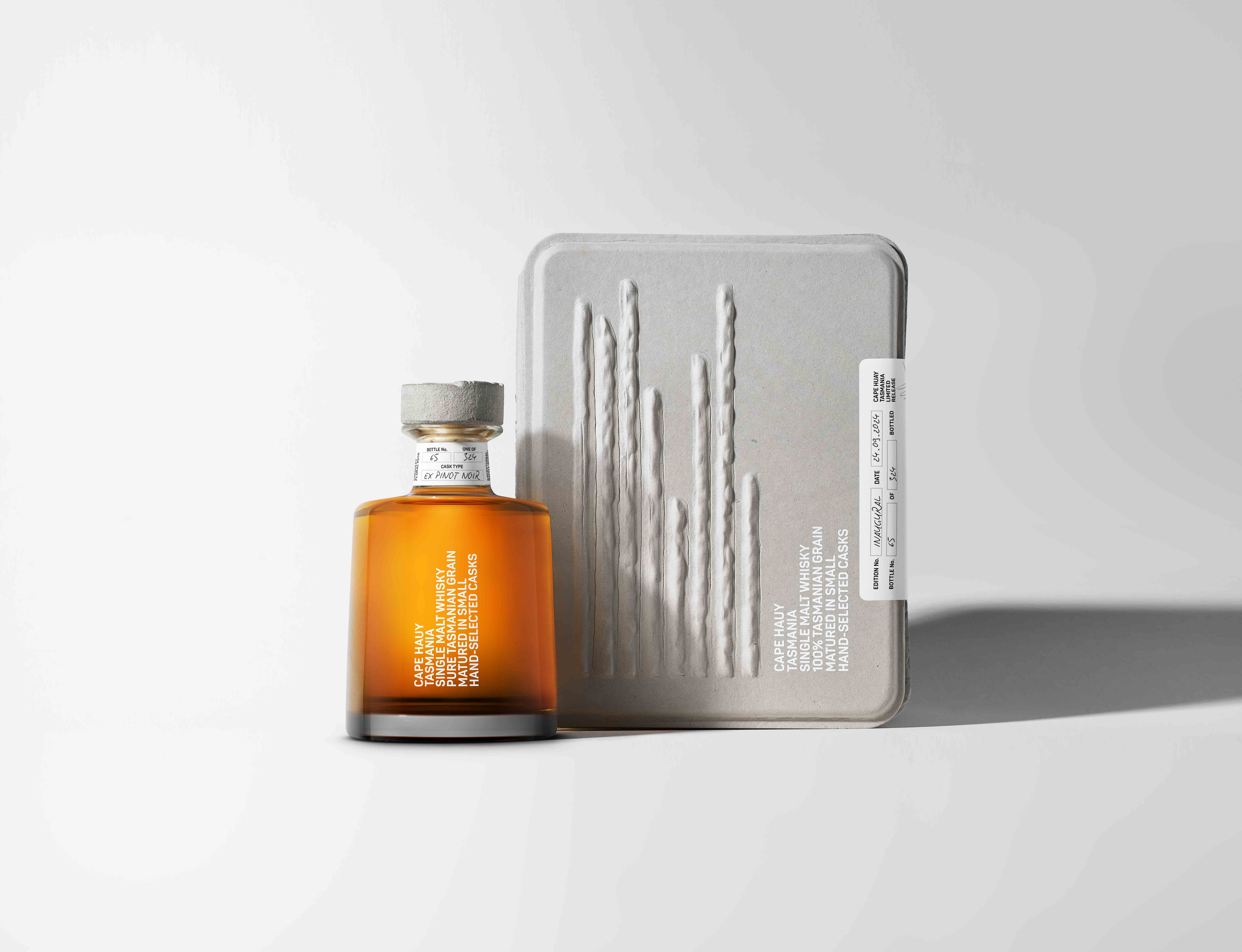
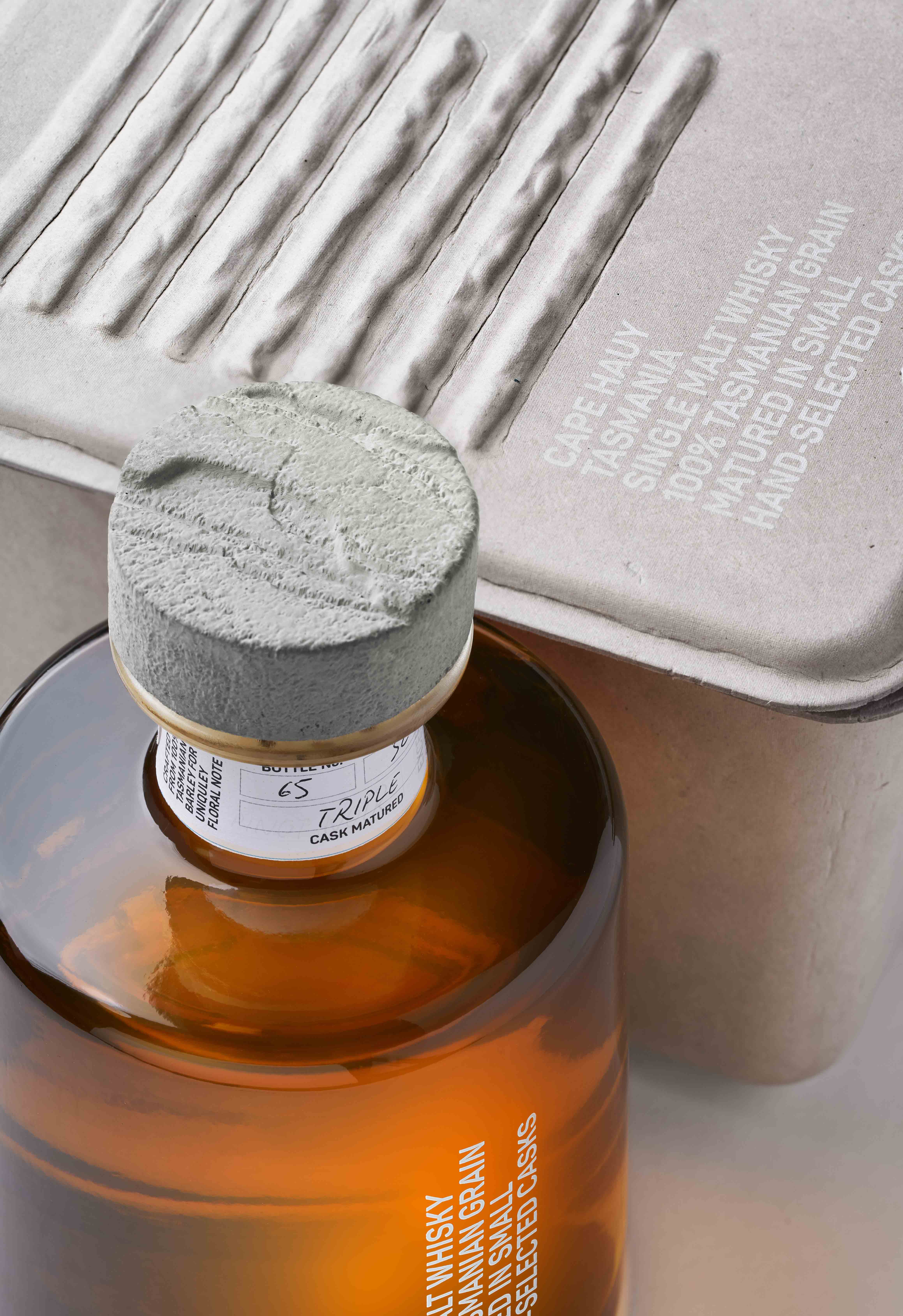
From material to form, Cape Hauy is brand design agency Denomination’s study in sensory storytelling. The bespoke stopper, hewn from a dolerite-like stone, captures the textured drama of the cliffs. Typography is stacked vertically, a bold structural gesture mirroring the geological formations themselves. Every detail reflects the purity, integrity, and artistry of the whisky inside.
The liquid, made entirely from Tasmanian-grown grain and local spring water, carries a floral signature shaped by the island’s unique terroir – soil influenced by dolerite, climate softened by ocean air. The back label proudly states: Made by Tasmania – a declaration of origin and authenticity.
An off-the-shelf bottle is elevated with a smoky grey vignette that fades to reveal the golden liquid, with the brand’s world features blind-embossed dolerite motifs – minimalist, architectural, unforgettable.
“The brief was to create a whisky brand with a deep sense of place and a disruptive design ethos,” says Rowena Curlewis, Co-founder and CEO of Denomination. “Cape Hauy doesn’t just reference Tasmania – it’s carved from it.”
The inaugural release of is just 1,000 bottles, available from May 2025. This is not just a whisky. It is a sculpture in liquid and stone – designed to be savoured, shared, and remembered.
CREDIT
- Agency/Creative: Denomination
- Article Title: Cape Hauy Launches: a Brave New Tasmanian Whisky Inspired by Nature’s Rarest Stone
- Organisation/Entity: Agency
- Project Type: Packaging
- Project Status: Published
- Agency/Creative Country: Australia
- Agency/Creative City: Sydney
- Market Region: Asia
- Project Deliverables: Packaging Design, Packaging Guidelines, Structural Design
- Format: Bottle
- Industry: Food/Beverage
- Keywords: Whisky, Australian Whisky
-
Credits:
Creative Director: Margaret Nolan
Art Director: Frances Chapman
Strategy: Anna Hamill
Client Services: Alexandra Warren
Photography: Kristian Bull


