


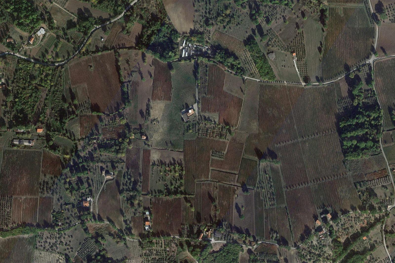
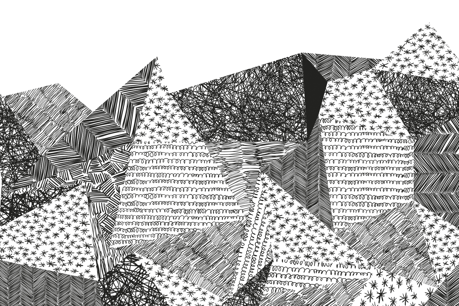
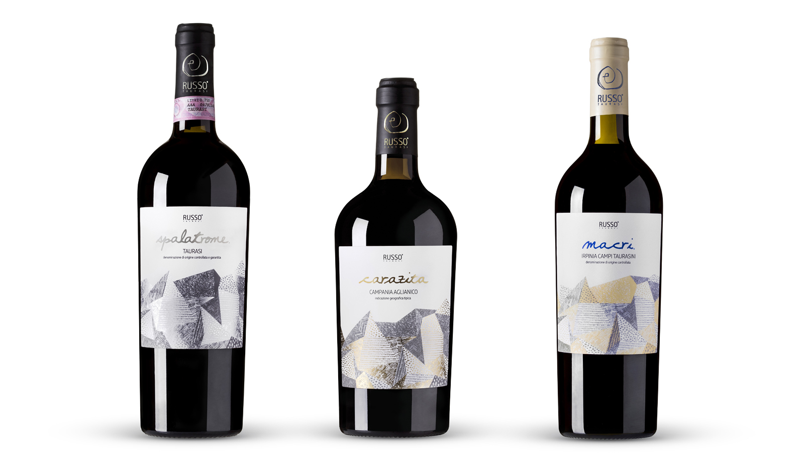
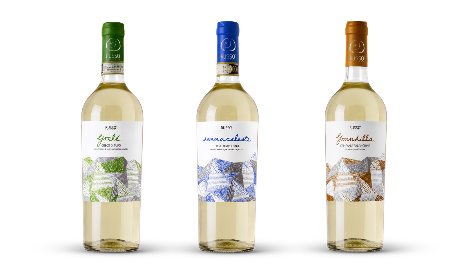
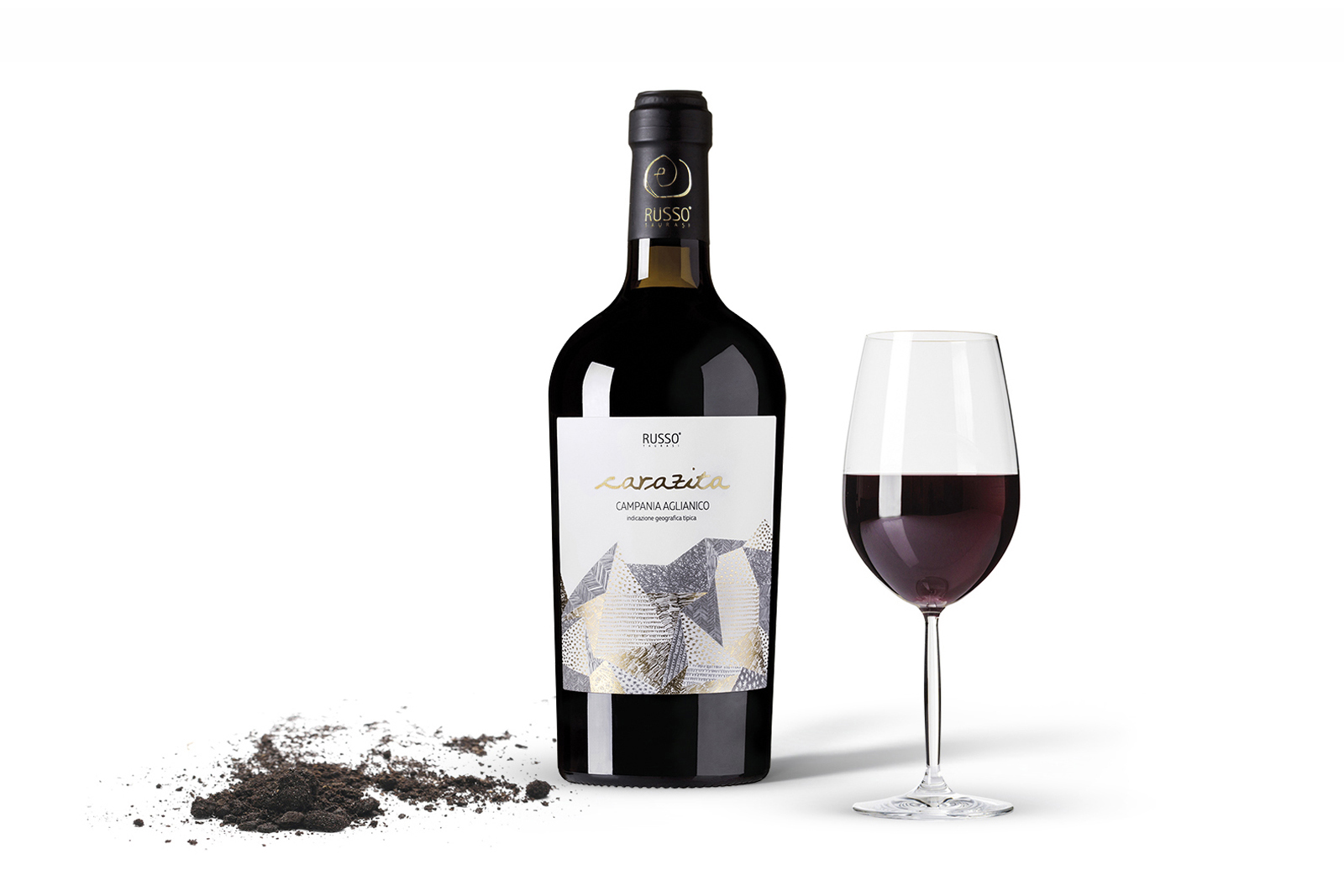
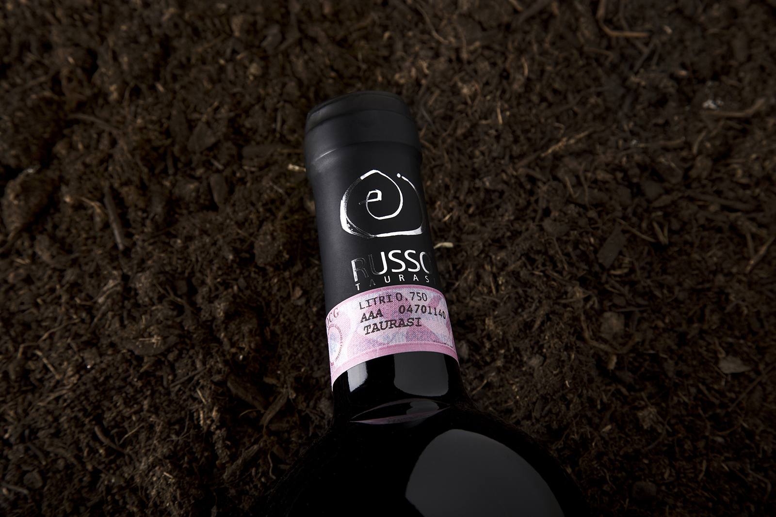
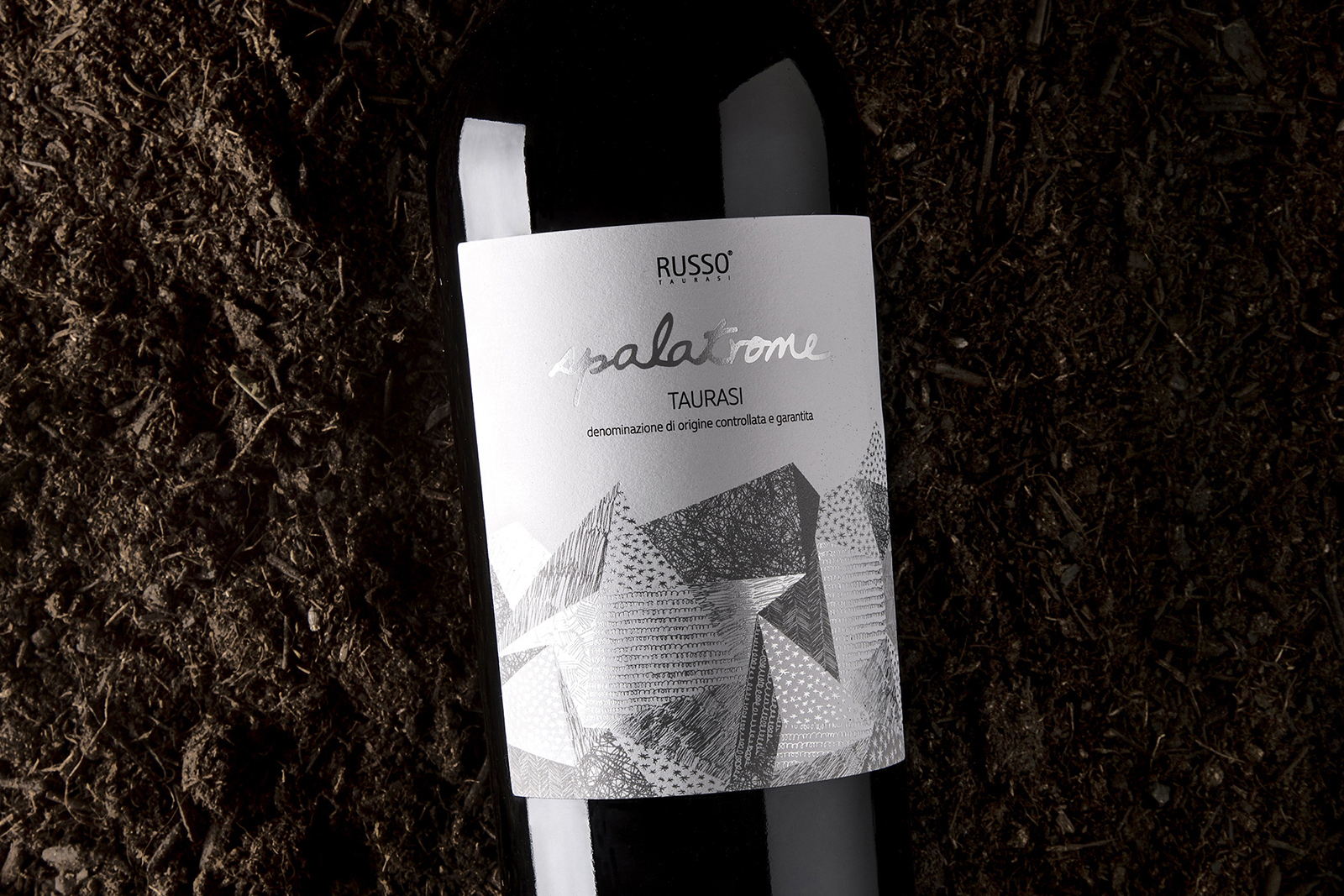
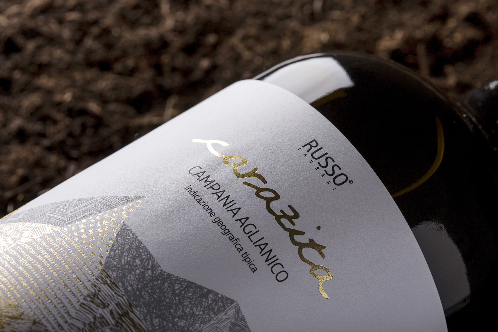
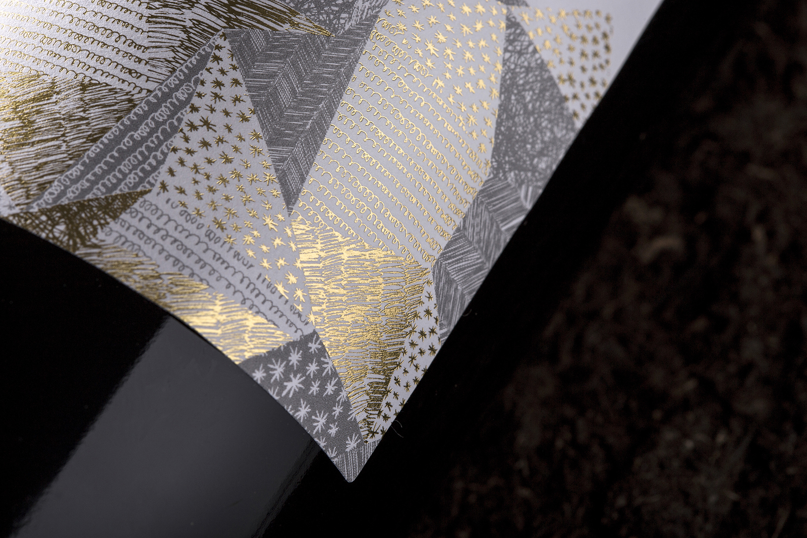
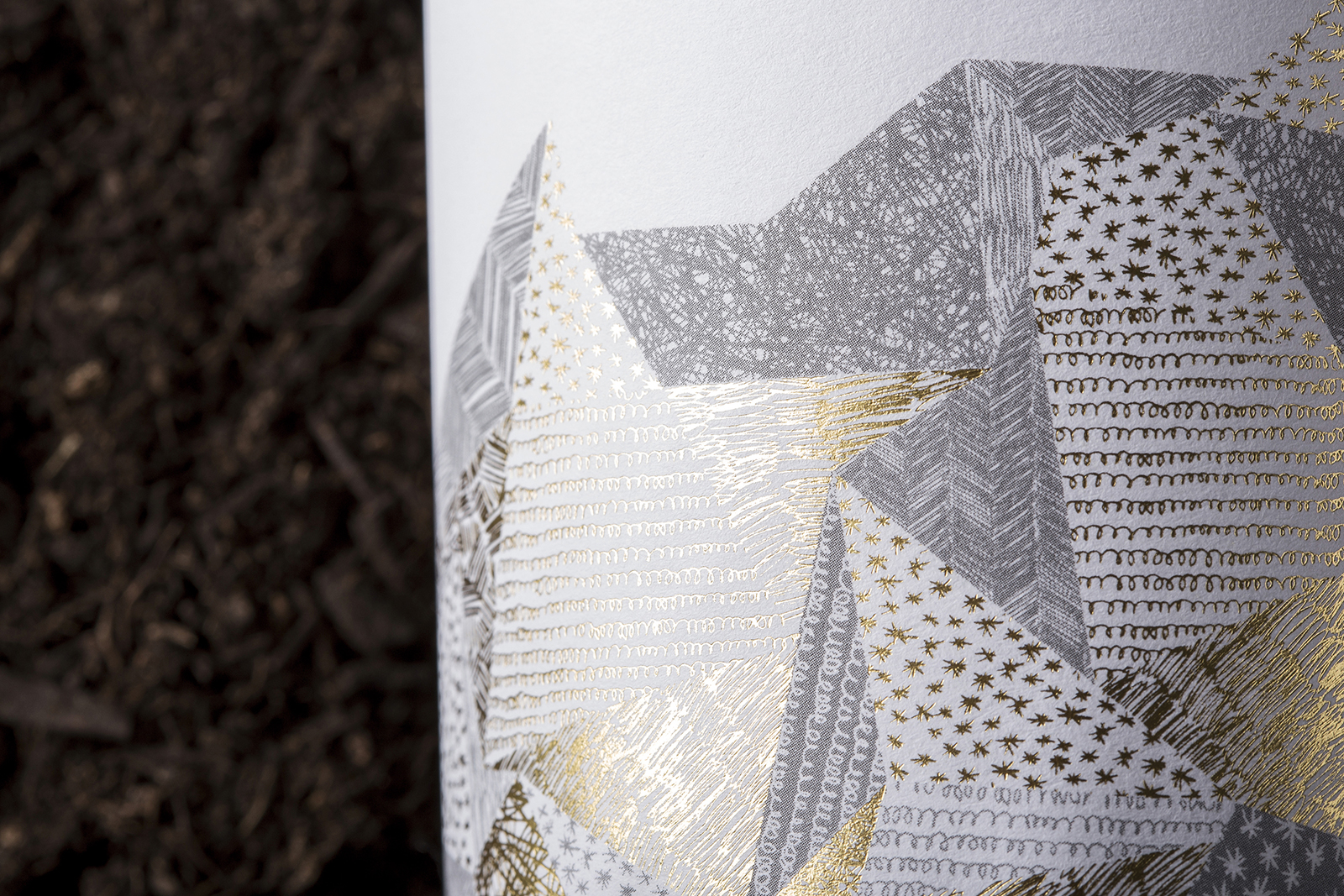
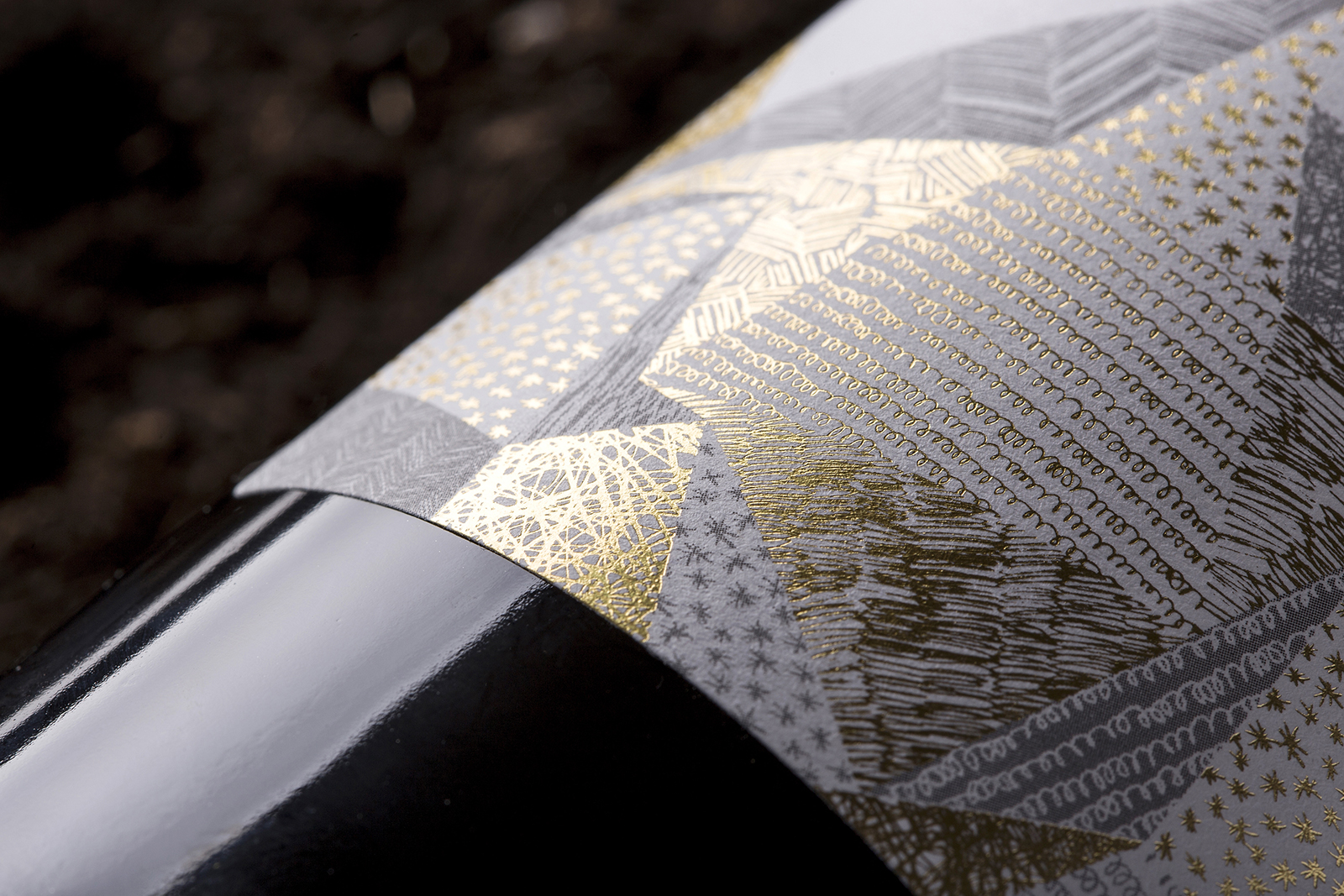
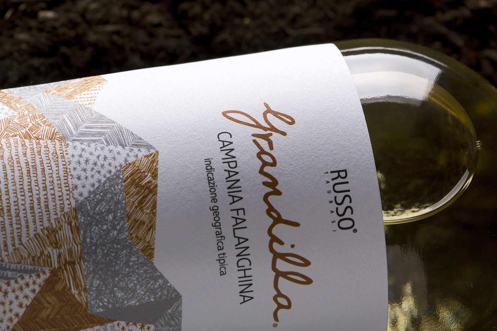
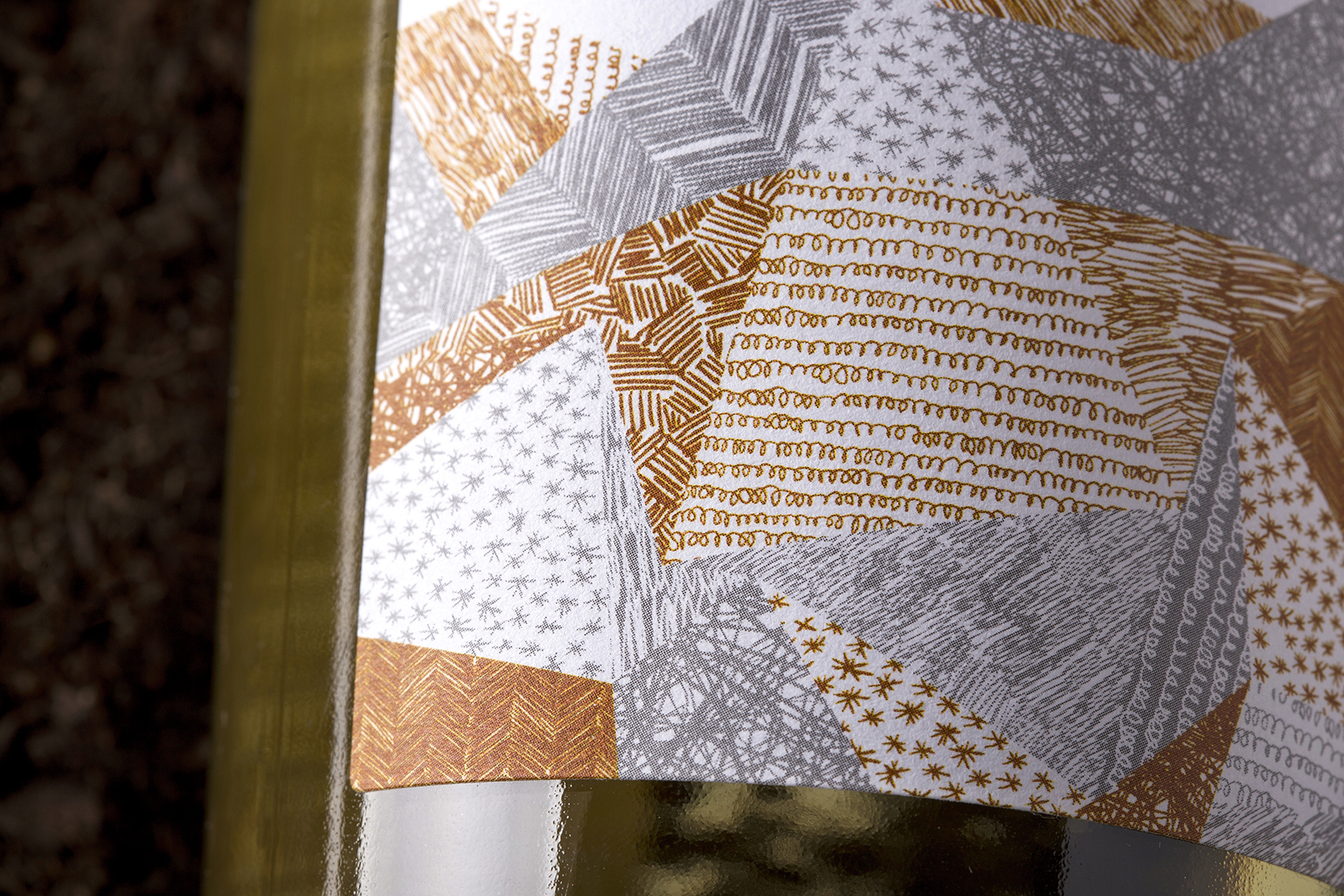
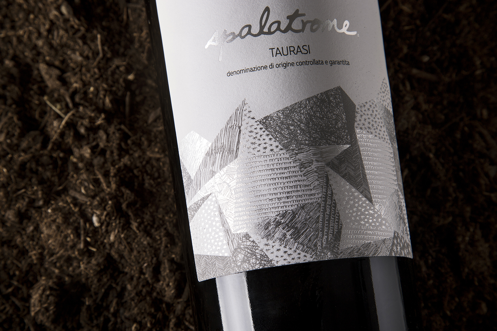
The term autochthonous (from Greek language autòs: same, and chthòn: land) is the starting point that inspired exceptional graphic design for the creation of the line of labels for Cantine Russo. When mentioning autochthonous, we refer to vine varieties that have been located in the territory for at least a thousand years and for which the single-variety vinification is rigorously observed. The shapes and lines drawn on each label are the represent of the lots where the grapes for these unique wines are grown; for that reason, the shapes evoke abstract compositions that stand out and never leave us indifferent. This sincere and original proposal represents a perfect example of the added value given by a successfully developed design applied to a label that has to impress, captivate, stand out and be different from the others. The result is a charming and refined label with a captivating design with attention to detail and its delicacy and the combination of various printing techniques enhancing the qualities of these unique wines with their unmistakable taste provides great recognition and prestige to Cantine Russo.
CREDIT
- Agency/Creative: BasileADV
- Article Title: Cantine Russo Taurasi Wine Label Redesign
- Organisation/Entity: Agency, Published Commercial Design
- Project Type: Packaging
- Agency/Creative Country: Italy
- Market Region: Global
- Project Deliverables: Brand World, Branding, Graphic Design, Illustration, Packaging Design, Photography, Rebranding
- Format: Bottle
- Substrate: Pulp Paper


