


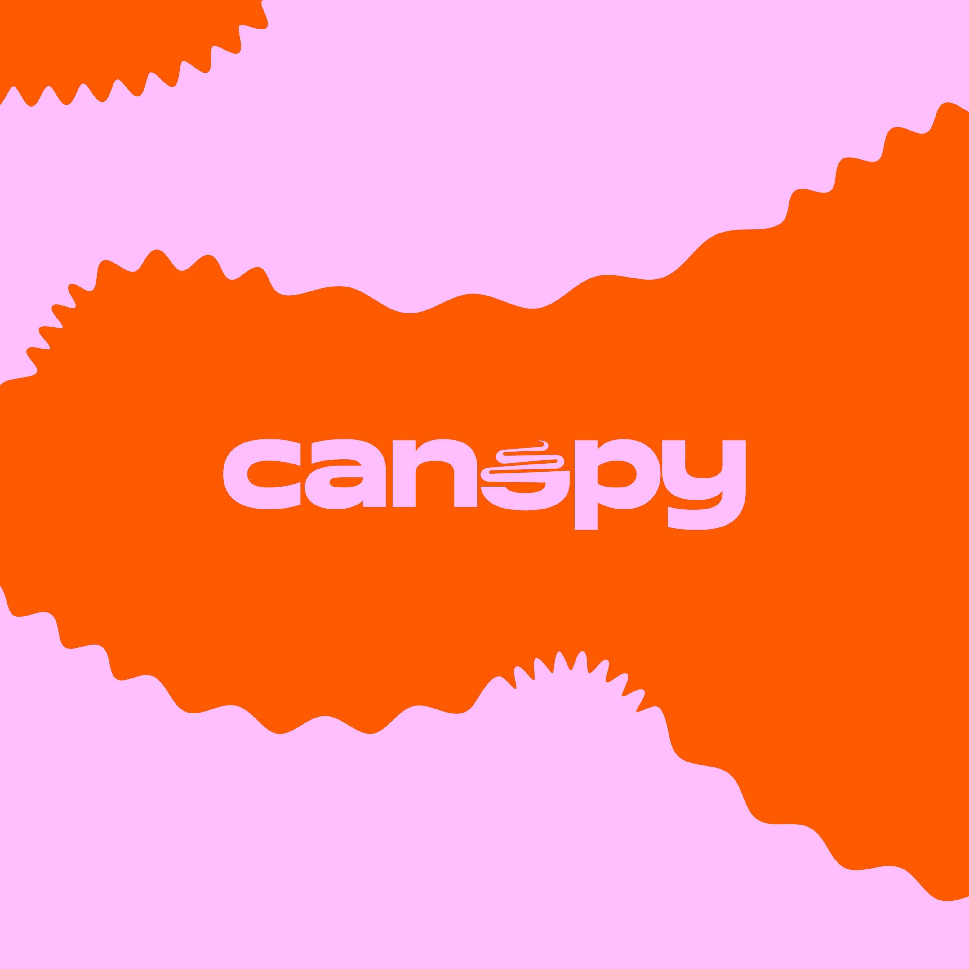
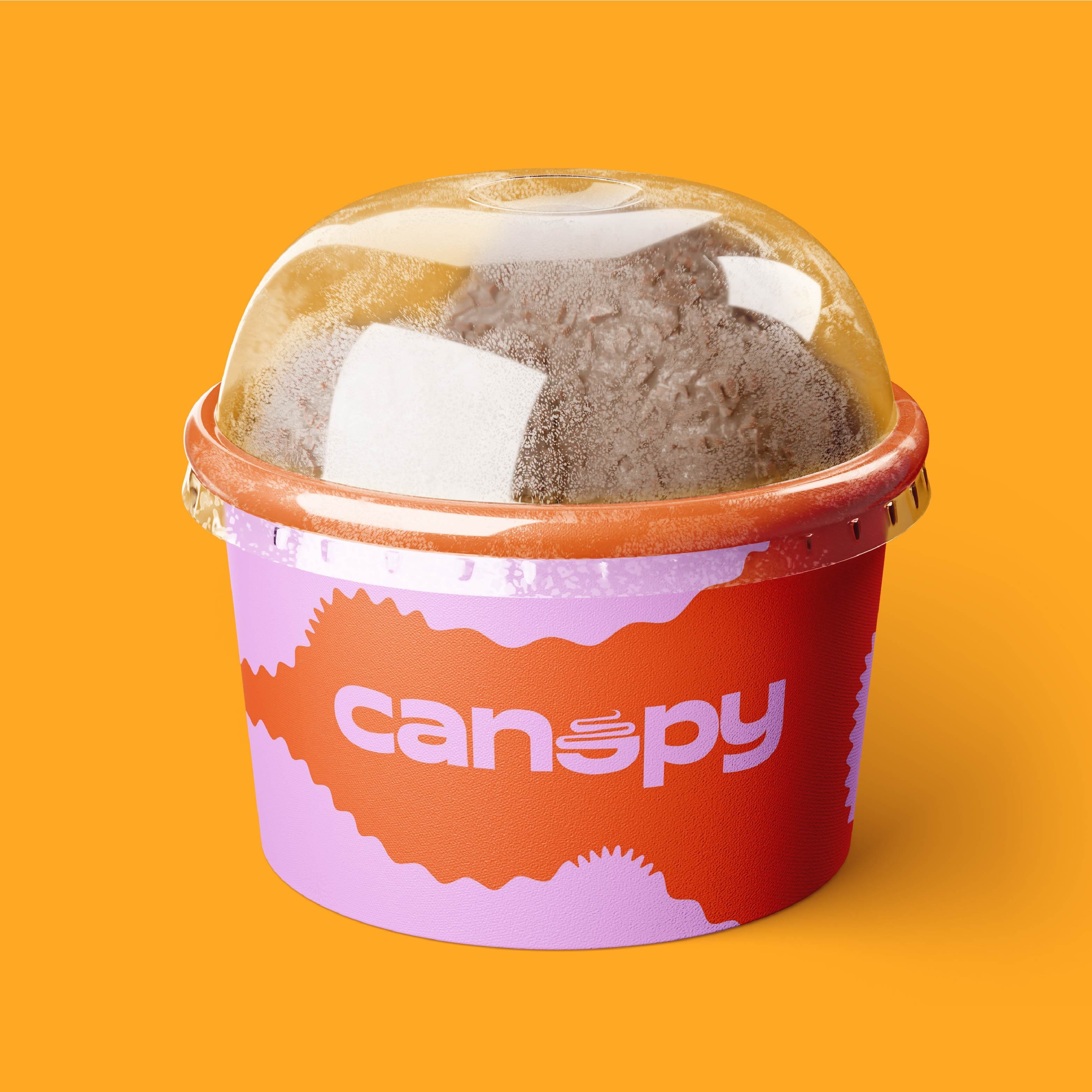
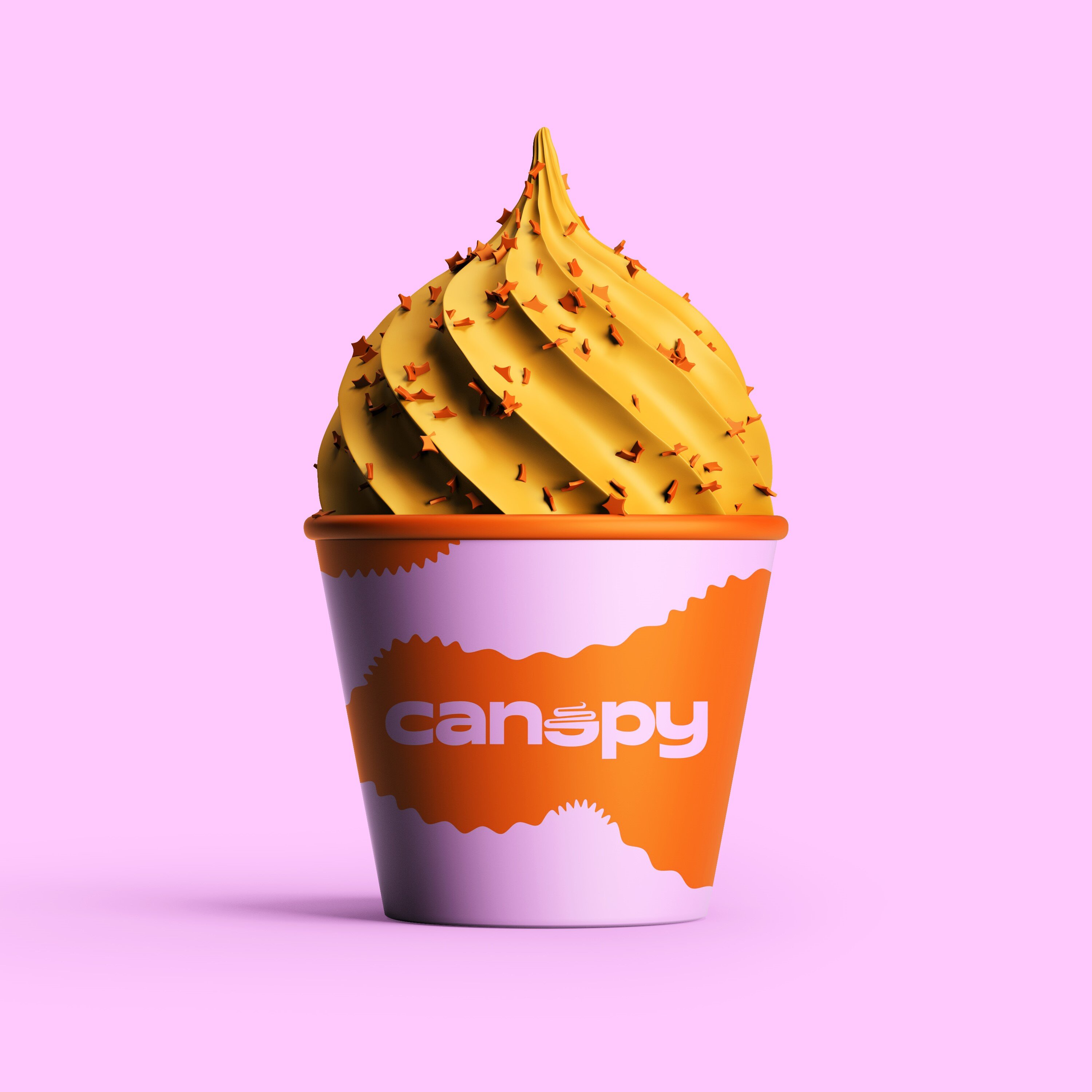
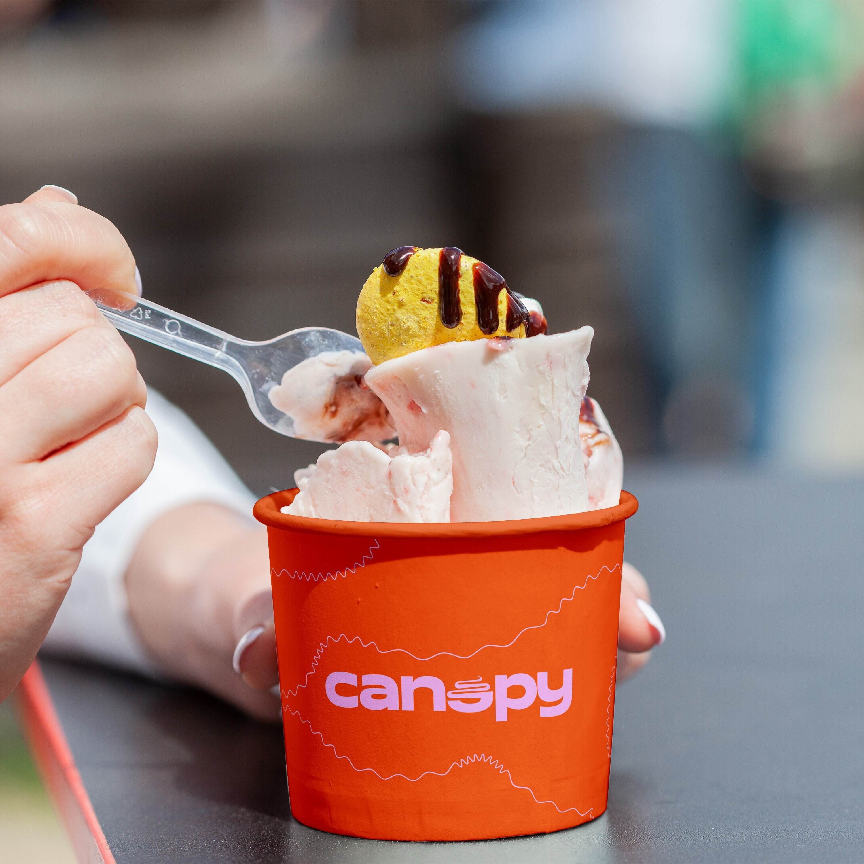
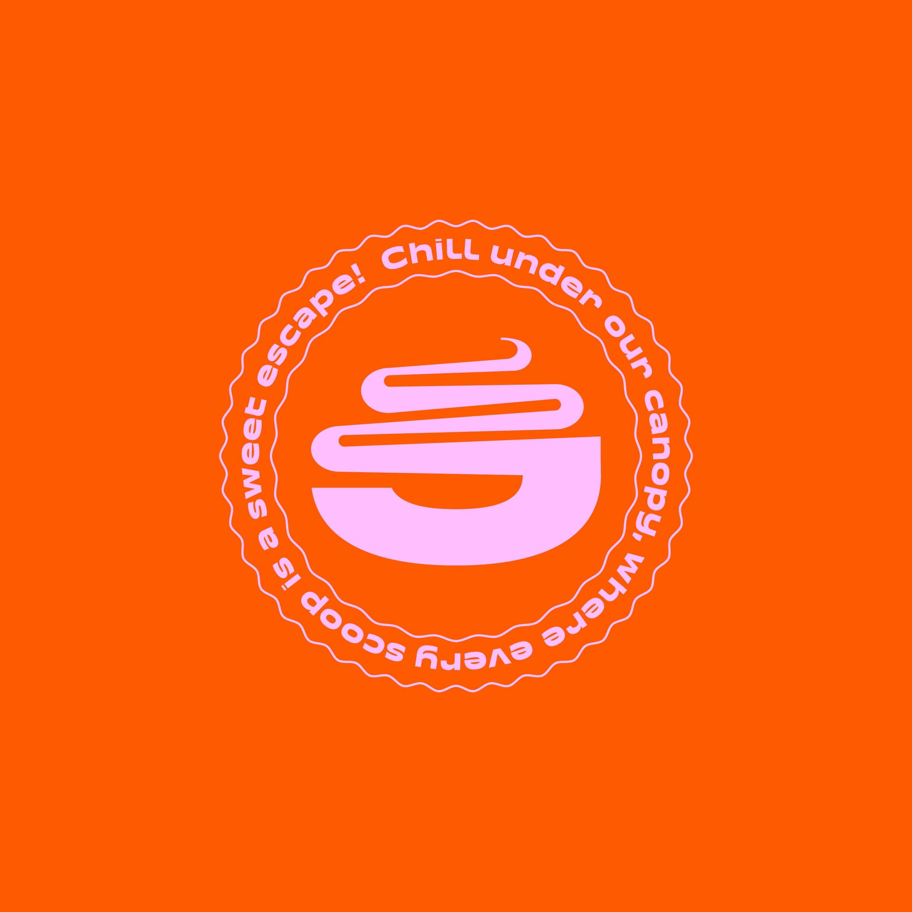
Canopy is an exquisite ice cream corner shop that charms every customer who walks in with its pristine décor and an array of tempting treats. From the moment you step inside, you’re greeted by a warm and welcoming atmosphere that appeals to people of all ages. The shop’s logo is a delightful reflection of its character, featuring a goofy-looking ice cream cup that perfectly captures the playful and inviting essence of Canopy. The design is not just quirky but also embodies the fun and lighthearted spirit of the shop.
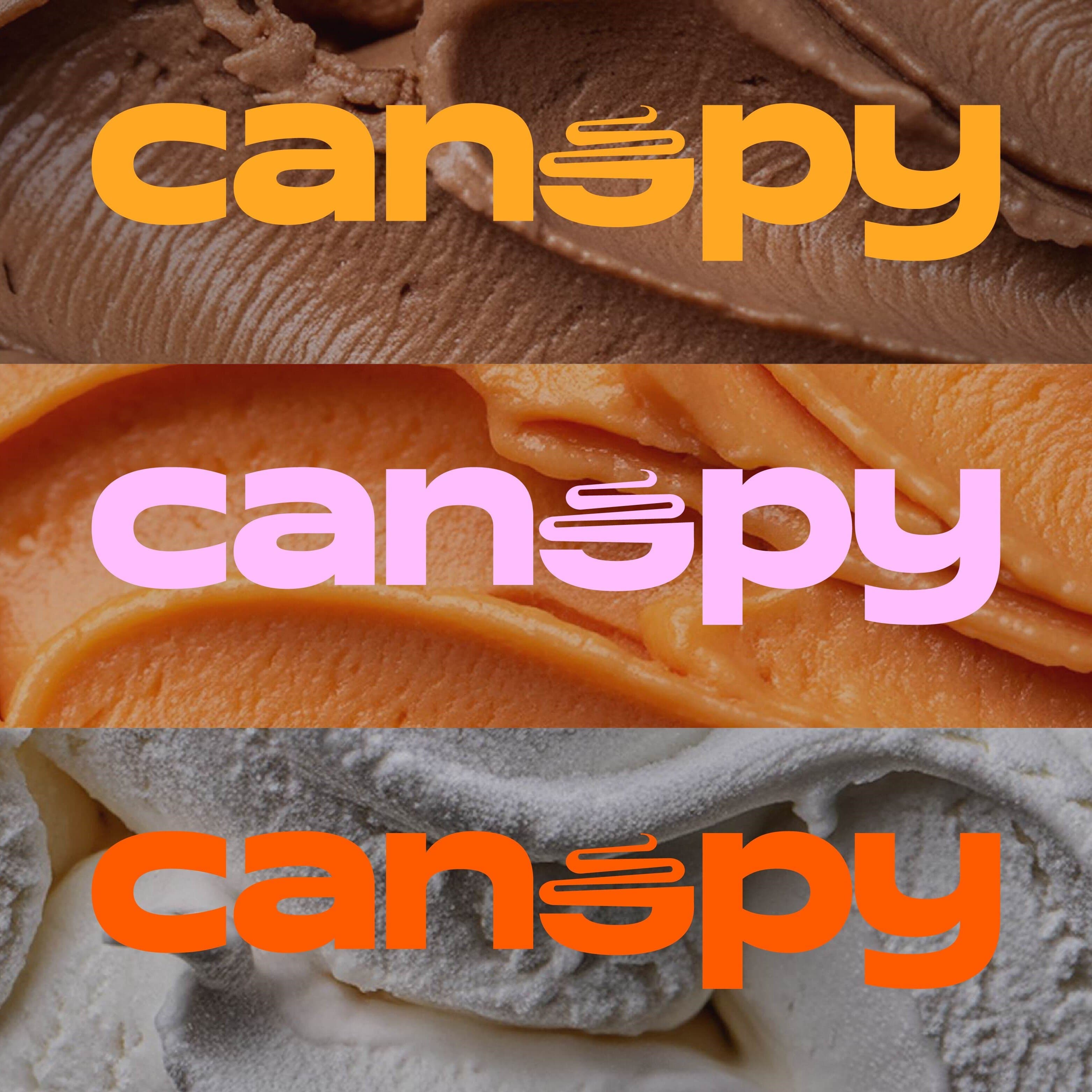
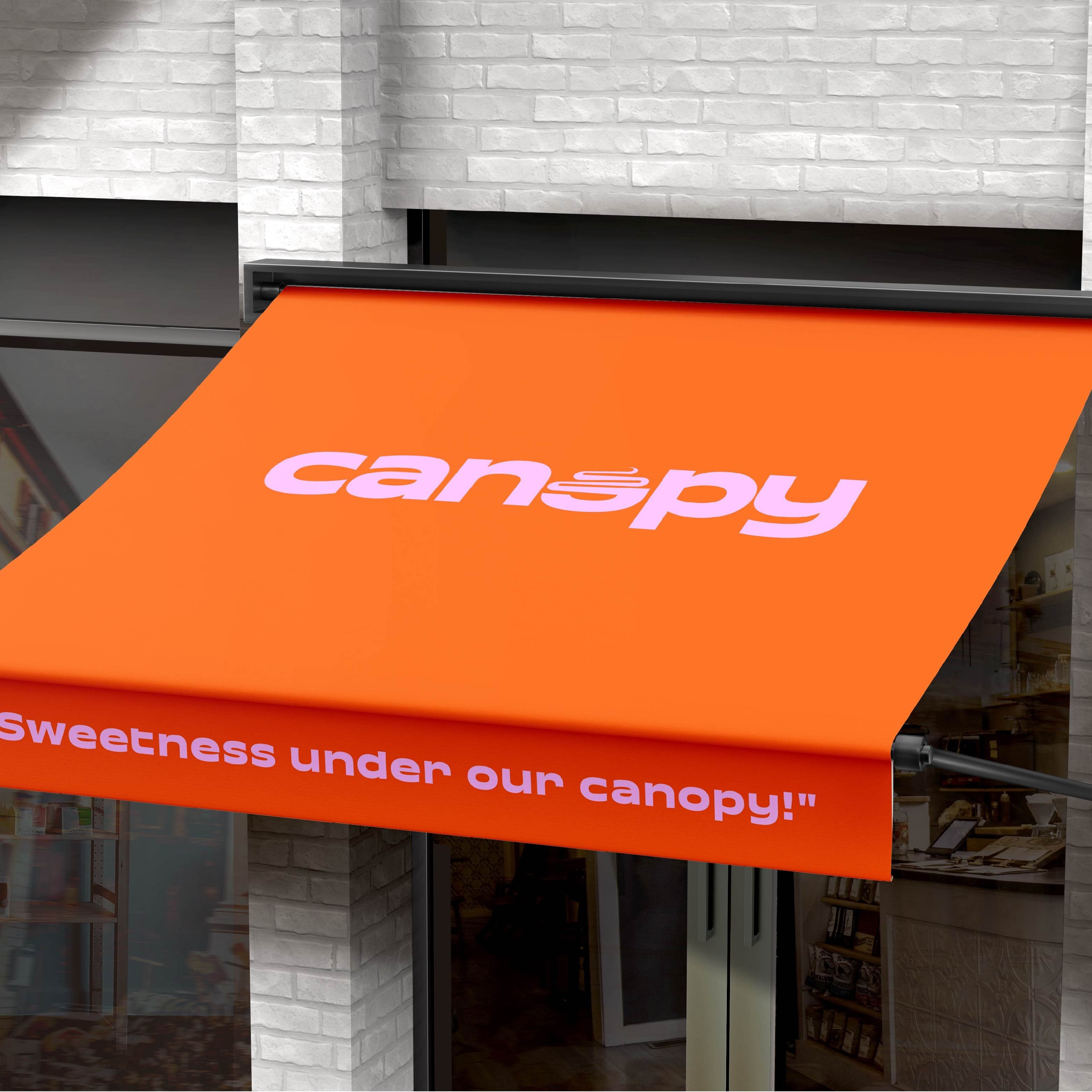
The use of bright orange in the logo is intentional and meaningful—it symbolizes happiness, warmth, and kindness, mirroring the cheerful and friendly nature of Canopy. This color choice reflects the joy and delight that every scoop of ice cream brings to its customers, making each visit to Canopy a moment of pure bliss. The ice cream cup in the logo signifies more than just a treat; it represents happy occasions, simple pleasures, and the creation of cherished memories. It’s an invitation for everyone, especially families, to come together and enjoy special moments within the cozy confines of the shop.
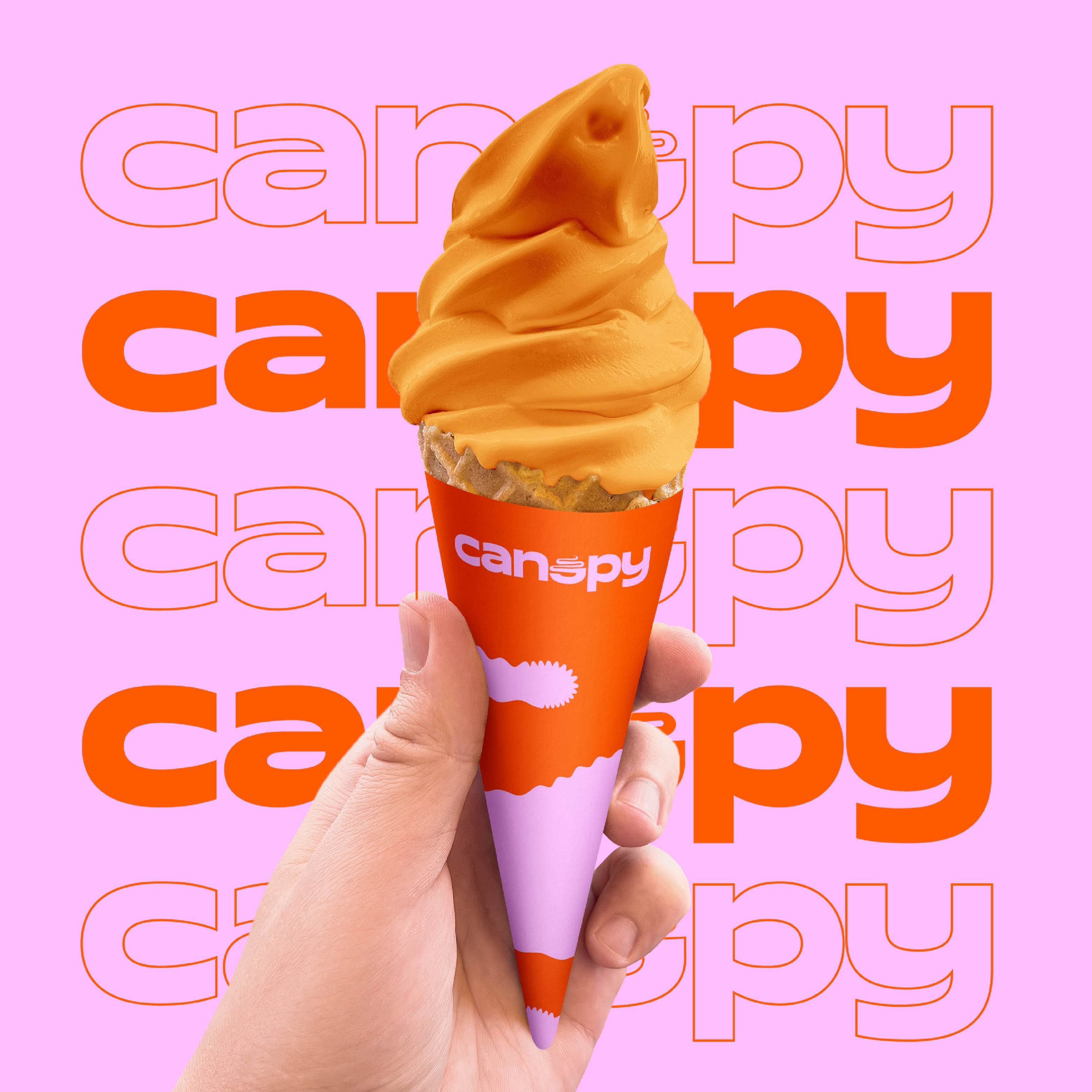
Canopy’s vibrant logo and its rocking, colorful design elements make it stand out as more than just an ice cream shop. It’s a destination for fun, joy, and celebration—a place where people come not only to satisfy their sweet tooth but also to relax, unwind, and indulge in some lighthearted fun. The playful imagery and lively colors convey a sense of excitement and adventure, encouraging customers to explore a variety of delicious flavors and enjoy the unique atmosphere that Canopy offers.
Whether you’re looking for a quick getaway from the daily grind or a place to discover exotic new treats, Canopy provides the perfect escape. It’s a haven where the distractions of everyday life melt away, replaced by laughter, smiles, and the simple joys of enjoying a delicious scoop of ice cream. With every visit, Canopy promises an experience that is not just about the treats but also about the memories you create and the happiness you feel. It’s a place where sweet moments are made, and where every visit is an opportunity to savor the good things in life, surrounded by the warmth and friendliness that define the Canopy experience.
For those in search of a place that goes beyond just serving ice cream, Canopy is the ultimate destination. It offers a delightful blend of great flavors, a welcoming ambiance, and a colorful, upbeat environment that makes every moment spent there truly special. Whether you’re stopping by with friends, family, or just treating yourself, Canopy invites you to enjoy an experience filled with joy, laughter, and unforgettable sweet moments.
CREDIT
- Agency/Creative: Mohamed Saidahmed
- Article Title: Canopy Ice-cream Shop Logo and Brand Identity
- Organisation/Entity: Freelance
- Project Type: Identity
- Project Status: Published
- Agency/Creative Country: Saudi Arabia
- Agency/Creative City: Riyadh
- Market Region: Asia, Middle East
- Project Deliverables: Brand Guidelines, Brand Identity, Design, Graphic Design
- Industry: Food/Beverage
- Keywords: ice cream, food, identity, logo
-
Credits:
Brand identity Designer: Mohamed Saidahmed


