


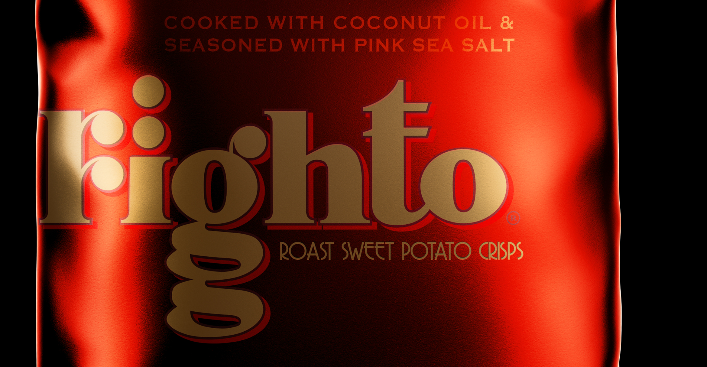
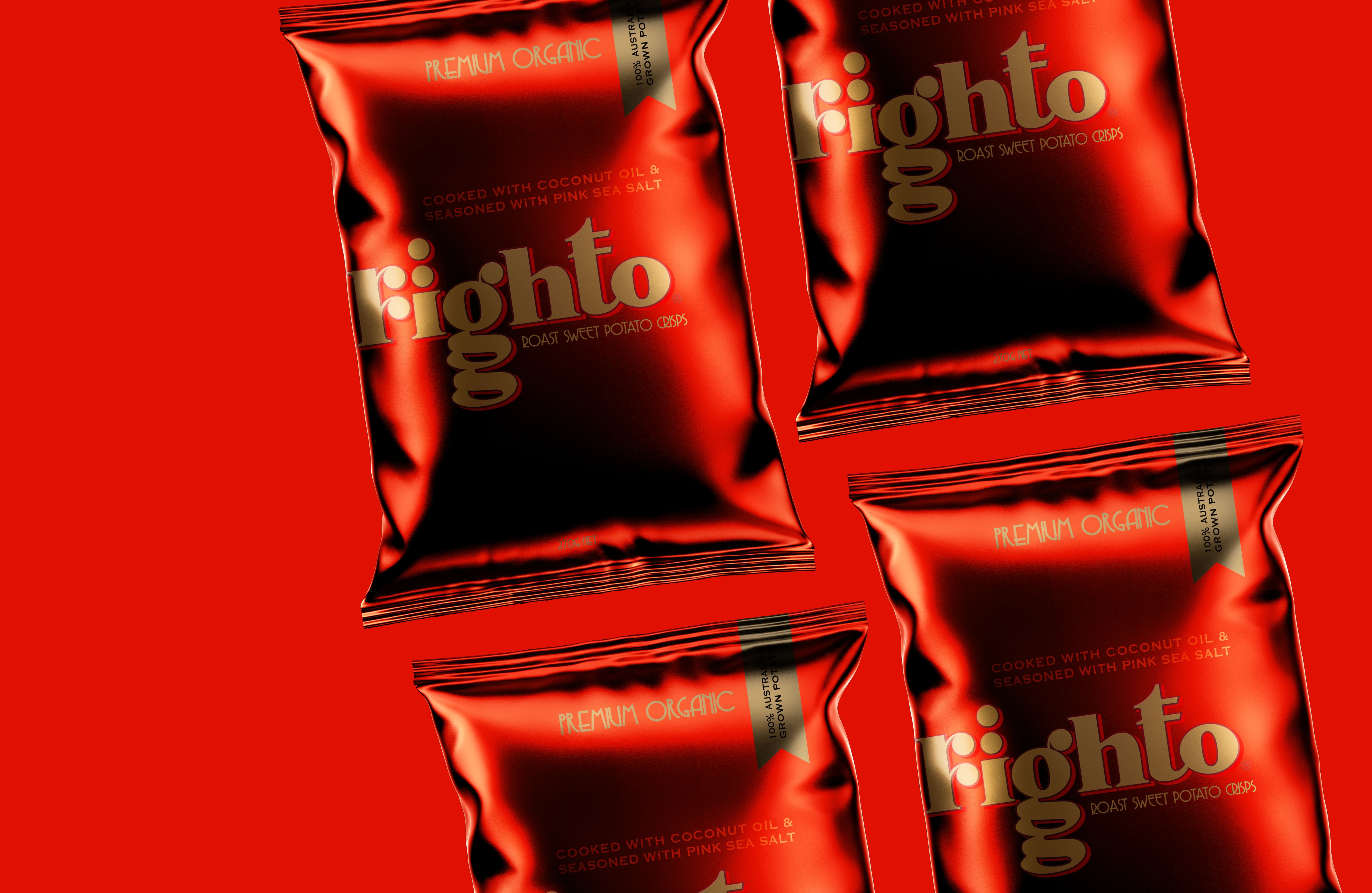
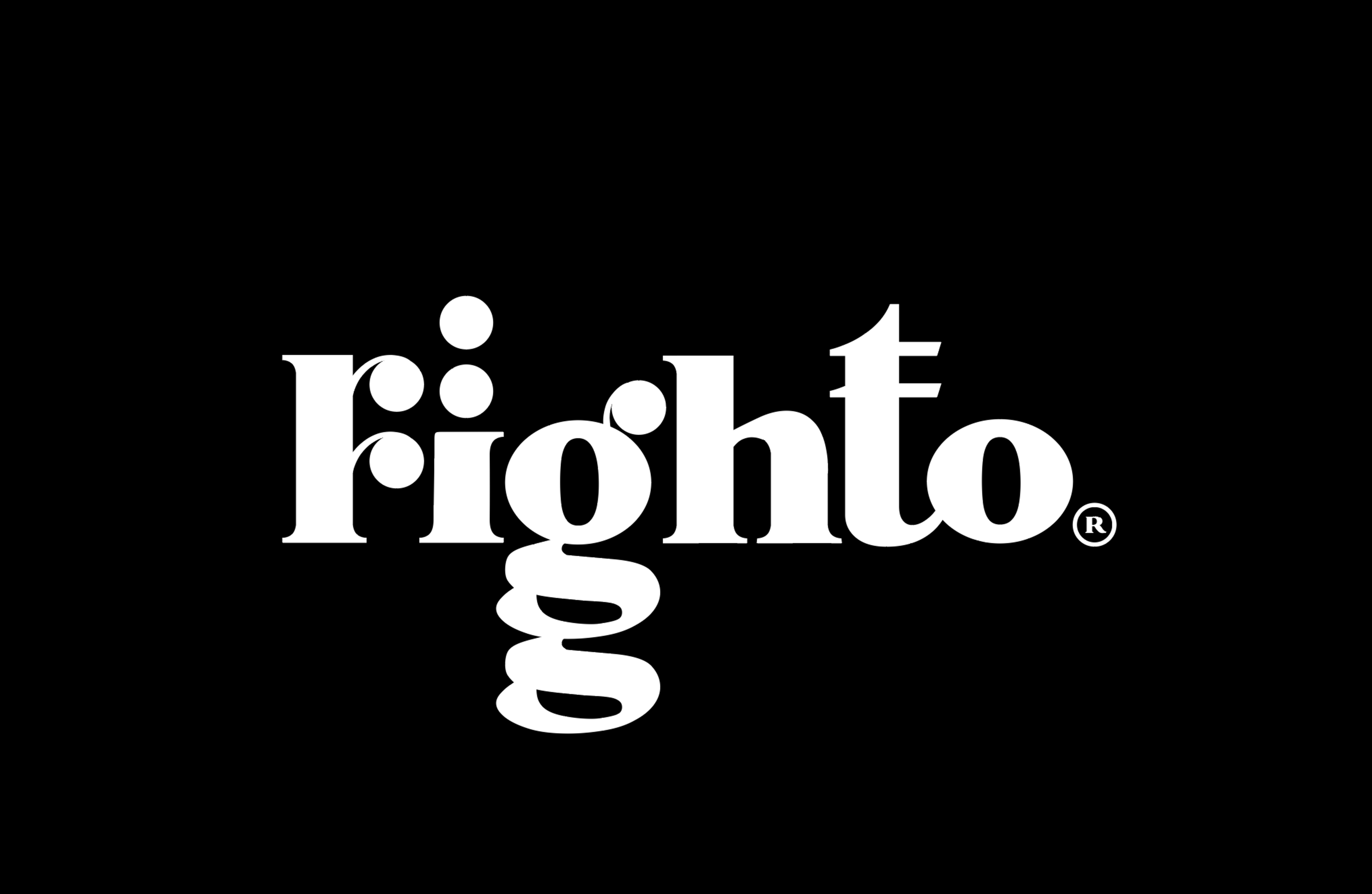
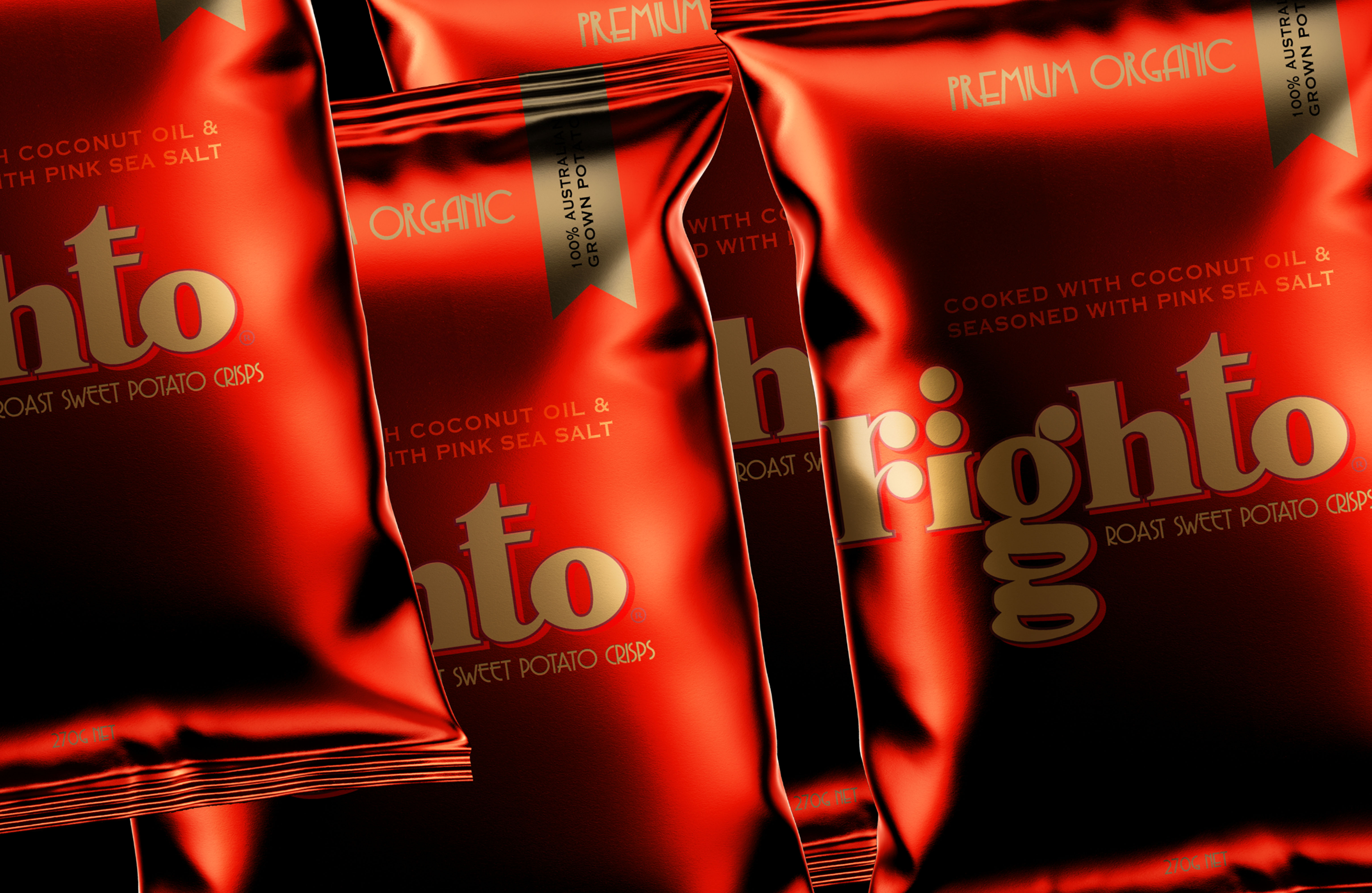
Righto sweet potato crisps explore a premium brand architecture with embellished gold foil packaging with ruby red contrast. The abstract wordmark strikes the consumer as unique while being approachable as righto is Australian slang and very common which contrasts the high end finishes on the packaging. In this organic alternative category the design tends to be browns, greens and all organics with typical leaves or nature graphics. Righto stands alone in a category thats a wash with nature as a premium fancy alternative to TV time.
CREDIT
- Agency/Creative: candybrophycreative
- Article Title: Candy Brophy Creatives Take on Premium Organic Crisps
- Organisation/Entity: Agency, Non Published Concept Design
- Project Type: Identity
- Agency/Creative Country: Australia
- Market Region: Global
- Project Deliverables: Brand Architecture, Brand Creation, Brand Identity, Brand Naming, Branding
- Industry: Food/Beverage
- Keywords: chris-design, crispbrand, brandidenity, brandlogo, branding, brandstolife
FEEDBACK
Relevance: Solution/idea in relation to brand, product or service
Implementation: Attention, detailing and finishing of final solution
Presentation: Text, visualisation and quality of the presentation


