


The Art of “Possible” — From Concept to Canned surprise.
“Have you ever felt the weight of the word ‘can’?”
At the heart of cancan, we play with the double meaning of this simple word—a conversation sparked by three founders with backgrounds in Marketing, Food Design (via Italy), and a decade of F&B expertise.
As a Verb: It represents the journey from “I can” to “We can.” It is a process of collective empowerment where we cook, curate, and collaborate to resolve the most intricate challenges in the food industry.
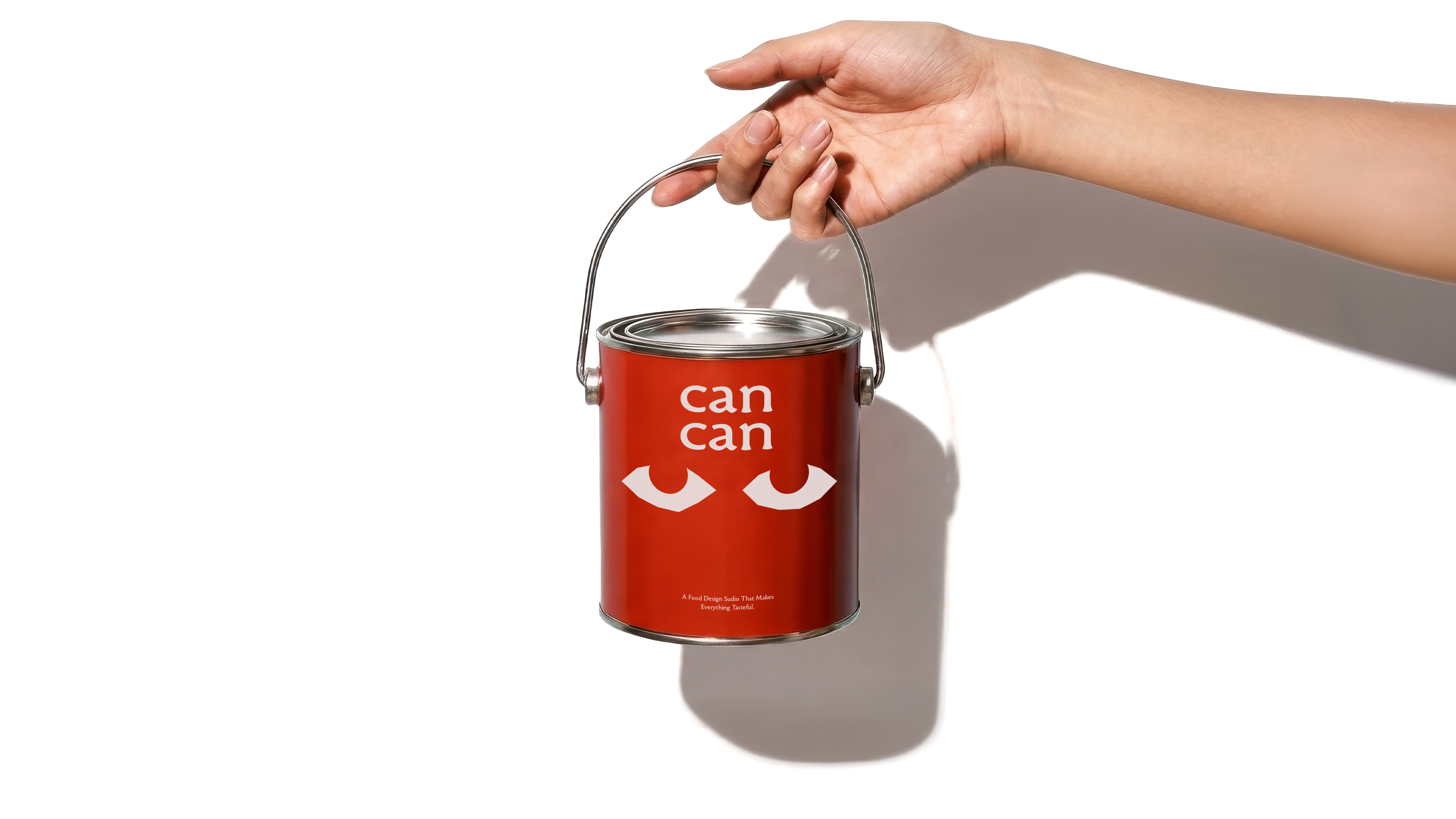
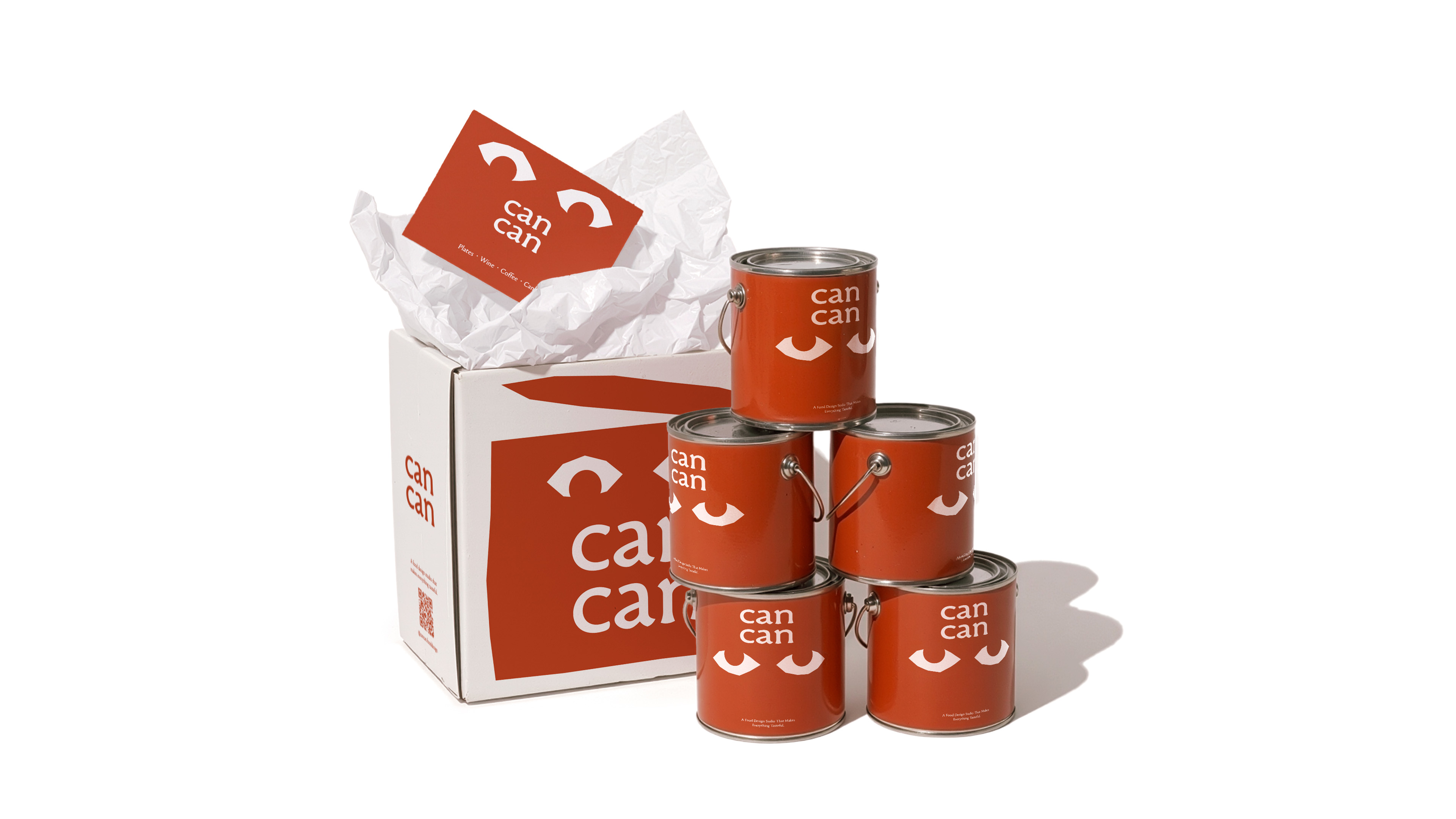
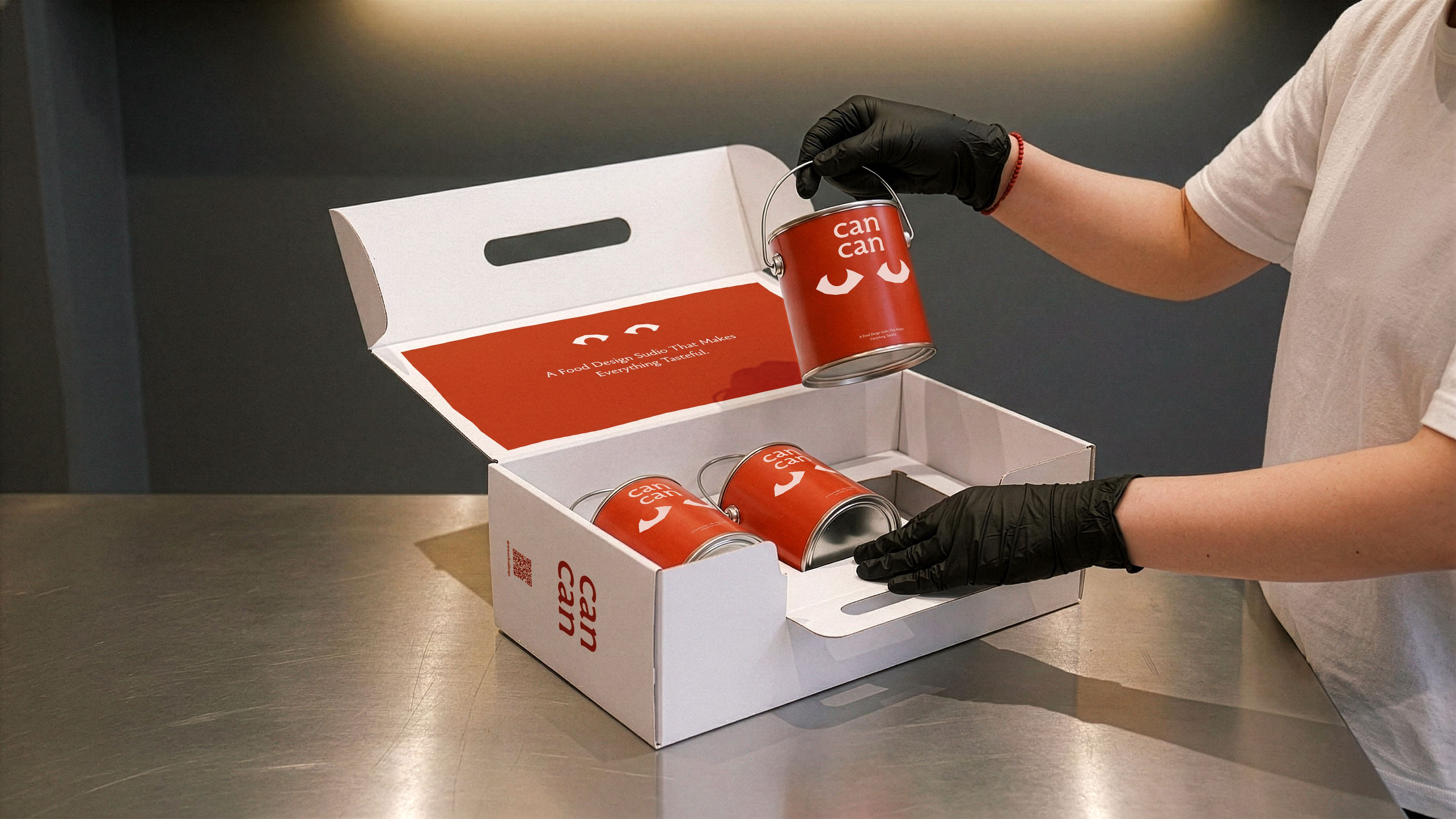
As a Noun: It is the “Can”—a vessel for preservation and concentrated time. We believe food design shouldn’t be a fleeting spark of inspiration. Like a tin can, we aim to seal the flavors of experimental design and transform them into scalable, market-ready business models that live and breathe in our everyday lives.
Narrative & Visual Identity: The Tactile vs. The Digital
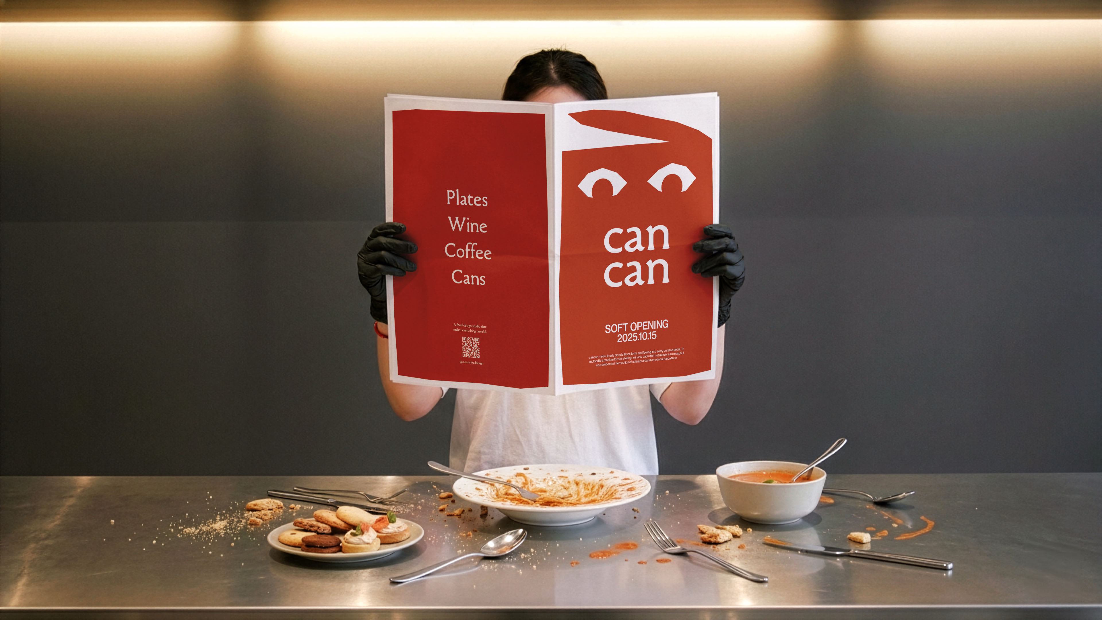
In defining the brand’s visual language, I deliberately steered away from the cold precision of digital aesthetics, opting instead for a “tactile” narrative. Through hand-crafted shapes and spontaneous strokes, the visual identity communicates the warmth of the human touch. From the silhouette of a ripening fruit to the breathing pores of fermenting sourdough, every element is designed to capture the raw, evocative tension of food in its state of transformation.
Beyond Visuals: Spatial Curation & Brand Atmosphere
My role extends beyond the graphic surface. I’ve architected the brand’s entire ecosystem—from its narrative storytelling to the spatial soft furnishing of our physical field. cancan operates as a dual-natured entity: a Food Design Studio that fuels innovation, and a Self-operated Restaurant that serves as its living laboratory.
Here, the space is more than an interior; it is a medium for the senses and a vessel for curious souls. We’ve curated an environment where the brand’s tone is felt in every texture and corner—an immersive experience where design isn’t just seen, but lived.
Conclusion: A Curation of Playfulness
This is not merely a project about food; it is a “playful curation” of what is possible when imagination is sealed into reality. We invite you to witness the synergy of design and commerce, of craft and scale.


CREDIT
- Agency/Creative: Lung-Hao Chiang
- Article Title: cancan Food Design Studio and Restaurant Identity by Lung-Hao Chiang
- Organisation/Entity: Agency
- Project Type: Packaging
- Project Status: Published
- Agency/Creative Country: Taiwan
- Agency/Creative City: Taipei
- Market Region: Asia
- Project Deliverables: Brand Identity, Packaging Design
- Format: Box, Can
- Industry: Food/Beverage
- Keywords: can
-
Credits:
Art Director: Lung-Hao Chiang


