co-partnership – Canadian Club Whisky
Canadian Club made its fame during the prohibition era of the 1920s, glamorously promoted by the likes of Al Capone, who smuggled large quantities over the Canadian/American boarder. More recently, it made another appearance as Don Draper’s drink of choice in the 1950’s drama, Mad Men.
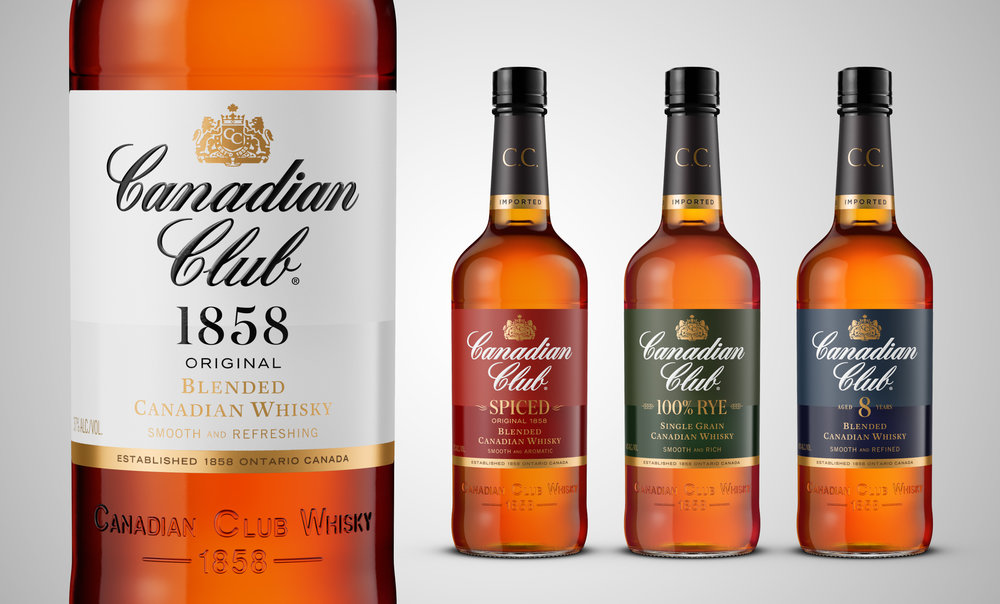
Canadian Club has a rich history as a premium whisky choice, however over the years the portfolio had become untidy with inconsistent bottle shapes, labels, graphics and production values.
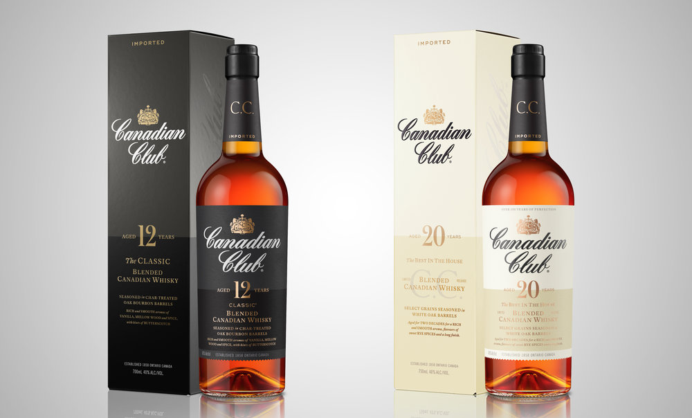
The task was to clean up the portfolio, raise the brand’s premium credentials and restore its iconic status as ‘the best in the house’. It was also important that we spoke to its current day need-state of being a smoother and more refreshing whisky style. We developed the strategic positioning, ‘Refreshingly Authentic’ which talked both to its historic credibility and the smooth, mixable whisky styles.
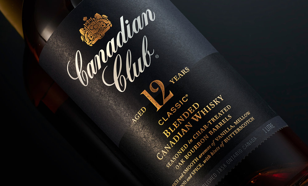
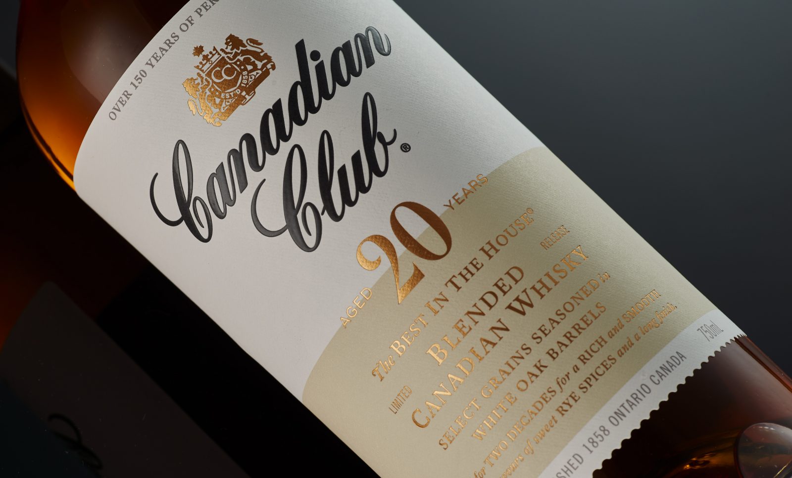
The packaging refresh began by researching into the rich archive of Canadian Club, studying past labels for their copywriting and typography – discovering what had been lost along the way and what was important to reinstate.
From a structural point of view, the long slender neck of the bottle was its most iconic feature and important to reintroduce across the portfolio. We dressed each neck with the tall black collar label it’s known for, punctuated with the C.C. monogram and finished with a gold foil band to hero the ‘imported’ status. On the main label we brought attention to the each of the whiskies different stories by using a band of gloss varnish and referenced the river Detroit where the Hiram Walker Distillery is located – the same river which the whisky used to be smuggled across and under, during the prohibition years.


CREDIT
- Agency/Creative: Co-Partnership
- Article Title: Canadian Club Whisky Re-Branding
- Organisation/Entity: Agency Commercial, Published
- Project Type: Packaging
- Agency/Creative Country: Australia
- Market Region: Global
- Format: Bottle
- Substrate: Glass


