Established in 1982, Canada West Mountain School (CWMS) has long been a premier mountain training and guiding center in British Columbia. Their array of courses and guided trips—ranging from rock climbing and ice climbing to mountaineering, hiking, backcountry skiing, and avalanche skills training—cater to adventurers of all skill levels. With a focus on safety, skill development, and fostering a deep appreciation for the mountain environment, CWMS’s experienced guides provide custom private programs tailored to individual needs.
With a noticeable disparity between the quality of services they offer and how they visually portray and position themselves as a brand, came the creation of the Canada West Mountain Schoo rebrand. This transformation transcends mere visual alterations; it’s a narrative poised to unfold. As Canada West Mountain School unveils its new identity, it aims to extends an open invitation to individuals from all walks of life to embrace their inner seeker. Recognizing the evolving needs of its audience and desiring to better capture the adventurous spirit of its brand, CWMS initiated a dynamic rebranding process.
The rebranding of Canada West Mountain School was strategically driven to modernize the brand and enhance its appeal and practicality for outdoor enthusiasts. Drawing inspiration from navigational distress symbols, the new logo design incorporates intricate lines resembling latitude and longitude rules within outdoor maps, embodying the spirit of navigation and discovery. This design element reflects the diverse adventures offered by CWMS, capturing the essence of exploration while emphasizing the brand’s commitment to safety and preparedness in the wilderness. The logo also transforms into a multitude of shapes, offering a dynamic visual experience. Depending on the angle, it can resemble a tent, a tree, a mountain, or the rugged face of a cliff, ready to be climbed. This versatility adds depth and intrigue to the logo, mirroring the varied diversity with its target market and landscapes encountered during outdoor adventures.
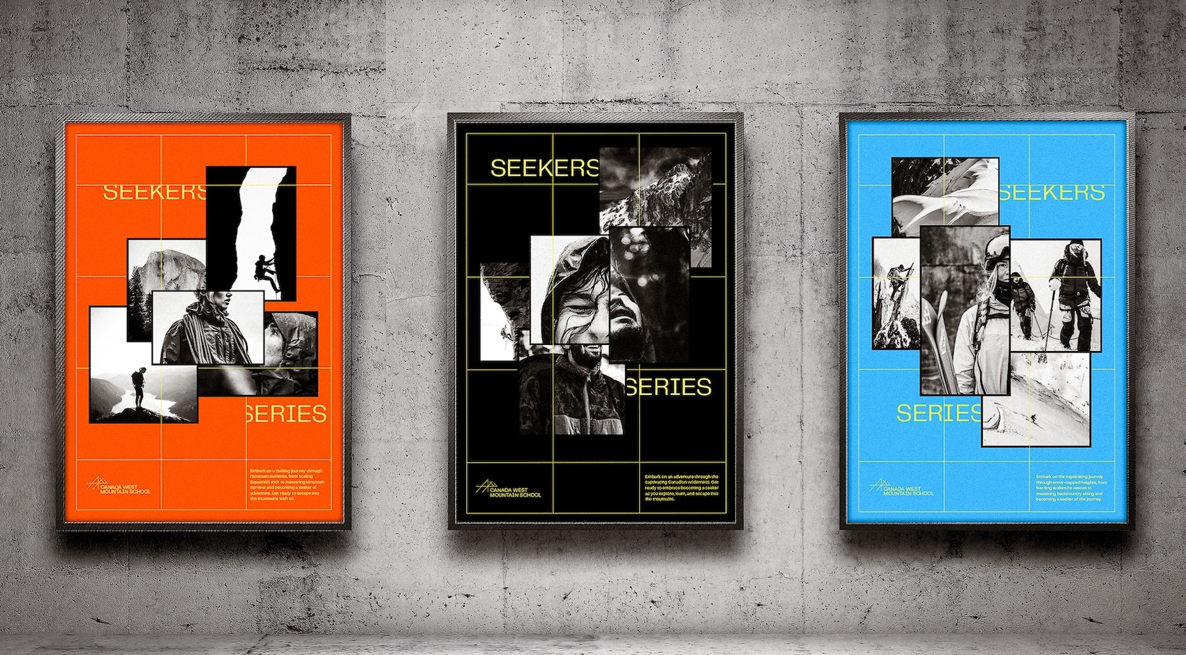
A carefully selected colour palette further enhances this connection to nature, with deep grays symbolizing majestic mountains and vibrant blues and burnt oranges acting as visual guides for safety and direction. These elements evoke the rugged beauty of Canada’s wilderness and serve to enrich the outdoor experience, providing clarity and inspiration for adventurers on their journeys. To complement this, CWMS guides and instructors will now be outfitted in high-visibility colours that contrast with the natural surroundings. This choice ensures they remain easily identifiable to participants at all times, promoting safety and enhancing easy communication during outdoor activities. In contrast, customers and other individuals will wear contrasting colours from the guides, providing a clear visual distinction and contributing to a safe and organized environment for both instructors and participants alike.
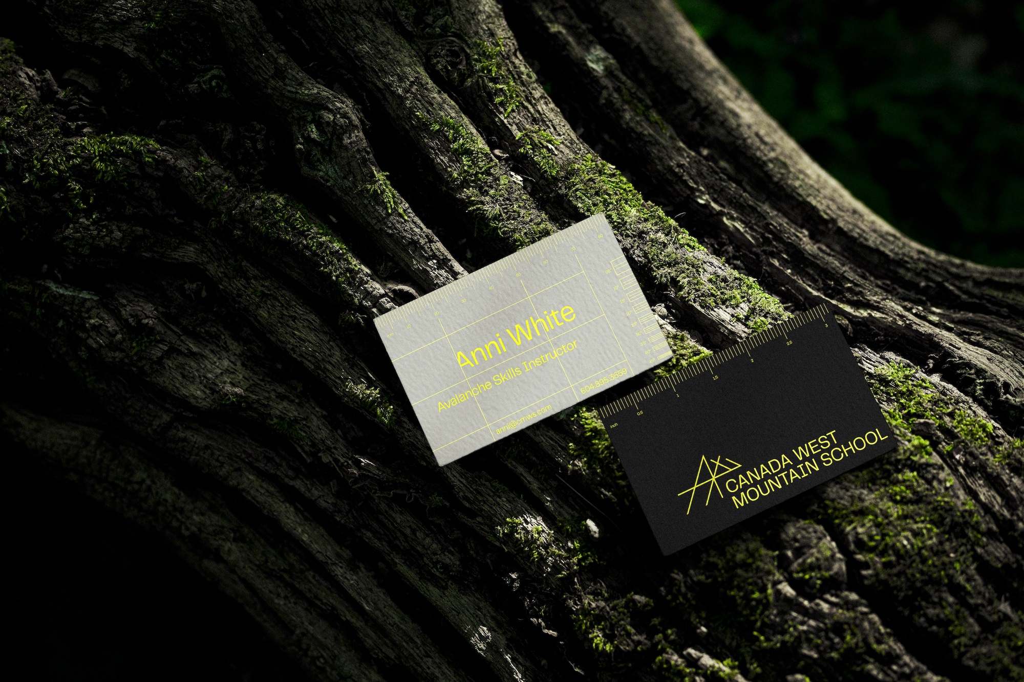
Functionality emerged as a pivotal focal point in the comprehensive rebranding strategy, transforming it from a mere visual overhaul into a practical enhancement for adventurers. This approach is evident in the redesign of the business card, where its dual-purpose nature seamlessly integrates both informational and navigational features. A ruler of measurements conveniently provided in inches and millimetres on distinct sides of the card offers adventurers a practical tool for measuring distances on maps. Additionally, the card design includes a contour interval feature to help assess avalanche risk within their maps. This deliberate design enhancement underscores the commitment to enhancing safety and preparedness for outdoor expeditions, encapsulating the ethos of the entire rebranding effort.
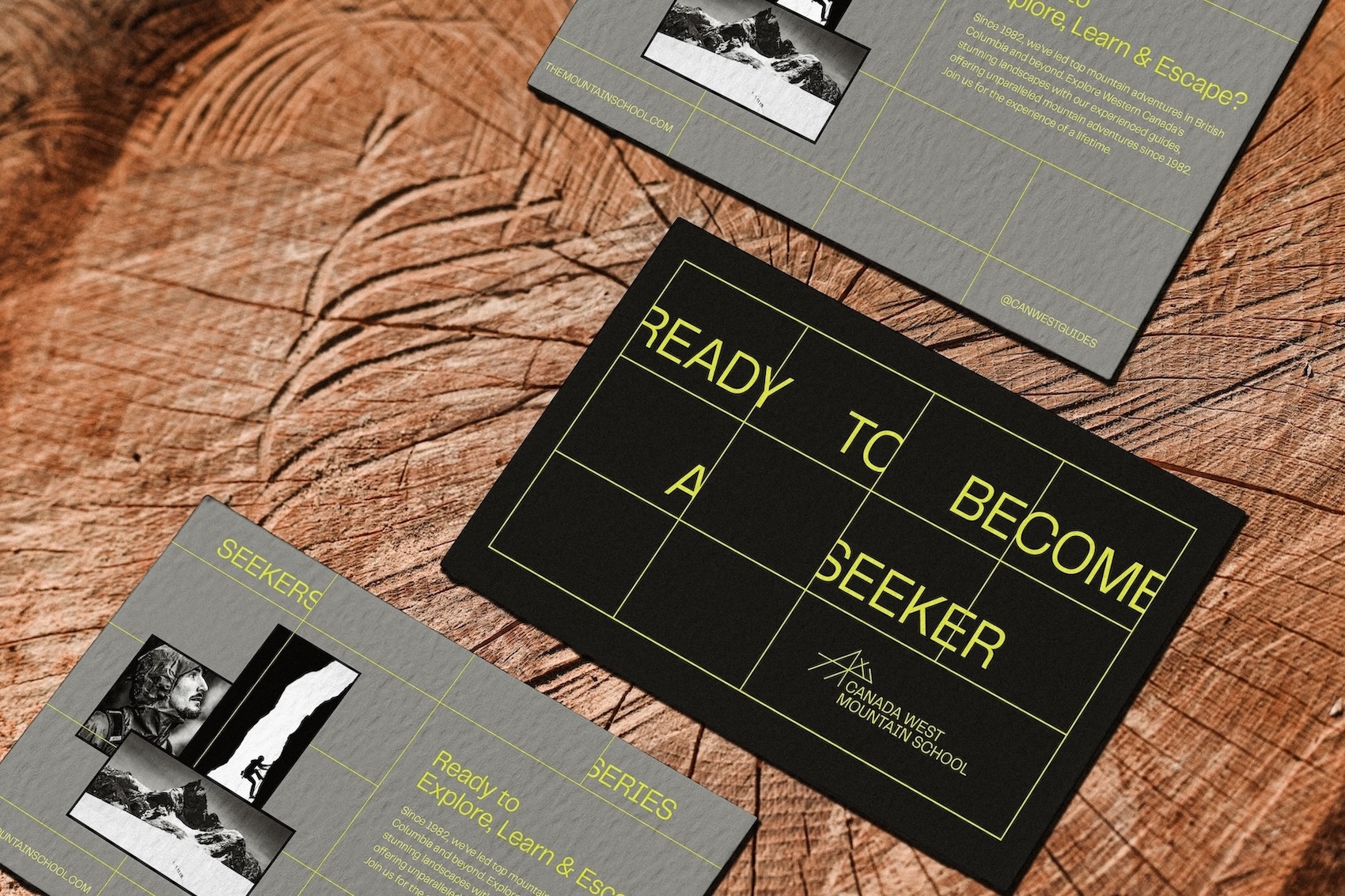
Rebranding transcends mere visual changes; it’s a narrative poised to unfold. As Canada West Mountain School unveils its new identity, it invites individuals from all walks of life to embrace their inner seeker. The Seekers Series campaign embodies this ethos, serving as a vibrant celebration of the adventurous spirit inherent in CWMS’s brand essence. Through captivating stories, immersive visuals, dynamic billboards, and strategic partnerships with outdoor retailers, the Seekers Series aims to kindle the fire of exploration in a diverse array of adventurers. Each participant brings their unique background and experiences, adding richness and depth to the collective journey.
Adding depth to the Seekers Series are the Field Notes books, offering invaluable insights ranging from wilderness first aid to avalanche response. These books are a treasure trove of wisdom drawn from years of experience, equipping seekers not only with gear but also with the knowledge necessary to navigate the challenges that lie ahead. They provide a glimpse into the rich educational offerings available through CWMS courses.
The rebranding of Canada West Mountain School goes beyond visual changes. It’s a call to adventure, a promise of discovery, and a testament to exploration’s enduring spirit. CWMS leads with careful design, strategic initiatives, and unwavering dedication to safety and education. Adventurers are invited to explore Canada’s untamed beauty and emerge transformed.


CREDIT
- Agency/Creative: Bella Sanchez
- Article Title: Canada West Mountain School’s Dynamic Rebrand by Bella Sanchez
- Organisation/Entity: Student
- Project Type: Identity
- Project Status: Published
- Agency/Creative Country: Canada
- Agency/Creative City: Vancouver
- Market Region: North America
- Project Deliverables: Art Direction, Brand Design, Brand Identity, Brand Redesign, Brand Rejuvenation, Brand Strategy, Brand World, Branding, Creative Direction, Design, Editorial Design, Graphic Design, Logo Design, Motion Graphics, Rebranding, Web Design
- Industry: Education
- Keywords: WBDS Student Design Awards 2024/25 , Mountain Adventure School
-
Credits:
Graphic Designer: Bella Sanchez
Educational Institution : Wilson School of Design - Graphic Design for Marketing
Educator's Name: Michael Cober


