California’s Sparkling proudly declares: Urban History’s Got Taste!
If you have ever been to California, you must have noticed how strong street culture is over there. It is like jumping into a completely different world of mural art, skate parks, dancers jamming in the streets, 70s vibe rollerbladers carrying boomboxes on their shoulders, surfers with their long sun kissed hair… Ever wondered how come California gets to be so saturated with these ever interesting and edgy characters? California’s Sparkling Waters will open all the secrets for you, you will have to use their illustrated cans as a key
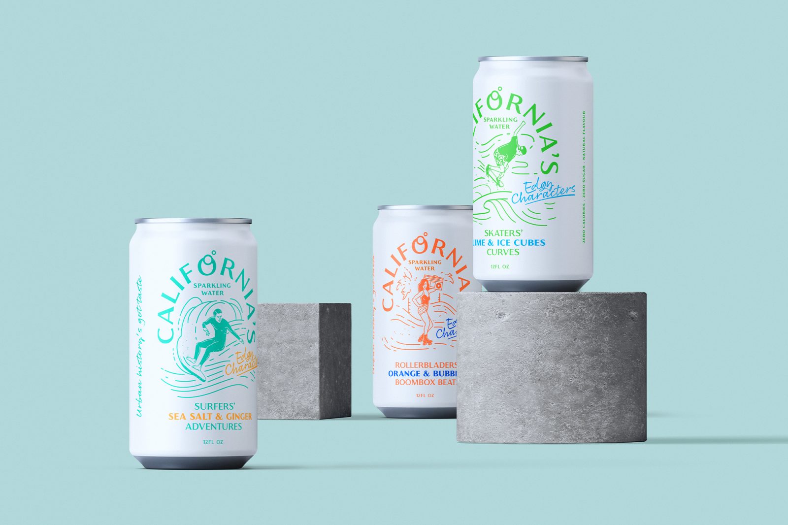
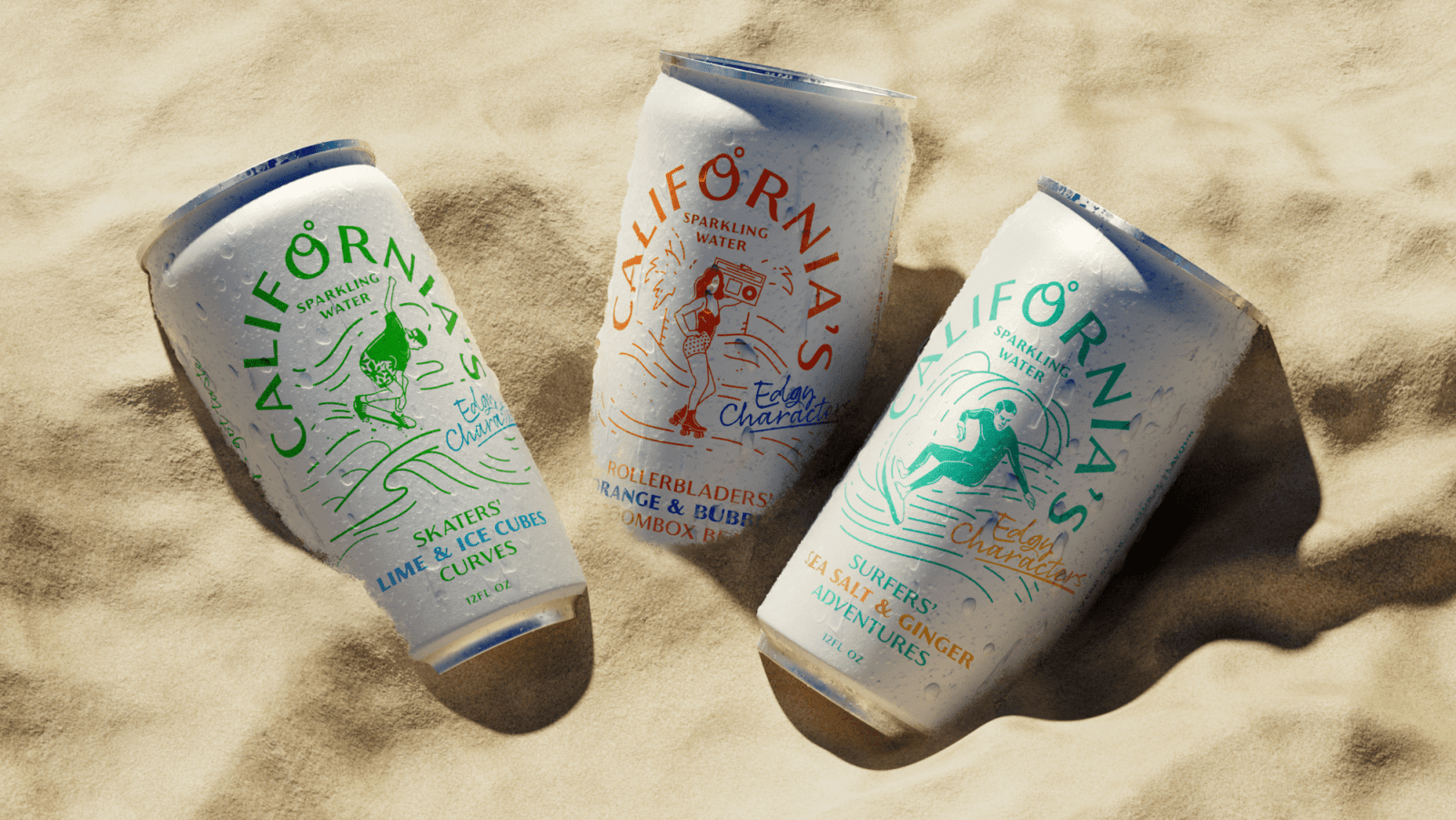
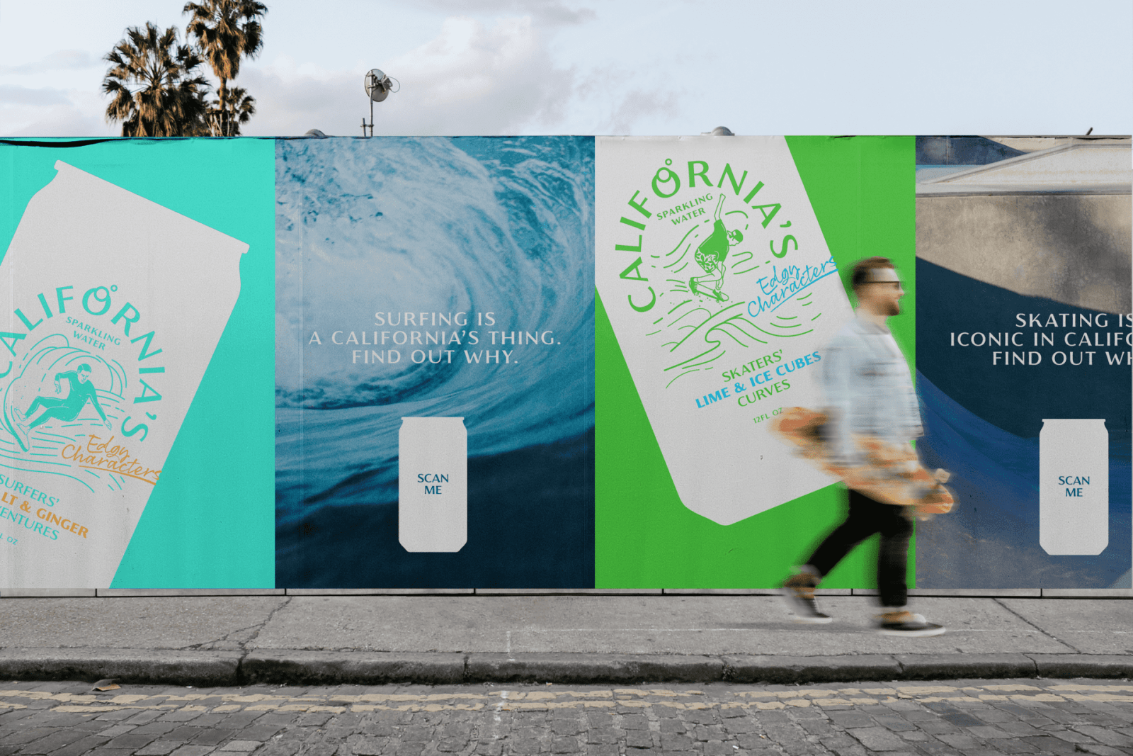
This concept showcases three cans of naturally flavoured sparkling water, each of them represents one character typical for Californian urban scene. These characters became dominant part of culture, they define recognisability of the state. The concept is meant to empower California’s urban culture and create awareness for those who doesn’t understand it and would love to know more about how it became a signature of California.
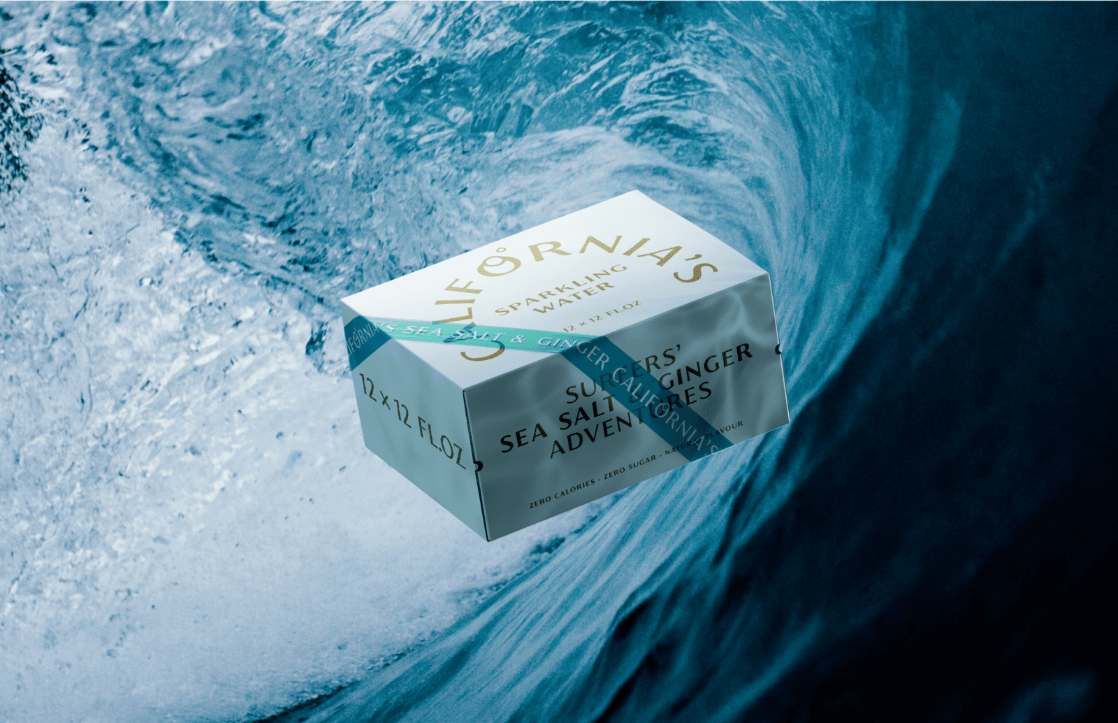
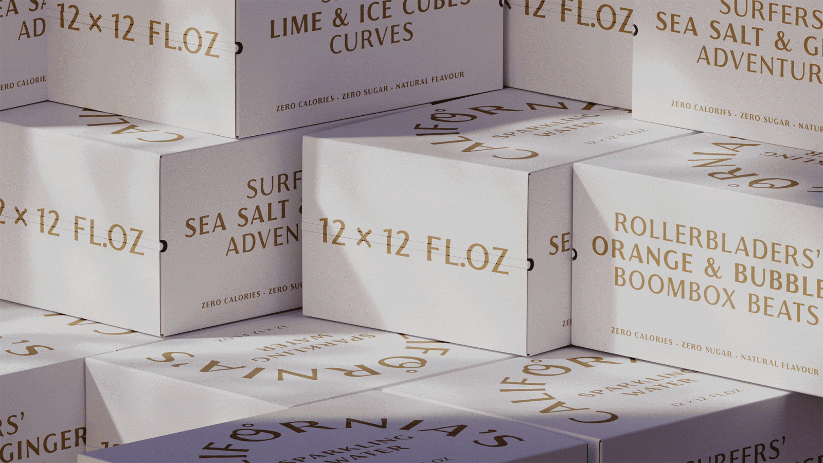
California’s Sparkling Water introduces not only edgy characters, but edgy flavours as well, according to the type of character. This way California’s Sparkling manifests that “Urban Culture’s Got Taste”! It’s a taste of “Surfers’ Sea Salt & Ginger Adventures”, “Rollerbladers’ Orange & Bubbles Boombox Beats” and “Skaters’ Lime & Ice Cubes Curves”. Product line is easily extendable to more cans, edgy flavours and edgy characters to cover Cali’s street culture fully, as well as introduce extended product lines, all shedding light on the culture and people – main thing that makes places so special.
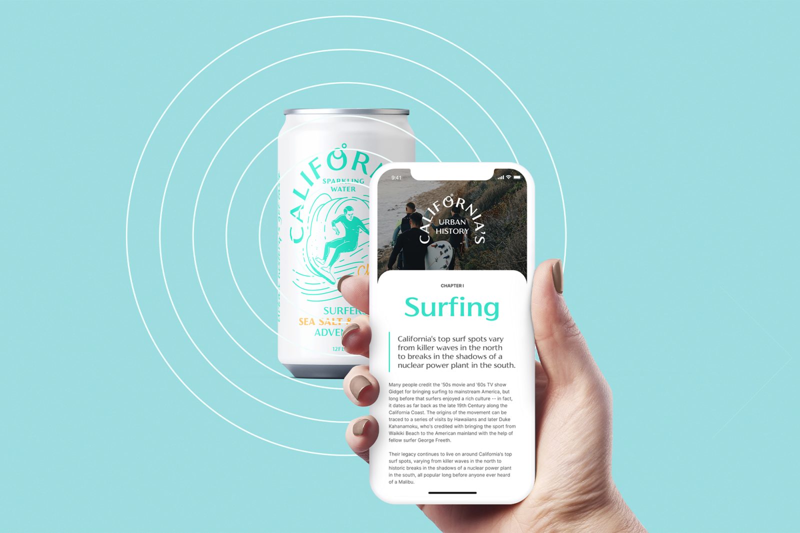
Each of the tasty looking illustrated cans has a digital trigger embedded, which can be activated through a mobile device. Just like that, every can opens up a thorough documentary study of each type of signature characters of California’s street culture. The brand lives in two dimensions – CPG embodiment and as a movement elevating street culture and creating awareness.
CREDIT
- Agency/Creative: ByAllMeans Studio
- Article Title: California’s Sparkling Packaging Design
- Organisation/Entity: Agency
- Project Type: Packaging
- Project Status: Non Published
- Agency/Creative Country: Czech Republic
- Agency/Creative City: Prague
- Market Region: USA
- Project Deliverables: Packaging Design
- Industry: Food/Beverage
- Keywords: WBDS Agency Design Awards 2022/23
-
Credits:
Creative Director / Art Director / Designer / Illustrator: Anna Belousova
Designer / Animator / 3D Designer: Stepan Derevianko
Agency: ByAllMeans


