


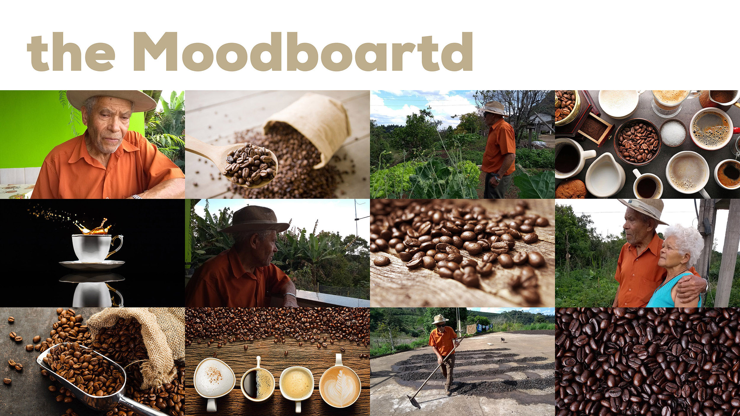
What can a small seed represent in the immensity of life? Some may say nothing. But for us, that’s all. Coffee is not just a grain. It represents much more than this: the foundation of an entire family. It’s more than 100 years of a hard-working history. His grandparents Lucas planted the seed that gave rise to the love of coffee. Generations of their families are fruits of this passion. The fertile lands of Simonesia not only welcomed us, but allowed us to cultivate our livelihood. Gratitude has germinated in the heart of our family, and the leaves of these feet remain united and strong as ever. Even after our patriarch divided his lands among the 7 children, we continued here, with our feet planted and engaged in the care for the land that helped to create us. And it is with all this love and affection, that after 100 years of hard work and acquired experience, we decided to take, directly to you, the coffee of our family. A coffee produced by those who are proud to do what they love.
The roots of the family were built through the café. As a child, Seu Túnico dealt with the planting. Time passed, the family growing, and the coffee was still there, firm and strong. It is more than a seed, it is the translation of all this union. And now, the coffee will not only be produced there, it will be packed and will come to the table of other families.
So bringing all these references was our biggest challenge.
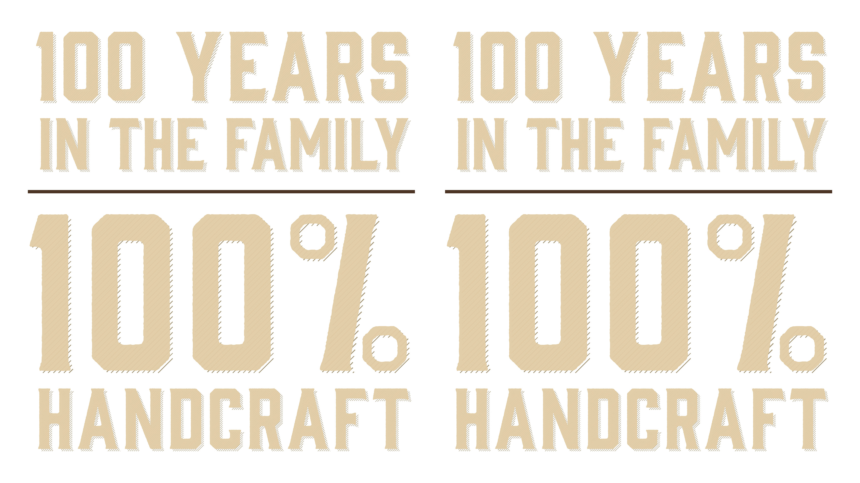
Coffee already has more than 100 years of family production. A coffee brand that represents the history of the whole family.
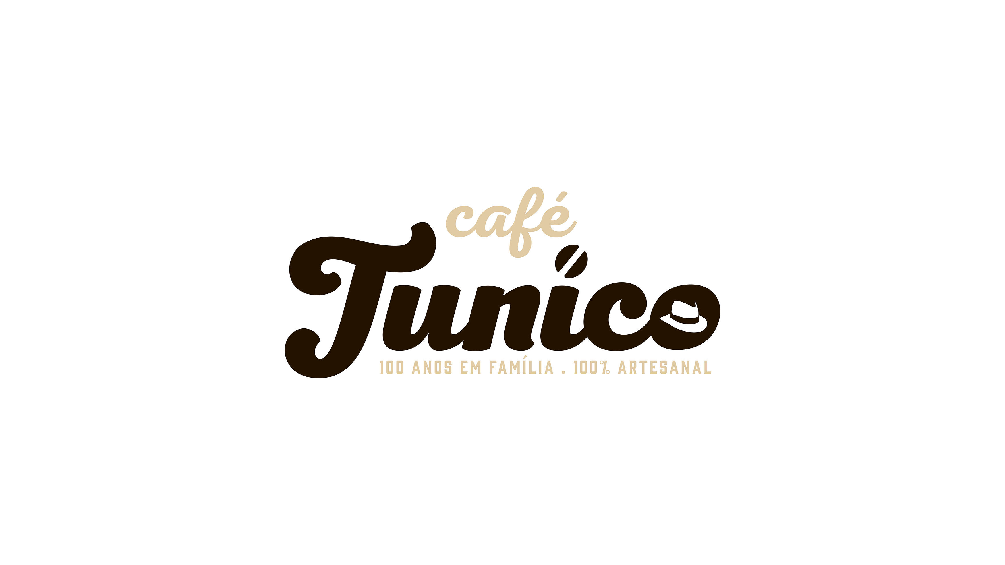
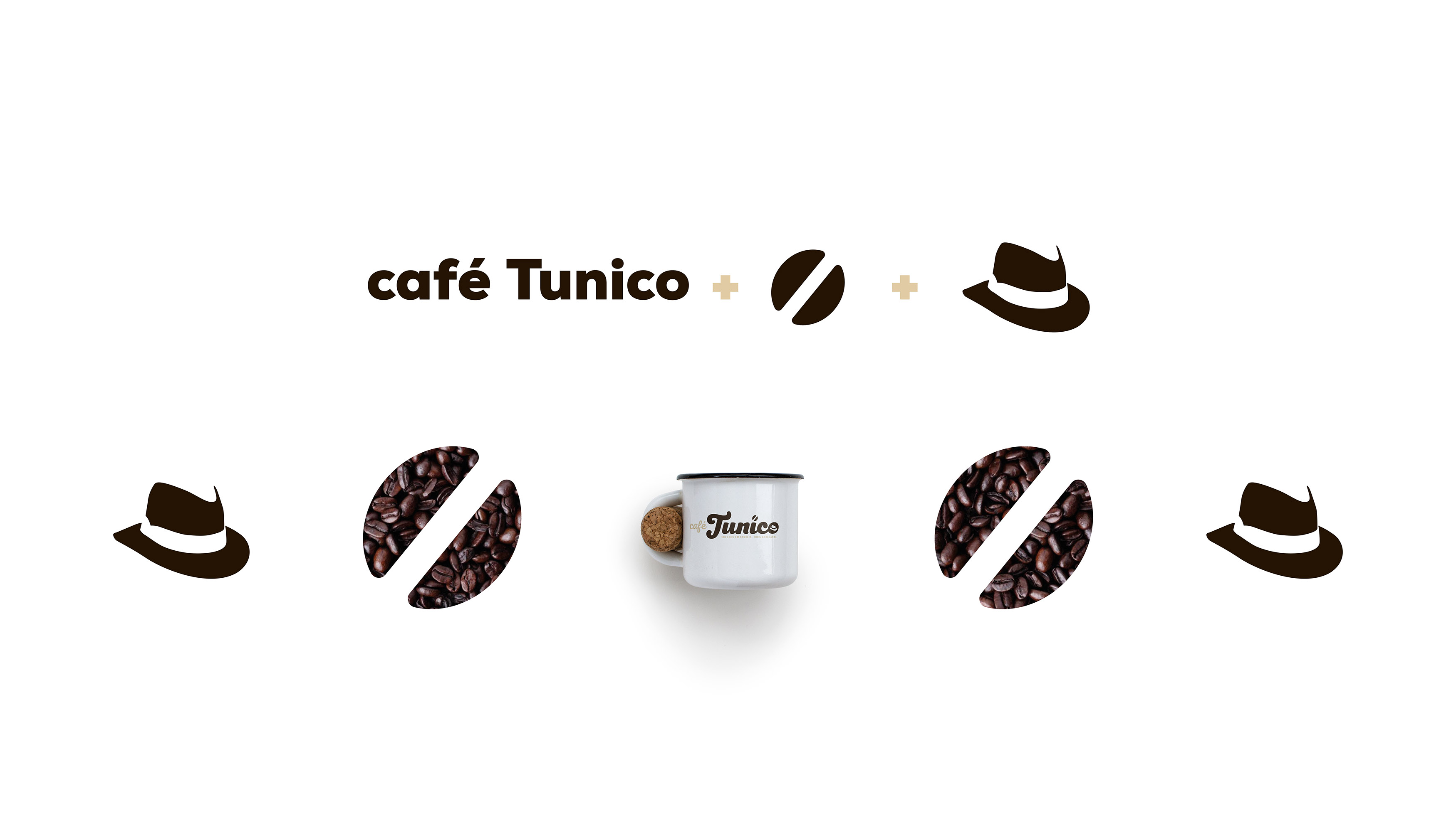
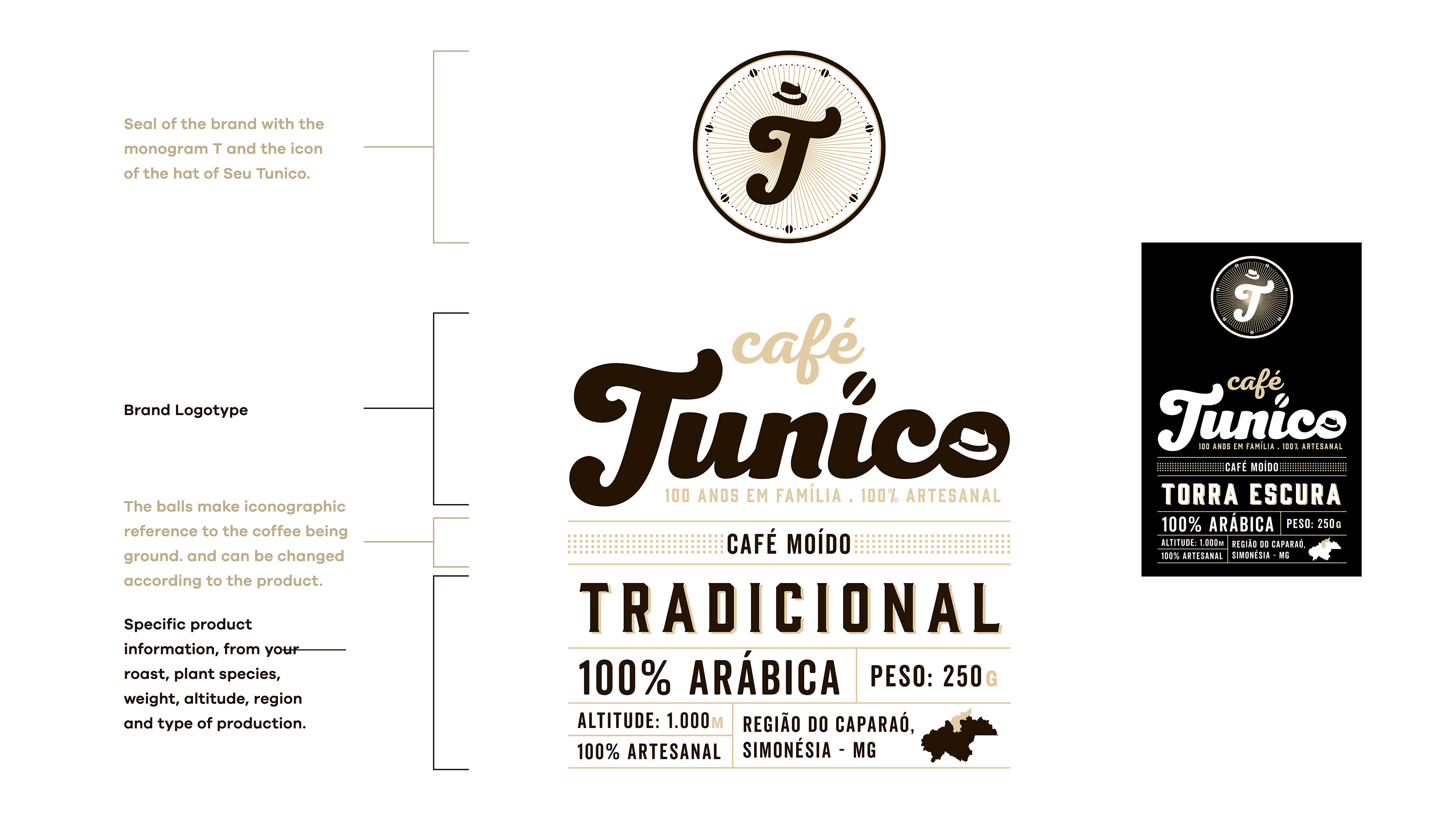
Coffee, family, 7 children and His Tunico Lucas. These are the pillars of this story, and that’s what we brought to the logo. The coffee, discreetly, replaces the “i” point. His Tunico is represented by the hat, inseparable companion.
Following the concept of tradition, we look for a typography that represents all the tradition of the family, the artisanal method of coffee production. The primary typography chosen was from the Nexa Script family.
A font with handmade style, traditional and retro, but with a contemporary, casual, decorative and elegant air. Various adjustments have been made in the design of the font to fit perfectly in the design of the mark improving the readability and highlighting the T.
For secondary typography we use Gin, an acute serif font, inspired by the vintage style of antique packaging. It brings an elegant contrast to the logo, being used in its slogan.
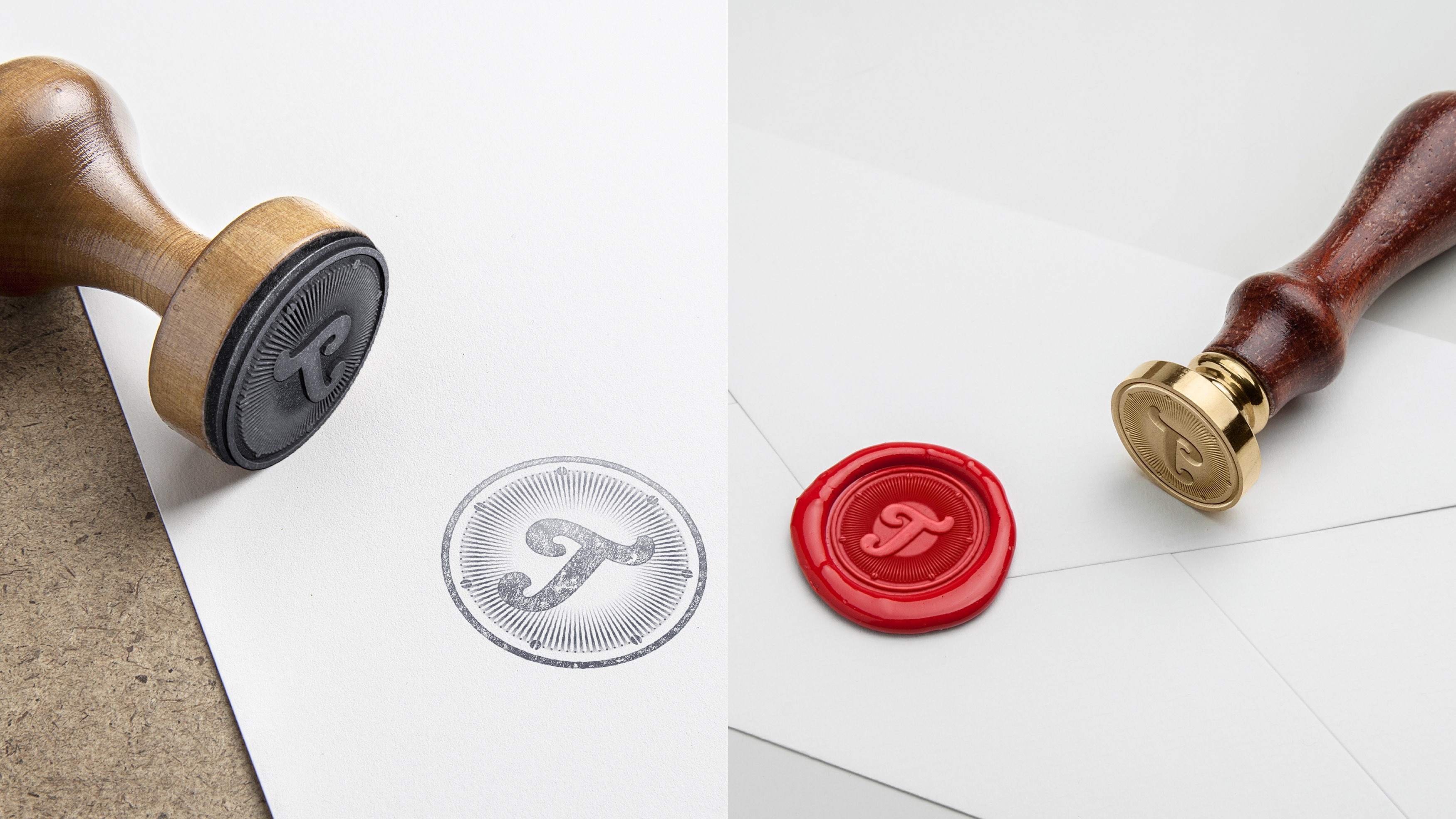
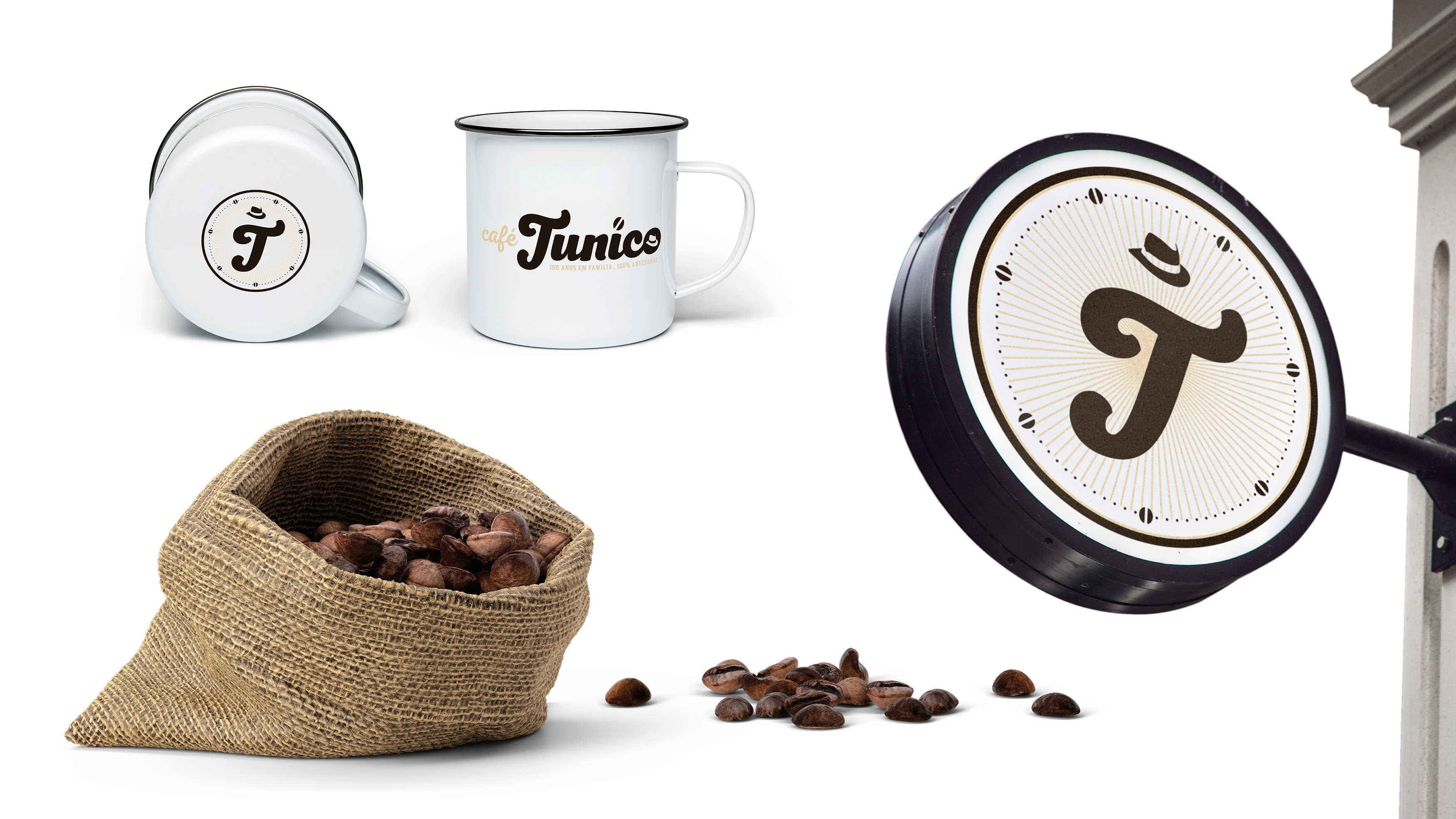
The seal is a way of identifying the brand quickly and that can be applied in various places and objects. In it we use the T Logo Tunico as a striking element of the brand and bring the hat in two different ways.
For the coffee bean, we take a little more of the current family history, the children. They are represented within the circle, symbolized by the 7 coffee beans around the T, of Tunico.
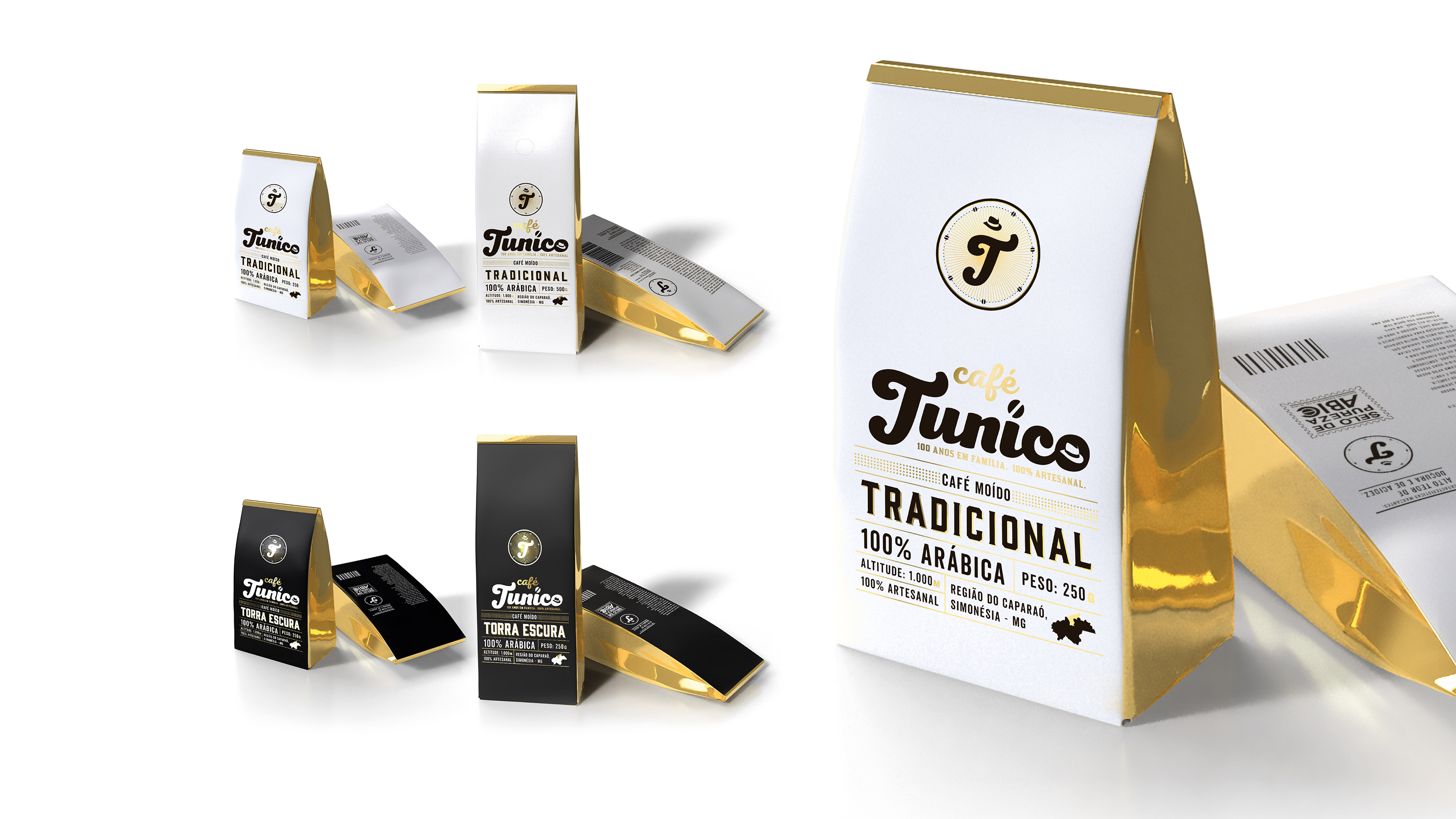
A coffee bean, for this family, is more than just a coffee bean. They call him a golden grain, for he was responsible for the main source of livelihood for all generations in those more than 100 years. Therefore, we use the golden detail to symbolize the meaning of coffee for the family. It is more than material, gold represents the wealth of love and prosperity.
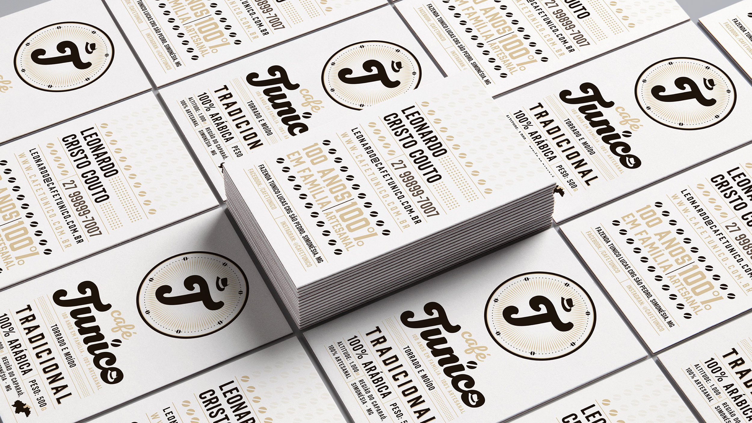
The concept was developed to translate the past, but in a modern way. The fountains and the layout refer to a retro that never goes out of style. As the idea is to pass the tradition of more than 100 years of family history with coffee, in addition to reinforcing the proposal that the Café Tunico is basically produced in an artisan way.
CREDIT
- Agency/Creative: Montenegro Design
- Article Title: Café Tunico Brand – Packaging Design
- Organisation/Entity: Freelance, Published Commercial Design
- Project Type: Identity
- Agency/Creative Country: Brazil
- Market Region: South America
- Project Deliverables: Brand Advertising, Brand Creation, Brand Design, Brand Identity, Brand Naming, Brand Strategy, Brand World, Branding, Graphic Design, Packaging Design, Research, Tone of Voice
- Industry: Food/Beverage
- Keywords: Café, Coffee, Minas Gerais, Brasil, Brazil, brand, logotype, packaging, bean, roasted, grain


