


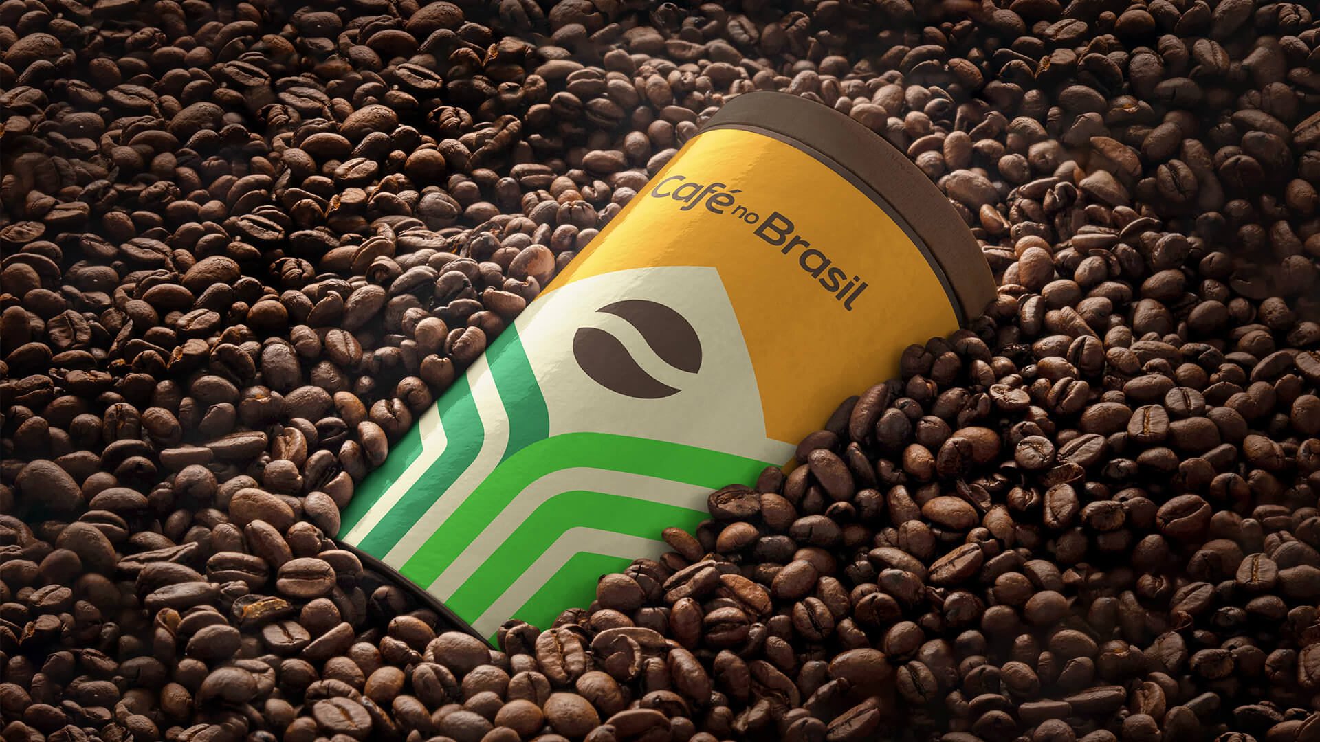
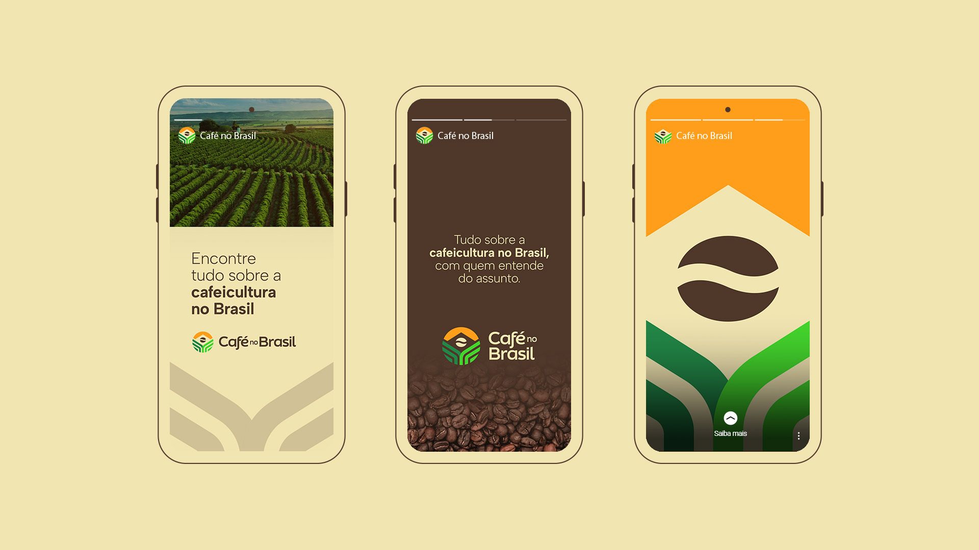
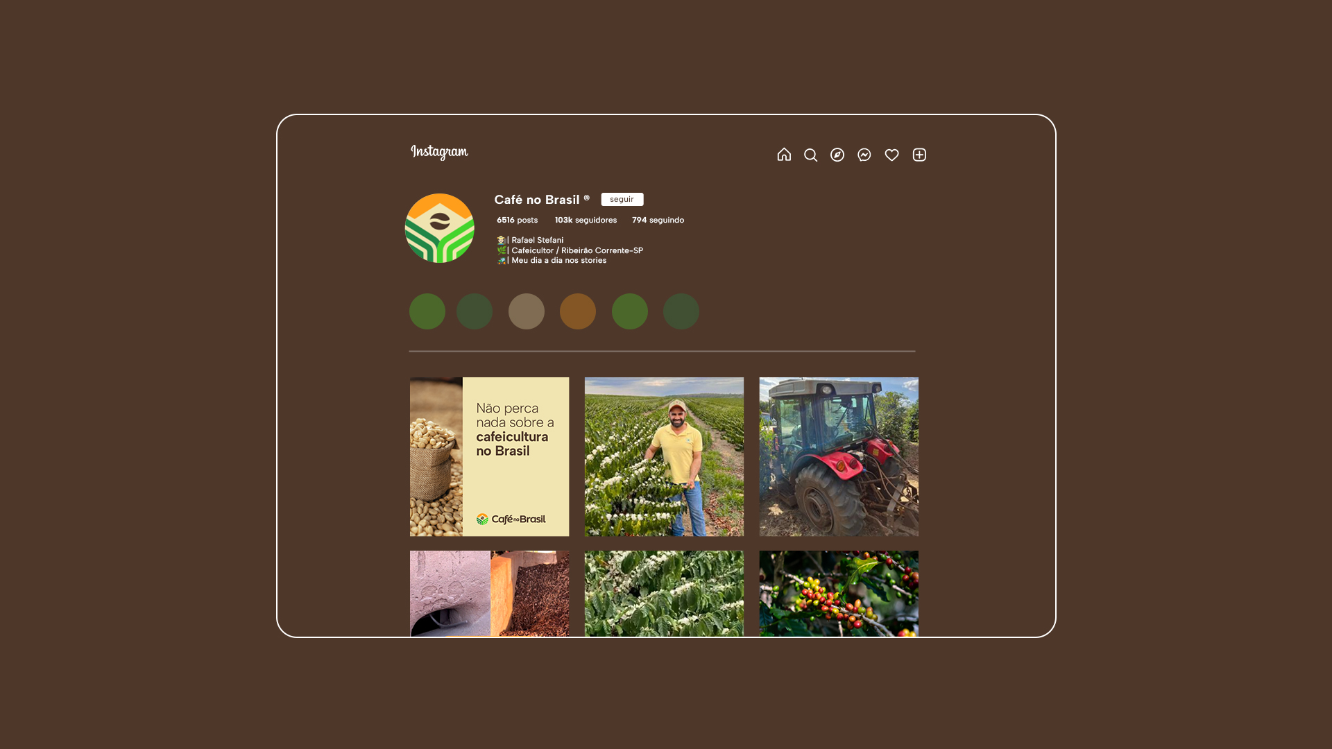
Café no Brasil (Coffee in Brasil in english) is an Instagram profile with more than 100,000 followers, created in 2014 with the aim of showing the beauty of Brazilian coffee growing, bringing news and information to coffee growers.
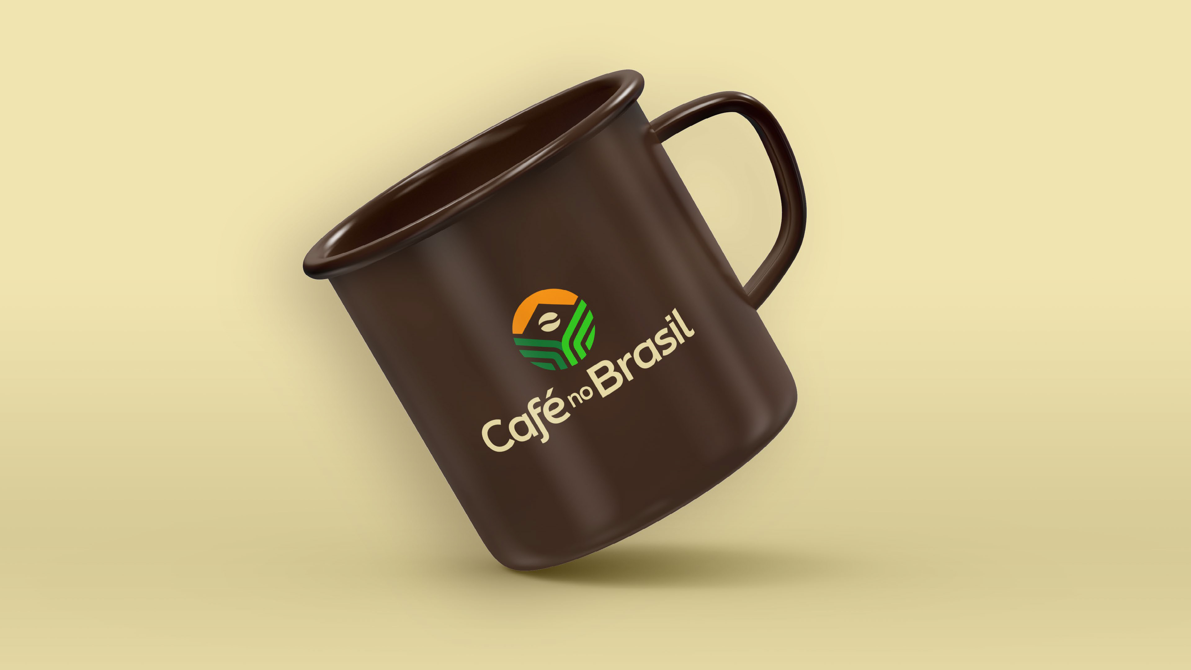
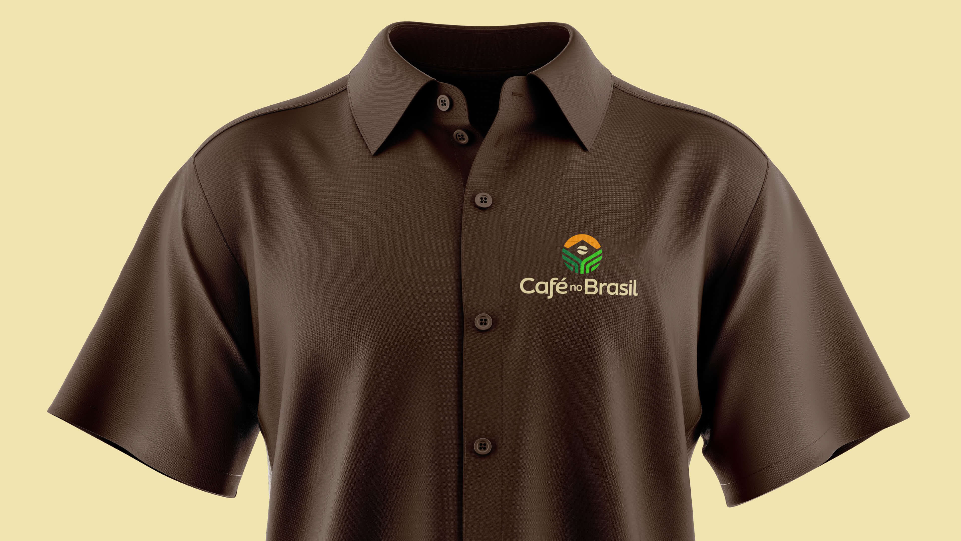
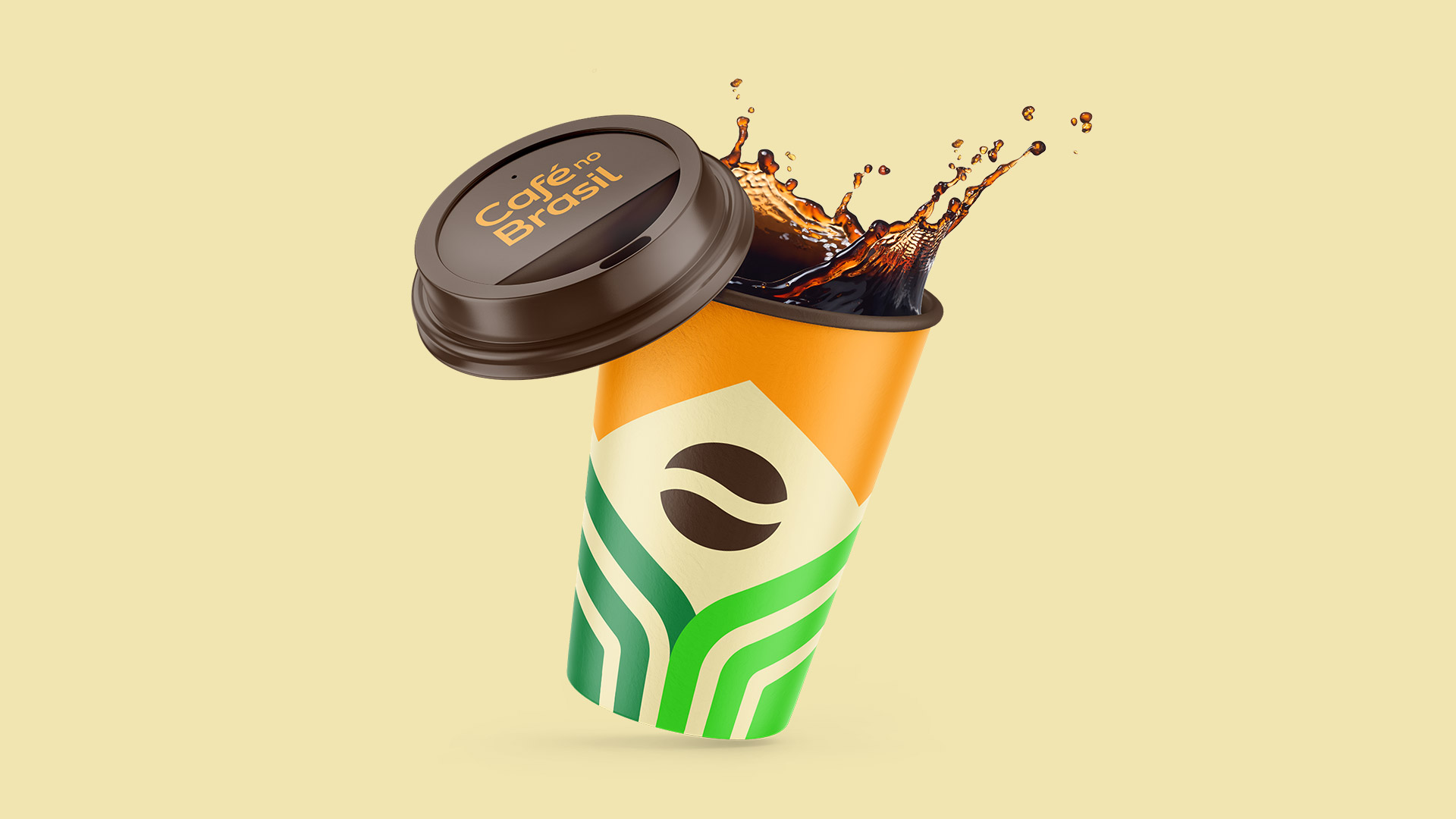
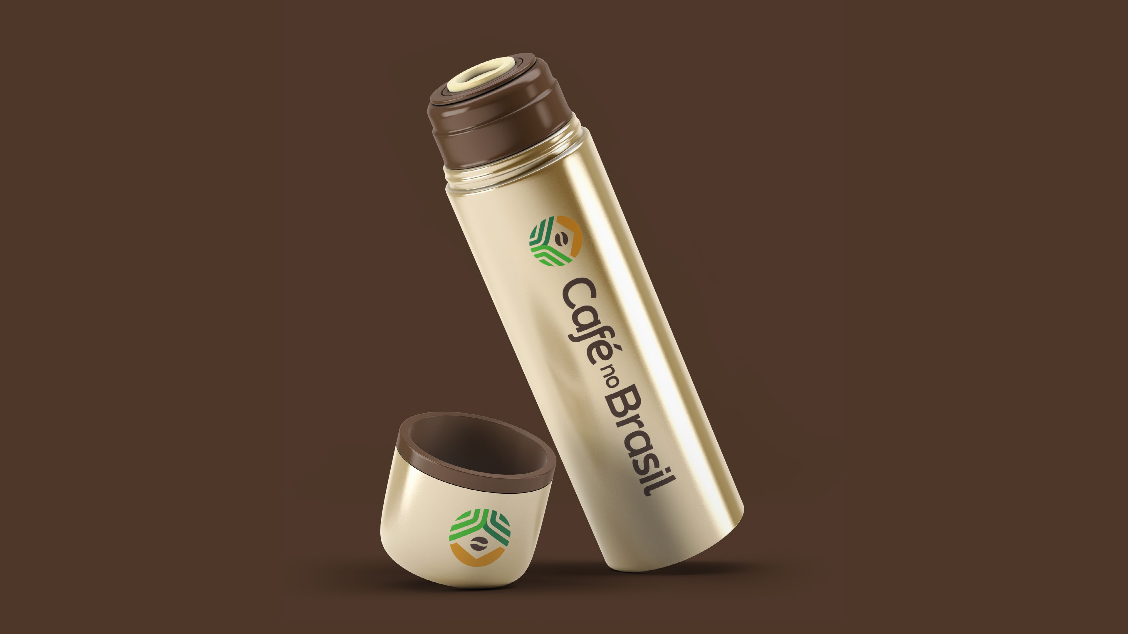
The brand’s proposal, in addition to its main use being on social networks, due to its round shape, was to work on several products that will be sold in an exclusive Café store in Brazil.
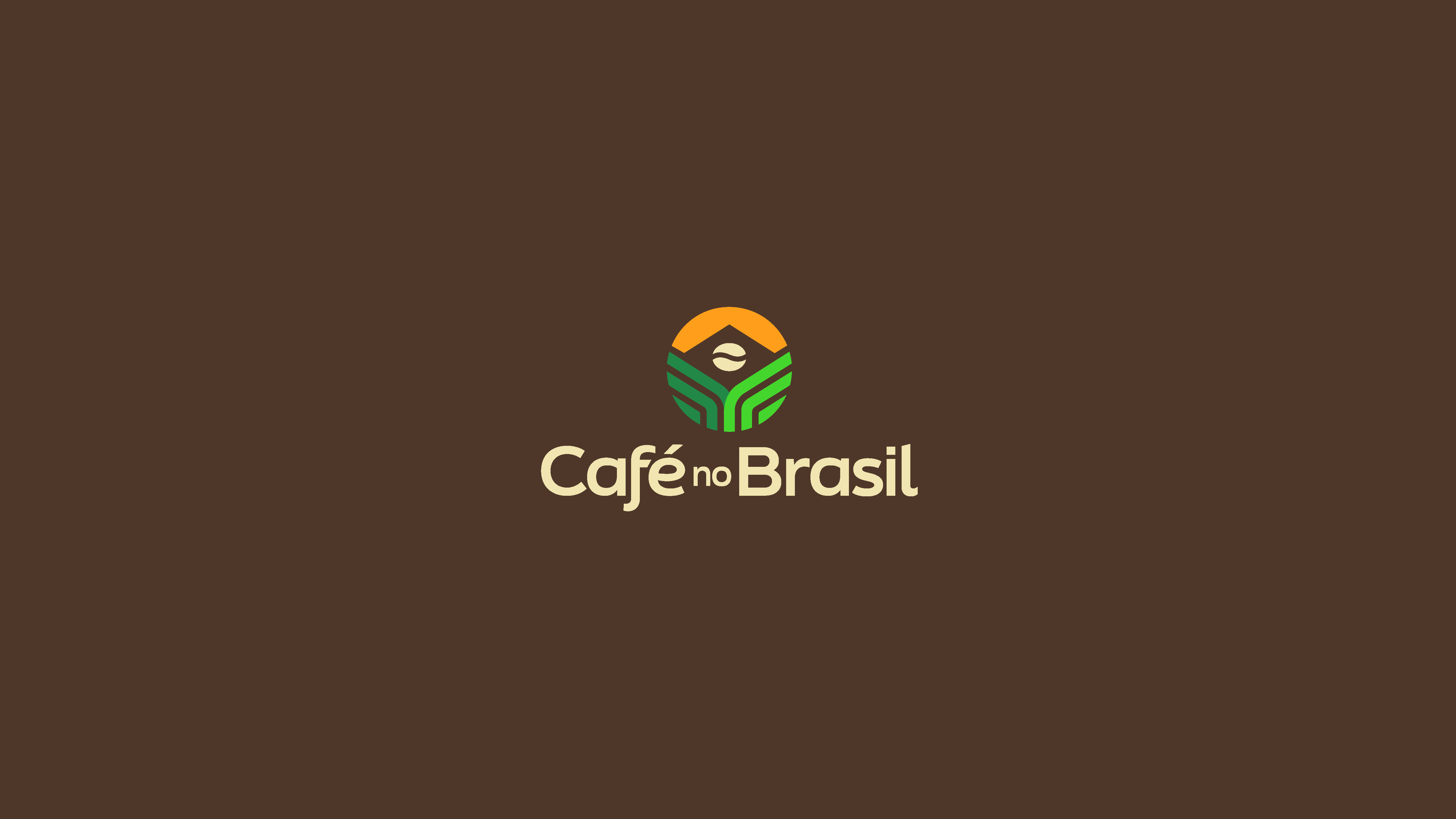
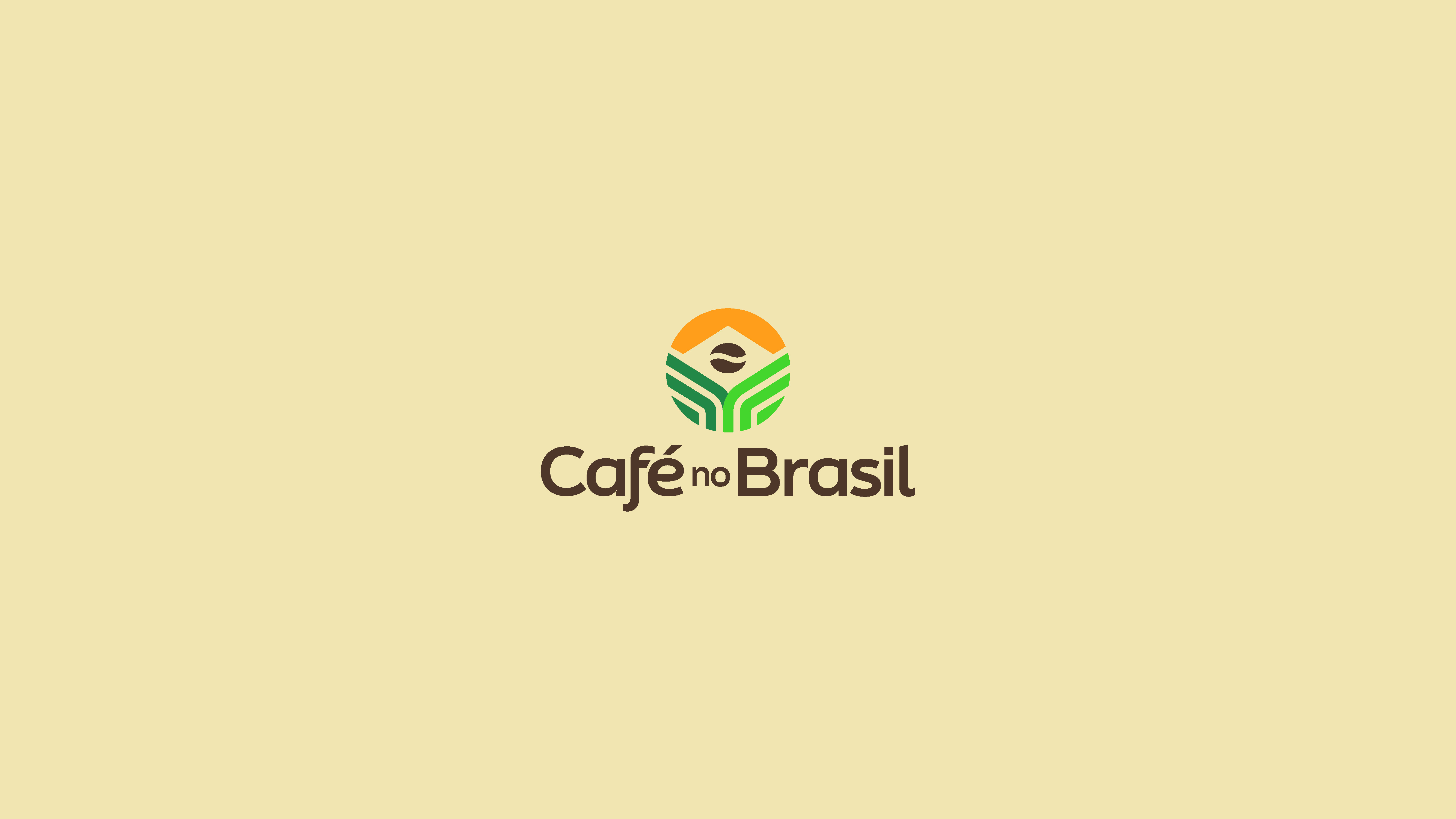
We seek to create a simple, informative brand, straight to the point, but full of meanings. In this way, we seek to insert the following elements into the brand: coffee plantation lines, the Brazilian flag and coffee beans.
Concepts
The plantation lines seek to position the brand in the coffee growing market, not just coffee. The use of green reinforces the naming, as it is on the Brazilian flag, along with yellow.
The brazilian flag was in negative, being formed by the lines, sun and coffee bean, forming an additional layer of meaning to the brand.
The coffee bean is intended to identify the brand, reinforce the meaning of the coffee and form the circle of the flag. I circle this one, to reinforce its use online, on instagram, facebook and youtube.
Support Typography
The supporting typography manages to convey neutrality and seriousness for the brand to pass on to its public correct and precise information about coffee growing in Brazil.
Symbol
The symbol was built within a Grid with the aim of organizing and harmonizing the elements that represent the brand’s concept.
Colors
The chosen colors have as main function, the representation of coffee and Brazil, that is, a reinforcement of the brand and highlight in relation to the competition.
Brown represents the coffee bean, the earth, while green, in addition to being the color of the leaves, is present in the Brazilian flag.
Yellow seeks to deliver energy to the brand, representing the riches on the flag but also the sun illuminating the grain and planting lines.
We look for bright colors to be in line with social networks, the public and the proposed archetype.
CREDIT
- Agency/Creative: Zanon Studio
- Article Title: Café no Brasil Branding
- Organisation/Entity: Agency
- Project Type: Identity
- Project Status: Published
- Agency/Creative Country: Brazil
- Agency/Creative City: Zanon Studio and Fedel & DiBella
- Market Region: South America
- Project Deliverables: Art Direction, Brand Creation, Brand Design, Brand Guidelines, Brand Identity, Brand Redesign, Graphic Design
- Industry: Agriculture
- Keywords: coffee, brazil, visual identity, brand, brand identity, agriculture
-
Credits:
Creative Director: Fedel & DiBella Design
Graphic Designer: Mauricio Zanon


