The town of Hajipur has very limited options for affordable fine dining. The concept of quality outdoor dining hasn’t caught up yet. D3 is an effort to bring that change in culture with inclusive outdoor fine dining. D3 is Hajipur’s ticket to the good memories of open garden dining and family-friendly nightlife.
D3 is the abbreviation for 3 Ds: Dil Dosti Dunia.
It stands for Dil Dosti Dunia. The 3 Ds together express the Dil or heart-warming experience for friends or Dosts and family that D3 aims to provide. It’s like a whole new world or Dunia for Hajipur.
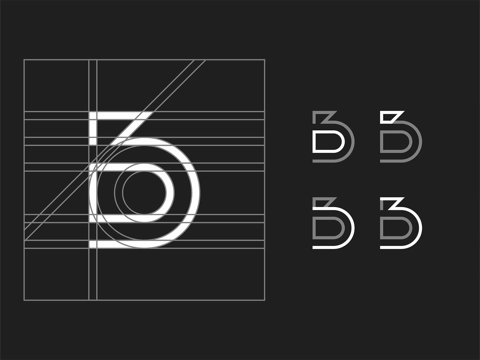
A monogram that feels premium but not too luxurious to alienate the crowd. It gives a sense of polish that gives the expression of family-friendly fine dining.
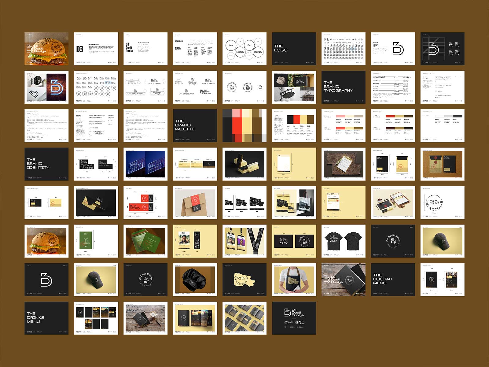
The primary brand palette of D3 is designed to give a polished rustic and friendly vibe. It is majorly comprised of D Black, Dil Red, Dosti Yellow and Duniya Brown.
D Black is the go-to background for digital creatives and the go-to text colour for print media and documents. Dil Red is the embodiment of D3’s passion. It is the go-to colour for pointing attention towards something. For example, CTAs, the primary colour of illustrations, offers etc. Dosti Yellow is the depiction of the friendly wholesome ambience of D3. It’ll occupy the most space in print media besides working as highlights in digital media. Duniya Brown is the embodiment of the reliability customers can expect from D3. It’ll occupy the second most space as background and text colour besides being the go-to colour for shadows.
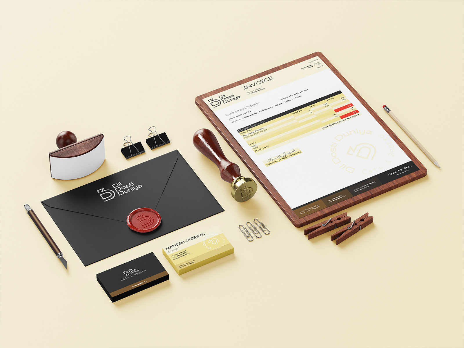
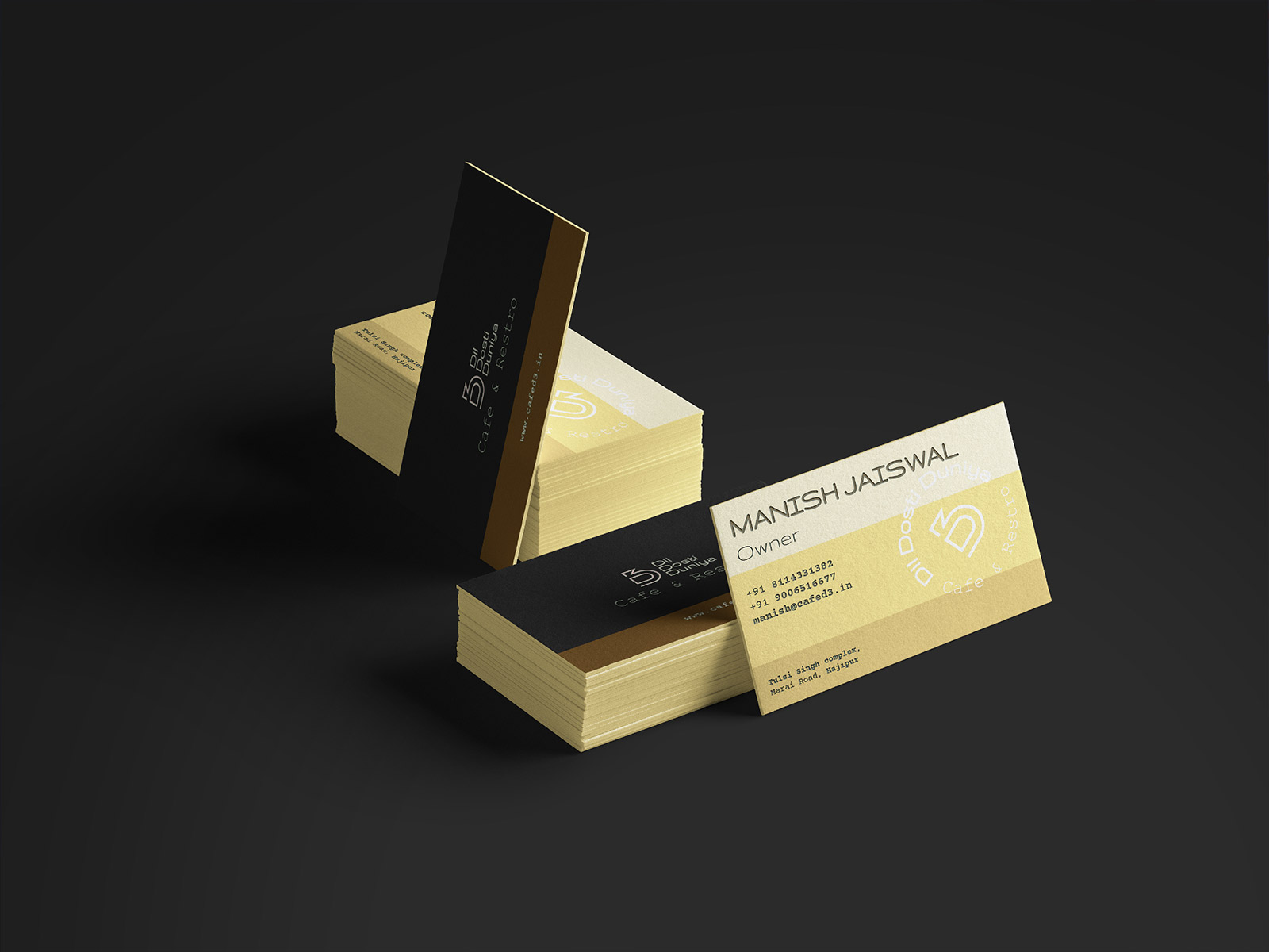
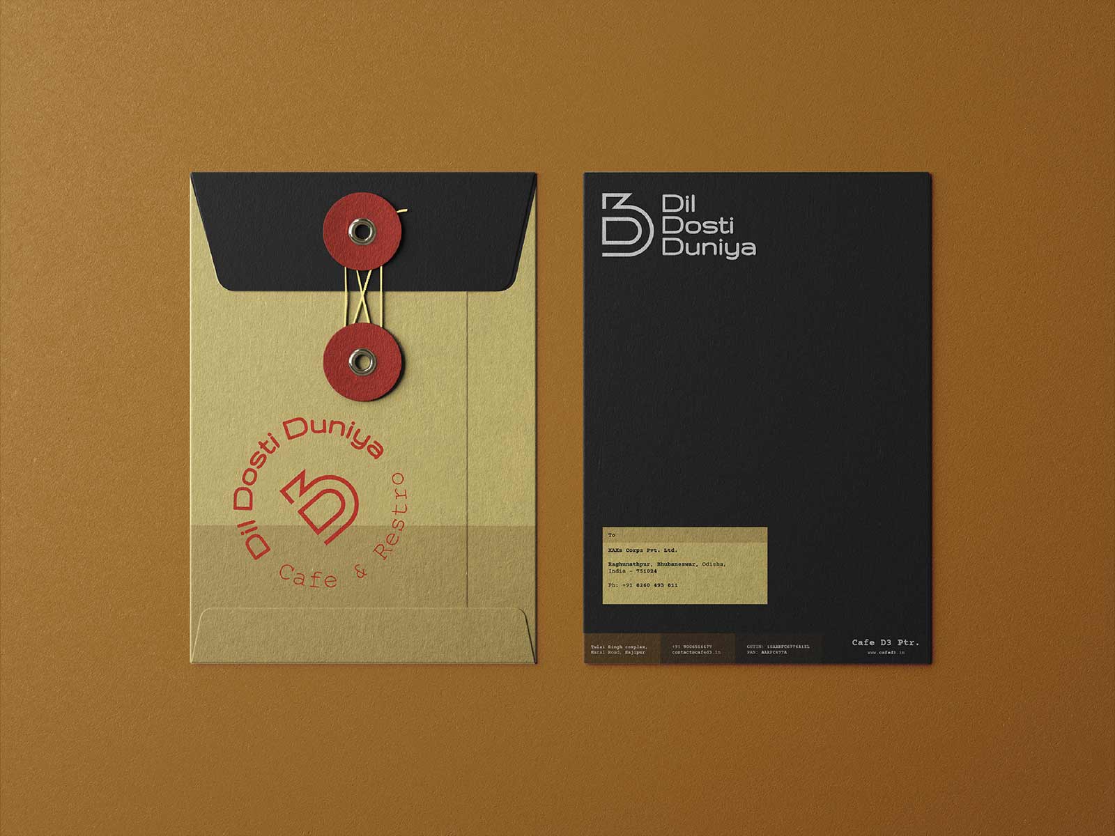
The brand stationeries we designed for Cafe D3 were Business cards, Letterhead, Invoices, Legal envelopes, Half letter envelopes and Invitation cards.
For stationeries that will be heavily printed upon like letterheads and invoices, we kept white as the base colour. While for single print stationeries like business cards, envelopes and invitations, we used a combination of D Black and the different shades of Dosti Yellow and Duniya Brown as the base colours. We implemented emboss print techniques with the combination of logo stamps in red to give a hand-crafted fine-dining experience. We further used the different shades of Dosti Yellow to group different information along with giving the stationery a signature visual brand identity.
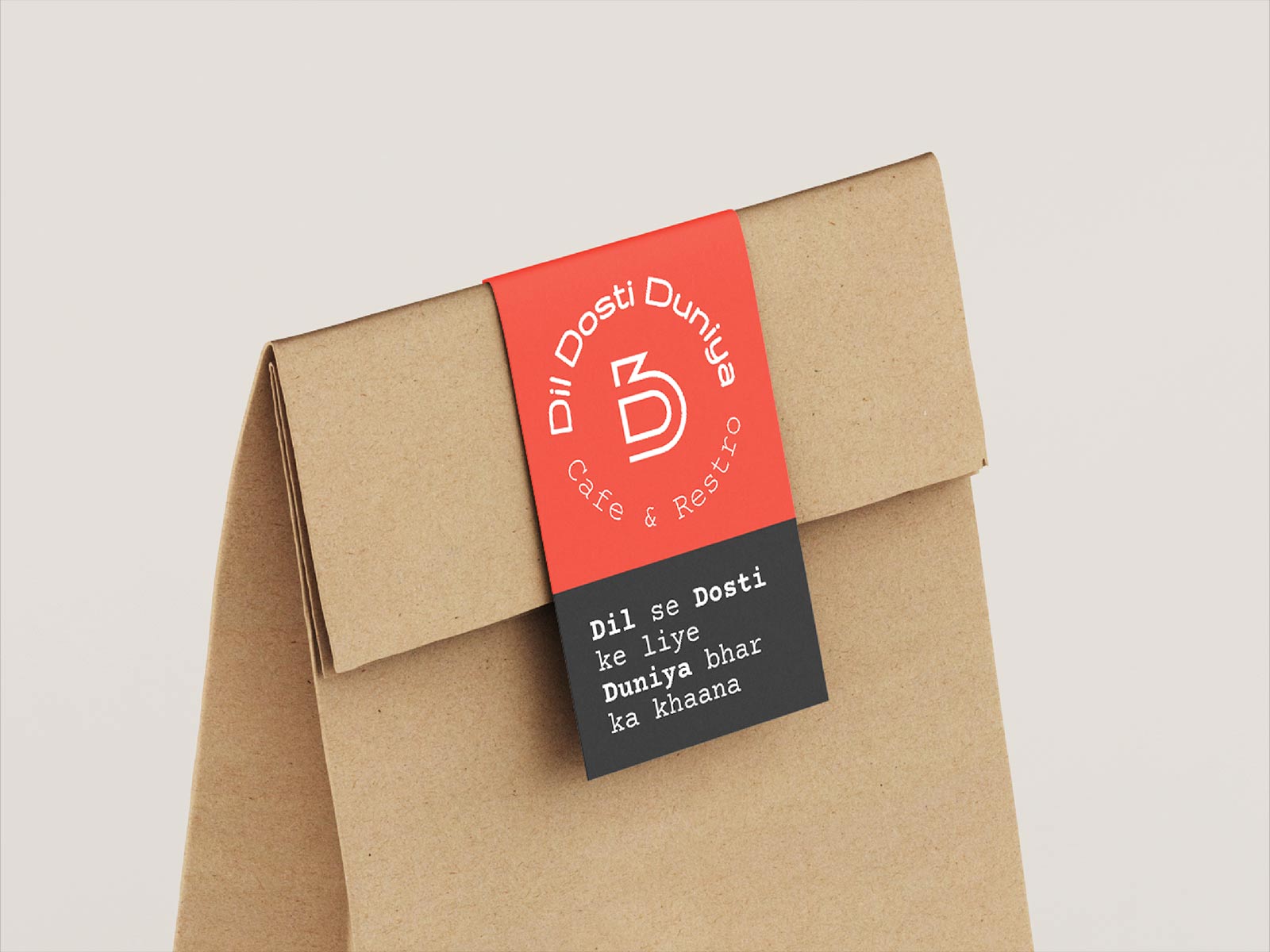
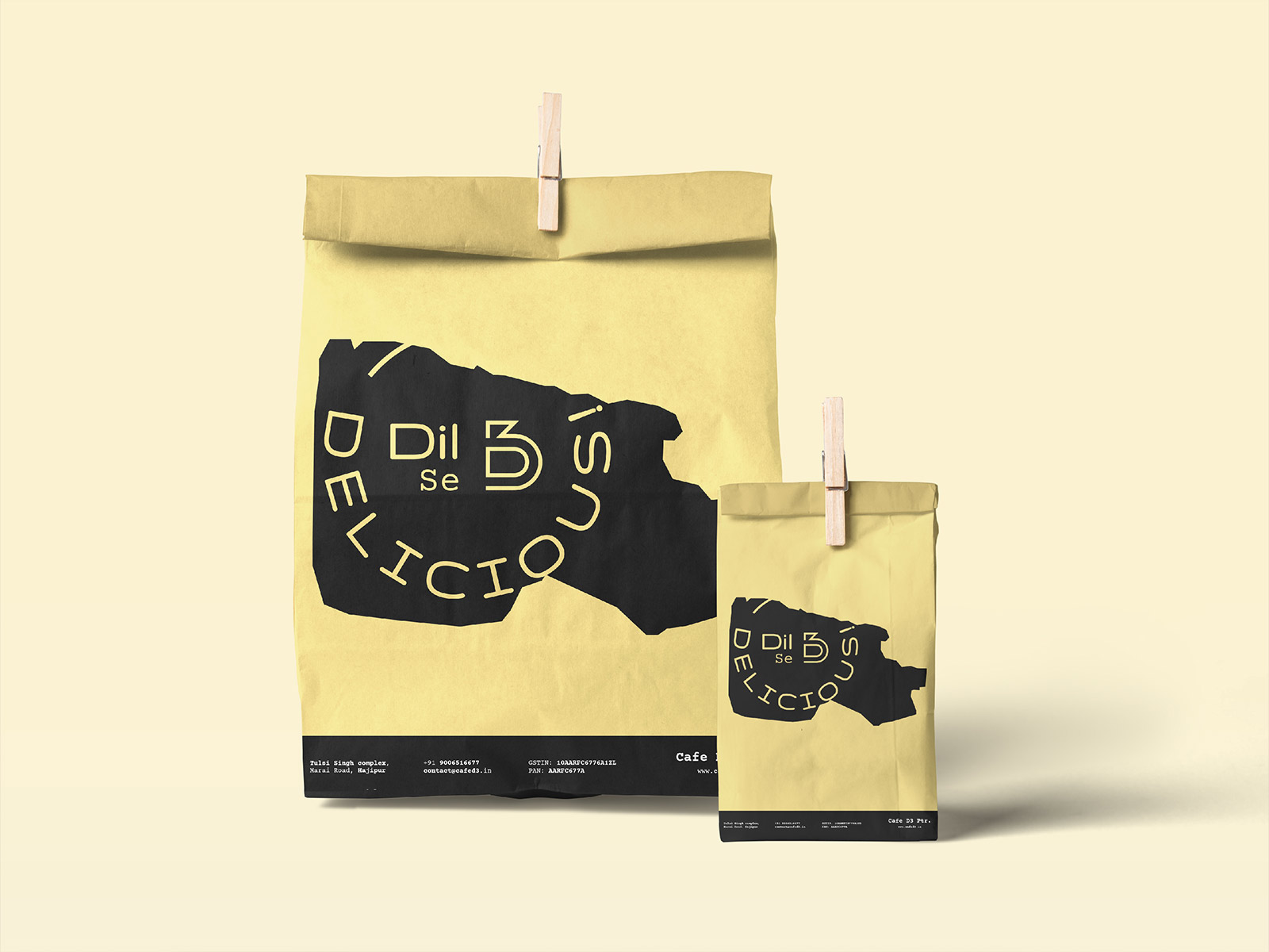
The packaging designs we delivered for Cade D3 were Label stickers and Carry bags. For carry bags, we went with the 3 standard sizes for the 3 most common takeaway use cases.
We carried forward the signature colour block systems we developed for Cafe D3 into the packaging design. We chose the Dil Red and D Black combo for the stickers as they are the seal of quality. For the paper bags, we designed custom illustrations using the map of Hajipur and developed a single-colour system. This was done to reduce the cost of printing without losing the brand identity.
The brand elements we developed for the D3 retail set were Tees, Caps, Chef hats, and Apron and Neon signage.
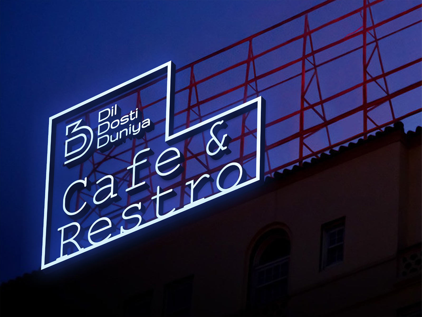
We went with D Black as the base colour and different lockups of the D3 logo for these. We also used the “Dil se Delicious” slogan and illustration for the aprons to give a welcoming hand-crafted vibe to the restro cafe. And to complete the fine retro vibe, we designed a neon signboard for the open garden and burger heat stamp branding.
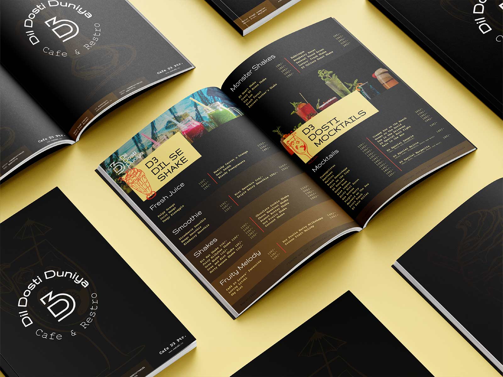
The menu is the most important brand collateral for a food joint as it is the brand element that the customers spend the most time with. Hence we made sure to make the Cafe D3 menu as attractive, user friendly and on-brand as possible. We divided the menu into subparts accompanied by each sub-menu with stock photos. Further, we added retro illustrations and the signature colour chunk-based grouping of information to make it more intuitive. And as a final fun touch, we named the dish groups creatively with a passionate sprinkle of Dil, Dosti and Duniya.
CREDIT
- Agency/Creative: XAXs Corps
- Article Title: Cafe D3 Logo, Branding and Packaging Design
- Organisation/Entity: Agency
- Project Type: Identity
- Project Status: Published
- Agency/Creative Country: India
- Agency/Creative City: Bhubaneswar
- Market Region: Asia
- Project Deliverables: Brand Design, Brand Guidelines, Brand Identity, Brand Mark, Brand Strategy, Branding, Logo Design, Packaging Design, Packaging Guidelines
- Industry: Hospitality
- Keywords: New, Friendly, Fun, Memory, Ease, Foodie, Modern, Fresh
-
Credits:
Brand Designer/ Creative Director: Aditya Roy


