


Cactus Hill – Ultra Premium Wine Label Design
A Brand Inspired by Place
Cactus Hill is a winery with an unusual origin story. Located near the village of Momkovo in southern Bulgaria, close to Svilengrad, the project takes its name from something you wouldn’t expect to find in this part of Europe — a hill where cacti grow naturally. That unexpected detail became the seed of an entire brand identity.
The winery building itself is partially embedded into the hill, a design decision that’s both aesthetic and practical. The terrain provides natural temperature stability year-round, creating ideal conditions for production and aging. From the start, everything about Cactus Hill has been deliberate.
The project is led by winemaker Petar Iliev, a respected figure in the Bulgarian wine industry. His vision was straightforward: wines with character, balance, and precision. But he understood early on that great wine alone isn’t enough — the bottle has to tell the story before anyone takes a sip.
Why Packaging Design Drives Wine Sales
In the wine industry, the label is often the first conversation between producer and consumer. It determines whether a bottle gets noticed on a crowded shelf, picked up, and ultimately purchased. For premium wines especially, packaging is a direct signal of what’s inside.
The design philosophy behind Cactus Hill was built around one core idea: communicate quality through restraint. No bold graphics, no visual noise — instead, a label that rewards attention. One that uses tactile surfaces, subtle depth, and carefully considered materials to create a physical experience that goes beyond aesthetics.
This is where skilled label design becomes a genuine sales tool. When a consumer holds the bottle and feels the texture of the paper, the raised lettering, the precision of the finish — they form an emotional connection with the product before they’ve even read the back label. That connection translates directly into purchase decisions, brand recall, and loyalty.
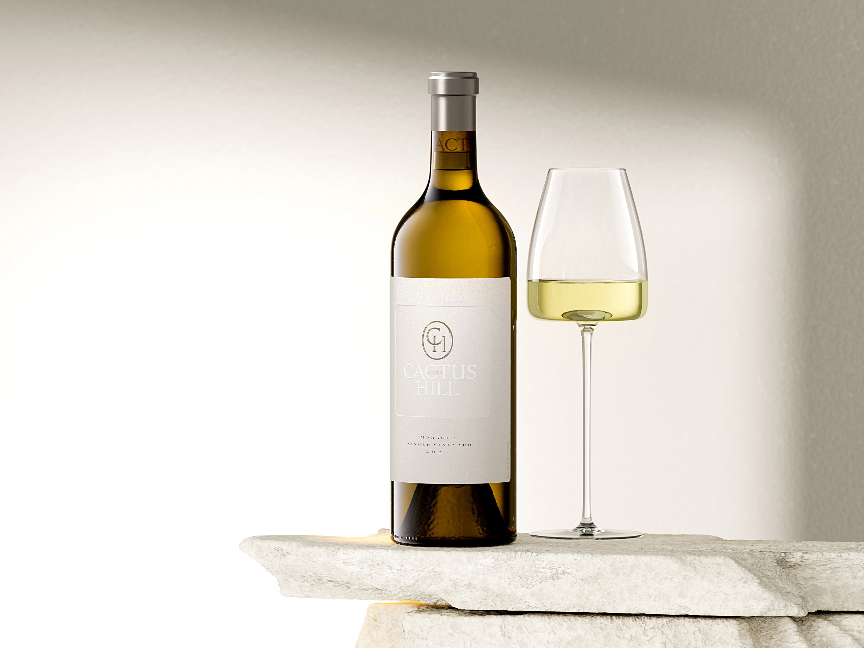
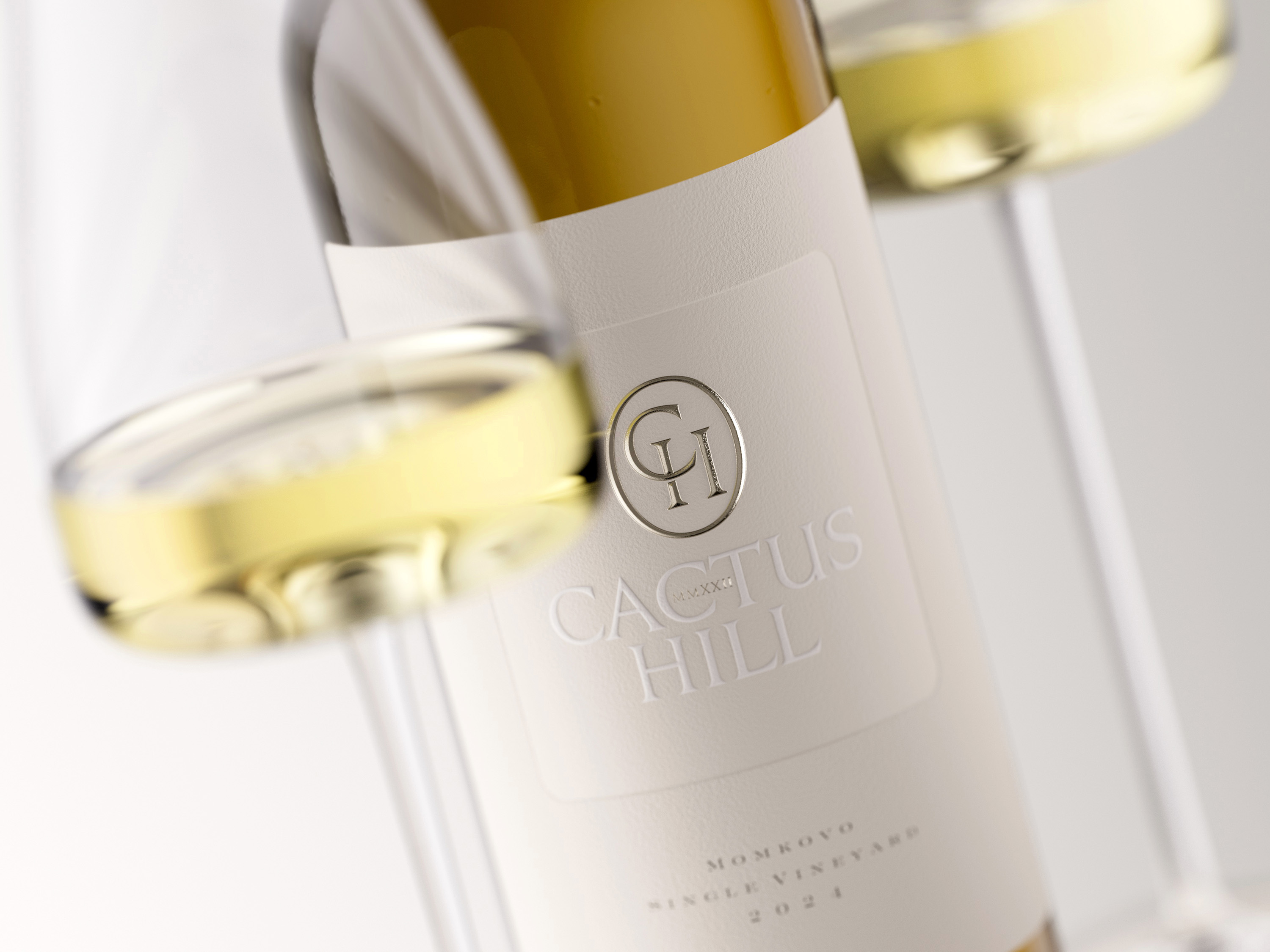
The Bottle: Starting From a Position of Strength
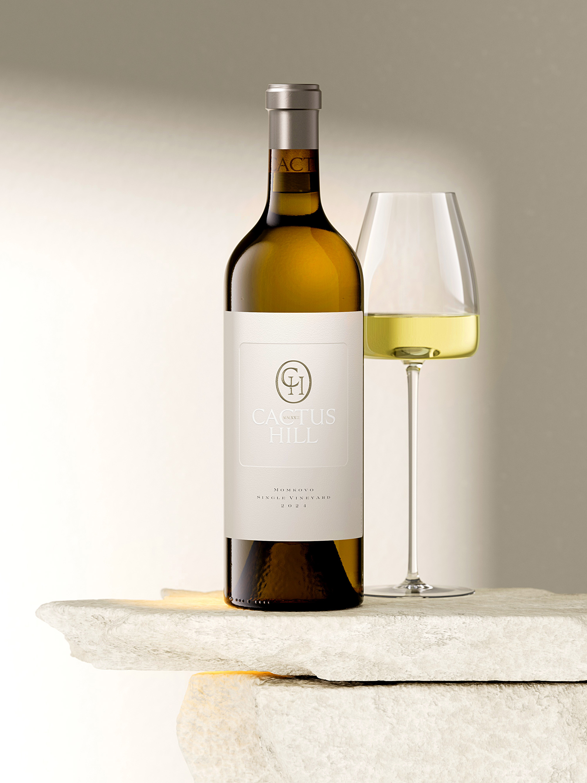
Strong wine presentation starts with the vessel. For the Cactus Hill Chardonnay and Viognier, a heavy Bordeaux Cru bottle by Italian manufacturer Vetreria Etrusca was selected. Its classic proportions and substantial weight set expectations before the label even enters the picture. In premium wine, the feel of the bottle in your hand matters. Heaviness reads as seriousness.
The bottle is sealed with a natural cork branded with the winery logo — a detail barely visible through the glass beneath the capsule, but one that quietly introduces the brand from the very first moment.
The Capsule: A Branding Element in Its Own Right
Capsules are easy to overlook in label design. Here, they were treated as an essential part of the visual system.
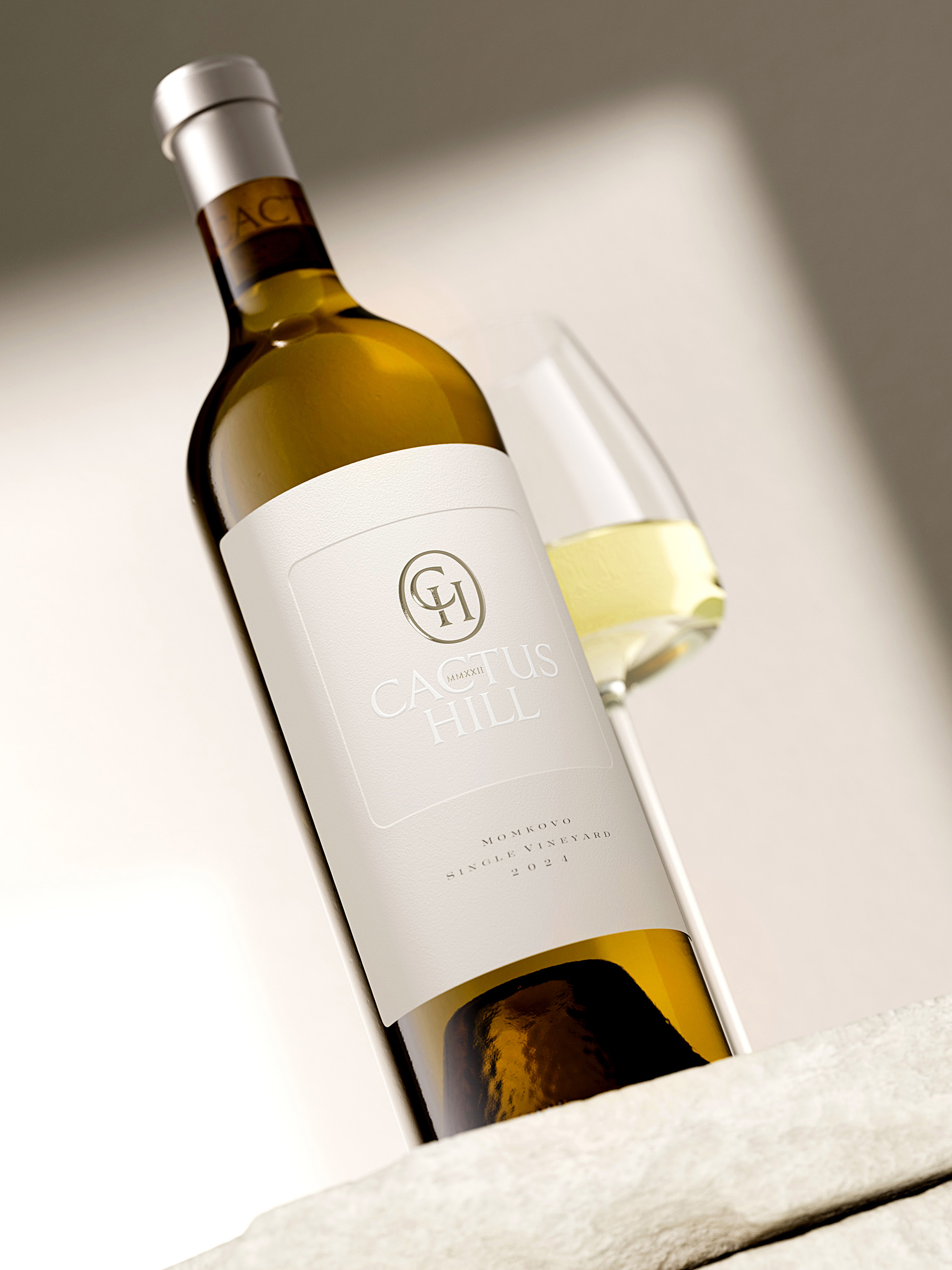
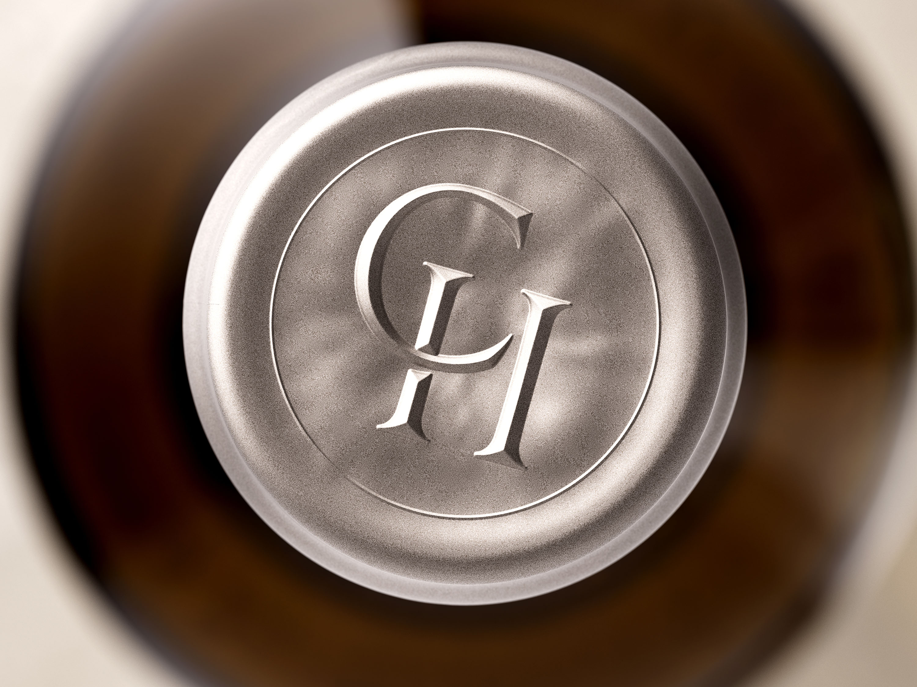
The Cactus Hill capsule is produced from poly-laminate material at an uncommon height of 38 millimeters — taller than standard, which elongates the bottle’s silhouette and strengthens its shelf presence. The color is a carefully developed cobalt-grey that reads as deep, confident, and contemporary. On the top, the CH monogram is embossed, functioning as a tactile signature even before the bottle is opened.
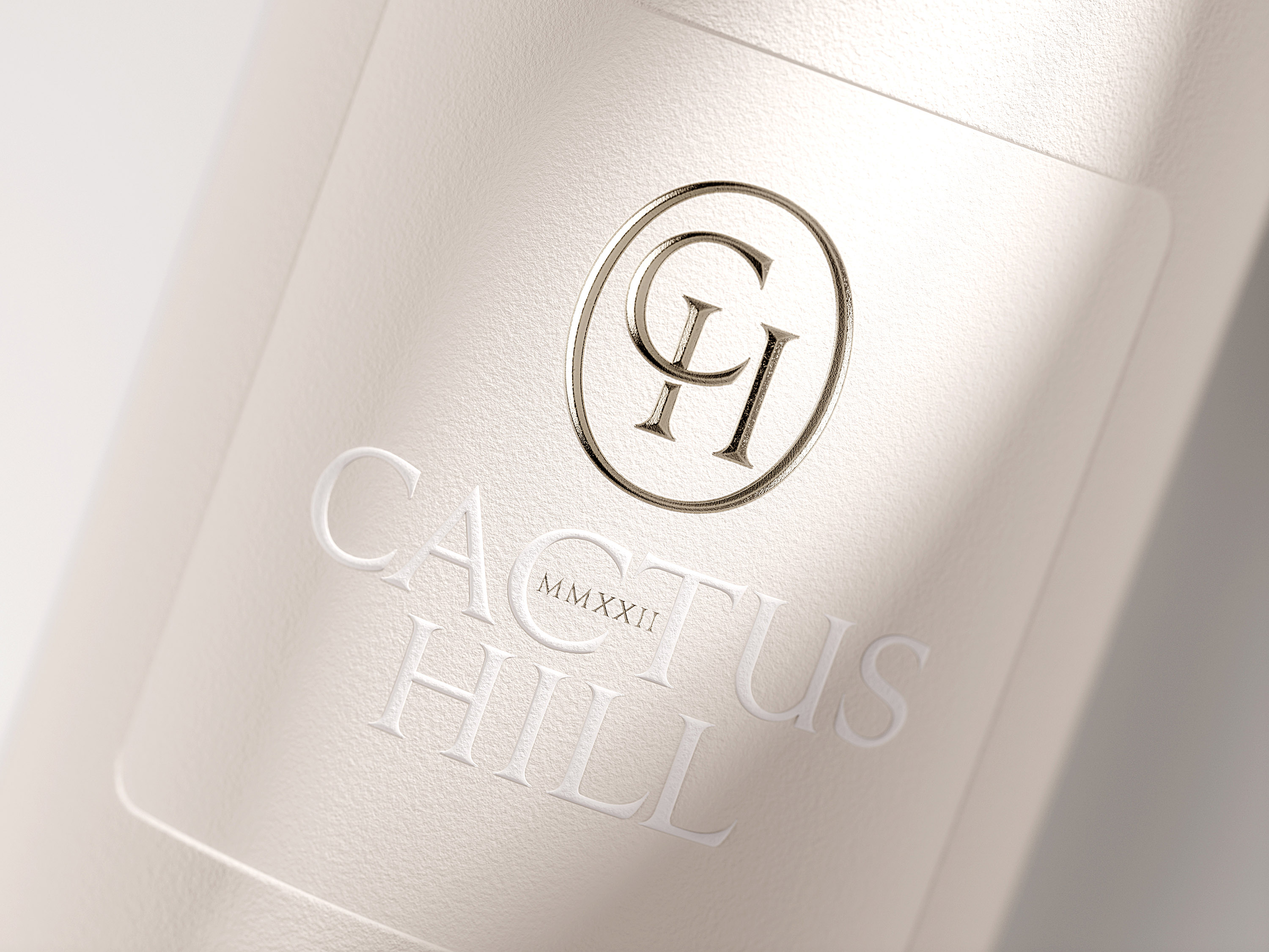
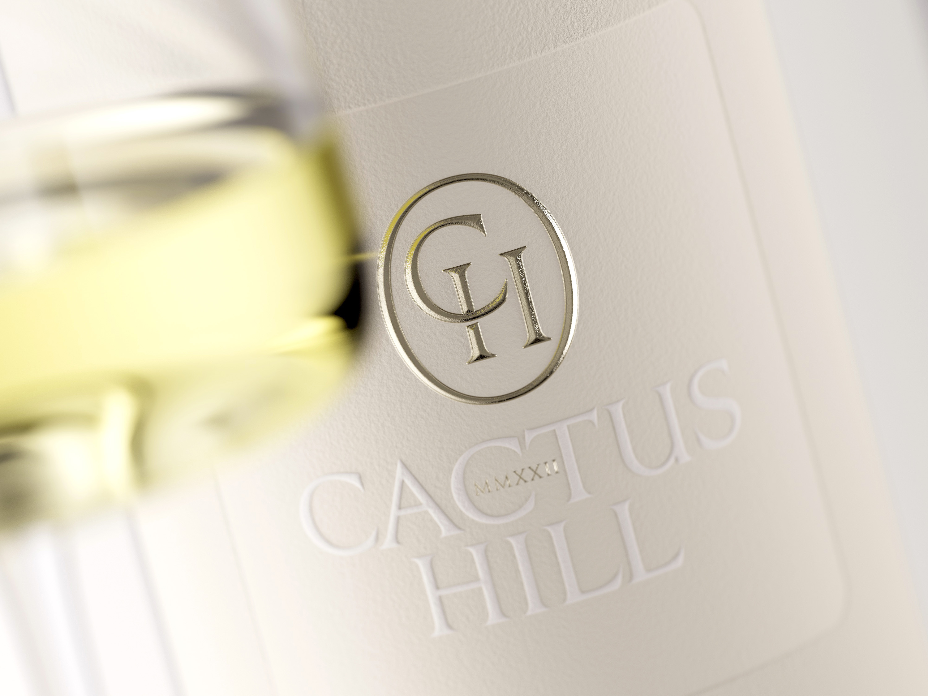
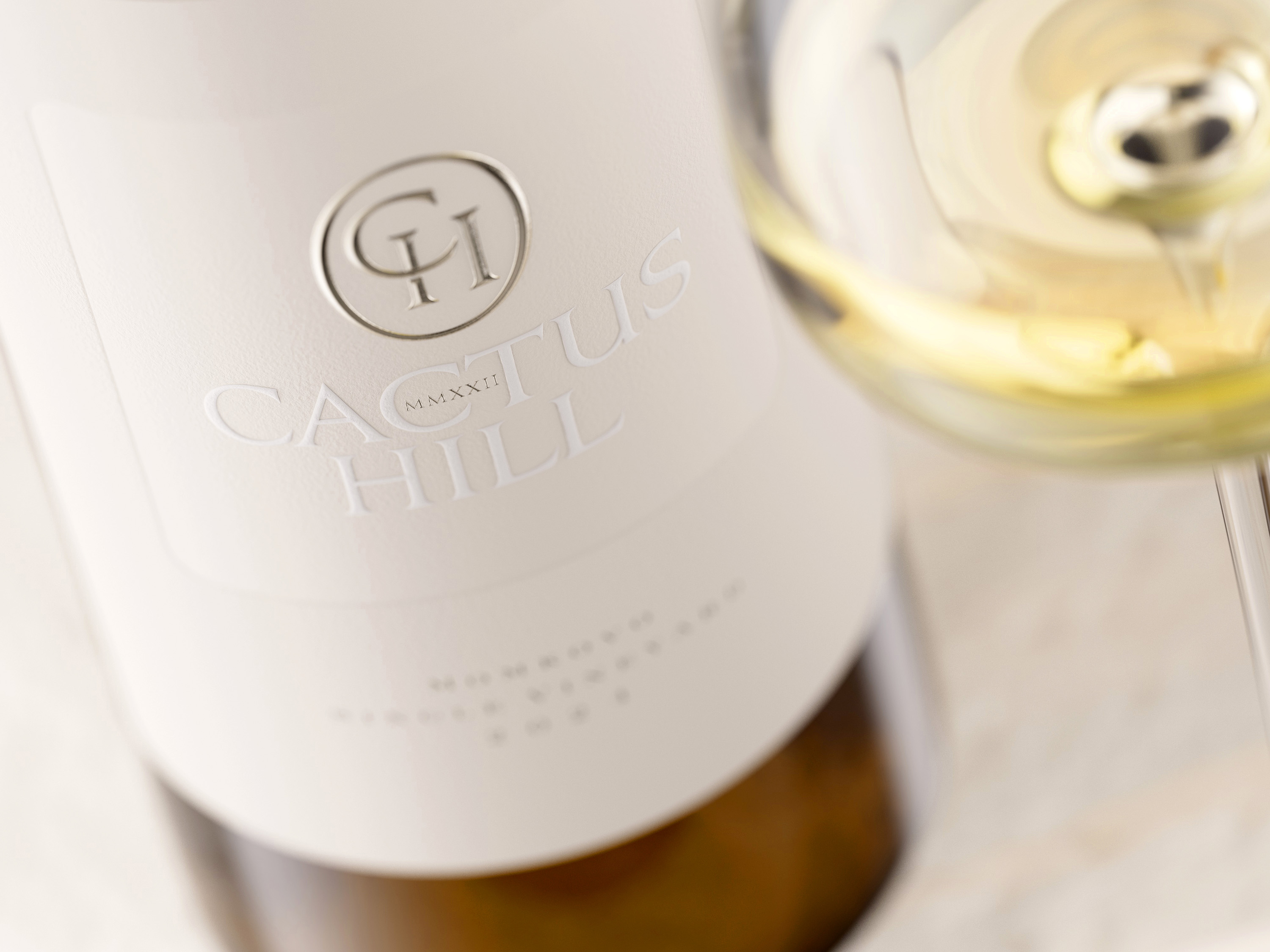
The Label: Minimalism With Depth
The label is printed on Fasson Cotton Touch paper — a premium material with a soft, fabric-like texture that signals craftsmanship the moment you touch it. The shape is a clean rectangle, but the real work happens in the surface.
A large rectangular area at the center is formed through deep debossing — a process that compresses the paper fibers into a recessed frame. No additional ink. The contrast between the recessed surface and the surrounding material creates structure and depth purely through the manipulation of the paper itself.
Inside that frame, the Cactus Hill logo is embossed in white — slightly brighter than the natural cotton tone of the paper. The result is a layered composition of whites: the raw paper, the debossed field, and the raised lettering. The founding year appears in Roman numerals, a typographic choice that adds timelessness and invites the viewer to pause rather than just glance.
For the CH monogram, a fine hot-foil stamp in a matching grey-cobalt tone adds a controlled touch of metallic brilliance — subtle enough to feel refined rather than decorative. Label printing was executed by Dagaprint, whose technical precision made perfect alignment between embossing, debossing, and foil stamping possible.
Design That Builds Emotional Bonds — and Long-Term Sales
The best wine labels don’t just package a product — they create a memory. When thoughtful design meets exceptional wine, the bottle becomes part of the brand experience itself. Consumers remember it, seek it out again, and associate the visual and tactile impression with the pleasure of what was inside.
Cactus Hill reinforces this through one more detail: each bottle carries an individual number. It’s a small gesture, but a meaningful one. It transforms a production run into a collection of unique objects — each bottle its own piece of the story.
Through disciplined minimalism, premium materials, and expert execution, the Cactus Hill label demonstrates what design can actually do for a wine brand. It doesn’t decorate the product. It elevates it.
CREDIT
- Agency/Creative: the Labelmaker
- Article Title: Cactus Hill Ultra Premium Wine Label Design by the Labelmaker
- Organisation/Entity: Agency
- Project Type: Packaging
- Project Status: Published
- Agency/Creative Country: Bulgaria
- Agency/Creative City: Varna
- Market Region: Europe
- Project Deliverables: CGI, Graphic Design, Label Design, Packaging Design
- Format: Bottle
- Industry: Food/Beverage
- Keywords: TheLabelmaker, WineDesign, pilievcraftedexcellence, CactusHill, UltraPremium, WineMarketing, BrandIdentity, LuxuryPackaging, WineBusiness, LabelDesign, InspireTheFirstSip, PackagingStrategy, Dagaprint
-
Credits:
Design & CGI Photo: the Labelmaker


