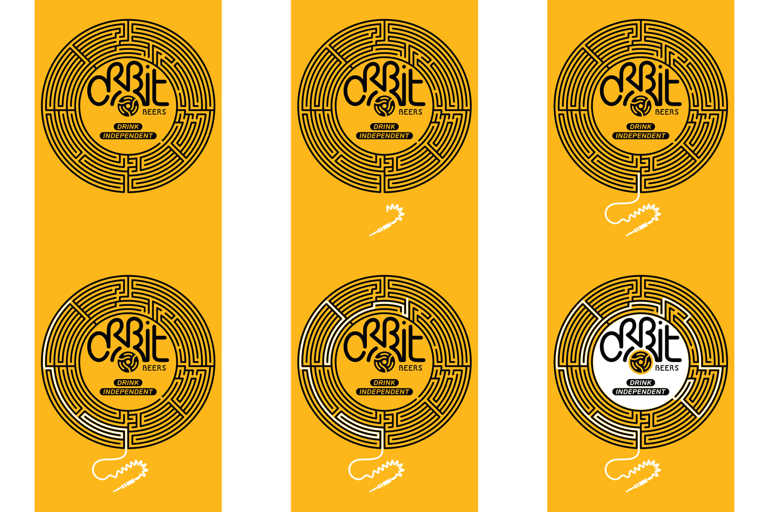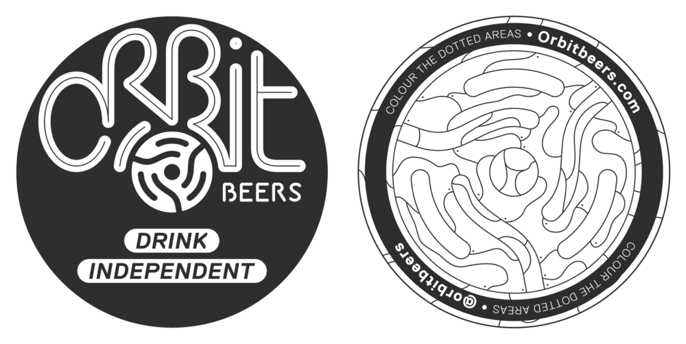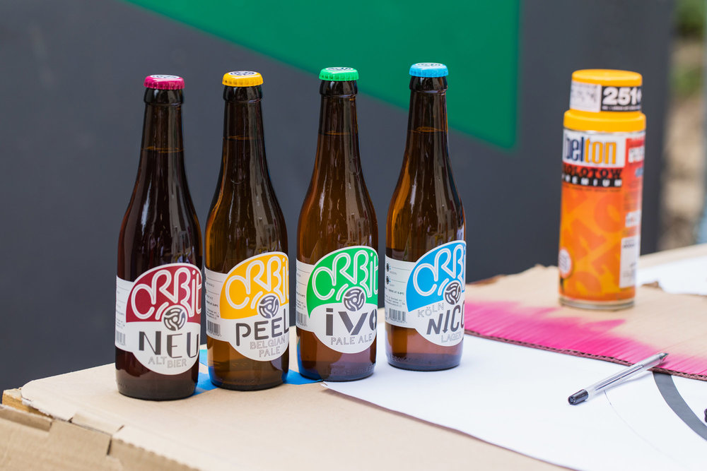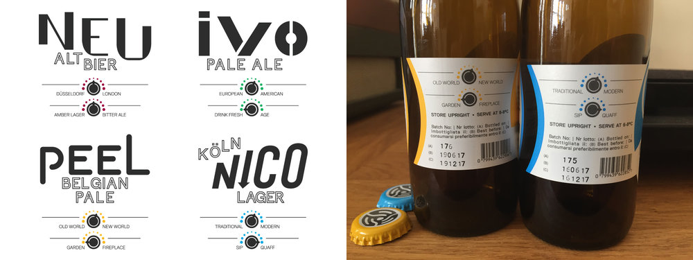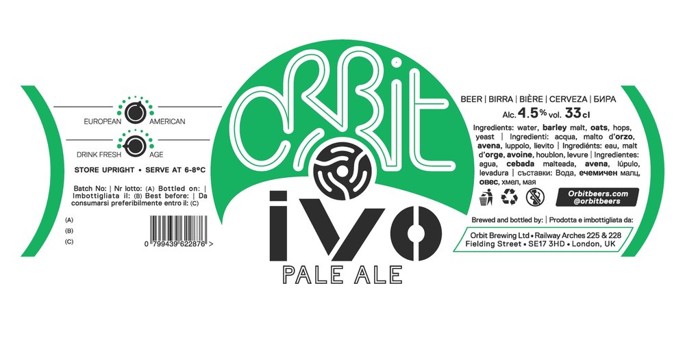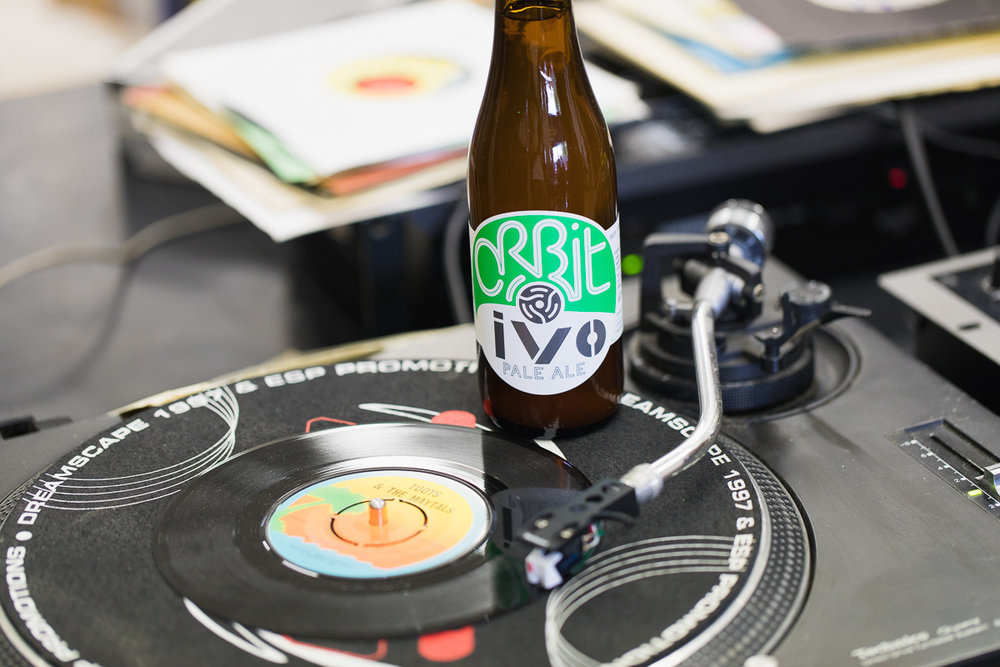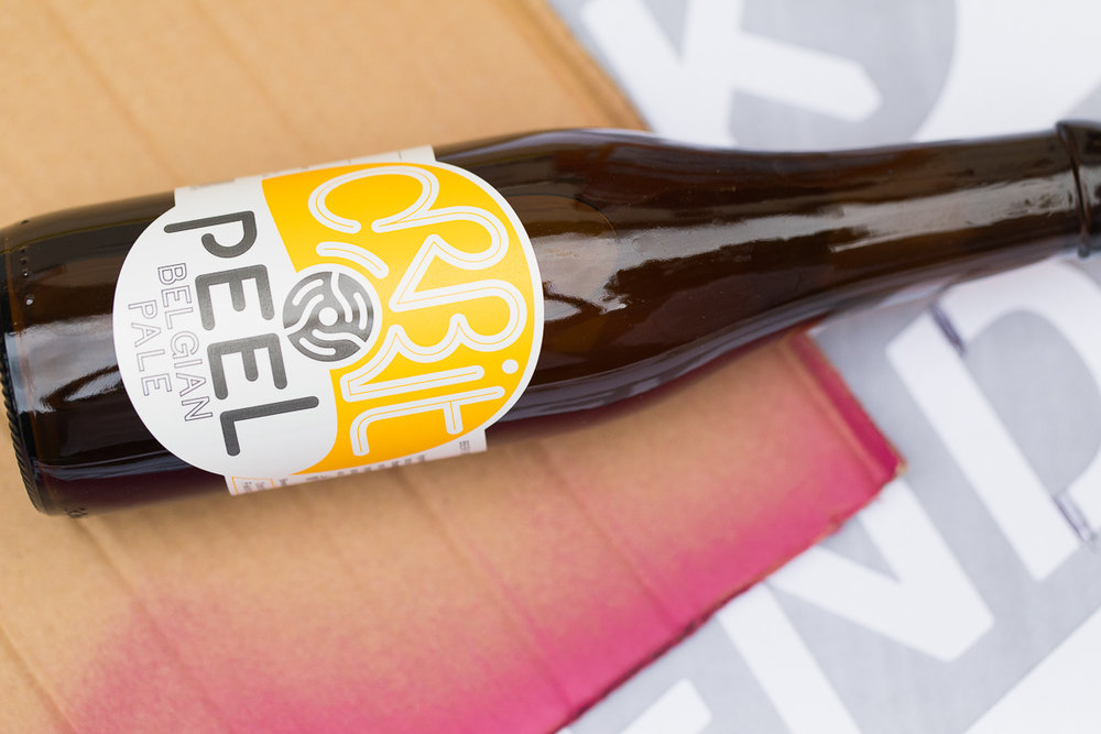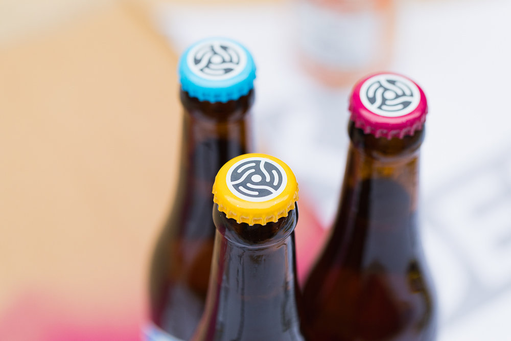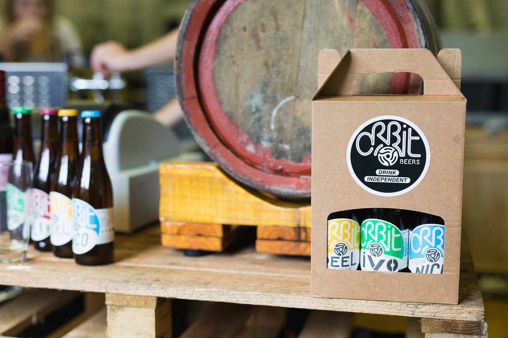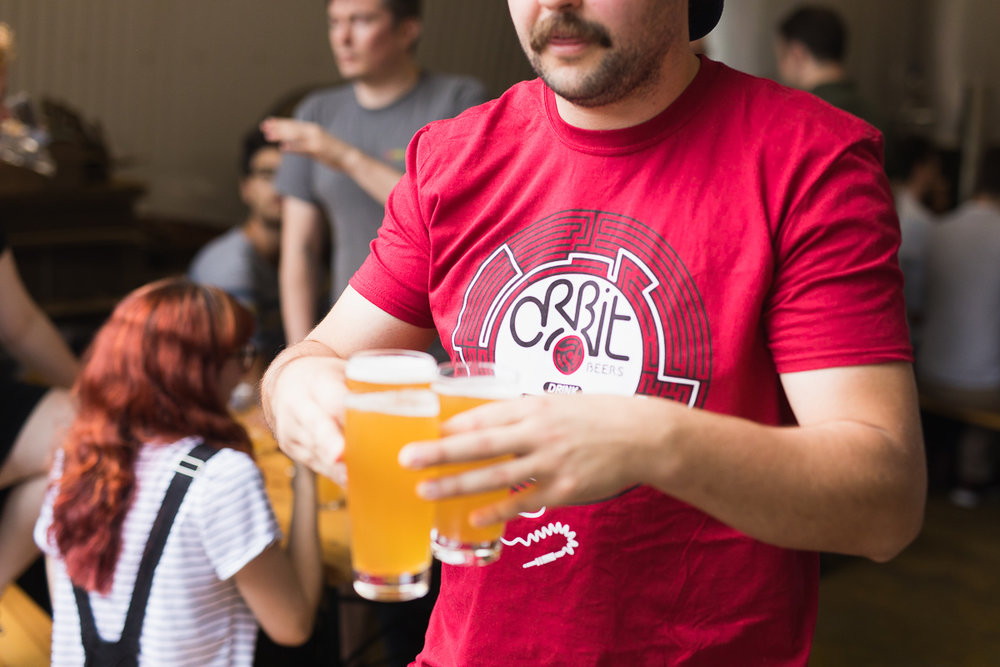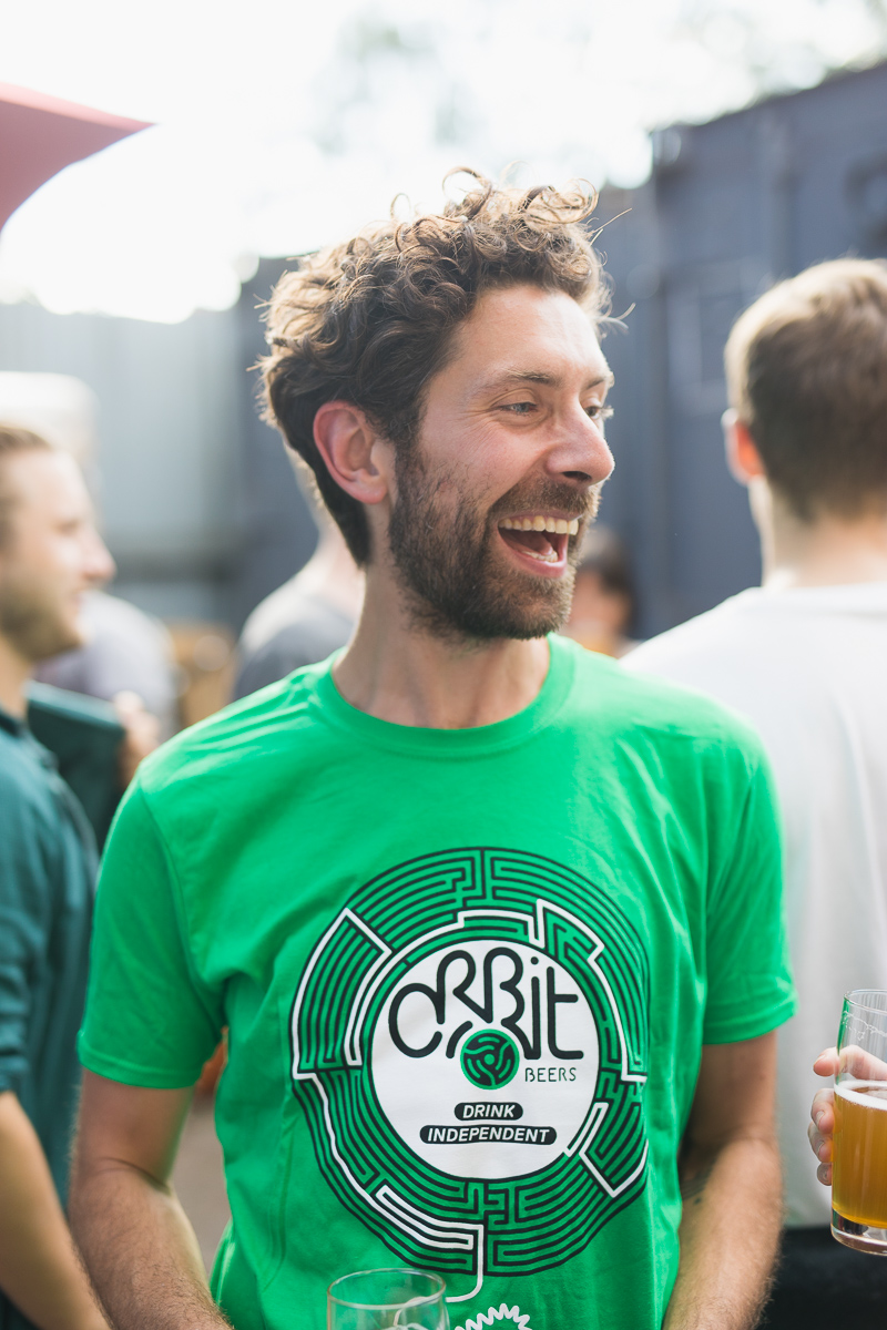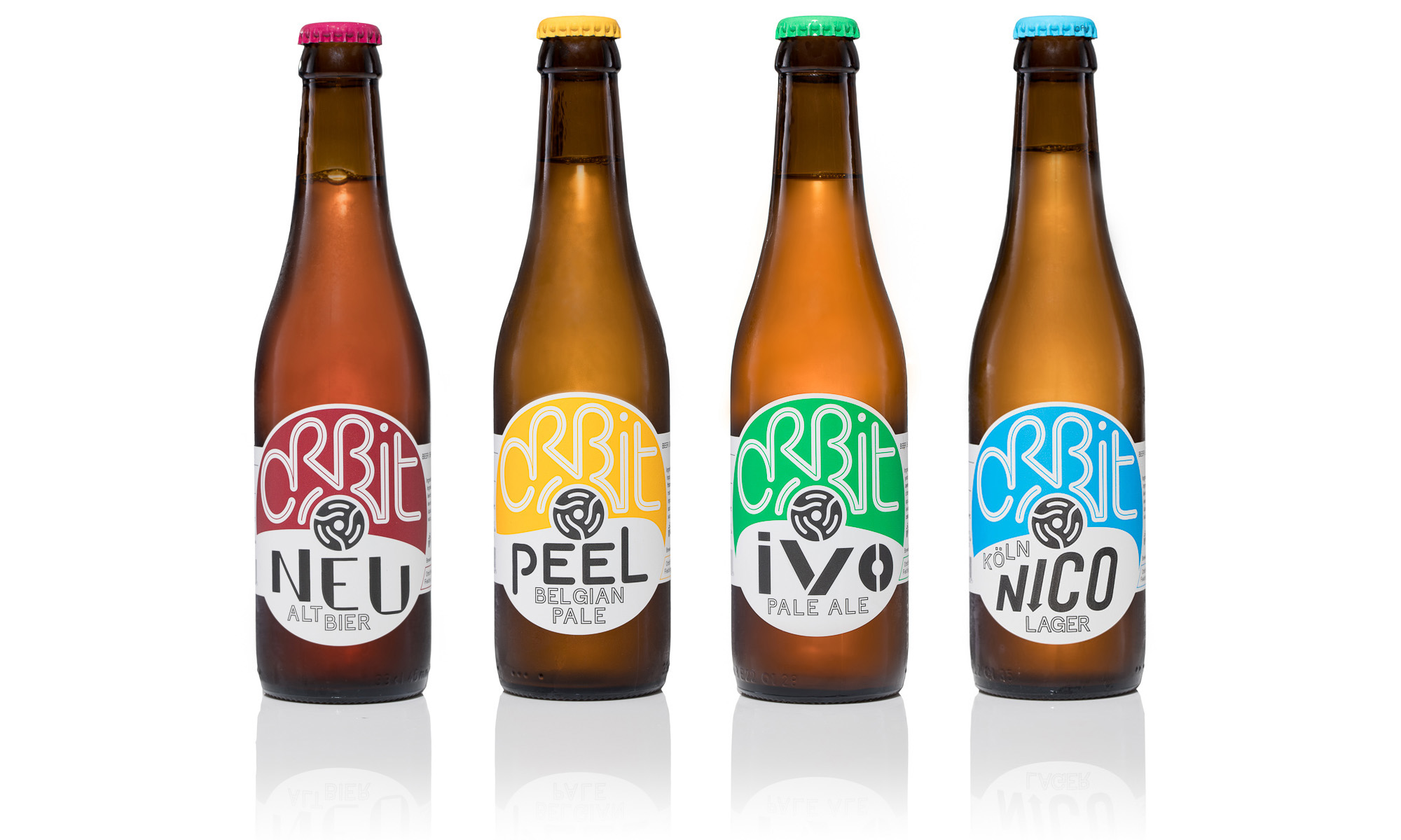
” CHALLENGEBrewing in London has changed dramatically over the past decade, with now over a hundred breweries of all shapes and sizes scattered around the map. Orbit was born in 2014 under a railway arch adjacent the lively neighbourhood of Camberwell in South London, and since the very beginning the team combined a fascination for traditional European brewing heritage with a deep passion for all things music and vinyl records. However strong their mission, they soon realised that their visual identity needed to be stronger to tackle the competition.SOLUTIONSince we first sat down with the team at Orbit we all agreed that the direction to take was losing some of the visual elements that hindered the key assets. Our focus shifted onto the single word Orbit and the spindle adapter, a strong iconic feature that customers already linked with the brand, and we thought about how they could play together on the label. We decided to revolve our inspiration around the art of the centre label designs of vinyl singles: the spindle adapter clearly belonged to the hole in the middle, the name Orbit had to dominate the top half as if it was the name of the artist or the record label, leaving the bottom half inform about the different beers and styles like they were songs. We shaped the lettering Orbit thinking of a soundwave using soft and harmonious dynamics, then added stark contrasts of colour helped by a bold use of white as background. The music geeks may also read a direct reference to the cover art of some German rock and electronic music of the 70s, which is deeply treasured by the members of the team.RESULTAfter consolidating the domestic market, expansion and export are already in sight for Orbit. We will collaborate over course of the year to strengthen the brand and let it resonate better with consumers through dedicated events and alternative merchandising.”
