


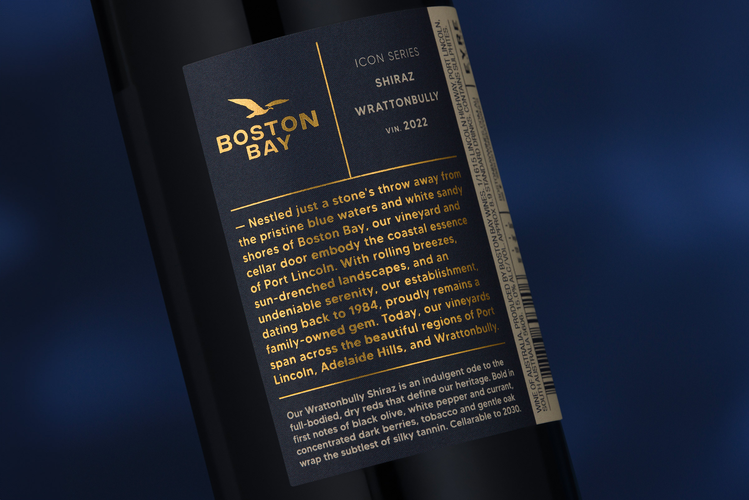
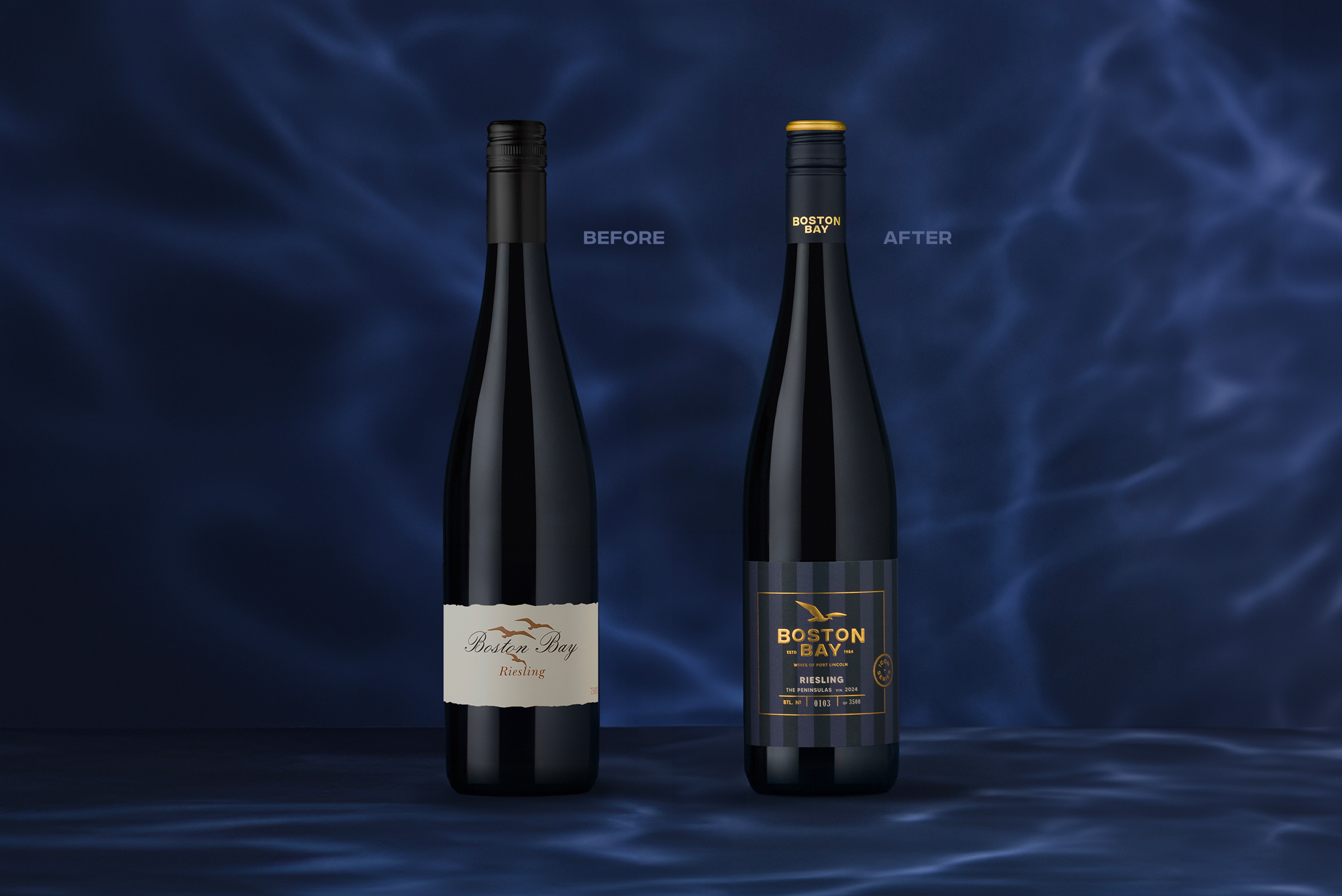
Boston Bay Wines, a cornerstone of Port Lincoln’s wine scene since its establishment in 1984, has unveiled its first major brand update in decades. This significant rebrand, led by Byerlee Design, seamlessly blends the winery’s rich history with a sleek, modern aesthetic, ensuring the continued loyalty of existing customers while captivating new markets. With vineyards possibly closer to the ocean than any others in Australia, Boston Bay is a unique icon that deserved a brand realignment to spark a connection with today’s wine lovers and facilitate new opportunities.
Now under the stewardship of new owners, Boston Bay enters an exciting new chapter with an expanded portfolio of varietals, supported by sister vineyards in other premium wine regions across South Australia. The rebrand was carefully tailored to seamlessly incorporate these new products, further broadening the brand’s appeal.
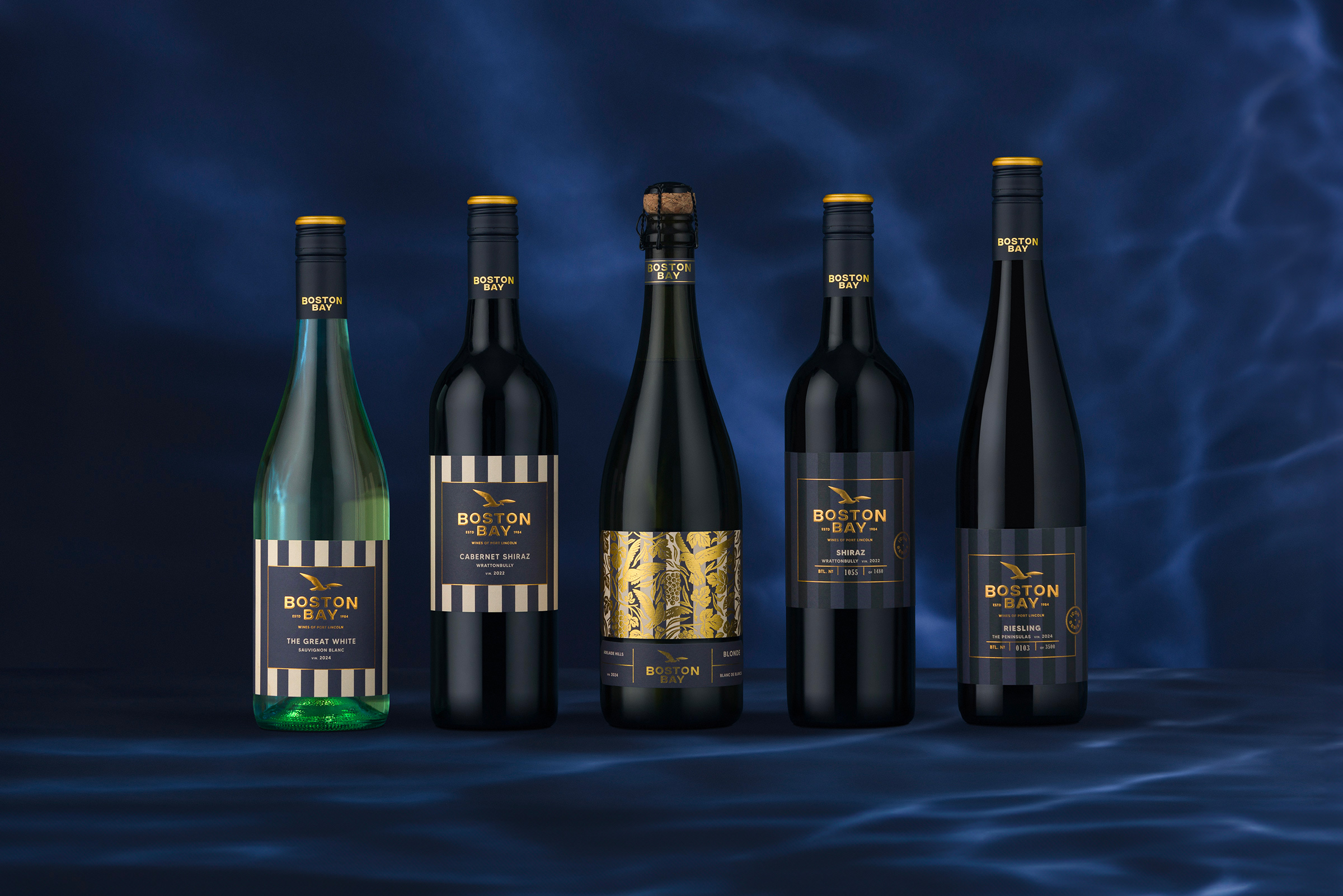
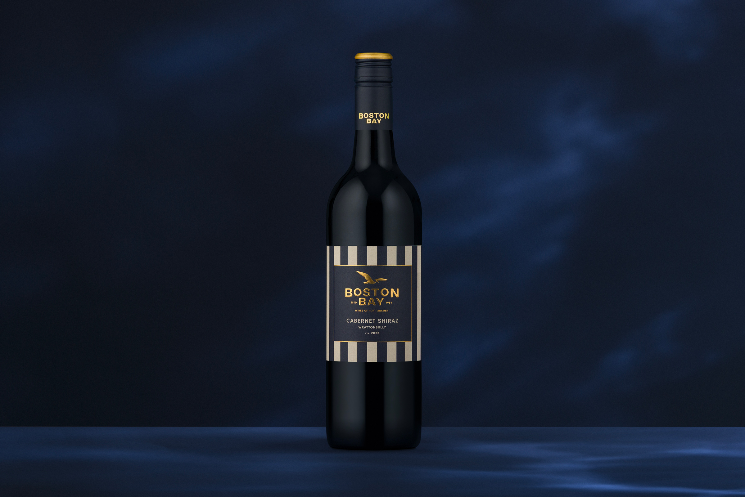
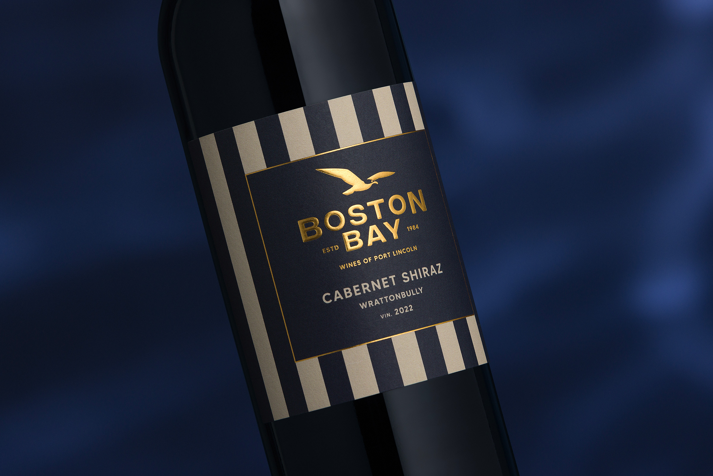
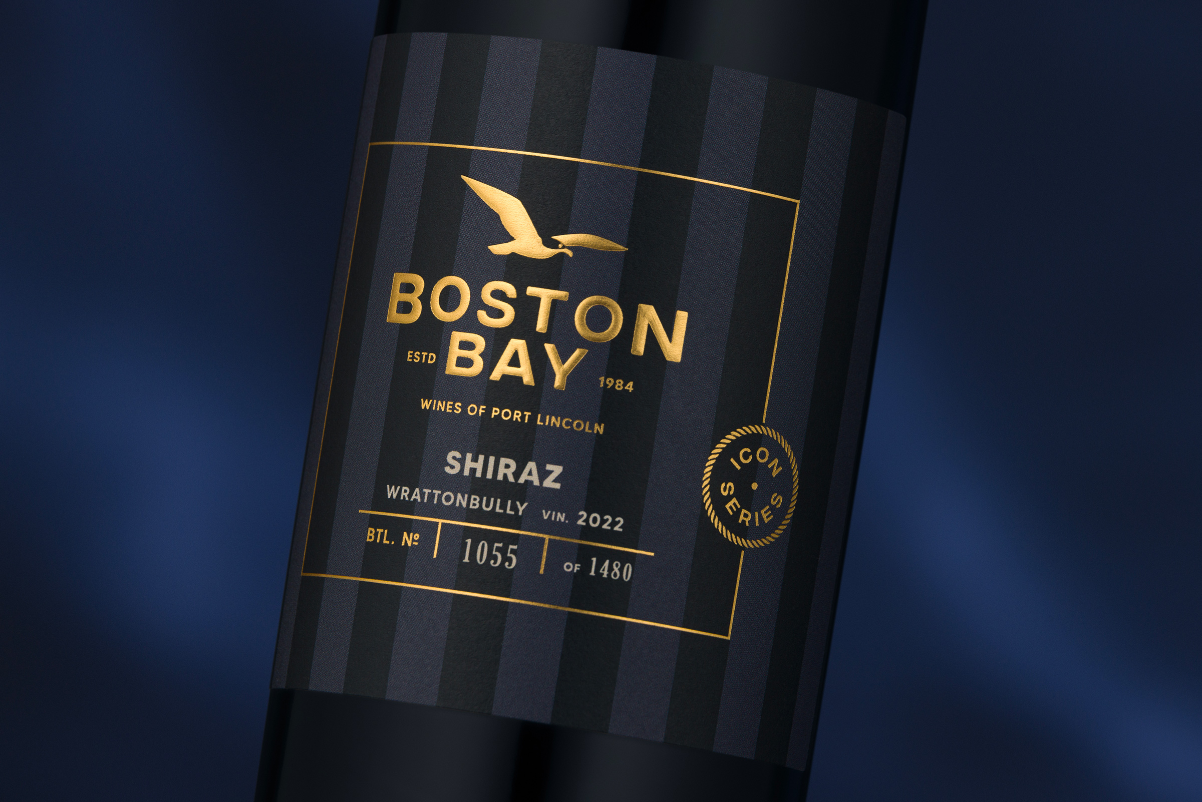
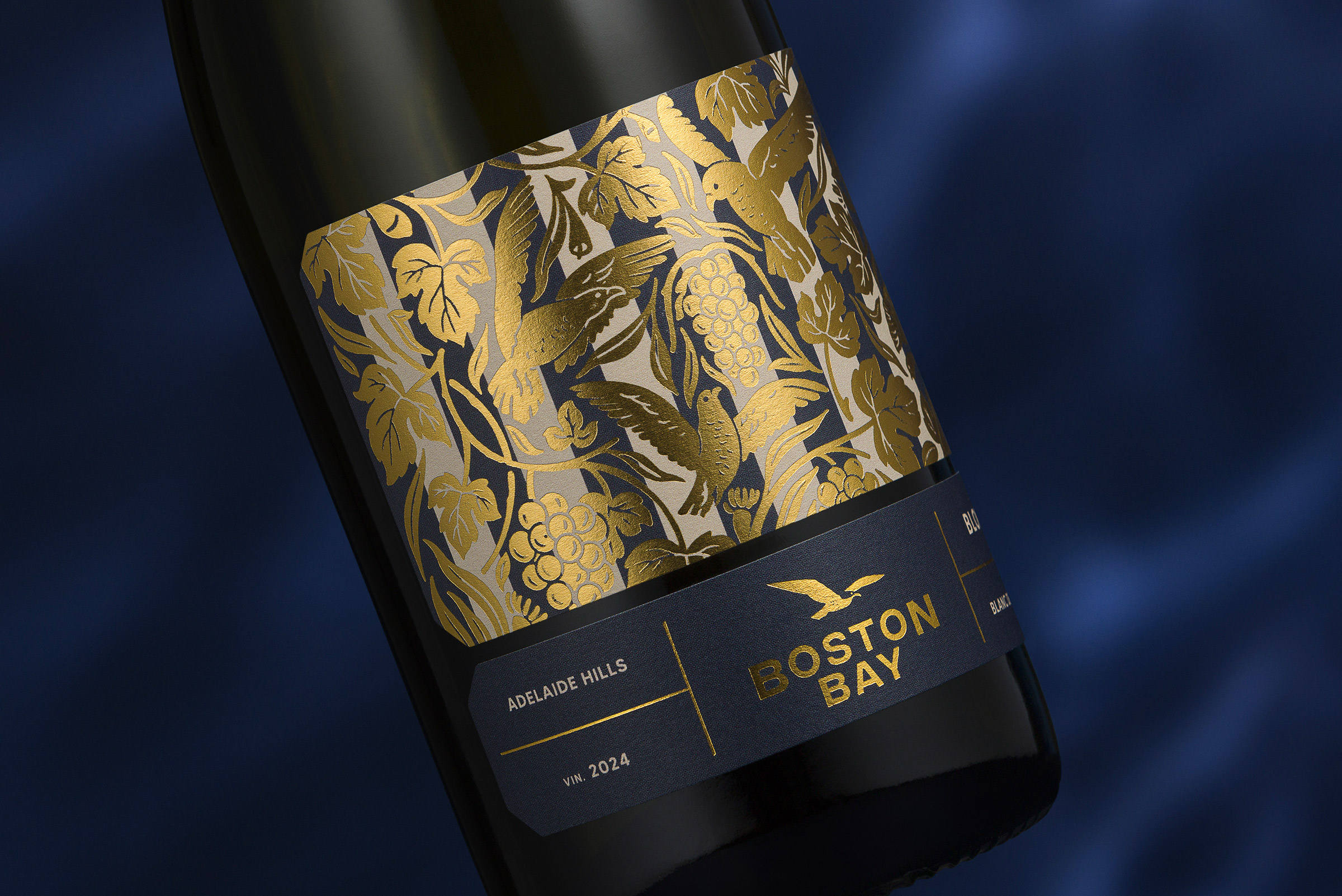
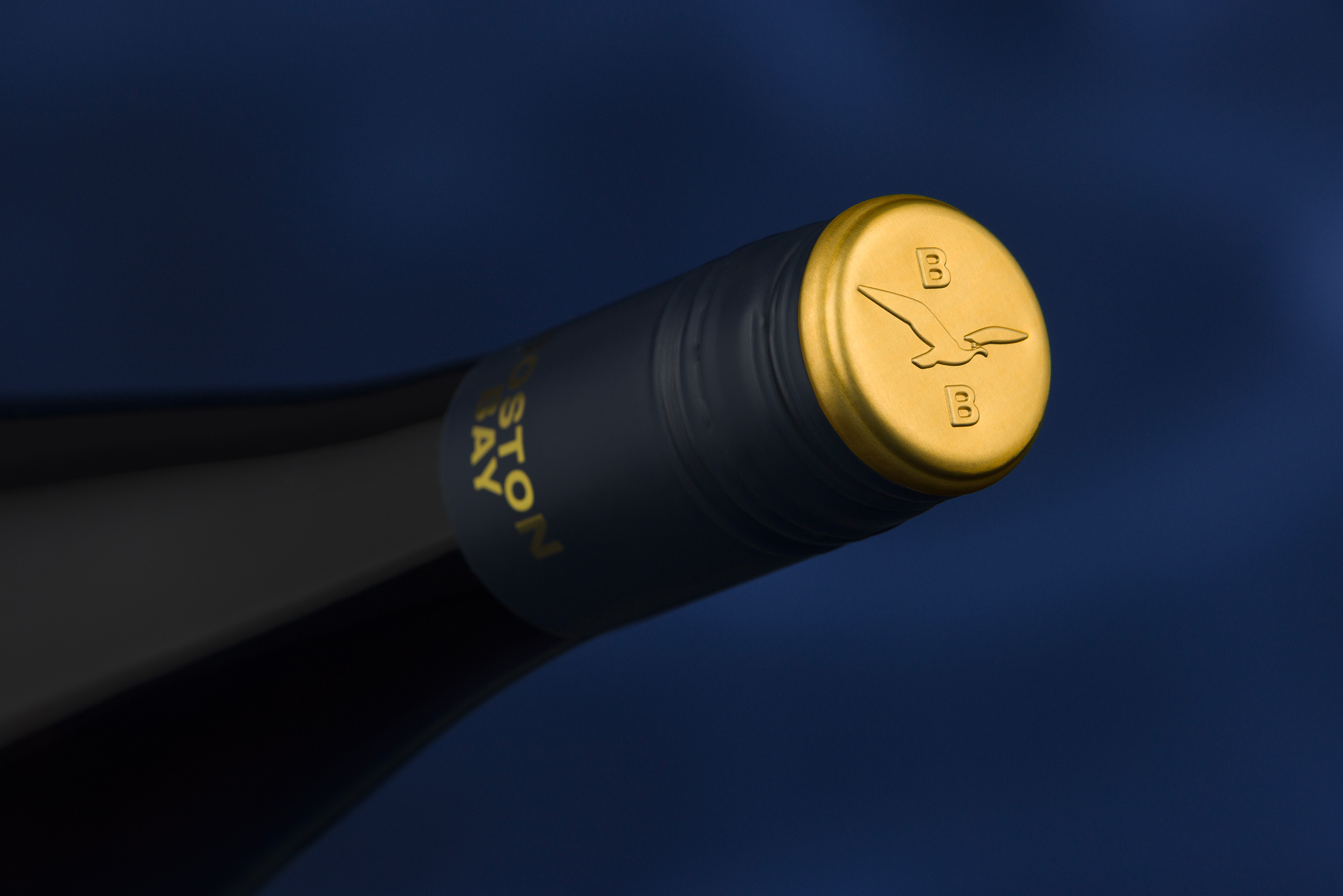
The revitalised brand and bottle designs ensure Boston Bay stands out amidst a sea of competitors in the modern market. Featuring distinctive nautical stripes alongside a refreshed seagull motif, the new design pays tribute to Boston Bay’s stunning coastal location. Interestingly, in 1858, the French Navy was the first to dress their crew in striped uniforms, discovering that sailors were more visible if they fell overboard. This design has since become iconic and deeply connected to maritime culture. Beyond the nautical reference, the striped labels were intentionally designed to achieve the same high visibility in crowded bottle shops or bars.
The rebrand spans three distinct wine tiers, each strategically positioned across different market categories and ascending price brackets. Each tier is tailored to its target market while retaining the unmistakable new Boston Bay brand DNA. Executed with a timeless aesthetic, the comprehensive redesign process meticulously considered every detail to ensure a cohesive and impactful rebrand.
This rebranding initiative blends the winery’s storied past with its ambitions for the future. Boston Bay is now recharged and poised for continued success in the wine landscape for years to come.
CREDIT
- Agency/Creative: Byerlee Design
- Article Title: Byerlee Design Transforms Boston Bay Wines with a Striking Nautical Rebrand
- Organisation/Entity: Agency
- Project Type: Packaging
- Project Status: Published
- Agency/Creative Country: Australia
- Agency/Creative City: Adelaide
- Market Region: Oceania
- Project Deliverables: Art Direction, Brand Creation, Brand Redesign, Brand Rejuvenation, Brand Strategy, Copywriting, Graphic Design, Logo Design, Packaging Design, Product Design, Rebranding, Tone of Voice, Typography
- Format: Bottle, Box
- Industry: Food/Beverage
- Keywords: wine, byerlee design, design, adelaide, port lincoln, boston bay, winery, wine labels, nautical, coastal, hamptons, Australia, south australia, eyre peninsula, shiraz, riesling, cabernet, wine brands, product, alcohol,
-
Credits:
Creative Director: David Byerlee


