


Meamo Branding and Packaging for a brand of cosmeceutical products
BWDS Studio has rebranded Meamo company, which develops innovative solutions in the field of cosmetology and aesthetic medicine. The company launched its product line in 2024. Meamo means “I love myself” in Spanish, but in Korean it is associated with the concept of beauty.
Task
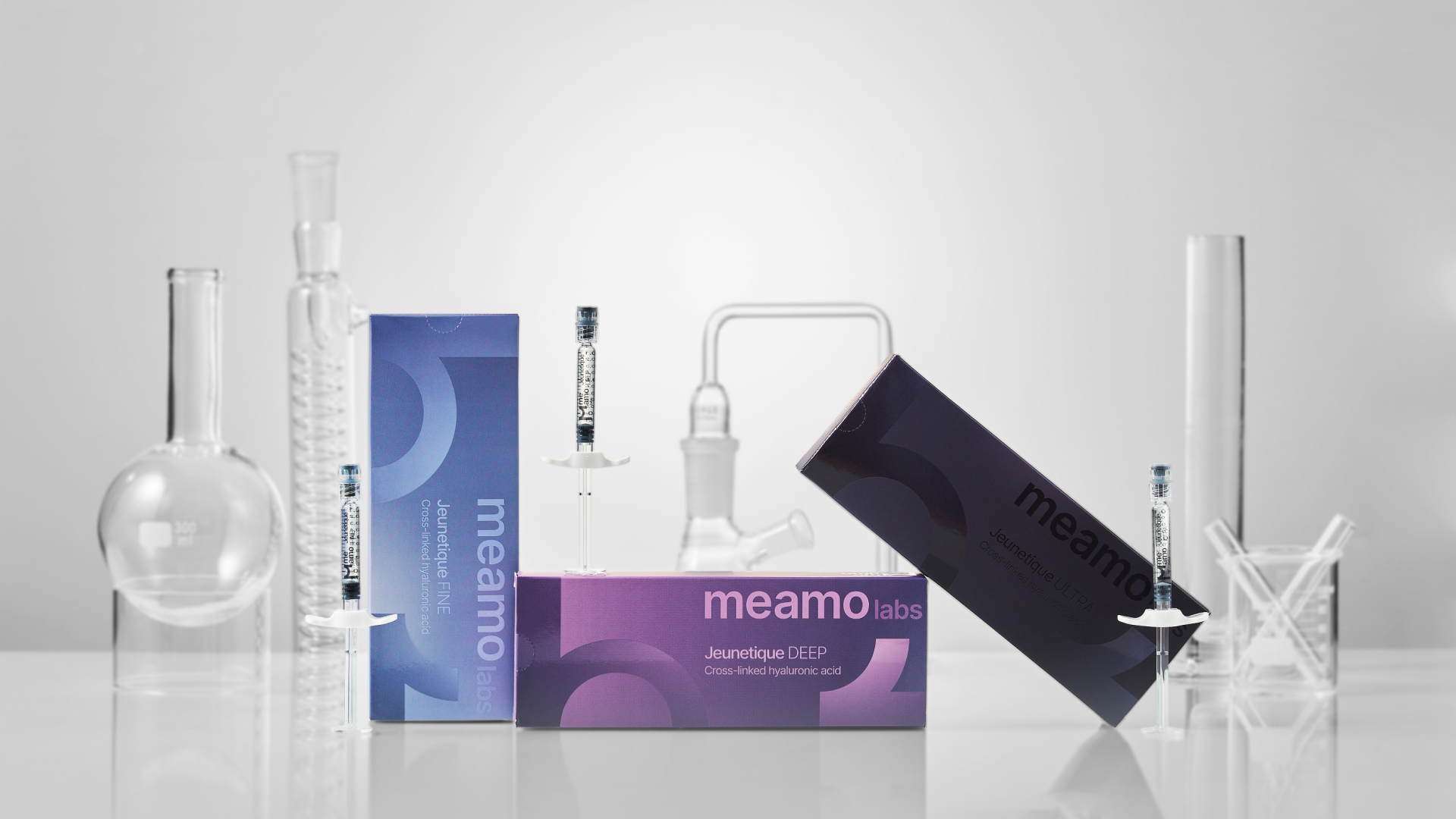
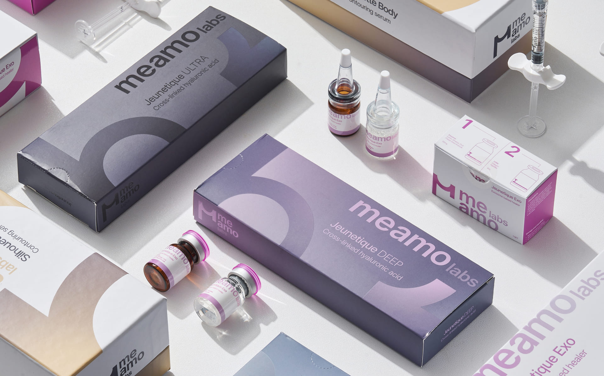
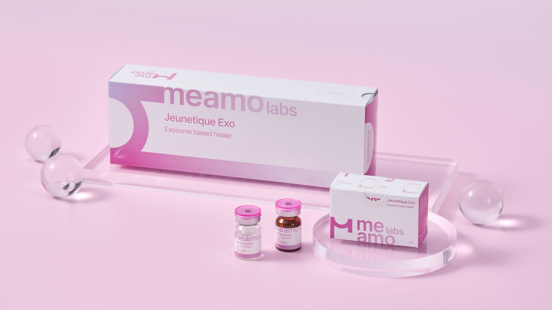
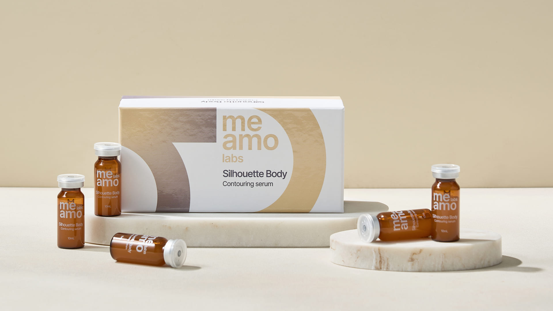
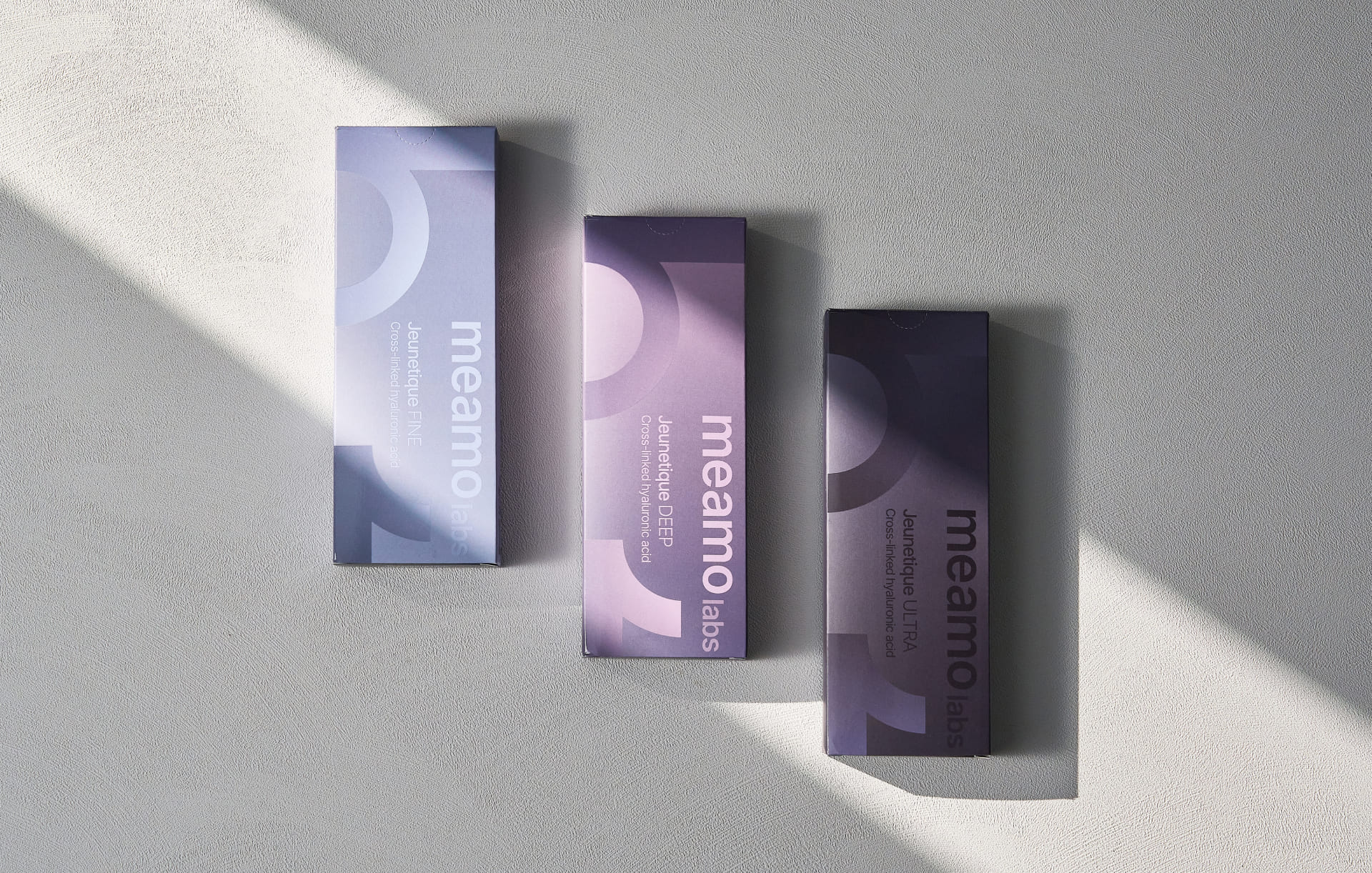
Rebranding of the existing visual guidelines (to update the identity, logo, graphics and rules of use) and design development for five product packages: lipolytics, skinboosters and a line of three fillers. For the branding, it was crucial to create a single identity while preserving the uniqueness of each product. It was also important to use the Korean alphabet (Hangul), while maintaining an international orientation. After developing the basics of the style and the first packaging, we created packaging for 4 more products and continue to work together on the design of new products.
Main idea & metaphore
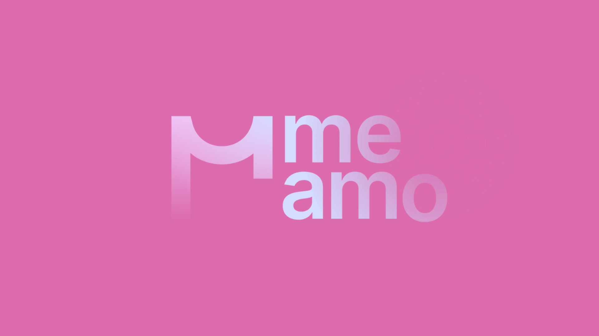
We developed an identity based on the concept of lightness, self-care and restoring beauty at a cellular level, with the logo and graphics inspired by the Korean alphabet.
Product line differentiation
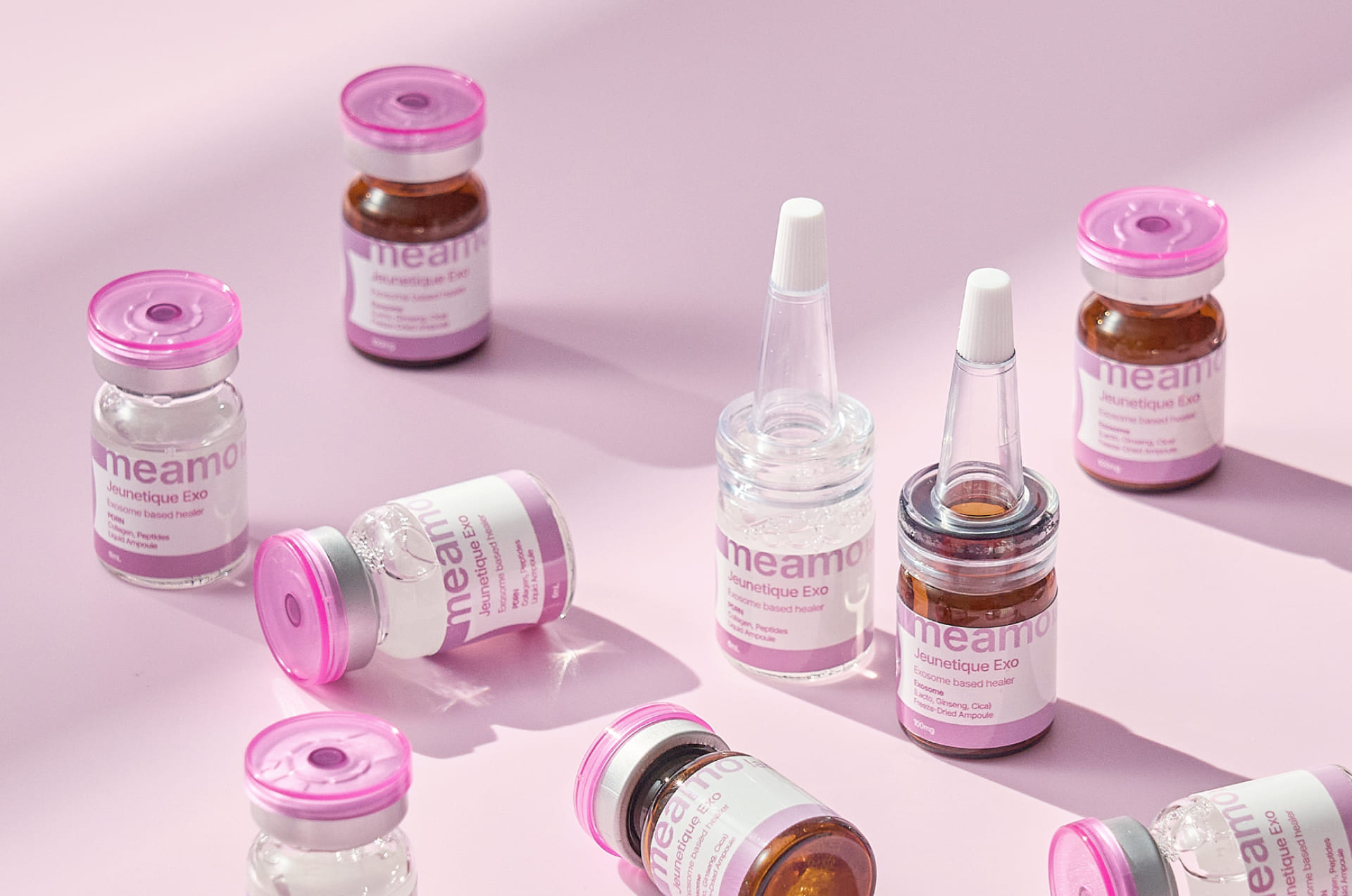
The product lines are differentiated by colour and composition. Each line is based on a brand colour: magenta for skinboosters, transparent yellow for lipolytics and cool grey for fillers. The second colour for the gradient was chosen based on the metaphor we wanted to convey. For example, salmon for the PN Pro Skinbooster, as the polynucleotides that are the main component of the product are extracted from salmon, or the saturation of the complementary colour in the filler line reflects its density.
The main palette includes delicate pastel shades, which fits into the concept of lightness and care. At the same time, the palette has the potential to expand with additional shades, depending on the properties and positioning of the company’s future products.
It was important for us, on the one hand, to create a clear, memorable sign that would present the updated brand on the international market, and on the other hand, to convey through branding a caring attitude, gentleness and lightness.

CREDIT
- Agency/Creative: BWDS
- Article Title: BWDS Merges Korean Influence with Soft Minimalism for Meamo’s New Identity
- Organisation/Entity: Agency
- Project Type: Packaging
- Project Status: Published
- Agency/Creative Country: Russia
- Agency/Creative City: Moscow
- Market Region: Global
- Project Deliverables: Art Direction, Brand Guidelines, Brand Identity, Design, Identity System, Logo Design, Packaging Design, Research
- Format: Box, Tube
- Industry: Beauty/Cosmetics
- Keywords: branding, brand identity, packaging, logo design, meamo, cosmeceuticals
-
Credits:
Art Director: Veronika Potapova
Brand designer: Maria Shalangova
Packaging designer: Alisa Ignateva
Project manager: Uliana Sergeeva


