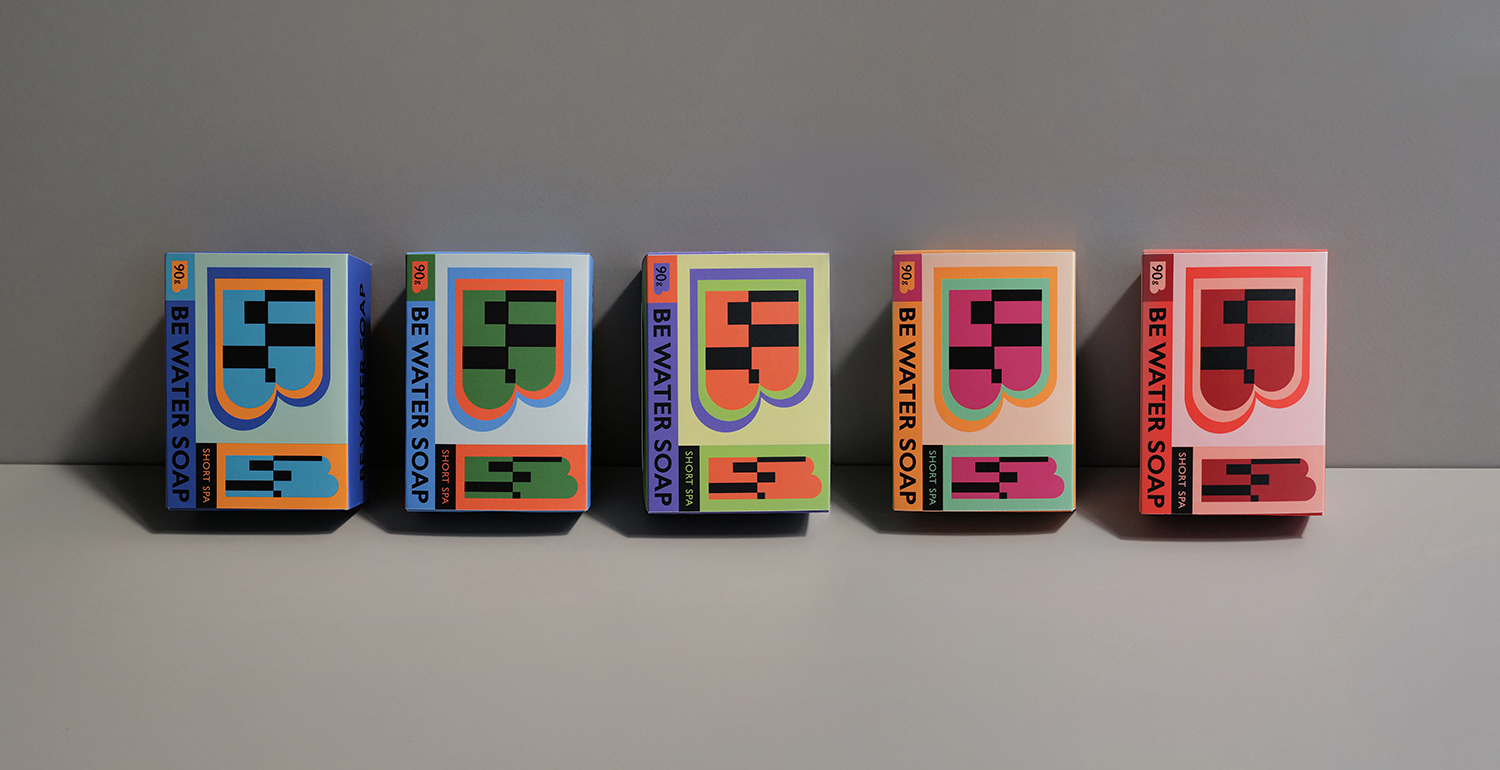
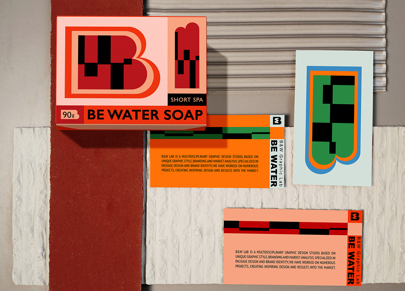
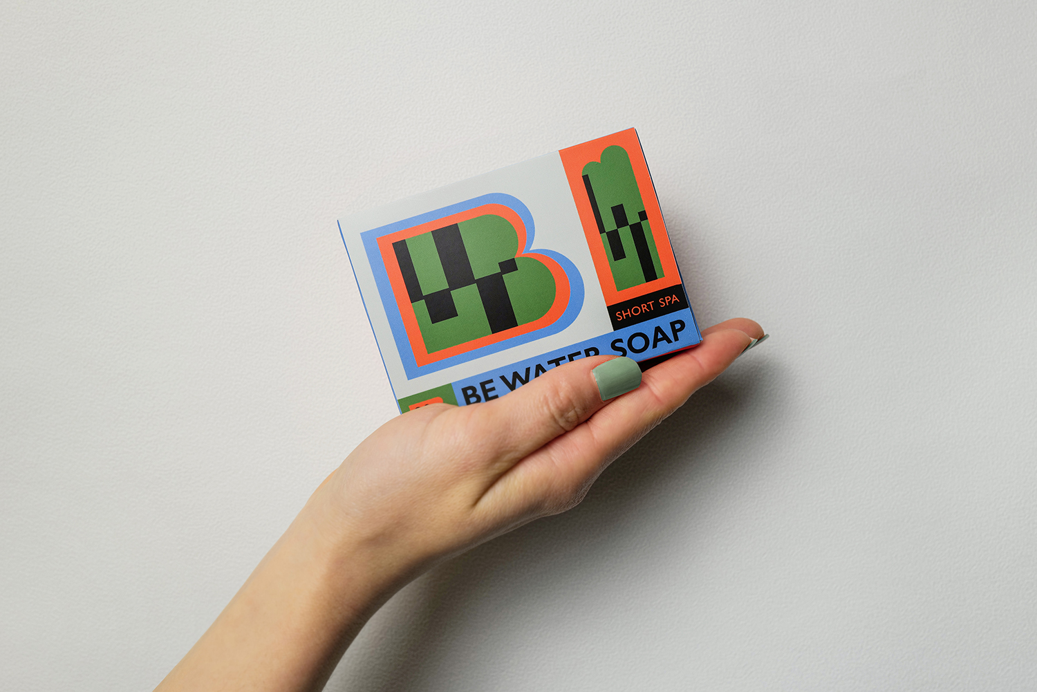
As for cleanliness, it is no longer simple from nature, and more happy atmosphere is added on the basis of purity. The graphics are evolved from B&W’s main image. The W symbol of Water carries more rhythm and uncertainty, and the collision between materials and colors creates a future texture.
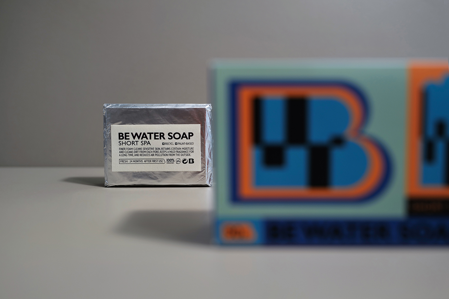
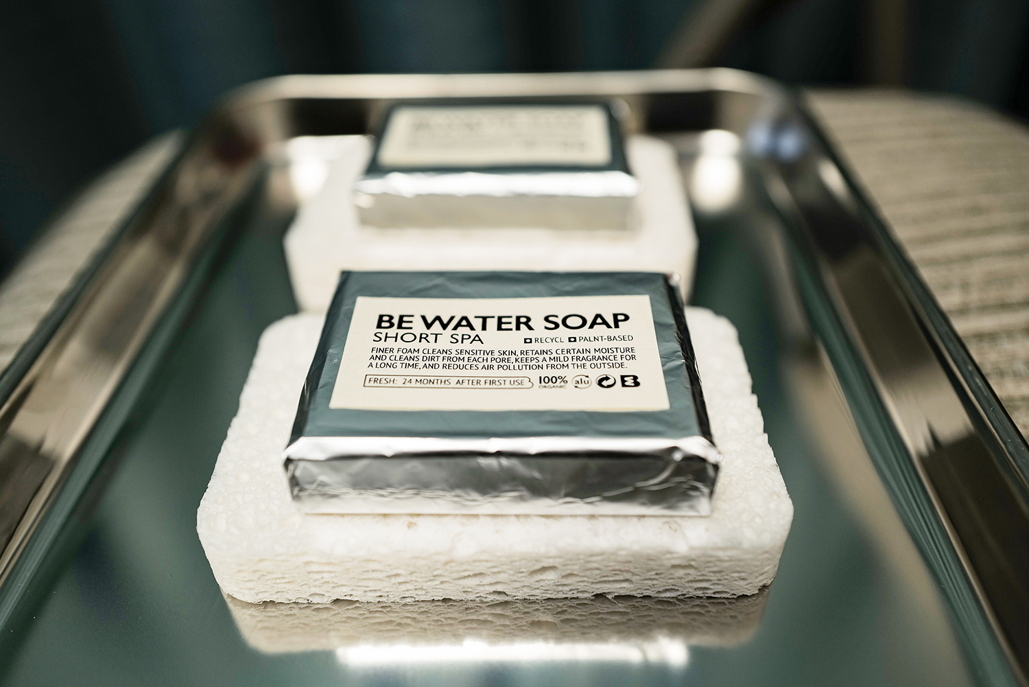
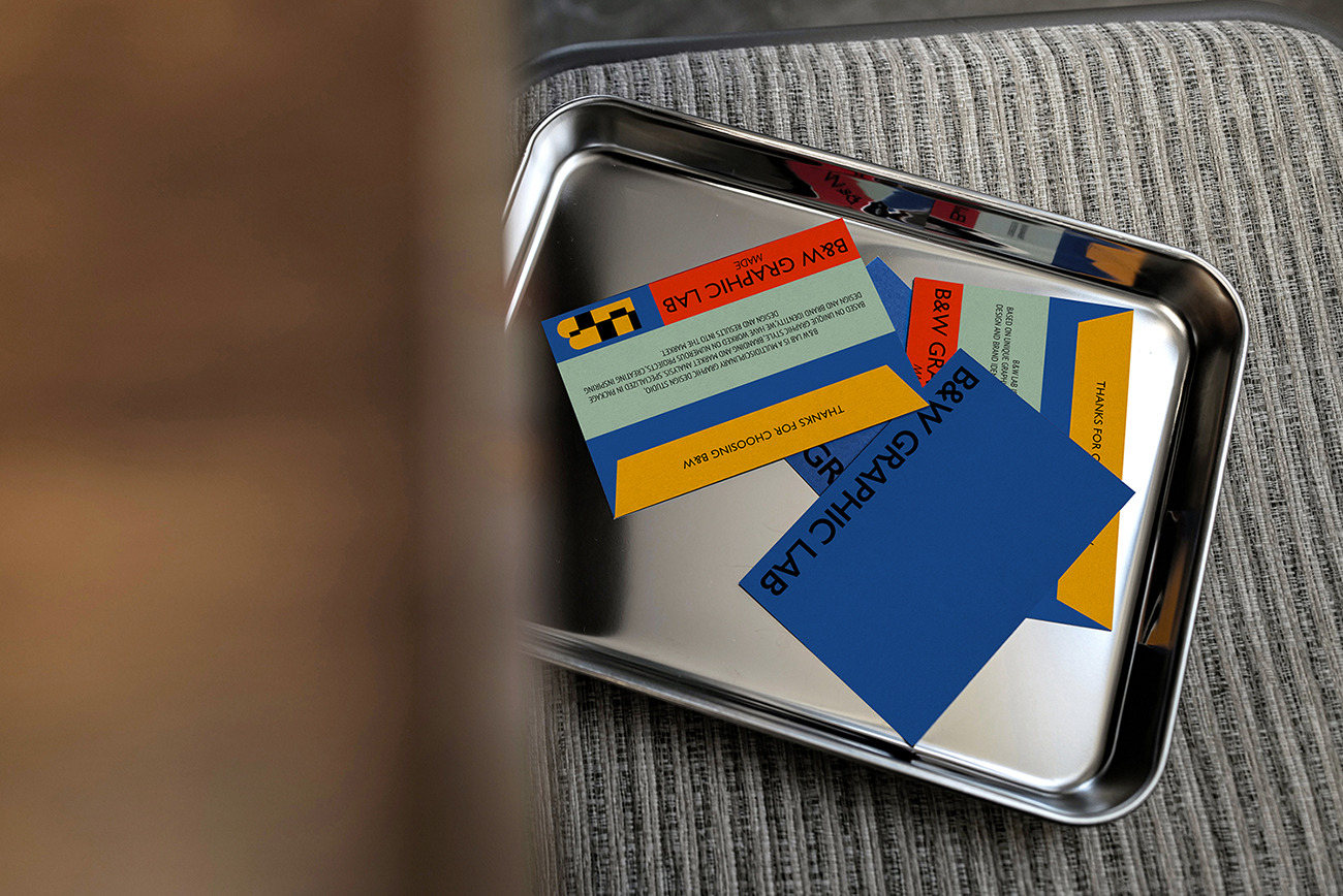
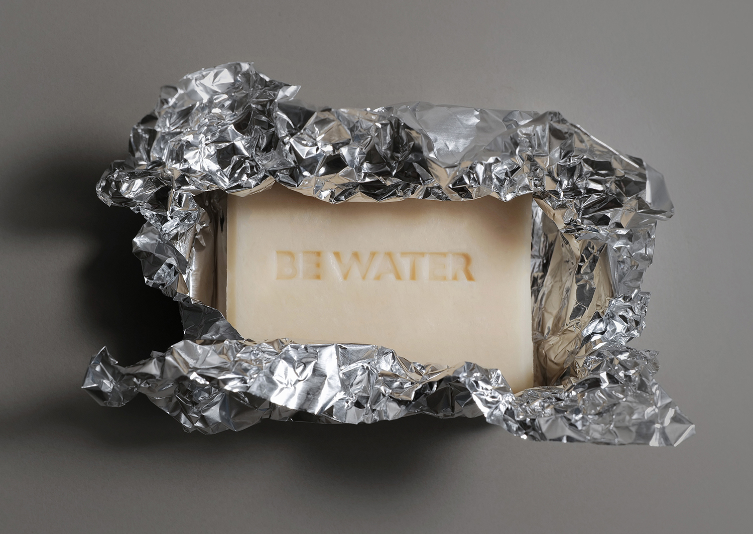
The handmade soap made by cold soap process retains more of its natural nutrition cost and is pollution-free in the production process. The formula can be customized according to the user’s own system. The production cycle of cold soap is generally 2-3 months, during which all the ingredients are slowly fermented and merged. The brand was founded to provide customized cleaning services for more sensitive people. The delicate foam brings more gentle cleaning process. In this rhythm, we add more cheerful atmosphere to the brand, and the outer packaging material and inner packaging texture increase such contrast and contrast. Reflective materials contrast more color combinations to convey the brand production project in the pioneering and professional, reliable and artistic texture.
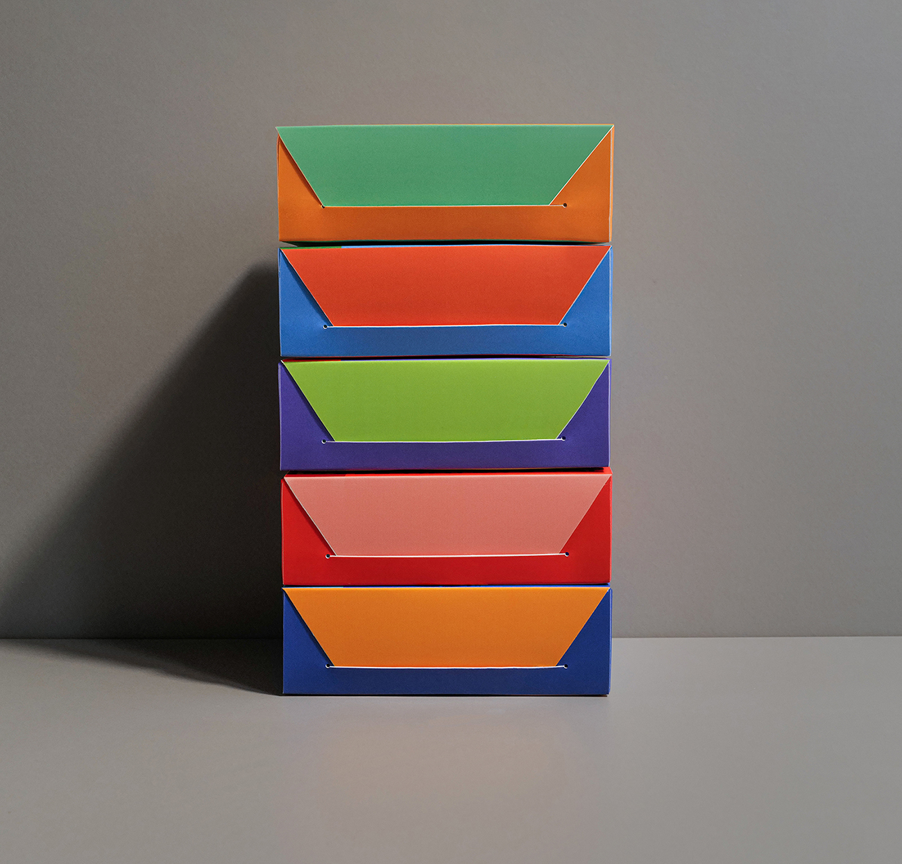
We graphically summarize the concept of the gift box, and the combination of lines and colors adds to the gift attributes and enhances the connection of the use scene.
For cleaning, we have broken the style of simple design in the previous industry, and added more artistry and future. The market is becoming more and more refined in the details of each category, and people are becoming more and more private and customized for product functions. Exploring more possibilities is the direction we have been adhering to.
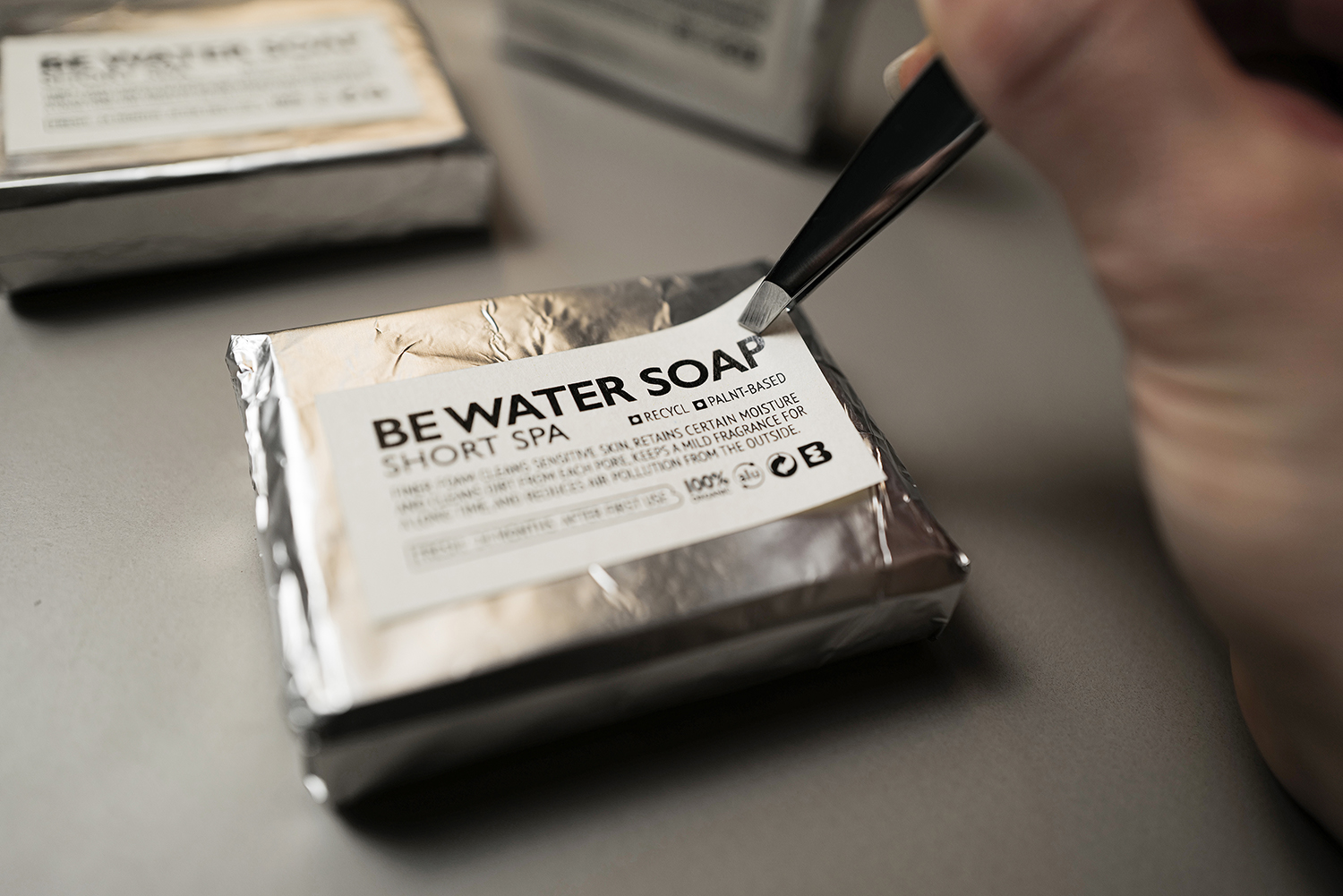
From opening the box to opening the contents, your understanding of cleanliness will be improved layer by layer. This invisible connection will be integrated into your every use. We look forward to your feedback and suggestions.
CREDIT
- Agency/Creative: B&W Graphic Lab
- Article Title: B&W Graphic Lab Design Packaging for Be Water Soap
- Organisation/Entity: Agency
- Project Type: Packaging
- Project Status: Published
- Agency/Creative Country: China
- Agency/Creative City: Shanghai
- Market Region: Asia
- Project Deliverables: Branding, Graphic Design, Packaging Design
- Format: Box, Tag
- Substrate: Pulp Board
- Industry: Health Care
- Keywords: As for cleanliness, it is no longer simple from nature, and more happy atmosphere is added on the basis of purity. The graphics are evolved from B&W's main image. The W symbol of Water carries more rhythm and uncertainty, and the collision between materials and colors creates a future texture.
-
Credits:
Designer: Ben Xu
Designer: Wei Hou


