The brief: time for a makeover
Award-winning Butternut London, makes organic, all-natural luxury nut butters with unusual and exciting flavour combinations such as Pistachio & Rose and Cashew, Coconut & Cardamom. With big plans to grow from a stall at Borough-market to high-end delis, luxury retail and eventually global export, founder, Zoe, knew Butternut needed a makeover to get there.
Our brief was simple: make Butternut an aspirational, modern brand, with a clear reason for being and a strong point of difference. We paraphrased it as creating a ‘Liberty-worthy’ brand.
The strategy: London vibes
Our first task was to set up the strategic foundations. Having trawled the category of premium and gourmet nut butters and found samey, uninspiring messages of taste, health and ethics, we knew we needed to give Butternut more edge – and Zoe was our answer. We love her passion for food and culinary experimentation. Born and bred in London and with a stall at world-famous Borough Market, she can’t help but be influenced by the diversity of cultures and flavours that make her hometown a melting pot for creativity. Not to mention her exacting standards and obsessive attention to detail – she’s a woman after our own heart!
We also knew that the luxury world has changed. Out with the ‘bling’ and in with values-driven, originality and self-expression. Here was an opportunity for Butternut to own a creative and playful space targeting change-makers and the cultural elite. We summed it up as, ‘Boutique nut butters imagined in London’.
The packaging: a feast for the eyes
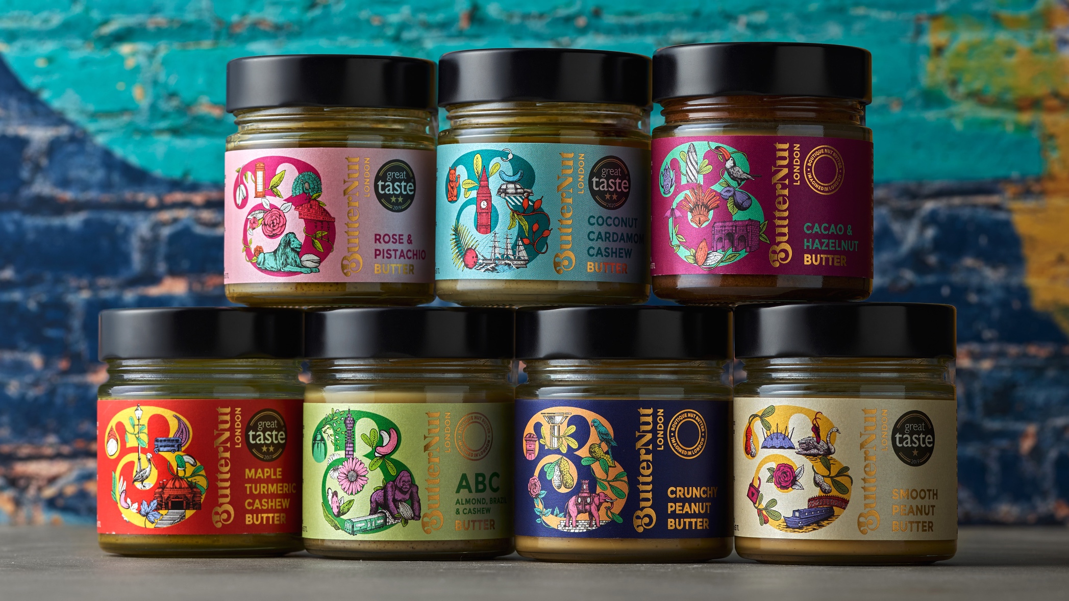
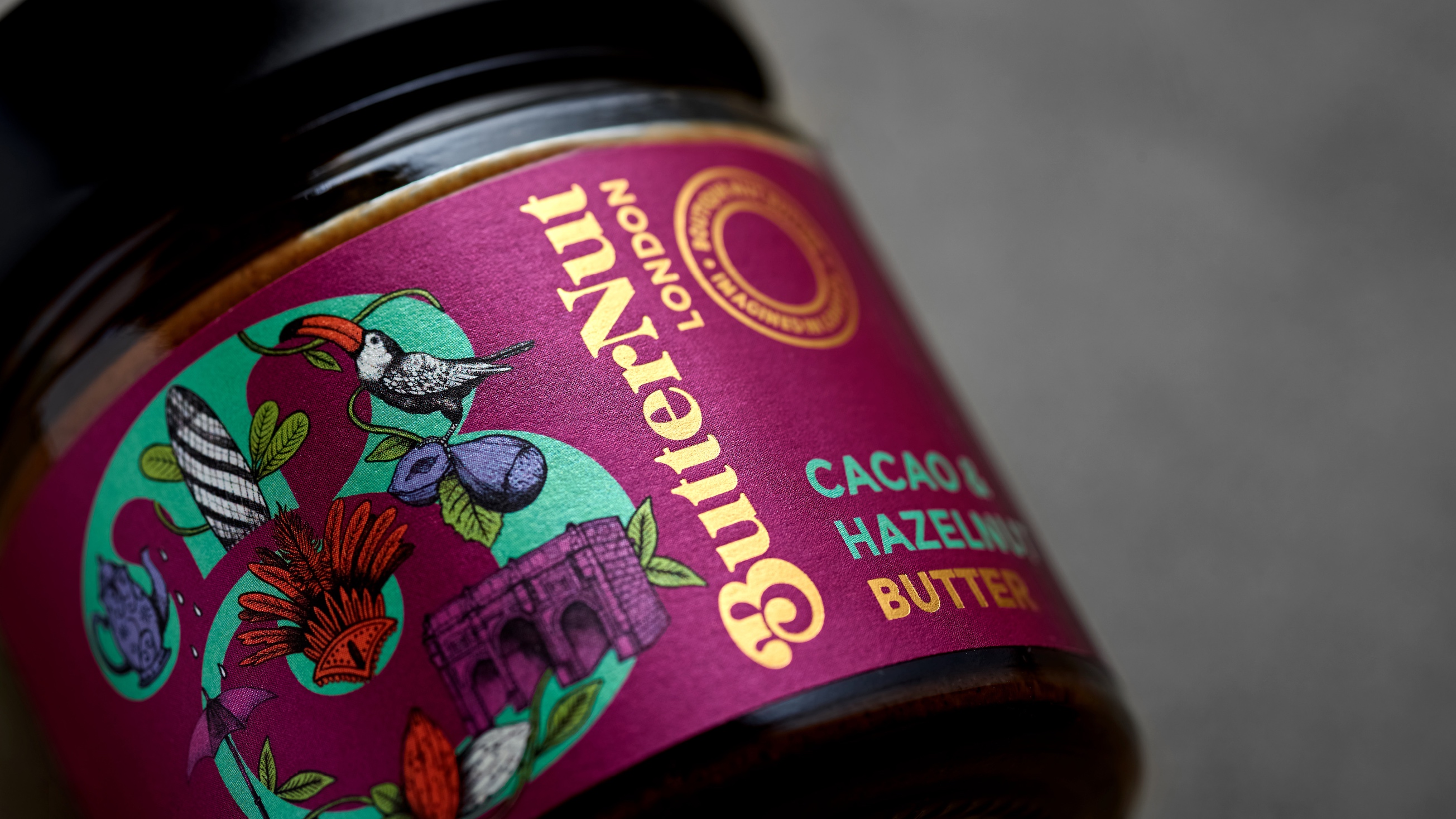
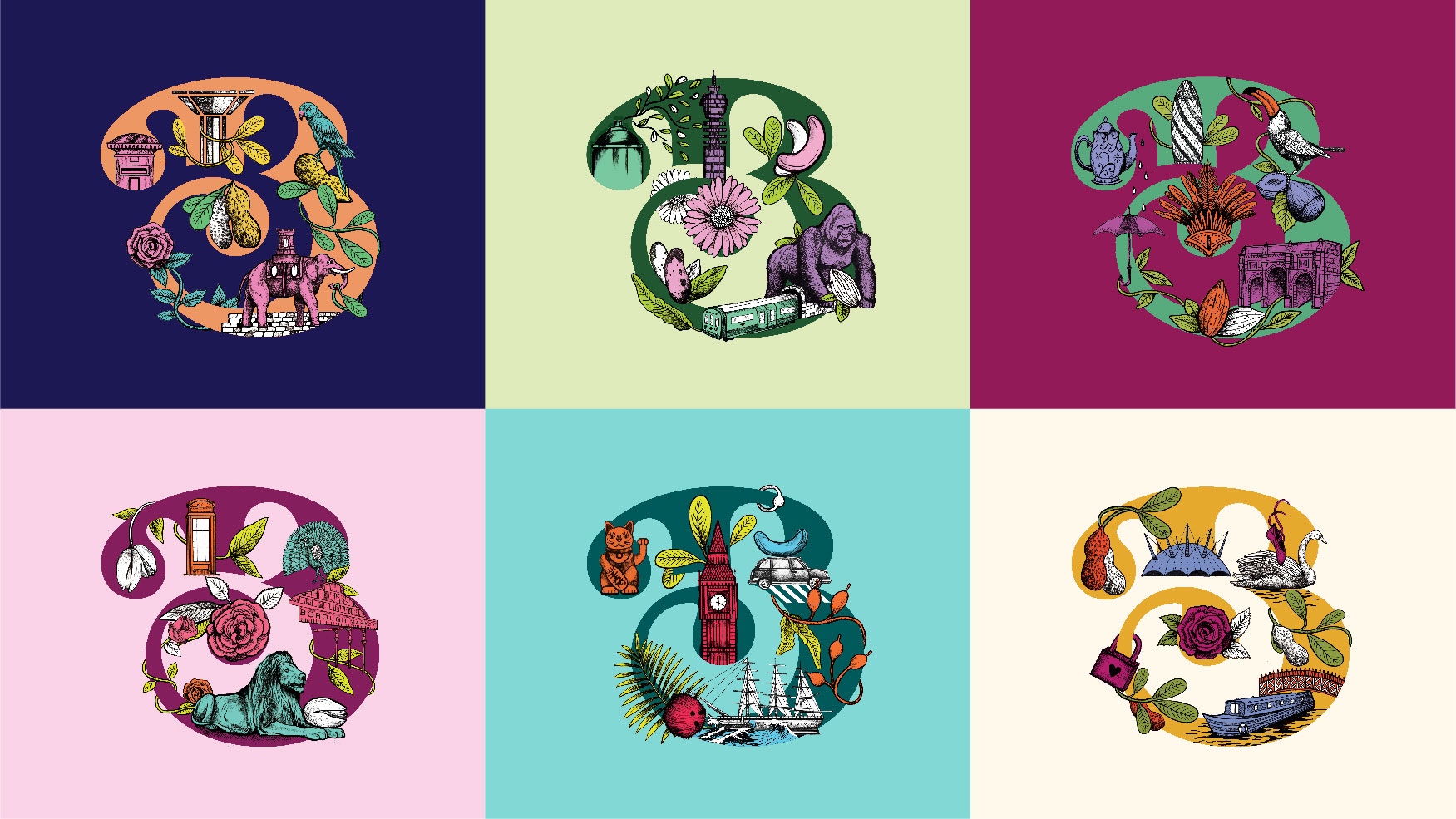
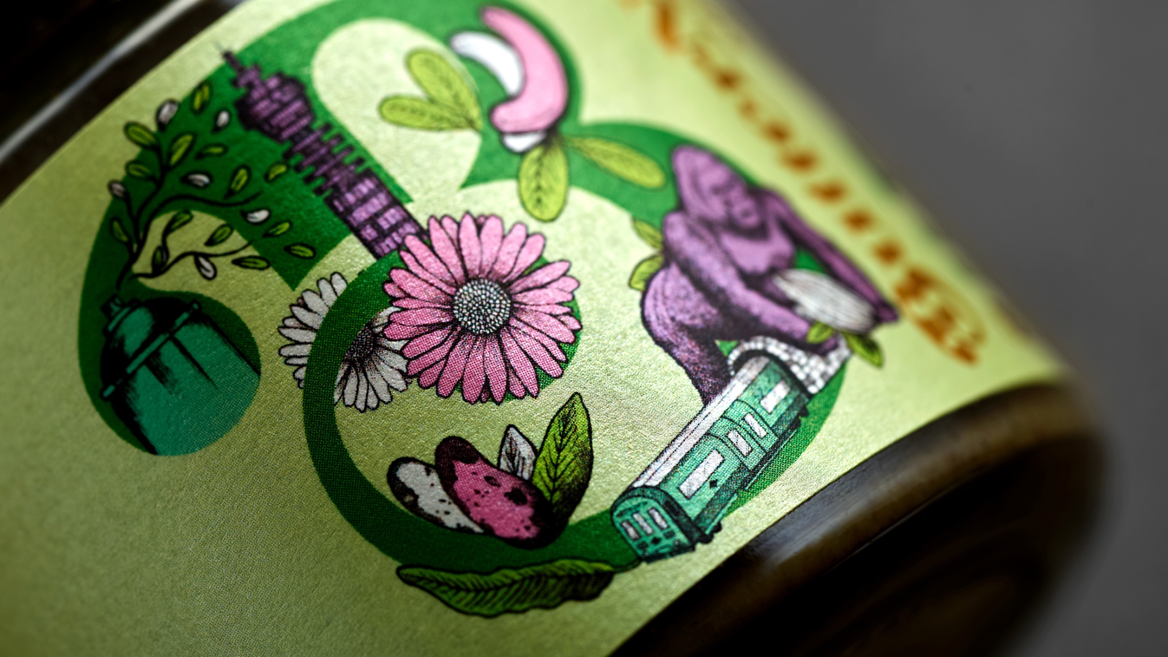
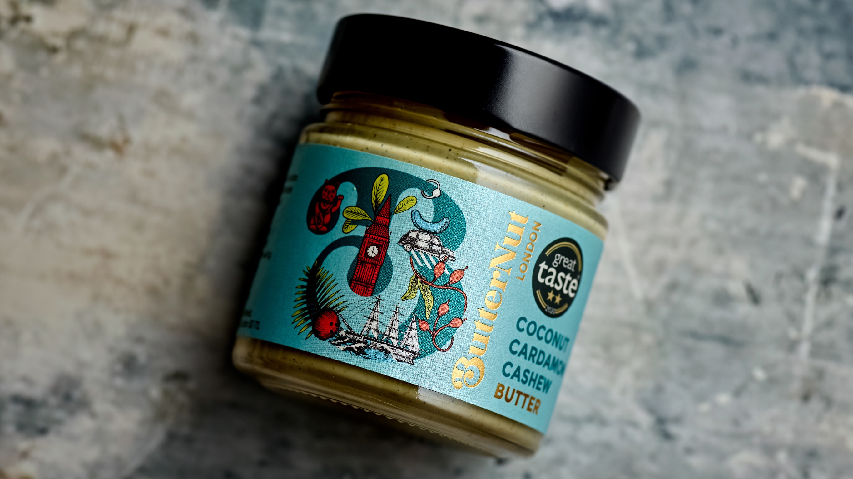
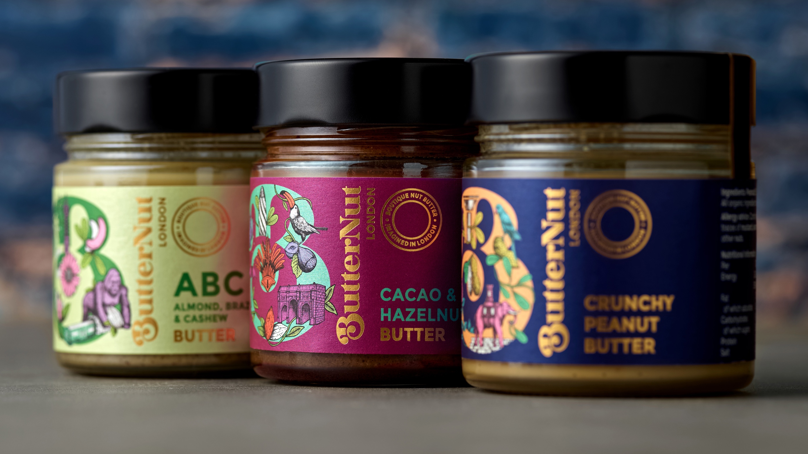
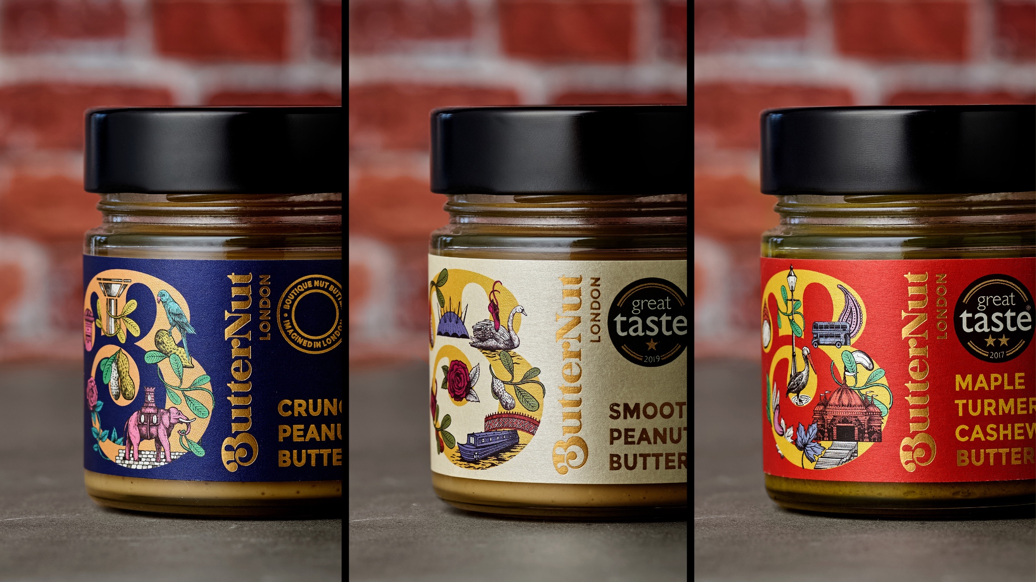
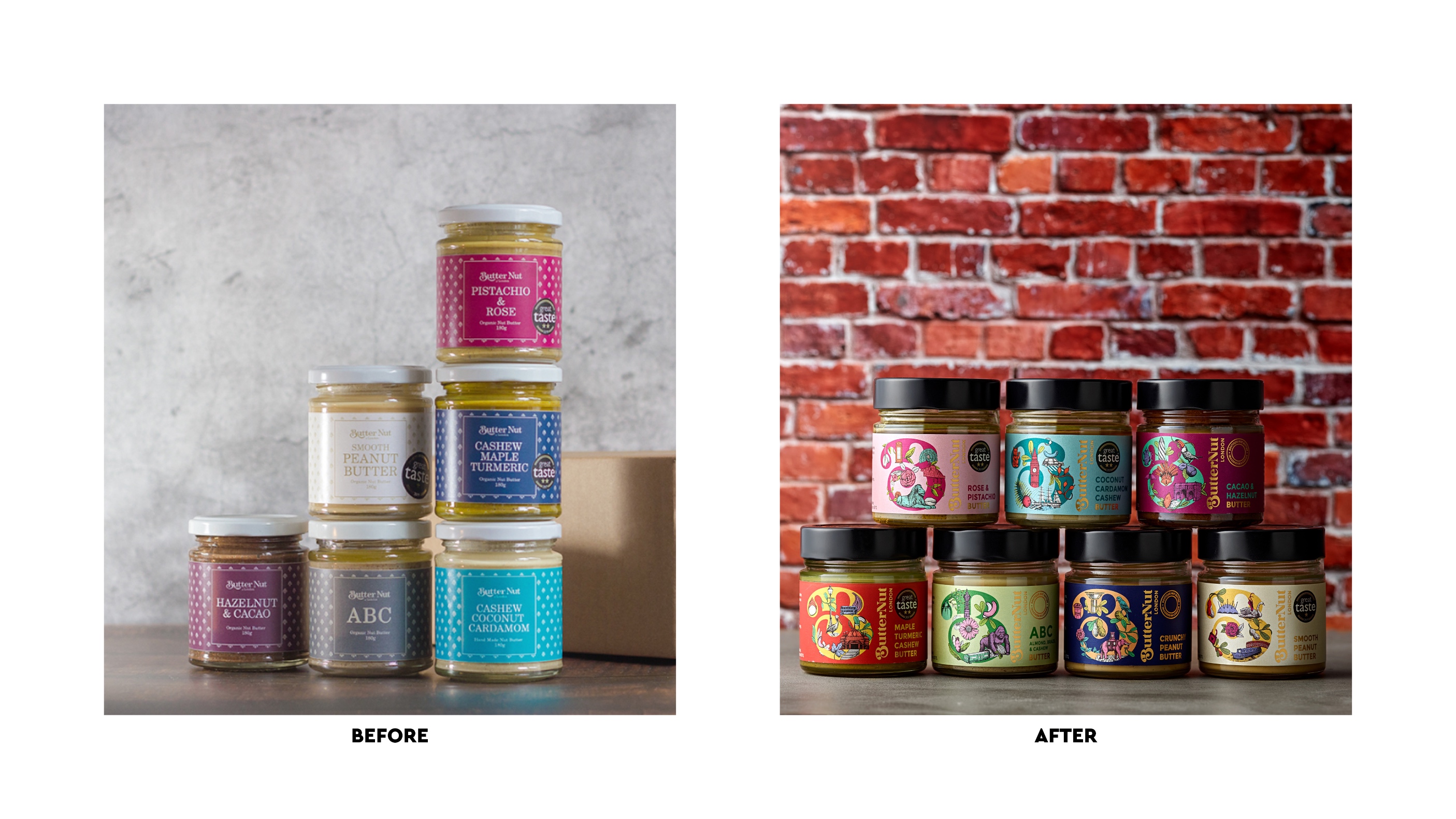
Aside from creating a luxury look and feel, we also wanted to create a suite of assets that would give Butternut scope and creativity on and off-pack. Inspired by London, our design captures its eclecticism and contrasts: traditional versus modern, luxury versus gritty, clichés versus hidden gems, vibrancy versus calm… all interacting with an elegant ‘B’ monogram. Every pack features illustrations depicting ingredients, as well as different London landmarks and experiences that act as a metaphor for the variant flavours. Some are well-known, others are for those in the know. Beautifully detailed and artfully hand-drawn in-house, the illustrations are executed to reflect Zoe’s flair and eye for detail.
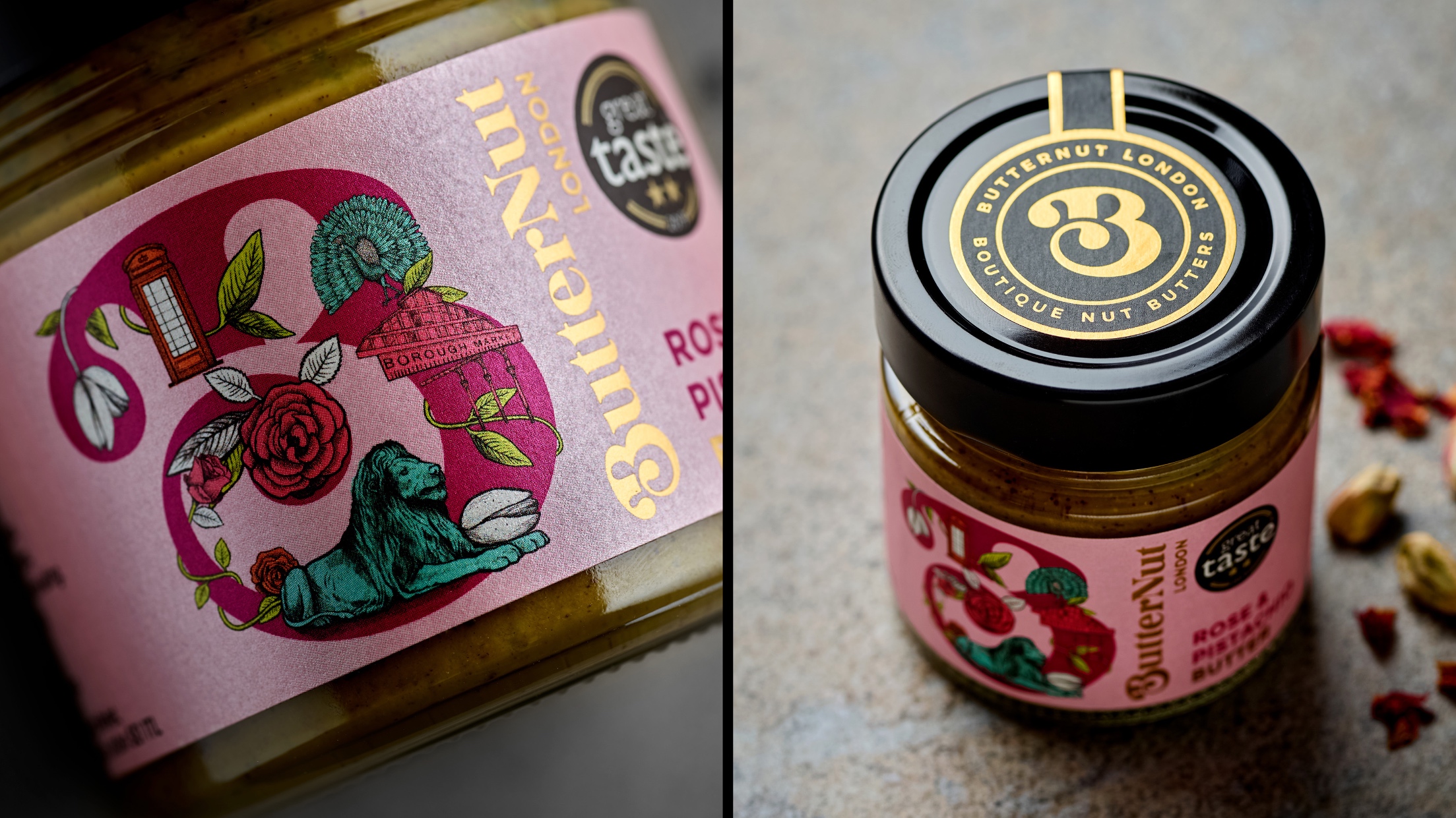
The logo was reworked to give it a contemporary aesthetic and the compact ‘B’ is now more iconic and better suited to digital and social media.
The colours are bold and unexpected representing Zoe’s surprising flavour combinations and the energy of London. Whilst the pearlescent paper stock, combined with a gold foil blocked logo, adds tactility and a touch of understated luxe.
The results: stopping people in their tracks
Zoe wanted a brand and a pack design that people would covet. And we know that it’s already working its magic.
“We are getting a great response from our customers at Borough Market about the new branding. It’s so eye-catching that it stops people dead in their tracks and draws them in.” – Zoe, Butternut
With new-found brand confidence, Butternut has been featured in foodie publications including Delicious, Great British Food and the Guardian. Sales have soared as a result.
CREDIT
- Agency/Creative: The Collaborators
- Article Title: Butternut London: Nut Butters Re-Imagined
- Organisation/Entity: Agency
- Project Type: Packaging
- Project Status: Published
- Agency/Creative Country: United Kingdom
- Agency/Creative City: Bristol
- Market Region: Europe
- Project Deliverables: Illustration
- Format: Jar
- Industry: Food/Beverage
- Keywords: WBDS Agency Design Awards 2023/24
- Keywords: Packaging Design, Product Redesign, llustration
-
Credits:
Strategy: Alex Ririe
Creative Director & Designer: Mary Lewis
Illustrator: Ben Wills
Account Director: Caroline White
Artwork & Production: Chris Ellis


