More than a high-end urban salon, The Browery is a sisterhood. Every client is a new friend to founding sisters Amira and Rada. With locations in Munich, Berlin and Dusseldorf, their next step was to launch a product range.
We saw the chance to shape their brand identity around the personality and personal touch of the sisters. Building on their brand story, we developed their tone of voice, product naming, packaging design, visual merchandising point of sale, photography, social media, and brand guidelines. Respectively bringing creativity and strategic thinking to the business, Amira and Rada’s personalities are perfectly contrasting. We centred our creative approach around this harmonious juxtaposition.
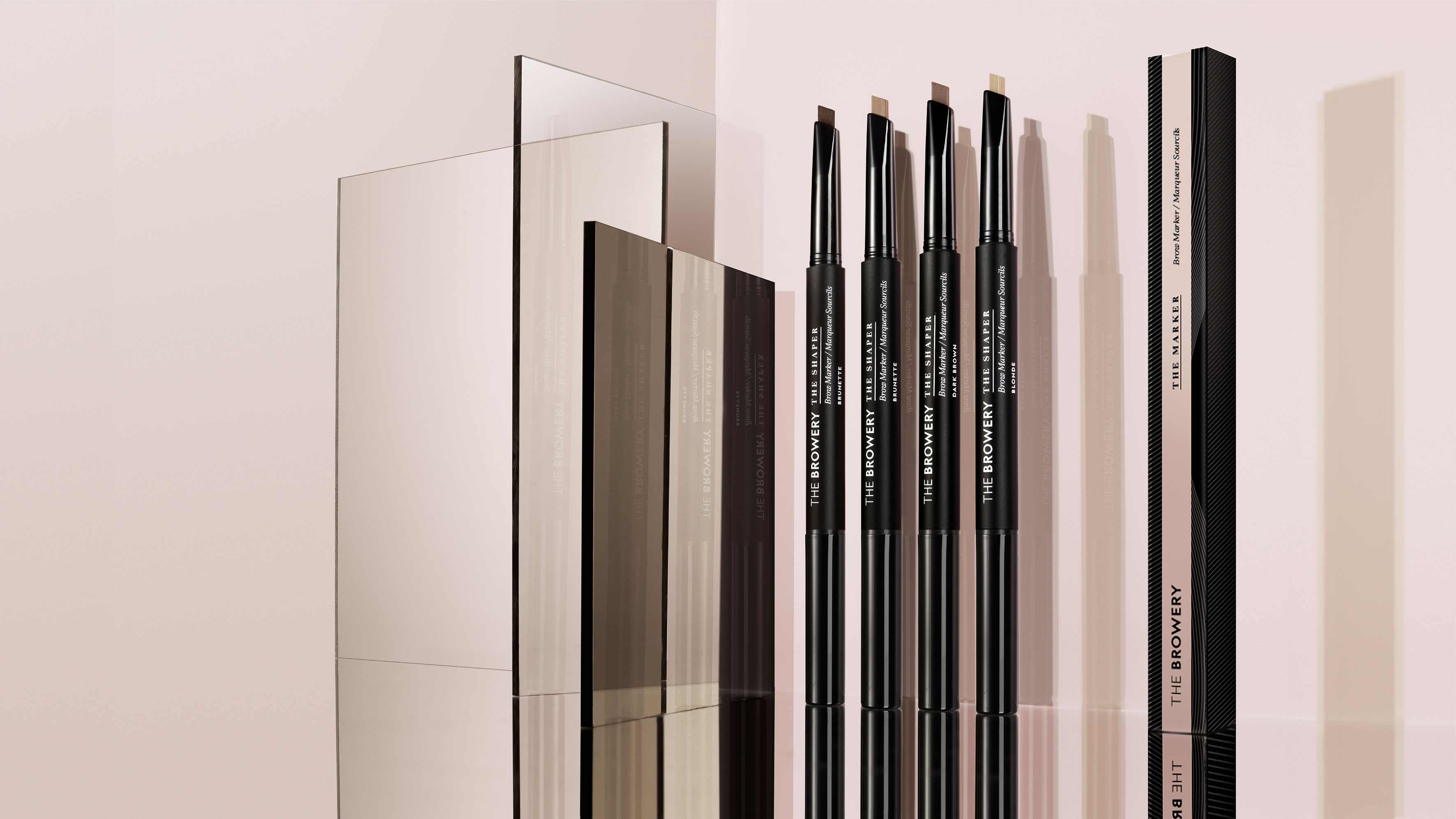
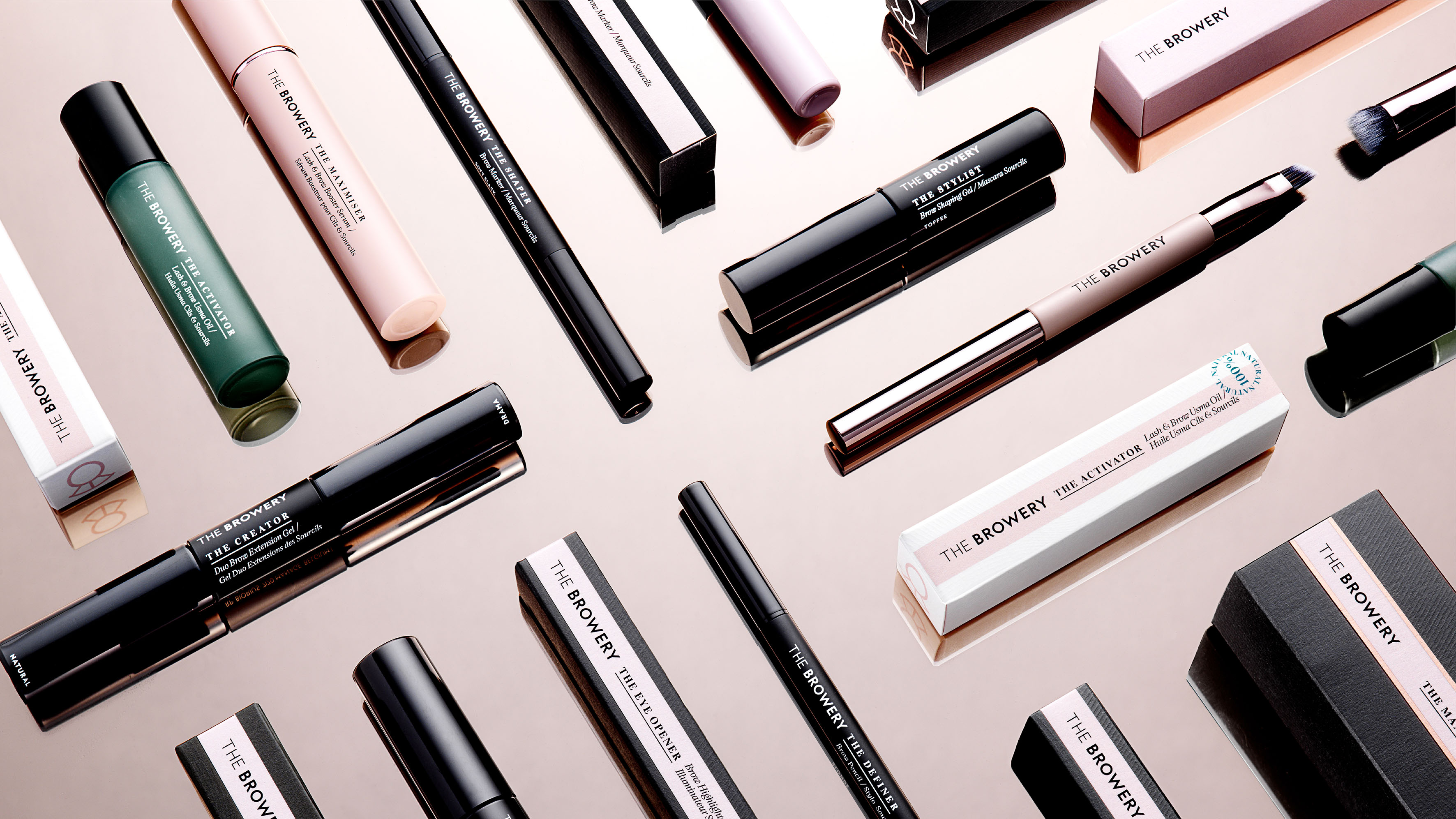
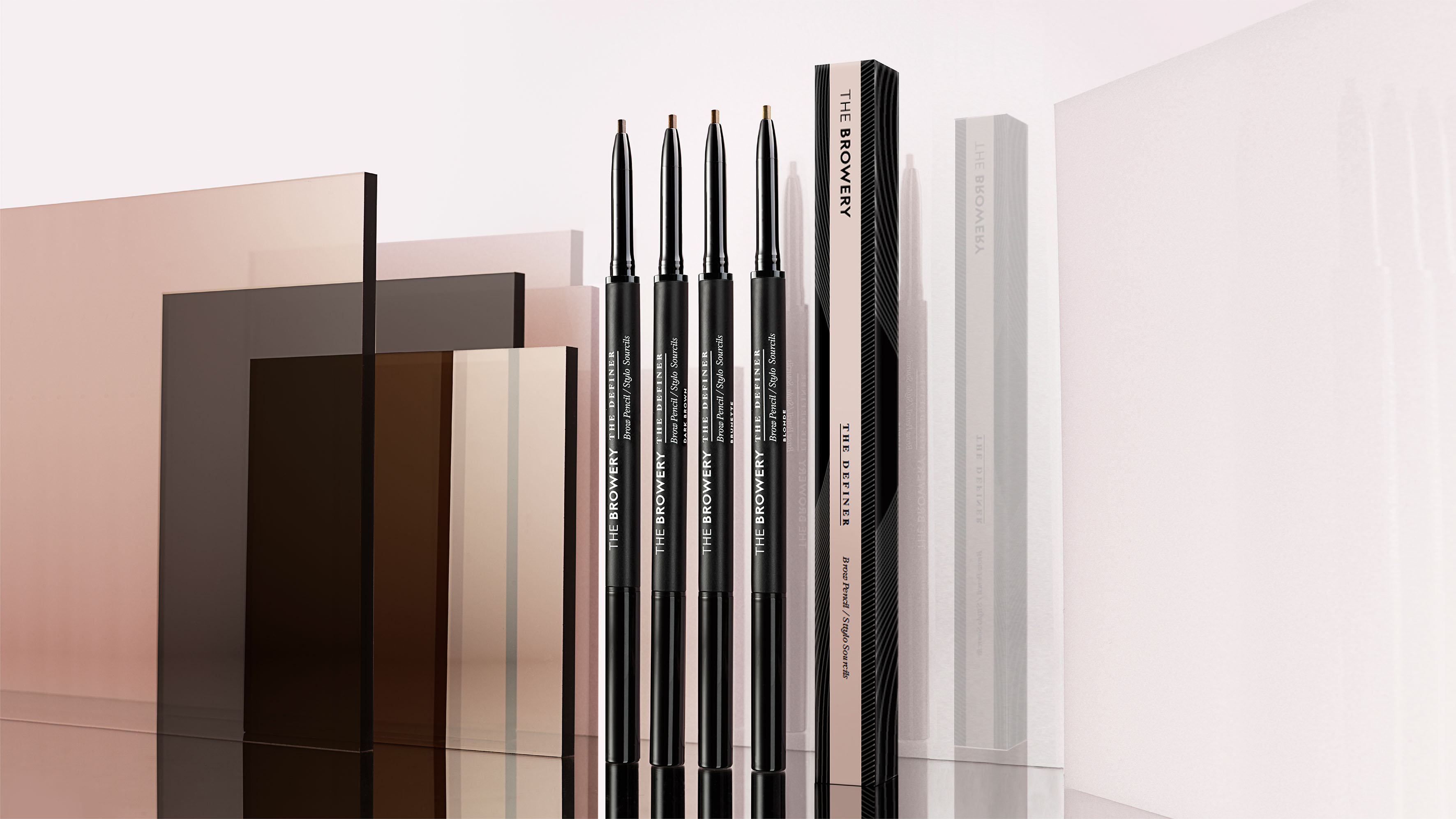
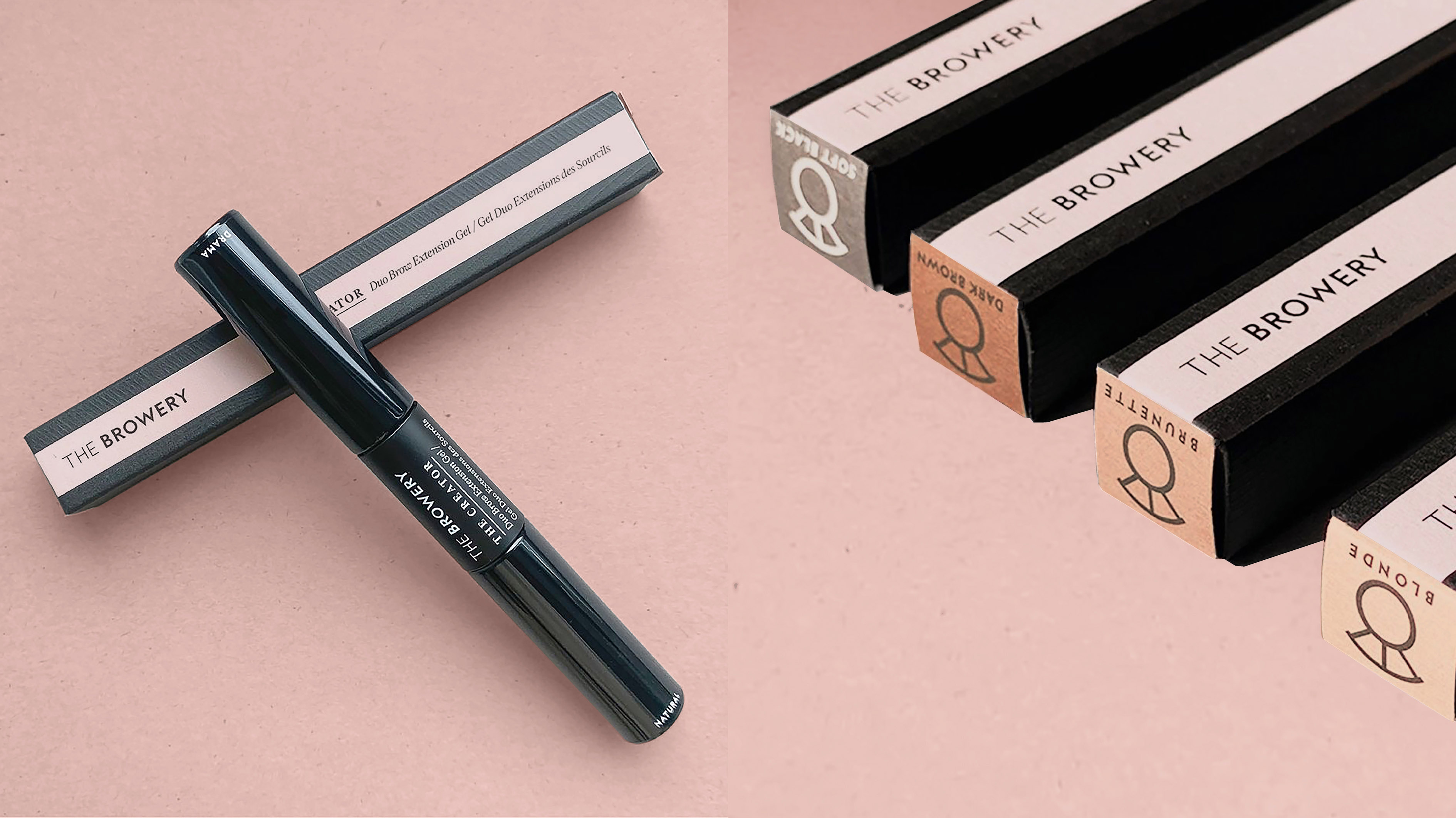
Duality runs through the visual identity. We used two weights in the logo type and a mix of serif and sans serif typography for the confident, straight to the point product names (The Definer, The Maximiser). Formally structured, centralised branding creates gravitas, but is softened by the personal touch of the line ‘by Amira and Rada’. We picked a pink-nude colour palette to match their emphasis on real, natural beauty, contrasted with black for a dynamic, urban edge. Accents of teal add bursts of vibrancy and energy.
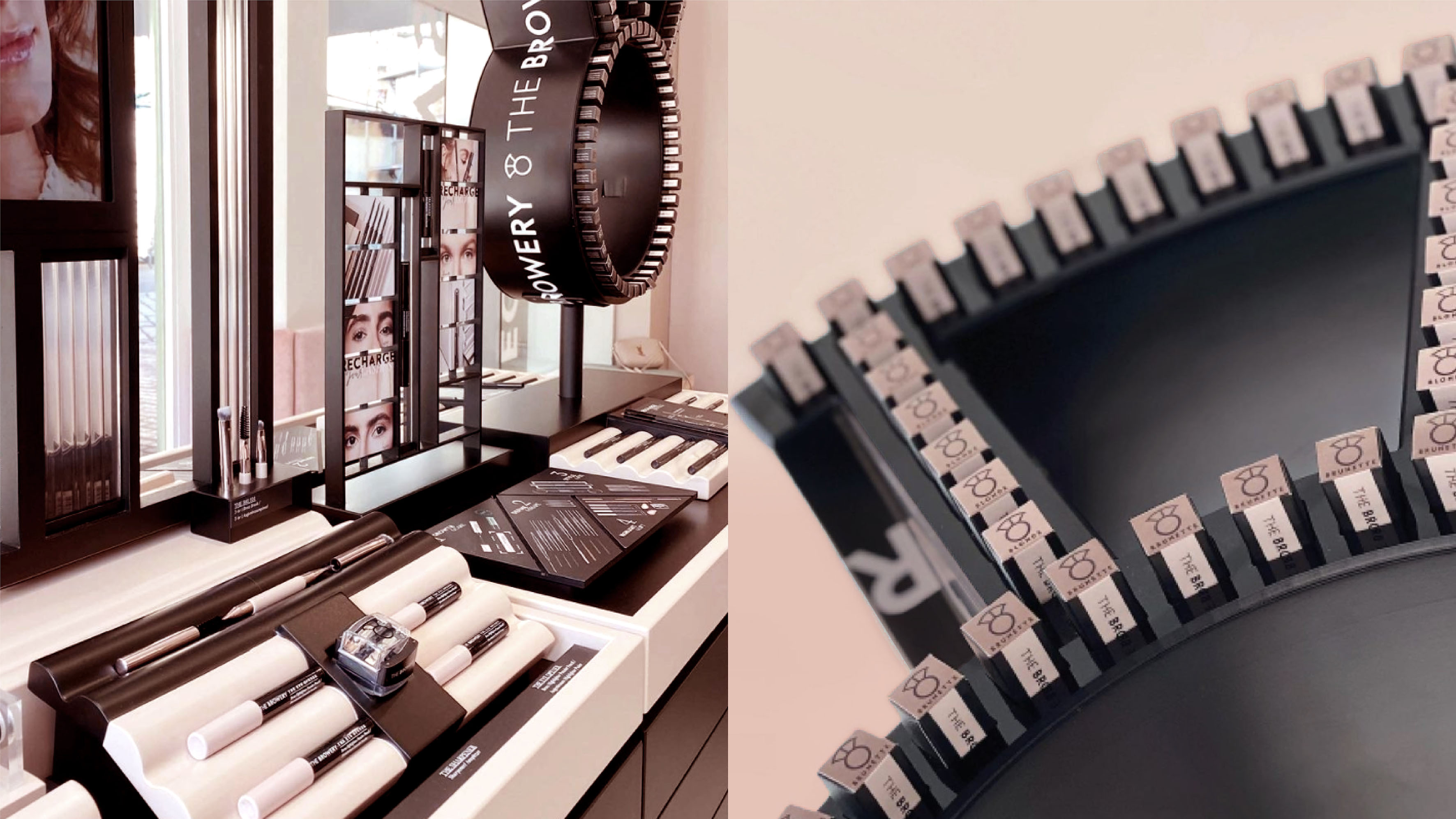
Subtle detail in the finishing brings the sisters’ contrasting personalities onto pack. Embossed waves meet strong structural lines. Working in collaboration with The Browery Creative Team and Creative Director, Izabela Szmyla, this understated tactility is continued through the salon’s interior design. In-store, visual merchandising heroes the brand’s ‘brow’ icon. Doubling up as an impactful, eye-catching product display area.
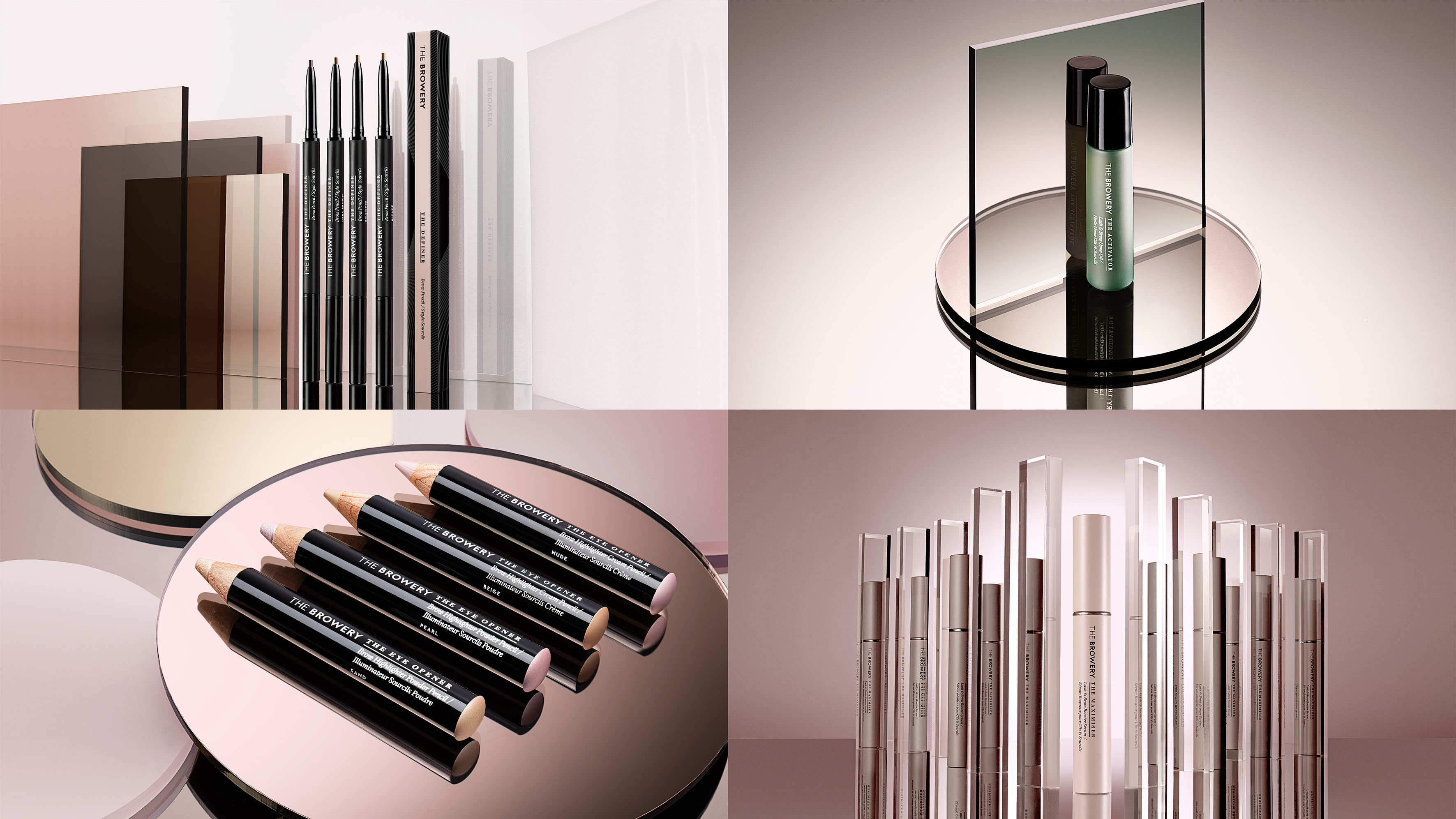
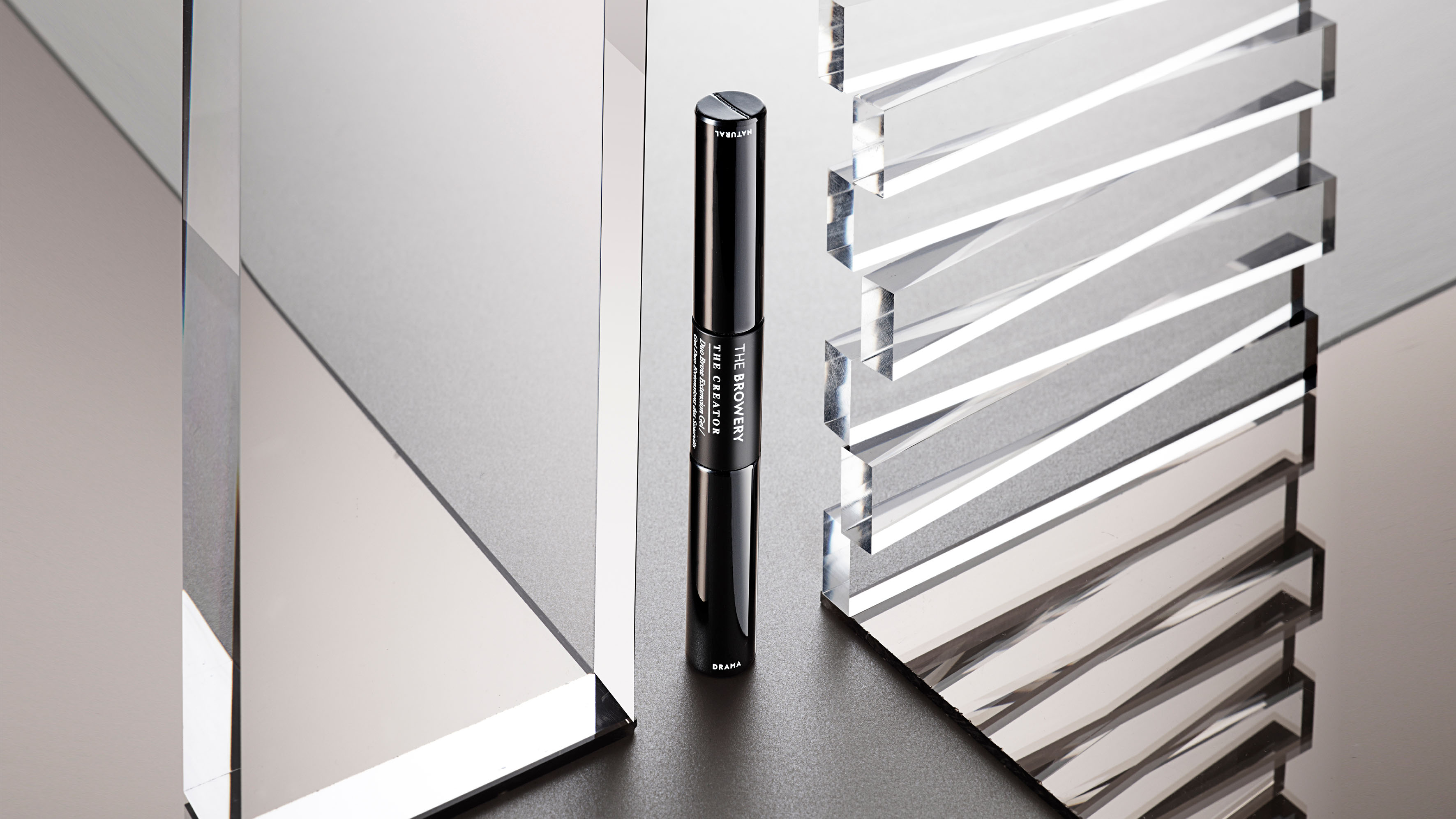
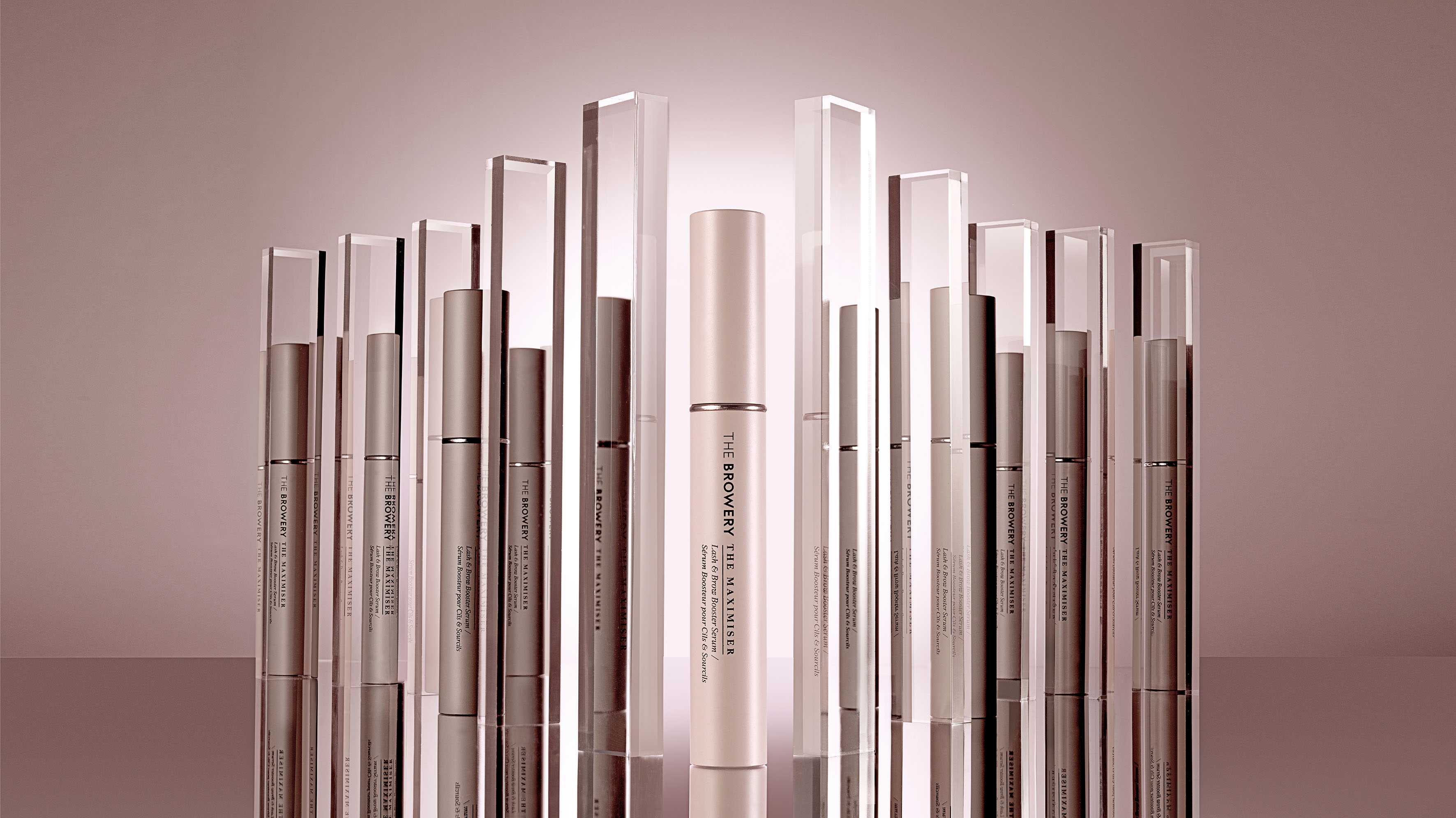
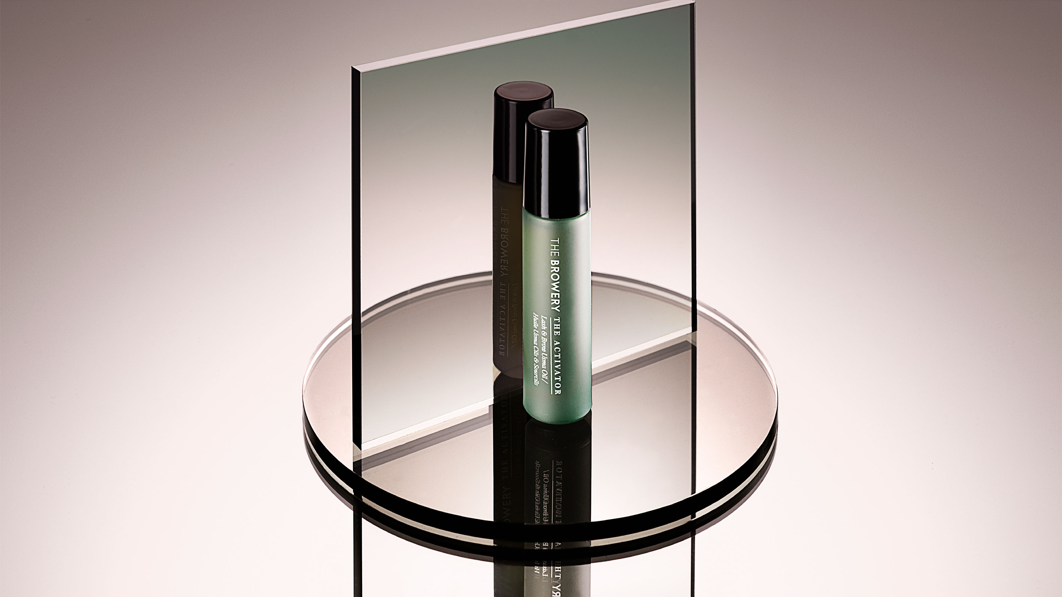
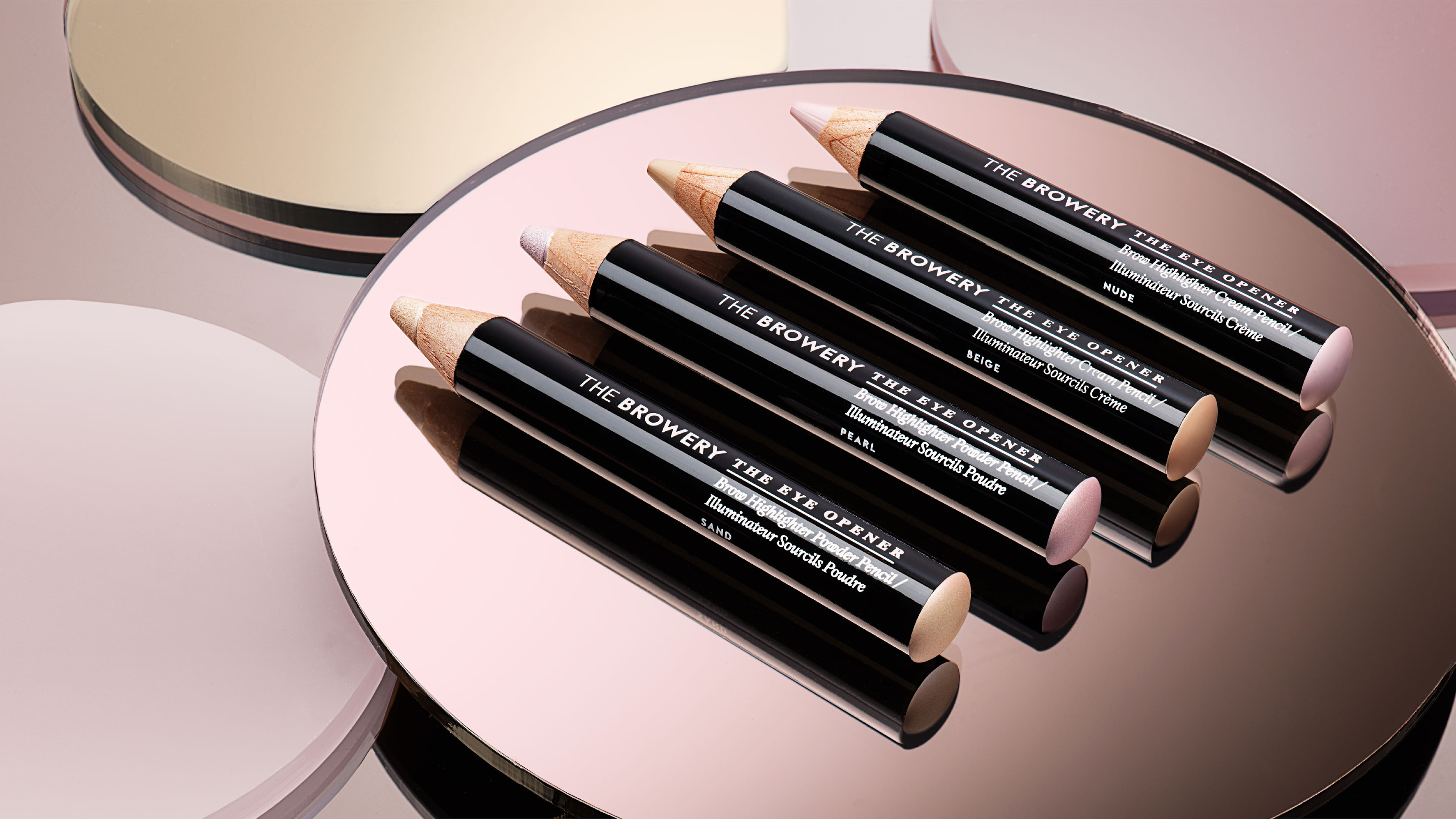
For brand photography, we worked with Barry Makariou, an award-winning liquid & still life photographer. The product-led photography centres long shadows set against natural stone textured backgrounds to create drama and dynamism. Reflections and distortions from faceted glass and mirrored surfaces capture the duality of the sisters. As does the model-led photography; casting models posed in pairs to show the products in use. The photography is used across salon visual merchandising, printed on in-store banners, product display cards, landscape signage and social media.
For the tone of voice principles, we wanted to make sure all communication had the personal and straight-talking touch of the sisters. Empowering and engaging, it feels like a real person talking. We also created the energetic and adaptable tagline ‘Recharge Your Brows’…‘Lashes / Volume / Glow’ etc. and #welcometothesisterhood for social media.
All the thinking was brought together into a brand playbook. Which is being used to roll out the new packaging and visual identity across The Browery salons in Munich, Berlin and Dusseldorf.
Here’s to the power of brow.
“With their work on our packaging and brand identity, Butterfly Cannon have perfectly captured what THE BROWERY is all about – real people and real connections. Our brand is now fully realised but stays true to us and the sisterhood we have built. We are totally in love with our new product range and everything else Butterfly Cannon has created for us and cannot wait to work with them again.”
Amira & Rada, Founders, The Browery
CREDIT
- Agency/Creative: Butterfly Cannon
- Article Title: Butterfly Cannon Shapes the Visual Identity for Luxury Brow Salon The Browery
- Organisation/Entity: Agency
- Project Type: Identity
- Project Status: Published
- Agency/Creative Country: United Kingdom
- Agency/Creative City: London
- Market Region: Europe
- Project Deliverables: 2D Design, 3D Design, Art Direction, Beauty Photography, Brand Design, Brand Guidelines, Brand Identity, Brand Tone of Voice, Design, Graphic Design, Identity System, Interior Design, Packaging Design, Retail Design, Structural Design, Tone of Voice
- Industry: Fashion
- Keywords: cosmetics
-
Credits:
Marketing Manager: Chris Joscelyne


