Brief: You are asked to find an outdated packaging design on the market shelf. Involving completely new or improved graphics (lifting) of a product (surface design).
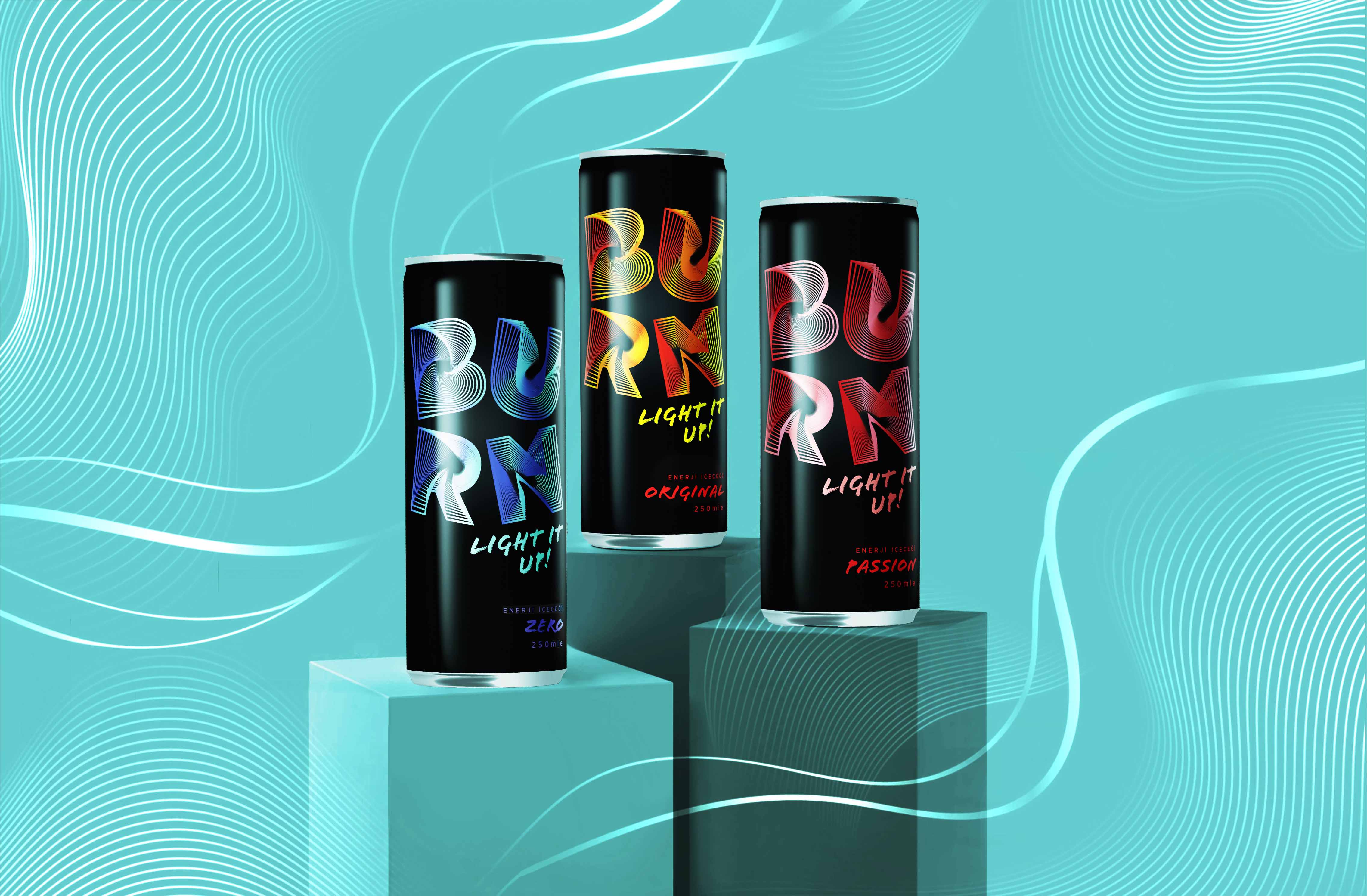
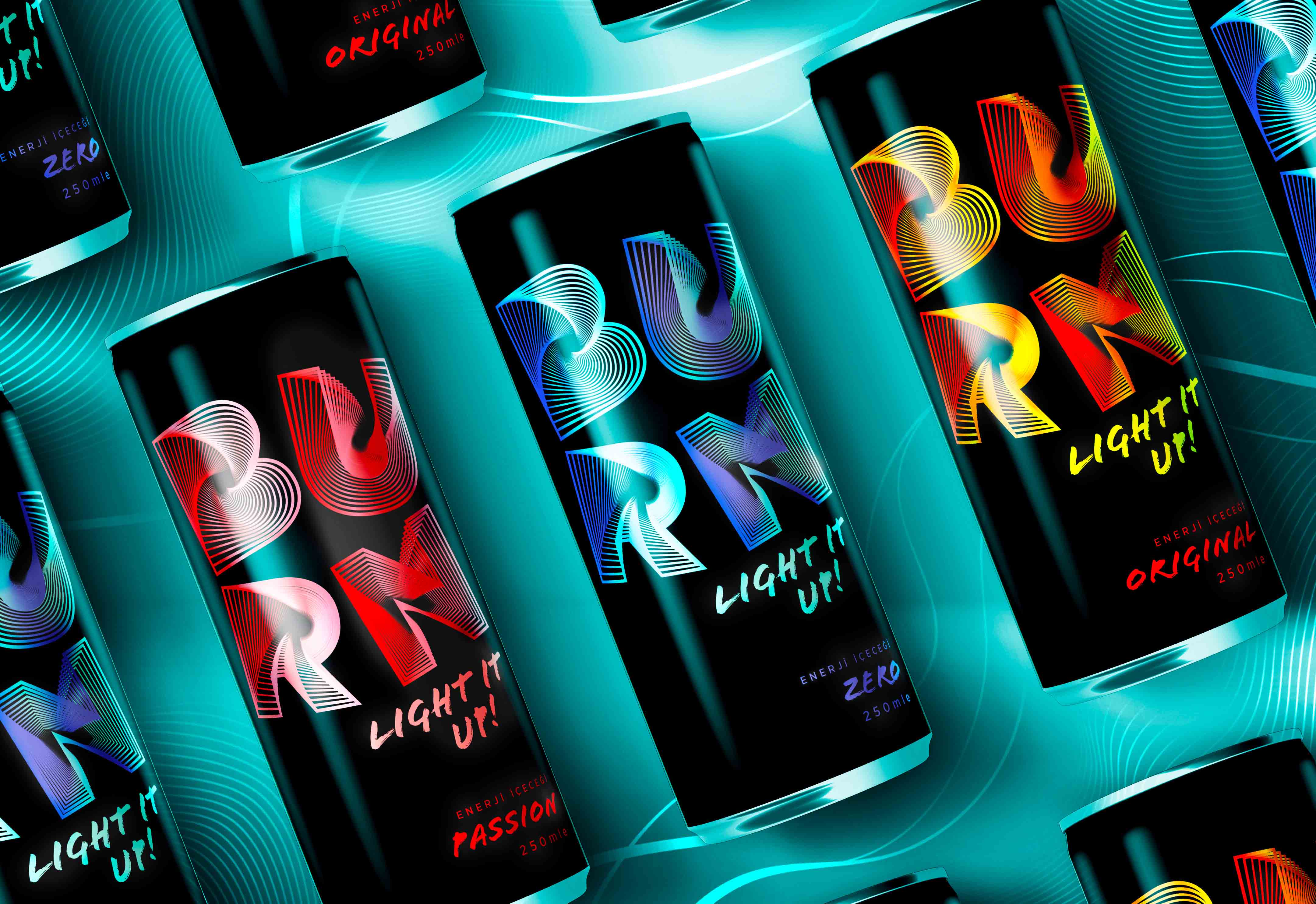
Chosen Brand & Product Line: Burn Energy Drinks (flavors: Original Burn, Burn Passion and Burn Zero)
Target Audience: Young Adults (mostly students)
Explaining The Brand & Problem: Burn is an international energy drink brand which competes with huge brands such as Red Bull, Monster, Reign… It is owned by Coca Cola and mainly targets the young adults. However because of the visual branding, it doesn’t look good when it is placed on a shelf. Specially when it sits next to Red Bull and Monster. It looks cheesy, unprofessional and outdated. I think the main reason is because of the visual (the flame photography) and the way typography (pixelated serif type combined with 2 different san serif font) is used. So that is why I rebranded ‘‘Burn Energy Drink’’.
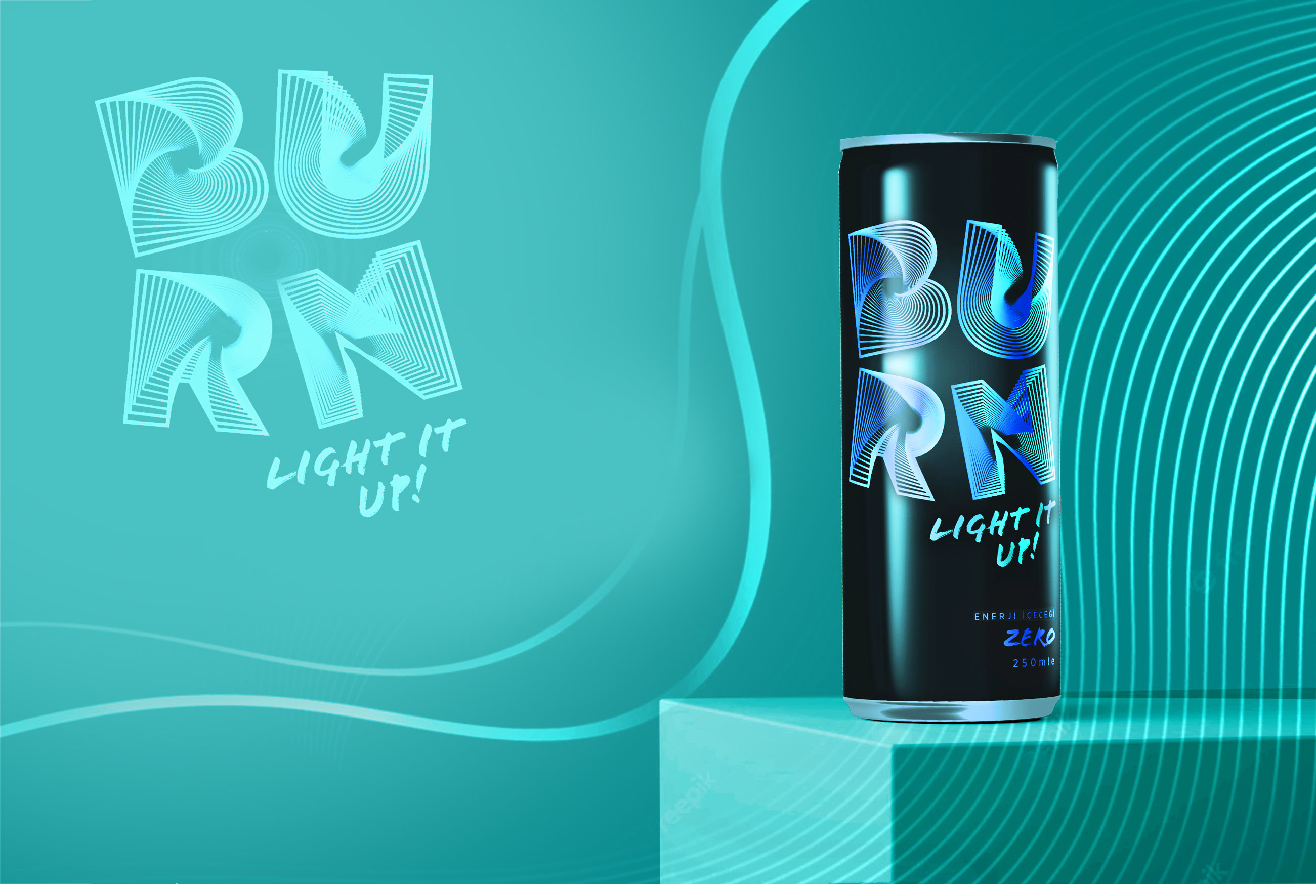
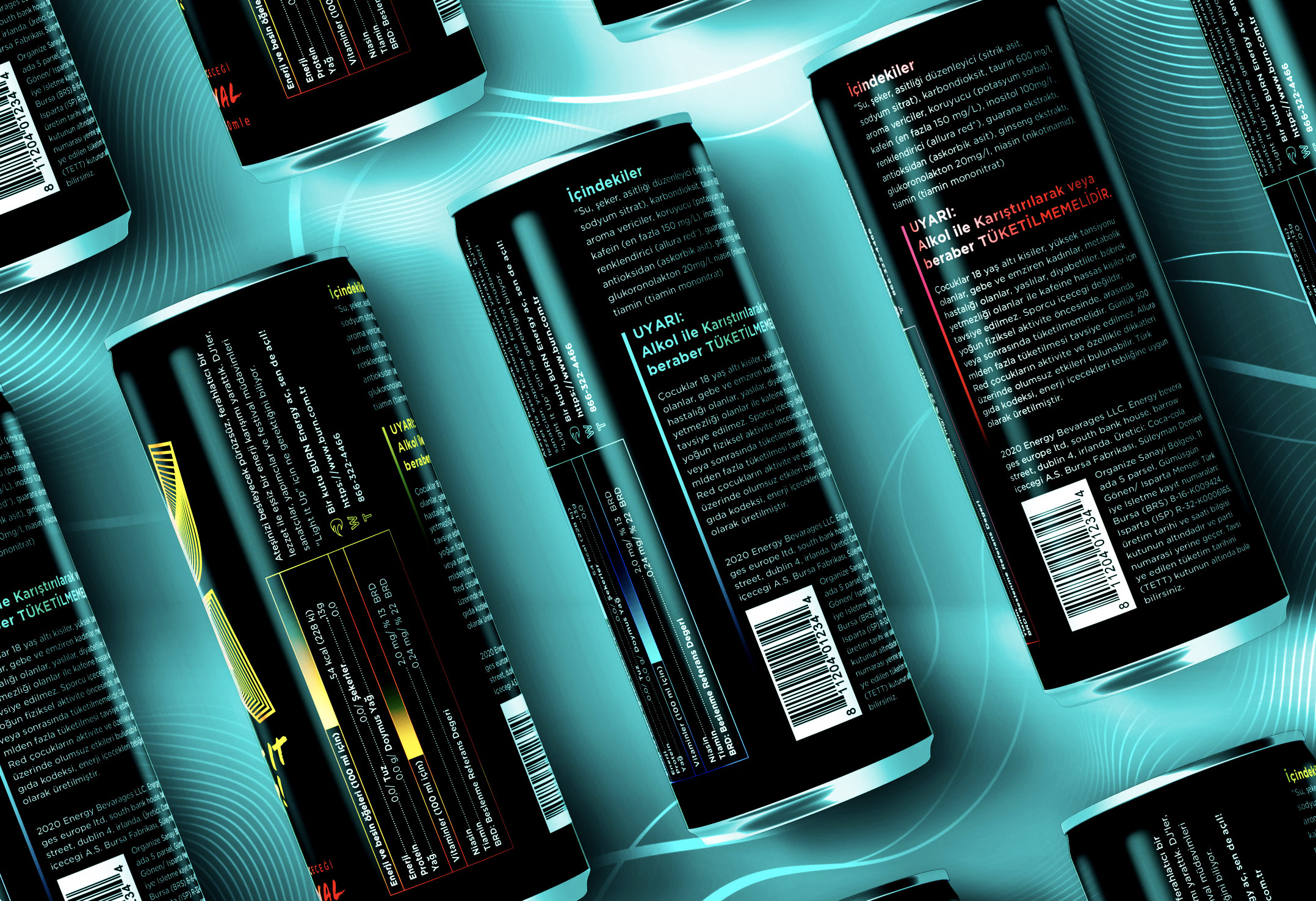
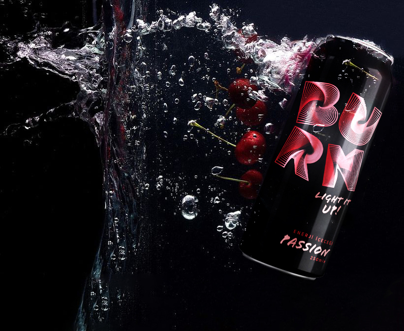
Solution: Packaging needs to be orderly, presentable, and functional. It needs to include visual clues like brand logos, colors, and other elements that reflect your overall brand values. In our case brand value being ‘’energy’’ is represented with different thicknesses of line strokes. Rebranded logo is the main visual for the packaging. ‘‘Light it Up’’ is the slogan, which the company use while promoting themselves. Putting the slogan below right to the logo is a little added detail, to be engaging and unforgettable. When it comes to a beverage’s packaging, even the seemingly insignificant elements can have a big impact on sales. With strong/saturated colors and a clear typography the minimalistic yet aesthetic design was created.
CREDIT
- Agency/Creative: Ozge Ucoluk
- Article Title: Burn Energy Drinks Rebranding
- Organisation/Entity: Student
- Project Type: Packaging
- Project Status: Non Published
- Agency/Creative Country: Turkey
- Agency/Creative City: Ankara
- Market Region: Europe
- Project Deliverables: Advertising, Brand Identity, Graphic Design, Packaging Design, Rebranding
- Format: Can
- Substrate: Metal
- Industry: Food/Beverage
- Keywords: WBDS Student Design Awards 2022/23
-
Credits:
Teacher: Gokhan Numanoglu


