The question
Approaching their 10-year anniversary, burger & lobster was looking to reconnect with the unorthodox ethos that earned them cult status upon launch. Once renowned for its industry-disrupting offering, the market had followed suit and the brand now needed to rediscover that unique spirit which had made it so impossible to ignore a decade ago.
We were challenged to evolve the brand, reigniting the rebellious spark whilst staying true to the heritage that earned them their devoted following. But how can you surprise an audience when the experience itself is a household name?
The answer
By breaking convention first, and lobster claws second. Crafting an identity that merges the playful nostalgia of burgers with the indulgence of lobsters, we infused the brand with a sense of grown-up play — a north star that represents an immersive, visceral and indulgent physical experience.
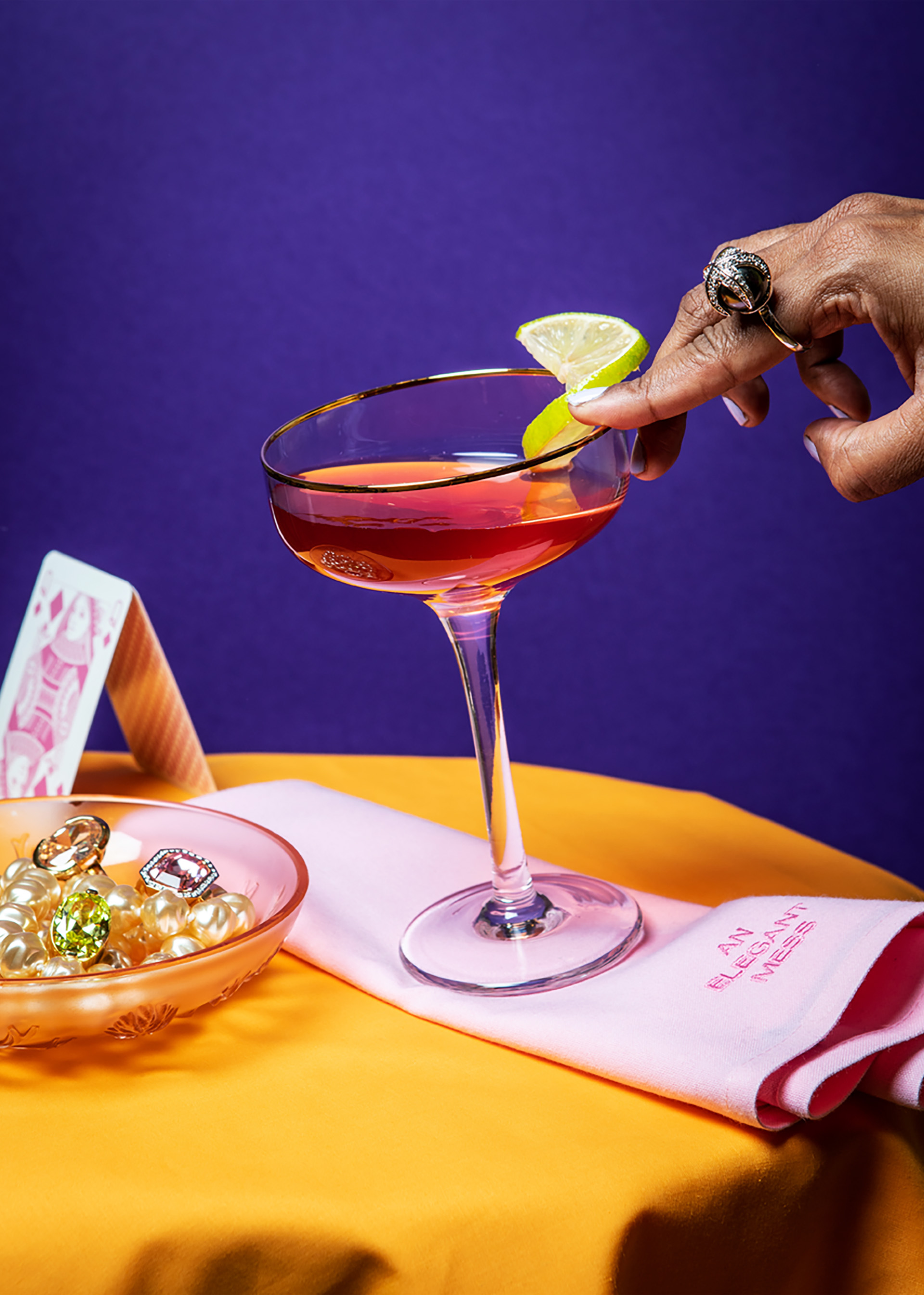
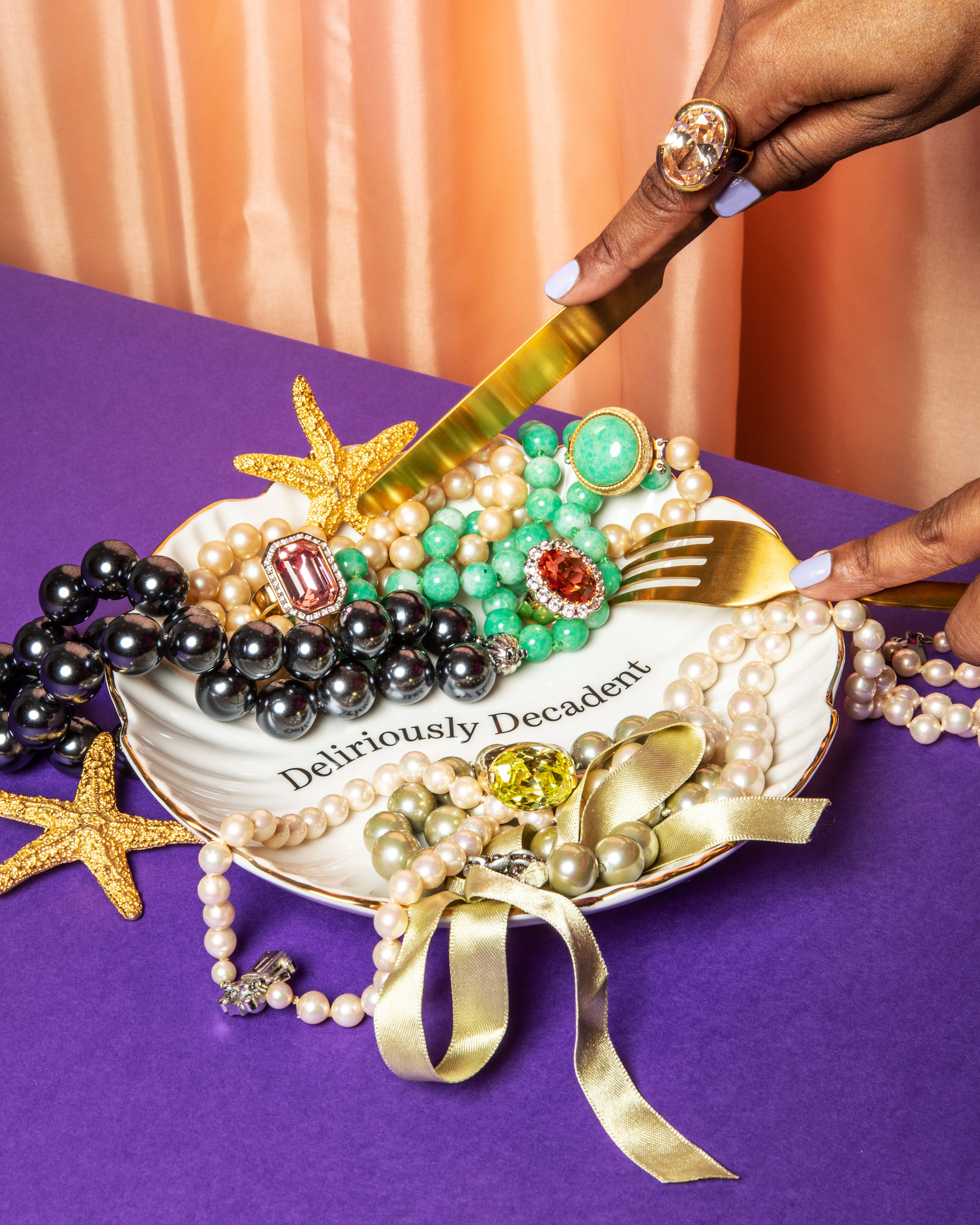
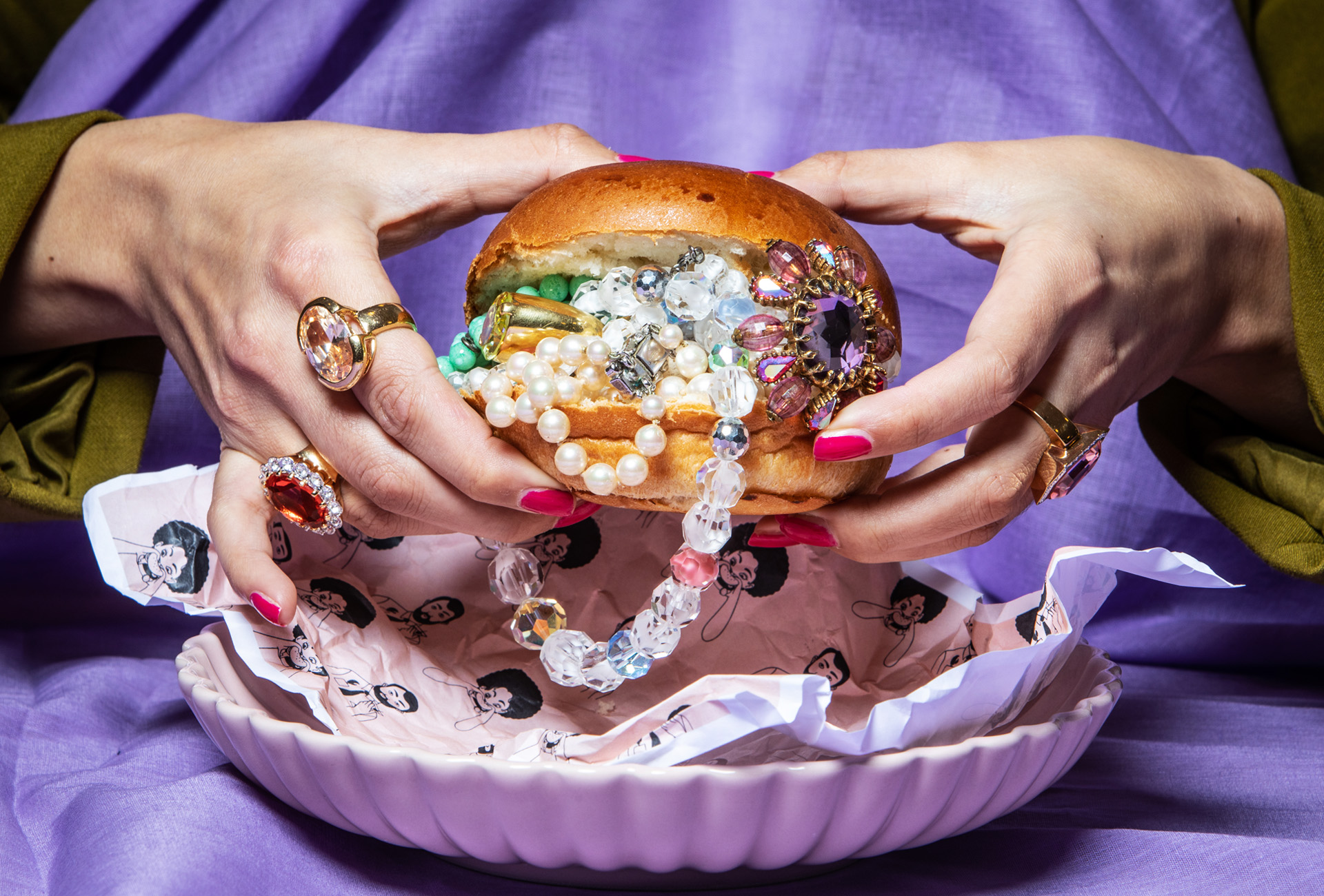
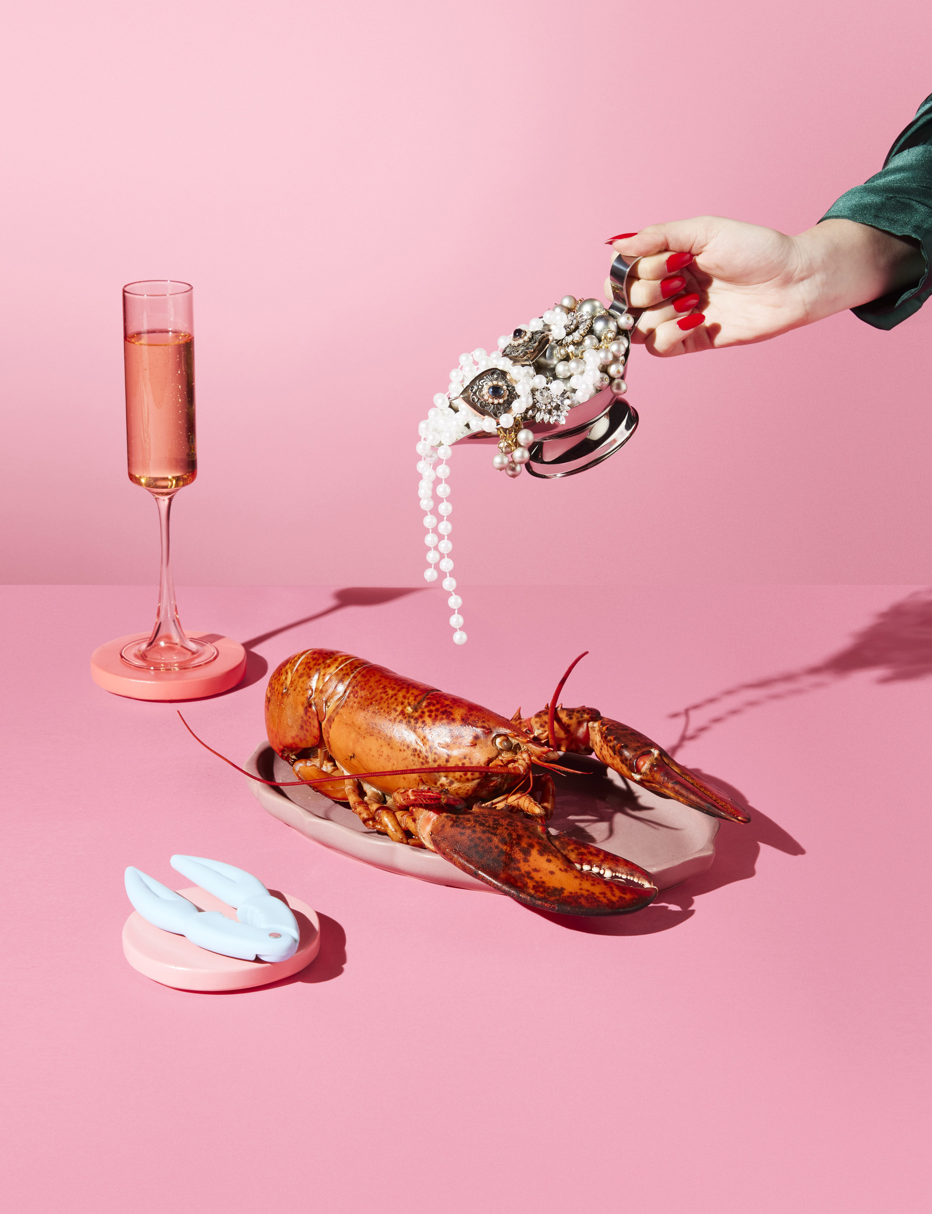
A space where custom napkins smear magnificent messes and lobsters are drenched in dollops of pearls; it’s unpretentious opulence served up on a silver platter — no cutlery required.
Two heroic typefaces
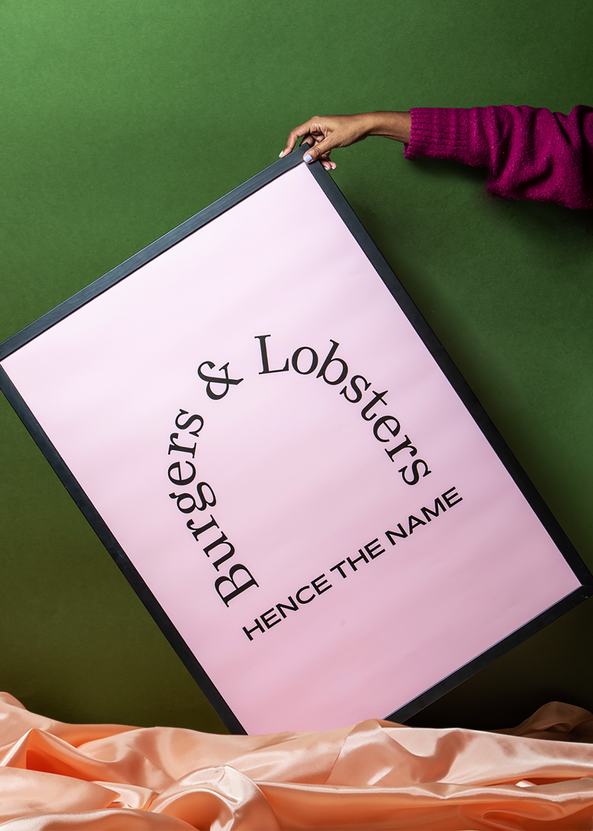
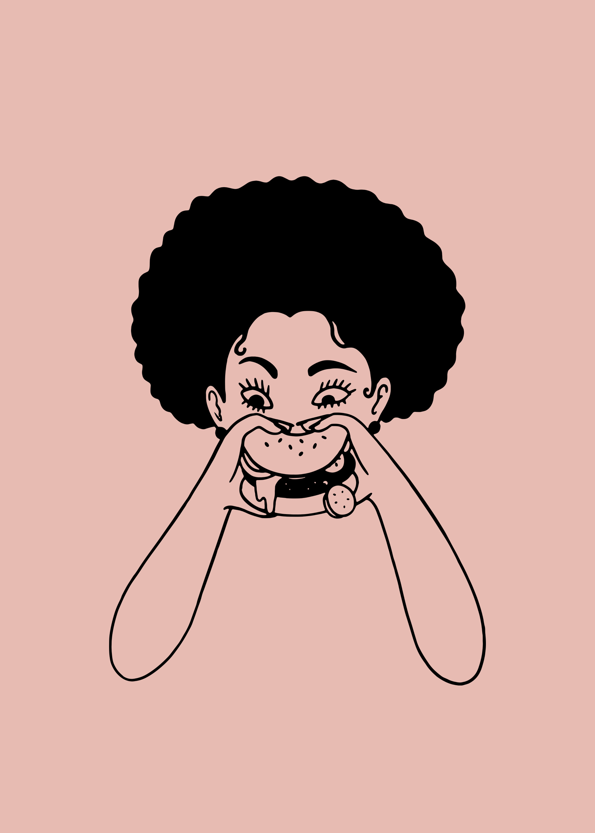
Marrying luxury with vibrancy began with fonts — juxtaposing an elegant ‘lobster’ serif typeface against a beefy burger san serif. We further elevated visuals with a bright and bold colour palette that paired naturally to a series of bespoke illustrations. These custom additions were styled to bring a sense of playful surrealism to the brand, and were hidden in unexpected places amongst collateral.
Unadulterated joy
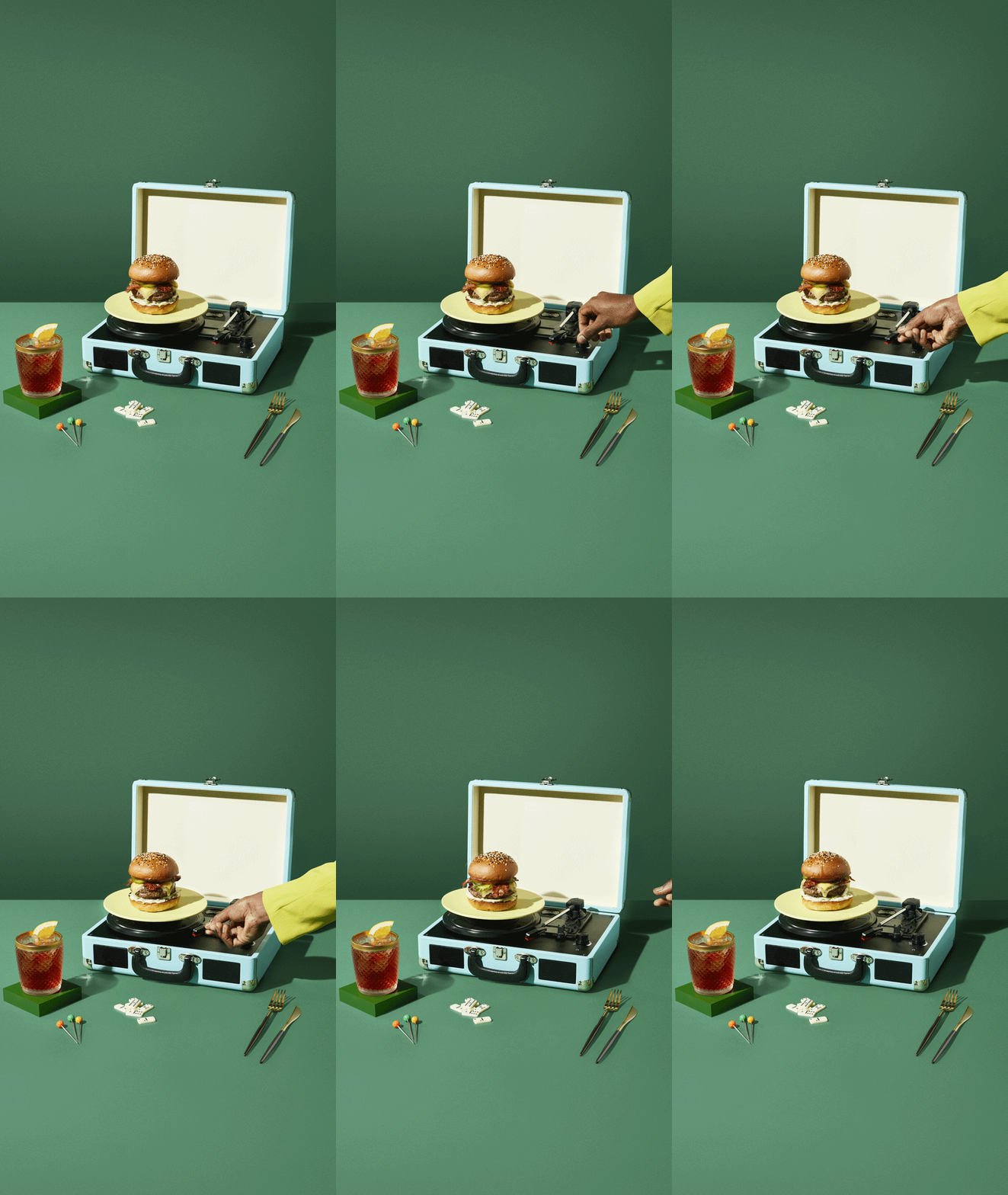
Photography further championed the immersive experience of the restaurants, with a dream-like lens applied to every frame. Lifestyle photography suspended reality — with pearls poured over whole lobsters and burgers bound to vintage turntables.
(don’t) mind your manners
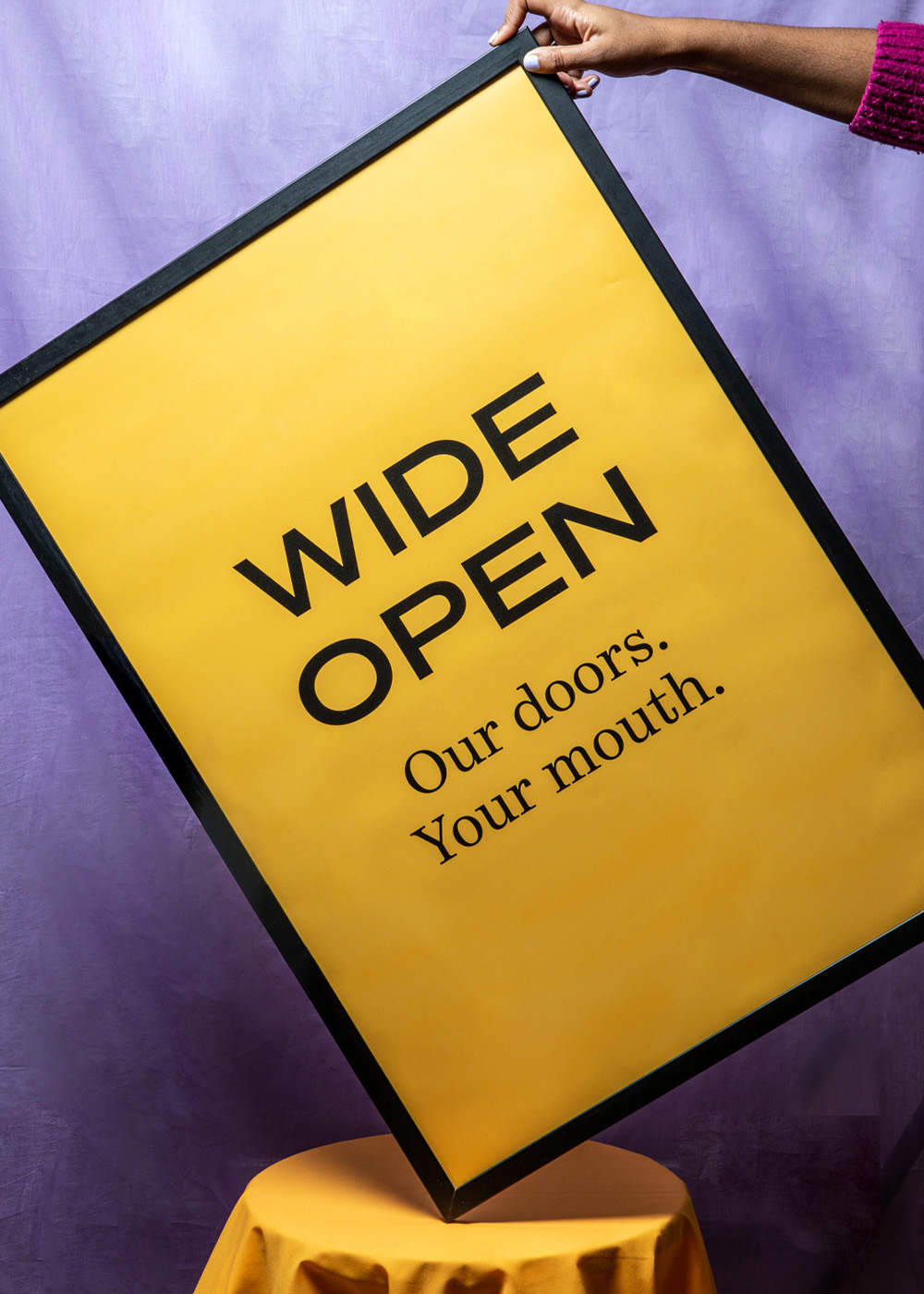
We created an unapologetic and entirely enticing brand personality and tone of voice that successfully balanced a sense of playful nostalgia with a more sophisticated presentation. Punchy but decadent. Indulgent yet unpretentious. The burger and lobster experience demands you to leave your table manners at the door — so our language needed to speak to exactly that.
Indulgent play
Lauréne boglio created a set of illustrations that celebrated the brand’s playful spirit and unique menu — sprinkling some charm, wit and warmth into unexpected places.
Crack. Chomp. Bliss.
A flexible set of frameworks showcasing the brand’s fresh new toolkit bought some much-needed energy and flavour to burger & lobster’s social channels.
The only rules to follow
The final step was producing a brand book that could inform, guide and inspire those responsible for bringing the burger & lobster brand to life.
“What a refreshing experience. Forty eight point one took us firmly out of our comfort zone, creating a brand identity and strategic vision that’s got us all excited about the next 10 years”
Hannah williams burger & lobster
Head of marketing & digital


CREDIT
- Agency/Creative: Forty Eight Point One
- Article Title: Burger & Lobster: Breaking Decorum With the Original Restaurant Disrupters
- Organisation/Entity: Agency
- Project Type: Identity
- Project Status: Published
- Agency/Creative Country: United Kingdom
- Agency/Creative City: London
- Market Region: Europe
- Project Deliverables: Art Direction, Brand Architecture, Brand Design, Brand Guidelines, Brand Identity, Brand Redesign, Brand Refinement, Brand Strategy, Brand Tone of Voice, Branding, Copywriting, Creative Direction, Design, Food Photography, Food Styling, Photography, Rebranding, Writing
- Industry: Food/Beverage
- Keywords: Restaurants Hospitality Food Drink
-
Credits:
Co-Founder & Creative Director: Jack Carey
Co-Founder & Creative Director: Paddy Carey


