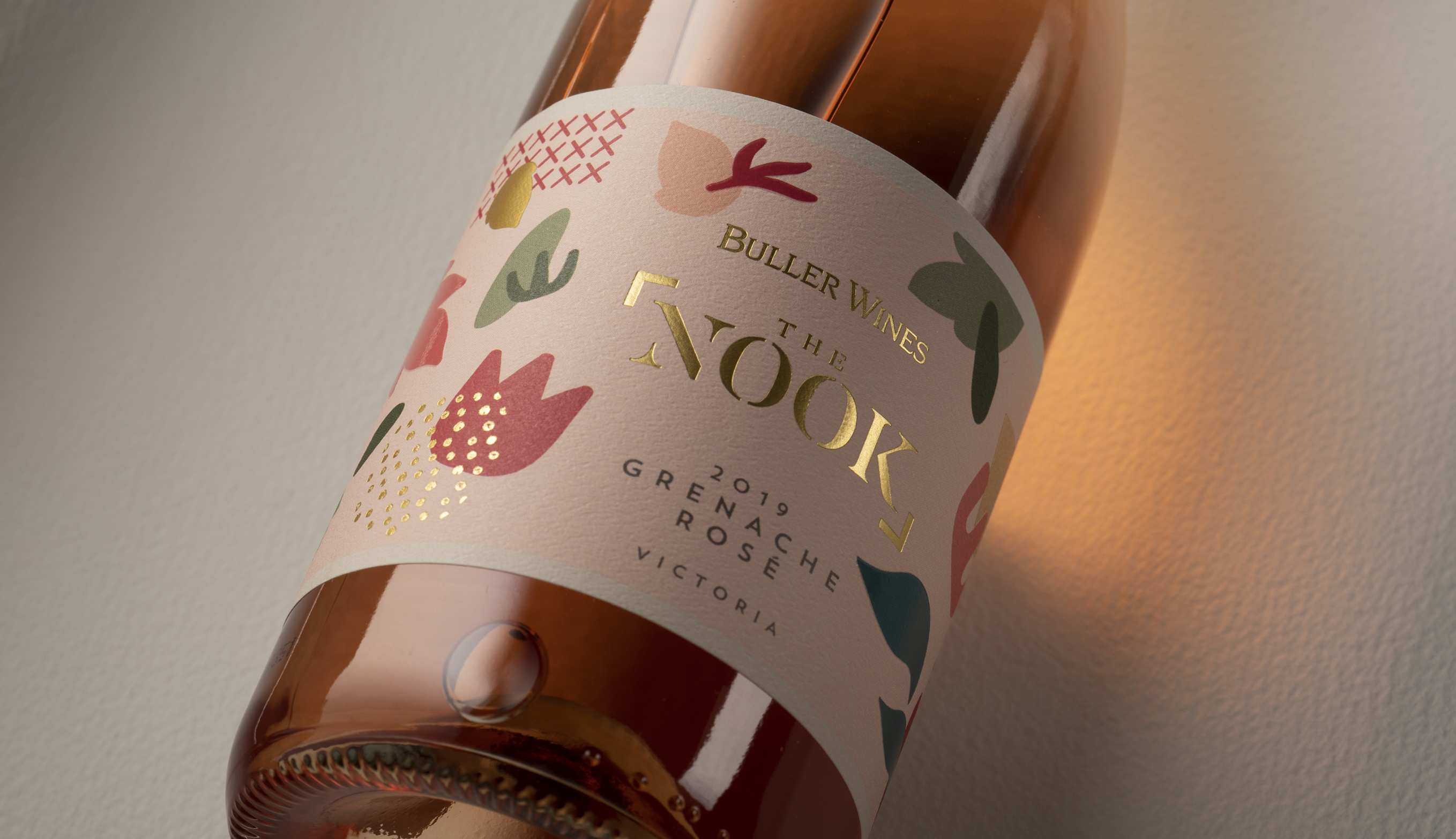
Design Energy was briefed by Buller Wines to create a new range of wines to appeal to the younger wine explorer, predominately female. Buller Wines is an established winery that has been operating for almost 100 years in Australia. However, the brand image for most of their ranges is for a more mature audience leaning towards a more male aesthetic.
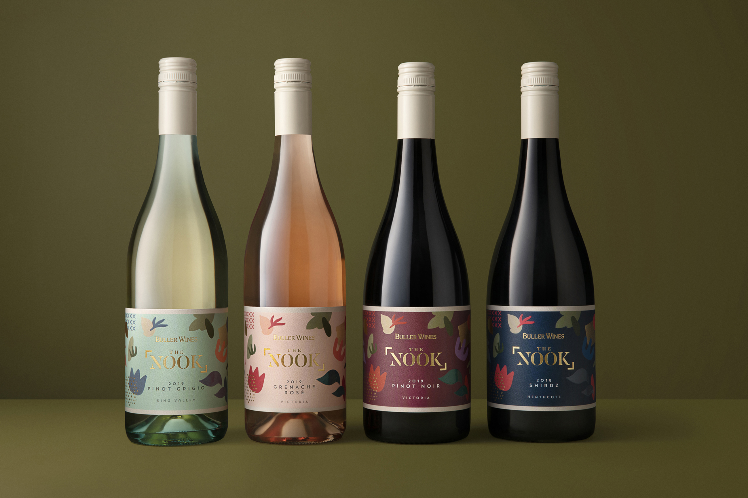
Part of the brief criteria was to create a regional theme as each wine is from a different region within Victoria. The wines showcase the best varietal those regions has to offer.
To appeal to the younger audience we decided to be playful with the name but we aimed to keep the design contemporary and slightly sophisticated. Design Energy came up with the name “The Nook” from the saying “in every nook and cranny”. This refers to hidden areas to discover, inviting the consumer to explore those regions and start their wine education about the best regions for those wine varietals.
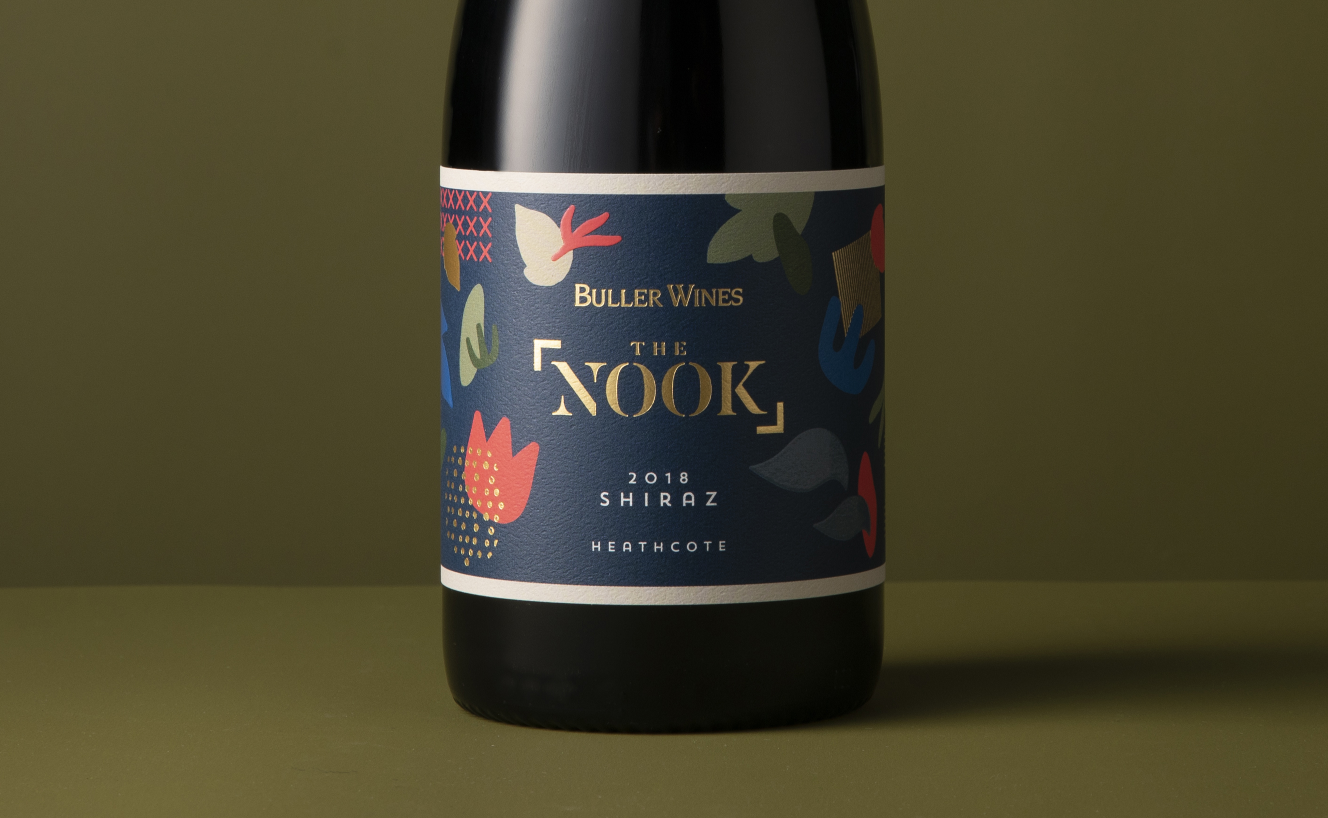
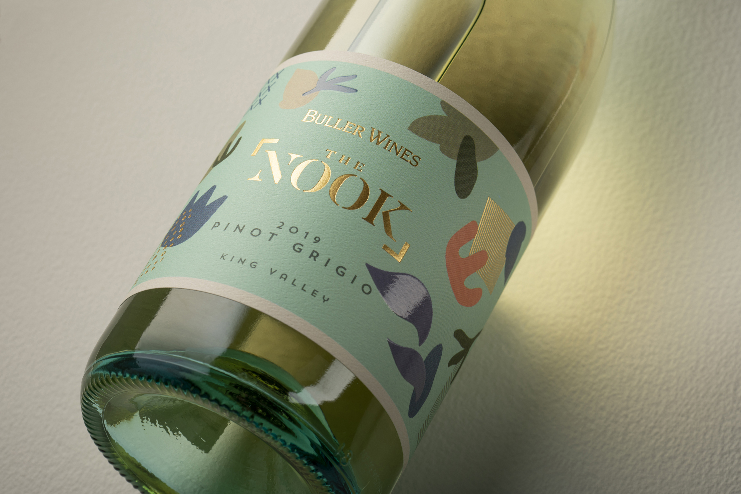
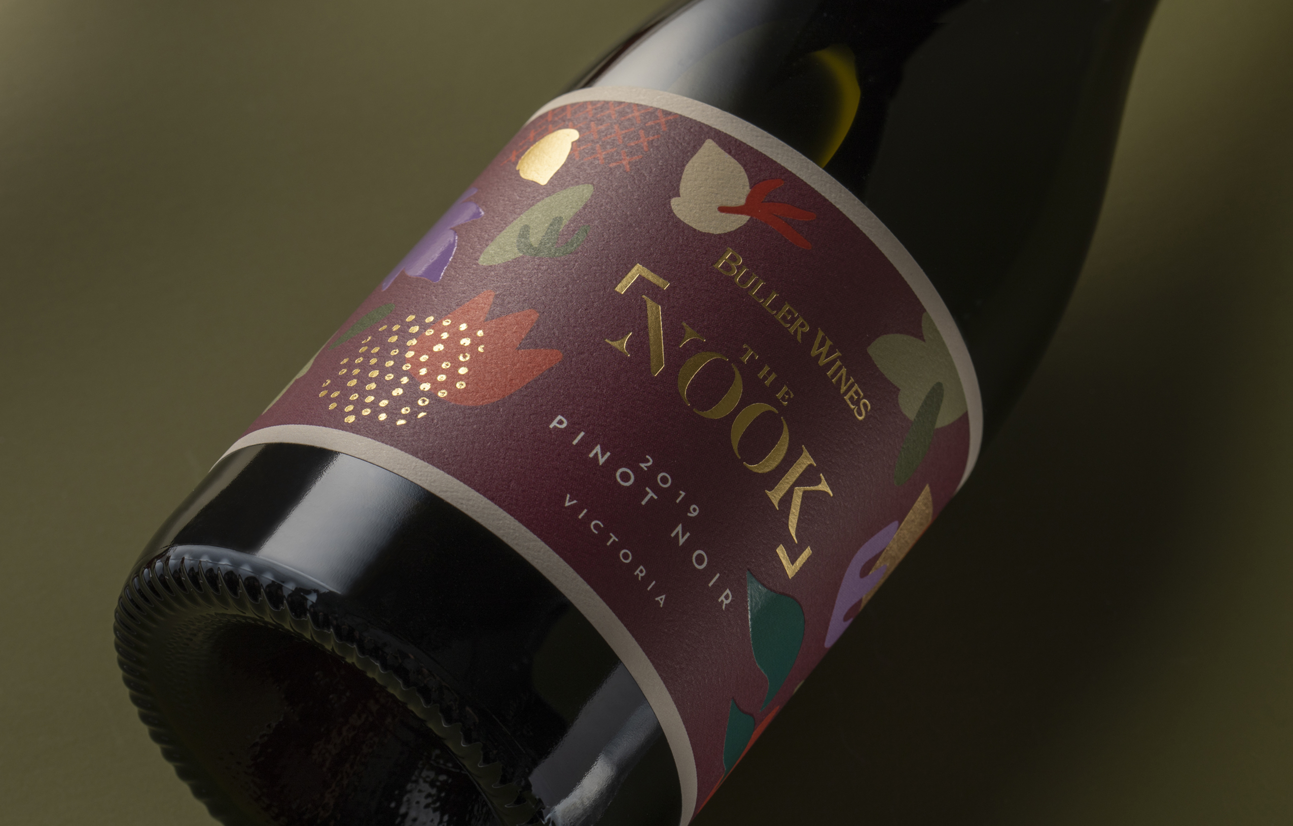
The imagery has been created to represent vineyards scattered throughout the state. There are rows of lines, crosses and patchwork to represent the different vineyards and varietals. There is a cluster of “golden” pebbles that represents the rich, earthy soil Heathcote is renowned for. There are waves and larger rocks to represent the King River in the King Valley. Leaves and organic shapes scatter the label to add to the earthiness and regionality of the brand and also create a sense of movement and discovery.
The colours are representative of the wine style for each varietal, but are also a contemporary mix that creates shelf impact. Added finishes of textural stock, scattered foil and highbuild gloss varnish invites the consumer to touch and explore further.
Buller Wines have had great acceptance in the market place with this new range. “We have been able to place this brand in boutique liquor outlets that previously the same wines haven’t had access to. The stockists of the old branding have found their sales have increased in volume with the new range”, says Michael Murtagh from Buller Wines.
CREDIT
- Agency/Creative: Design Energy
- Article Title: Buller Wines Regional Discovery by Design Energy
- Organisation/Entity: Agency, Published Commercial Design
- Project Type: Packaging
- Project Status: Published
- Agency/Creative Country: Australia
- Market Region: Oceania
- Project Deliverables: Brand Architecture, Brand Creation, Brand Identity, Brand Naming, Brand Redesign, Brand Rejuvenation, Brand Strategy, Brand World, Branding, Graphic Design, Illustration, Packaging Design, Product Naming, Rebranding, Research, Retail Brand Design, Tone of Voice
- Format: Bottle
- Substrate: Glass Bottle
- Keywords: WBDS Agency Design Awards 2020/21


