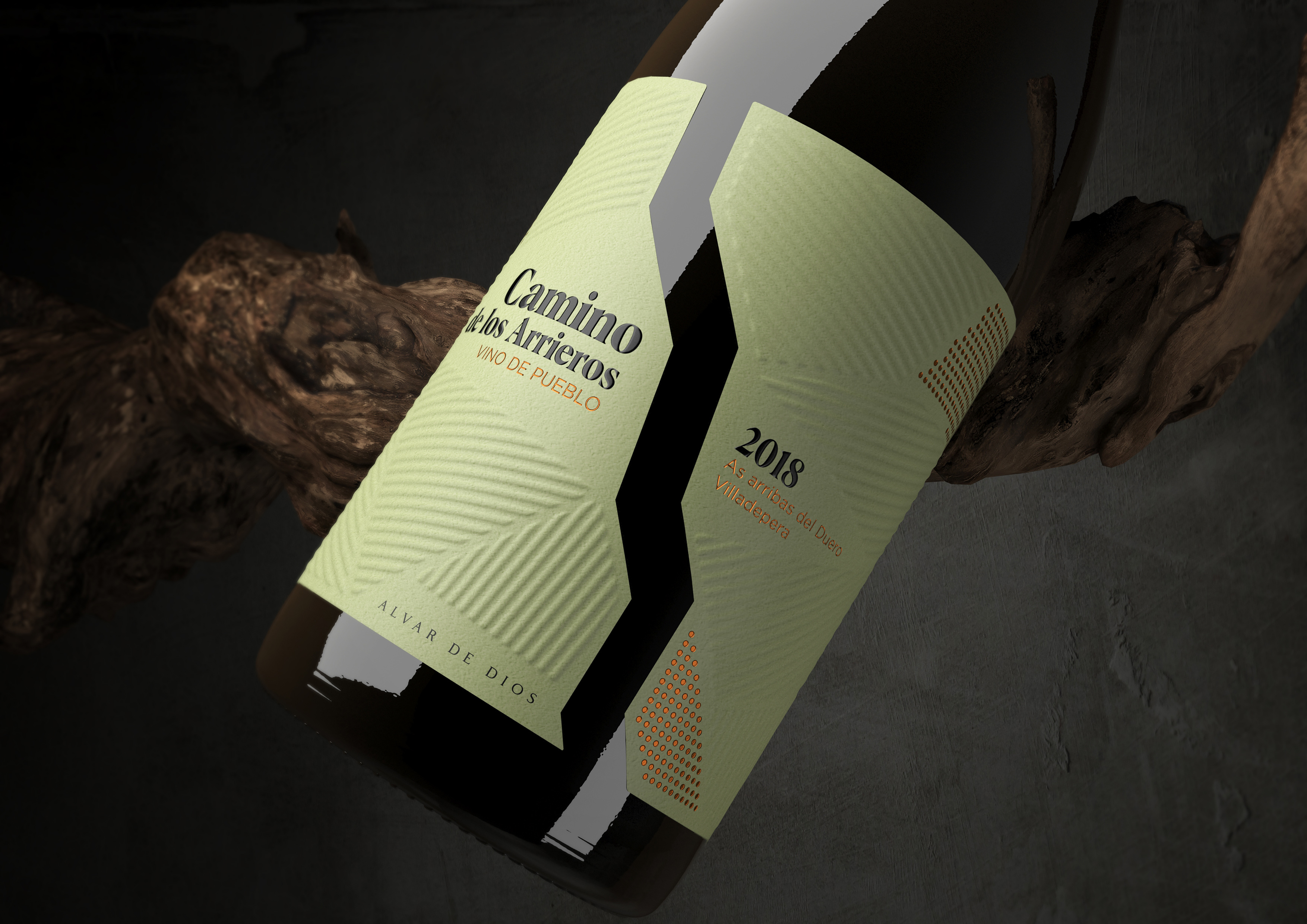
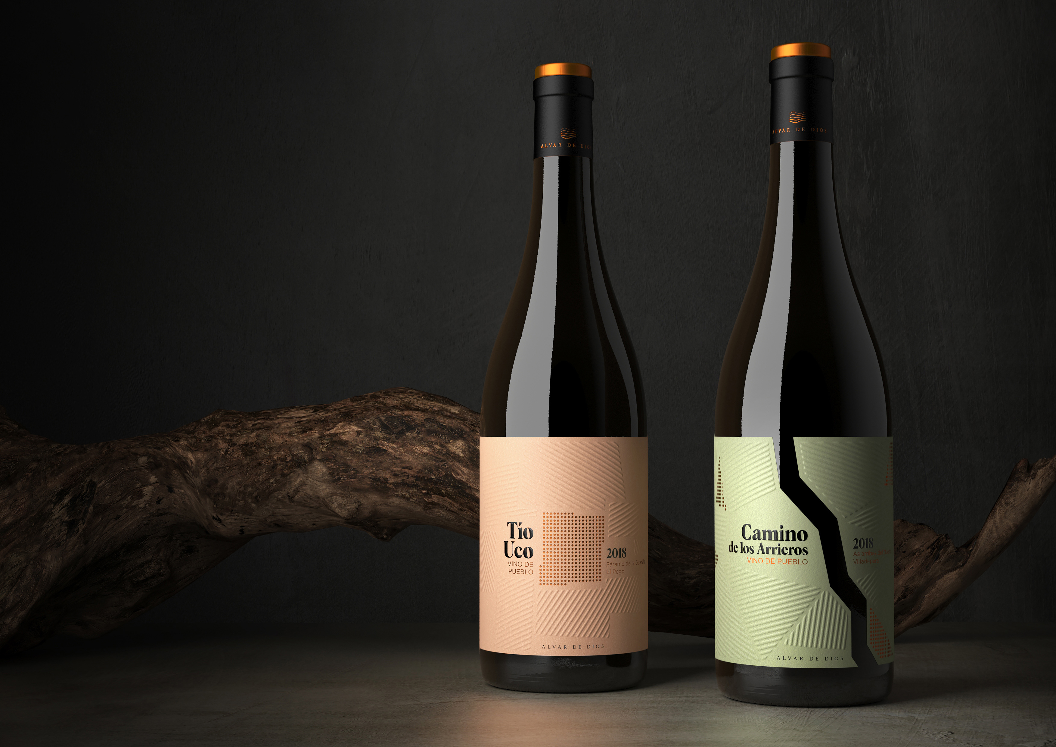
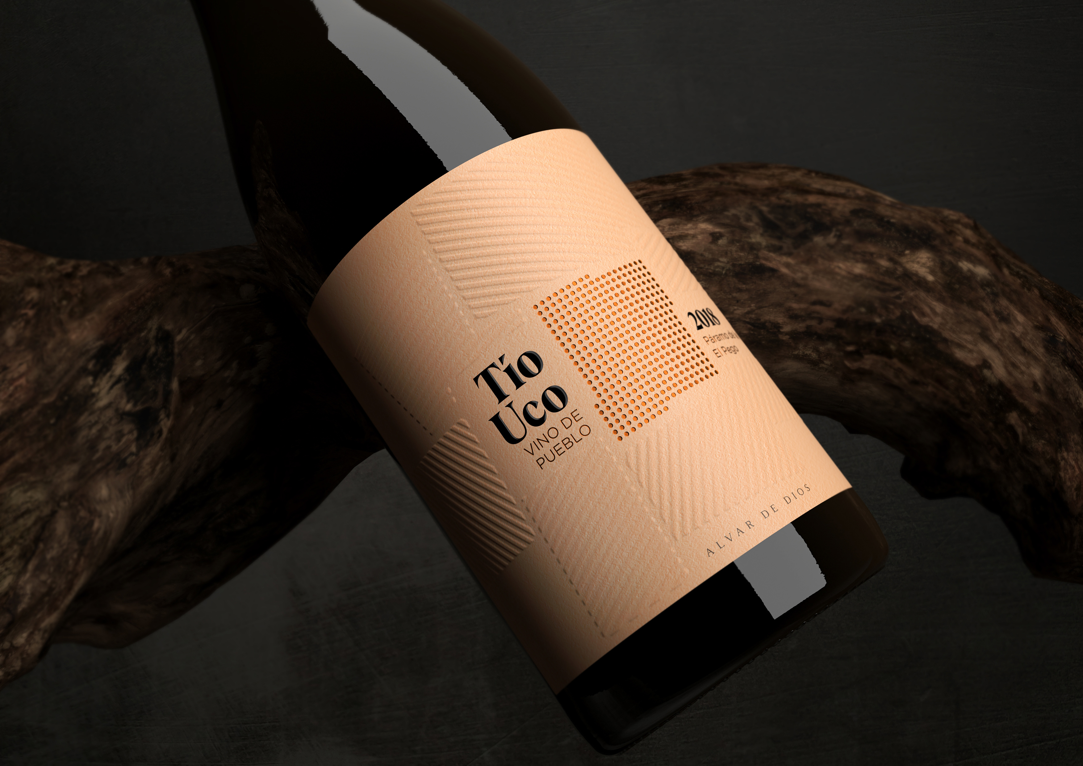
Camino de los Arrieros and Tío Uco are the gateway to the universe of Alvar de Dios, wines defined as “village wines”. Honest but at the same time complex products that capture both for their taste and their aesthetics the differences between the lands and soils from which each one comes.
The strategy for this new labeling project has been to represent the differences between the two regions in the colour of the label, green on the Camino de los Arrieros and brown on Tío Uco, as the soils of both places actually are. At the graphic level, these landscapes have been represented in a very synthesized, geometric and abstract way, seen from the sky where the vines are distinguished as small points thanks to the way they are grafted (leaving a large space between them so that each one can feeding on the few nutrients of both types of soils.) and parallel lines appear on the sides of these points, symbolising the rest of the fields dedicated to other crops. In this way, labels full of graphic content are perceived, as well as very subtle and elegant, where the important thing is the points of the vines, their arrangement and colour.


CREDIT
- Agency/Creative: Bulldog Studio
- Article Title: Bulldog Studio Creates Wine Range For Alvar de Dios
- Organisation/Entity: Agency, Published Commercial Design
- Project Type: Packaging
- Project Status: Published
- Agency/Creative Country: Spain
- Market Region: Global
- Project Deliverables: Brand Creation, Brand Identity, Brand Strategy, Brand World, Branding, Graphic Design, Packaging Design, Product Naming, Tone of Voice
- Format: Bottle
- Substrate: Glass Bottle
- Keywords: WBDS Agency Design Awards 2020/21


