


Founded in 2018, DIT has quickly made a name for itself by focusing on design, engineering, and overseeing electrical and mechanical projects, specialized in data center projects. With tech giants like Microsoft, Google, and Amazon driving the need for massive data centers, DIT stepped up to offer top-notch services in commissioning these complex systems. Their work is all about making sure that from the first blueprint to the final testing, every part of a data center is set up perfectly.
DIT has big plans to keep growing in the data center engineering field, which is super important for keeping data safe and businesses running smoothly. They’re looking to offer their services more widely and become well-known internationally, bringing in investments from the US, Europe, and Asia. They’re also thinking about branching out into related areas like energy storage and infrastructure for electric vehicles.
To make sure they stand out and grow, DIT reached out to us with the idea to invest in its brand strategy which led to a full brand identity design with the goal to be the go-to choice for US companies that need specialized engineering services. Even with competition out there, DIT is focused on getting stronger and offering even more than just data center projects.
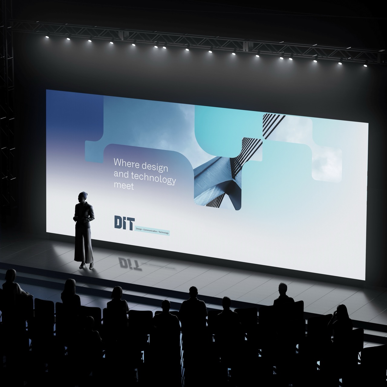
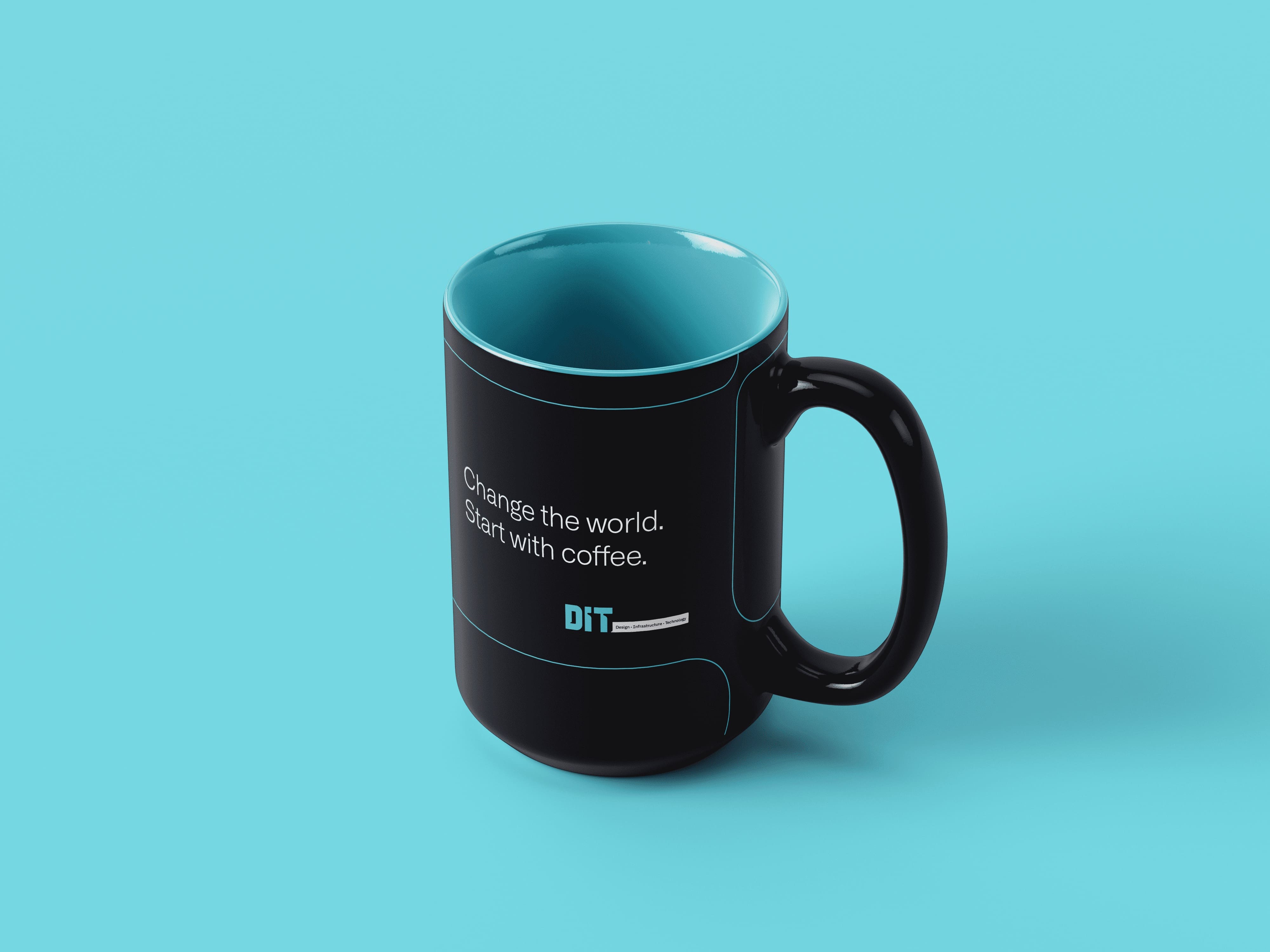
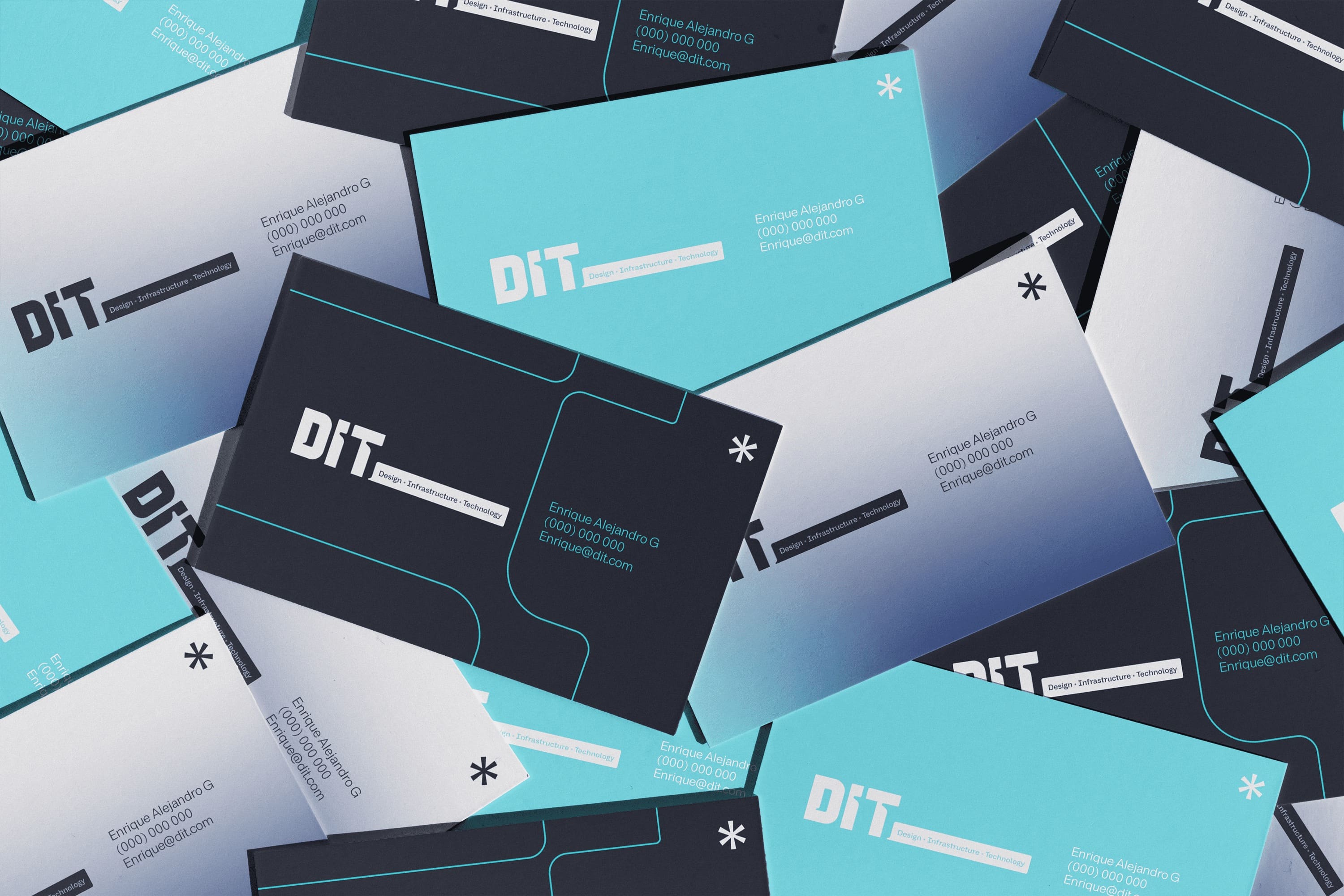
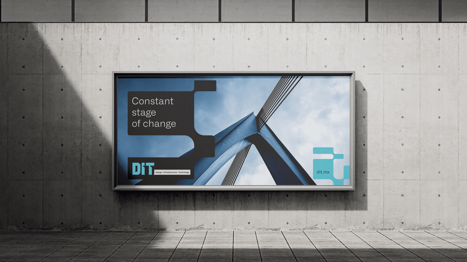
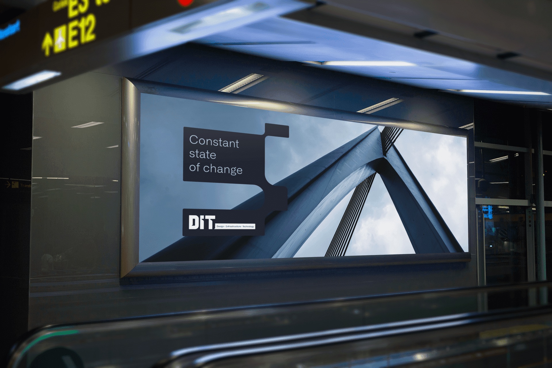
Their new visual identity is all about the future, innovation, and being reliable. The design aims to show off their modern, futuristic vision with smooth lines, bold fonts, and bright colors, while also showing that they’re experienced and trustworthy.
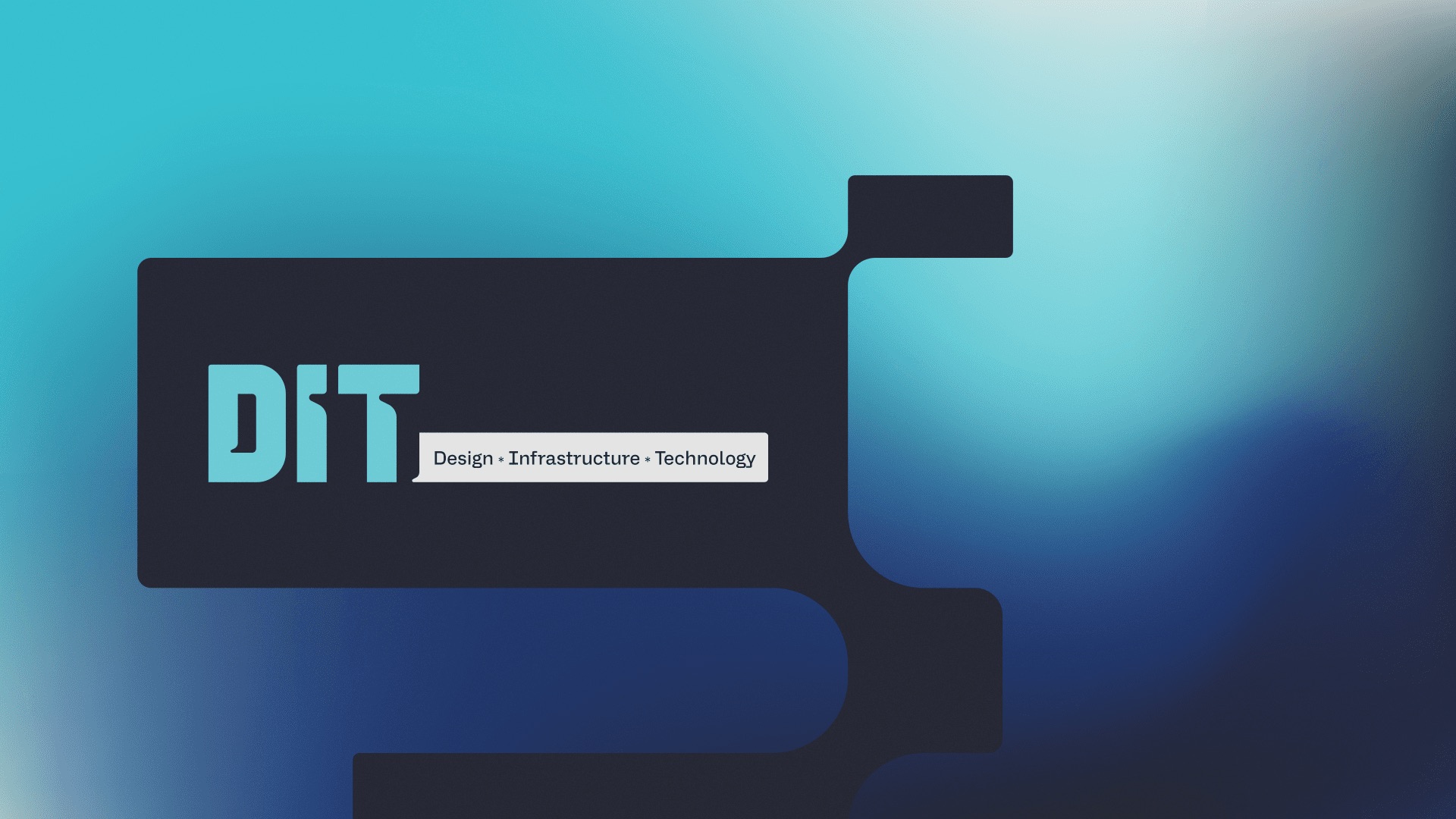
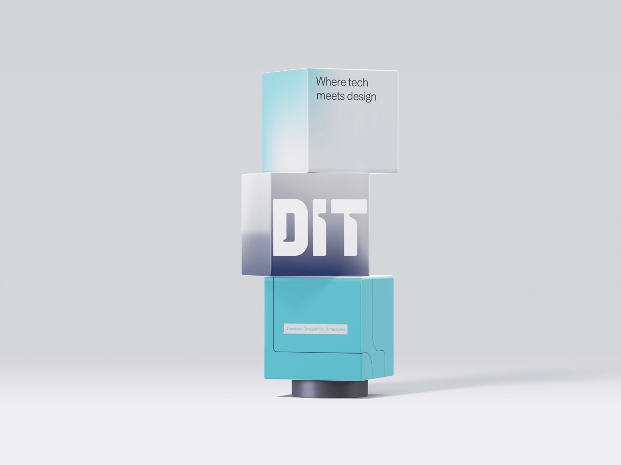
The logo balances a smart, timeless look with an icon and wordmark that show off DIT’s values: pushing forward, reliability and innovation. The asterisk, a detail from their tagline, ties back to the acronym “DIT,” highlighting the importance of each aspect of their work and also suggests precision and attention to detail, both crucial in DIT’s field.
A key part of DIT’s new brand identity is a design system inspired by elements of their wordmark. This system includes icons that stand for design, infrastructure, and technology. These icons can be used across various platforms to symbolize the brand, even without the logo.
The color palette uses light and deep blues to represent design and engineering, and gray to represent technology, all adding up to a look that’s fresh but also classic. The use of gradients adds depth and dimension, representing the interconnected nature of their services.
The design is serious but bold, especially with the typography and icons that use blue shades to look reliable and fresh at the same time. They took some inspiration from cool, futuristic movies like “Tron” and “Blade Runner” to create a look that’s about the future but doesn’t feel old.
A strong, bold font for the wordmark gives it a futuristic feel, with special touches like unusual accents. The icon is simple but abstract, which makes DIT’s brand look both high-tech and dependable.
With this smart branding and cool design, DIT is ready to face today’s data center challenges and help lead the industry into the future. They’re all about pushing forward with a brand that’s as solid as their vision.
CREDIT
- Agency/Creative: Round
- Article Title: Building the Future of Data Centers: The DIT Brand Identity Case Study by Round
- Organisation/Entity: Agency
- Project Type: Identity
- Project Status: Published
- Agency/Creative Country: Mexico
- Agency/Creative City: Round
- Market Region: North America
- Project Deliverables: Brand Identity, Brand Strategy
- Industry: Technology
- Keywords: #BrandStrategy #DesignThinking #InnovationInDesign #EngineeringExcellence #TechBranding #CreativeSolutions #BrandIdentityDesign #DataCenterInnovation #InfrastructureDesign #TechnologyLeaders #DesignSystem #GraphicDesign #VisualIdentity #CorporateBranding #DigitalTransformation
-
Credits:
CEO/Founder: Jose Elias Ganem


