Actti – Building dreams.
Actti is a company that offers construction, maintenance and installation services to clients of different sizes and regions in Brazil.
The need for a new visual identity arose after the brand went through an internal restructuring where it is now believed that, in order to be creative and objective in a scenario where the common prevails, it is necessary to be provocative, seek the opposite of the obvious and promote what is different.
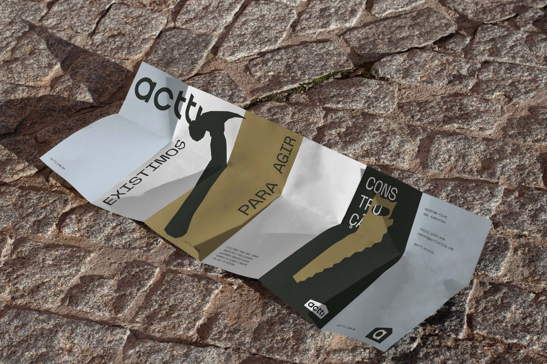
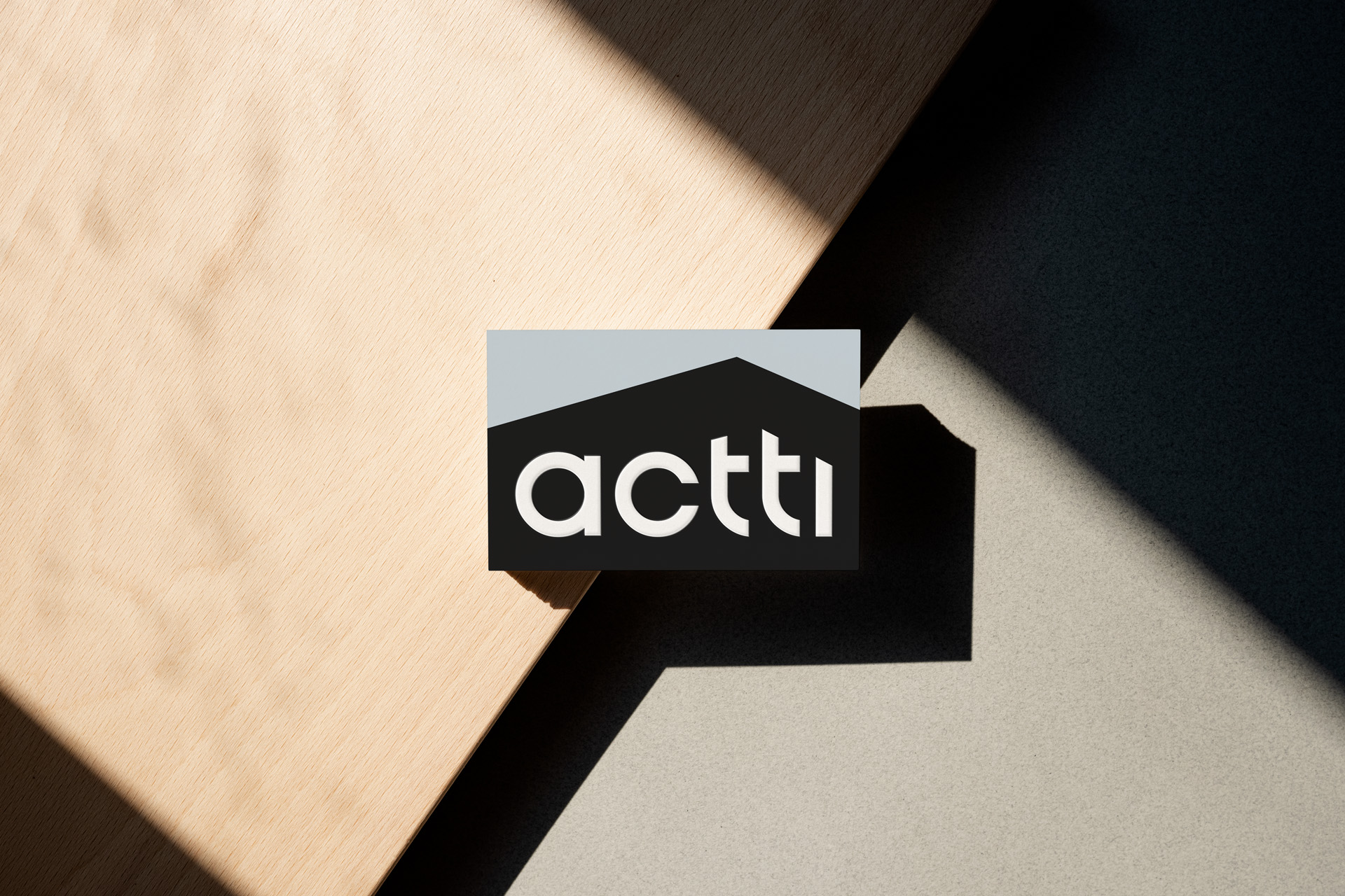
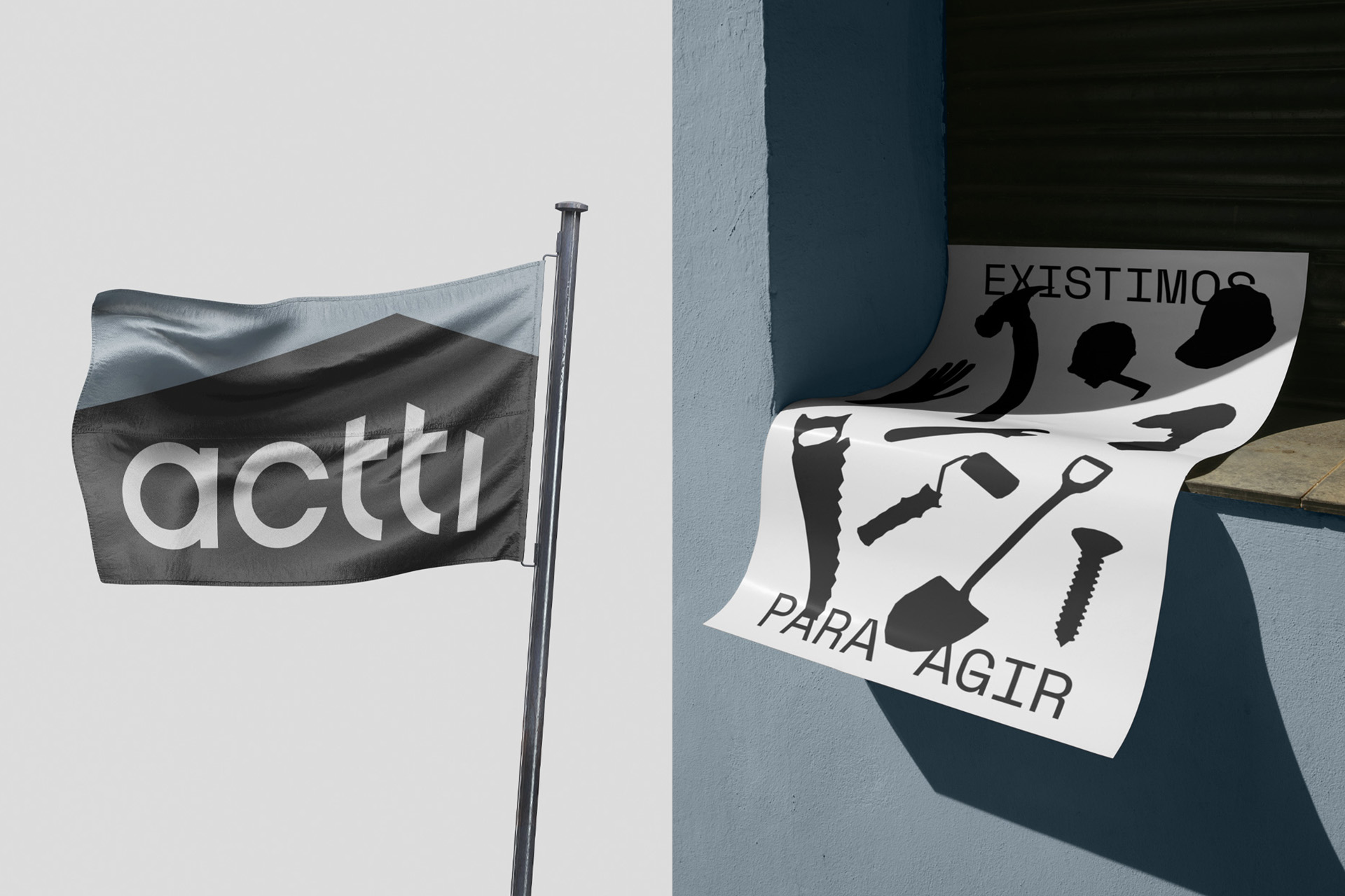
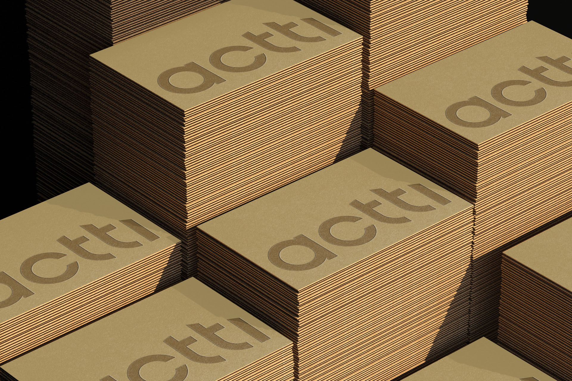
Now the central pillar of the brand is centered on promoting efficient management, reducing bureaucracy in work processes, with agility from the initial point to the final delivery. For this reason we sought a new color palette in pastel tones to represent the lightness and tranquility that the brand transpires, along with a shade of black that represents the elegant side, to balance and favor the contrast in the materials.
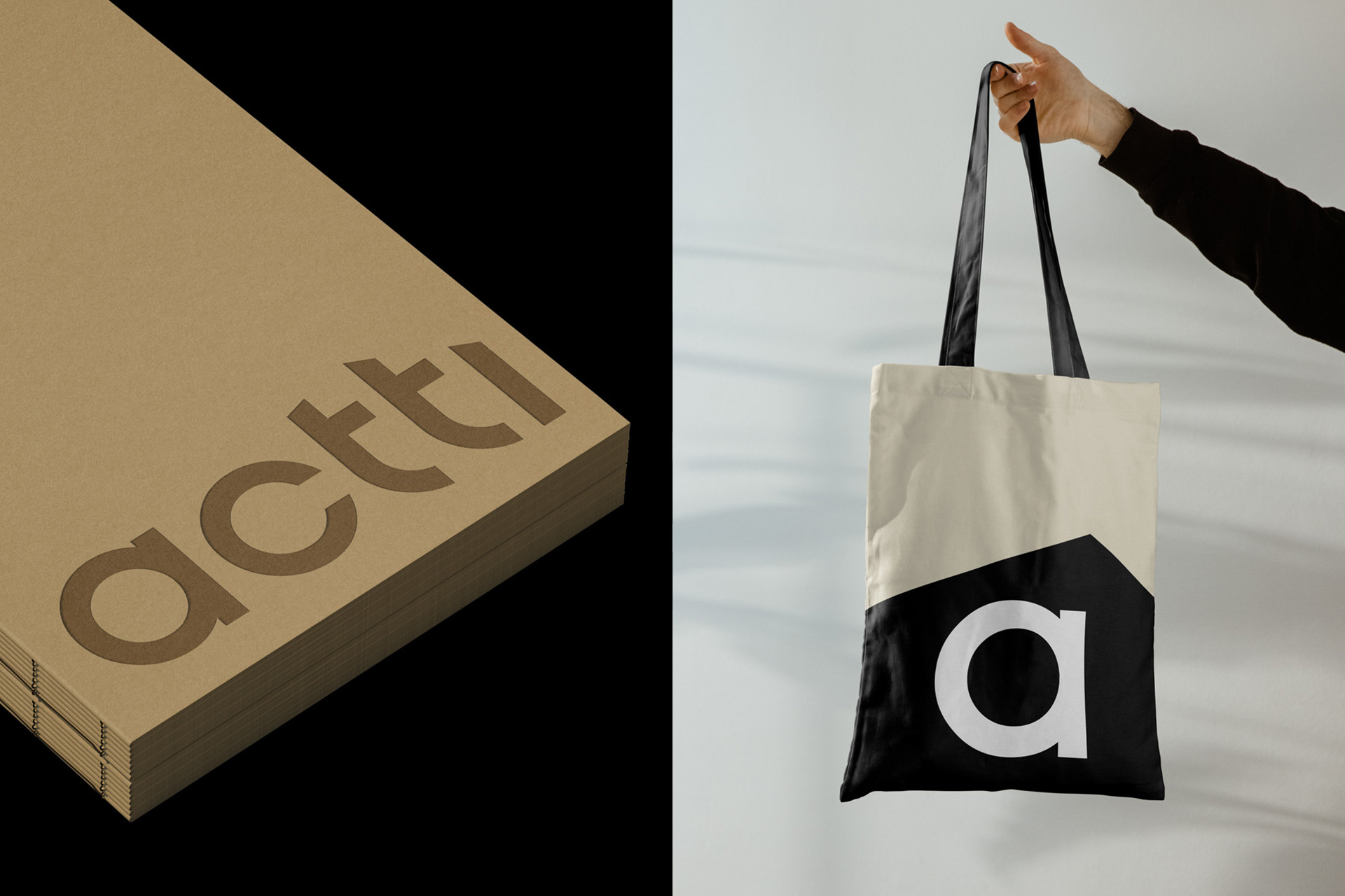
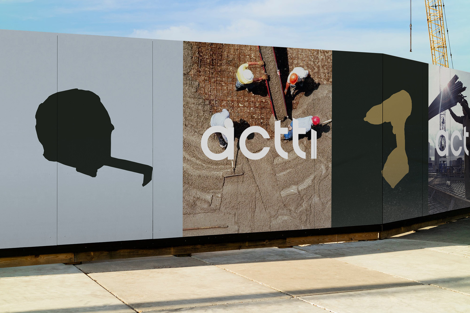
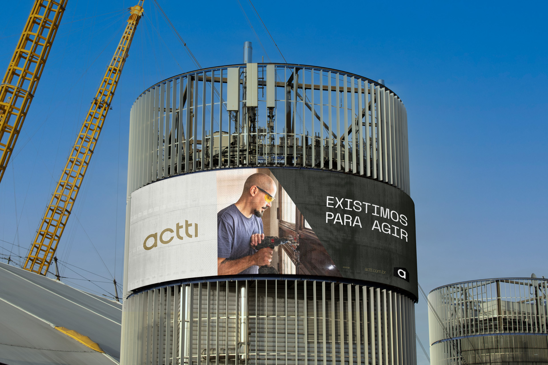
For the logo, a sans serif typography that works within a shape representing constructions, an asset that translates well the brand’s segment. A series of icons also derive from the logo, with pointed corners to help us tell actti’s story.
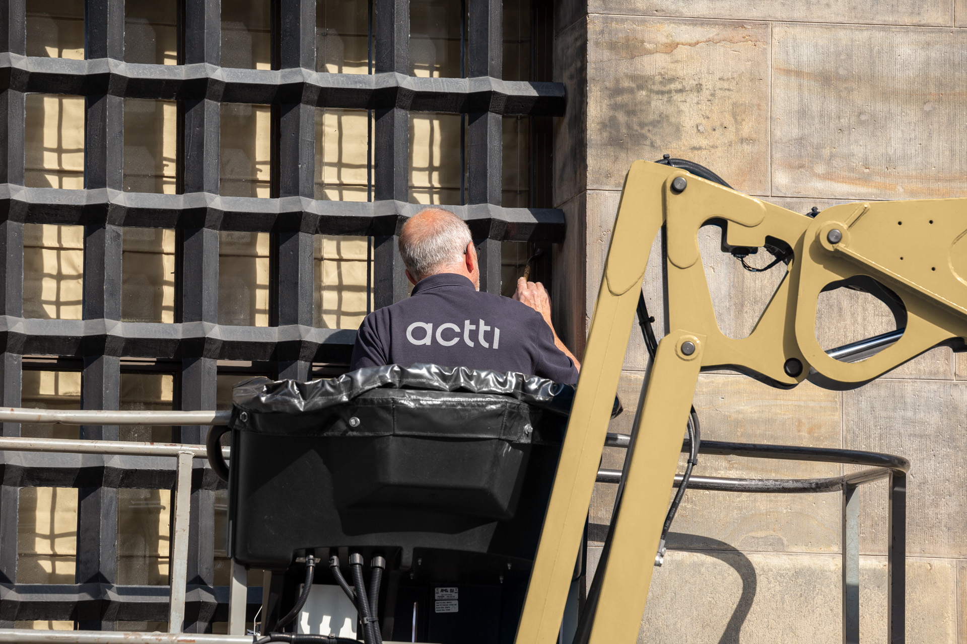
The photographs now also represent moments of construction, professionals at work and textures. All part of the brand’s creative universe.
For typography, we chose a sans serif also for the body text. It works as a display for big titles and big patches of information. With bold and thin weights providing a great reading experience.
More than acting, making dreams come true.

CREDIT
- Agency/Creative: Yago Ferreira Design
- Article Title: Building Dreams with actti
- Organisation/Entity: Freelance
- Project Type: Identity
- Project Status: Published
- Agency/Creative Country: Brazil
- Agency/Creative City: Nova Iguaçu
- Market Region: South America
- Project Deliverables: Art Direction, Branding, Graphic Design
- Industry: Construction
- Keywords: architecture, real estate, building,
-
Credits:
Visual Identy, Brand Positioning: YAGO FERREIRA DE LIMA


