Sibling Rivalry has created an impactful new brand identity and accompanying launch assets to introduce Raptive, formerly known as CafeMedia and AdThrive, to the global creator community.
Sibling Rivalry, a brand studio and production company, led on developing and activating the new Raptive brand. Strategy studio Third Person delivered the strategic brand territory, brand architecture, and naming for the project.
Raptive offers content creators the opportunity to grow their revenue via its audience and business solutions. Originally a digital advertising and technology business with a sophisticated tech stack, Raptive now offers enhanced benefits, services, and revenue streams. As such, Raptive wanted to move its brand compass from a ‘publisher-first’ positioning towards a facilitator of a ‘creator-first future’.
Tara Jepson, SVP, Brand, Raptive, says: “Thanks to our partnership with Sibling Rivalry and Third Person, our new brand identity captures the momentum and energy of our company and our creators, as well as our ethos as a brand to be a catalyst for the incredible creators we serve. Our new creative direction expresses who we are today and signals where we are headed on our mission to power creator independence.”
Becky Lau, Head of Strategy at Sibling Rivalry, says: “By supporting creators in engaging with their audiences, Raptive is committed to helping people make a living doing what they love most. This is a defining moment for Raptive, and we’re proud to have played a role in bringing the new brand to life. The new visual identity conveys the ambition and energy behind Raptive’s mission to democratize the media landscape. Now, we look forward to seeing how the creator community embrace it.”
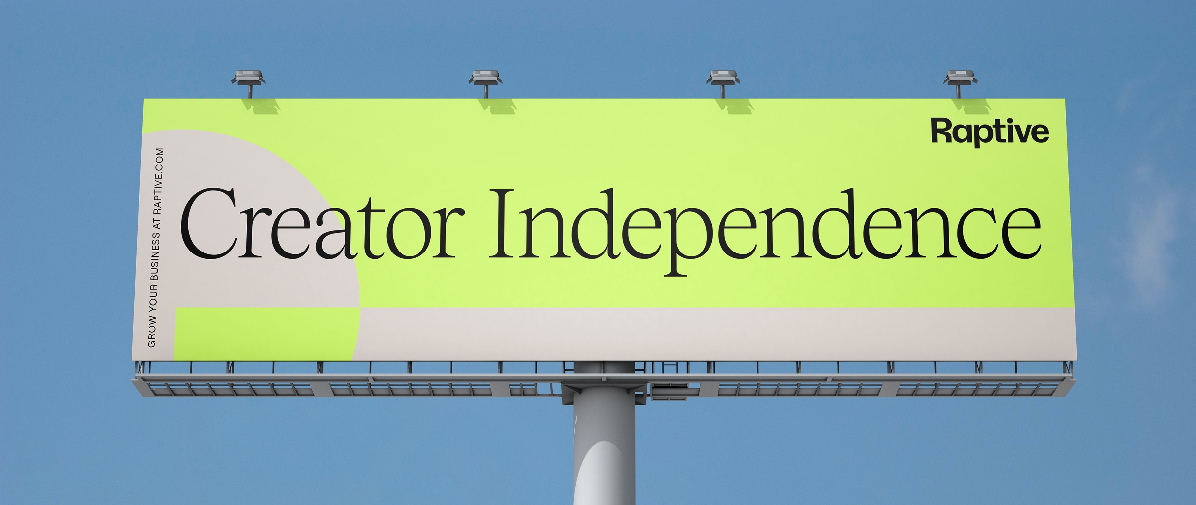
Kyle Barron-Cohen and Eva Green, Partners at Third Person, say: “In developing the brand strategy, our first task was to identify and develop a clear brand idea that united all of CafeMedia’s brands and sub-brands under a singular rallying cry and flag to fly: ‘Creator Independence’. This profoundly powerful statement of promise is open to endless definition, and led us to a name that lived up to the brand’s role as catalysts for creators big and small, celebrity and enterprise; a name that could capture our fascination and focus on these creators. The name ‘Raptive’ was born from the obvious determination and drive, enthusiasm, and energy behind everyone at the company. It’s uniquely active, tuned into the constant evolution of an industry, riveted by whatever comes next.”
A catalyst for creators
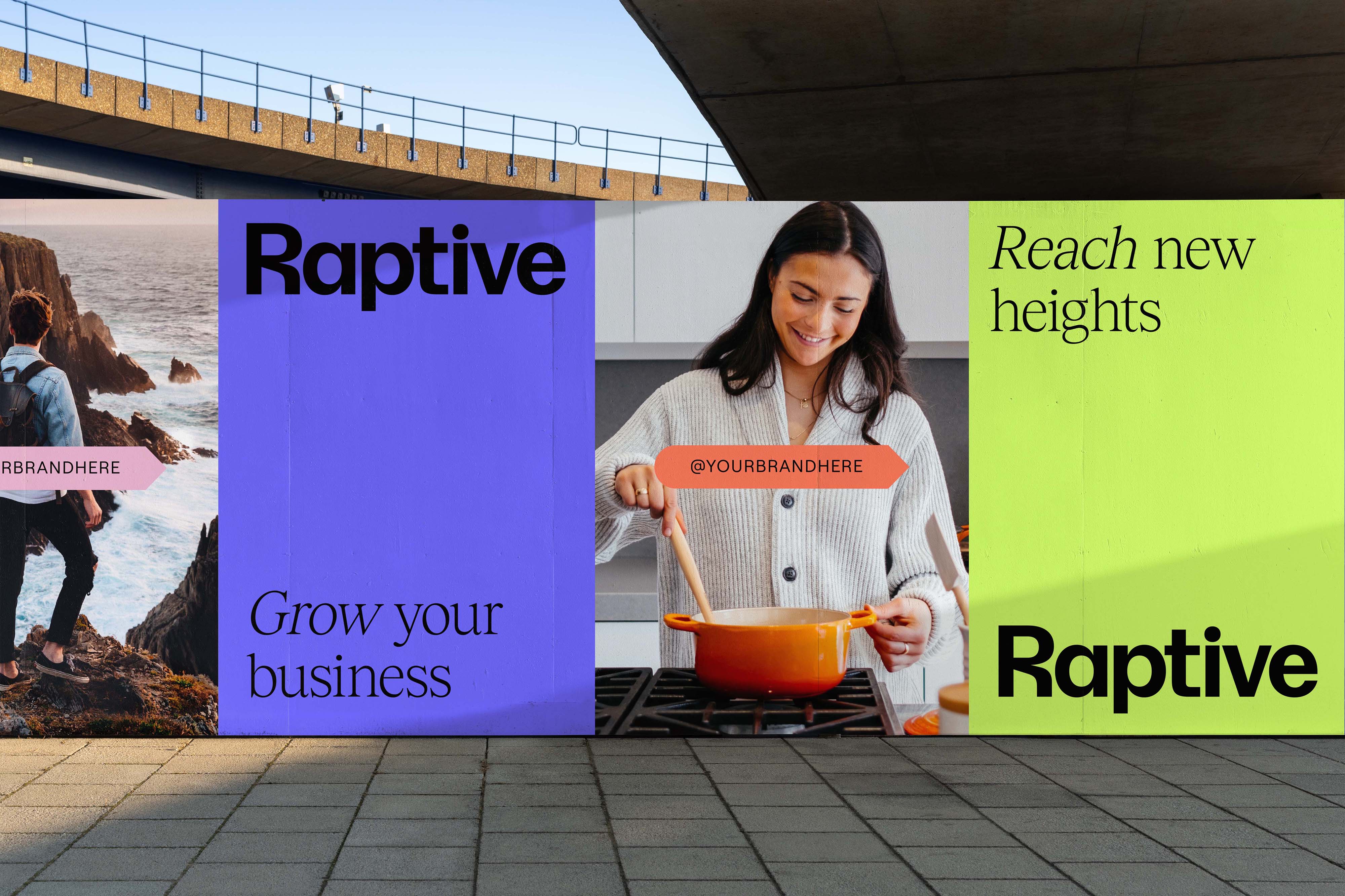
Sibling Rivalry began the job of bringing the Raptive brand to life by identifying three core design principles: Amplify, Activate, and Transform. These principles served as guiding lights in the development of a motion-forward identity that represents the catalyst moment of explosive energy when creators meet Raptive.
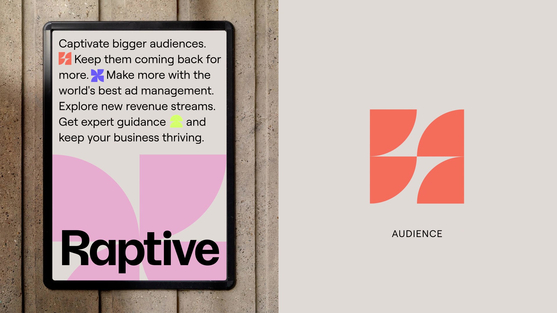
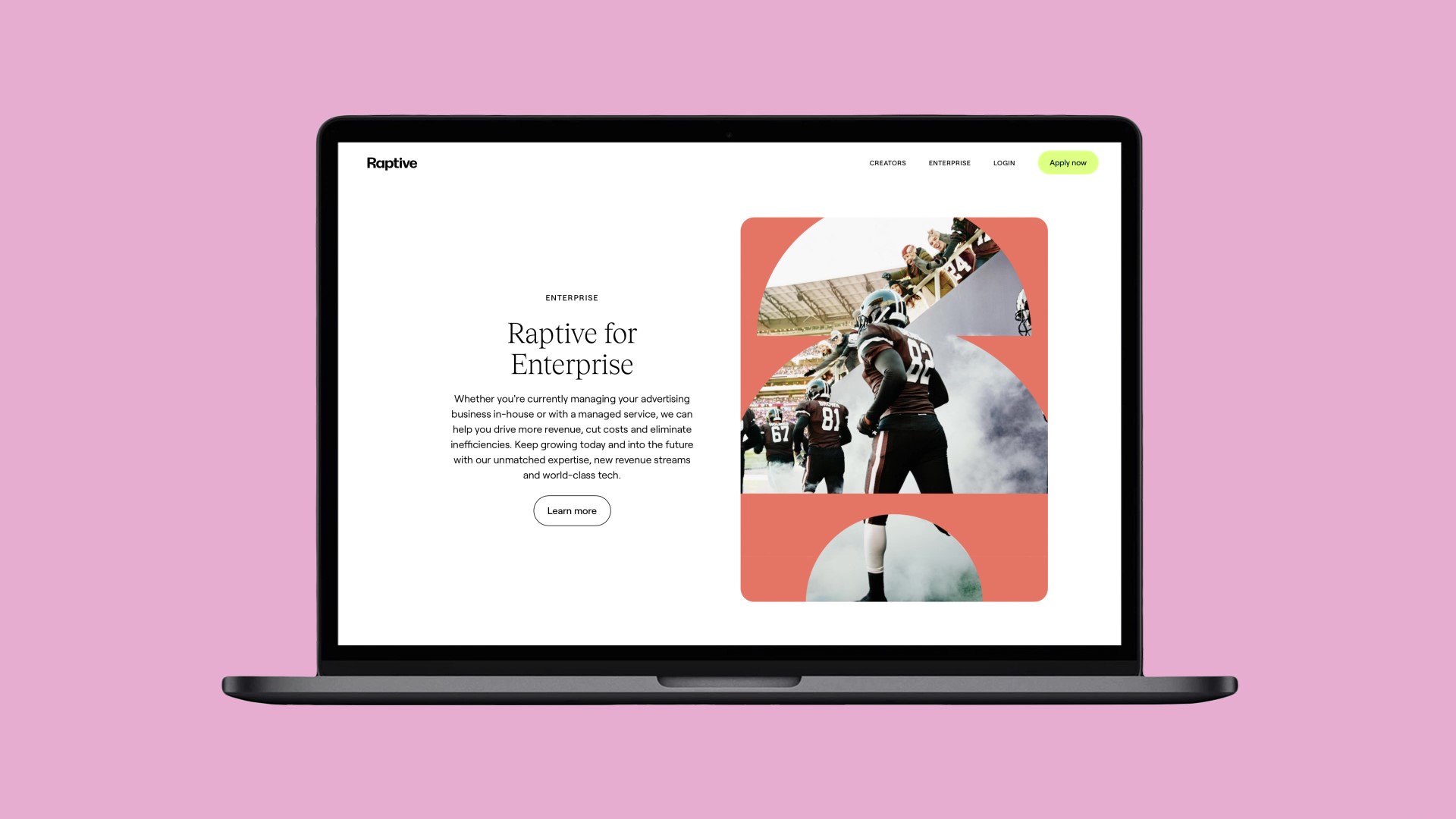
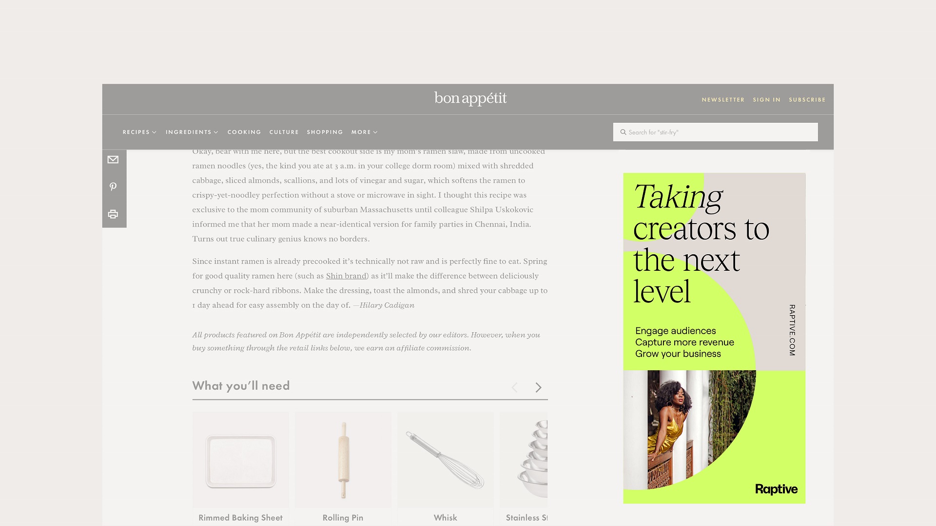
The visual identity radiates through all Raptive graphic devices, data visualizations, base energy shapes, and iconography, with Sibling Rivalry creating an in-depth style guide and rules around usage of all system elements when static and in motion.
“The expression of momentum and energy truly reflects the brand. Importantly, it also reflects the trajectory of Raptive end users – the individual creators who now have the opportunity to fulfil their potential,” says Lau.
The new visual identity also reflects the prestige of Raptive as a premium destination for creators, supporting them to sustain and diversify their brand and business.
A balanced brand system
Maintaining a balance between the human, creative side of the business and the sophistication and innovative technology it uses was key.
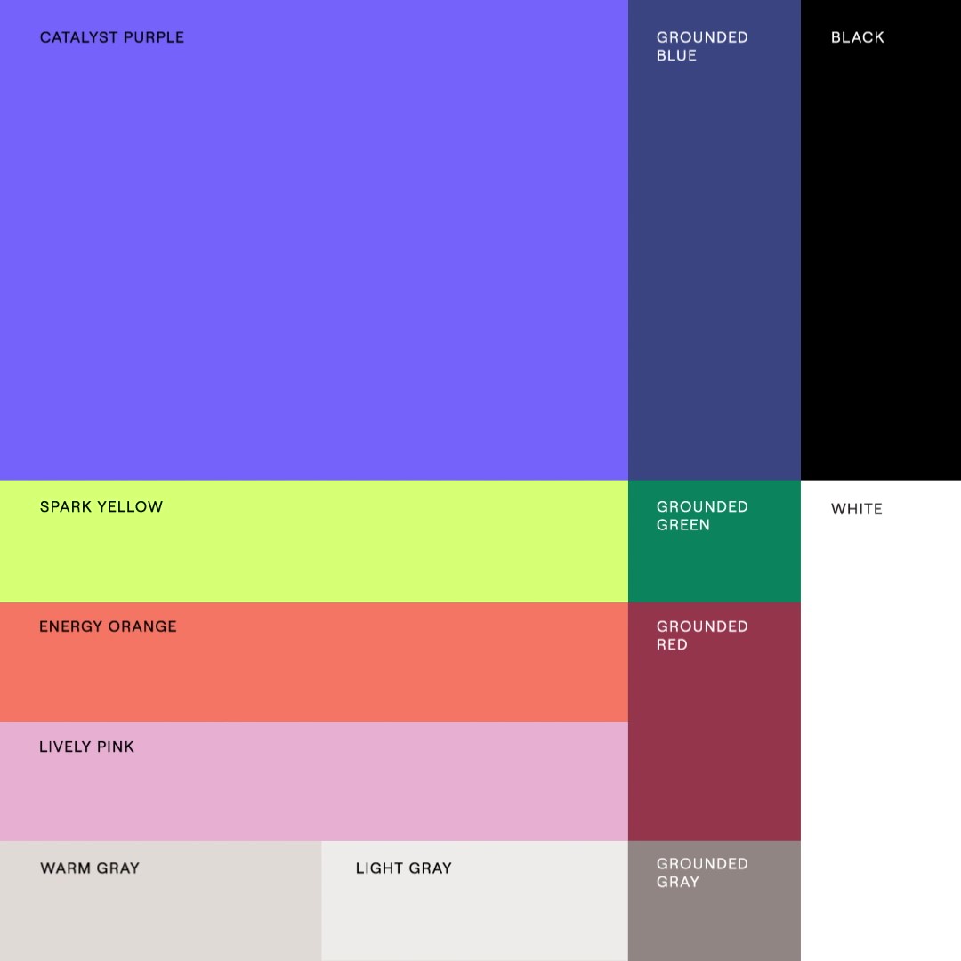
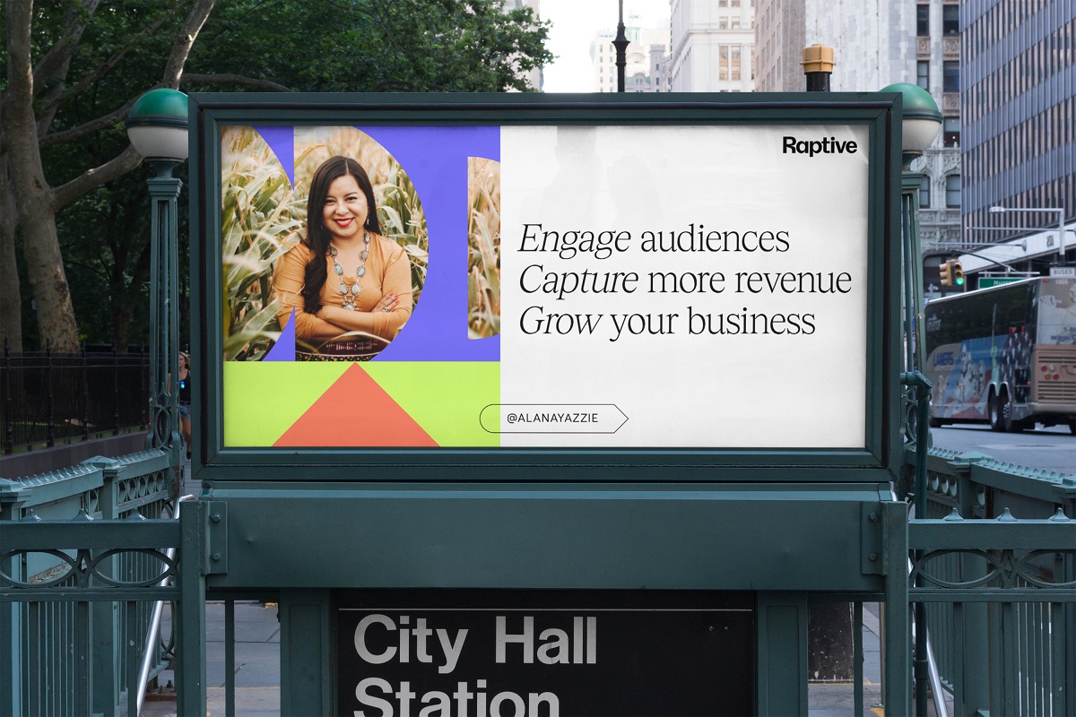
Eva Bochem-Shur, Design Director at Sibling Rivalry, says: “The use of color was critical to achieve the right balance of approachability and innovation. While making refinements to the primary color palette, we also created a richer, secondary palette to deliver flexibility and sophistication, distinct from the blue and green tones prevalent across digital tech brands.”
To activate the color palette, Sibling Rivalry has developed a clear hierarchy around how colors work relatively and proportionally to each other. Particular attention has been paid to how colors transform in moments when shapes move and interact, enhancing the sense of transformation through the visual identity.
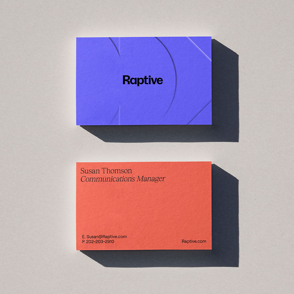
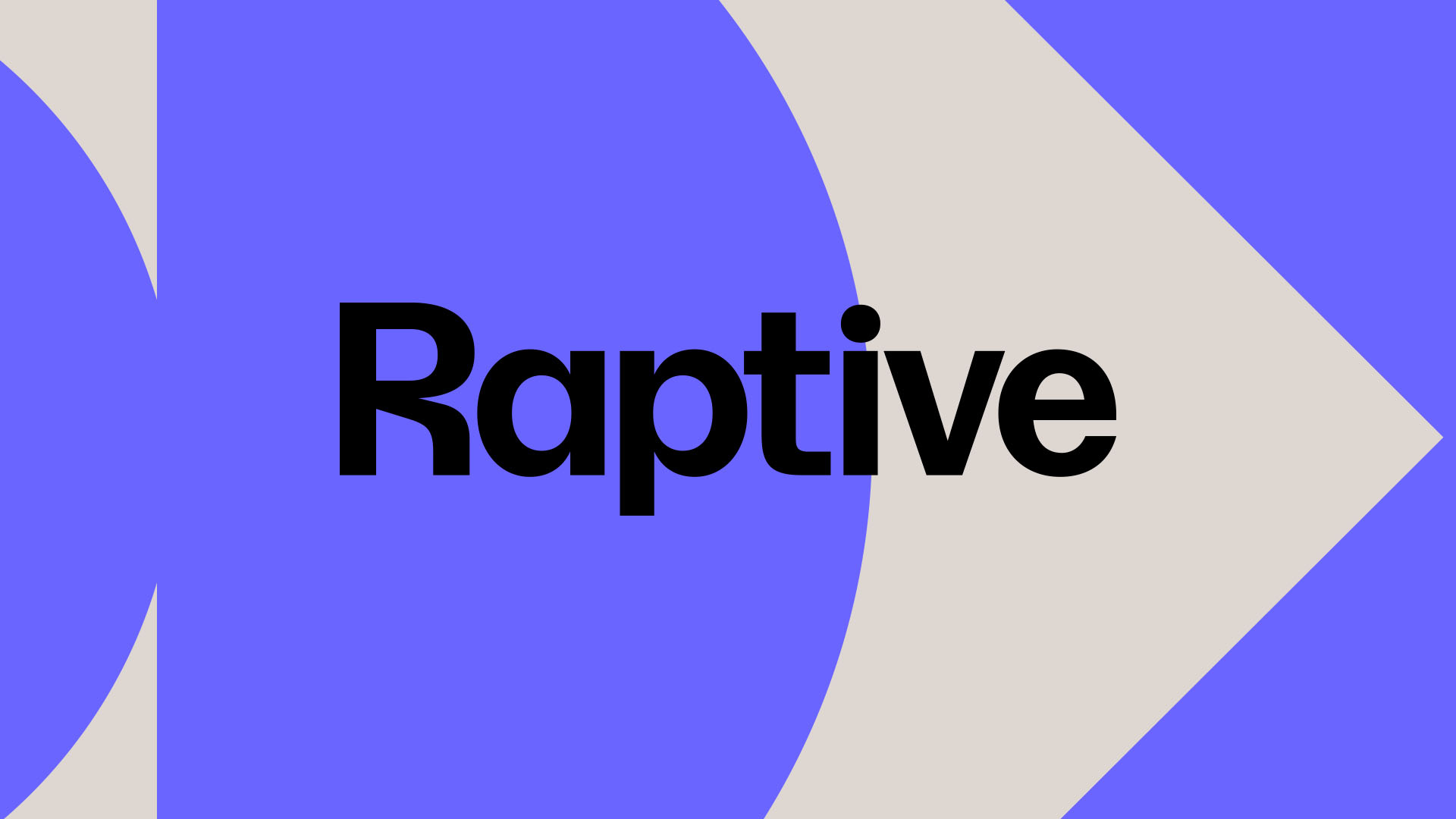
Sibling Rivalry partnered with talented typographer Tal Leming to dive deep into the nuances of the Raptive wordmark. The result is characterful typography and a vibrant wordmark that conveys a sense of momentum and forward motion. The “R” itself can stand as its own distinct mark for creative and attribution needs, while all letterforms can scale for legibility as needed.
Bochem-Shur adds: “We worked extensively on adjusting the wordmark to achieve a premium feel fitting for a tech company, incorporating little quirks that speak to the energy and creativity of the Raptive audience.”
Consistency and flexibility
One inherent challenge with the creative brief is the variety of stories Raptive creators tell and the spectrum of content they share.
“With momentum and energy at its core, there were countless possibilities as to how we could bring the brand to life. The visual identity needed to feel as exciting, diverse, and creative as the Raptive creator community, while also being cohesive, consistent, and instantly recognizable,” says Frances Yeoland, Creative Director at Sibling Rivalry.
The design system acts as the bridge between the many different worlds Raptive brings together, from video tech reviews to cookery photography. Consistent elements in the system are the through line connecting this diversity of creator content.
“The strength of the graphic system lies in letting each individual piece flex in different ways, allowing distinct creator content to stand out while always being attributable to Raptive,” Yeoland adds.
The new visual identity is now live across all Raptive platforms.
CREDIT
- Agency/Creative: Sibling Rivalry
- Article Title: Building a Creator-First Future: Raptive Unveils Dynamic Identity From Sibling Rivalry
- Organisation/Entity: Agency
- Project Type: Identity
- Project Status: Published
- Agency/Creative Country: United States
- Agency/Creative City: New York / Los Angeles
- Market Region: Europe, North America, Global
- Project Deliverables: Brand Design, Brand Guidelines, Brand Identity, Brand Mark, Digital Art, Graphic Design, Icon Design, Logo Design, Motion Graphics
- Industry: Technology
- Keywords: Creator-first future, dynamic, momentum, energy, motion-forward, catalyst, base energy shapes, iconography, transformative
-
Credits:
Brand studio and production company: Sibling Rivalry


