


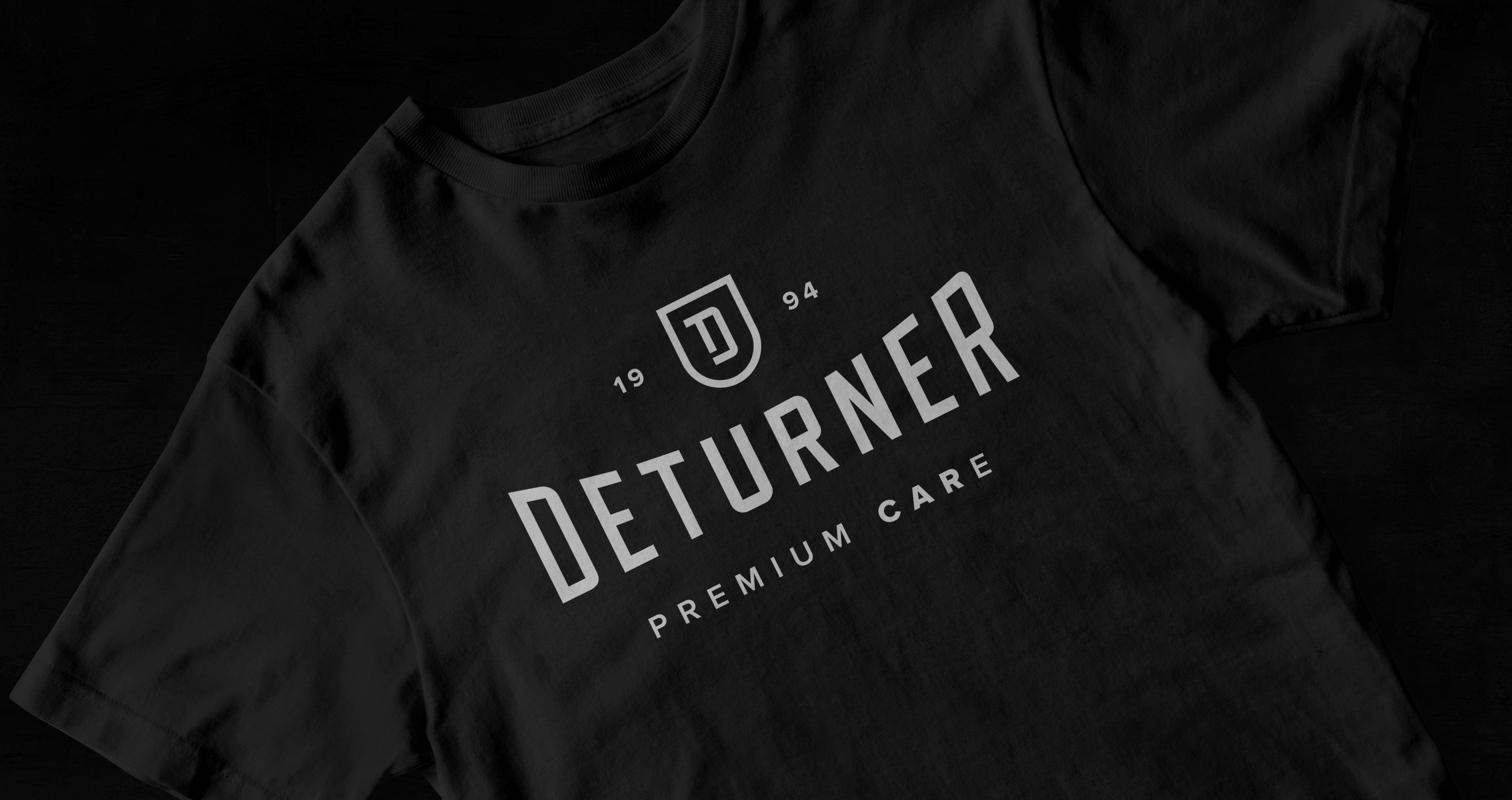
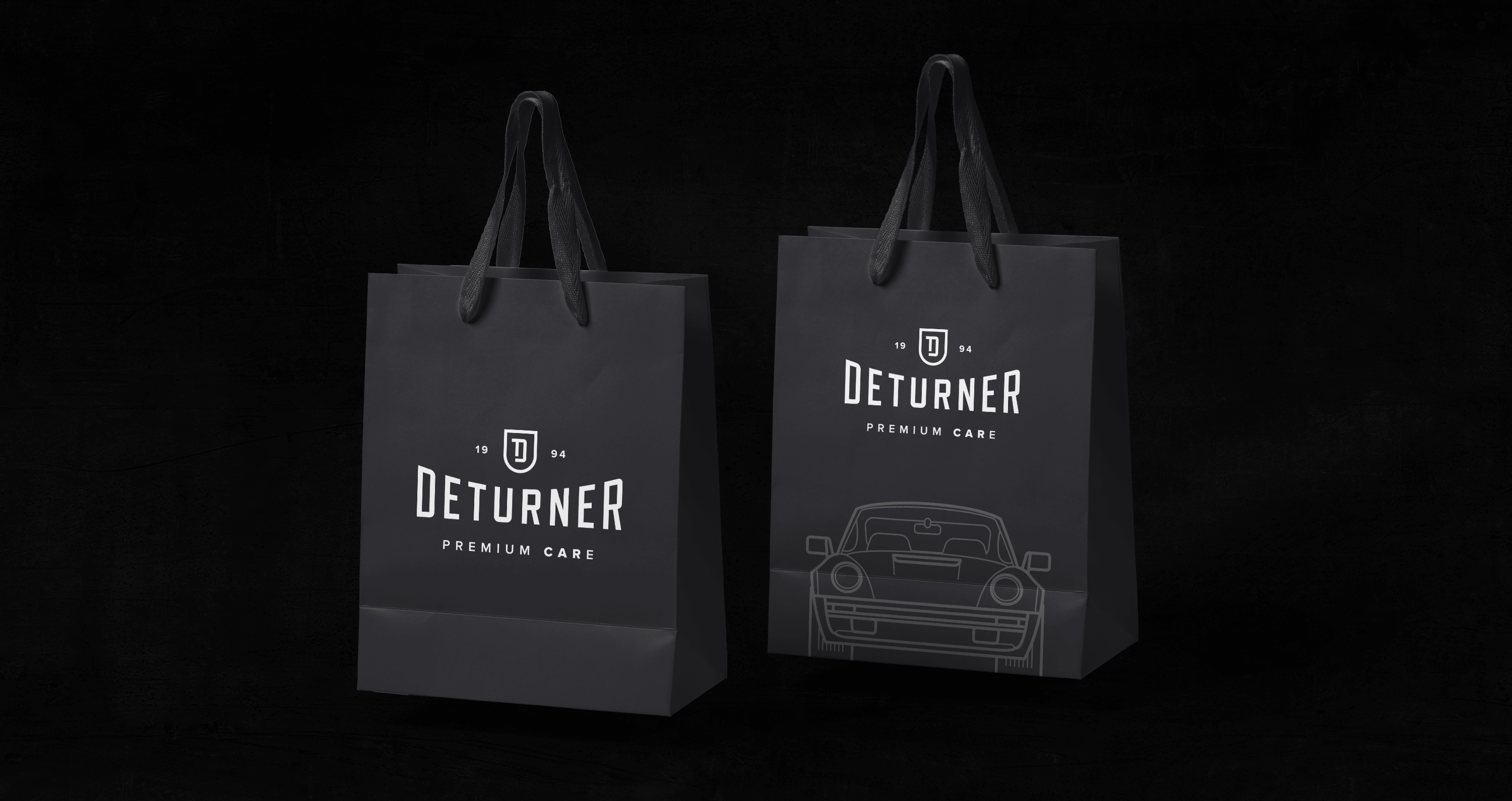
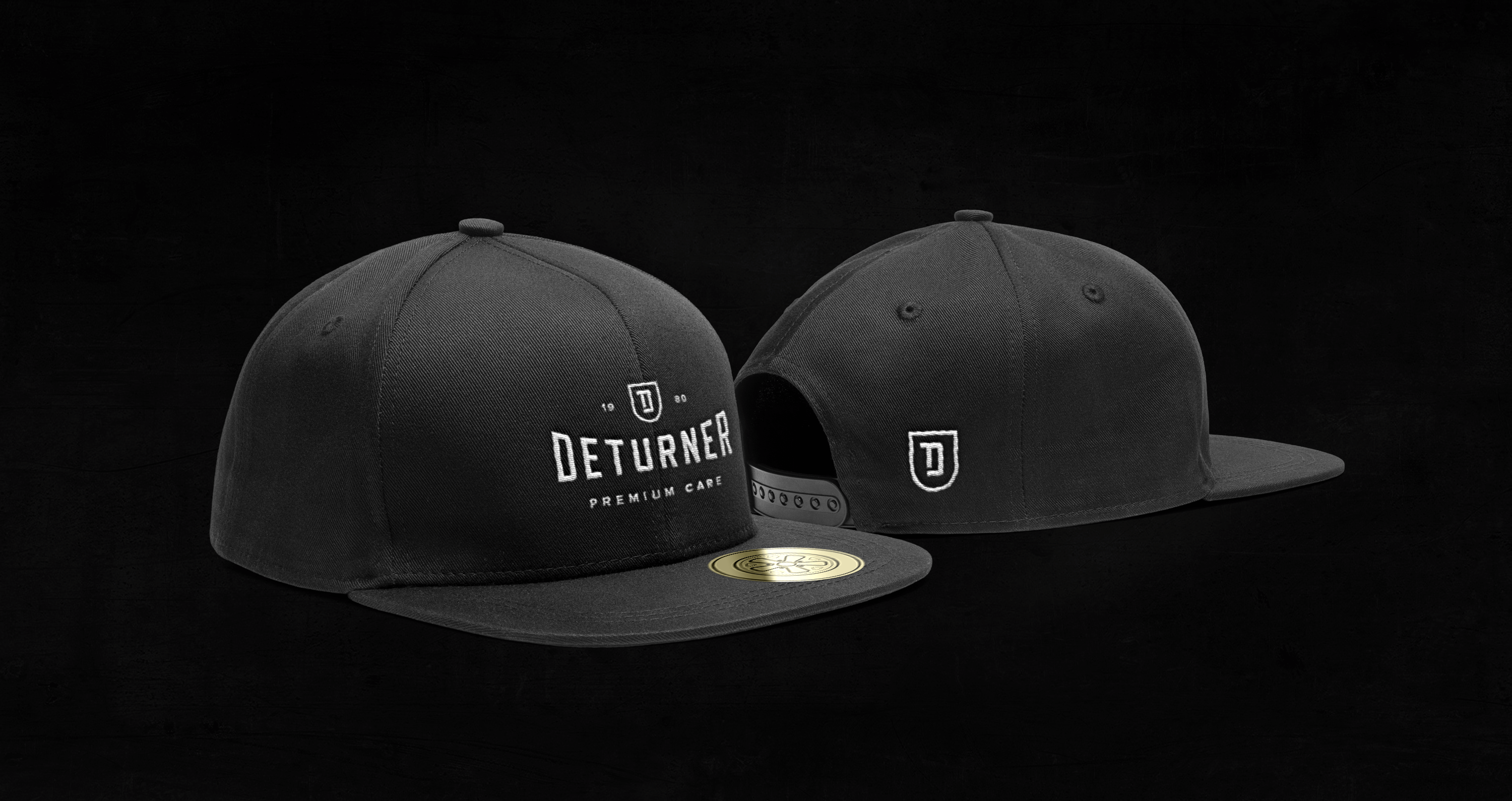
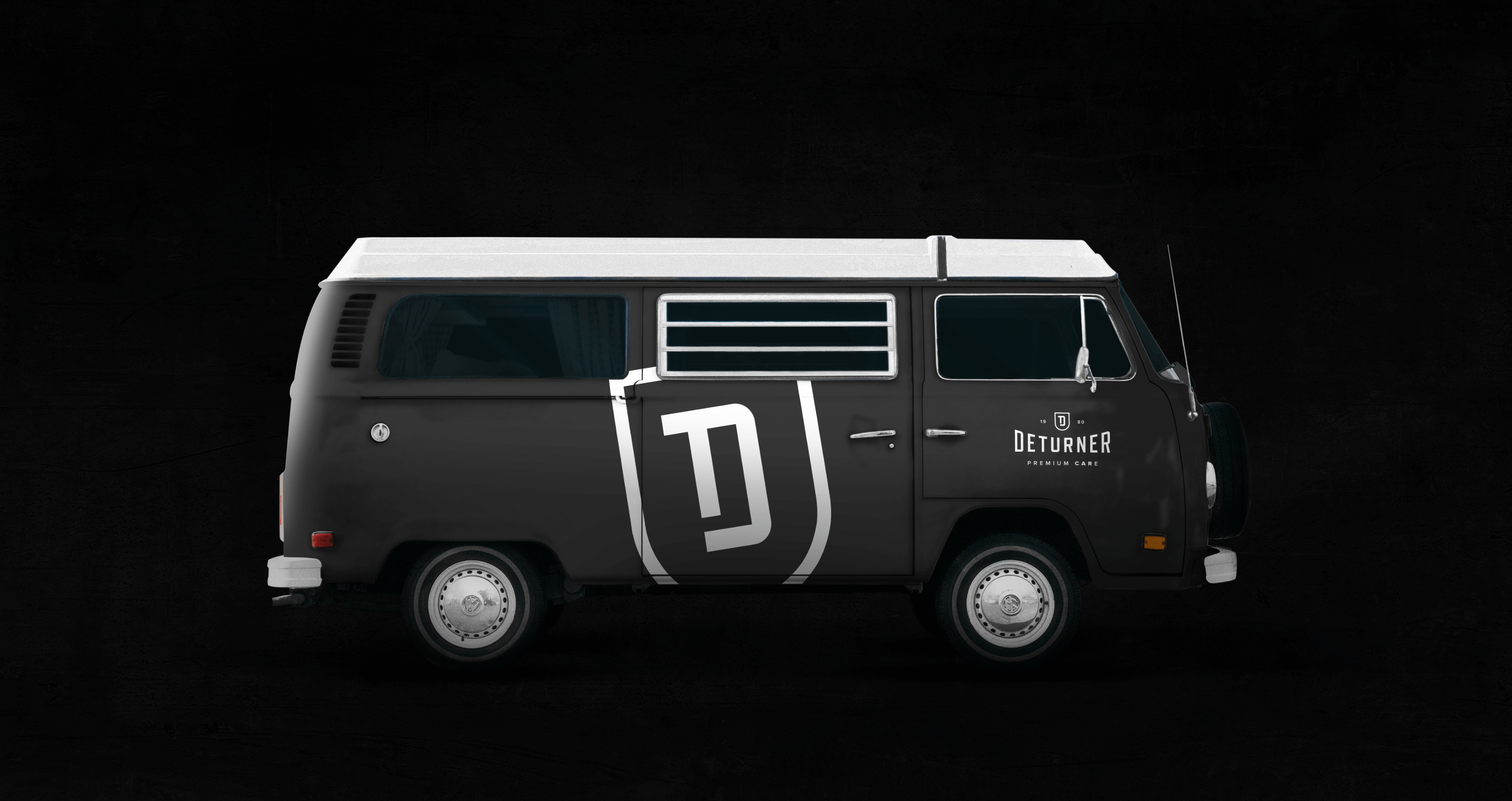
We are big fans of the automotive industry, hence we were very happy with our newest order: Building a complete visual identity for a car cosmetics manufacturer. The premise was to create an original premium product that would refer to the automotive classics, and also stand out on the market. It is very difficult to find the original name with an available domain on the network (pl, com). We managed to accomplish this task by creating the name Deturner, which is a hybrid of words derived from the owners’ names and the word detailing. To communicate premium quality, the upper part of the logotype has a coat of arms that creates a signet ring with the letters D + T connected,
which are the first letters of the brand name and the name of the owners.
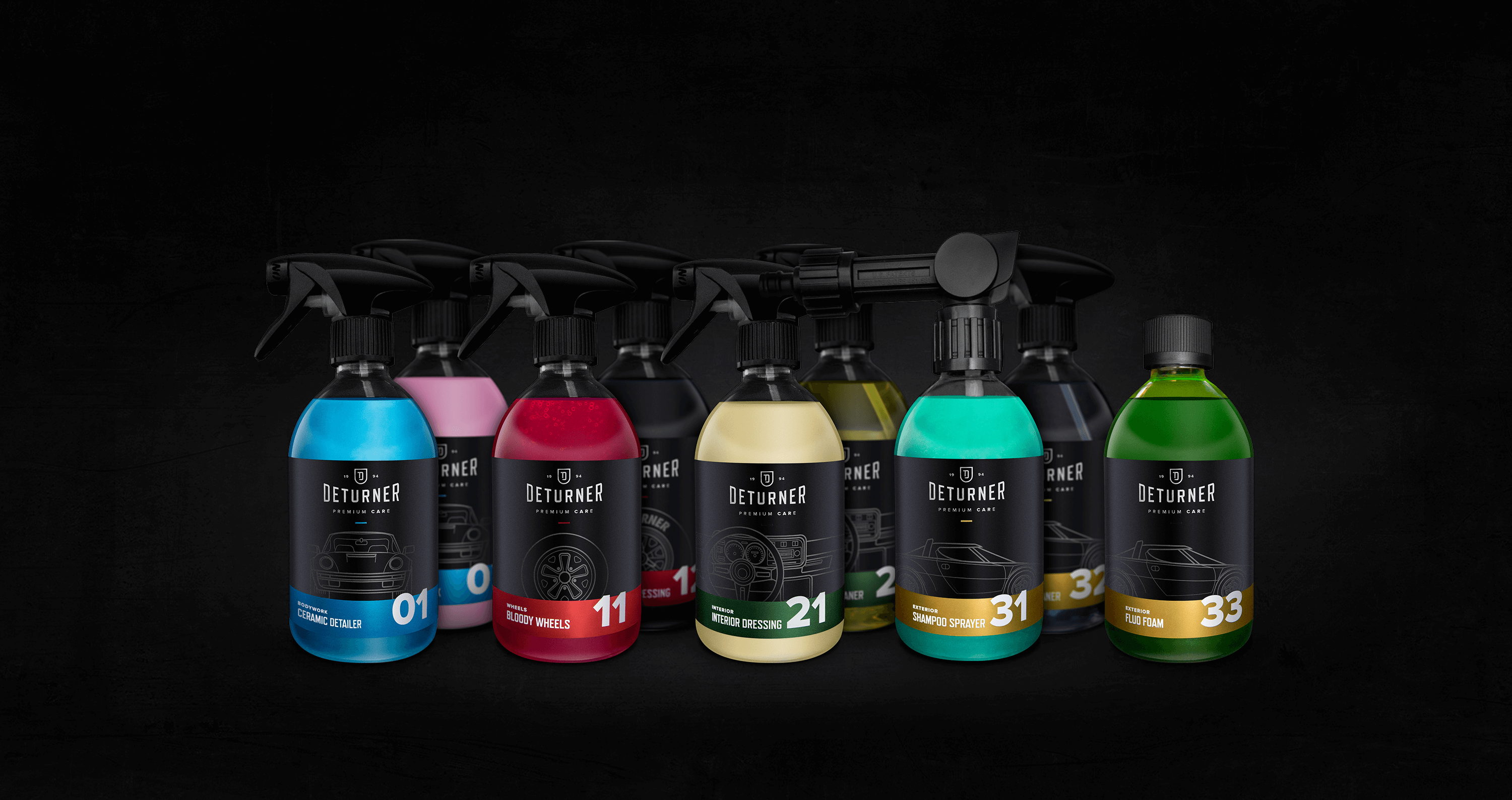
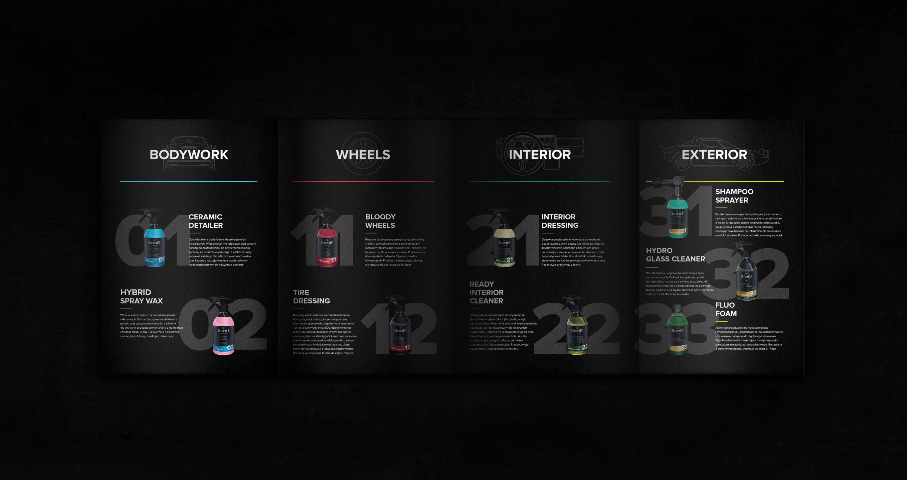
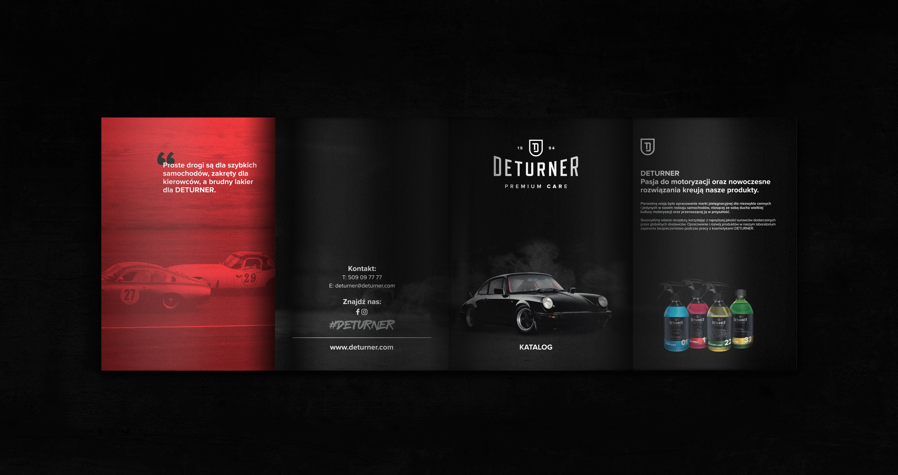
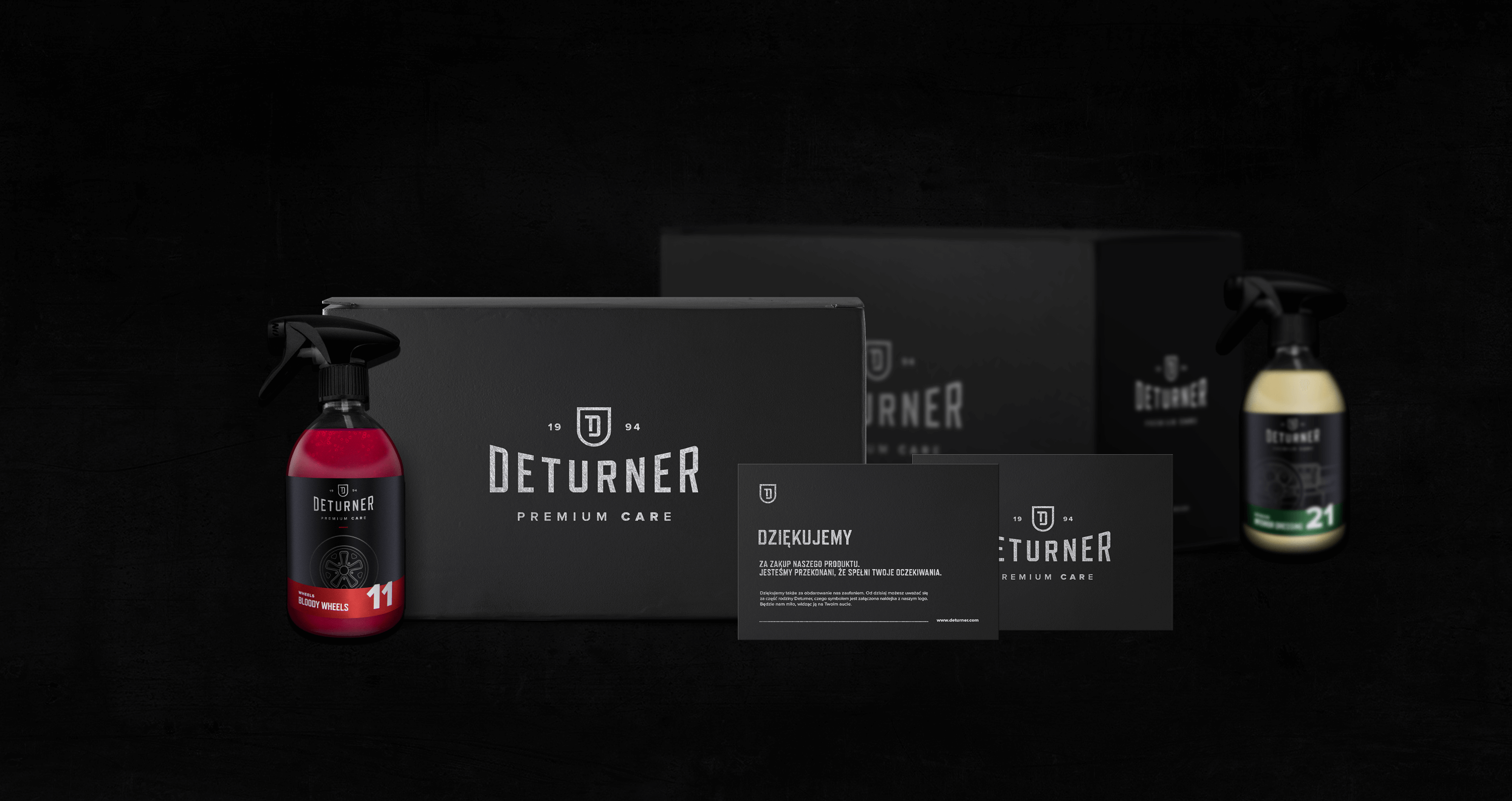
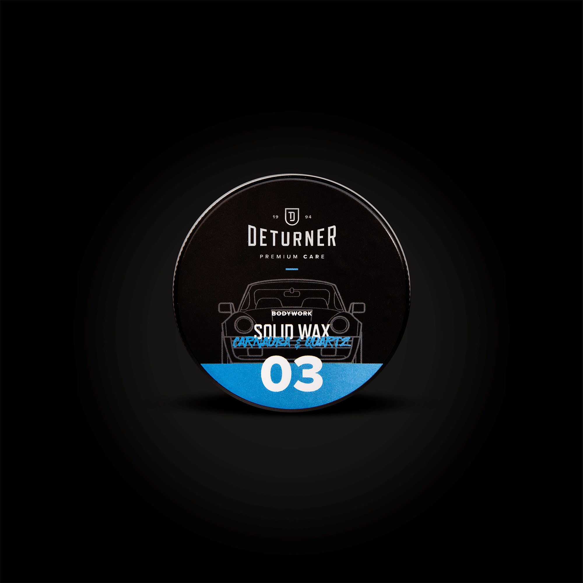
Another extremely important element of the image was the creation of stylish labels for products. The choice was elegant satin finish and metallic details. The products fall into four basic categories: Wheels, Interior, Exterior and Bodywork. An individual color and intuitive graphics have been selected for each category. Automotive fans will definitely notice that the colors refer to the known colors of Formula 1 teams, and the icons to the legends of motoring.
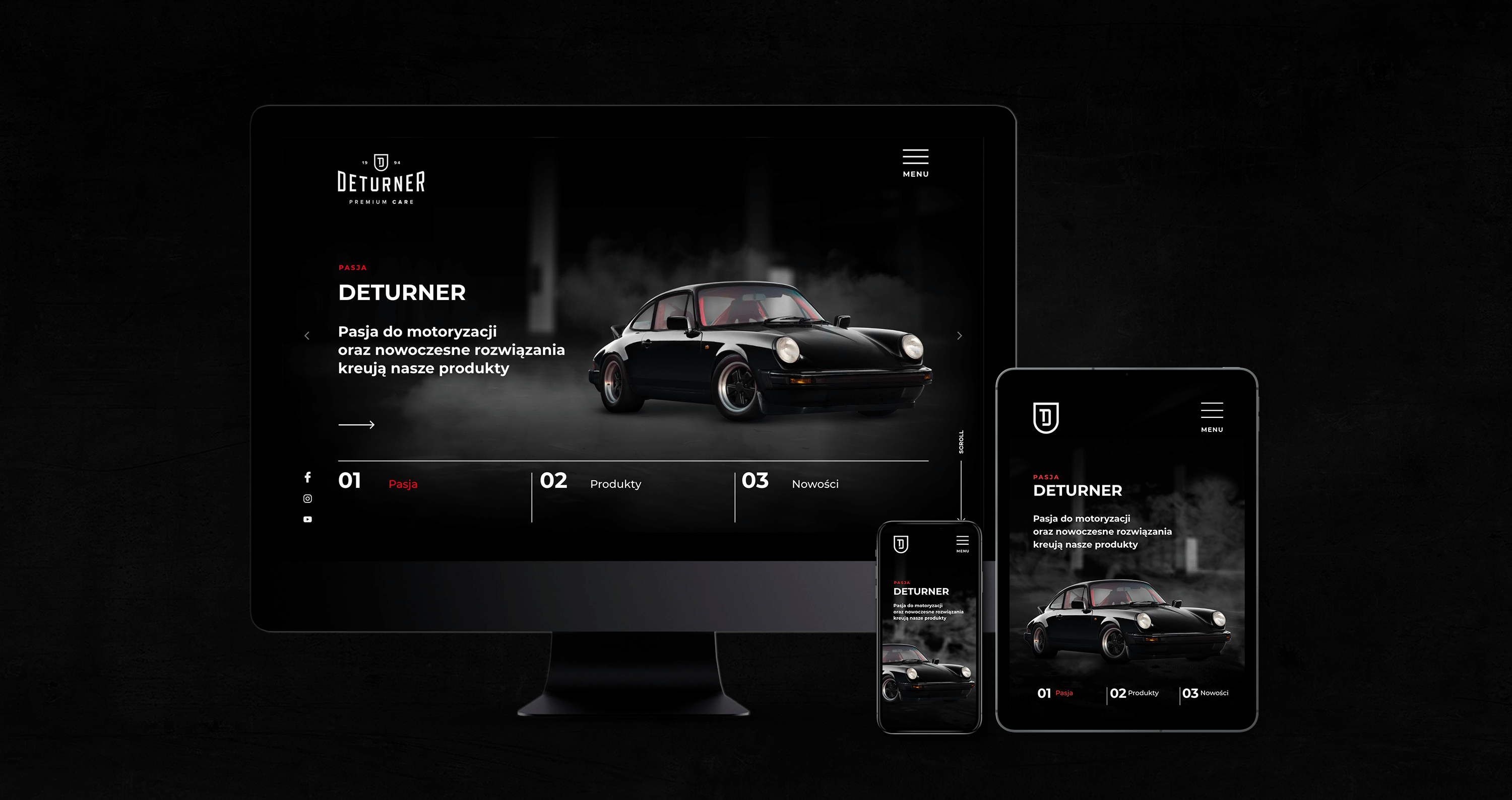
After building the basic elements of visual identification, i.e. name, logo and labels, it is time to create a website.
The website was built on the WordPress system and meets the basic assumptions of UX and UI. It is kept in a dark tone, referring to the brand’s colors.
To emphasize the quality of the brand, we used many interactive elements and animations that attract attention.
Despite the many visual effects, the site received a very good result in the Google speed test.
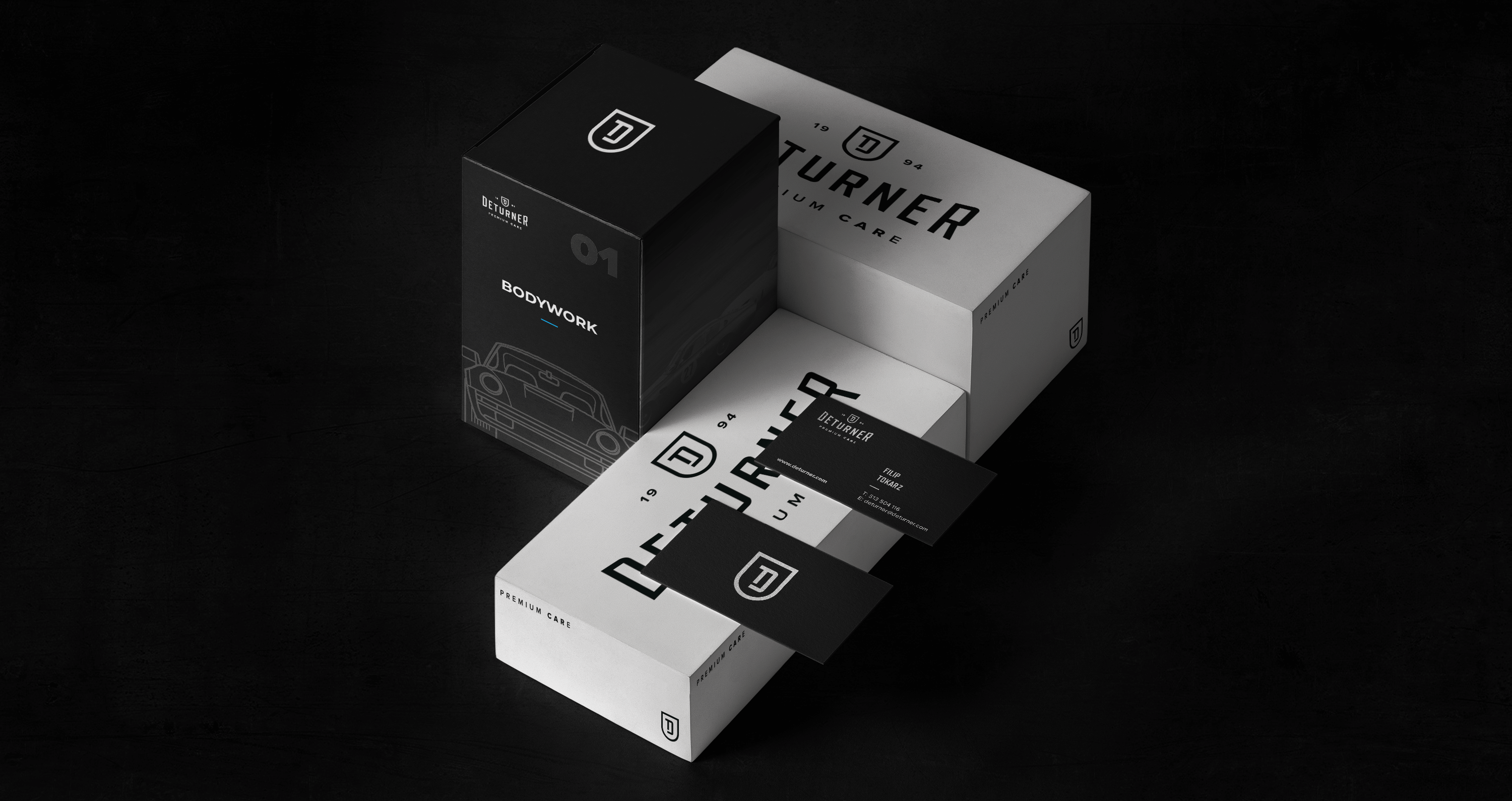
During business meetings, an extremely important element is the moment of handing a business card which should stand out from the others. That is why business cards prepared for Deturner are made on carefully selected, natural, mass-dyed paper.
In addition, the content on the business card is marked with the Hot-stamping method, which gives it an elegant metallic finish and perfectly contrasts with the black background.
The basis of identification is consistency, which is why “thank you cards” attached to the purchase were made using the same technique.


CREDIT
- Agency/Creative: Belgrav
- Article Title: Building a Complete Visual Identity for a Car Cosmetics Manufacturer
- Organisation/Entity: Agency, Published Commercial Design
- Project Type: Identity
- Agency/Creative Country: Poland
- Market Region: Europe
- Project Deliverables: Brand Advertising, Brand Identity, Brand Naming, Branding, Graphic Design, Packaging Design, Photography, Product Architecture, Product Naming
- Industry: Chemical


