


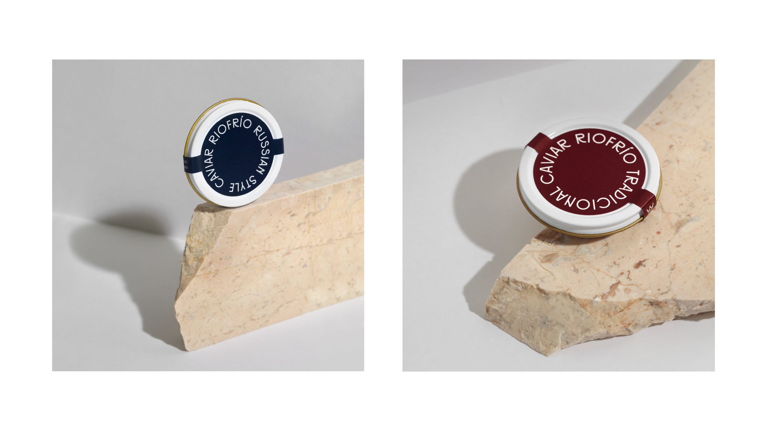
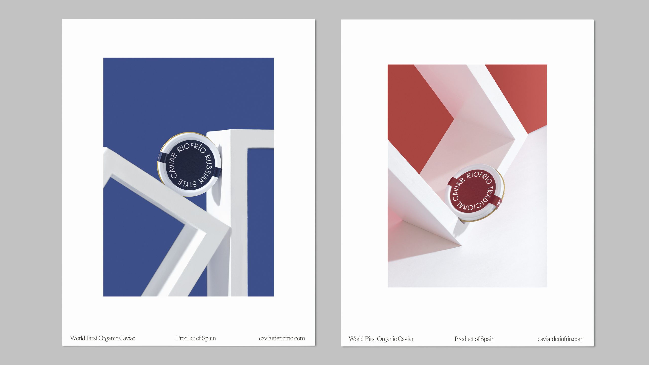
Founded in 1963, Caviar de Riofrío is todaya world benchmark in luxury and top quality gastronomy. It is one of the main sturgeon aquaculture breeders in Europe, the most important in the Acipenser naccariispecies, and the first with an Organic certification for caviar. Its sturgeon is bred in the best waters in Spain at a constant temperature of between 14-15º C, naturally reproducing its wild habitat. Caviar de Riofrío is recognised as one of the best in the world thanks to its freshness and range of nuances. Since 2019, the company operates under the name of Riofrío 1963, maintaining the same structure, location and spirit of its origins. Nowadays, the caviar de Riofrío brand is appreciated by gourmets all over the world, the most exclusive delicatessen shops and numerous chefs with Michelin stars. Both traditional recipes are created – Russian and Iranian – as well as organic ones, which are the most sought after. Also various derivatives are prepared from caviar and sturgeon meat.
Originally used for windmills, fulling mills and drop hammers, the waterfall at the source of the river Frío was discovered in the 1960’s by Doctor Domezain, the pioneer of fish farming in Spain, a doctor from the region of Navarre who together with two partners founded the first fish farm in Riofrío in 1963 Domezain was attracted to this area for its unique conditions: the water sources naturally and throughout the whole year 300 metres away from the fish farm, at a stable temperature of between 14-15º C.
They needed a rebranding and a comprehensive review of their product image. In 1923, the great Bauhaus master László Moholy-Nagy (1895-1946) wrote a short essay in which he delved into the role of typography and in which he assured that typography “must be communication in its most intense form”.
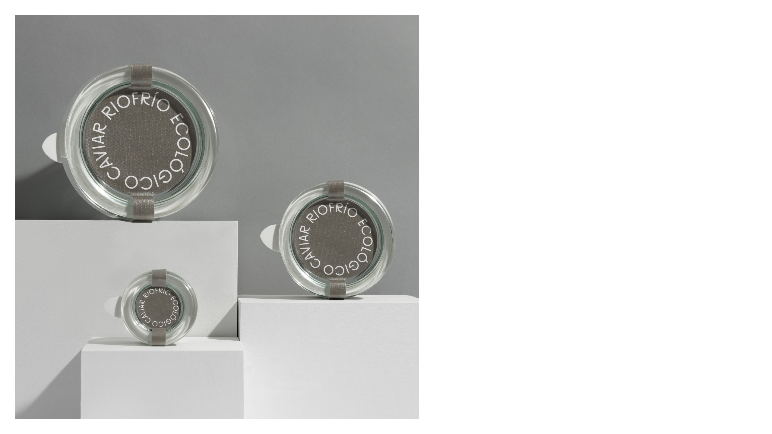
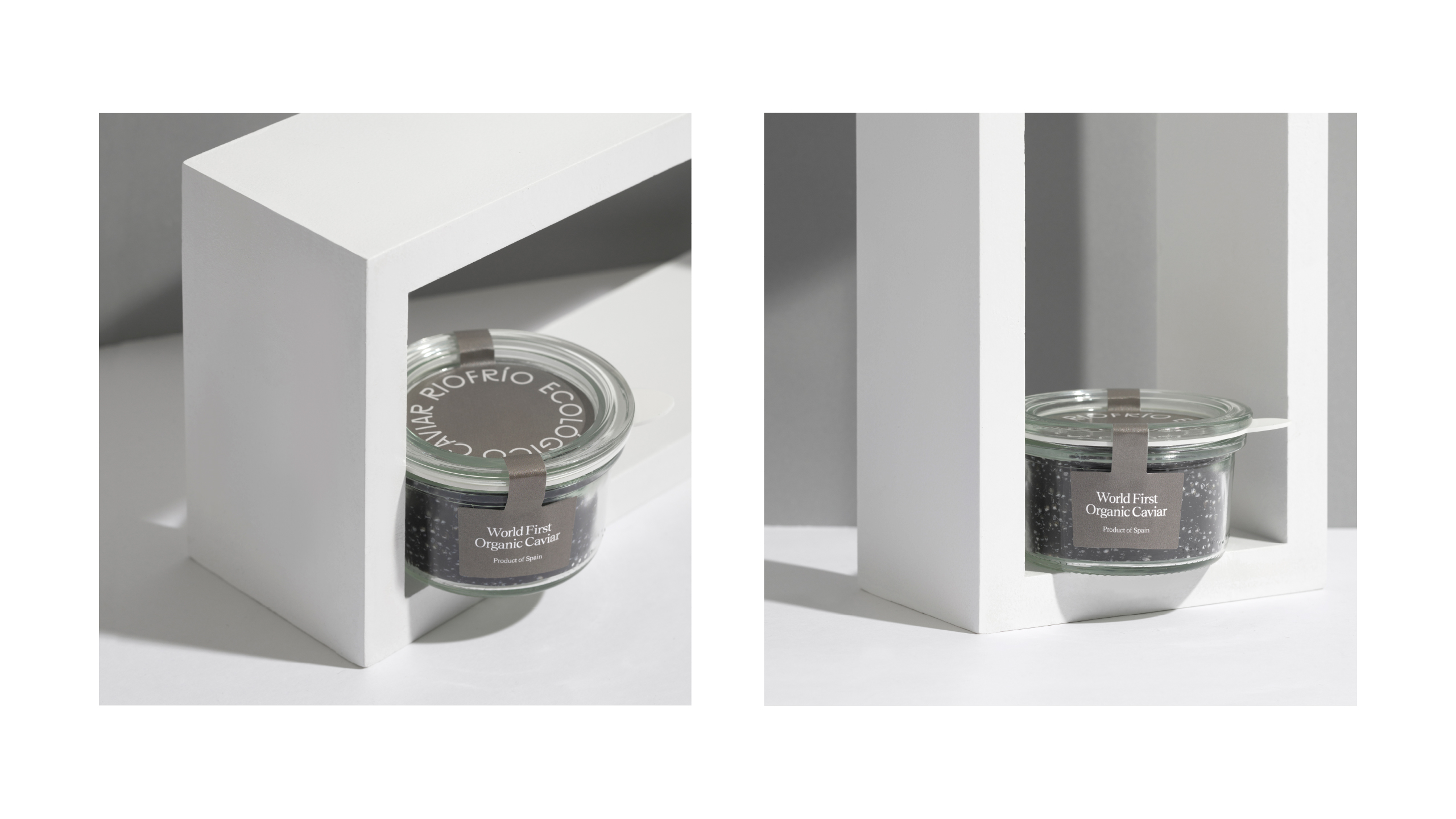
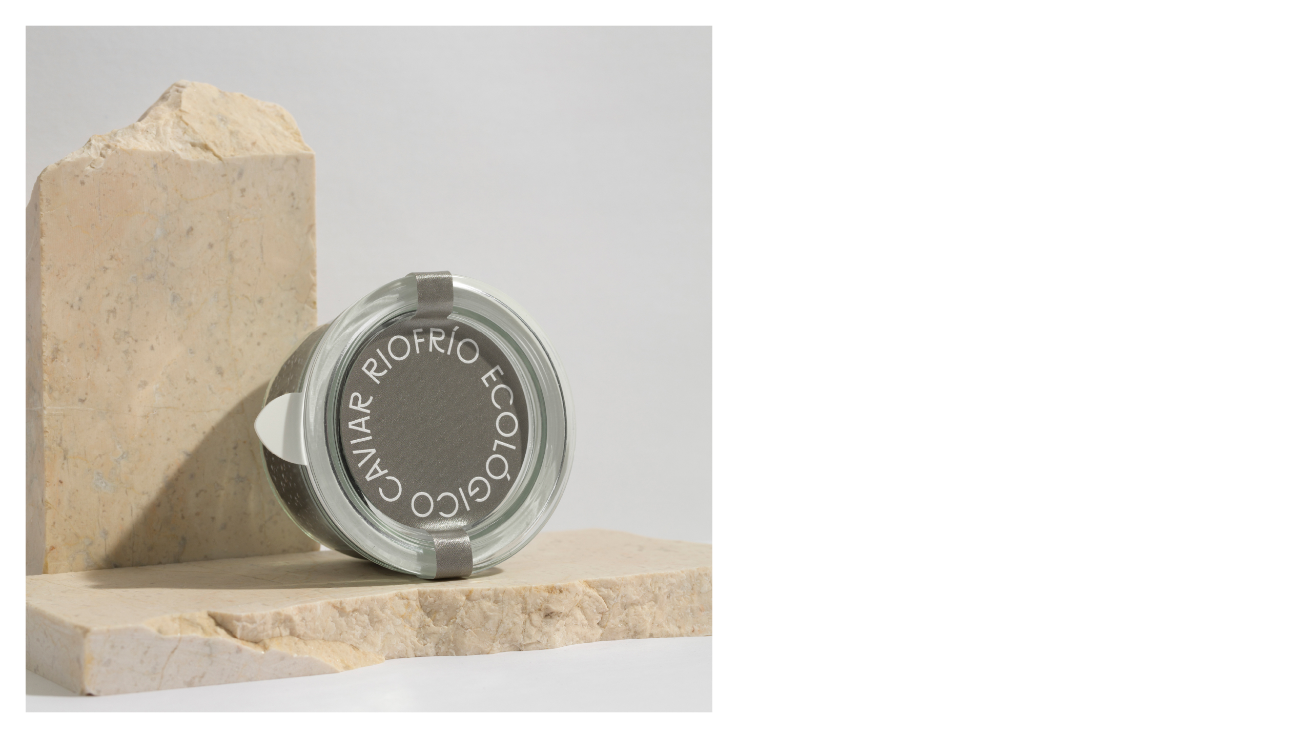
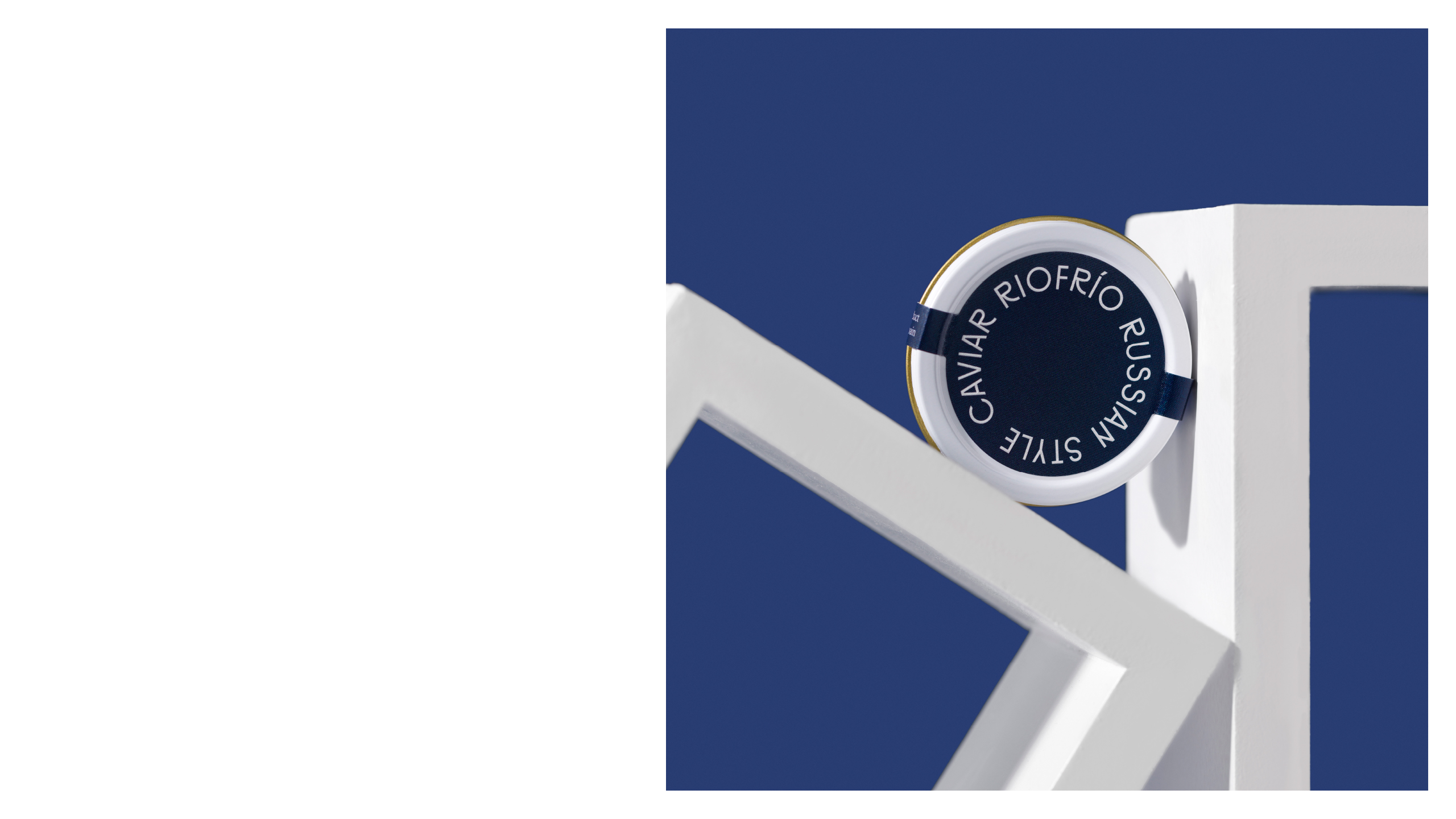
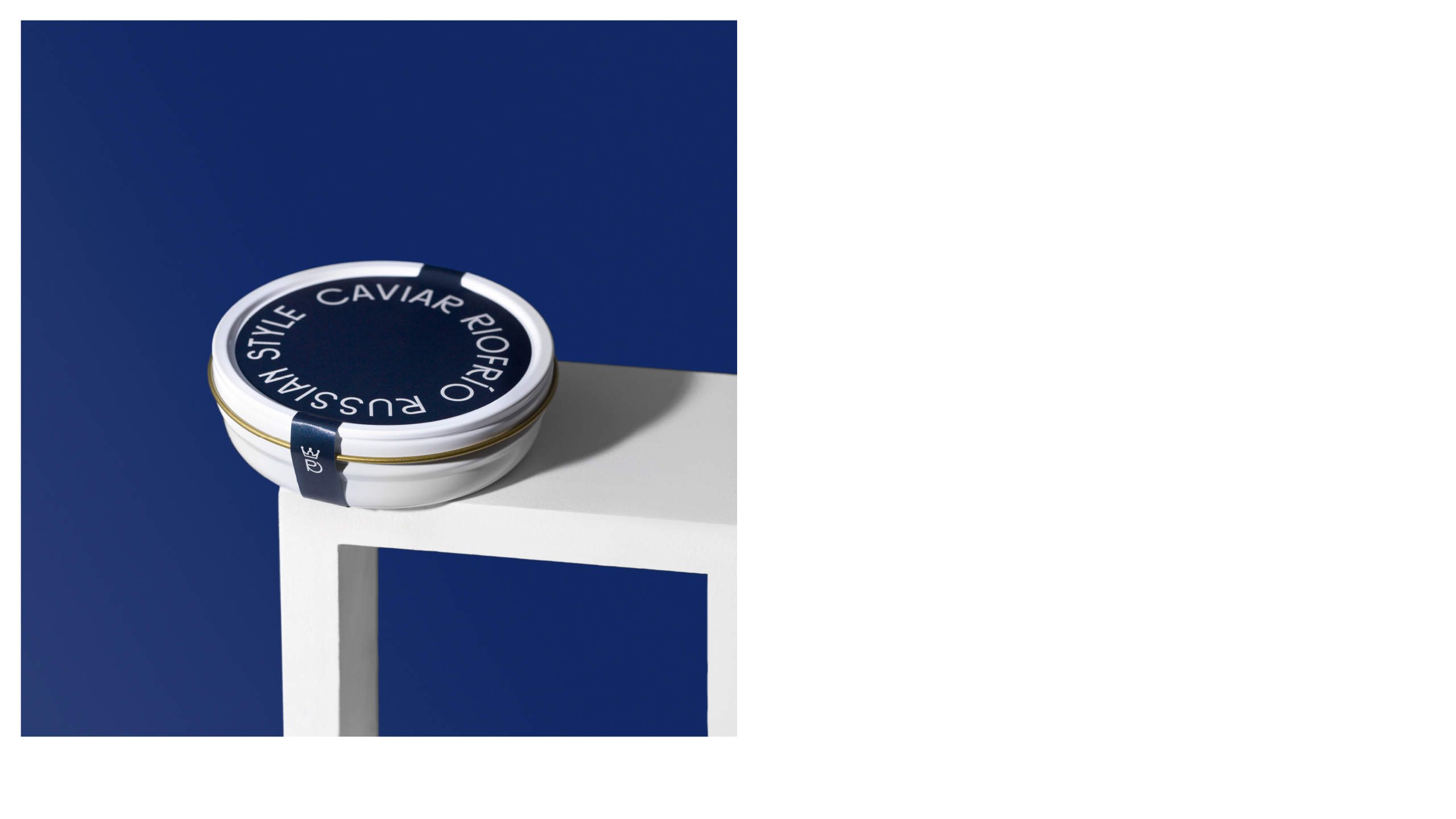
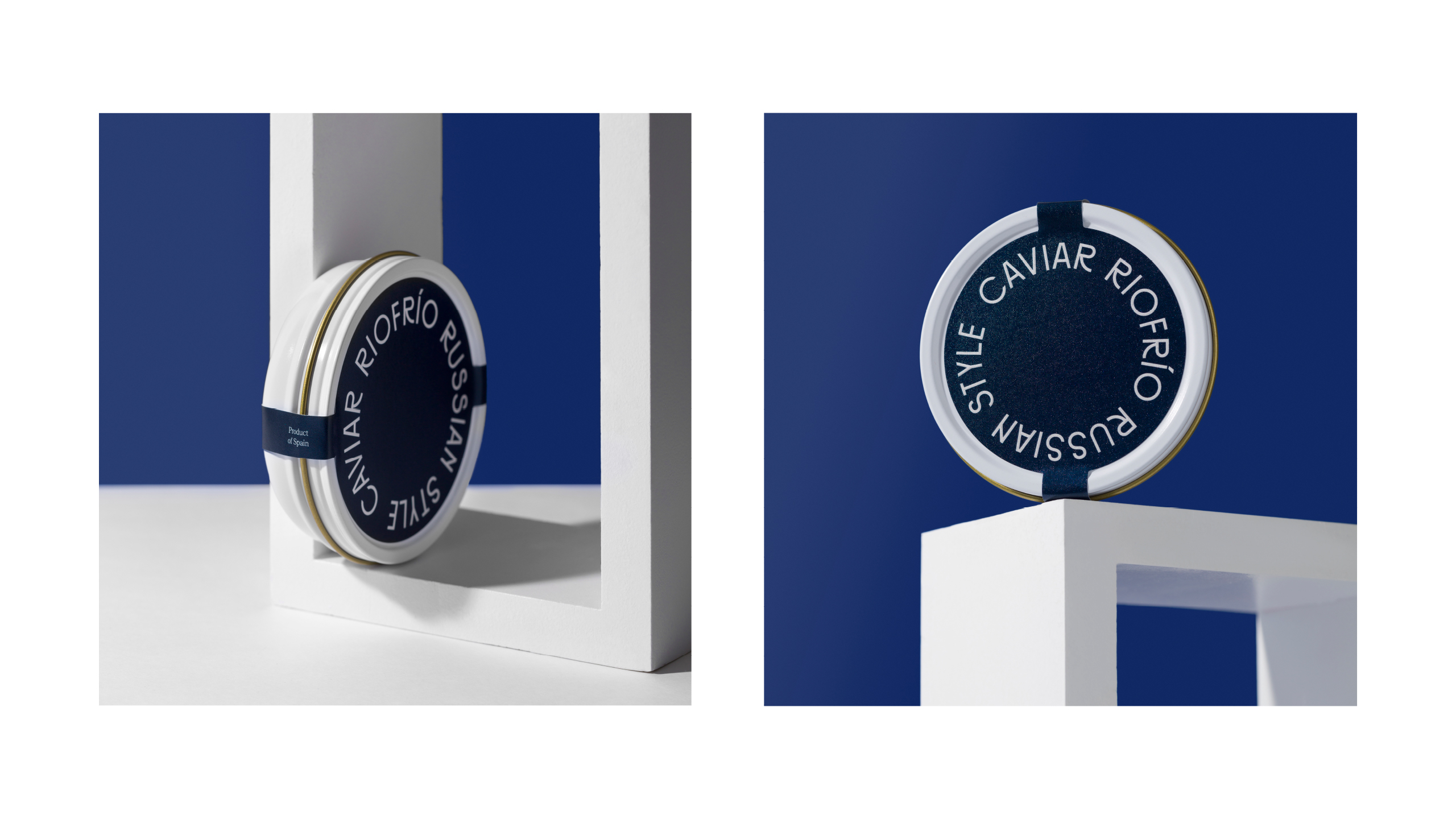
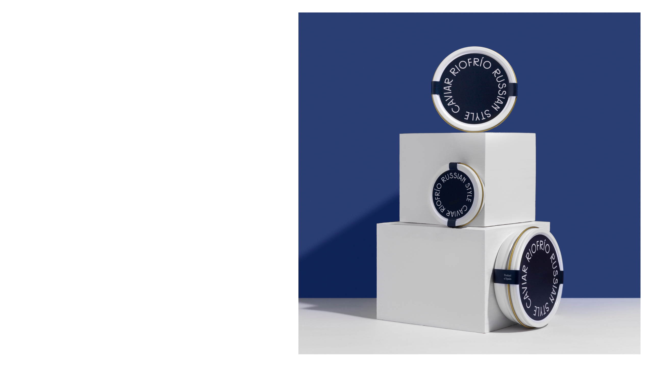
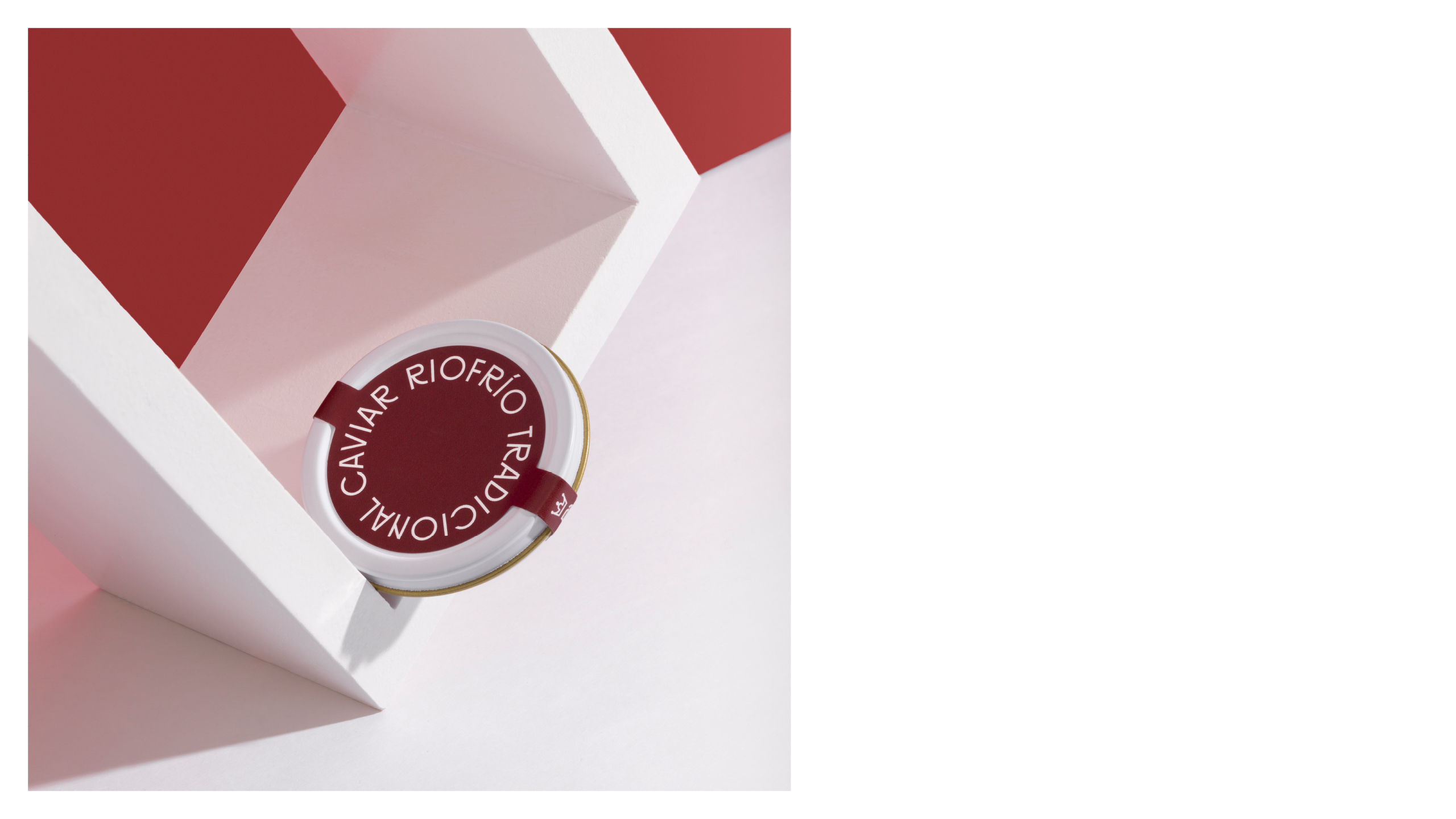
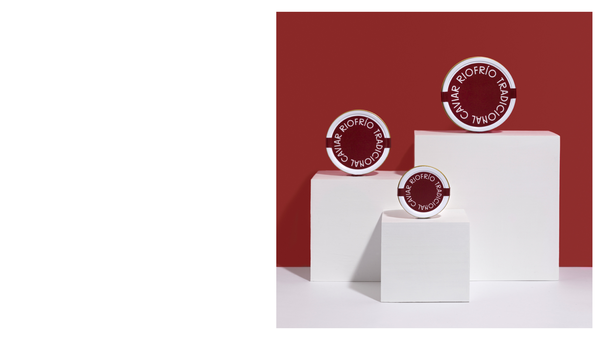
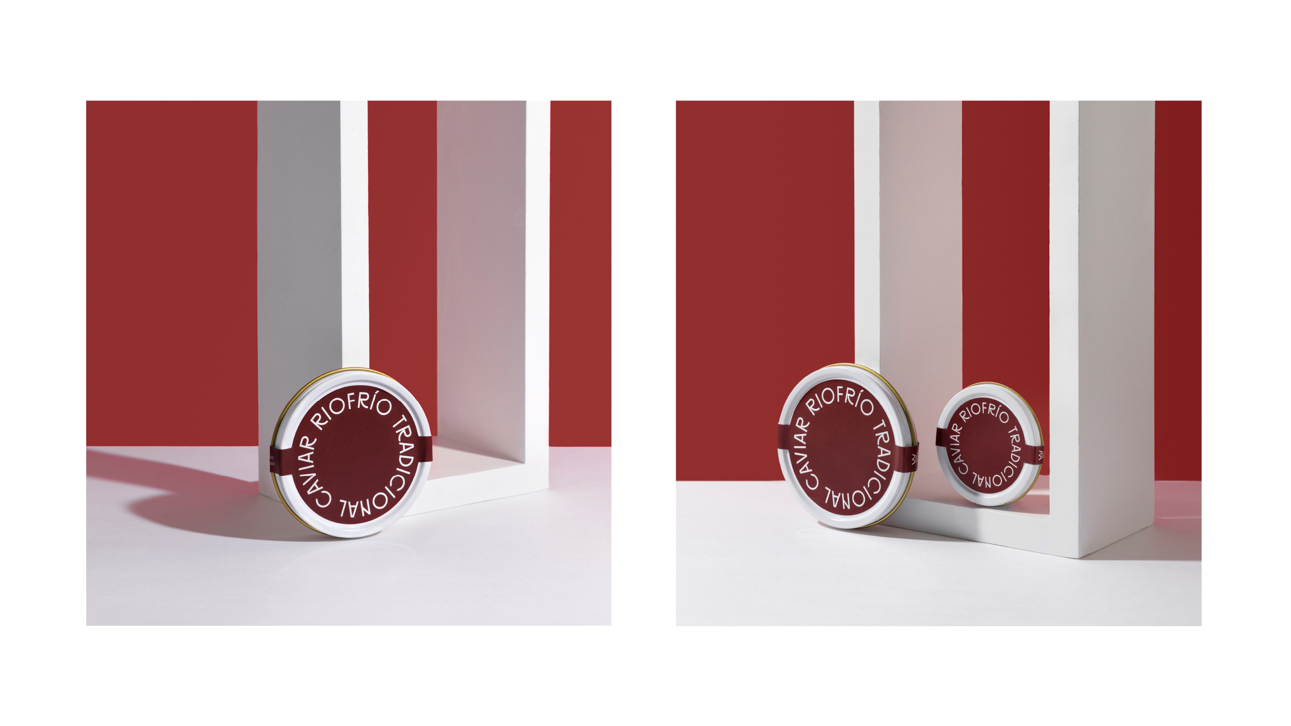
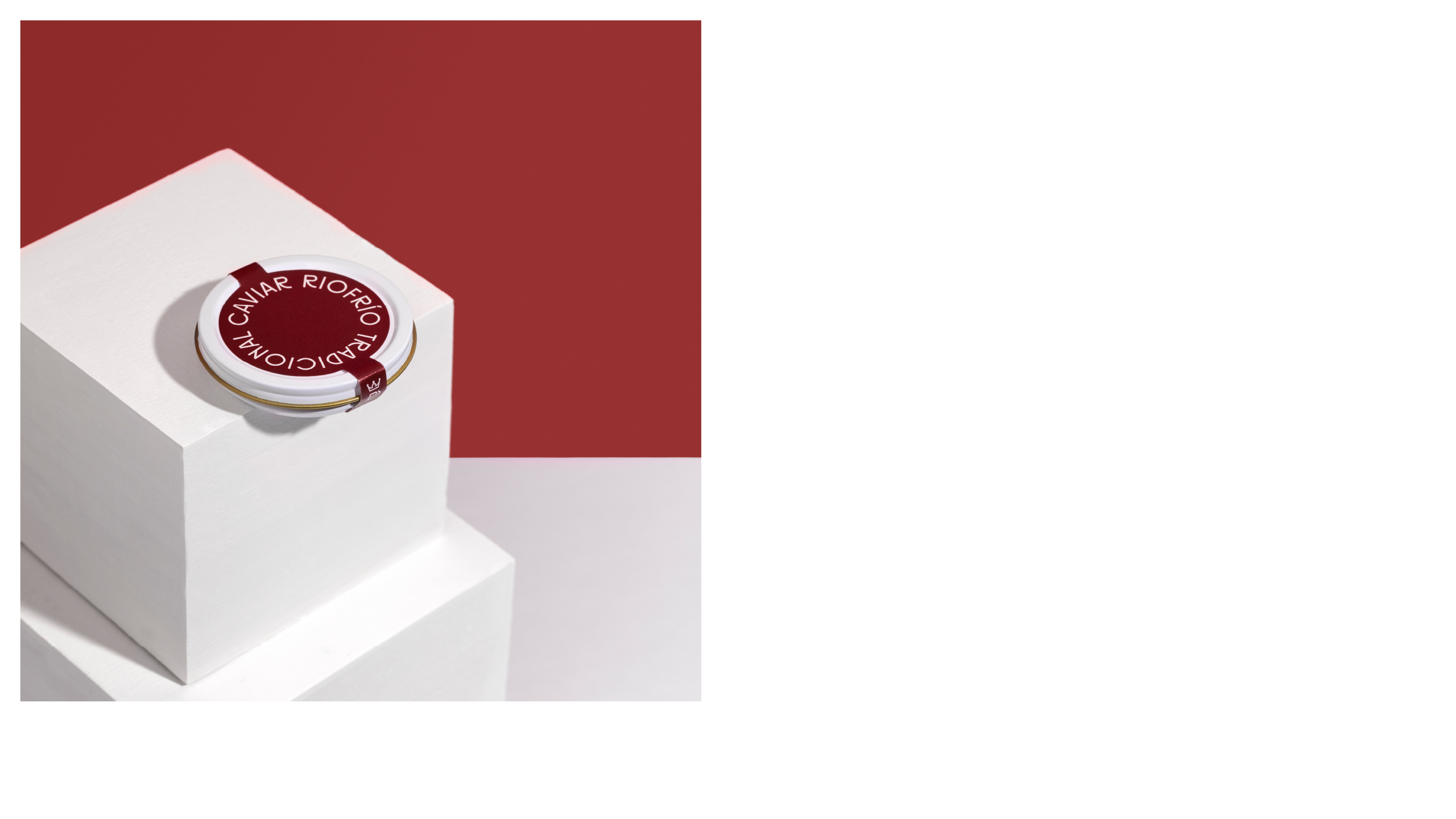
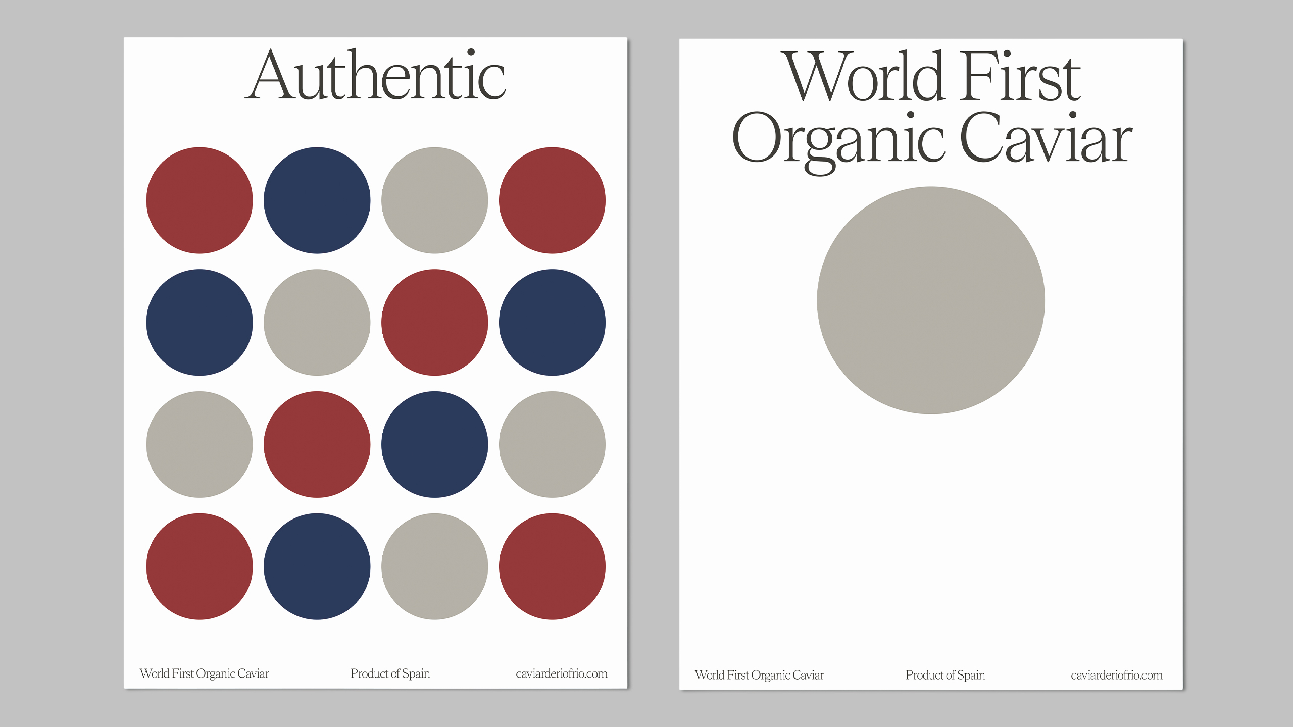
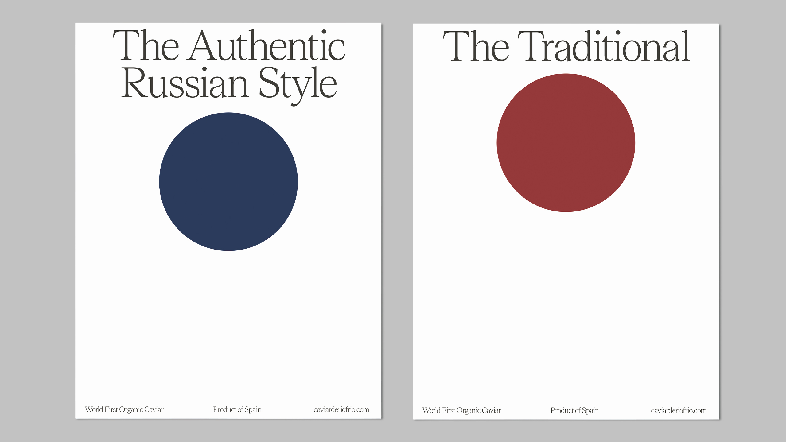
With this idea as a starting point we created a typographic visual system based on the way sturgeons move and which ends up adopting the circular shape, an icon of the caviar universe. This system works integrating each of its recipes into the brand with emphasis on absolute clarity. We also added a color scheme.
CREDIT
- Agency/Creative: Buenaventura studio
- Article Title: Buenaventura Studio Create Brand and Packaging Design for the World First Organic Caviar
- Organisation/Entity: Agency, Published Commercial Design
- Project Type: Packaging
- Agency/Creative Country: Spain
- Market Region: Europe
- Project Deliverables: Brand Architecture, Brand Redesign, Brand World, Graphic Design, Product Architecture, Rebranding
- Format: Jar
- Substrate: Glass, Metal


