


Following a period of transformation and growth, architecture studio Salto has renewed its visual identity to more clearly communicate its current vision and positioning.
This new identity reflects the duality inherent in its working philosophy: the balance between strategy and creativity. Through the development of a dual typographic identity and a graphic language inspired by everyday elements of architectural practice, Salto strengthens its presence with a more global and contemporary image.
Salto is an architecture, interior design, and engineering studio with offices in Granada, Málaga and Murcia. Its trajectory has been marked by continuous growth and evolution, which led to the need to redefine its visual identity and narrative. This redesign seeks to express the professional maturity the studio has achieved in recent years, offering a more robust image aligned with its current standing in the industry.
Salto is defined by a balance between strategic thinking and creative expression. This duality—central to the studio’s methodology and embodied in the personalities of its founders, Esperanza Campaña and Gustavo Rojas—has been instrumental in shaping the new visual identity. The result is a system that translates this coexistence of approaches into a typographic structure that reinforces and highlights Salto’s uniqueness within the sector.
A dual typographic structure reflecting the studio’s personality
Typography, like architecture, is built on principles of structure, balance, and functionality. Every stroke, proportion, and detail adheres to a set of rules designed to communicate a clear and coherent message. Yet beyond its technical precision, both disciplines have the power to evoke emotion.
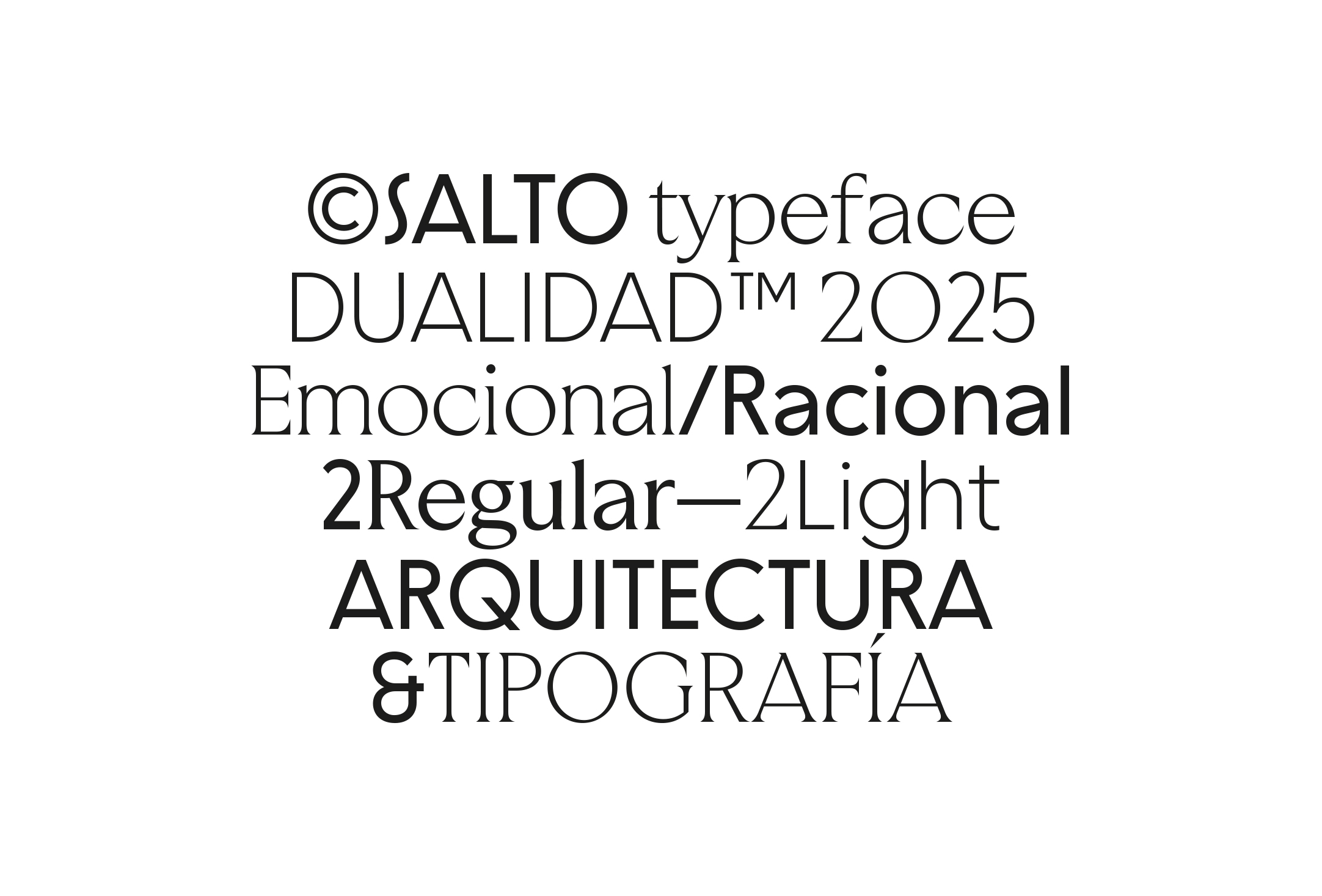
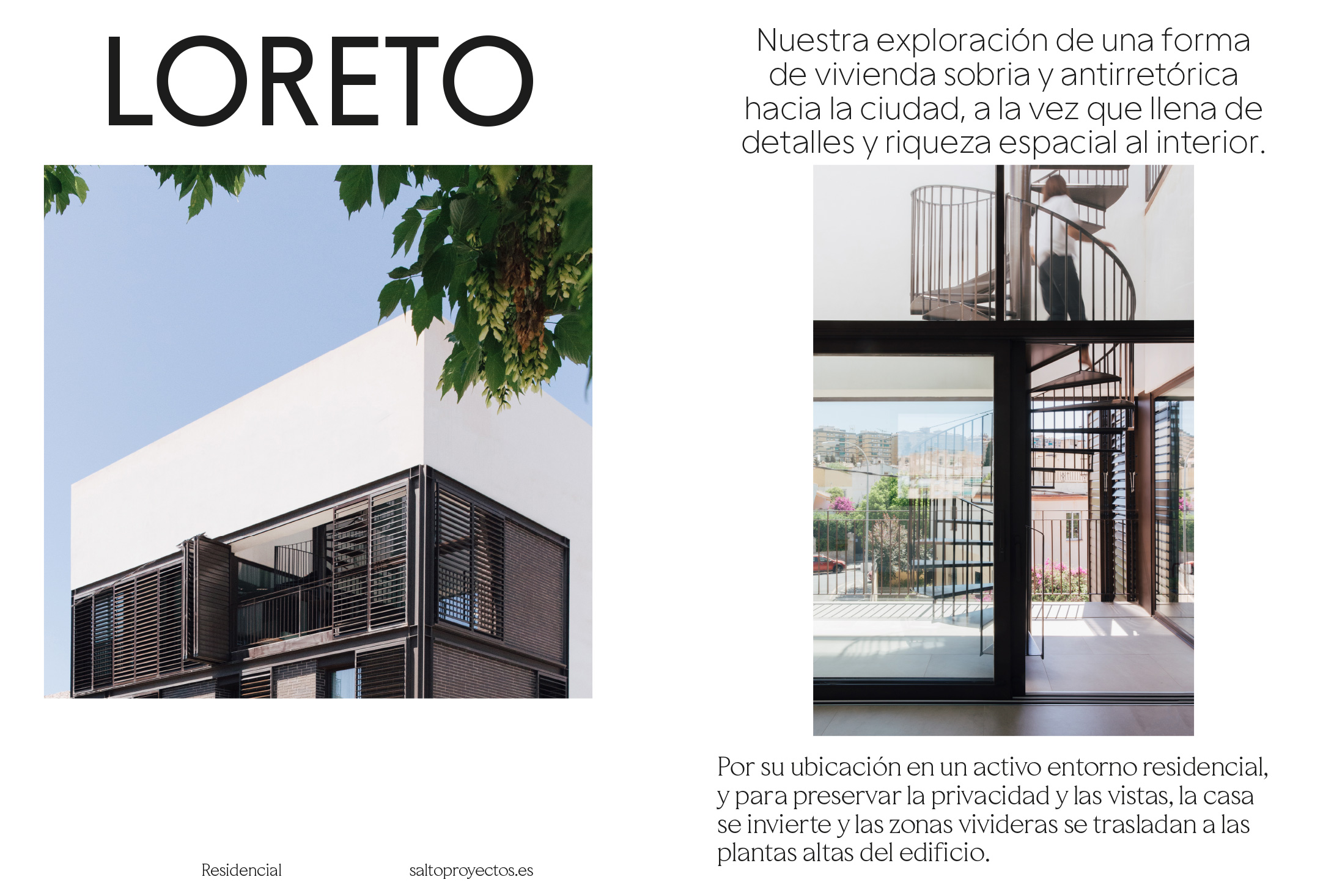
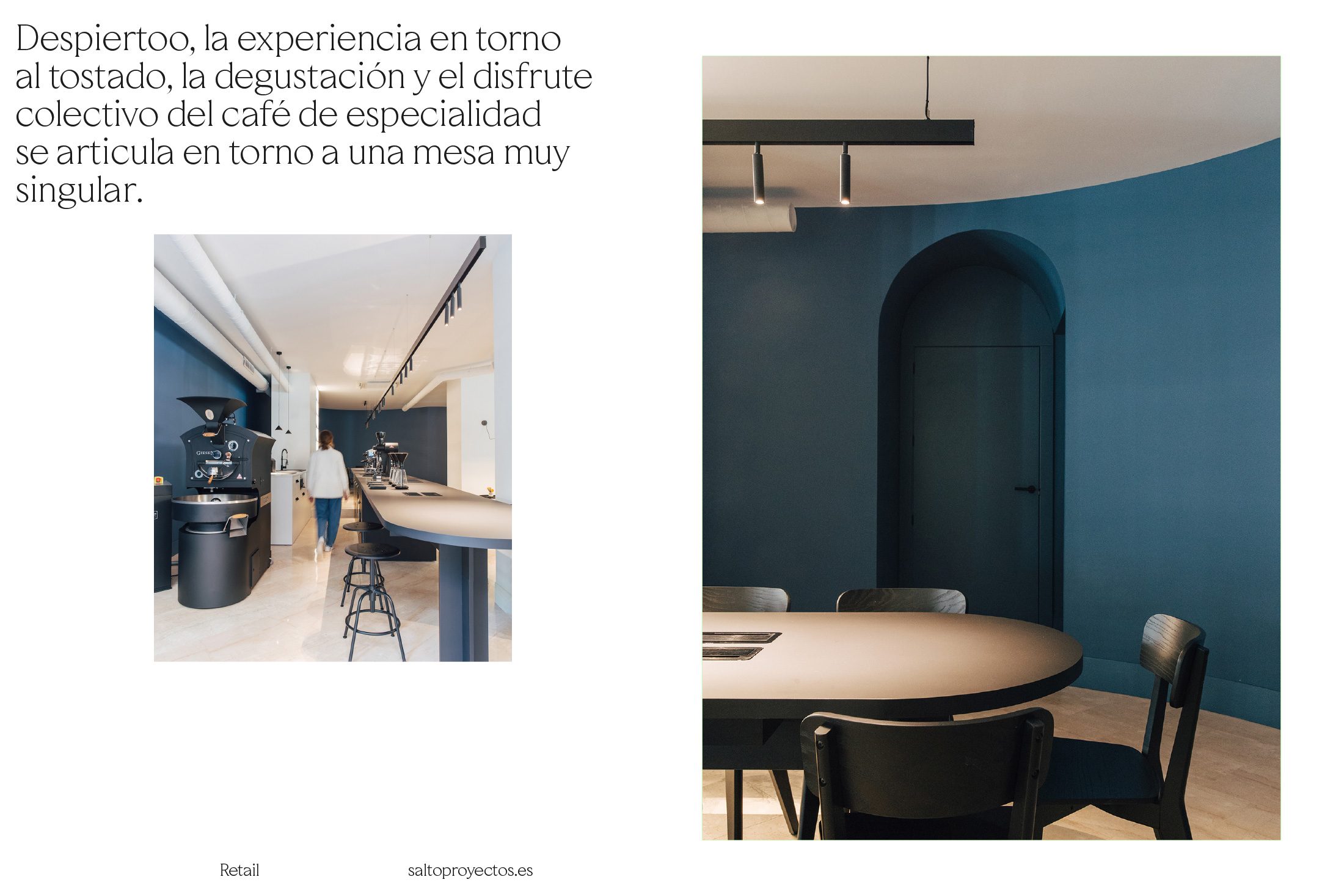
Salto’s typographic identity needed to embody this intrinsic relationship with architecture—combining structural rigor and expressiveness to create a cohesive and characterful visual language. To achieve this, two custom typeface families were developed: Salto Sans and Salto Serif, conceived as natural extensions of the studio’s philosophy.
Salto Sans is a geometric, low-contrast sans-serif typeface that conveys solidity, pragmatism, and a timeless quality. Its design follows a rigorous structural logic, with clean forms and carefully balanced proportions that evoke the stability and rationality typical of architecture and engineering. It serves as the firm foundation on which Salto’s visual identity is built, ensuring clarity and legibility across all applications.
To add dynamism, a set of stylistic alternates has been incorporated, broadening its range of use while maintaining visual coherence.
In contrast, Salto Serif introduces a more expressive, humanistic dimension. Inspired by classical typographic tradition but interpreted through a contemporary lens, it blends elegance and warmth in its forms. With its subtly contrasted strokes, it brings depth and personality to the system—reflecting the artistic sensibility that, like in architecture, coexists with technical precision in Salto’s work.
Both typeface families have been designed for versatility across various contexts and media. Each comes in two weights—light and regular—and in both uppercase and lowercase, allowing for flexible visual hierarchy without compromising coherence. They also include a wide array of custom graphic details that reinforce Salto’s identity: a complete set of numerals, arrows, signs, and symbols, as well as stylistic alternatives that add flexibility and personalization to the visual system.
The result is a typographic system that not only fulfills its communicative function but also visually synthesizes the essence of Salto—an essence rooted in the balance between strategic precision and creative sensitivity, where structure and emotion coexist in harmony.
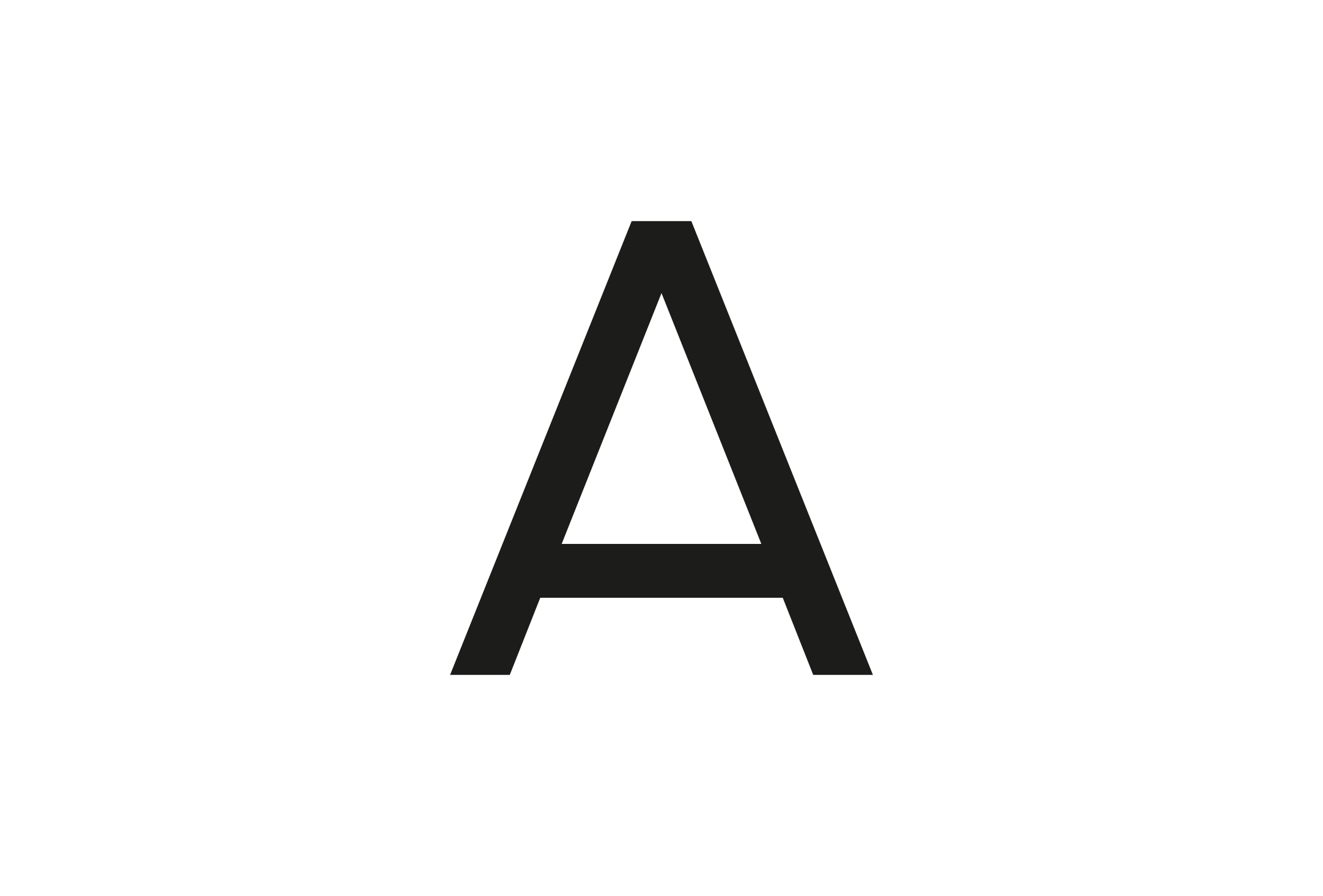
A typographic emblem
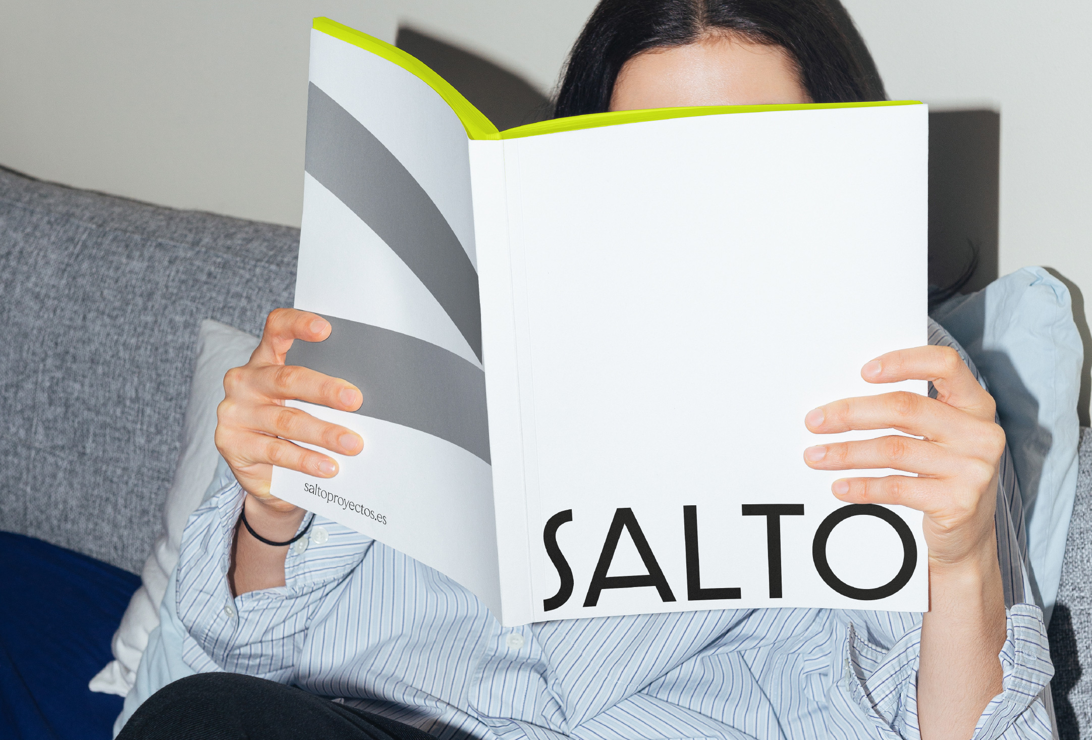
A key element of this typographic identity is the capital letter “S,” designed as a distinctive symbol of the brand. Carefully crafted to go beyond its linguistic function, the letter becomes a visual emblem.
This character serves as a central pillar of the studio’s identity, reinforcing its uniqueness and ensuring recognizability across applications.
A visual language inspired by art
To complement the typographic duality, Salto’s identity includes a graphic layer that enhances the studio’s visual narrative and gives it a unique and distinctive voice.
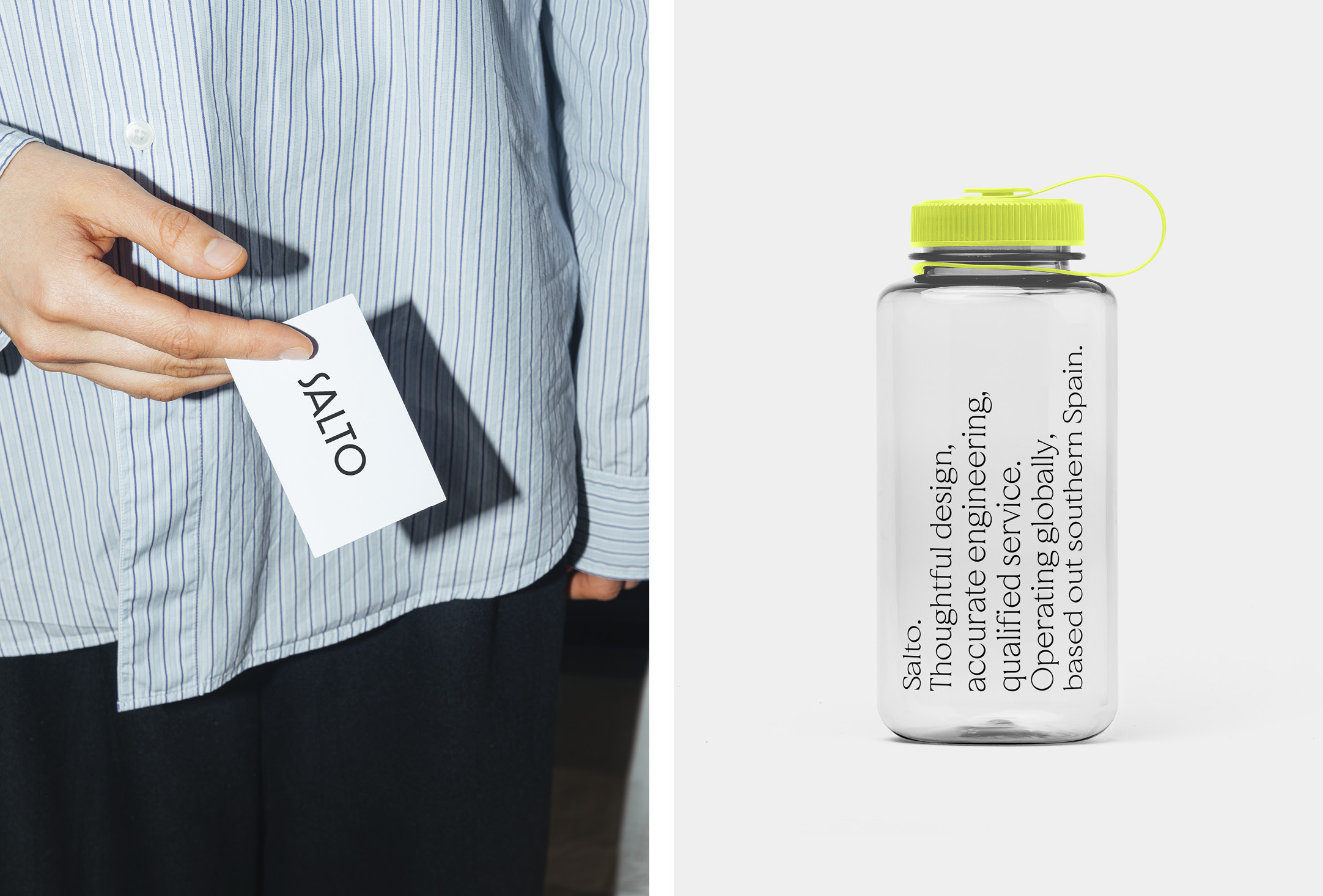
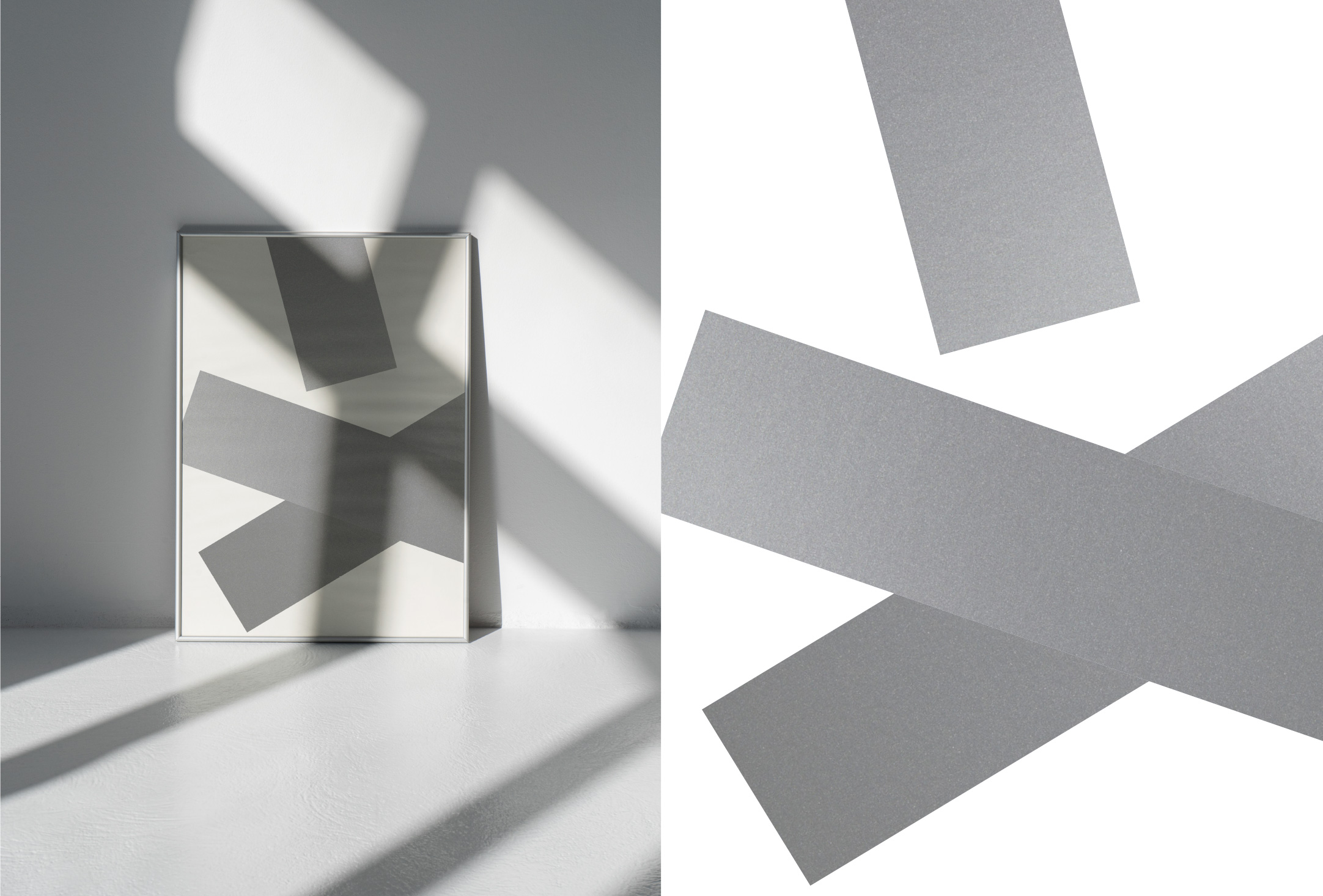
This visual language, with an artistic sensibility, reinterprets familiar elements from fieldwork in architecture through an innovative lens. Reflective bands from safety vests—commonplace in architectural settings—are transformed into graphic motifs that bring conceptual depth to Salto’s identity through a subtle process of reinterpretation.
This illustrated layer helps build a fluid and versatile visual system that unfolds organically across the studio’s communication materials. From corporate applications to editorial and digital media, its integration generates a cohesive identity adaptable to a variety of formats and contexts. Even in applications such as posters, this visual system strengthens Salto’s distinctive character, consolidating its presence in every graphic expression.
The outcome is a contemporary, multi-faceted visual system that not only communicates the studio’s methodology and approach but also conveys its unique perspective on architecture—where strategy and creativity are seamlessly balanced.
CREDIT
- Agency/Creative: Buenaventura
- Article Title: Buenaventura Designs a Dual Typographic Structure for the New Visual Identity of Architecture Studio Salto
- Organisation/Entity: Agency
- Project Type: Identity
- Project Status: Published
- Agency/Creative Country: Spain
- Agency/Creative City: Loja (Granada)
- Market Region: Europe
- Project Deliverables: Brand Identity, Editorial Design, Identity System, Illustration, Type Design, Web Design
- Industry: Professional Services
- Keywords: Type Design, Visual System
-
Credits:
Creative Direction and Design: Buenaventura
Typeface Design: Buenaventura
Illustration and Motion: Buenaventura
Audiovisuals: Adrián Cecilio


