


Flapjacks are a beloved comfort food in British culture — a true national treasure that evokes nostalgia, warmth, and the simple pleasure of homemade treats. For many, flapjacks represent moments shared with family, the aroma of golden syrup in a bustling kitchen, or the reliable pick-me-up enjoyed with a cup of tea. Flapjackery, founded with a passion for elevating this humble classic, has set its ambition on becoming the UK’s most recognisable and celebrated flapjack brand. With an extensive, award-winning range of flavours, from indulgent chocolate combinations to lighter, fruit-infused varieties — including a thoughtful selection of vegan options — the brand truly offers something for every taste and dietary preference.
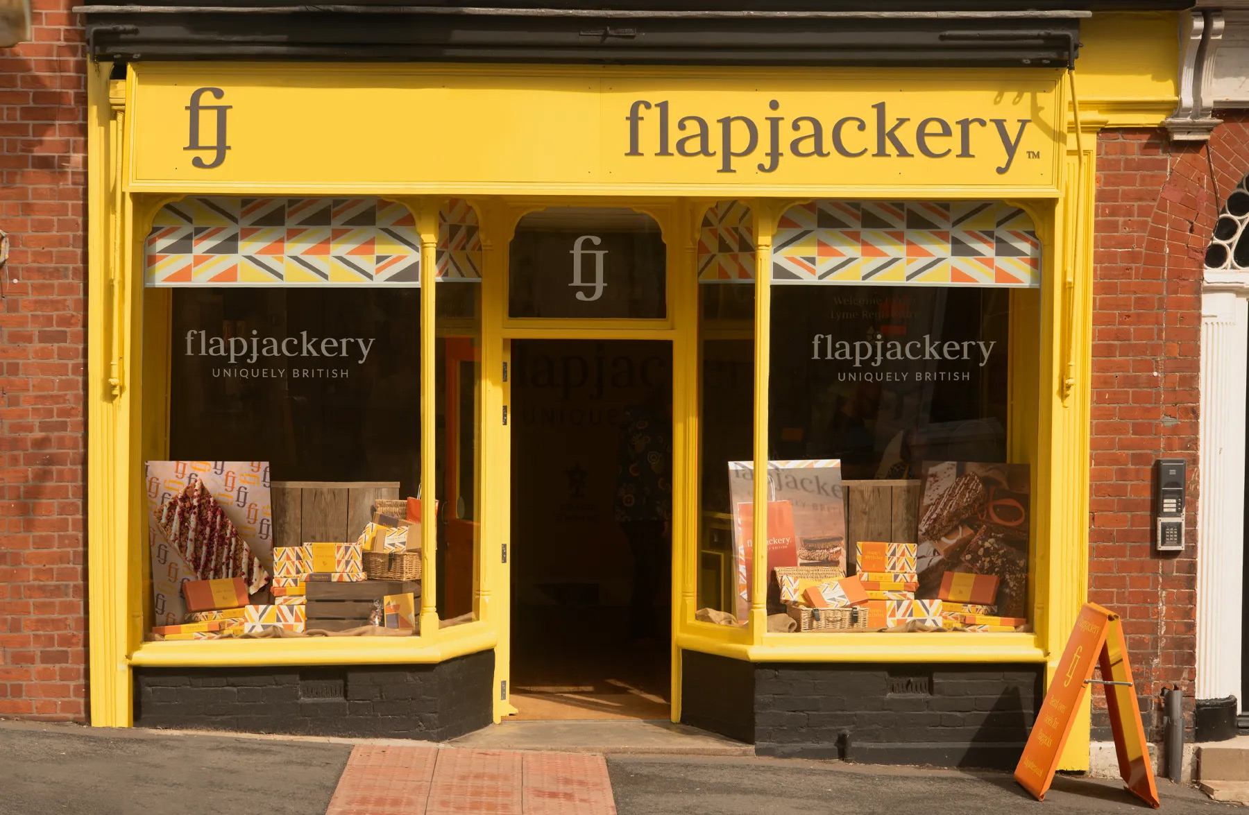
After a period of impressive and rapid growth, the business transitioned from a small single market stall to establishing itself as a thriving independent retailer. Over time, it expanded into a network of specialist shops across the Southwest, each one attracting loyal customers and curious newcomers alike. However, as the company matured, it became clear that the existing brand identity no longer reflected its potential or supported its aspiration to reach a broader, more diverse audience. The visual language, while functional, lacked the distinctiveness and emotional resonance needed to compete in an increasingly crowded marketplace.
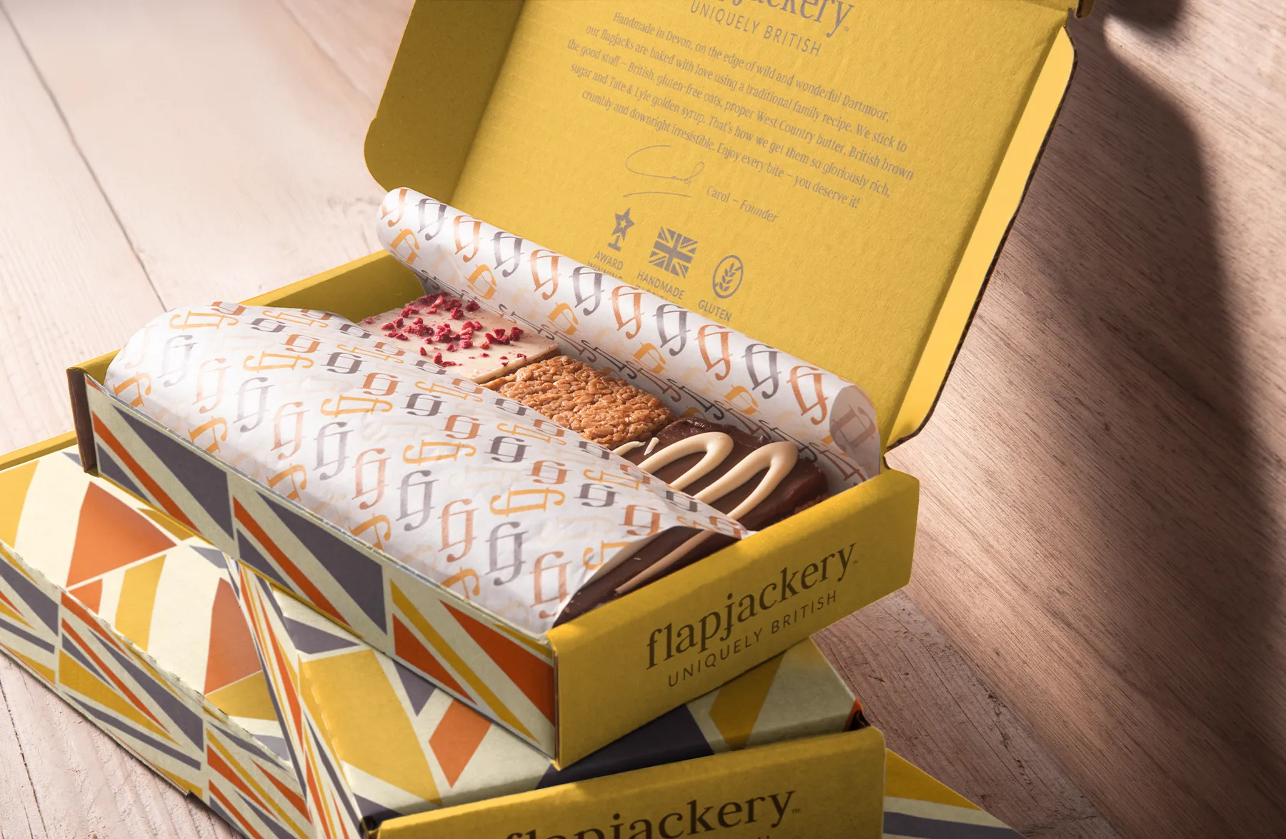
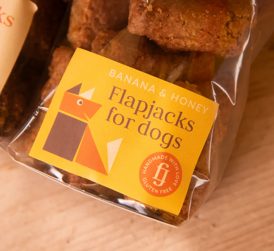
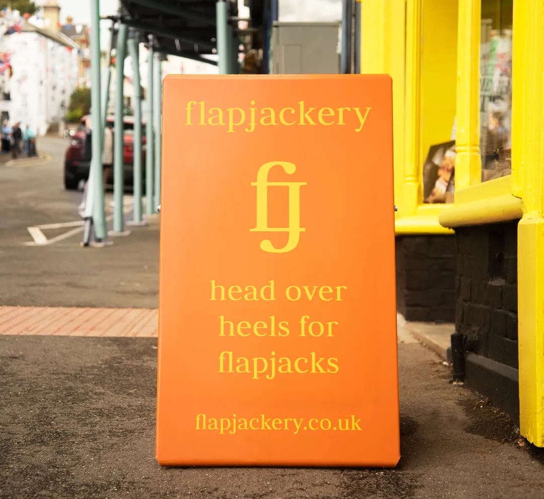
Recognising the opportunity to express Flapjackery’s proudly British spirit in a more contemporary and compelling way, Buddy embarked on a comprehensive brand refinement. Their approach involved strengthening and modernising the visual assets without losing the authenticity and charm that customers already loved. By reimagining the Union Flag in a playful yet sophisticated manner — treating it almost like flapjack itself — Buddy introduced sliced forms, angular cuts, and dynamic compositions that echo the familiar way flapjacks are portioned. This approach not only felt visually striking but also created an immediate, intuitive connection to the product.
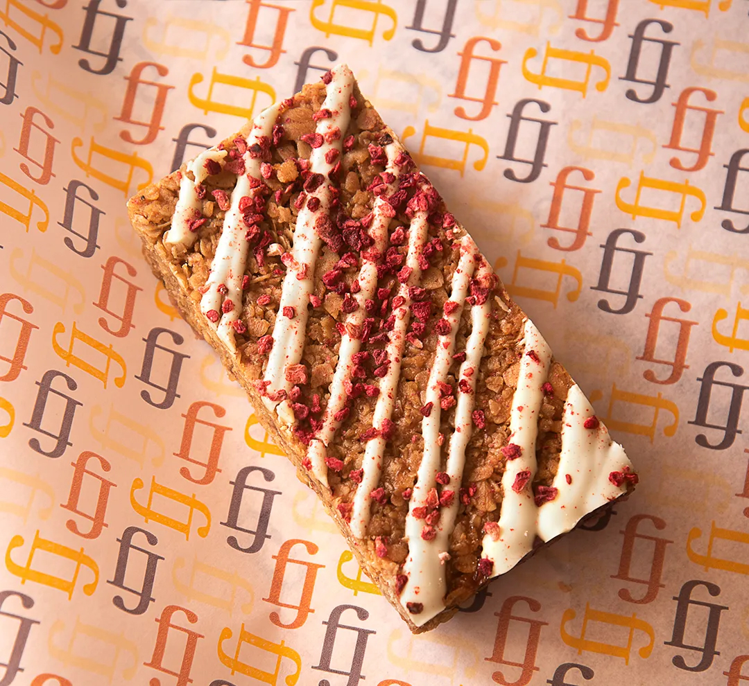
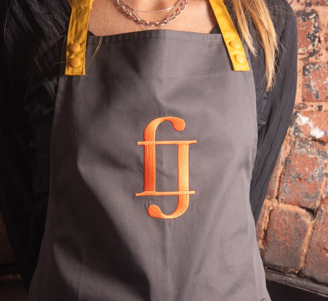
To complement these graphic elements, Buddy developed a warming, inviting colour palette inspired by the rich tones of traditional baking: golden oats, deep honeyed browns, and soft, buttery neutrals. These colours, paired with a newly crafted FJ monogram, introduced a greater sense of cohesion, quality, and homely appeal. The result is a brand identity that feels more distinctive, more ownable, and far more aligned with Flapjackery’s mission — celebrating British flavour, craftsmanship, and the simple joy of truly good flapjacks.


CREDIT
- Agency/Creative: Buddy Creative
- Article Title: Buddy Creative Unveils a Warm, Bakery Led Identity Reinforcing Flapjackery’s National Comfort Food Heritage
- Organisation/Entity: Agency
- Project Type: Identity
- Project Status: Published
- Agency/Creative Country: United Kingdom
- Agency/Creative City: Exeter
- Market Region: Europe
- Project Deliverables: 2D Design, Brand Design, Brand Identity, Brand Mark, Brand Redesign, Brand World, Branding, Creative Direction, Design, Graphic Design, Icon Design, Illustration, Label Design, Logo Design, Packaging Design, Rebranding
- Industry: Food/Beverage
- Keywords: Flapjackery, Buddy, Creative, Brand, Brand identity, Branding, Packaging, Design, Flapjacks, British
-
Credits:
Creative Director: Mark Girvan


