In the heart of Brugg, a quaint town nestled within the lush landscapes of Austria, stands a charming half-timbered building. This historic structure is home to a revered old brewery, the birthplace of the renowned modern beer brand, Brugg. Known for its authentic Austrian Pilsner, this brewery weaves a tale of tradition, craftsmanship, and community.
This packaging design aims to honor the rich heritage of a traditional product in the modern European craft beer market, blending Fachwerk-inspired architecture with contemporary typography. The client, the brewery’s inheritor and great-granddaughter of the founder, sought a design that would intertwine the brewery’s unique legacy with a fresh appeal to the contemporary tastes of a younger, modern audience.
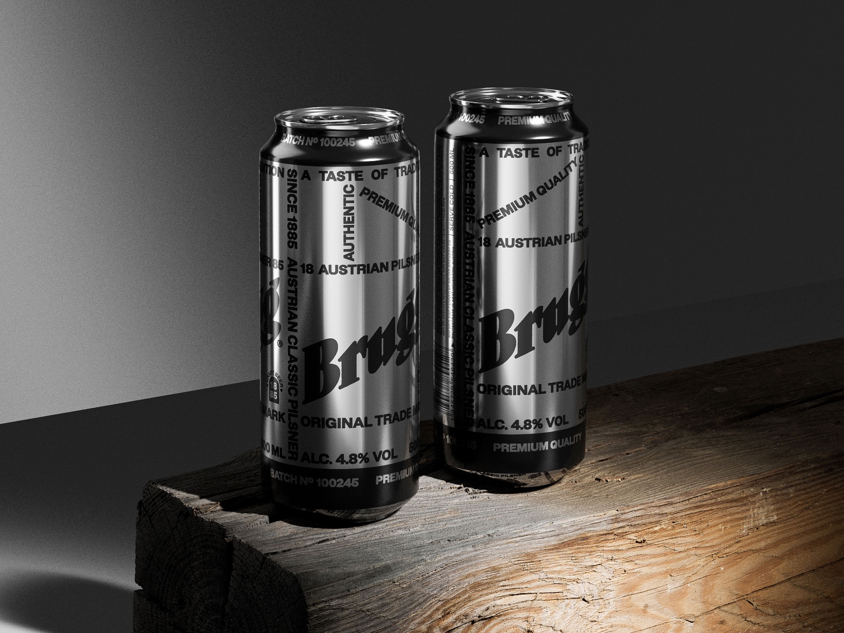
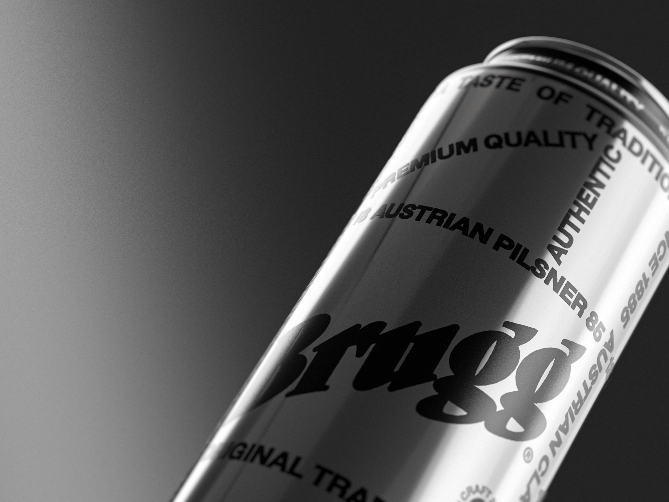
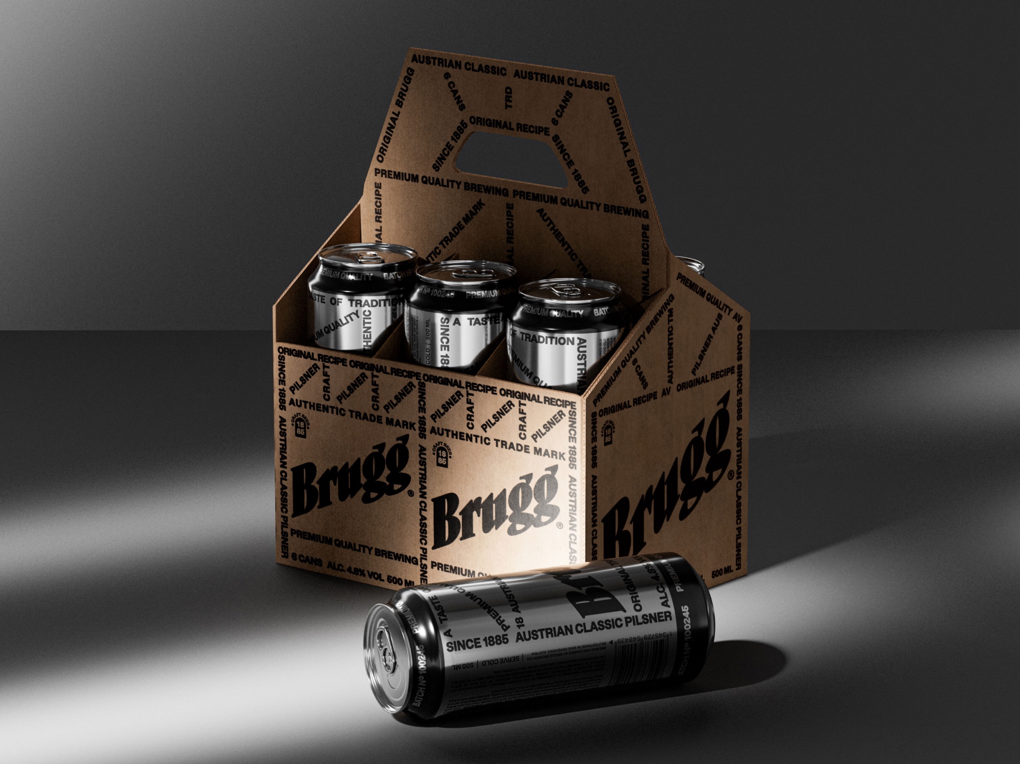
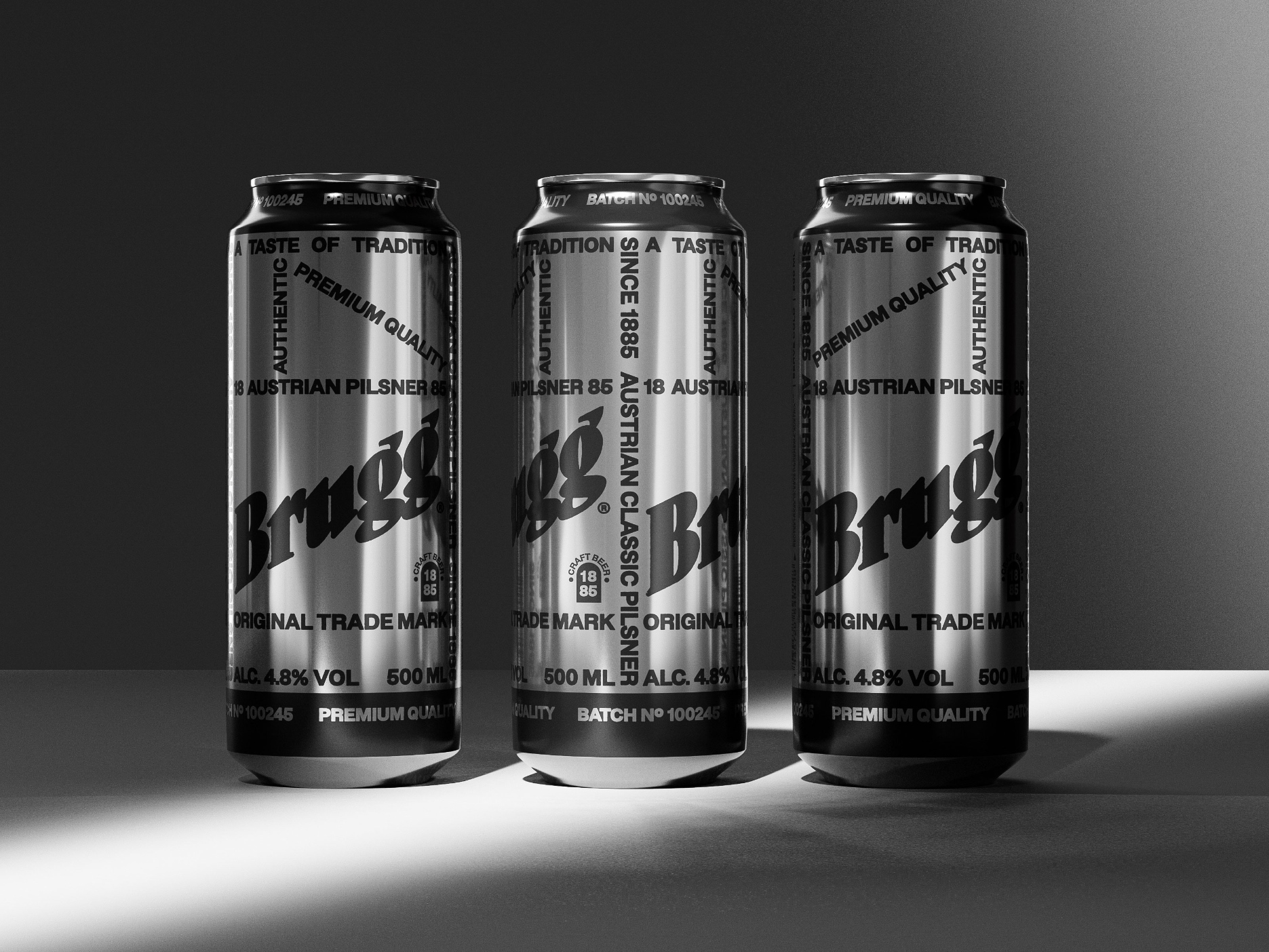
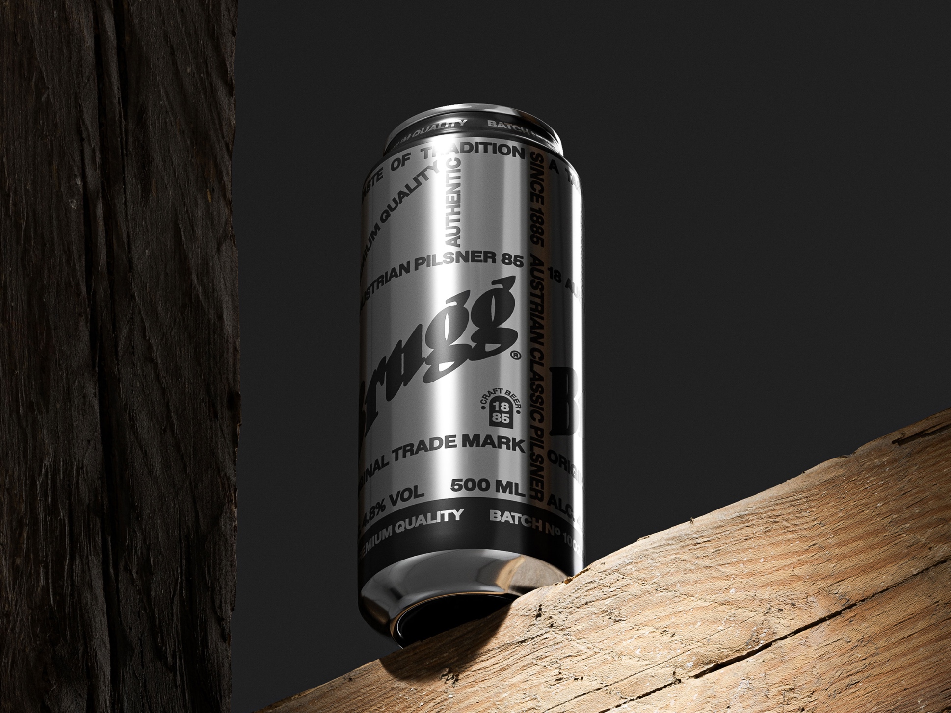
The packaging design for Brugg’s signature Pilsner is a visual echo of the half-timbered structure. The typography serves not just as text, but as a dynamic graphic system.
A crucial element of this design is the preservation and subtle refinement of the original logo. By maintaining this iconic symbol, we pay homage to the brewery’s roots while infusing it with a modern twist.
A minimalist color palette is a strategic choice, allowing the architectural graphics to take center stage, thereby engaging the viewer in a visual exploration of the brewery’s legacy. Emphasizing sustainability, it employs only recyclable materials and minimum paint, reducing environmental impact by using Revolution® UV printing.
The product has been produced and successfully released in the EU in a limited quantity of 5000 units. This packaging design has rejuvenated the brewery’s image and played a crucial role in a new chapter of the brewery’s storied history.
Furthermore, the packaging also includes an innovative QR code that links to an interactive digital experience. This feature invites customers to delve into the rich history of the Brugg brewery, offering virtual tours of the half-timbered building and insights into the brewing process. This blend of physical and digital elements not only enhances the consumer experience but also reflects the brewery’s commitment to staying at the forefront of technological advancements. It’s a bridge between the tangible legacy of the brewery and the digital future, engaging customers in a uniquely immersive way.
In essence, this packaging is a homage to the Brugg brewery’s enduring legacy. It appeals to a new generation of beer enthusiasts while paying tribute to the art of brewing.
CREDIT
- Agency/Creative: Vsevolod Abramov , Daria Shiian
- Article Title: Brugg Pilsner Packaging Design
- Organisation/Entity: Agency
- Project Type: Packaging
- Project Status: Non Published
- Agency/Creative Country: United States
- Agency/Creative City: New York
- Market Region: North America
- Project Deliverables: Packaging Design
- Format: Can
- Industry: Food/Beverage
- Keywords: WBDS Agency Design Awards 2023/24
- Keywords: Packaging Design, Product Creation
-
Credits:
Creative Director: Vsevolod Abramov
Art Director: Daria Shiian


