


spoondesign – Brothers In Farms
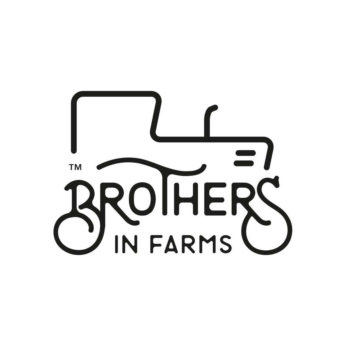
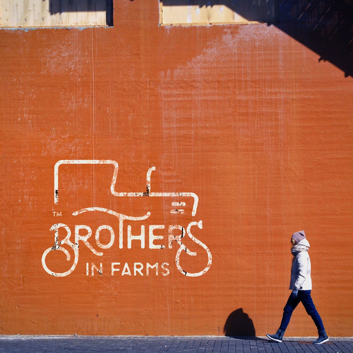
Think of your stereotypical idea of a farmer. What images and meanings come to your mind? Right…now please forget about all these and reset your perceptions.Brothers in Farms is a small unconventional farming business based in Kyparissia in Southern Greece. It is the labor of love of two brothers (obviously) and is a reflection of their funky and alternative philosophy of life, a philosophy that changes the very idea of how farming is all about.Their products are naturally of top quality, but it is their spirit that differentiates them from the crowd. And while most farming businesses would not even bother with a brand name and a logo, these two guys wanted to go the whole way. This is where we came in.So when it came to creating a new unique identity for them, it was clear that we needed to capture all these elements. For a starting point, we needed something that solidly placed the nature of their business on the table.Thus, we created the very recognizable outline of a tractor – a typical symbol of farming. The whole look has a vintage vibe in it, denoting the close, loving relationship of the brothers with their land and their produce.Brother in Farms now have the identity that best reflects what they stand for.
CREDIT
- Agency/Creative: spoondesign
- Article Title: Brothers In Farms
- Organisation/Entity: Agency, Published Commercial Design
- Project Type: Packaging
- Agency/Creative Country: Greece
- Market Region: Africa
- Industry: Agriculture


