


Introducing Blue
Blue is the new ride-hailing sensation that has taken Bucharest by storm – more than just a transportation app, it’s a thoughtfully curated branding journey. Designed by BroHouse Agency, Blue reimagines what urban mobility can look and feel like when design, emotion, and technology move in harmony.
Built on a deep understanding of its audience and a meticulous exploration of color psychology, typography, and visual clarity, Blue was designed to evoke sophistication and trust. Every element — from the logo to the car sticker – was strategically created to convey premium experience, simplicity, and forward-thinking spirit.
Driven by What’s Ahead
Blue is not just a name – it’s an attitude. The identity expresses the brand’s drive to move forward, to stay in motion, and to inspire progress.
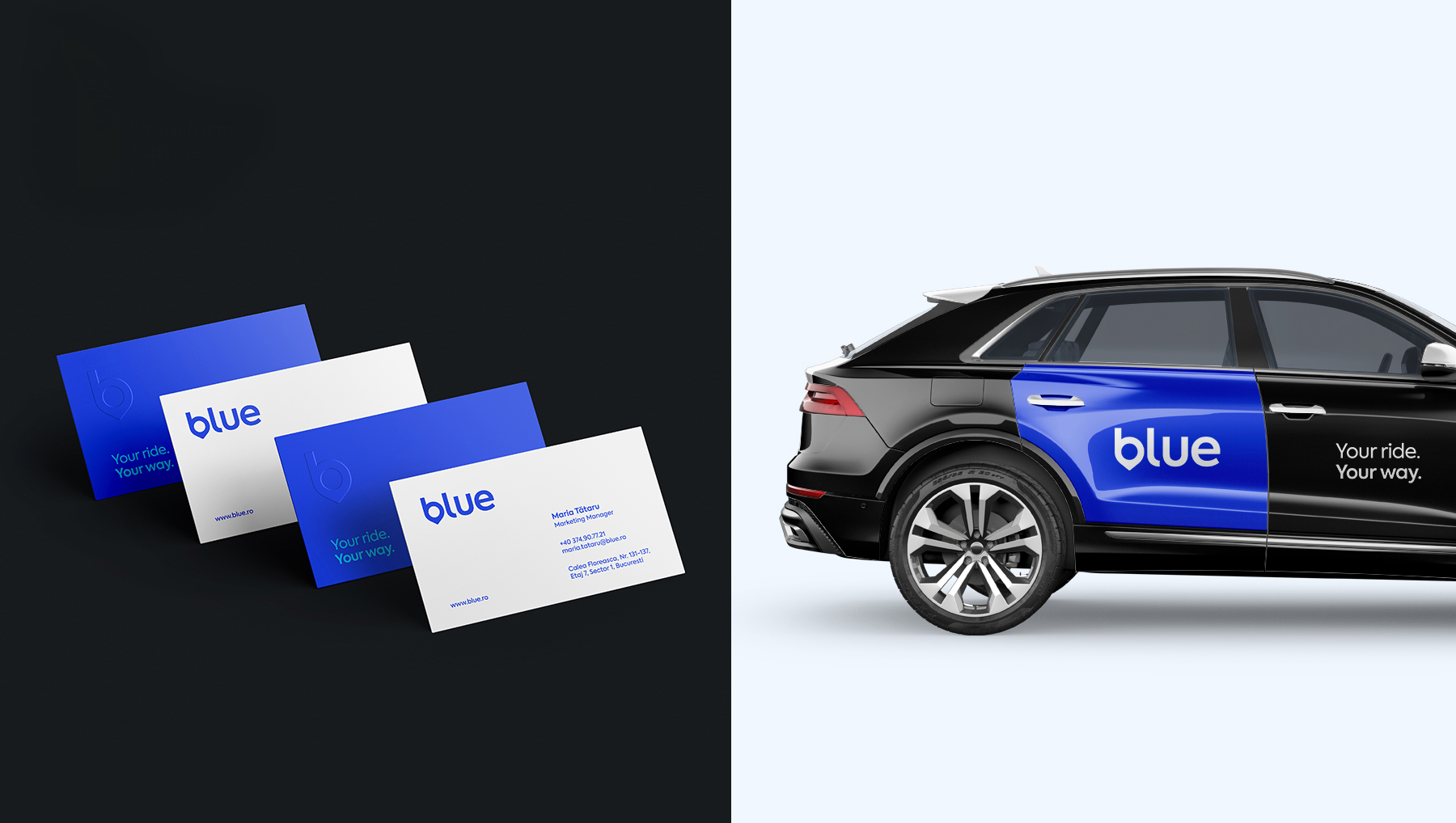
At its core stands a confident logotype, designed to highlight the strength of the name itself. In a world where many brands rely on symbols, Blue’s decision to lead with typography signals maturity and self-assurance. The clean geometry and timeless simplicity of the logo ensure high versatility across digital and physical touchpoints, reinforcing recognition and consistency.
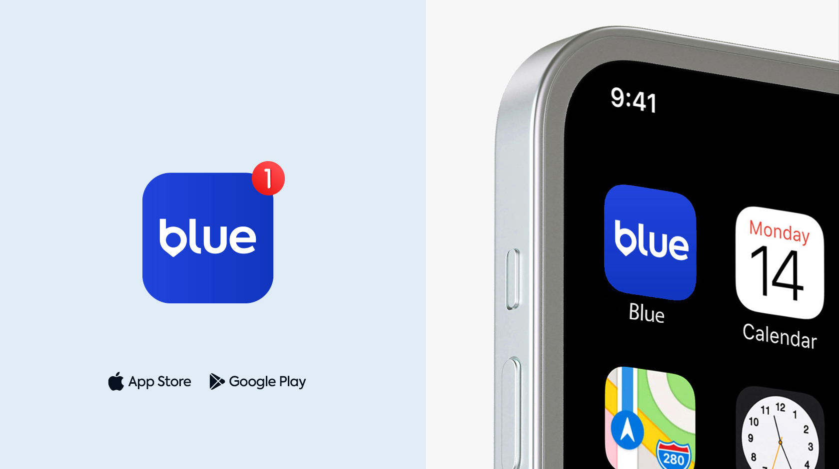
The “B” Mark – Where Branding Meets Navigation
The distinctive “B” mark, developed by BroHouse, merges the letter B with the iconography of routes and pins – a subtle nod to direction, mobility, and connection. This fusion turns a simple letter into a visual metaphor for the journey itself.
The mark becomes Blue’s unique navigation signal, instantly recognizable across all applications – from app icons to motion identity. It represents both the precision of movement and the emotion of discovery.
Blue in the Spotlight
While competitors rely on black or green, Blue embraces its name as its greatest asset. The color blue becomes the hero of the entire system – a symbol of reliability, innovation, and human connection.
Blue is more than a color choice; it’s a statement. It defines the brand’s character — trustworthy, confident, and forward-looking — and ensures immediate recognition in a crowded market.
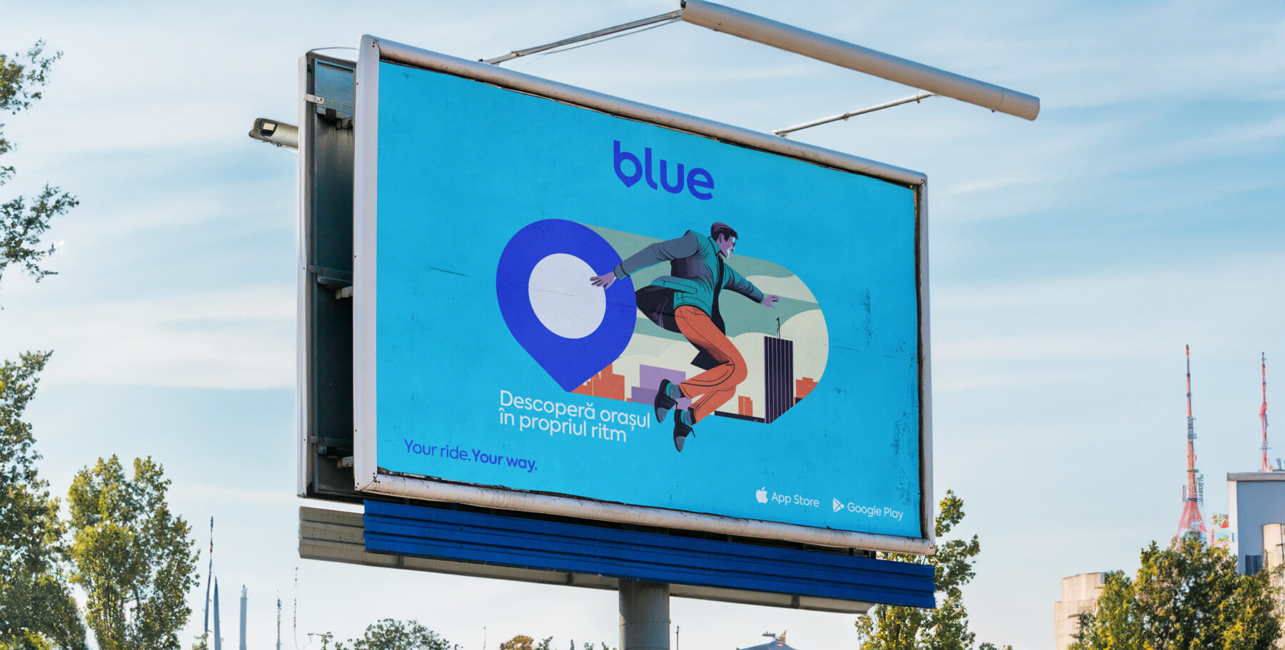
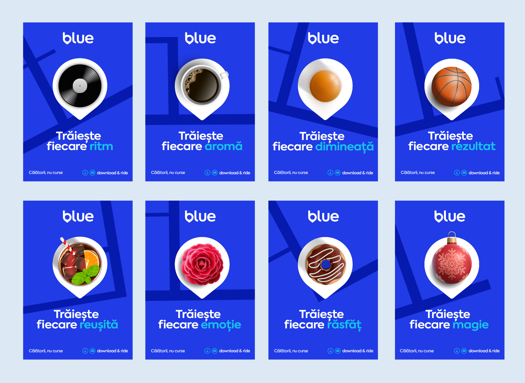
OOH Campaign – “Break Free from the Ordinary”
To bring the brand to life, BroHouse created a vibrant outdoor campaign that celebrates freedom, individuality, and the rhythm of city life.
Illustrations feature confident, young professionals exploring the city with ease — embodying the spirit of movement and modern optimism. The key message, “Discover the city in your own rhythm,” invites people to see Bucharest as a playground for personal exploration.
This campaign captures the emotional heartbeat of Blue: freedom with style, technology with soul.
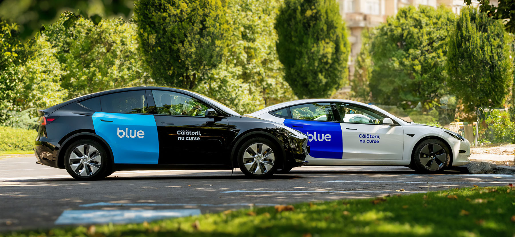
A Bold Visual Gesture – The Blue Sticker
Innovation often lies in the smallest details. BroHouse redefined the ride-hailing category with a simple yet powerful move: the Blue sticker, placed on the back left side door window.
Unlike conventional branding on front doors, this unexpected placement creates instant visual distinction and unmissable street visibility. The Blue sticker becomes a moving signature across Bucharest – a proof of the brand’s fearless approach to standing out.
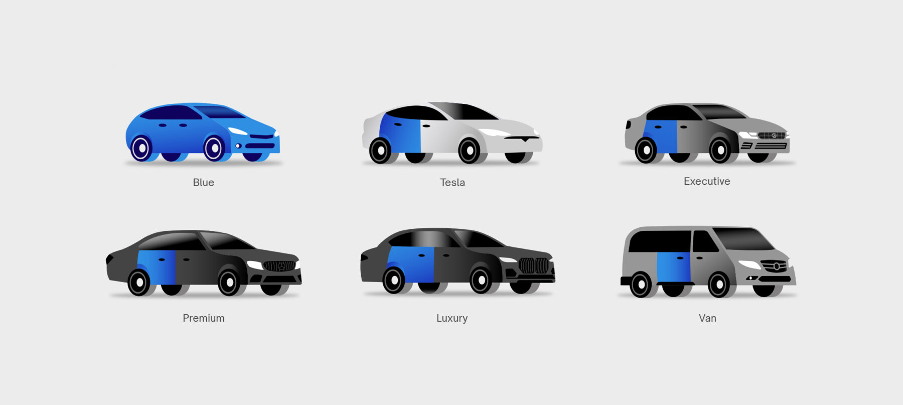
Category Icons – Visual Harmony in Motion
BroHouse collaborated closely with the Blue team to design a set of vehicle category icons that align perfectly with the brand’s system. Each icon reflects functionality and clarity, built with the same precision and restraint as the master identity. The result: a cohesive, elegant icon set that reinforces the Blue experience at every interaction.

CREDIT
- Agency/Creative: BroHouse
- Article Title: BroHouse Transforms Blue into a Ride-Hailing Brand with Purpose
- Organisation/Entity: Agency
- Project Type: Service
- Project Status: Published
- Agency/Creative Country: Romania
- Agency/Creative City: Bucharest
- Market Region: Europe
- Project Deliverables: App Design, Brand Design, Branding, Drawing, Logo Design
- Industry: Transport
- Keywords: ride-hailing, transport, ride app, urban mobility
-
Credits:
Creative Director: Costin Oane


