


BroHouse stepped into the Turabo project knowing it wasn’t just another “design a pretty box and call it a day” assignment. Turabo had been off the market for several years, and bringing it back meant rebuilding trust, redefining the brand architecture, and shaping a packaging portfolio strong enough to guide the brand into future product categories. You know… all the fun, complicated stuff that keeps designers awake while you sip coffee pretending it’s your personality.
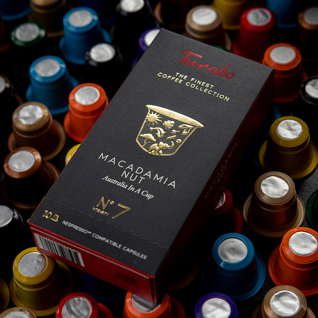
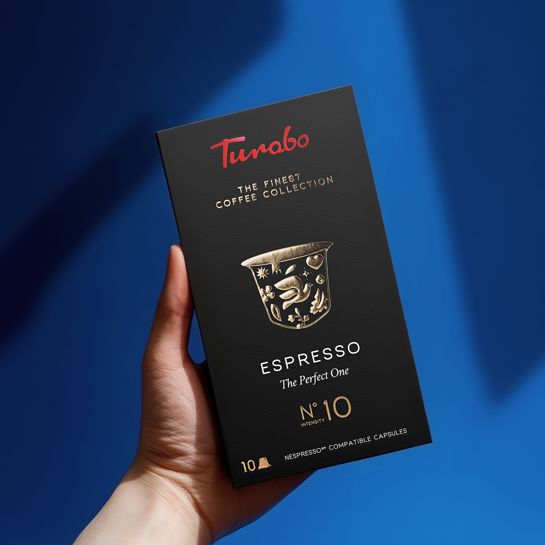
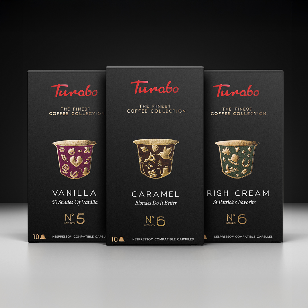
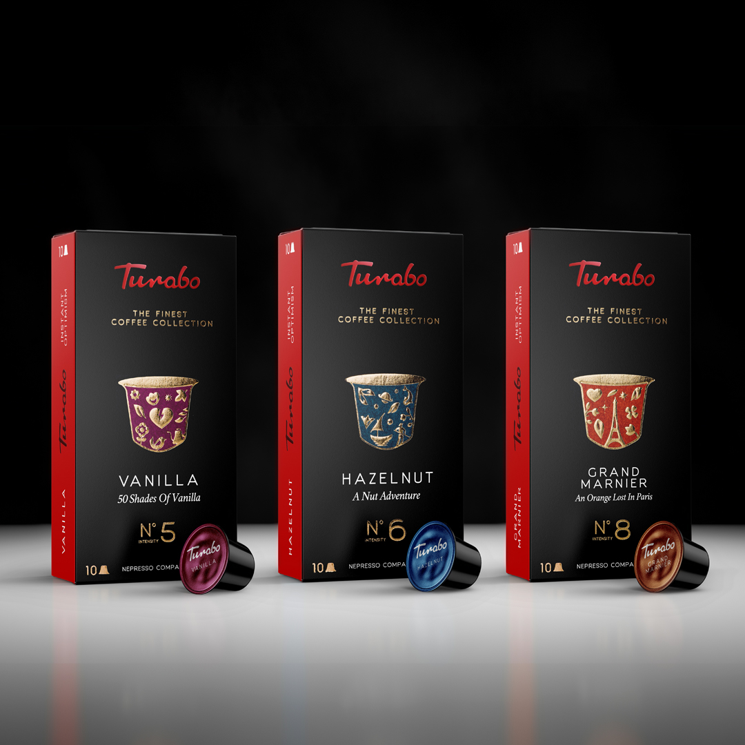
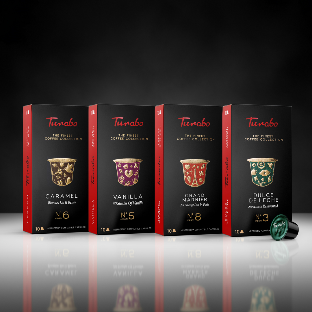
The challenge was to reconnect Turabo with consumers while modernizing every touchpoint. The new packaging system is rooted in the brand’s past but inspired by a more optimistic future — the kind of world Turabo imagines every time someone takes a coffee break that actually feels good. Each product in the 15-item portfolio received a visual story of its own, developed through the lens of the Explorer archetype. Instead of typical, boring coffee visuals, every SKU expresses a sense of curiosity, movement, and a bold spirit.
To keep the portfolio coherent, BroHouse built a flexible master design system that gives each product its own chromatic identity while preserving brand unity. The iconic red-black-white palette remains at the core:
– Red signals recognition and energy – Turabo’s most iconic brand asset.
– Black grounds the brand in confidence and premium positioning.
– White adds clarity, balance, and a modern touch to every composition.
The result is a packaging experience that stands out on shelves and feels unmistakably Turabo: modern, friendly, expressive, and intentionally different from traditional, muted coffee packaging. The whole system is crafted to grow with the brand as new blends, formats, and experiences join the portfolio.
For Turabo’s founder, the brand has always been about people, connection, and inspiring others to pursue their own passions – coffee just happens to be the medium. BroHouse transformed that philosophy into a packaging story consumers can actually see, feel, and recognize instantly.

CREDIT
- Agency/Creative: BroHouse
- Article Title: BroHouse Reimagines Turabo Coffee Through Storytelling Driven Packaging
- Organisation/Entity: Agency
- Project Type: Packaging
- Project Status: Published
- Agency/Creative Country: Romania
- Agency/Creative City: Bucharest
- Market Region: Europe
- Project Deliverables: Brand Architecture, Brand Redesign, Branding, Illustration, Logo Design, Packaging Design
- Format: Box
- Industry: Food/Beverage
- Keywords: coffee brand, coffee packaging, beverages
-
Credits:
Creative Director: Horia Oane


