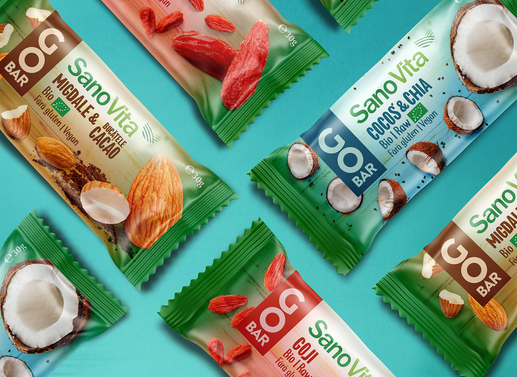
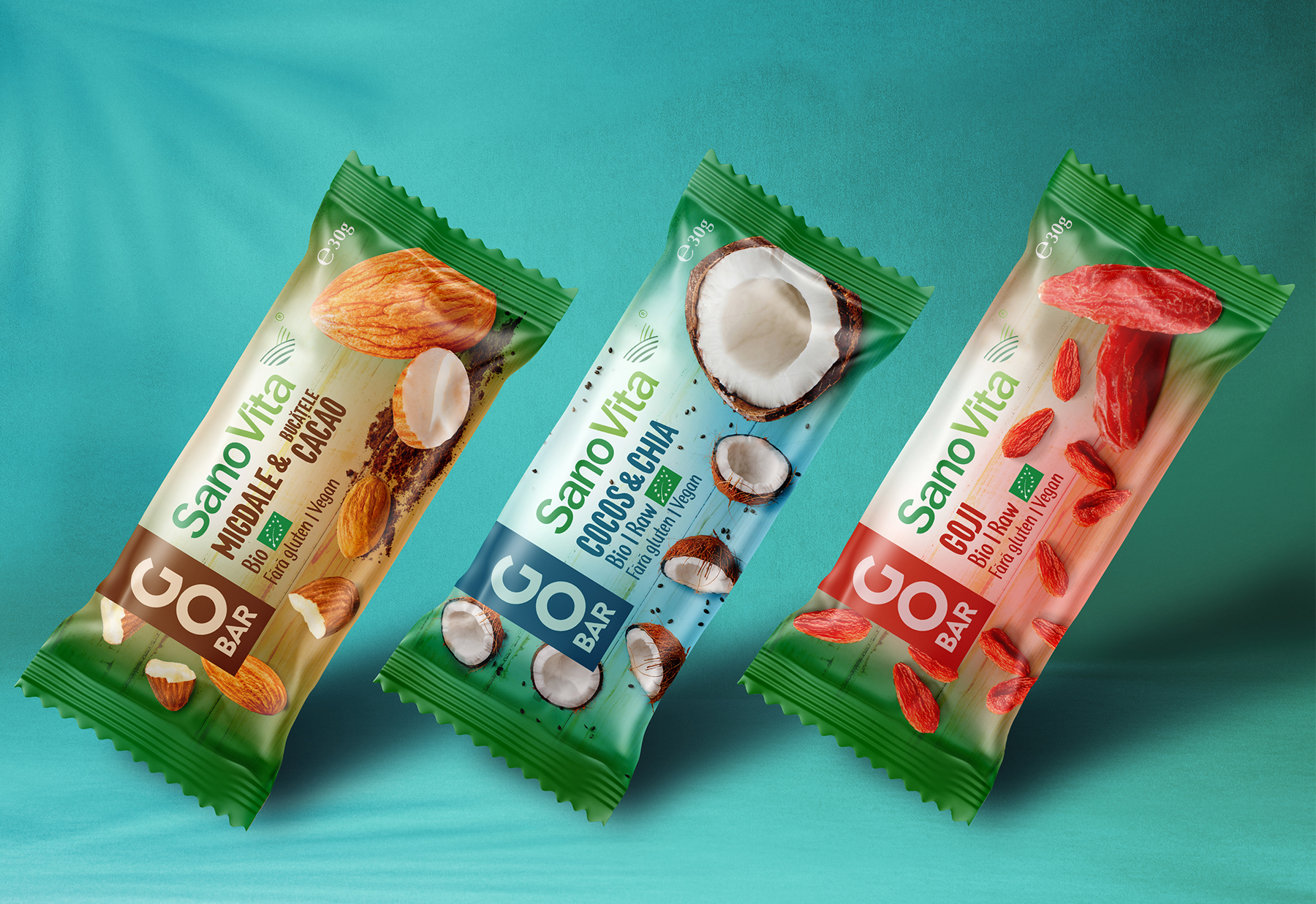
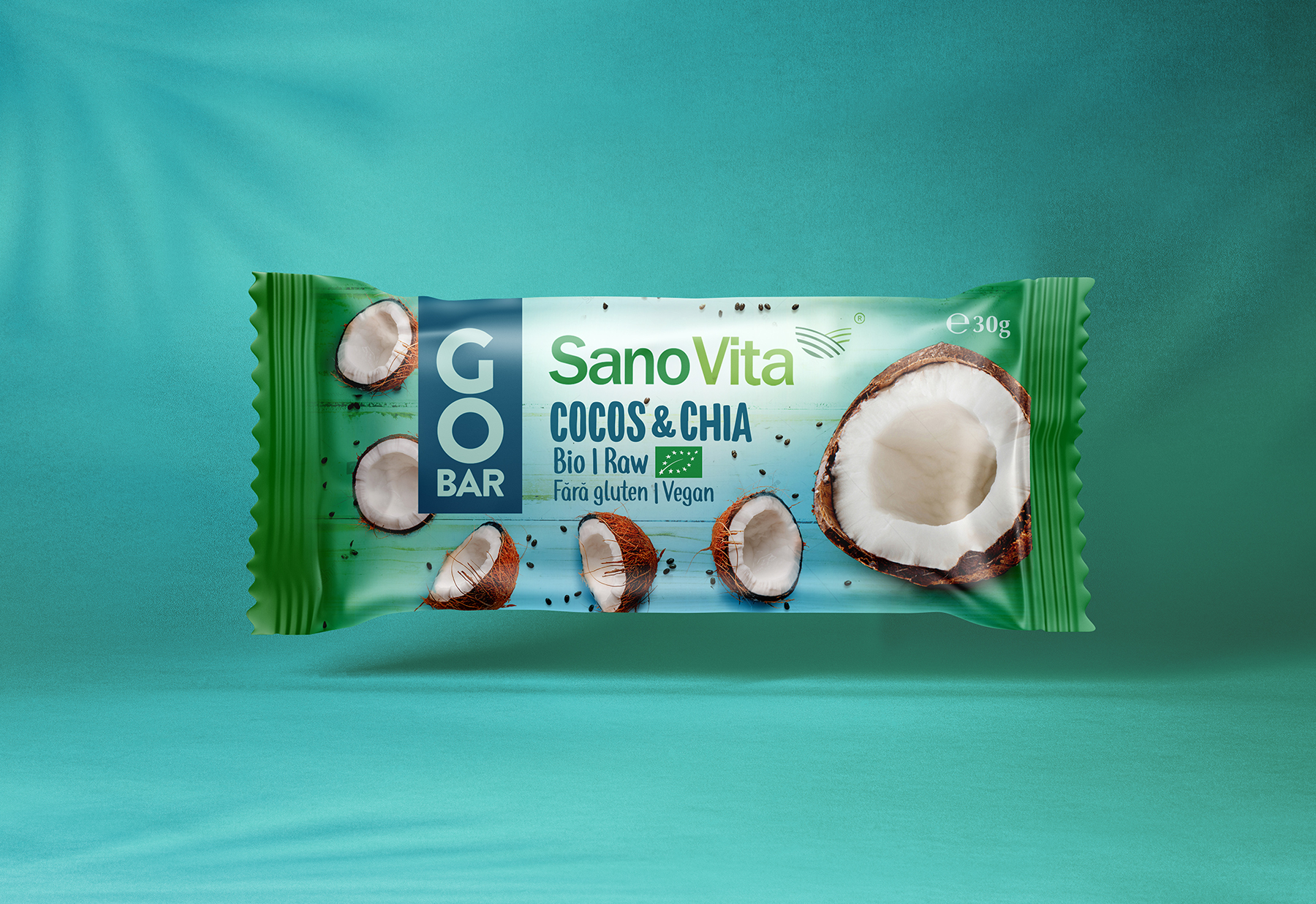
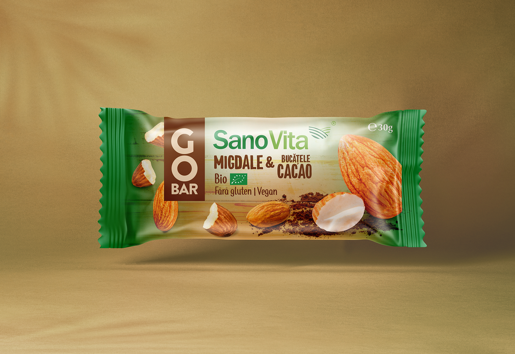
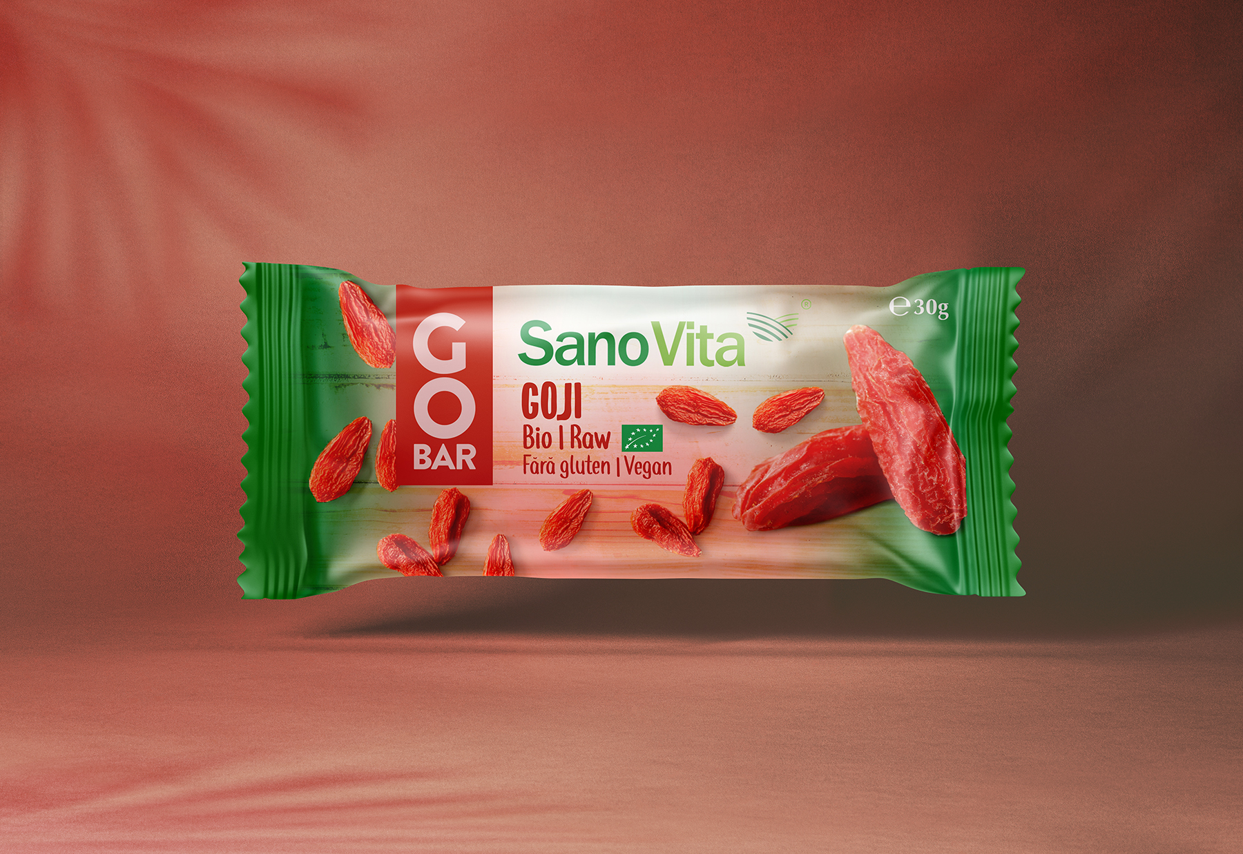
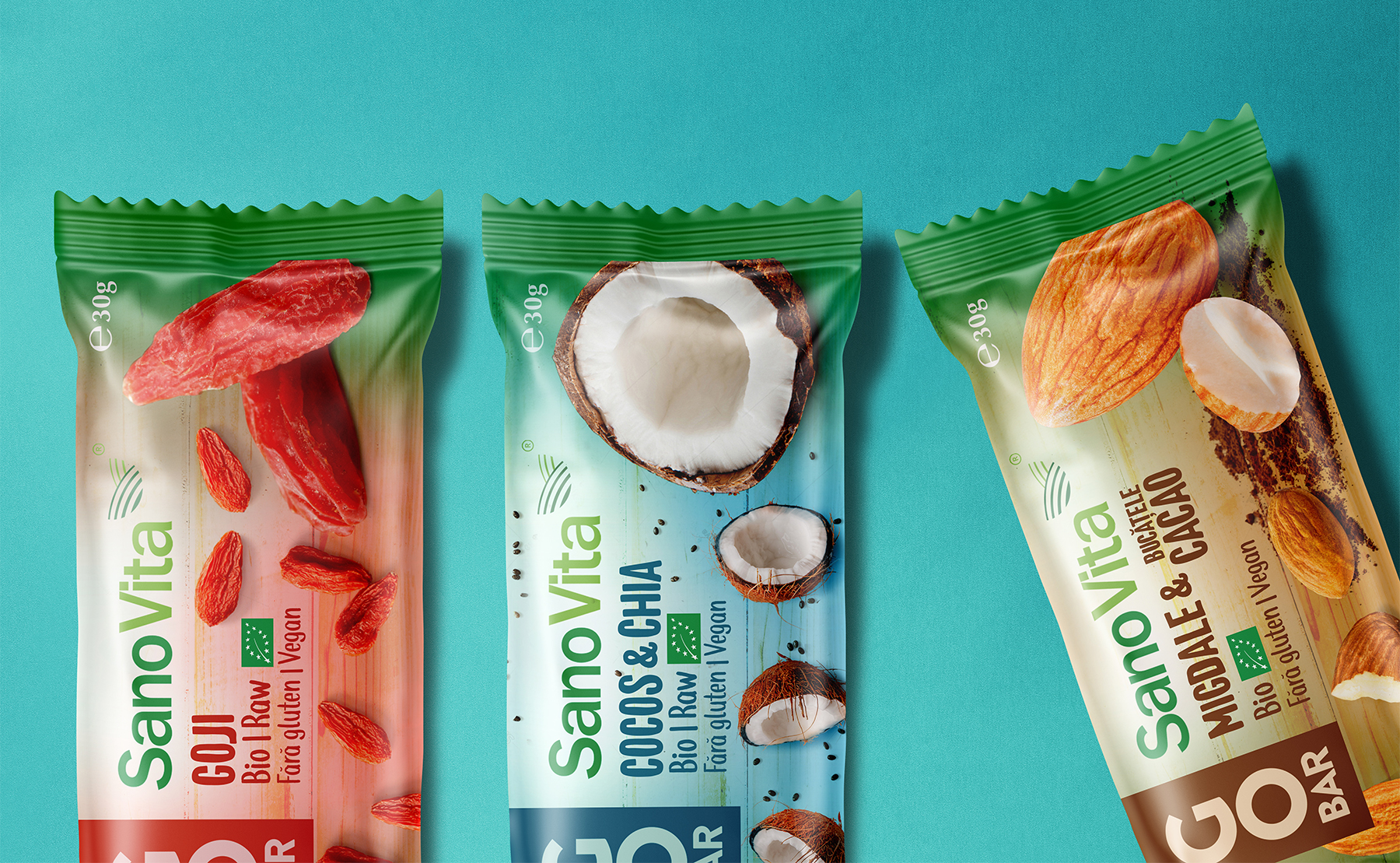
SanoVita expands its portfolio of “Go Bar” with a new category with functional benefits – organic, raw bars. SanoVita wants to build a relevant position in this segment by expanding its portfolio with the “Raw / Organic” range under the Go Bar umbrella through a portfolio of 3 bars: Coconut & Chia, Almonds & Cocoa Ribs, and Goji.
From the beginning, we planned to be honest with what the packaging design says: a quality product with nothing added. To convey this one can resort to transparency (revealing product) or a realistic photo. Simple, gestural typefaces, “sketchy”, to gave a crafted look, personalised care.
In order to solve this packaging solution, it was necessary to create a concept that was generous enough to support the entire GoBar product portfolio. Although each product has received its chromatic and meaningful identity, and all products are part of the same conceptual approach, bringing together all visual solutions under a single unitary concept.
The solution created is providing information on the nature and qualities of GoBar products, continue to support the values of the manufacturer Sanovita. The visual language of each solution transmits a unitary emotional appeal that allows the consumer to feel the benefits and diversity of the GoBar – SanoVita bars.
CREDIT
- Agency/Creative: BroHouse
- Article Title: BroHouse Creates New Packaging Designs for a Tasty and Healthy Bars
- Organisation/Entity: Agency, Published Commercial Design
- Project Type: Packaging
- Agency/Creative Country: Romania
- Market Region: Europe
- Project Deliverables: Brand Strategy, Branding, Packaging Design, Product Architecture, Research
- Format: Flow-Pack
- Substrate: Plastic


