


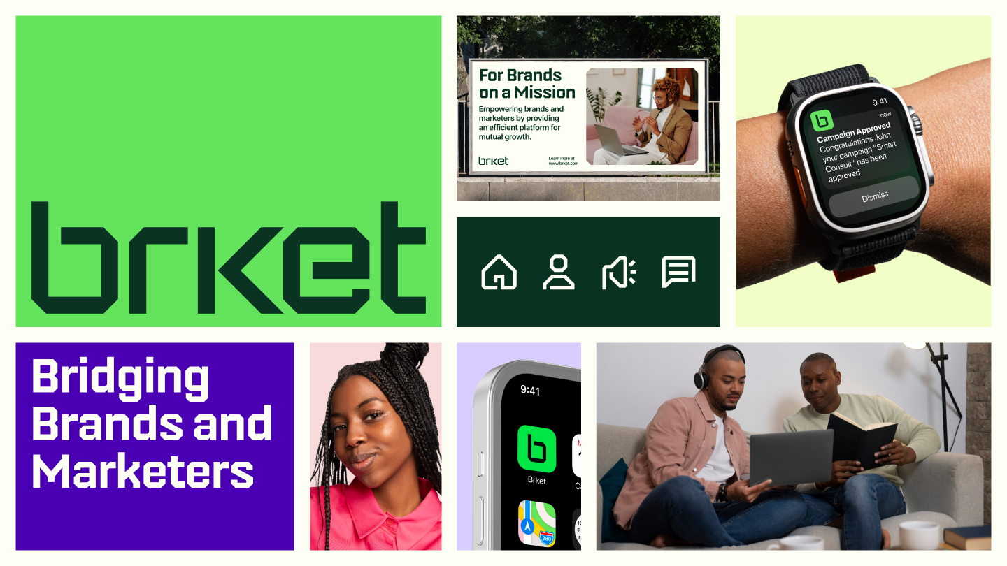
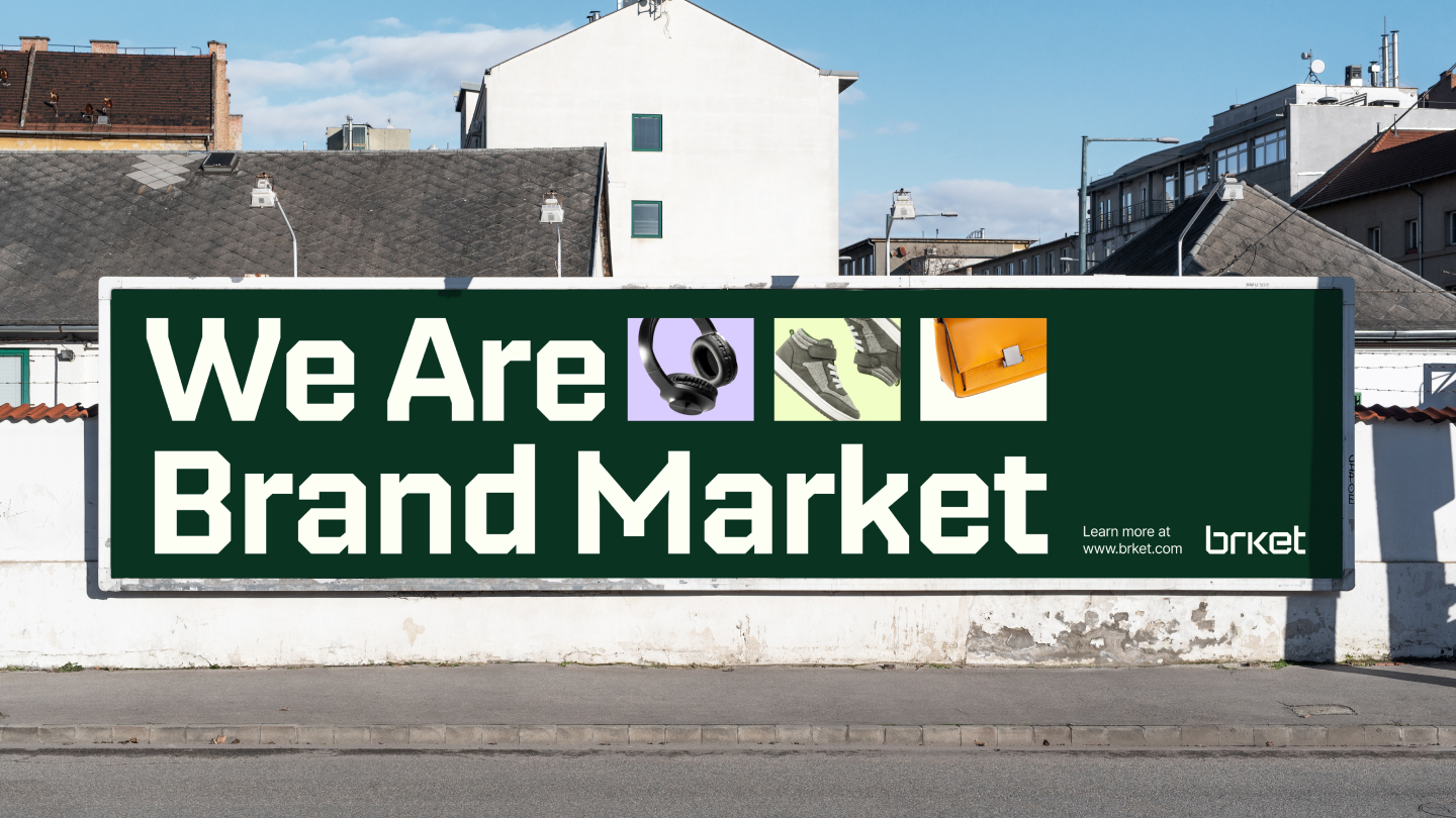
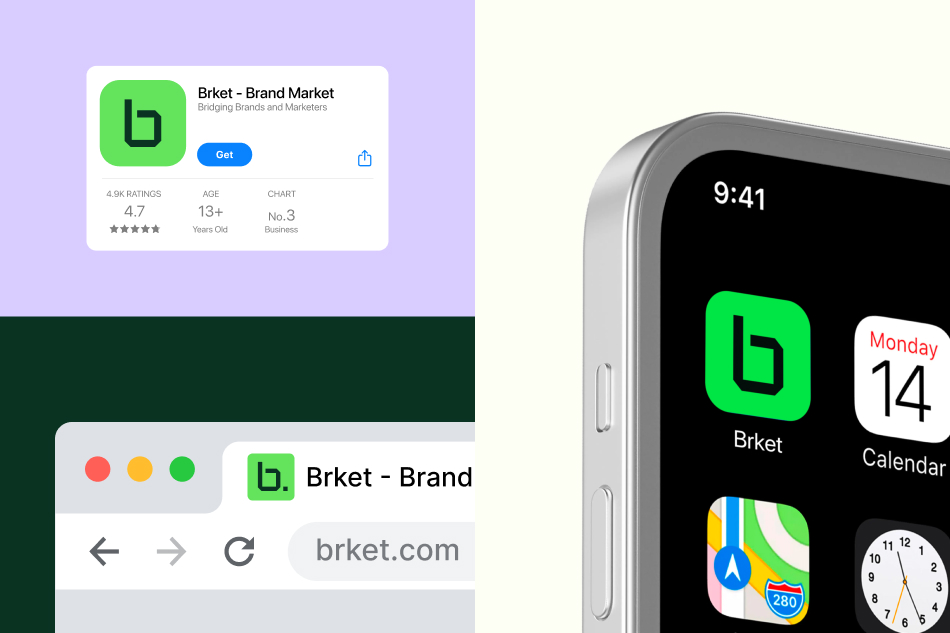
Brket, short for Brand Market, is an innovative platform that bridges the gap between brands and marketers, creating a seamless collaboration experience. The platform allows brands to list their products, which marketers can then choose to promote, earning commissions based on mutually agreed terms.
When developing the brand identity, the primary goal was to create something that’s not just visually appealing but also straightforward and intuitive. The design needed to communicate simplicity and clarity, ensuring that users could easily navigate and understand the platform’s offerings. We also focused on conveying a sense of affordability and value, reassuring potential clients that using the platform is a smart investment that delivers significant returns.
Given that Brket operates in the digital space, it was essential to craft an identity that felt modern and tech-savvy, reflecting the nature of a cutting-edge online marketplace. At the same time, the brand needed to maintain versatility and recognizability, ensuring it could be effectively applied across various formats and sizes without losing its impact.
The design process began with an in-depth analysis of the platform’s core values and its target audience. What makes Brket unique is its mission to connect brands and marketers in a way that is both efficient and effective. This understanding was crucial in shaping every aspect of the visual identity.
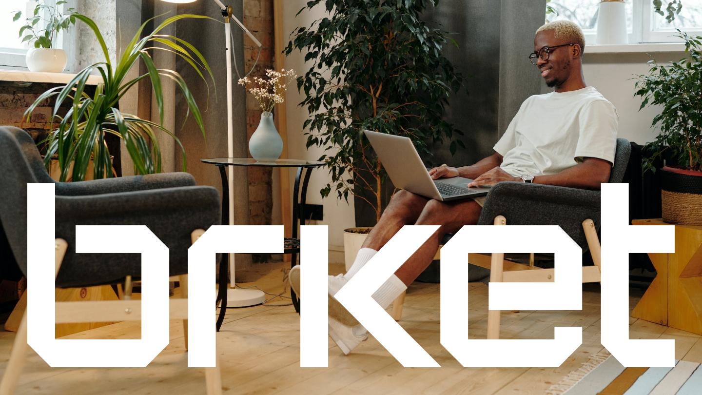
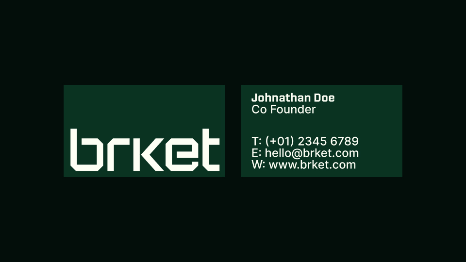
For the logo, we opted for a sharp, geometric style that instantly communicates a modern, tech-oriented feel. The angular lines and clean design give the logo a sleek, contemporary look, while ensuring it remains versatile and easily recognizable in different contexts. The simplicity of the logo was a deliberate choice, aimed at maintaining clarity and effectiveness, especially when used across digital platforms.
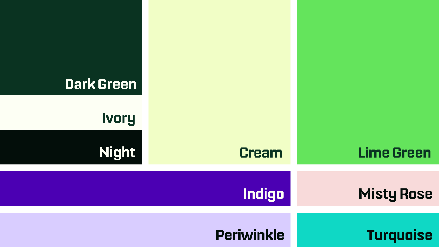
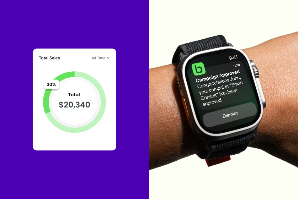
The color palette was another key element in conveying the brand’s message. We chose a set of primary colors including Ivory, Dark Green, Lime Green, Cream, and Night. These colors were selected to evoke a sense of professionalism and trust, with the natural tones providing a grounded, approachable feel. The contrast between the dark green and ivory, adds a touch of sophistication, creating a visually appealing balance.
In addition to the primary colors, we introduced secondary colors to inject vibrancy and energy into the brand. These colors are used strategically to accentuate elements in marketing materials, adding a dynamic edge that makes the brand feel lively and engaging.
Typography was also a critical component in defining the brand’s voice. For headlines and titles, we selected Nippo, a font that combines modernity with a slightly techy feel. Its bold, clear form ensures that headlines stand out, making a strong impression and capturing attention. This choice aligns perfectly with the overall brand identity, reinforcing the platform’s contemporary and professional image.
For body text, we chose Inter Regular, a font known for its high readability and versatility. Its clean and neutral design ensures that longer passages of text are easy to read, maintaining a sense of professionalism and clarity throughout. This consistency in typography helps to create a cohesive brand experience, whether users are interacting with the platform online or through printed materials.

CREDIT
- Agency/Creative: Abdulsamad Umar
- Article Title: Brket Digital Marketplace Brand Identity
- Organisation/Entity: Freelance
- Project Type: Identity
- Project Status: Published
- Agency/Creative Country: Nigeria
- Agency/Creative City: Abuja
- Market Region: Africa
- Project Deliverables: Brand Naming, Icon Design, Logo Design, Motion Graphics
- Industry: Financial
- Keywords: Logo, Branding, Brand Identity, Iconography
-
Credits:
Brand Identity Designer: Abdulsamad Umar
Art Director: Abdulsamad Umar
Art Director: Haleemah Muhammed
Icon Designer: Linda Ojo
Motion Designer: Osunleke Samuel


