


Britvic, the leading British soft drink producer, has unveiled a refreshed identity for its natural energy drink brand Purdey’s. Global brand-led creative agency BrandOpus is responsible for the brand strategy, tone of voice, visual identity, and pack refresh. Hitting UK shelves in May, the revamp of the cult classic aims to grow Purdey’s to a mainstream brand by broadening its appeal to a wider audience looking for functional drinks.
The original vitality drink first made its mark in the late 1980s and quickly became the rejuvenating tonic of choice for consumers. Having gained a loyal following over the past three decades, Britvic were on a mission to grow the brand even further with a new identity that better reflected its role as a natural energy drink – moving away from the dominant codes in the category of caffeine-fuelled beverages.
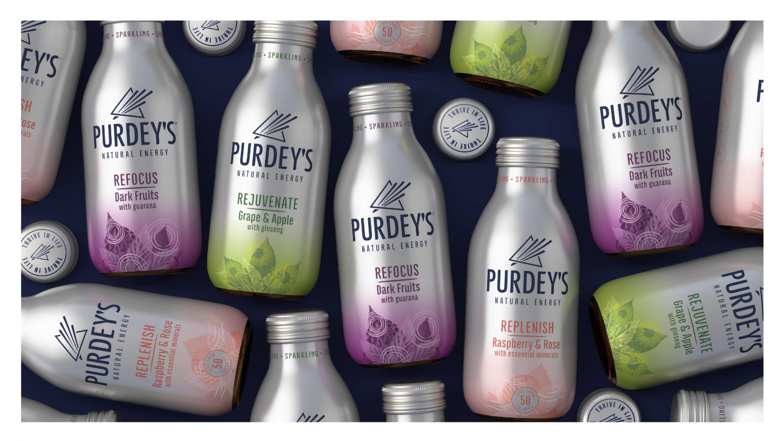
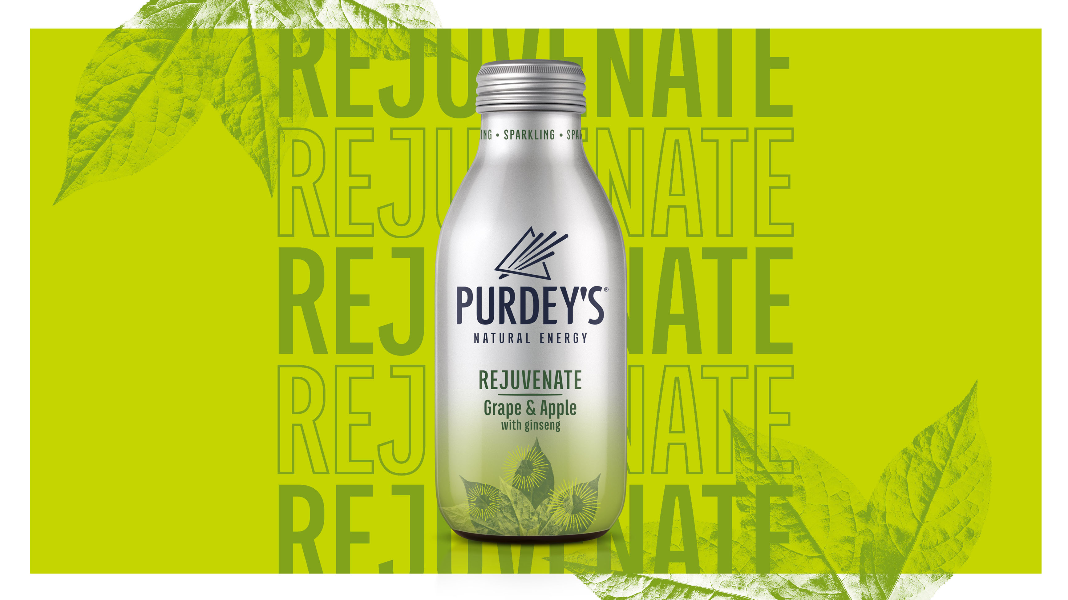
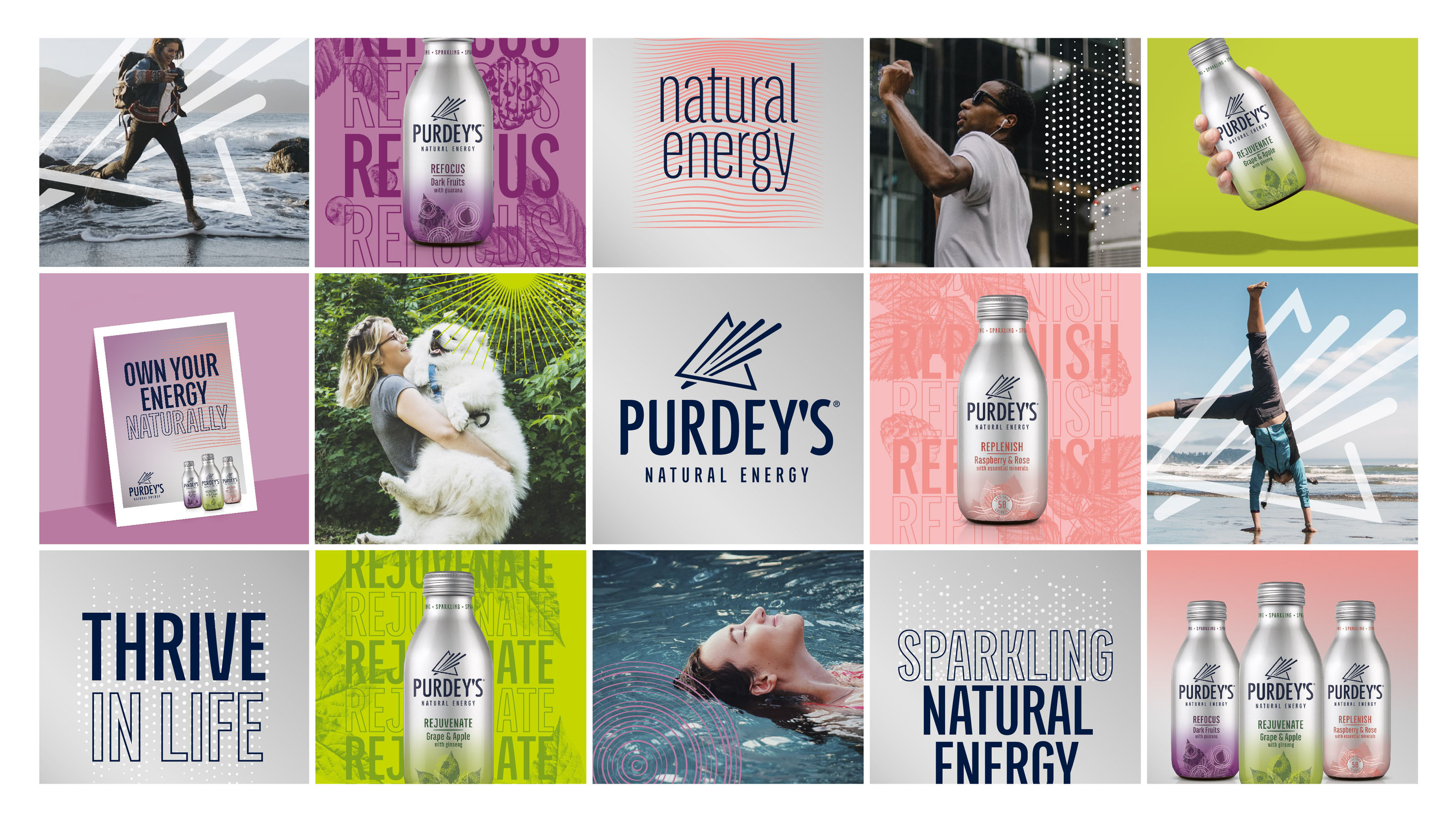
Tasked with this challenge, BrandOpus conducted a semiotic study of Purdey’s, uncovering that there was an opportunity to better decode the brand’s naturalness and help consumers intuitively understand the product’s benefits and flavours. To thrive in the natural energy space, Purdey’s needed to elevate its existing packaging, imbuing its recognisably metallic look and feel with more natural cues. Drawing inspiration from the drink’s feel-good energy and fresh fruity flavour, the new, naturally upbeat identity is more distinctive and accessible.
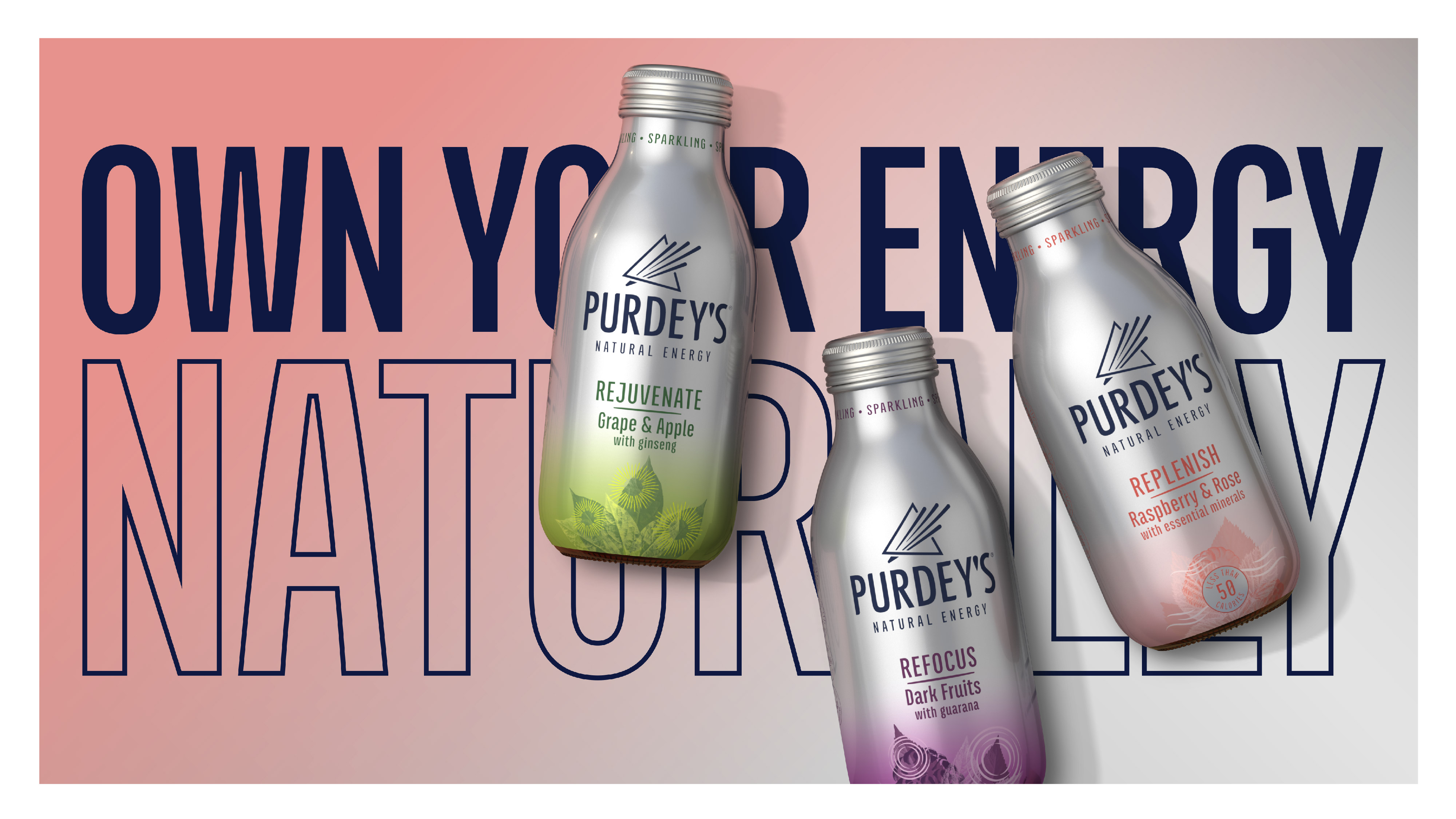
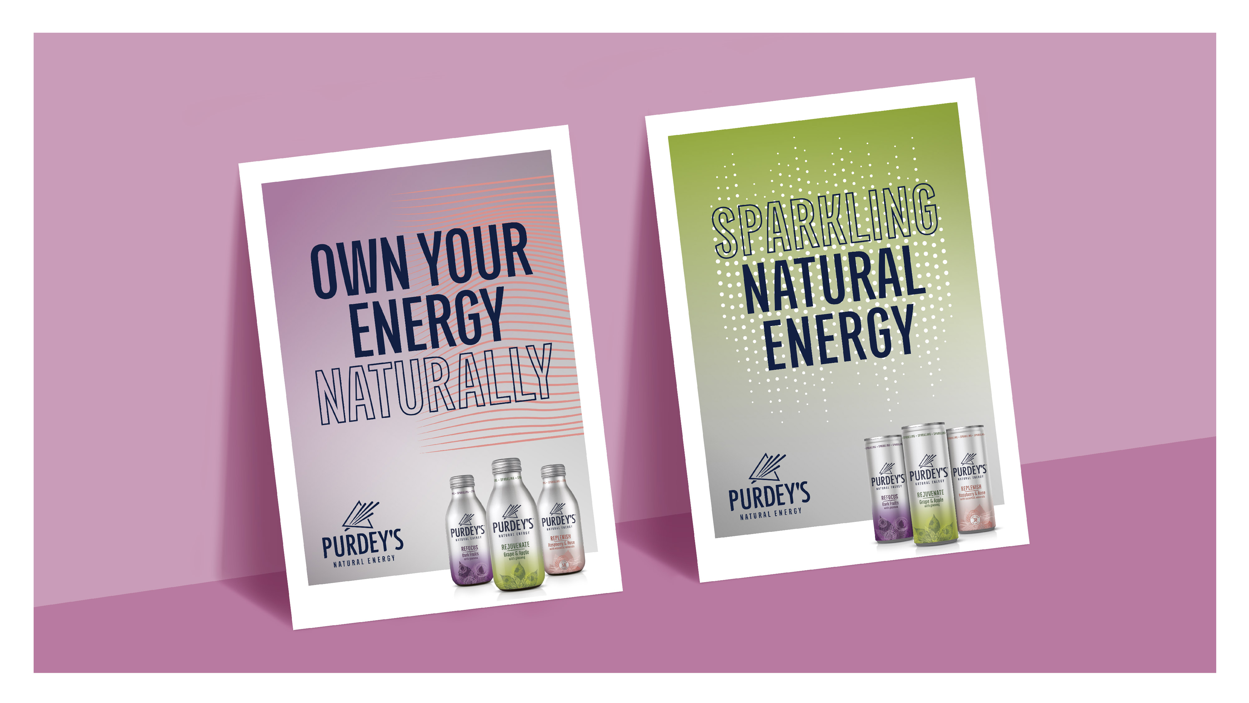
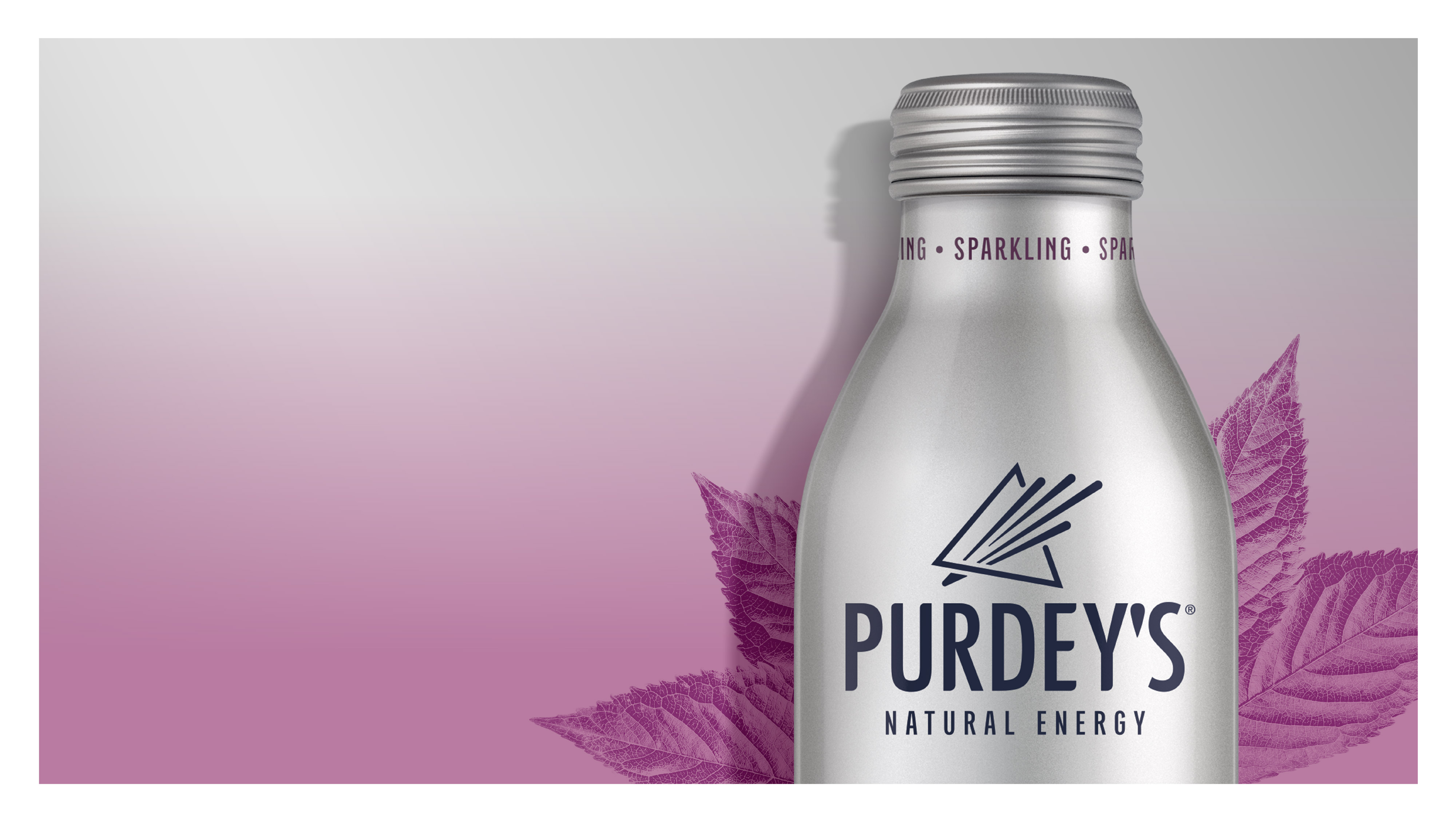
Key design details of the refresh include the introduction of a ‘Prism’ symbol to the word mark, capturing the brand’s unique take on natural multi-dimensional energy within, whilst reflecting the idea of transformation. A sleek yet confident typeface, giving the overall look and feel a softer and brighter aesthetic that alludes to the freshness and naturalness of the drink.
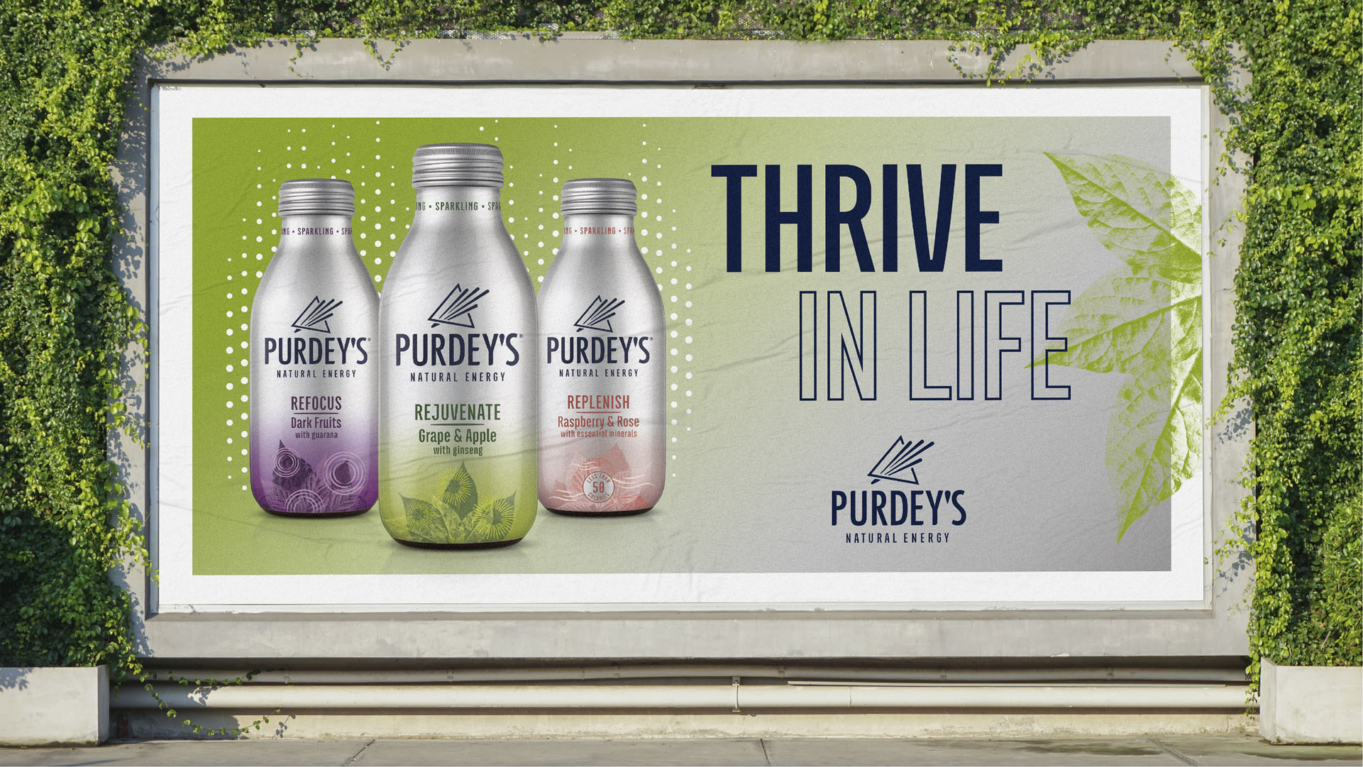
The retention of the brand’s distinctive and premium core colour palette: the silver canvas has been overlaid with pops of colour to inject a sense of liveliness, whilst a gradient style brings a ‘gentle lift’ of energy. The addition of bold, abstract illustrations into the brand world to cue the delicious fruitful flavours and emotional benefits of each variant – ‘Rejuvenate’, ‘Refocus’, ‘Replenish’ – and create an ownable and dynamic treatment.
John Ramskill, executive creative director, BrandOpus, comments: “Because Purdey’s taps into energy at a holistic level, we wanted to craft a visual expression that truly captured the brand’s unique take on natural vitality. The recharged identity heightens Purdey’s positioning by bringing relevance and meaning at a brand level. By introducing the ‘Prism’ symbol within the logo, we set out to tell the story of Purdey’s transformation that happens within. It’s a powerful tool in the brand’s armoury, helping to drive differentiation, memorability and meaning quickly and non-cognitively.”
David Laidler, growth space marketing controller, Britvic comments “With more and more consumers looking for an energising lift that they can feel good about, it was time for us to take a step back and re-evaluate how Purdey’s was manifesting itself in the world. It was crucial the new design stayed true to our roots – preserving what makes us so special – yet paving a way for Purdey’s to attract new consumers through demonstrating our great taste, unique flavour, and more natural ingredients. We’re thrilled with the outcome and are excited for the new design to hit the shelf and make its mark.”
CREDIT
- Agency/Creative: BrandOpus
- Article Title: Britvic Teams up with BrandOpus to Serve a Reinvigorated Identity for Purdey’s
- Organisation/Entity: Agency
- Project Type: Identity
- Project Status: Published
- Agency/Creative Country: United Kingdom
- Agency/Creative City: London
- Market Region: Europe
- Project Deliverables: Brand Design, Brand Identity, Brand Redesign, Brand Strategy, Brand World, Design, Illustration, Packaging Design, Rebranding, Typography
- Industry: Food/Beverage
- Keywords: Natural energy drink, soft drink, brand identity, packaging design, brand evolution, symbols, typography, colour palette
-
Credits:
Creative Director: John Ramskill
Designer: Charlotte Allibon


