


New School Vạn Phúc Integrated Education System | Visual Identity Design
Learn to become – Learn to integrate – Learn to thrive.
Project Overview
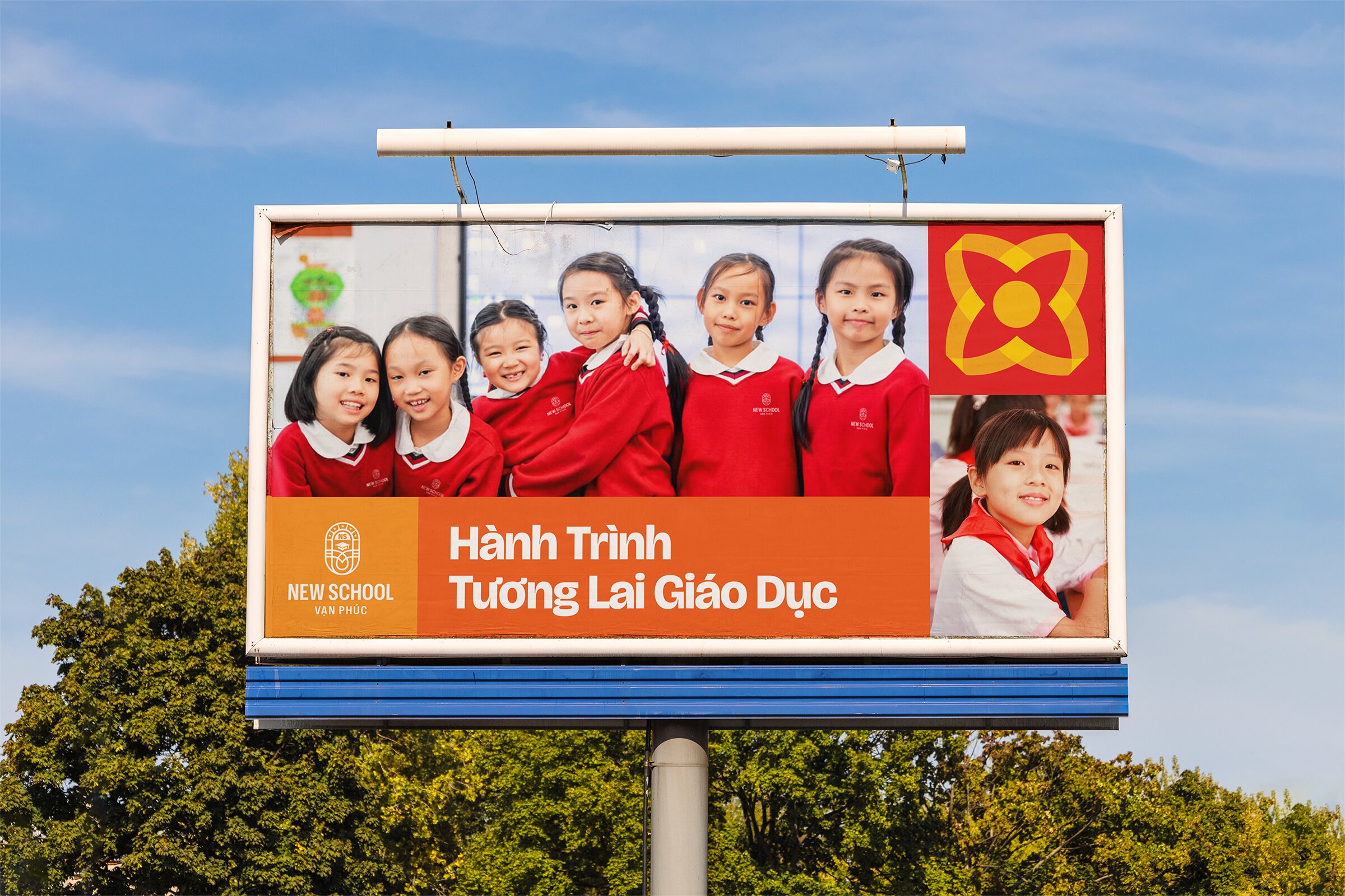
Established in 2025, New School Van Phuc was founded with the ambition to cultivate well-rounded individuals through a modern K-12 education model, featuring a continuous curriculum, integrated teaching methods, and a clear long-term development vision.
With a student-centered approach, the school aims to build a safe, respectful, and inspiring learning environment where each day becomes a journey of exploration and growth.
Starting from the need to build a brand identity that is both distinctive and approachable, Brio Studio developed a visual language rooted in the spirit of human-centered education. The visual system is defined by being dynamic, approachable, connected, and respectful of individuality, accurately reflecting the learning environment that the school aspires to create. Instead of relying on abstract symbolism, our design idea emphasizes clarity & emotional accessibility, enabling users, especially students, to easily engage with and remember the brand.
Brand Concept
Nurturing Growth Through Every Voice
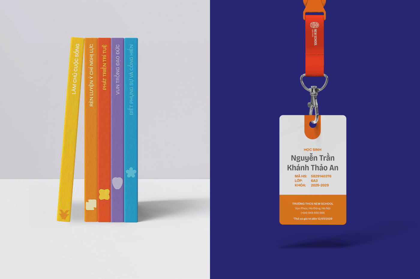
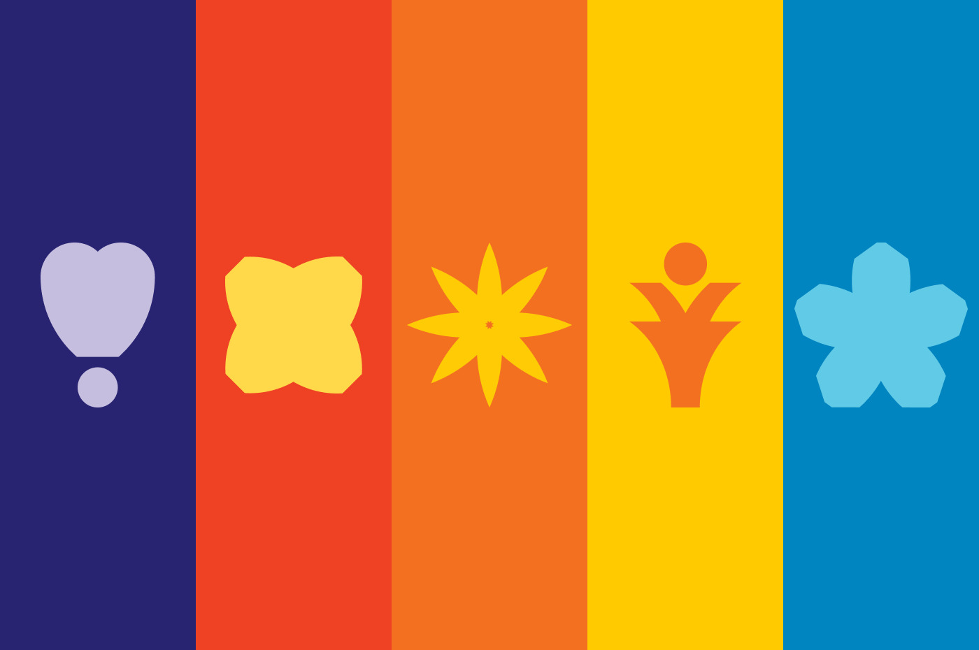
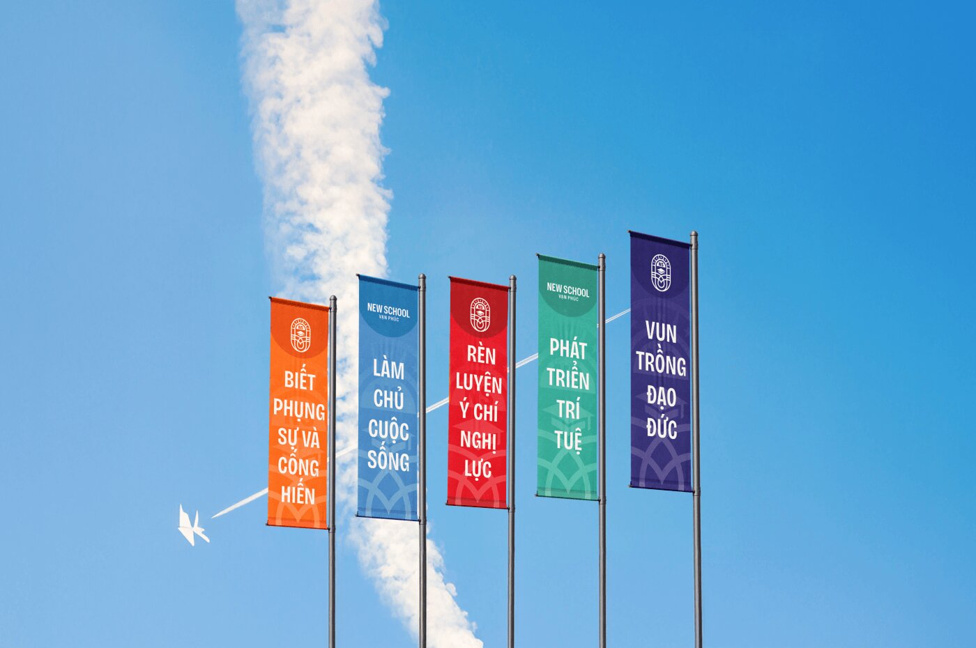
To visualize the school’s 5 core values, the identity system is built around 5 graphic motifs. Each motif represents a distinct value through its own geometric form and color. These motifs can function independently or be combined within a unified system, allowing the identity to remain consistent while being highly adaptable across various touchpoints.
By transforming abstract values into tangible visual elements, the system also helps students intuitively associate and remember these values in their daily learning experience.
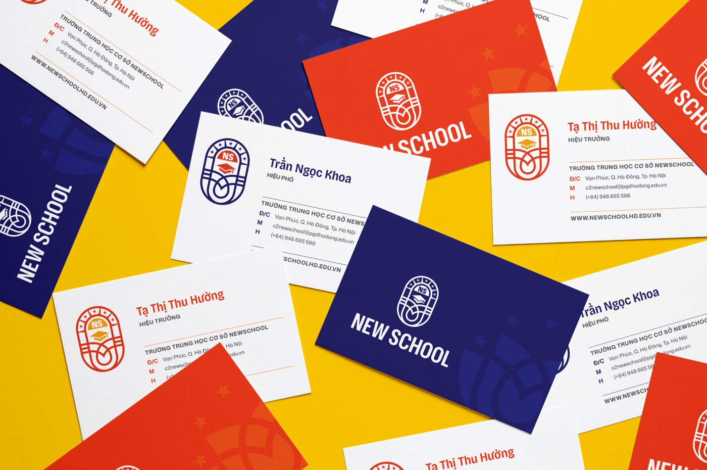
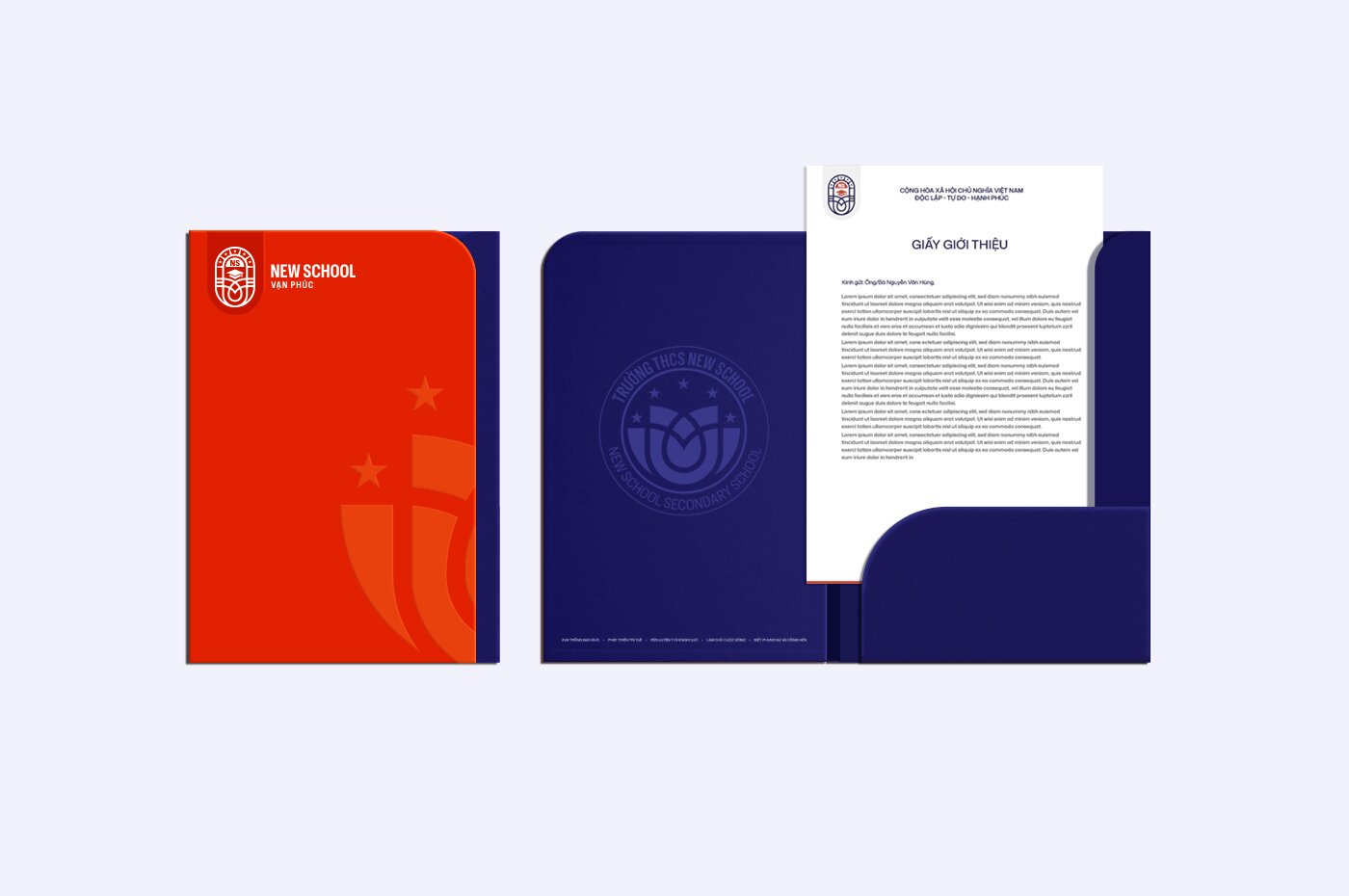
Color Palette
The brand color system is developed based on the balance between knowledge and human values, with two primary colors: Deep Indigo and Red-Orange. Deep Indigo represents knowledge, discipline, and lifelong learning, creating a sense of trust, stability, and intellectual aspiration. In contrast, Red-Orange reflects ethics and core human values such as gratitude, honesty, and collaboration. These primary colors are mainly applied in formal and administrative materials to ensure a sense of professionalism and consistency.
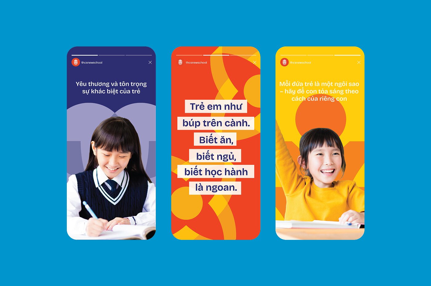
Supporting colors, including Yellow, Green, and Blue, are used flexibly across spatial design & communication materials to enhance vibrancy, evoke positive emotions, and encourage creativity within the learning environment.
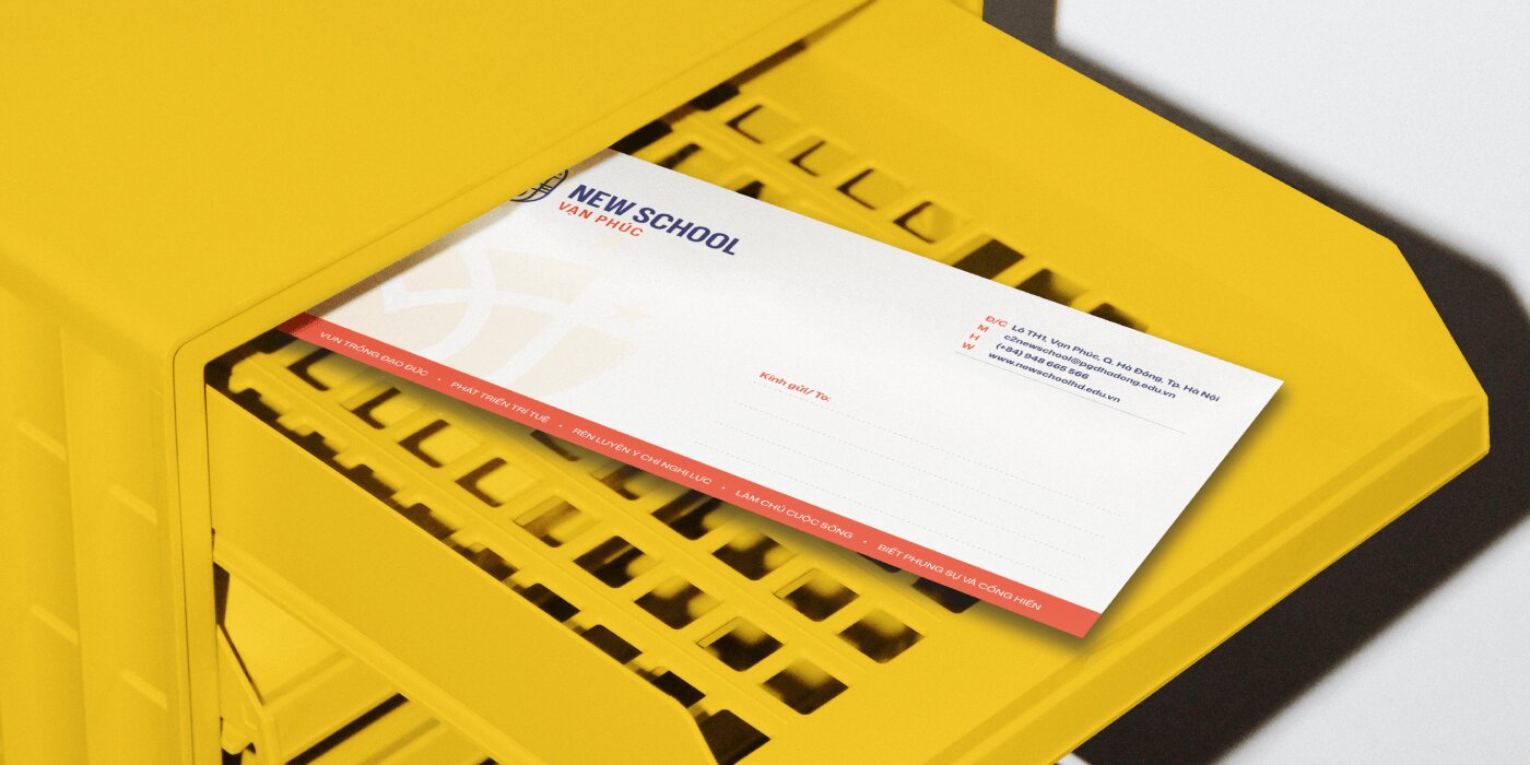
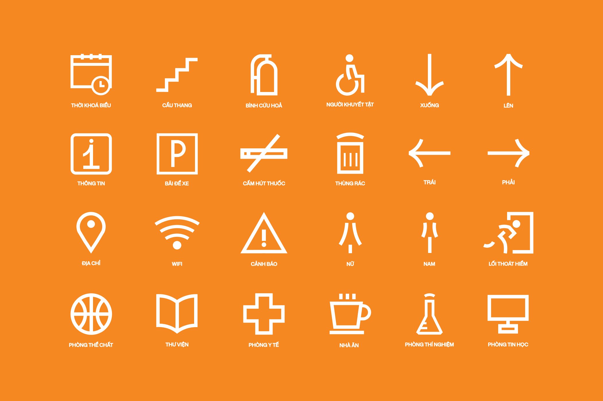
Application
The identity system is designed to be applied consistently across office materials, spatial environments, and digital platforms, ensuring a cohesive brand experience.
Beyond aesthetics, the system functions as a visual educational tool. It reinforces the school’s core values in students’ daily experiences while fostering a stronger emotional connection between students and their learning environment. Through this approach, New School Van Phuc is positioned not just as a school, but as a space where students can grow, connect, and shape their identities.

CREDIT
- Agency/Creative: Brio Creative LTD
- Article Title: Brio Creative LTD Develops New School Van Phuc Integrated Education System With a Human Centered Visual Identity
- Organisation/Entity: Agency
- Project Type: Identity
- Project Status: Published
- Agency/Creative Country: Vietnam
- Agency/Creative City: Hanoi
- Market Region: Asia
- Project Deliverables: Brand Experience, Brand Guidelines, Brand Identity, Creative Direction, Graphic Design, Icon Design, Label Design, Logo Design
- Industry: Education
- Keywords: branding, education, children, secondary school, brand identity, visual identity, school, kids, vietnamese brands, digital, creativity, WBDS Agency Design Award, Stationary design
-
Credits:
Project Manager: Huong Vu
Designer: Hai Ninh
Designer: Ha Vy
Designer: Bao Gn


