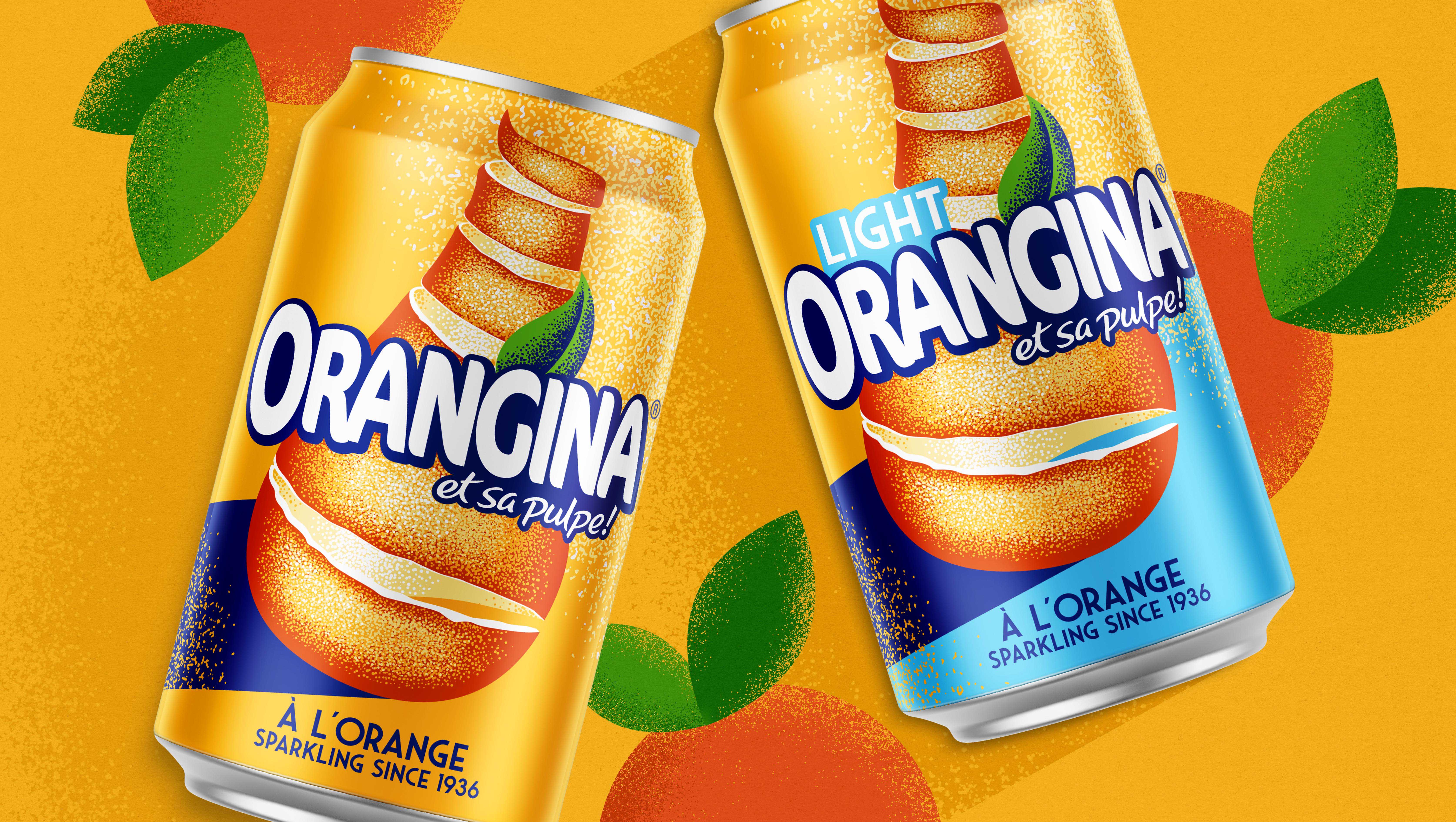
When global brand Orangina needed to rethink how their brand identity works across markets, they approached us to refresh their branding and packaging within the UK.
The new design retains the fundamentals of their global presence, but we flipped the hierarchy of the brand colours to ensure the iconic orange flavour of the drink sits at the heart of the new design, complemented by its traditional dark blue.
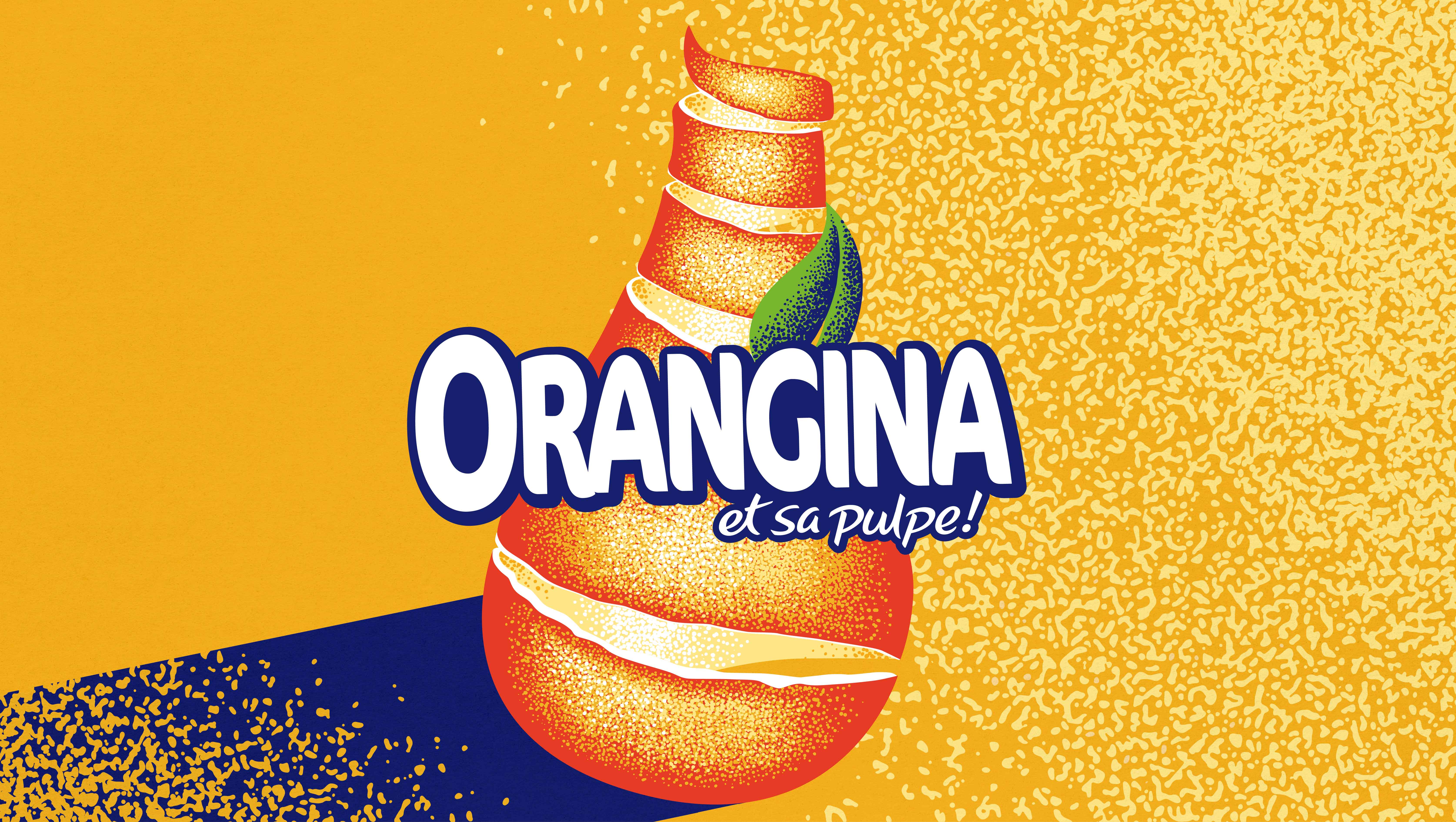
We modernised and re-illustrated the brand logo to accentuate the orange peel texture while highlighting the gentle and refreshing effervescence of the drink, dialling up its taste appeal. The new logo uses a strong shadow to evoke the sunny feelings historically associated with Orangina.
“Orangina is a hugely nostalgic brand, it brings back memories of summer holidays and sun-soaked beaches. We wanted the design to reflect the warmth of the South of France, while keeping the refreshment and taste it is known for.” Chris Cole, Designer

CREDIT
- Agency/Creative: BrandMe
- Article Title: Bringing Fresh A’Peel to Orangina
- Organisation/Entity: Agency, Published Commercial Design
- Project Type: Packaging
- Agency/Creative Country: United Kingdom
- Market Region: Europe
- Project Deliverables: Brand Architecture, Brand Identity, Brand Strategy, Branding, Graphic Design, Packaging Design, Research, Structural Design
- Format: Bottle, Can
- Substrate: Glass Bottle, Plastic


