


Product: Tender Coconut Water
Brand: B Natural
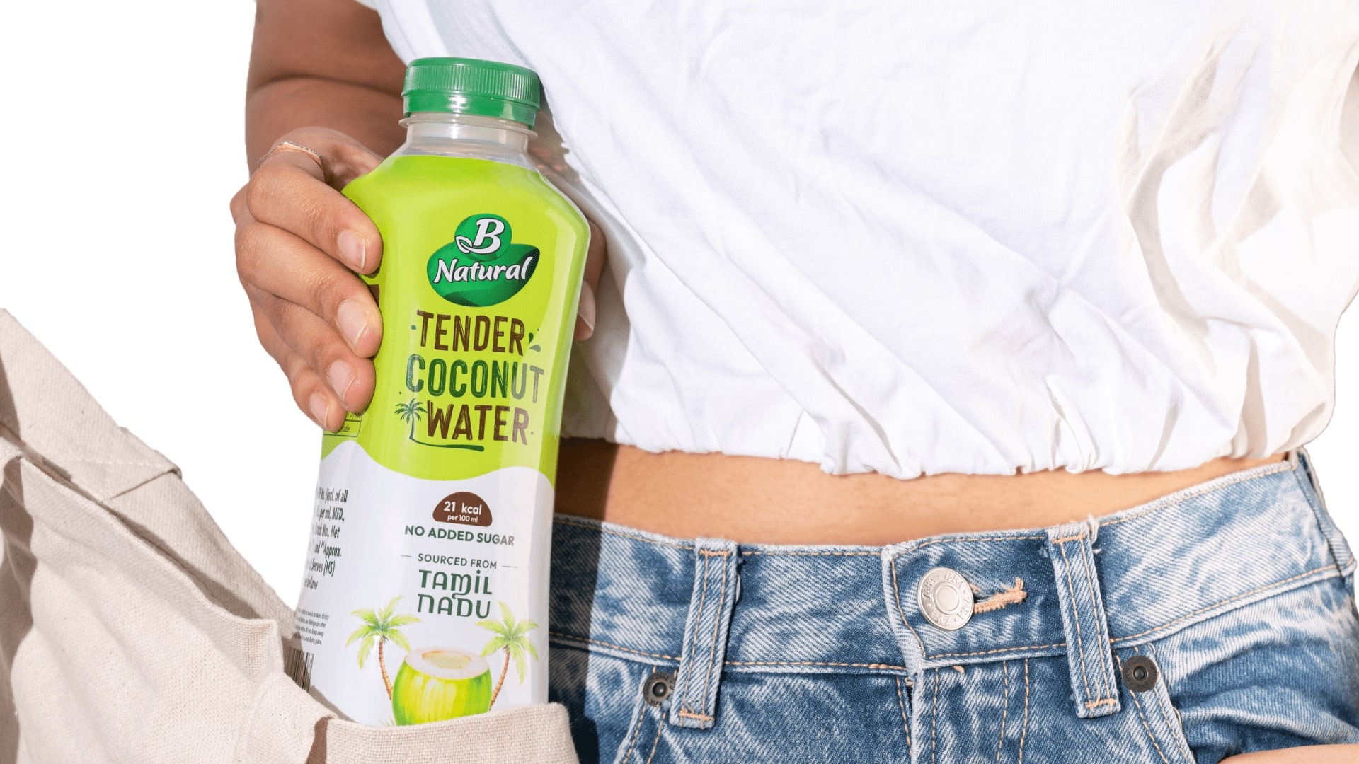
We redesigned the identity and packaging for B Natural’s ‘Tender Coconut Water’, a modern take on a classic Indian beverage that refreshes both body and soul.
About the brand:
‘B Natural’ is one of India’s legacy beverage brands, known for its range of fruit-based drinks and natural juices. However, over time, the brand’s older packaging had begun to feel dated—failing to connect with younger, design-conscious consumers. This redesign was an opportunity to bring a beloved Indian name back into relevance, especially on e-commerce platforms where visual appeal drives instant decisions.
About the product:
Tender Coconut Water is one of nature’s purest drinks—light, hydrating, and packed with electrolytes. Yet, in a market overflowing with sugary and artificial beverages, its simplicity often gets overlooked. Our goal was to create a design that would educate first-time buyers about its health benefits while reigniting trust in the brand’s natural promise.
About the design:
The vision was to build a packaging that looked as fresh and pure as the product inside—celebrating health, nature, and authenticity. We achieved this through three core design choices:
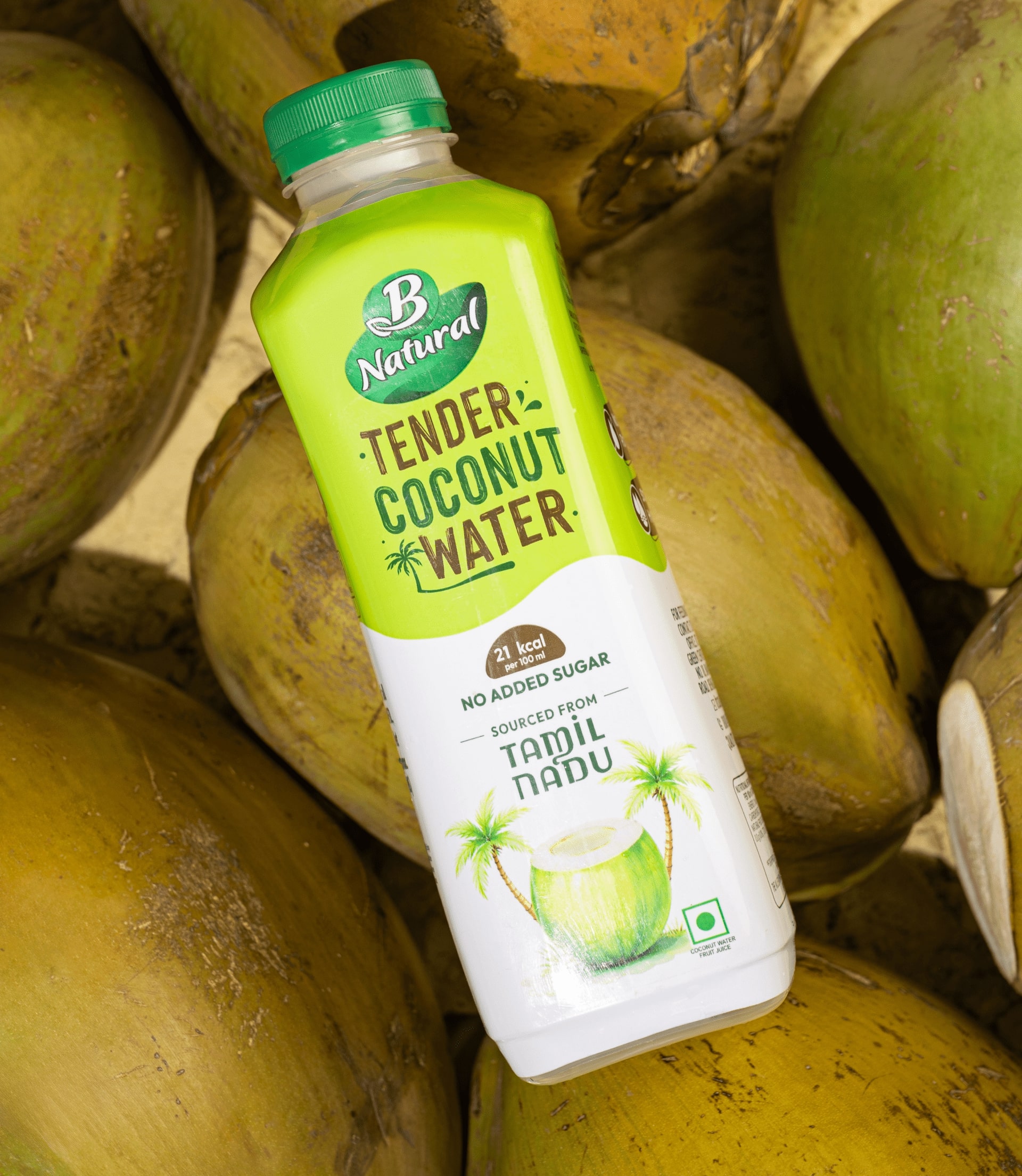
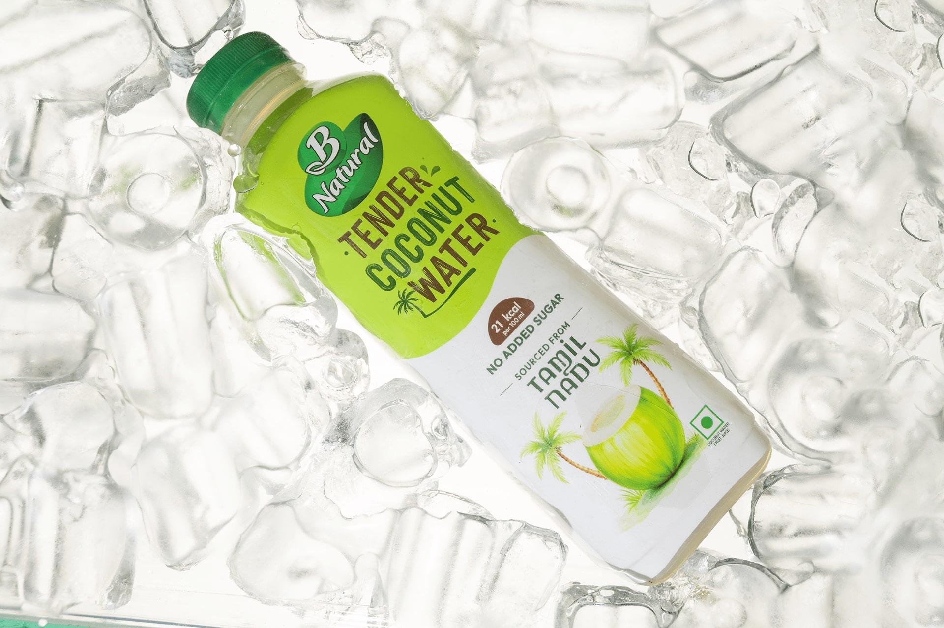
1. Minimal & Natural Color Palette:
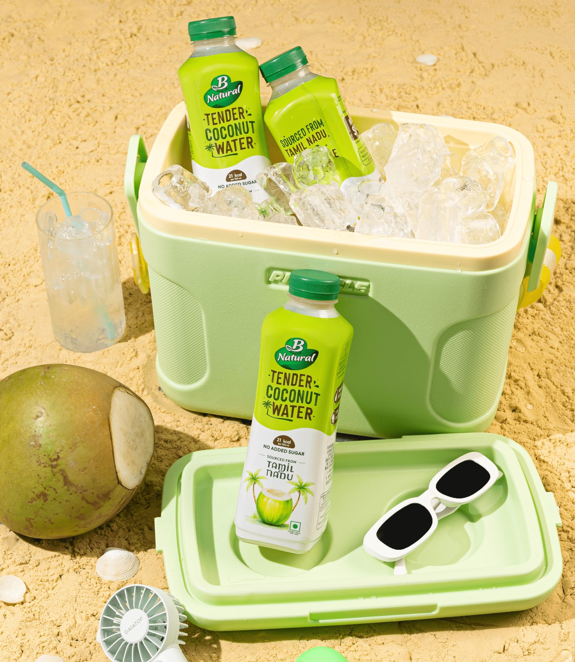
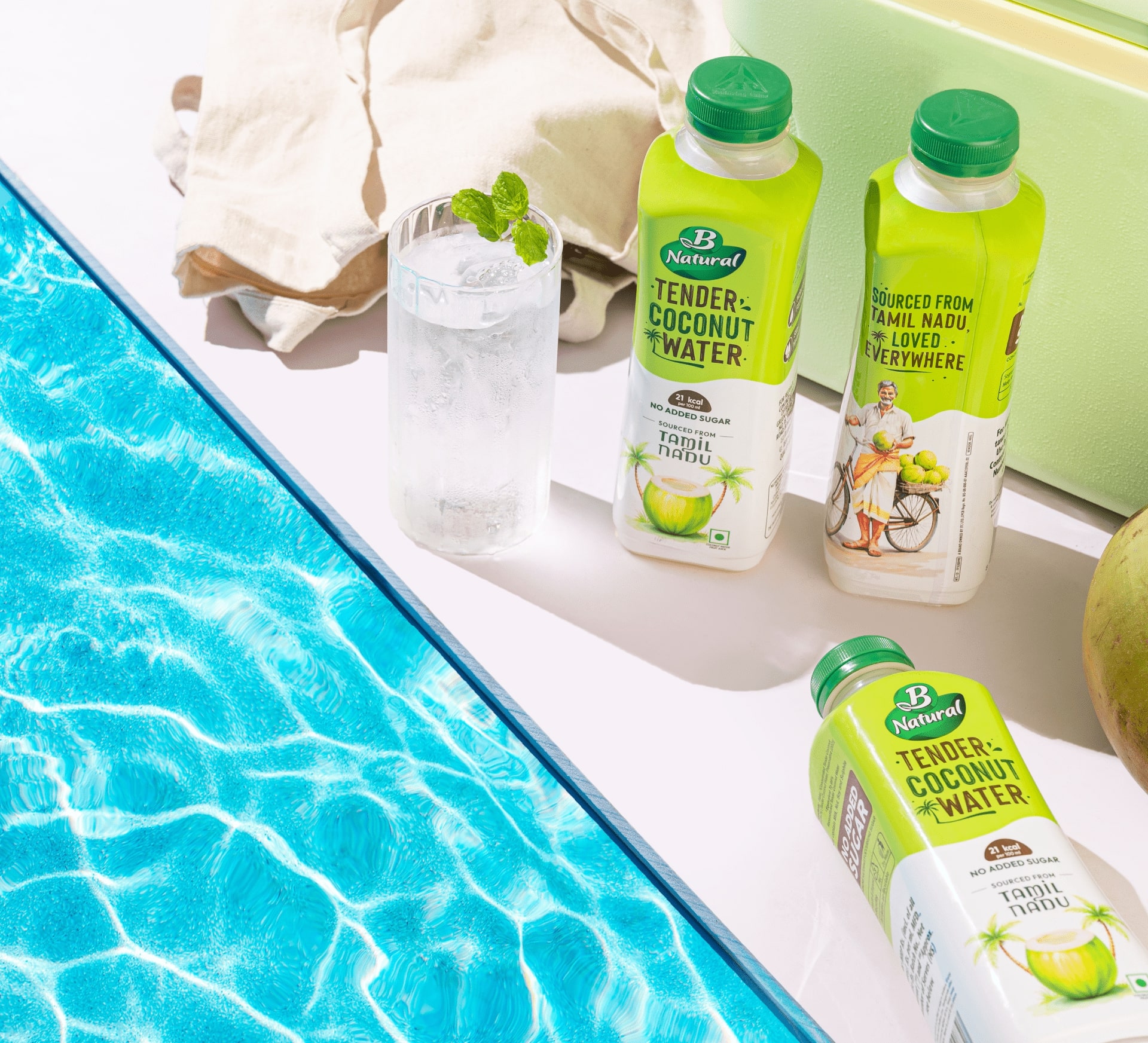
A soothing combination of white and tropical green evokes freshness, purity, and the organic roots of the product. This simple yet striking palette ensures instant visibility on crowded shelves, especially within India’s tropical beverage aisles.
2. Transparency through Information:
The front label proudly highlights facts that modern consumers care about—“Only 18 calories”, “No Added Sugar”, and “Sourced from Tamil Nadu”. These cues turn the packaging into an educator, helping even first-time buyers understand its natural and healthy value.
3. Hand-Painted Illustrations:
To retain the charm of its legacy, we used hand-painted coconut illustrations that feel crafted, warm, and human—contrasting beautifully with the clean, modern layout. This mix bridges the brand’s traditional roots with a fresh Gen Z aesthetic.
Easter egg:
A subtle pattern inspired by tropical palm leaves runs across the background—almost invisible at first glance, but adding a layer of texture and freshness when noticed. It’s a quiet nod to the lush coastal origins of the drink.
Brand’s extension:
B Natural has always stood for authenticity and purity. With this redesign, the brand evolves into a healthier, more modern voice—one that speaks confidently to a generation that reads labels, values clean design, and chooses mindful hydration.
Current scenario:
Since the redesign, B Natural Tender Coconut Water has found renewed traction across modern retail and online marketplaces. The refreshing aesthetic, paired with the transparent storytelling, has helped the brand re-establish itself among both loyal and first-time health-conscious consumers.
CREDIT
- Agency/Creative: Confetti Design Studio
- Article Title: Bright & Sunny Packaging Design for B Natural’s Tender Coconut Water
- Organisation/Entity: Agency
- Project Type: Packaging
- Project Status: Published
- Agency/Creative Country: India
- Agency/Creative City: New Delhi
- Market Region: Asia
- Project Deliverables: Brand Design, Packaging Design, Photography
- Format: Bottle
- Industry: Food/Beverage
- Keywords: Food, Beverage, Coconut, Drink, Tropical, Summer, Bottle, Packaging Design
-
Credits:
Director: Rishabh Jain
Creative Director: Himal Hazra
Sr. Graphic Designer: Harkirat Kaur
Srushti Shah: Project Manager


