


From hand-sculpted closures to a build-your-own-creature feature within the secondary packaging, Arithmetic Creative transformed a pioneering kids’ beauty brand into a story of curiosity, creativity, and care.
A Pioneer Ready for Reinvention
For more than two decades, Suncoat Kids has been a trusted innovator in children’s clean beauty. Founded by chemist and mom Ying Cheng, the brand’s water-based, peel-off nail polishes have long set the standard for non-toxic, odorless, and remover-free formulas. After twenty years as a quiet leader, Suncoat Kids was ready for a visual and strategic evolution — one that could expand its reach and reflect the joy, intelligence, and imagination behind its chemistry.
The Vancouver-based design studio, Arithmetic, partnered with Suncoat Kids to collaborate on a brand transformation led from the inside out: refreshing its packaging system, strengthening its brand identity, and aligning every touchpoint with a future-minded sustainability story.
Design Meets Discovery
For Suncoat Kids, Arithmetic imagined a universe where science and imagination coexist, and every discovery is seen through the eyes of a child.
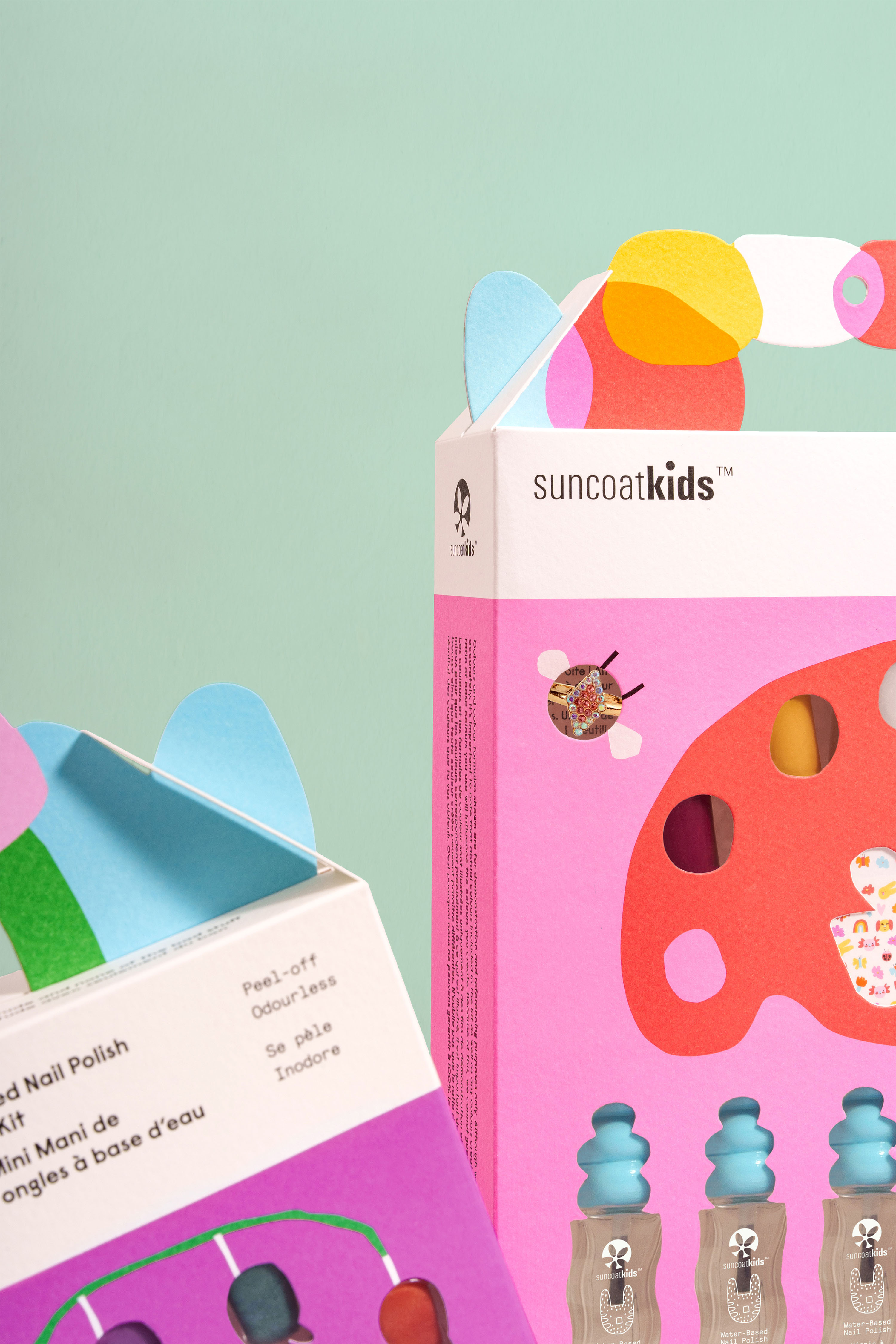
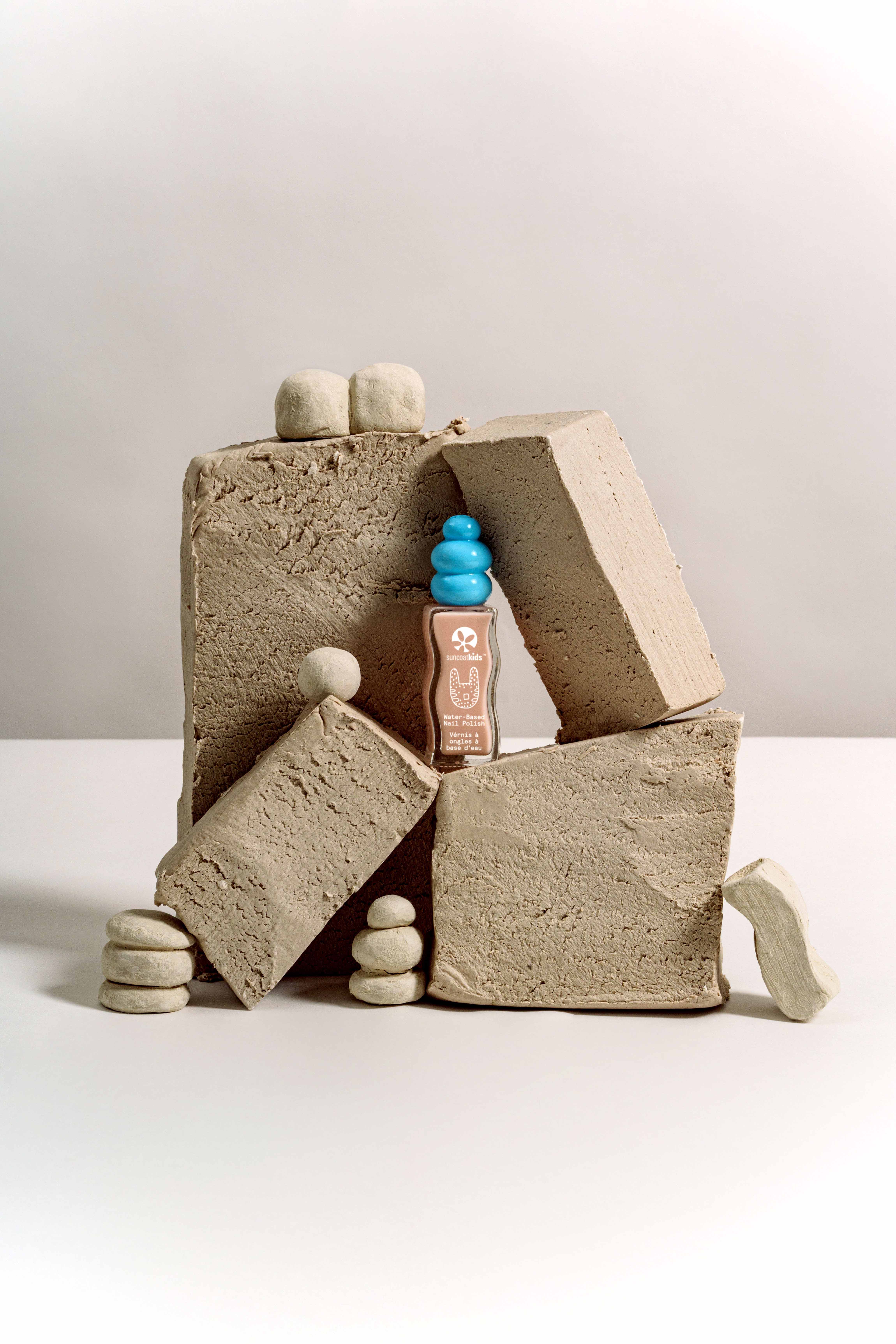
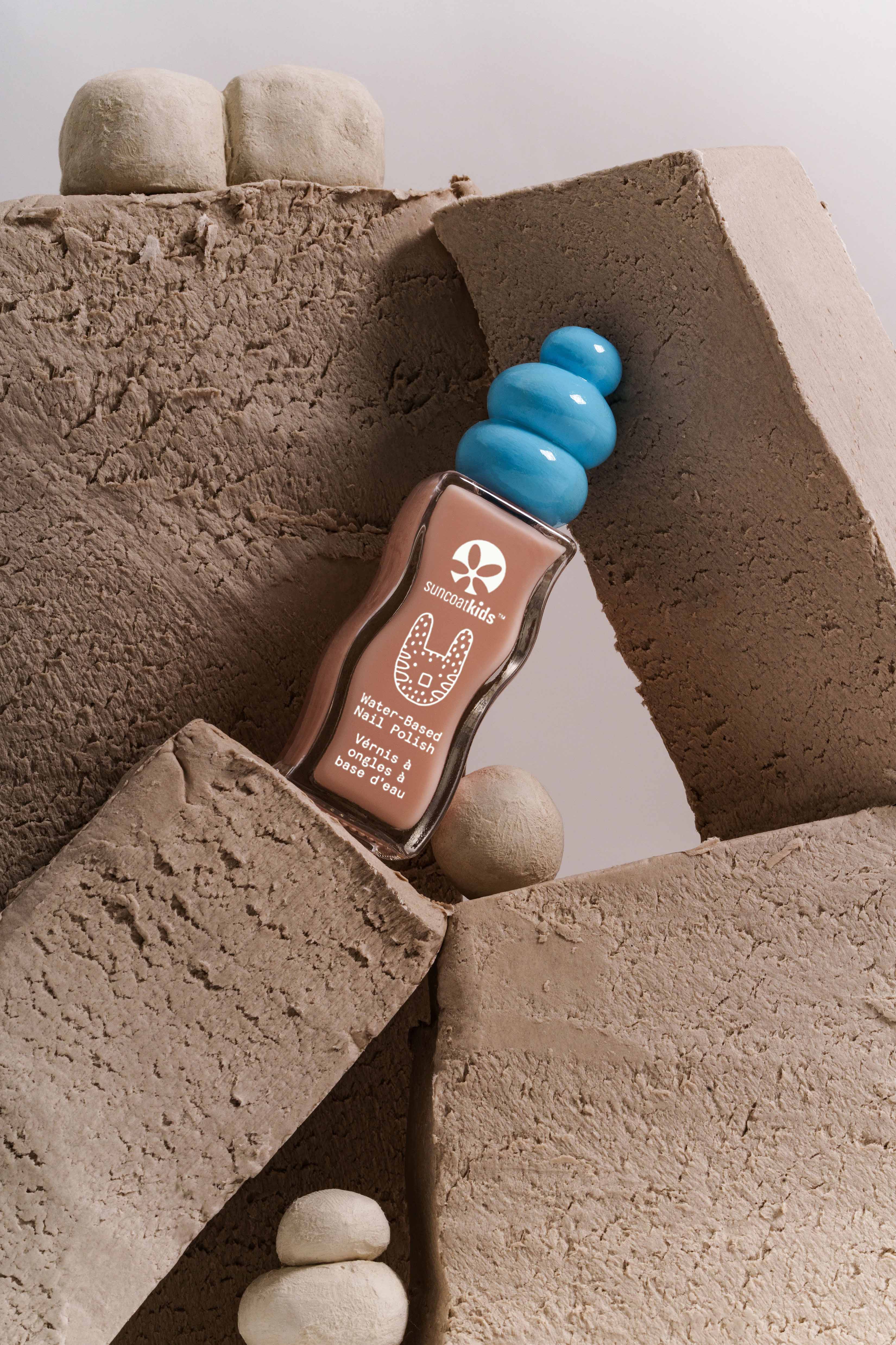
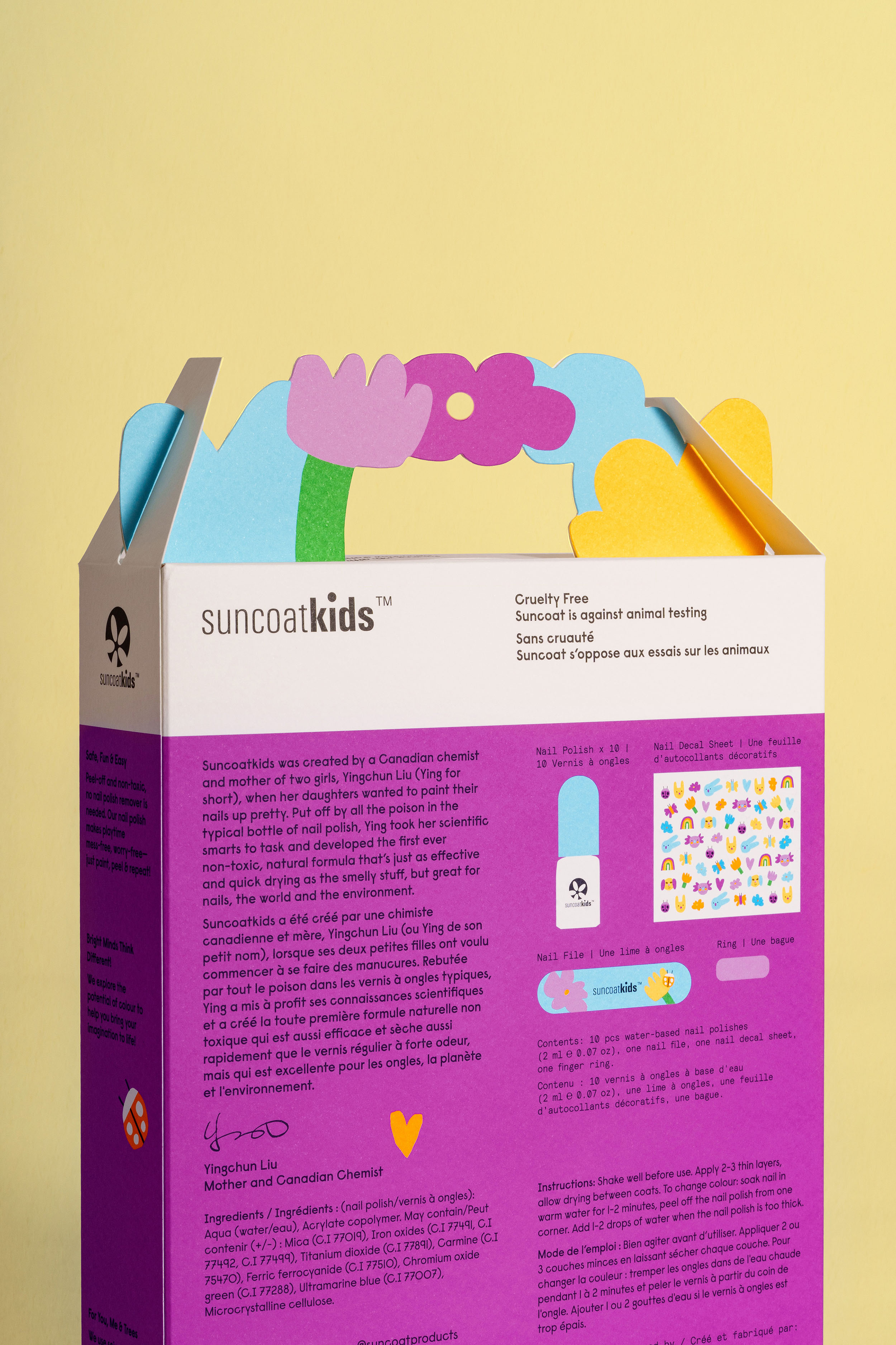
Throughout the design process Arithmetic sought to honor childhood’s innate creativity and the joy of exploration that lives at the heart of Suncoat. Shapes designed for little hands lend independence and confidence for young users. Every curve and contour of the bubble lid was hand sculpted with care to empower play, creativity, and self-expression.
Empathy at the Core
Arithmetic’s creative direction and brand strategy always begins with empathy. Each project is grounded in the studio’s human-centered methodology — listening, observing, researching, and most of all, connecting emotionally with the people they’re designing for.
For Suncoat, the team was deeply moved by Ying’s origin story and heartfelt values. Looking to feature her background in chemistry and her commitment to safe, non-toxic children’s products, Arithmetic led immersive strategy sessions and founder interviews. Through this deeply personal process, Arithmetic defined the brand pillars of Curiosity, Creativity, and Caregiving as strategic tools to unlock imagination, build emotional connection, and shape meaningful experiences. Transmuting Suncoat’s rich history into its new brand expression.
“Together with Ying, we developed a creative brief that invited us to become inventors, artists, and stewards of what we bring into the world,” says the Arithmetic team. “This work is about creating moments rooted in deep care, drawing outside the lines, shaping memory, and building cultural resonance.”
Designing for Little Hands
From early brand strategy and research to hand-sculpted clay prototypes, sketch explorations, and custom vessel design, the process was guided by observation and empathy.
Arithmetic watched how kids play, grip, and imagine — insights that shaped the unique bubble lid ergonomically designed for small fingers still developing grip strength and coordination.
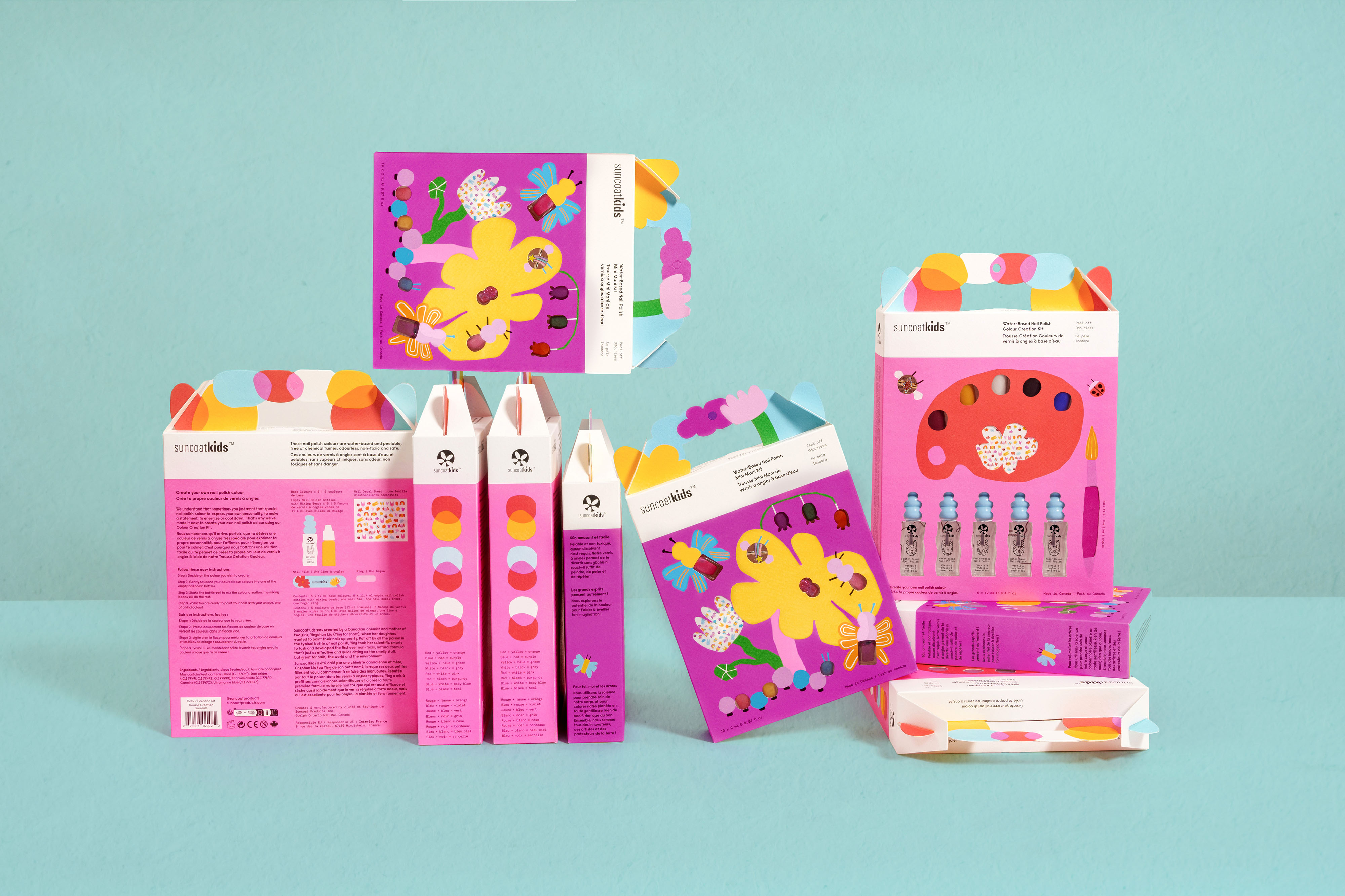
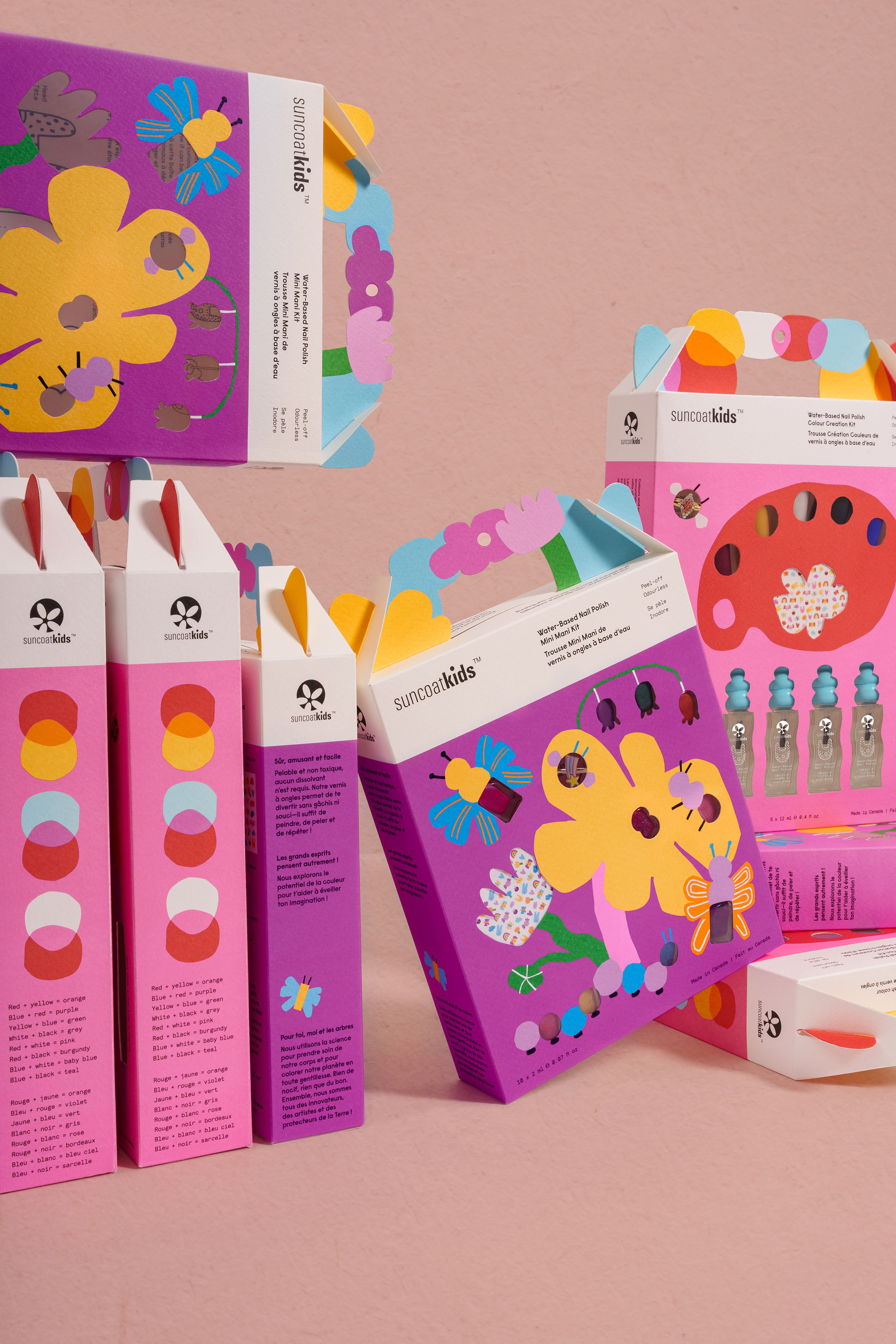
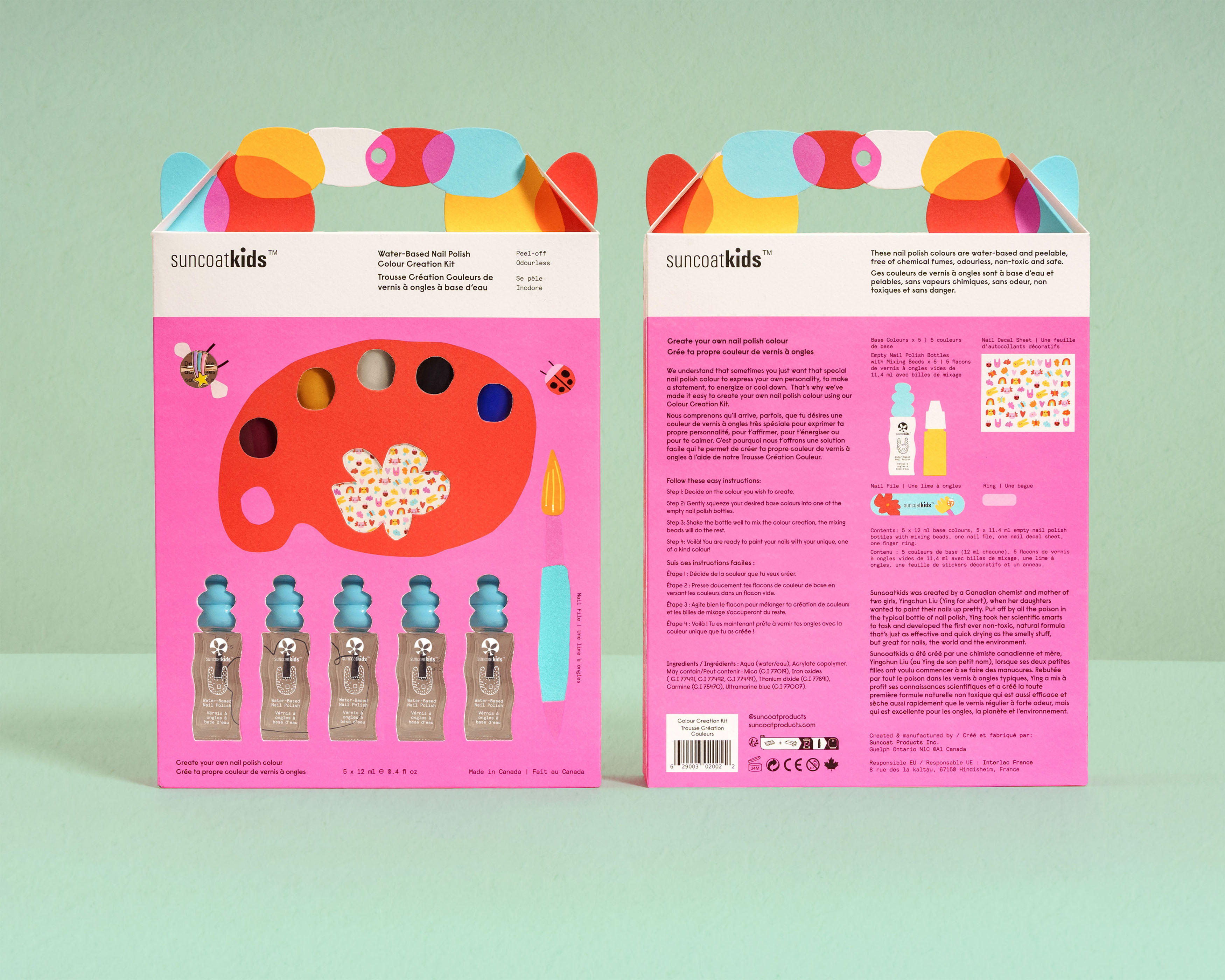
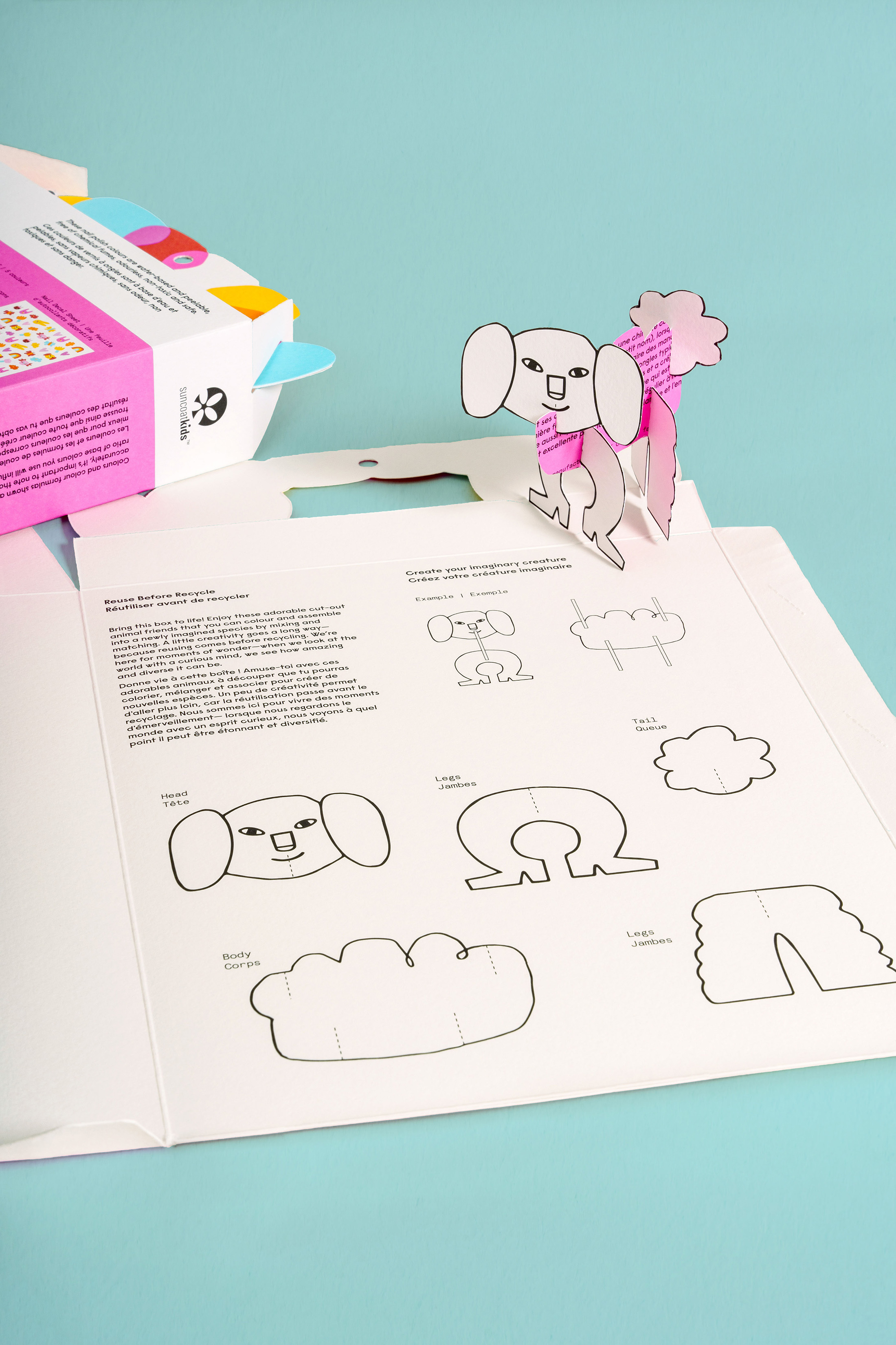
The packaging design becomes a lesson in play itself:
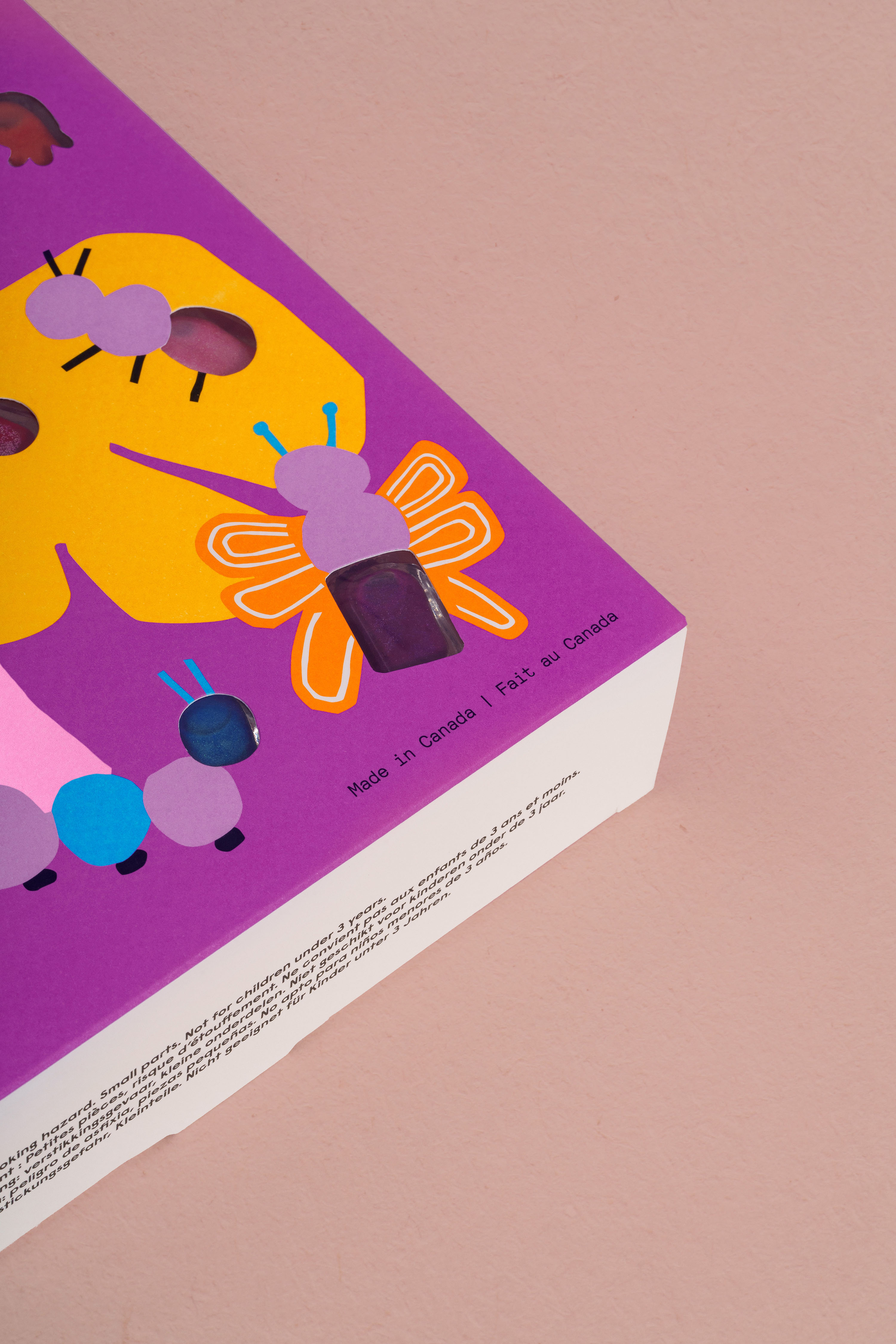
Cut-paper-inspired illustrations emulate the way a child cuts and layers shapes.
Tactile gable boxes transform into buildable creatures or craft kits after unboxing.
Custom sculpted toppers, first shaped by hand, translate the tactile joy of clay into production form.
Every decision — from FSC-certified paper to recyclable trays — celebrates sustainability and safety without compromising wonder.
“We wanted every part of the experience to feel like a discovery — science meeting art, chemistry meeting imagination,” the team notes.
A Universe of Colour and Care
The art direction brings together a palette of vibrant optimism and soft neutrality. The visual language draws from Paul Rand’s playful abstraction and Anni and Josef Albers’ colour theory, balancing curiosity with calm. Rounded typography, saturated brights, and textured neutrals form a modern yet timeless aesthetic.
Photography direction captures the intersection of learning and play — bright surfaces, open compositions, and a sense of joyful experimentation. Each scene feels like an experiment in colour and light, bringing to life the brand’s guiding statement: “For you, me, and trees; design can be playful, purposeful, and kind.”
The Impact
Following the rebrand, Suncoat Kids has greatly expanded its distribution across Canada, with major retailer London Drugs bringing Suncoat to its shelves in time for the Holiday 2025 season. This brings the brand’s new design system to families coast to coast, just in time for a season defined by imagination and giving.
For Suncoat, this marks a defining milestone: a Canadian pioneer transformed into a category-defining innovator in clean kids’ beauty. Parents respond to its honesty and eco-conscious message; children respond to its colour, interactivity, and delight.
Each bottle, box, and visual cue now acts as an invitation to explore — proof that sustainability and storytelling can coexist beautifully.
About Arithmetic
Arithmetic is a Vancouver-based branding and packaging design studio specializing in sustainable brand strategy, visual identity, and creative direction for beauty, wellness, and lifestyle brands.
For over two decades, Arithmetic has built a reputation for crafting award-winning packaging design and luxury sustainability storytelling — helping conscious brands connect their visual identity to a deeper sense of purpose.
The studio’s cross-disciplinary team blends strategic brand architecture, product design, and environmental responsibility to create timeless brands that resonate across markets.

CREDIT
- Agency/Creative: Arithmetic
- Article Title: Bright Minds Think Different: How Arithmetic Reimagined Playful Sustainability for Suncoat Kids
- Organisation/Entity: Agency
- Project Type: Packaging
- Project Status: Published
- Agency/Creative Country: Canada
- Agency/Creative City: Vancouver
- Market Region: North America
- Project Deliverables: 2D Design, 3D Design, Advertising Photography, Art Direction, Brand Refinement, Brand Rejuvenation, Brand Tone of Voice, Copywriting, Craft, Creative Direction, Design, Graphic Design, Illustration, Industrial Design, Packaging Design, Photography Styling, Product Architecture, Product Photography, Research, Sculpting, Structural Design, Type Design, Typography, User Experience, Writing
- Format: Bottle, Box, Tray
- Industry: Beauty/Cosmetics
- Keywords: Nail Care, Kids, Beauty, Redesign, Packaging, Kid's Beauty, Cosmetics, Kid's Cosmetics,
-
Credits:
Creative Director: Margherita Porra


