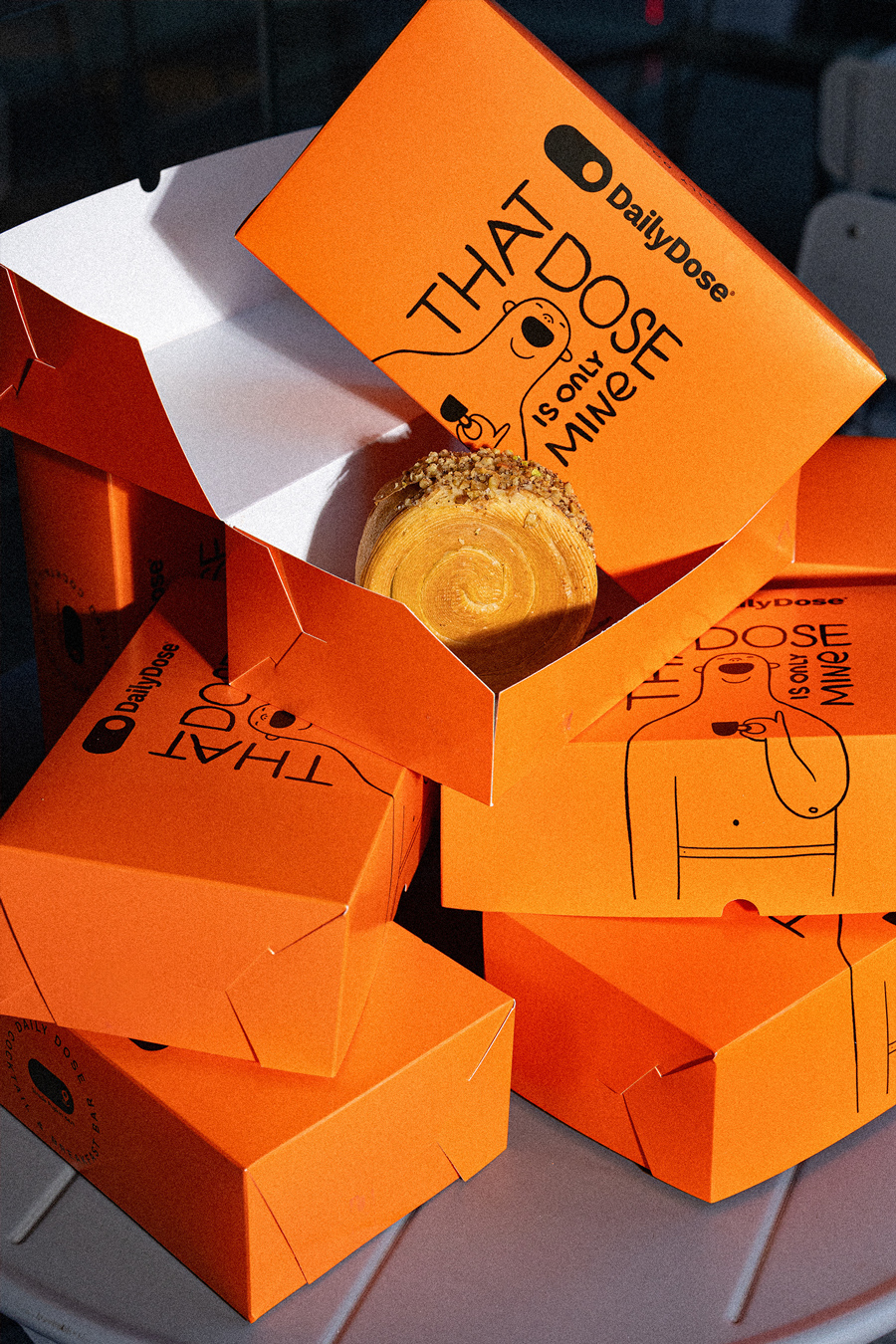
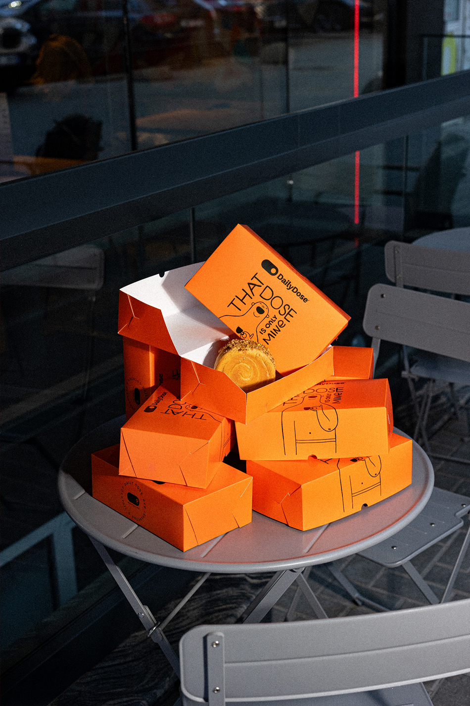
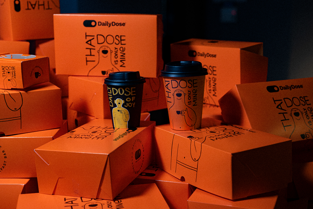
Imagine grabbing your morning treat, but instead of another boring box, you’re greeted with this: vibrant orange cartons that practically shout fun and energy. That’s exactly what Daily Dose delivers — packaging that’s impossible to ignore and perfectly matches the joy of what’s inside.
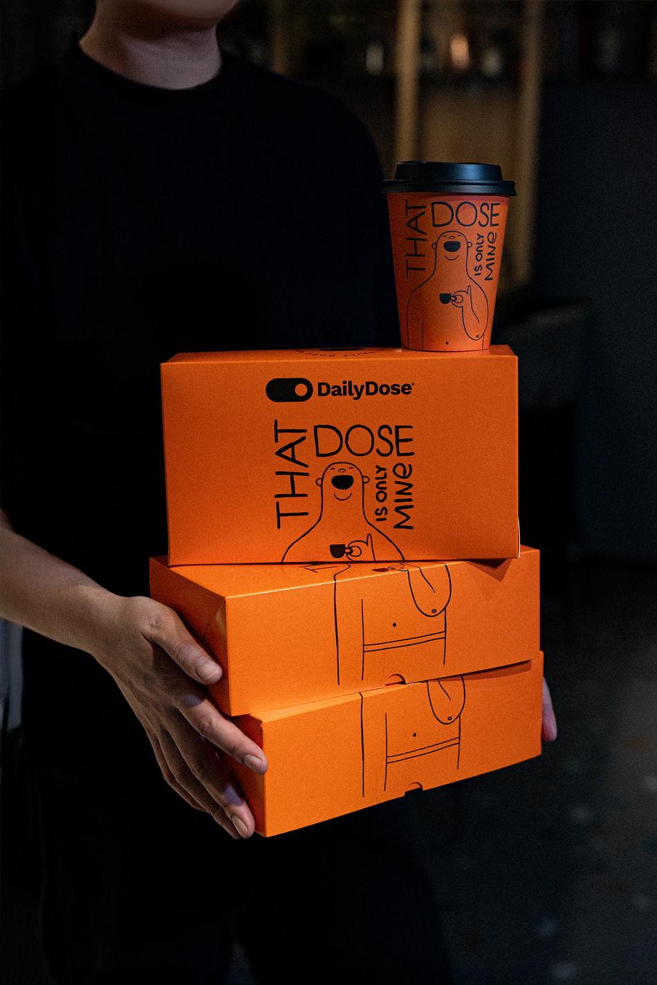
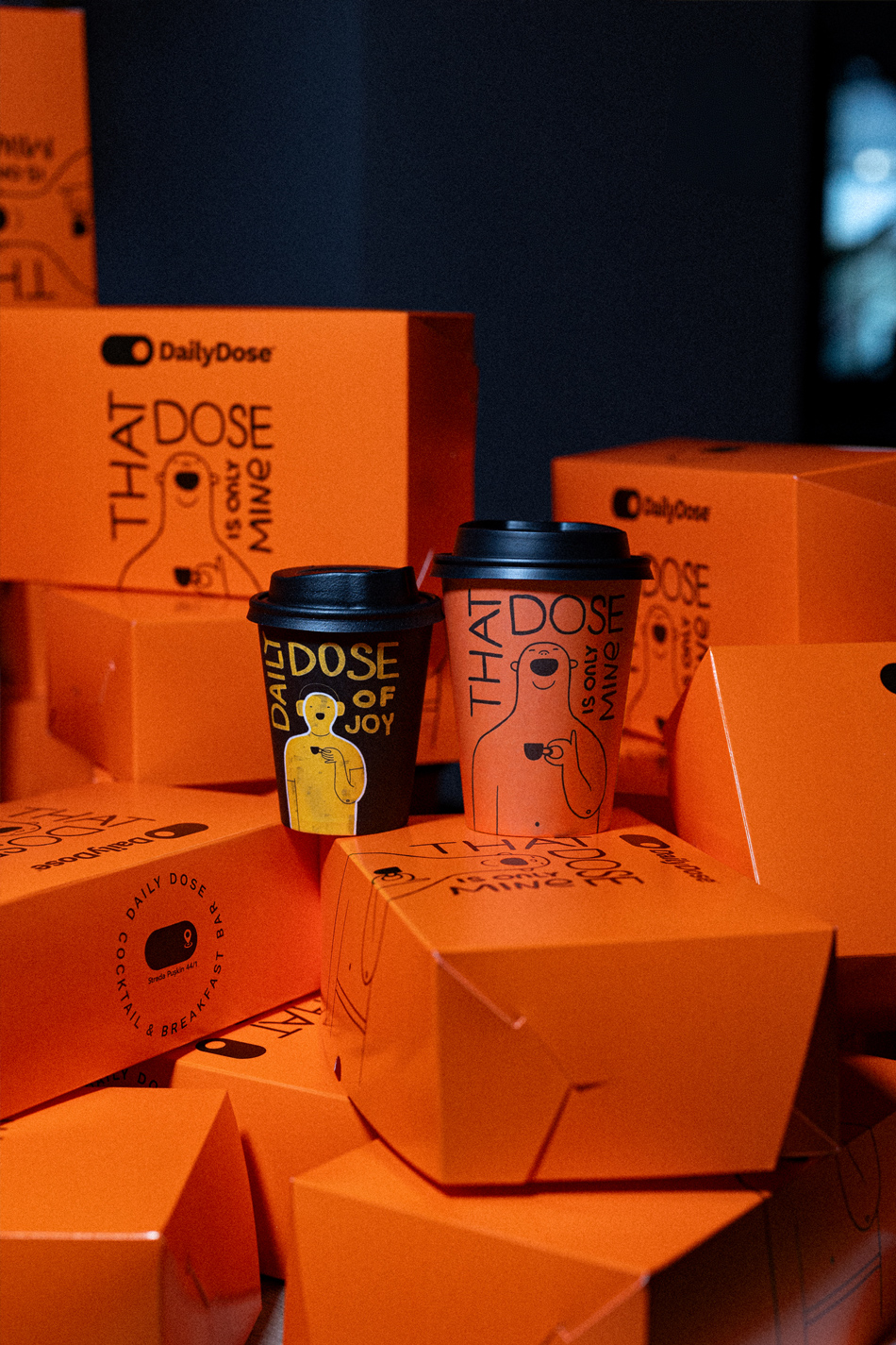
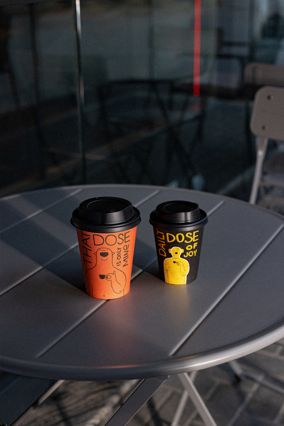
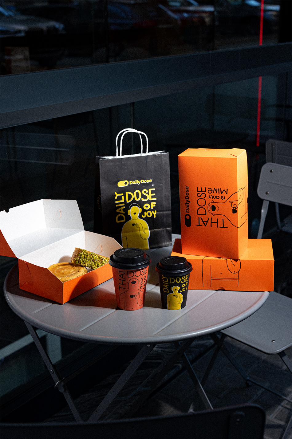
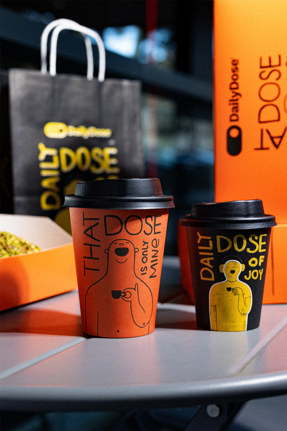
These playful boxes feature bold black illustrations and hand-lettered typography, keeping the vibe minimal yet quirky. At the center of attention? A grinning, relaxed character with a coffee cup and a caption: “That Dose is Only Mine!” — a cheeky reminder that you might not want to share your snack. This small detail transforms the box into something personal, playful, and entirely memorable.
The monochromatic doodle style adds an approachable, hand-crafted touch to the otherwise loud orange backdrop. This design choice is clever — it balances boldness with simplicity, making the box eye-catching without feeling overwhelming. The combination of the vivid orange color and the laid-back, illustrated character evokes a sense of comfort, happiness, and indulgence. Whether stacked together or opened to reveal a golden-brown pastry, these boxes tell a story of indulgence, individuality, and lighthearted humor.
Daily Dose proves that packaging can be more than functional — it’s an experience. From its attention-grabbing color palette to its witty personality, this design feels both premium and relatable. It’s not just a container for baked goods; it’s a statement piece, a mood lifter, and a small reminder to enjoy life’s little treats. In fact, it’s the kind of packaging you might not want to throw away right after unboxing. It’s photogenic, fun, and perfect for sharing — not just the pastries inside, but also snapshots of the box itself.
Takeaway: When design speaks, people listen. Daily Dose nails it with packaging that feels as good as the treat tastes — personal, joyful, and oh-so-shareable. This is branding at its best: charming, impactful, and impossible to forget.
CREDIT
- Agency/Creative: True Agency
- Article Title: Bright, Bold, and Totally Addictive: the Daily Dose Packaging Design That Turns Heads by True Agency
- Organisation/Entity: Agency
- Project Type: Packaging
- Project Status: Published
- Agency/Creative Country: Moldova
- Agency/Creative City: Chisinau
- Market Region: Europe
- Project Deliverables: Art Direction, Brand Design, Illustration, Packaging Design, Product Photography
- Format: Bag, Box, Cup
- Industry: Food/Beverage
- Keywords: Creative packaging, bold colors, playful design, minimalist illustration, quirky branding, food box design, modern aesthetics, orange packaging, fun brand identity, eye-catching visuals
-
Credits:
creative director, designer: Anta Petrenco


