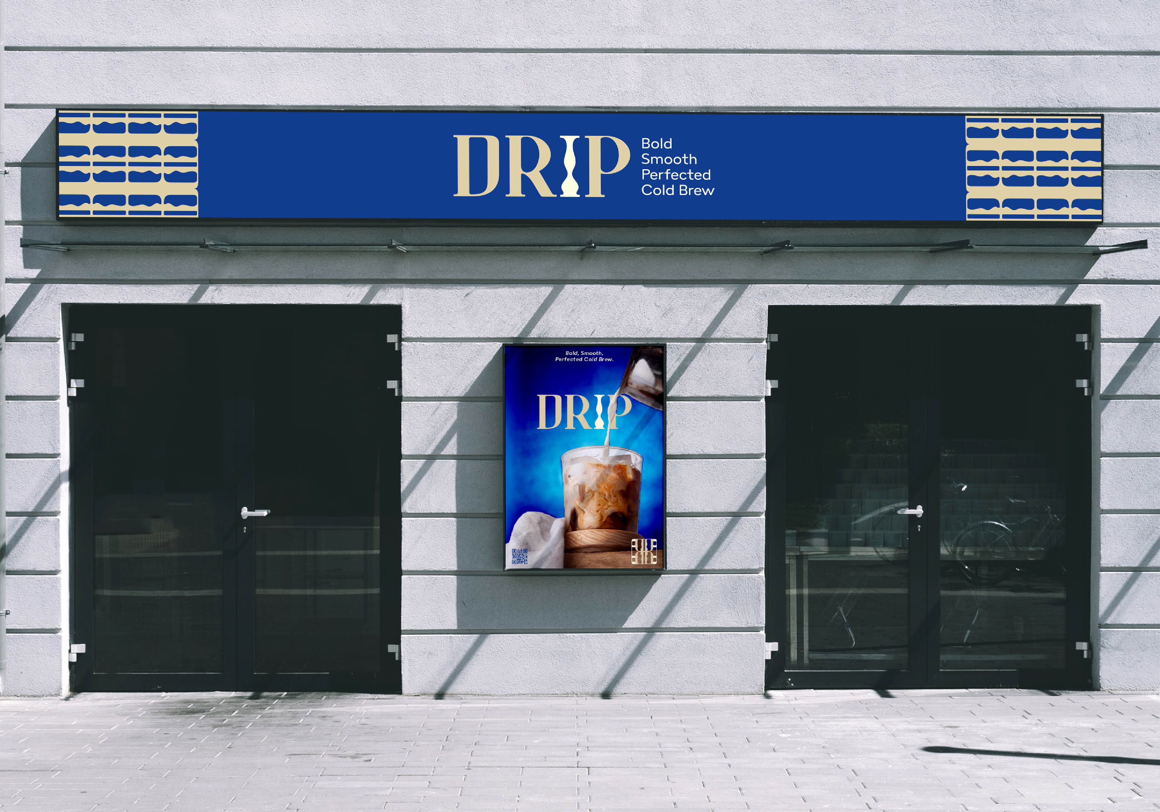
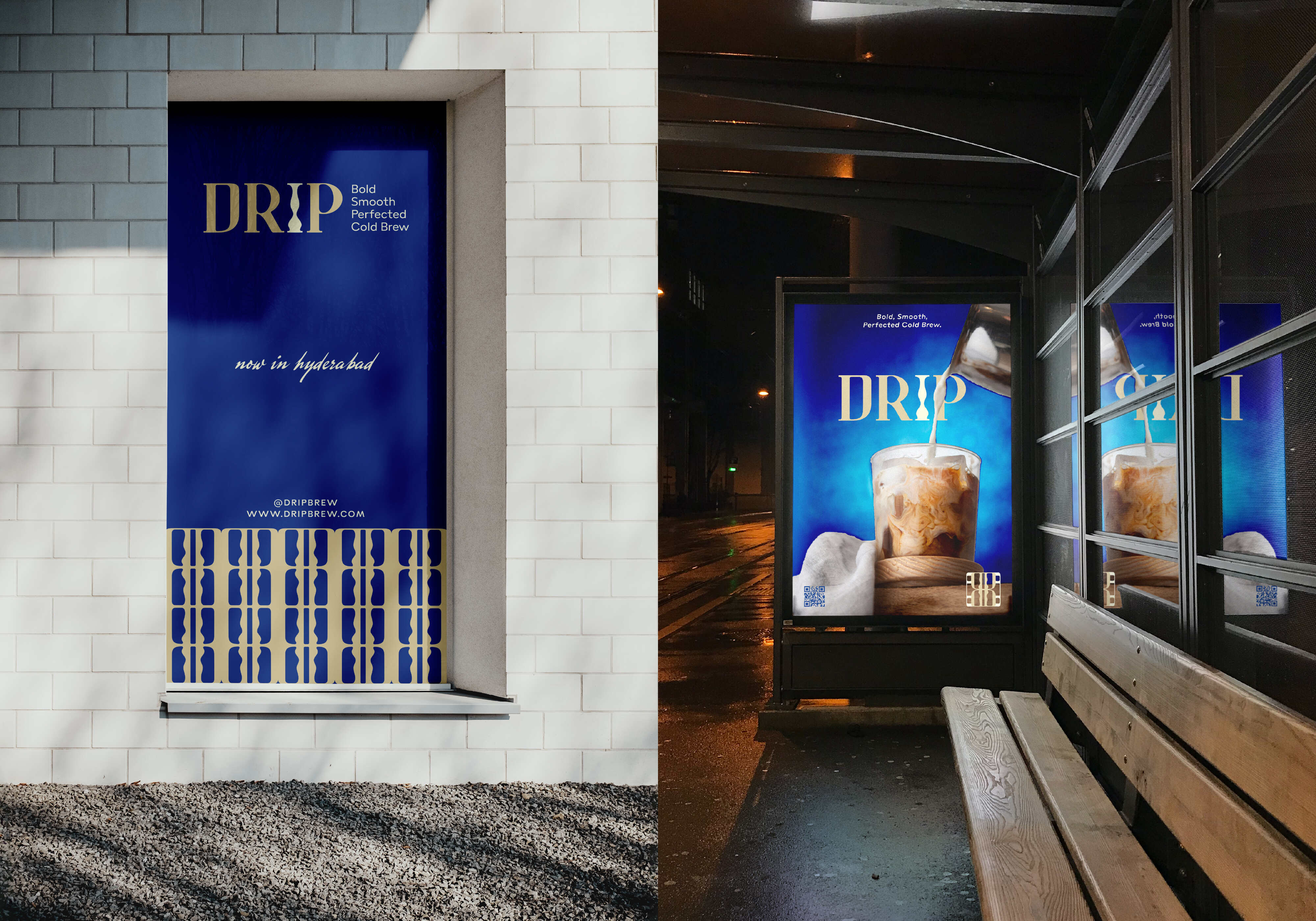
DRIP is a premium cold brew coffee brand crafted for individuals who appreciate the art of high-quality, artisanal beverages. The challenge for this project was to develop a brand identity that not only conveyed the sophistication of the slow-drip brewing process but also balanced elegance with approachability. In an increasingly competitive specialty coffee market, creating a visual identity that stood out while maintaining a minimal yet luxurious appeal.
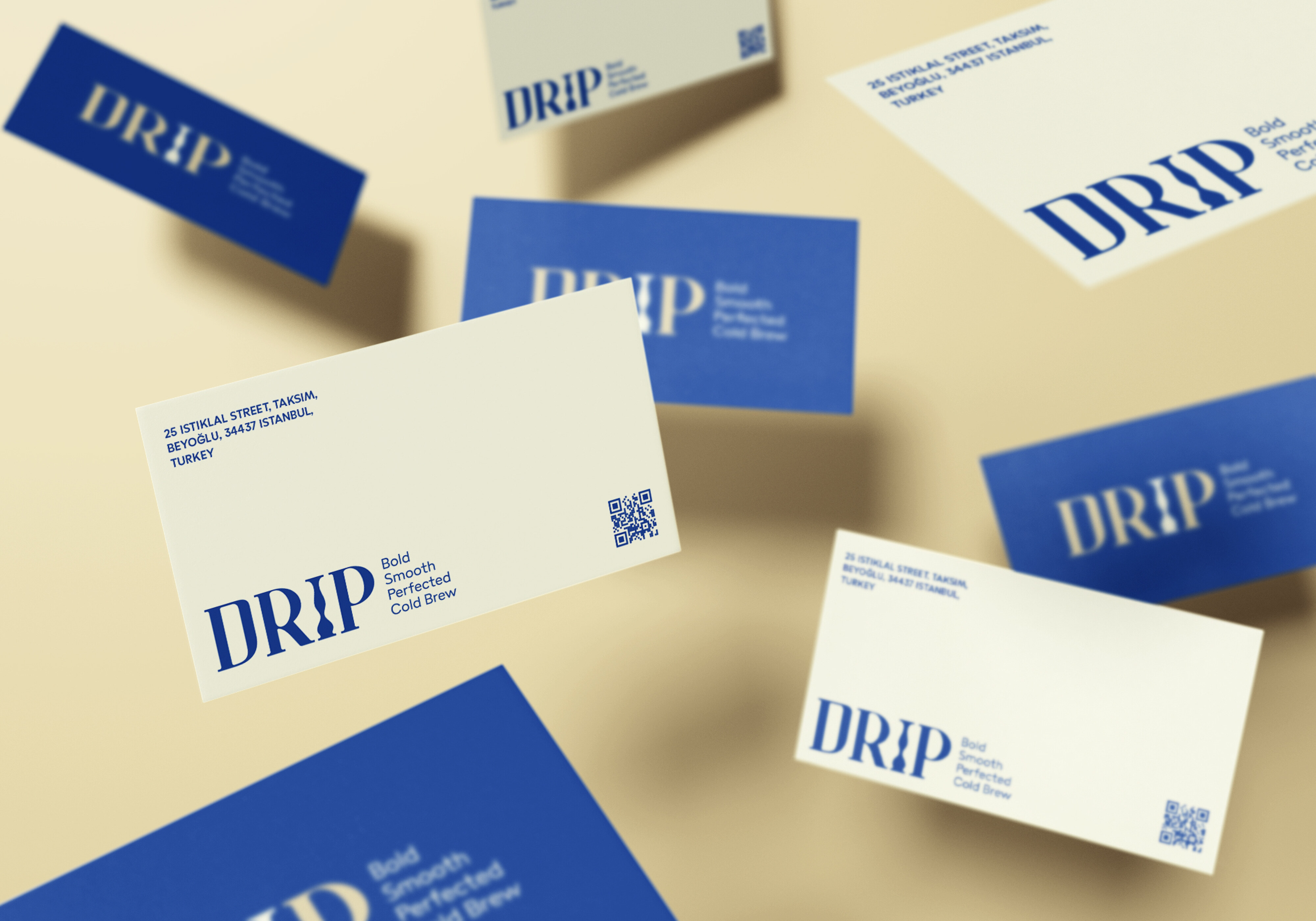
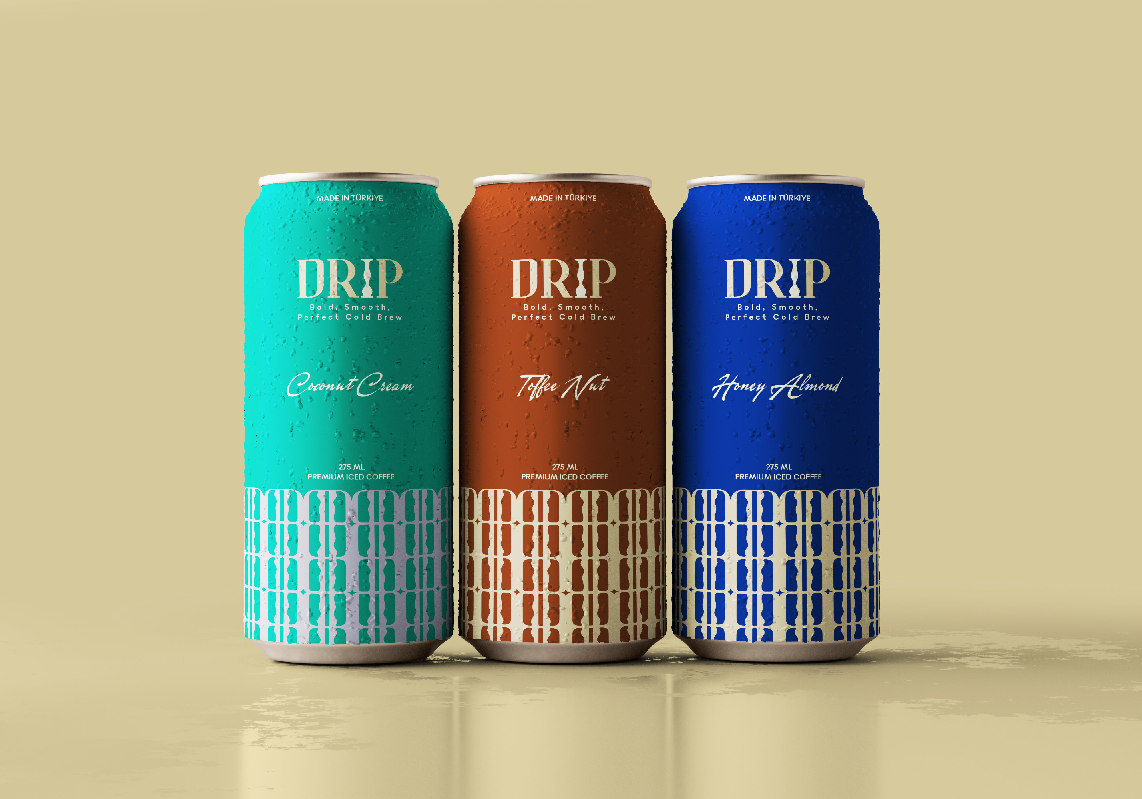
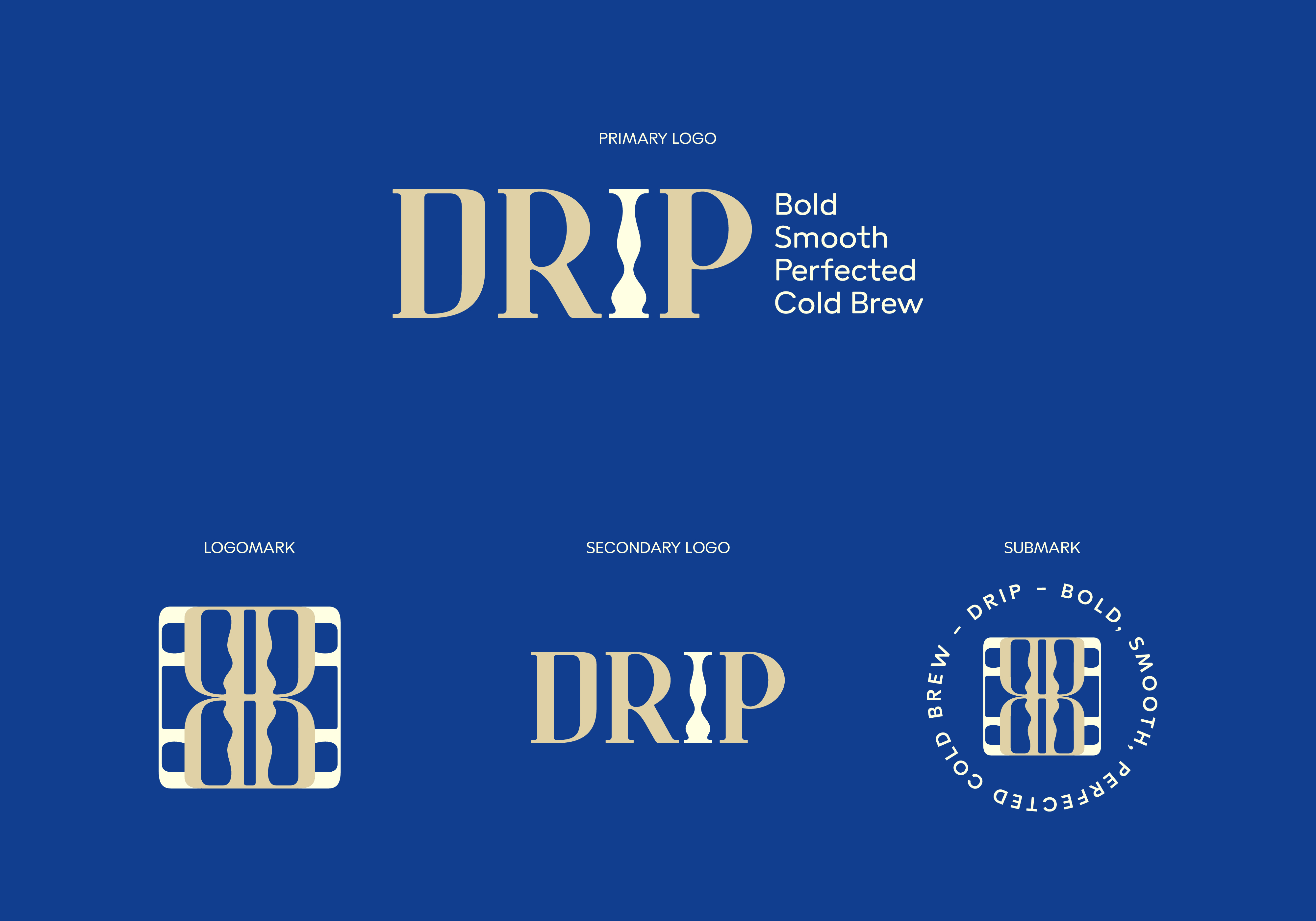
The design process began with a deep exploration of the brand’s core values—refinement, and quality. The choice of typography played a pivotal role in achieving the desired aesthetic. A customized serif typeface was developed to exude sophistication, with special attention given to the letter “I” to symbolize the slow-drip brewing process. This element subtly reinforces the brand’s core offering, ensuring a visual connection between design and product. Complementing the serif typeface, a handwritten font was introduced to add a touch of warmth and authenticity, while a clean sans-serif font was used for body text to maintain readability and modernity.
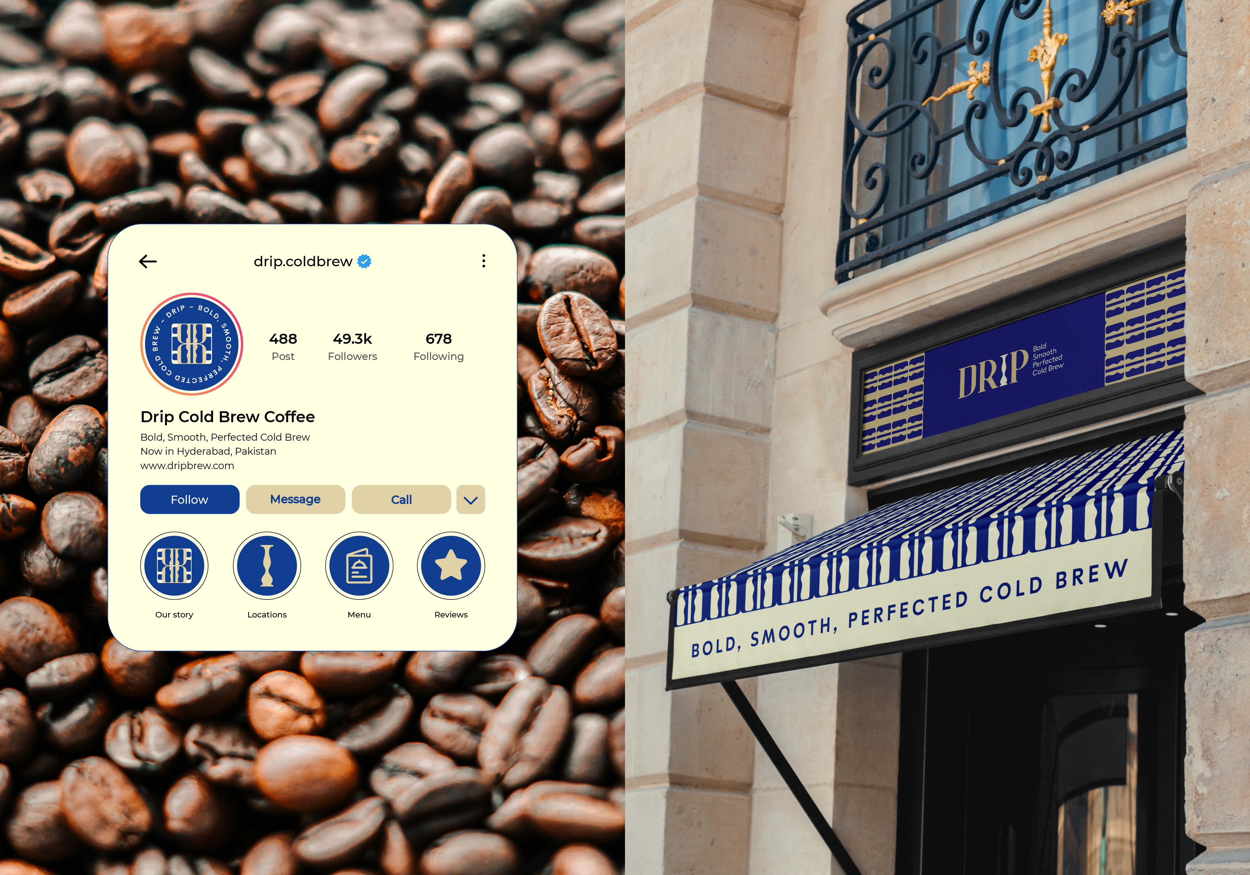
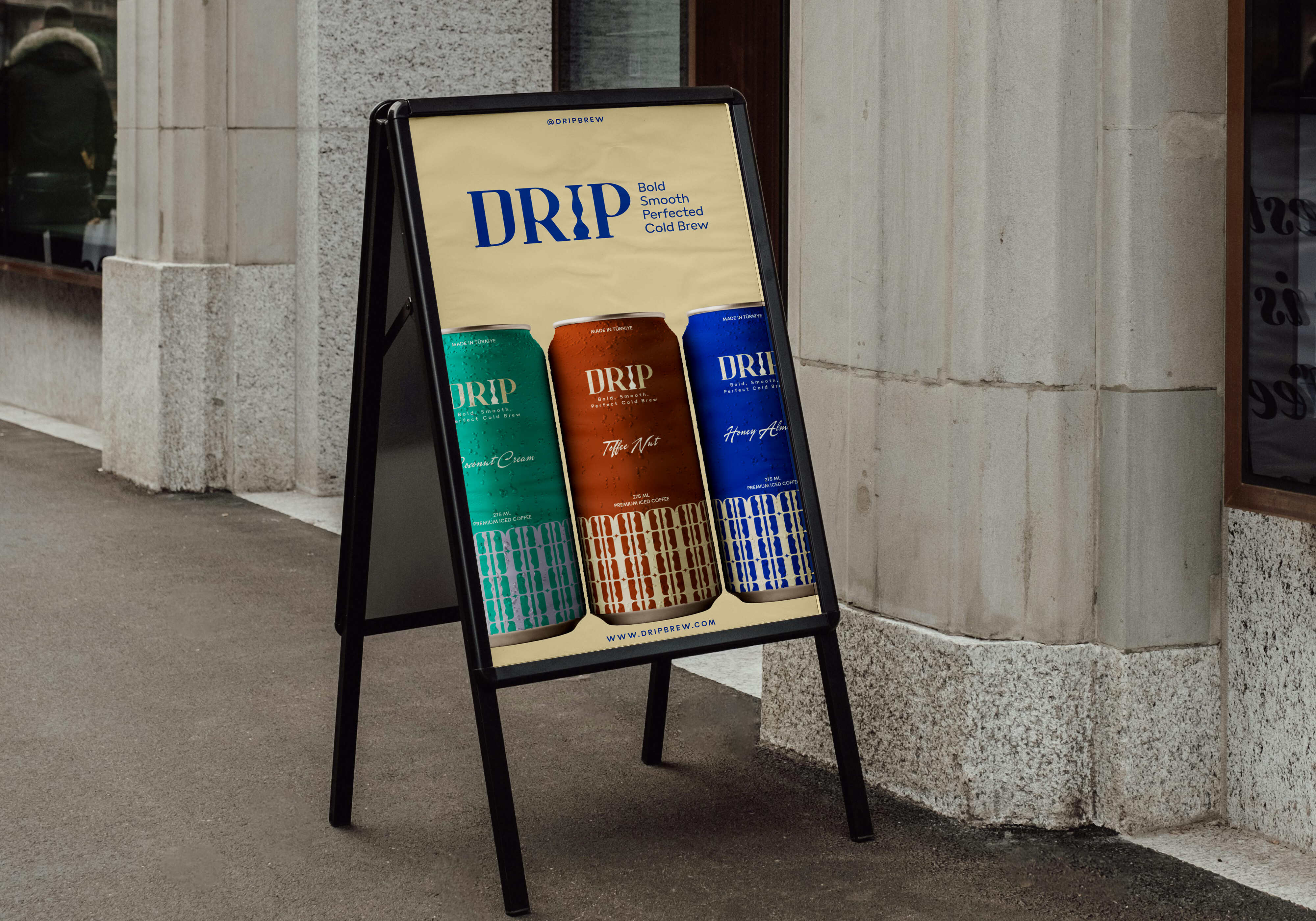
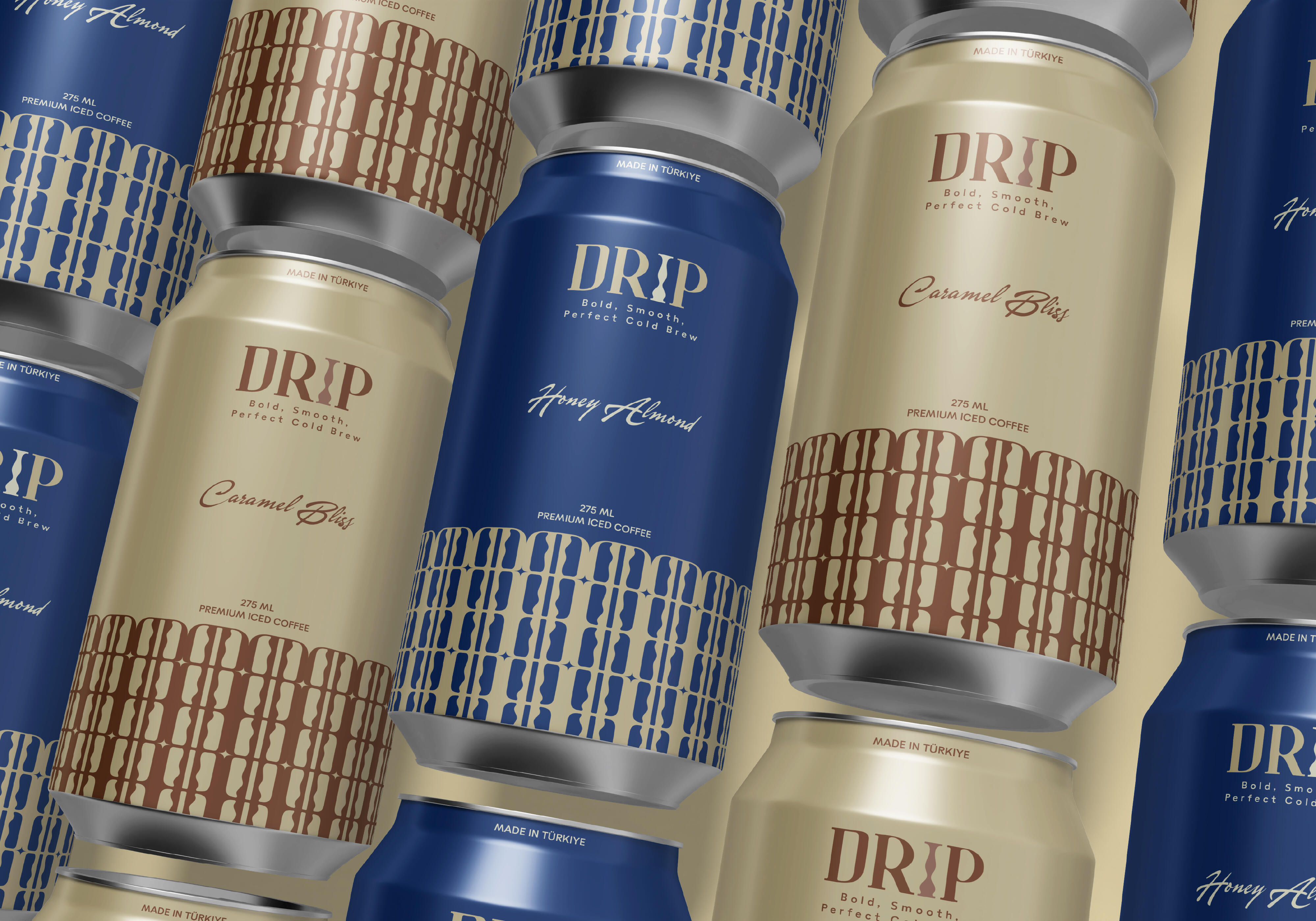
Color also played a significant role in the brand’s overall perception. A deep royal blue was chosen as the primary color to convey luxury, depth, and reliability, while a beige accent was integrated to add softness and an inviting touch. This combination enhances the premium feel of the brand and sets DRIP apart from other competitors in the specialty coffee segment.
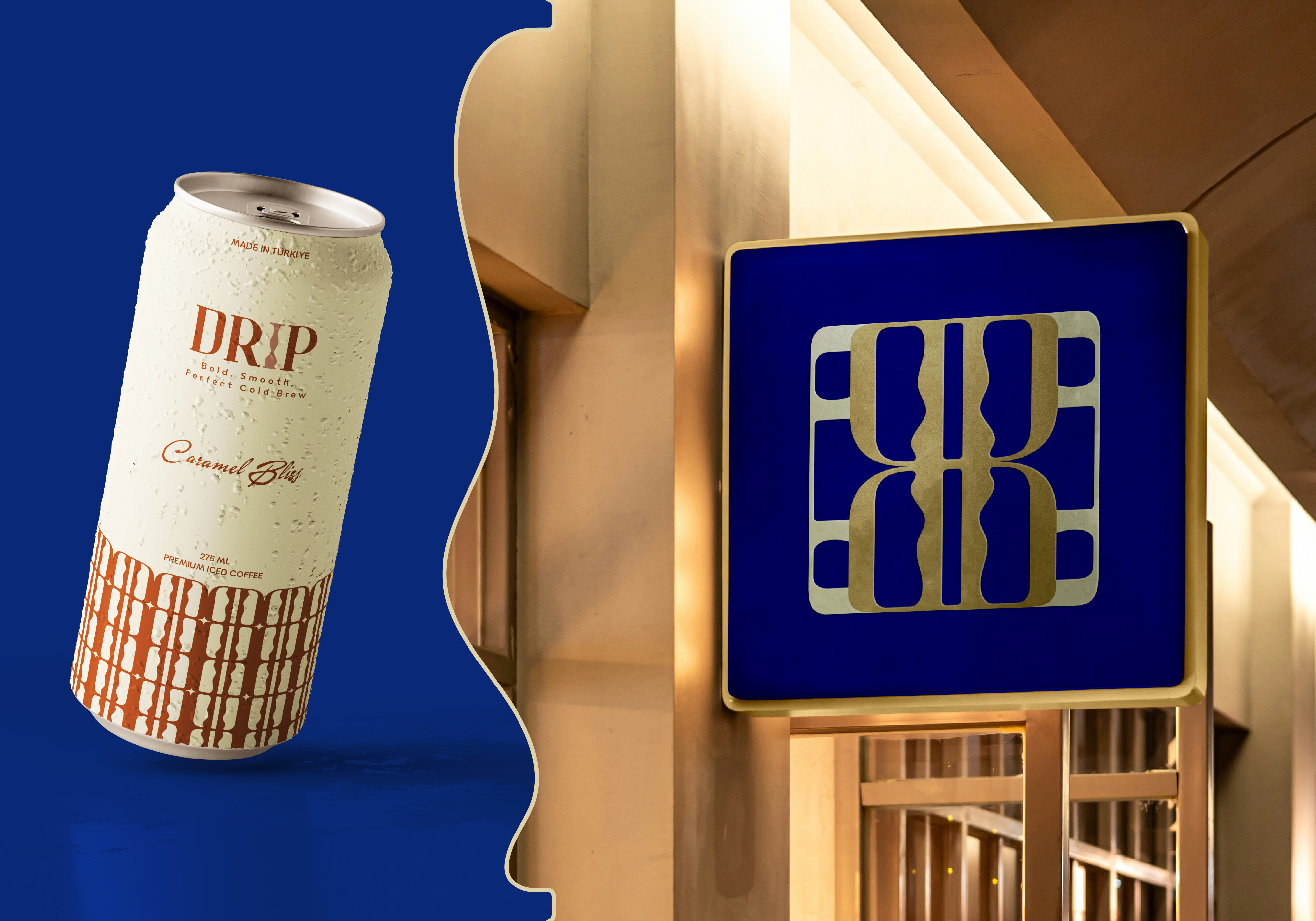
To further reinforce brand recognition, a distinctive monogram icon was designed, making the identity instantly recognizable. This monogram represents the letter “D” from the brand’s initials and also showcases the coffee dripping process the logomark can be used in different brand applications, from packaging to marketing materials, creating a seamless visual experience.
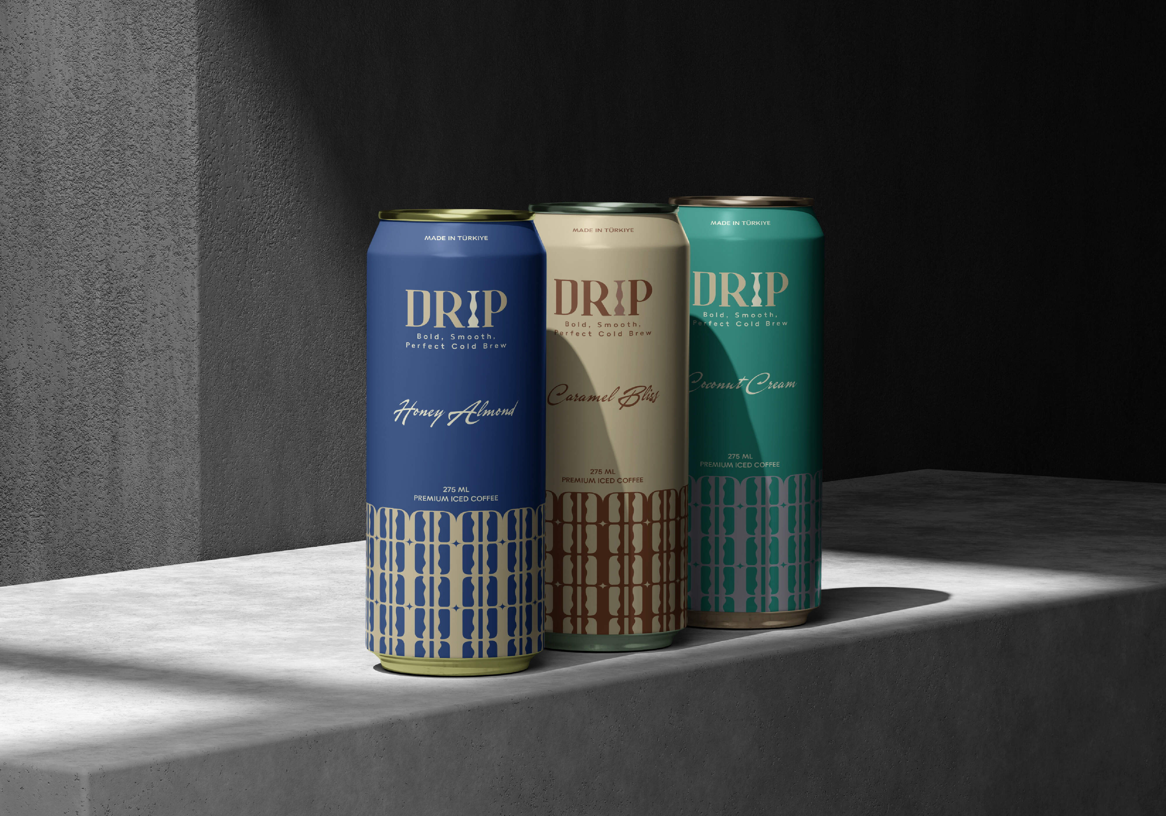
The packaging design, particularly the can labels, was crafted to reflect the brand’s ethos. The minimal yet elegant aesthetic ensures that DRIP’s cold brew cans not only look refined but also communicate the high-quality nature of the product inside. The clean layout and thoughtful use of space create an understated sophistication that appeals to coffee enthusiasts who value both aesthetics and substance.
Ultimately, the final identity is a harmonious blend of elegance, modernity, and minimalism. DRIP’s branding successfully captures the essence of slow-drip brewing while maintaining a bold presence in the competitive market. From its curated typography and color palette to its sleek labels, every element of the design contributes to an experience that resonates with consumers seeking a premium coffee brand that embodies both style and quality.
CREDIT
- Agency/Creative: Hassaan Ali
- Article Title: Bridging Premium Cold Coffee Culture and Minimalist Design for DRIP’s Identity
- Organisation/Entity: Freelance
- Project Type: Identity
- Project Status: Published
- Agency/Creative Country: Pakistan
- Agency/Creative City: Hyderabad
- Market Region: Asia
- Project Deliverables: Brand Design, Brand Identity, Branding, Label Design, Logo Design
- Industry: Food/Beverage
- Keywords: Cold Coffee, Cold Brew, Bold branding, Sophisticated, Can label design, Brand Identity
-
Credits:
Creative Direction, Brand Identiy and Label Design: Hassaan Ali


