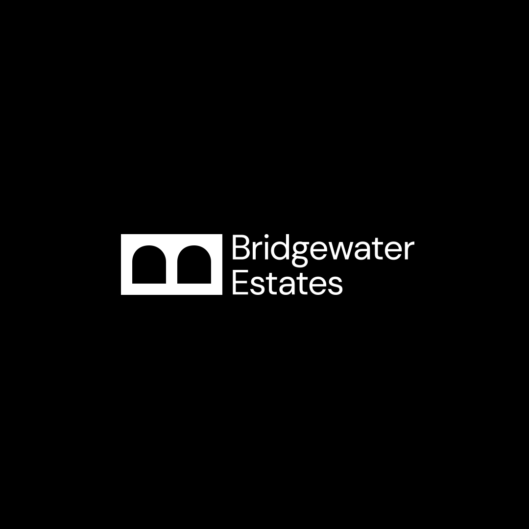
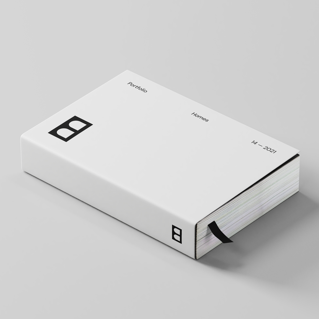
Bridgewater Estates specialises in creating homes that are contemporary in design and fastidious in construction. Mr.M was approached by Bridgewater Estates to design a brand identity for the Manchester based property developers. The idea behind the brand identity takes ownership of the company name by reflecting their modern and considered ways of developing.
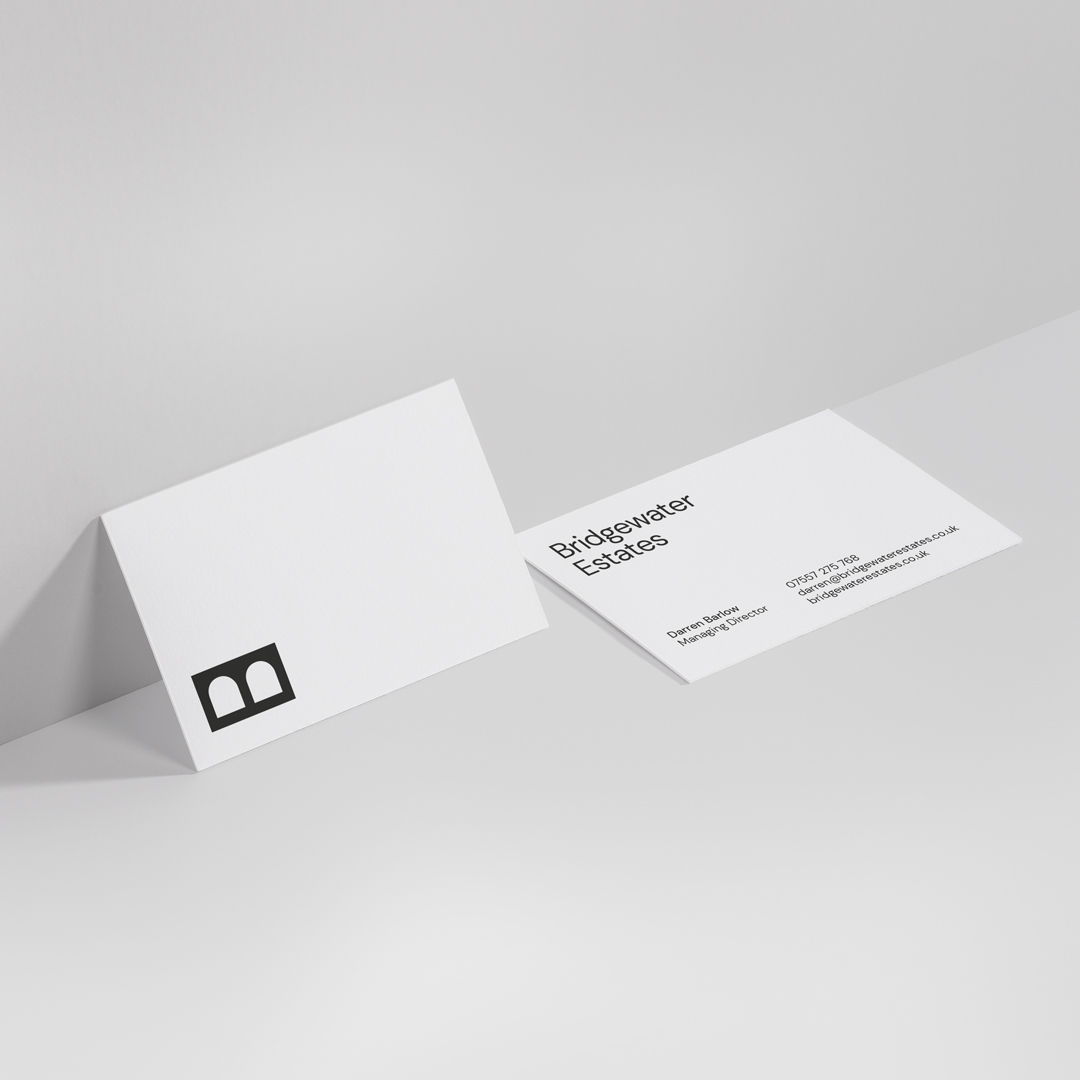
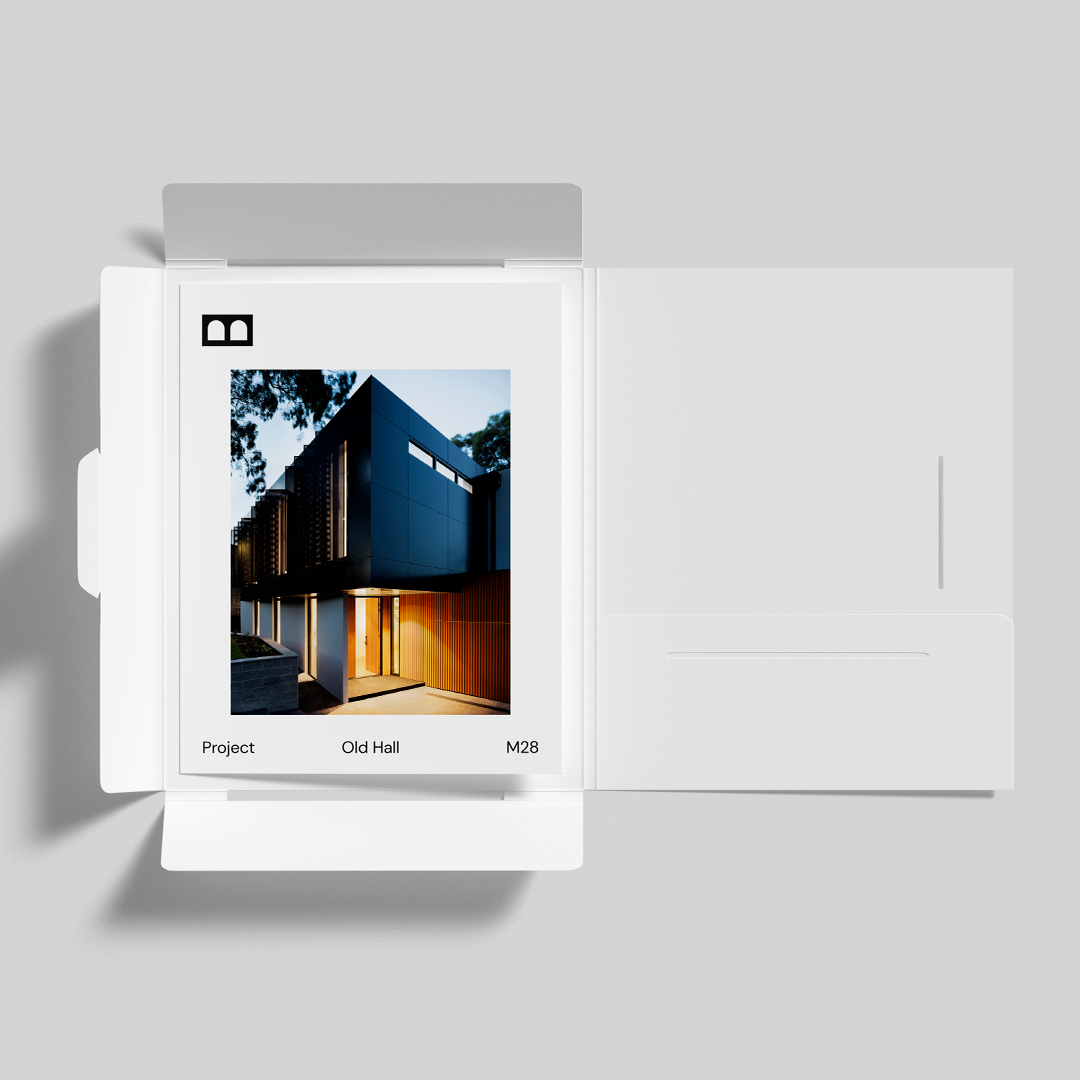
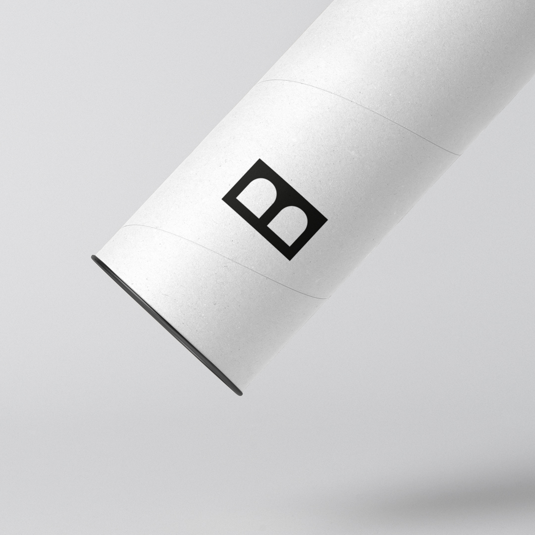
A bold but simple marque is complimented with a san serif typeface. An idea that embraces the letter ‘B’ from Bridgewater and alludes to the letter ‘E’ from Estates creates a very distinctive bridge with water flowing beneath but at the same time a rigid form is created which mimics a brick and construction. The overall styling is minimal and understated. An attention to detail is key making sure that all applications feel considered, effortlessly designed and with a high quality of production.
“I have followed Mr.M for a while now and have always admired their work. When the opportunity came to develop the Bridgewater Estates identity, I contacted Matt. From our initial conversations I knew Mr.M was going to exceed my expectations, the process felt effortless and enjoyable. What Mr.M presents puts a smile on your face and leaves you wondering — how did you come up with that? It fills you with enthusiasm and confidence. I’m looking forward to working with Mr.M in the near future and I cannot recommend them enough.” – Darren Barlow Managing Director Bridgewater Estates

CREDIT
- Agency/Creative: Mr.M ideas studio
- Article Title: Bridgewater Estates Brand Identity by Mr.M Ideas Studio
- Organisation/Entity: Agency
- Project Type: Identity
- Project Status: Published
- Agency/Creative Country: United Kingdom
- Agency/Creative City: Manchester
- Market Region: Europe
- Project Deliverables: Brand Identity
- Industry: Real Estate
- Keywords: Brand Identity, Property Developer, Manchester, Mr.M ideas studio
-
Credits:
Creative Director: Matt Maurer


