Objective
Brewery 28 boasts a century-long history rooted in Belgium, a country renowned for its brewing tradition. The name “28” has an interesting and meaningful origin: over 100 years ago in Belgium, breweries faced a higher tax if they used more than 28 grams of malt per liter of beer, increasing production costs. From the very beginning, the brewery’s philosophy was to uphold high standards of quality in their beer while respecting this limit, offering a product focused on flavor and quality rather than price. Thanks to this choice, Brewery 28 has carved out a unique position, representing a balanced and characterful beer that respects tradition while maintaining an accessible approach.
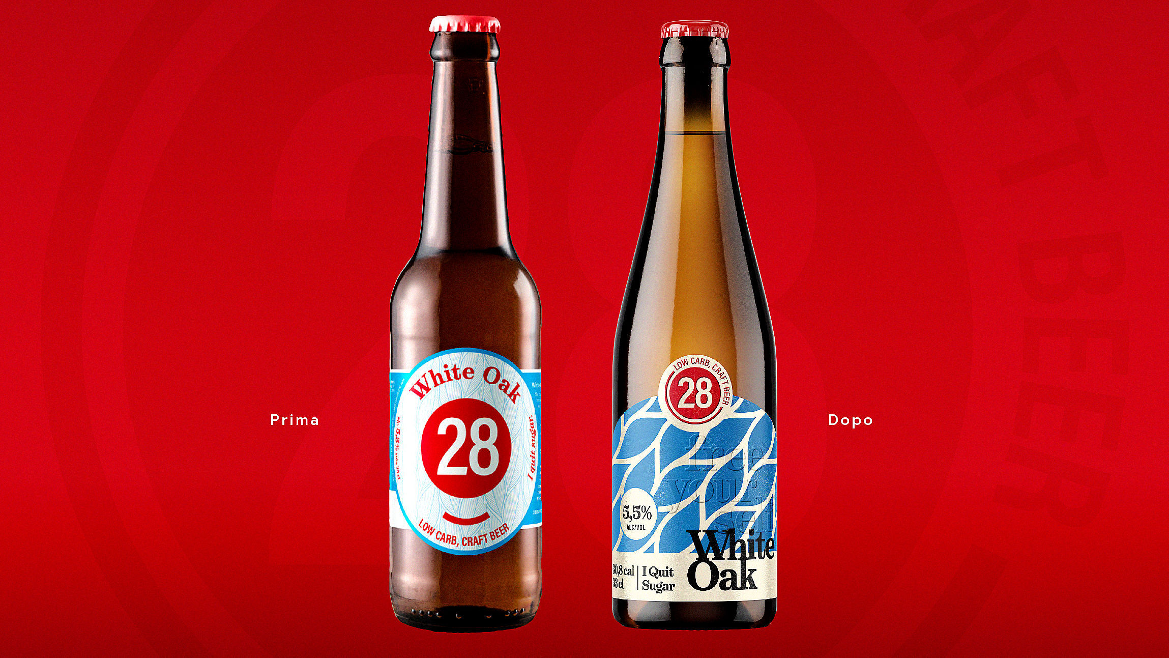
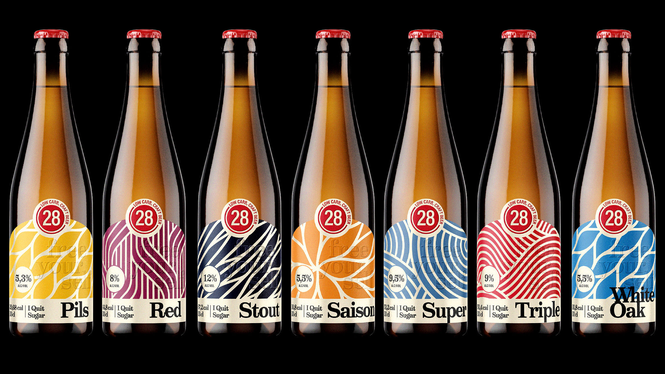
Over time, Brewery 28 has developed a diverse range of beers, always staying true to its original identity. Recently, they approached us to redesign their product line, while preserving certain key elements: the color codes and illustrations from the previous rebranding. Our goal, therefore, was to enhance these essential aspects, adding a touch of innovation that would celebrate the history and tradition of Brewery 28.
The Approach
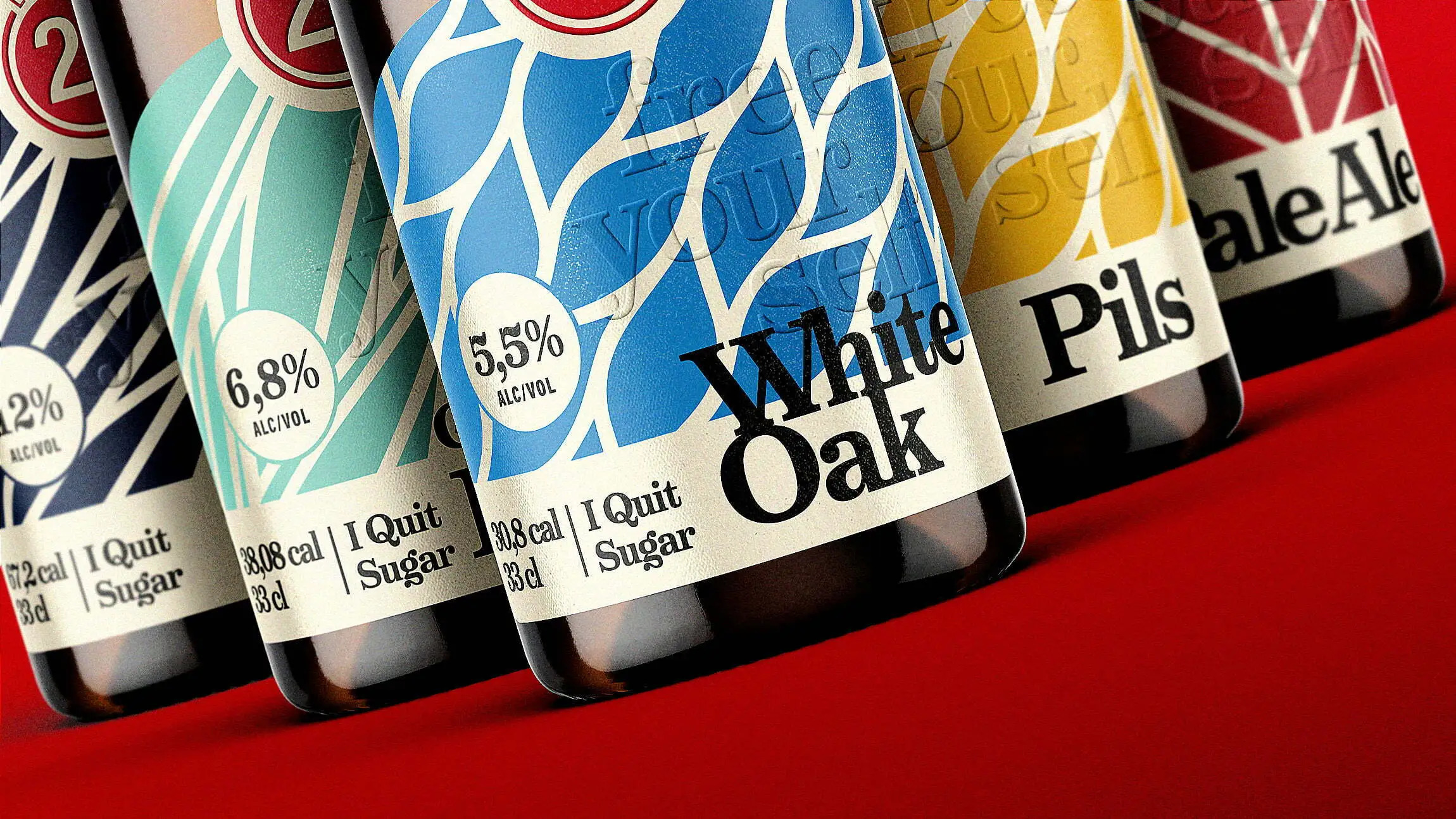
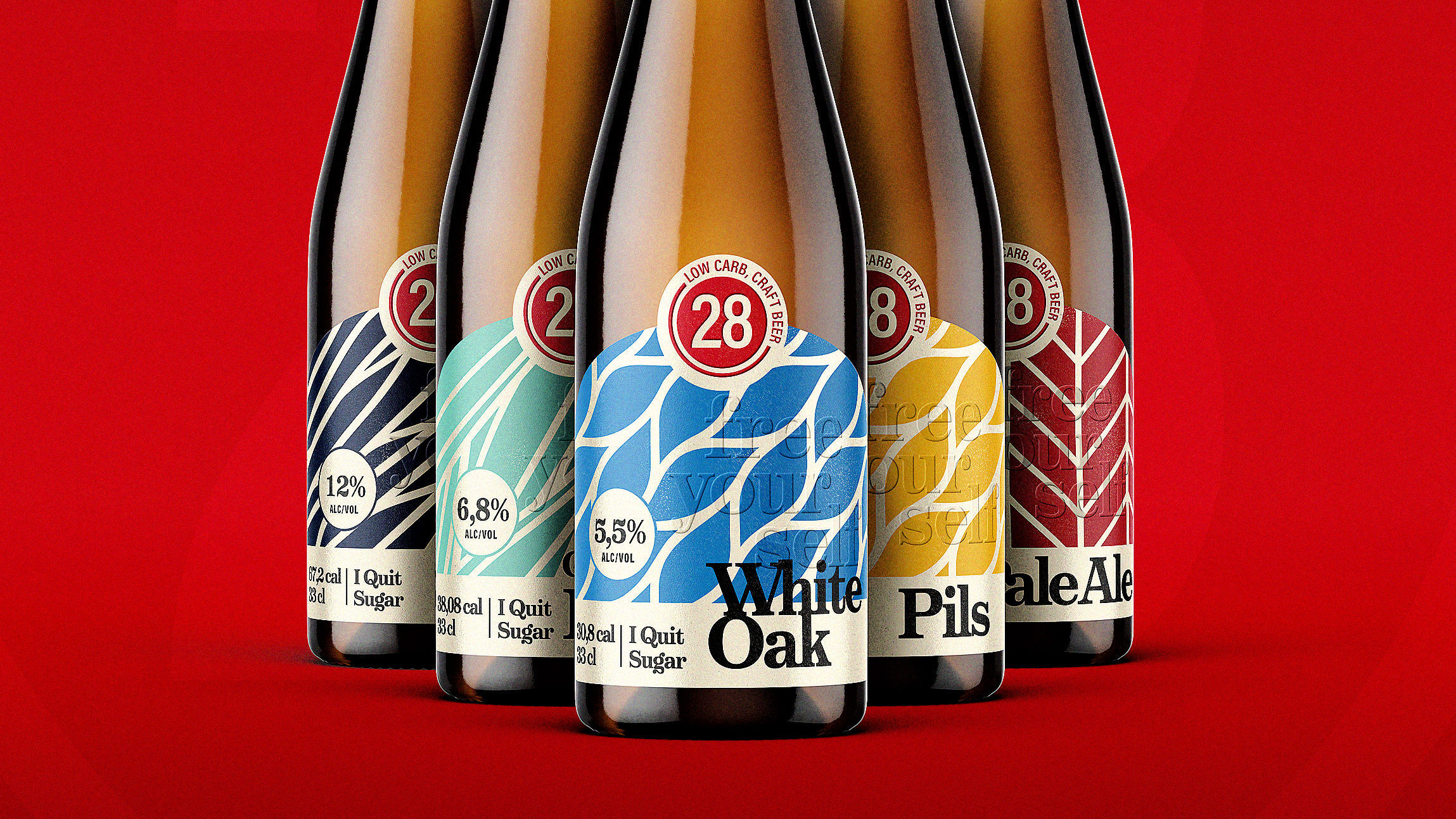
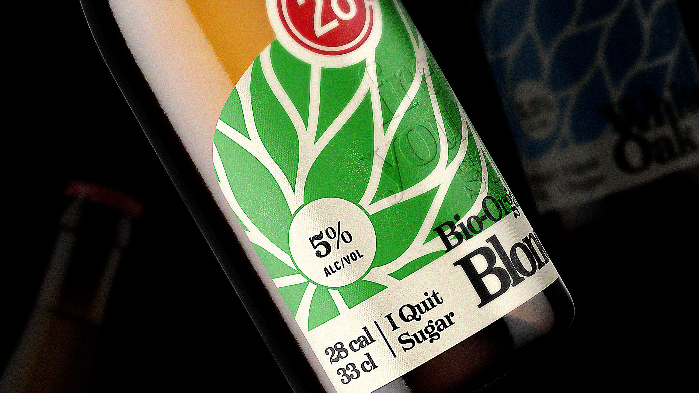
The first step of our intervention was to select a new bottle with a more “classic” design, which could best represent the brewery’s traditional identity. In addition, we introduced a new label shape designed to highlight both the logo and the illustrations, giving them the space to stand out and capture attention.
To add greater visual and tactile impact, we redesigned all graphics in bold fonts, giving them a more assertive and recognizable character. Embossed effects were applied to both the “28” logo and the central part of the label, contributing to a unique tactile experience. We also selected a special paper, derived from malt, offering consumers a sensory experience that recalls the craftsmanship and quality of the materials.
Finally, by adopting a typographic style that contrasts chromatically with the rest of the composition, we created a balance between classic and modern, resulting in a visually striking line that is both easily recognizable and memorable on the shelves.
CREDIT
- Agency/Creative: Rewot s.r.l.
- Article Title: Brewery 28 Redesign Elevates Sensory Branding with Bold Typography and Craft-Inspired Materials
- Organisation/Entity: Agency
- Project Type: Packaging
- Project Status: Published
- Agency/Creative Country: Italy
- Agency/Creative City: Parma
- Market Region: Europe
- Project Deliverables: Packaging Design
- Format: Bottle
- Industry: Food/Beverage
- Keywords: WBDS Agency Design Awards 2024/25 , bottle 28
-
Credits:
Art Director: Francesco Laguardia


