


Brew Tide is a thoughtfully constructed coffee brand identity designed around the natural rhythm of time, taste, and daily ritual. Created to serve three distinct types of coffee drinkers morning starters, afternoon rechargers, and late-night thinkers, the brand needed to communicate variety without fragmentation. The central challenge was to design a single identity system capable of holding multiple moods, energy levels, and consumption moments without leaning too heavily toward one audience over another.
The solution was rooted in the idea of tides continuous, rhythmic movements that mirror both nature and the daily routine of coffee cultivation and consumption. Drawing inspiration from the day-to-day rhythm of a coffee farmer, the identity unfolds across three core moments morning, afternoon, and night. Each moment influences how the brand looks, feels, and behaves, while remaining part of one cohesive visual language.
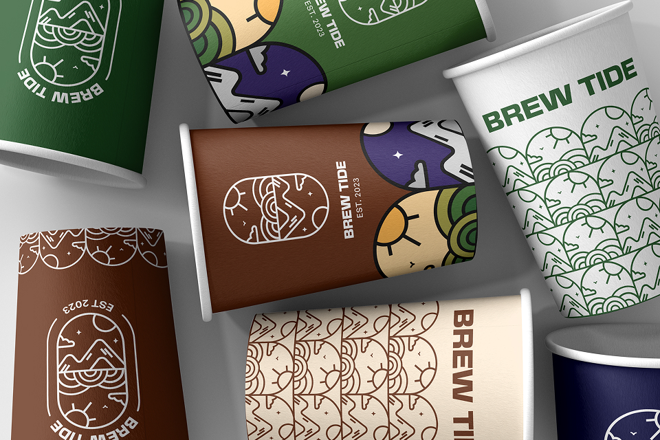
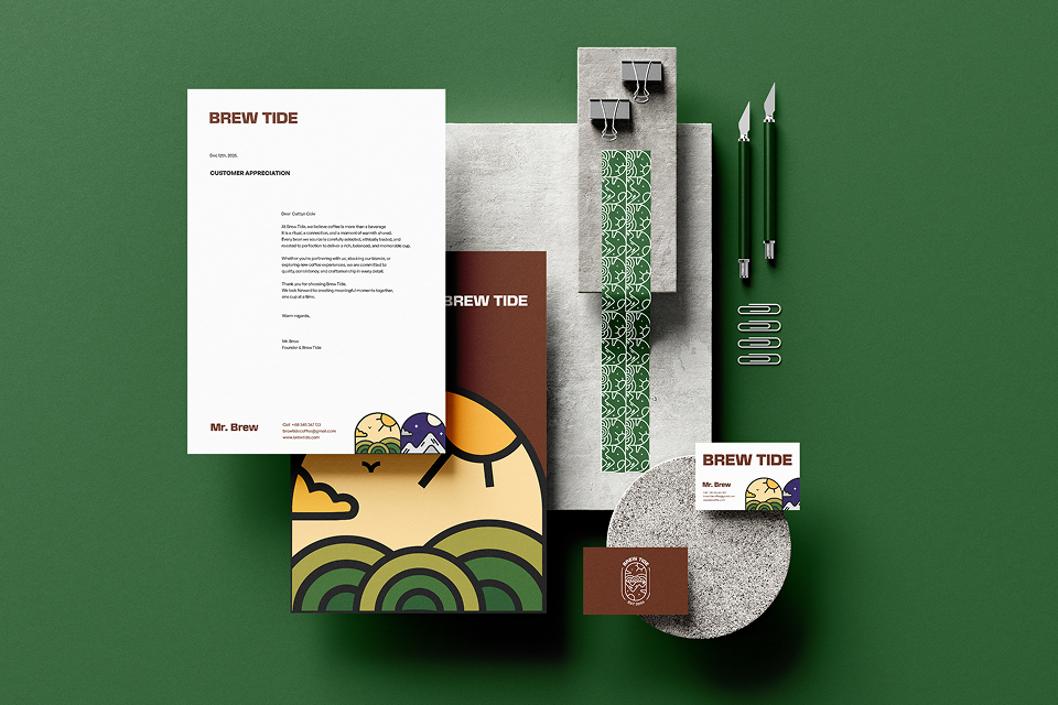
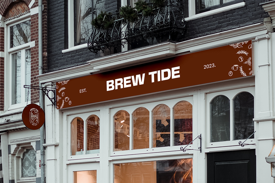
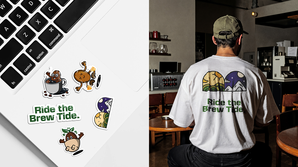
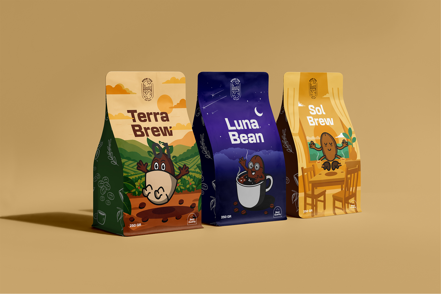
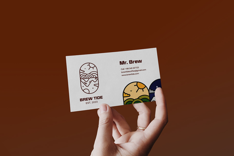
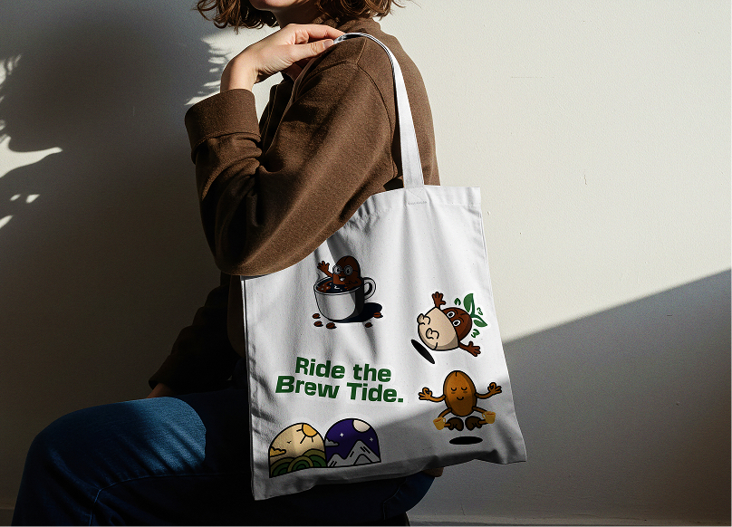
At the heart of the system is a symbolic emblem developed within a cocoa bean form. Every curve and line was intentionally crafted to represent elements of a full day in nature. A rising sun appears as a partial arc, stacked lines form mountains and growth, while softer curves suggest clouds, motion, and the resting moon. The upper portion of the mark reflects light, movement, and energy, while the lower half carries calm, growth, and stillness. Together, they form a complete landscape a tide and a full day captured in a single shape. This emblem was extended into a flexible logo suite, including a core mark, badge variations, and wordmark options to ensure adaptability across applications.
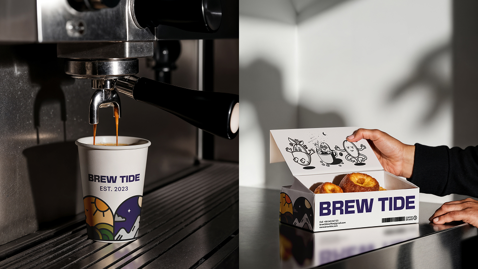
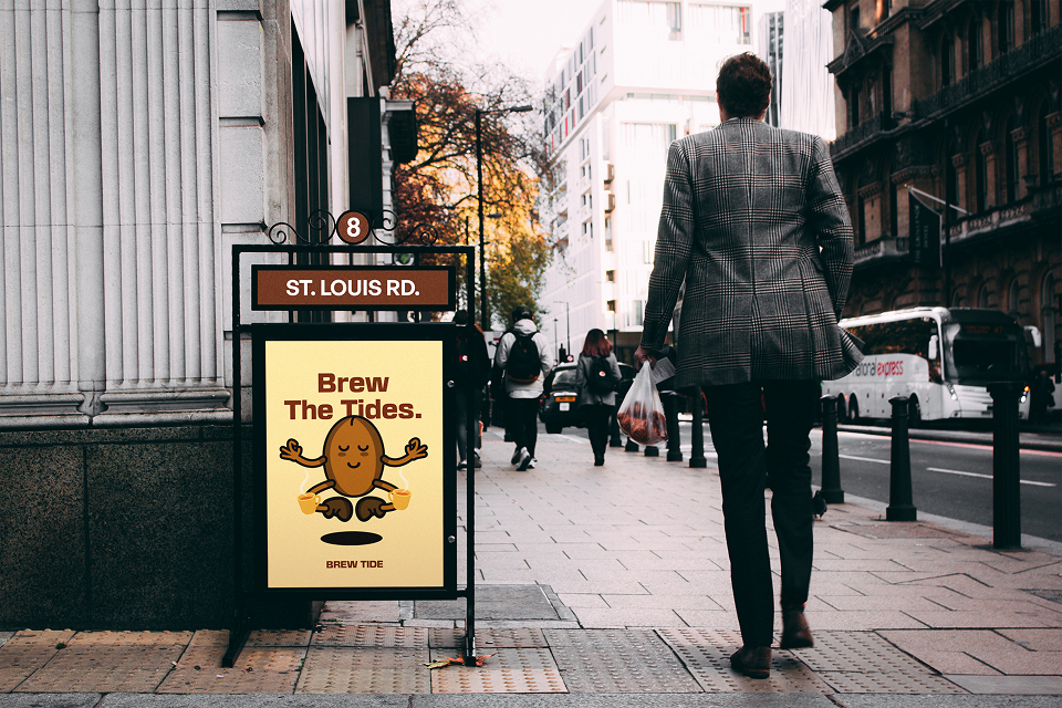
The visual language expands through organic lines, soft edges, and modular shapes, forming patterns and continuous line illustrations that scale seamlessly from packaging to environmental graphics. To further humanize the brand, a character system was introduced. Three bean-shaped illustrated figures represent each time of day energetic and upright for morning, confident and expressive for afternoon, and calm and relaxed for night. These characters act as intuitive visual cues across packaging, motion, and campaign materials.
Color plays a key role in maintaining both distinction and unity. Brown serves as the anchor across all variants, grounding the brand in warmth and familiarity, while secondary palettes shift to express mood and energy. Packaging brings the system to life through three blends Sol Brew, Terra Brew, and Luna Bean each designed with its own rhythm, character, and palette. The result is a scalable, story-driven brand identity that allows Brew Tide to exist as one unified narrative told through three distinct moments of the day.
CREDIT
- Agency/Creative: Forestance
- Article Title: Brew Tide Branding: A Visual System Built Around Tides, Time and Taste by Forestance
- Organisation/Entity: Agency
- Project Type: Identity
- Project Status: Published
- Agency/Creative Country: Nigeria
- Agency/Creative City: Lagos Nigeria
- Market Region: Global
- Project Deliverables: 3D Design, 3D Motion, Brand Design, Brand Identity, Brand Mark, Brand Strategy, GIF Animation, Illustration, Packaging Design
- Industry: Food/Beverage
- Keywords: Brand Identity Design Visual System Coffee Branding Craft Coffee Brand Strategy Brand Characters Illustrated Mascots Bean-Shaped Characters Character-Led Branding Expressive Illustration Logo Design Emblem Design Logo Suite Identity System
-
Credits:
Brand Identity Design Team: Forestance


