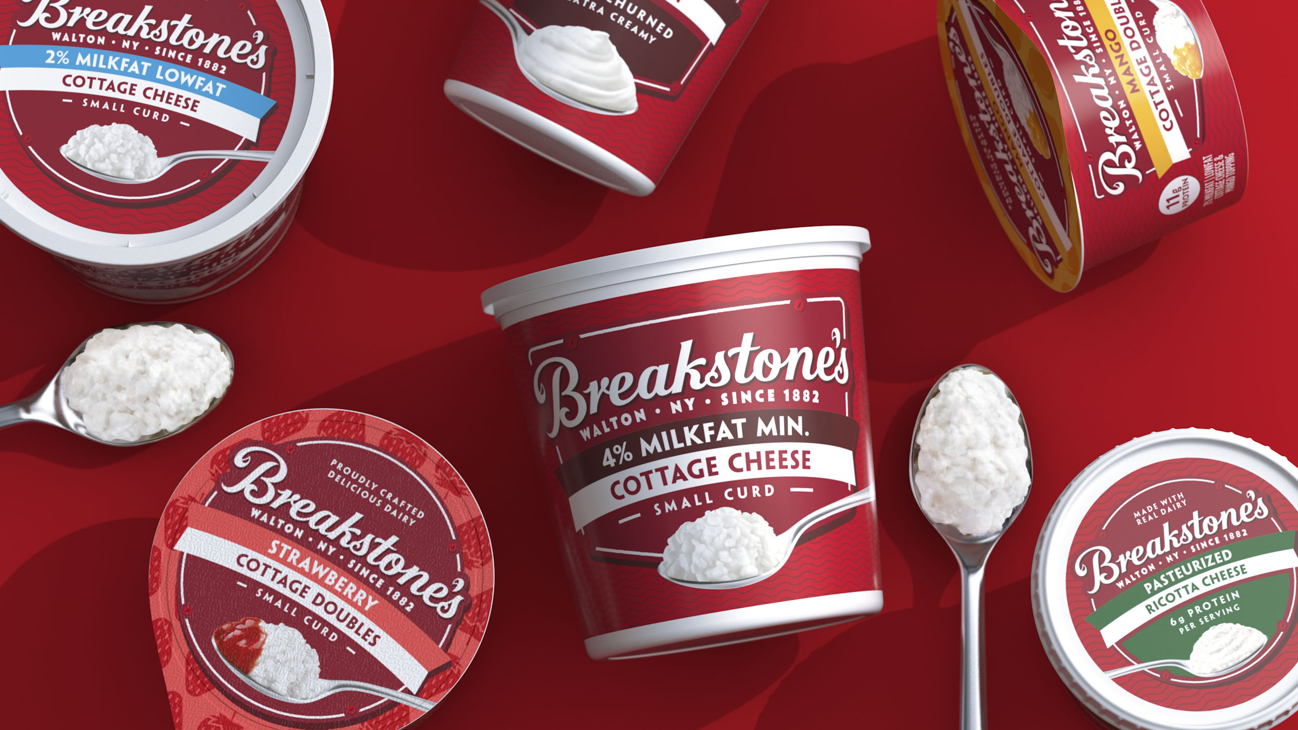
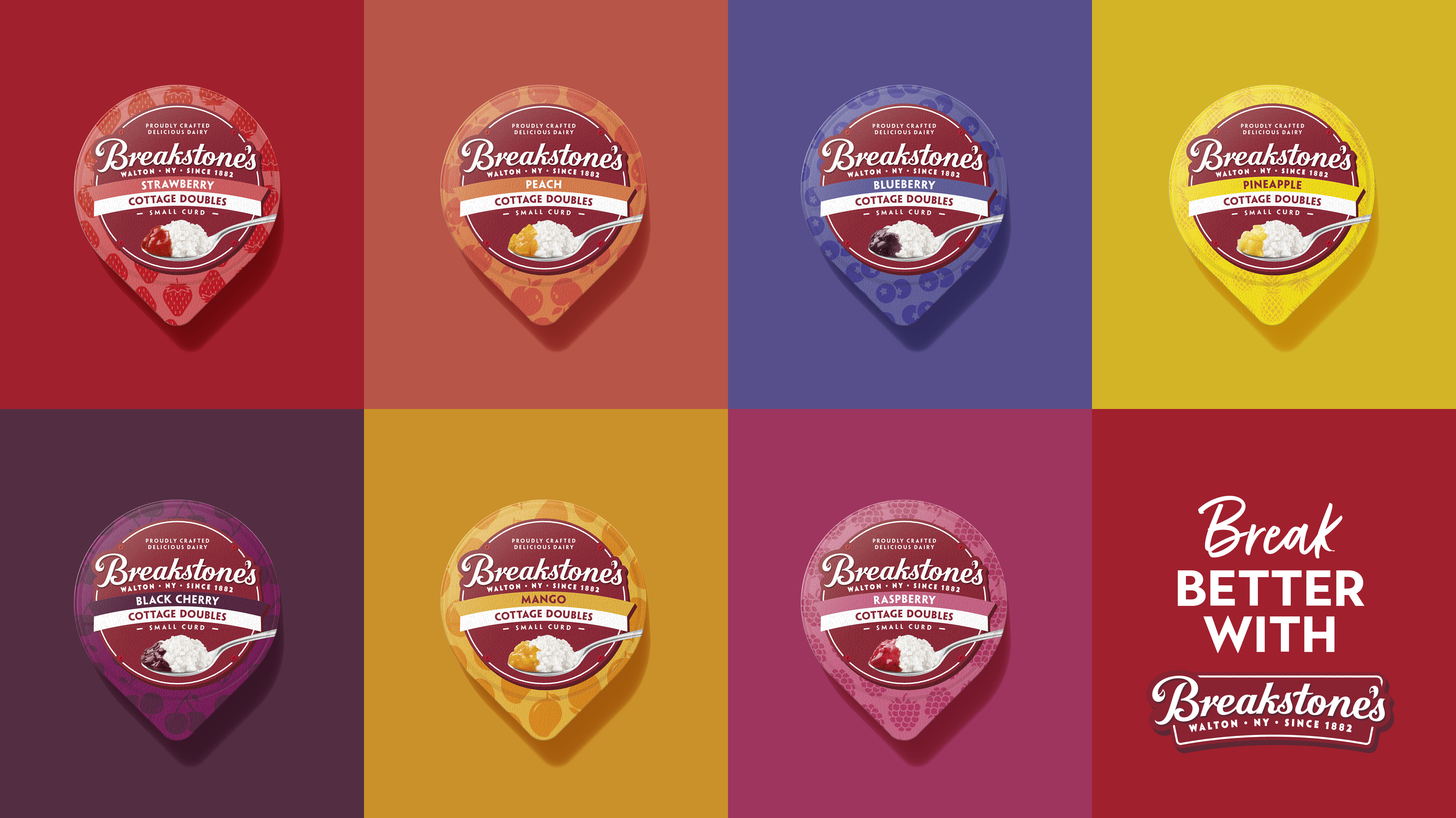
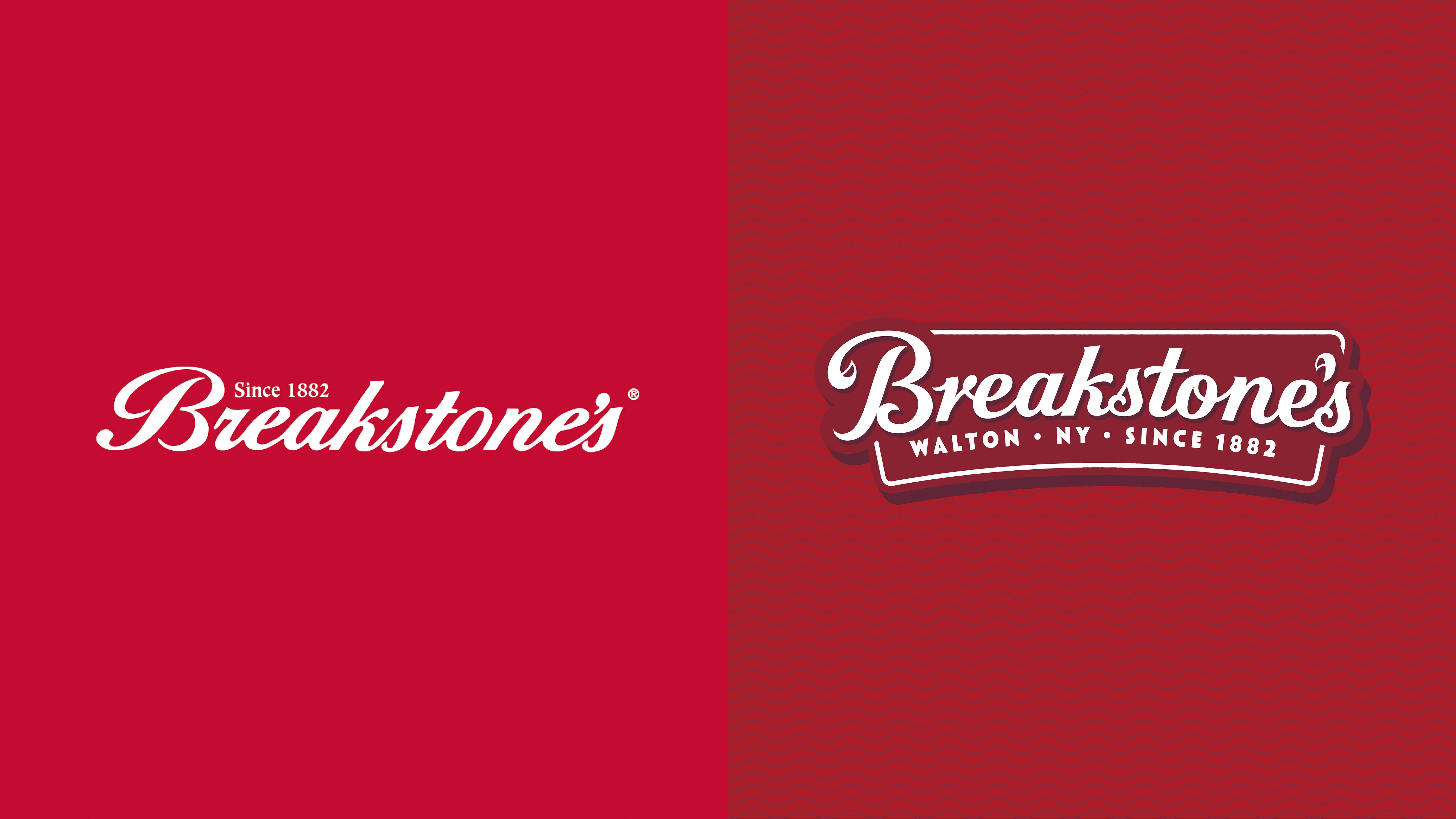
Kraft Heinz has unveiled a modernized look for its cultured dairy brand Breakstone’s, with a view to reconnect with consumers. BrandOpus, the global branding agency behind the redesign, has refreshed the brand’s identity, pack design, social assets, as well as the website – launching later in the year. The elevated design provides a contemporary twist on Breakstone’s rich heritage and will be hitting US grocery stores on the East Coast and Mid-West.
Founded by the Bregstein Brothers in 1882, Breakstone’s is best known for its cultured dairy staples of cottage cheese, sour cream, and ricotta. Now part of the Kraft Heinz portfolio the brand’s home remains in Walton, NY, where it continues to nurture its traditional crafting methods – hand cut and triple churned – to deliver the same rich tasting dairy products, 130 years on.
The heritage brand has been faced with budding rivalry and new entrants in recent years. The BrandOpus team were briefed to boost contemporary relevance – re-establishing what makes Breakstone’s unique for today’s consumers. Research highlighted that although the brand was deemed reliable and credible, it was showing up in the world as formal and old-fashioned. Playing into Breakstone’s unique heritage and expertise, the new design is rooted in the idea of “enriching the everyday with craft and care”.
Design elements of the redesign include:
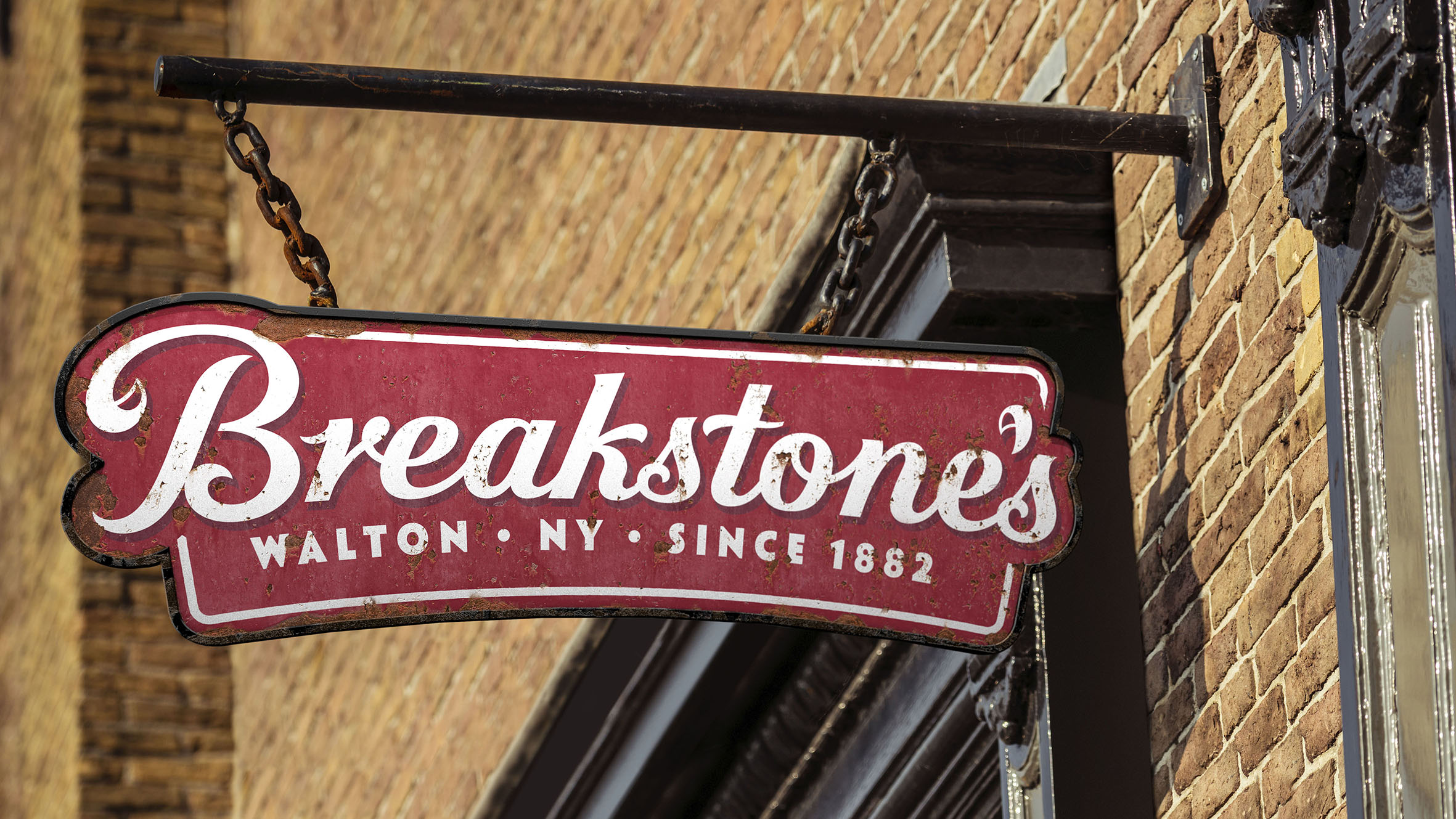
• The refurbished brand mark uses the symbolism of signage, working as a visual embodiment of permanence. An indicator that Breakstone’s is a reliable and trusted brand that’s stood the test of time and now acts as a welcoming beacon to consumers at shelf.
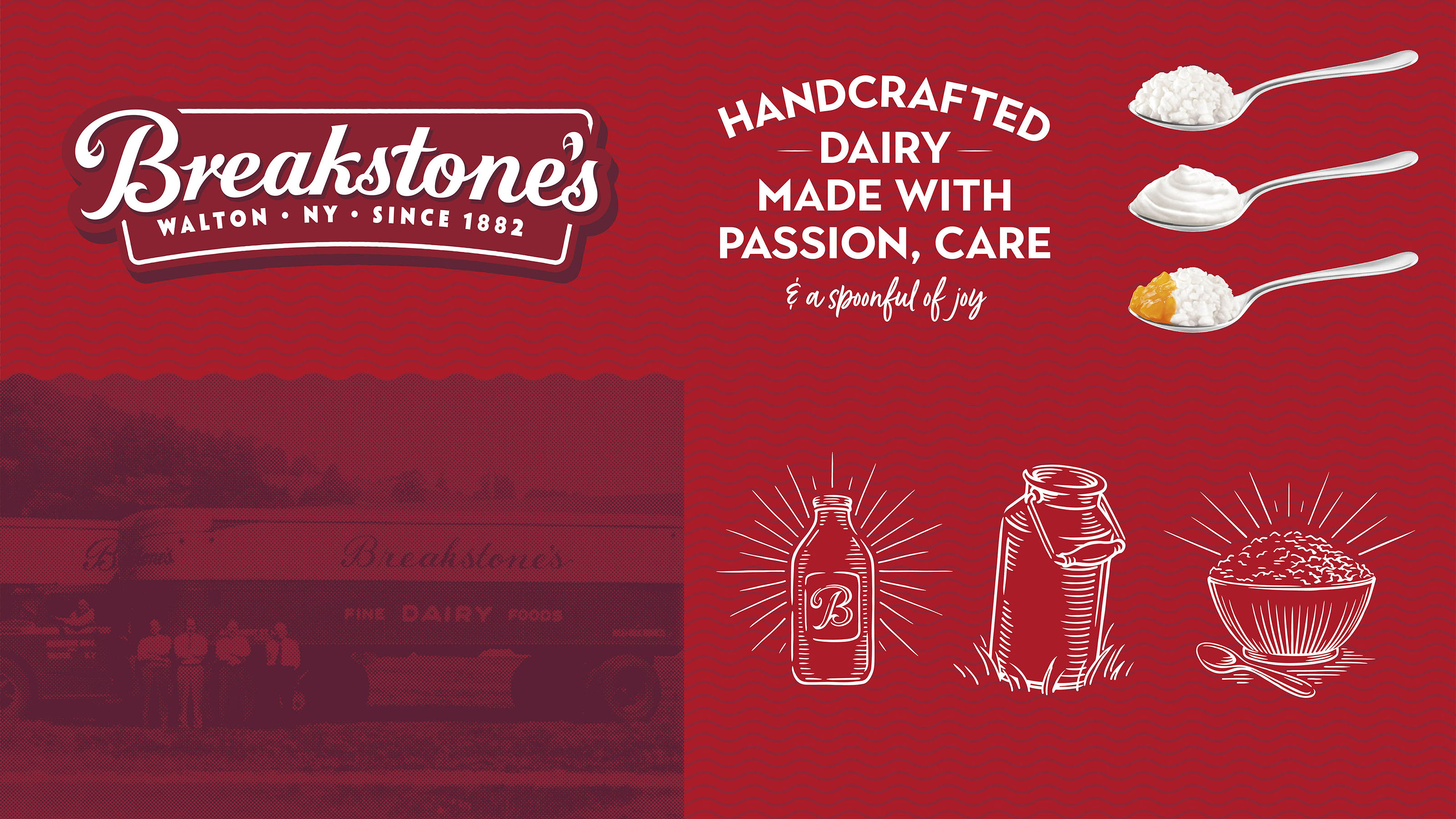
• A freshly refined & crafted cursive script for the Breakstone’s mark establishes an iconic and modern nod to the brand’s heritage and hand-cut nature.
• Bold and bespoke graphic elements including the spoon– a bullseye on the current packaging – was amplified and made more heroic, now used across the portfolio and within the wider identity to champion Breakstone’s delicious dairy. Whilst a linework background metaphorically creates connections to stamps and marks of quality.
• A light and fun linework illustration style flawlessly captures the handcrafted nature of the brand, which flexes across the pack and brand world.
• Breakstone’s iconic white and red color palette has been retained and enhanced to preserve memory structure. Now embracing a more sophisticated and elevated red to dial up the brand’s quality and heritage cues.
Paul Taylor, chief creative officer and founding partner, BrandOpus comments “Breakstone’s has built a legacy on carefully crafting delicious dairy staples – something we really didn’t want to lose with the new identity. Our ambition was to package that up in an emotive way that enriches the lives of new and existing consumers. We’re excited to reintroduce the same great-tasting Breakstone’s to the world, but in a more meaningful and revitalised way.”
Ken Padgett, director, Cheese Brand Build, Breakstone’s, comments “The strengthened look and feel re-establishes us as a relevant, modern heritage brand and rightly reflects the richness and craft that is integral to Breakstone’s. The talented team at BrandOpus have equipped us with the tools to retain our iconic status in East Coast dairy for today and into the future.”
CREDIT
- Agency/Creative: BrandOpus
- Article Title: Breakstone’s Brings Culture Back to the Dairy Aisle with Brand Overhaul by BrandOpus
- Organisation/Entity: Agency
- Project Type: Identity
- Project Status: Published
- Agency/Creative Country: United Kingdom
- Agency/Creative City: London
- Market Region: North America
- Project Deliverables: Brand Design, Brand Mark, Brand Redesign, Brand Rejuvenation, Brand Strategy, Brand World, Branding, Design, Illustration, Logo Design, Packaging Design, Rebranding
- Industry: Food/Beverage
- Keywords: packaging, redesign, rebrand, visual identity, branding, diary, Kraft Heinz, illustration, typography
-
Credits:
branding agency: BrandOpus


